Free with trial A gleaming, metallic golden arrow curves downwards, indicating a downward trend or decline. The arrow is rendered in 3D with a polished, reflective surface, casting a subtle shadow on the white background. It symbolizes concepts like financial loss, decreasing statistics, or negative movement. Trend decrease illustrations Shiny Golden Downward Curved Arrow Showing Decline on a White Background image photo. A gleaming, metallic golden arrow curves downwards, indicating a downward trend or decline. The arrow is rendered in 3D with a polished, reflective surface, casting a subtle shadow on the white background. It symbolizes concepts like financial loss, decreasing statistics, or negative movement
Free with trial The image displays a bold, downward-pointing arrow with a zigzag pattern along its shaft. The arrow is colored in a teal shade and signifies a decrease, reduction, or decline in values or trends. The design is clean and minimalistic, emphasizing the downward movement. Trend decrease vectors Downward zigzag arrow indicating decline or reduction in values. The image displays a bold, downward-pointing arrow with a zigzag pattern along its shaft. The arrow is colored in a teal shade and signifies a decrease, reduction, or decline in values or trends. The design is clean and minimalistic, emphasizing the downward movement
Free with trial A sleek, bold black arrow graphic pointing diagonally downwards to the right, signifying direction, decrease, navigation, or progress. Clean and simple vector. Trend decrease illustrations Black arrow pointing diagonally down and right icon graphic sign. A sleek, bold black arrow graphic pointing diagonally downwards to the right, signifying direction, decrease, navigation, or progress. Clean and simple vector
Free with trial A 3D rendered image of a red arrow graph showing a downward trend, situated in a room with grey tiled walls and floor, illuminated by overhead lighting. Trend decrease illustrations A 3d red arrow graph trending downwards in a grey tiled room. A 3D rendered image of a red arrow graph showing a downward trend, situated in a room with grey tiled walls and floor, illuminated by overhead lighting
Free with trial A 3d bar graph showing a downward trend with a red arrow indicating decline, representing business loss. Trend decrease vectors Bar chart with red arrow pointing down on white background. A 3d bar graph showing a downward trend with a red arrow indicating decline, representing business loss
Free with trial A bar graph with a descending arrow, symbolizing economic decline and financial downturn, set against a blue background. Trend decrease illustrations Downward Trend - A Visual Representation of Economic Decline. A bar graph with a descending arrow, symbolizing economic decline and financial downturn, set against a blue background
Free with trial A sharp, reflective red arrow points downward on a neutral background. Trend decrease illustrations A glossy red arrow curves downwards indicating a significant decline or negative trend. A sharp, reflective red arrow points downward on a neutral background
Free with trial Red upward arrow icon with crossed downward line and bar chart showing growth and decline contrast. Trend decrease illustrations Red upward arrow with crossed down trend icon and bar chart. Red upward arrow icon with crossed downward line and bar chart showing growth and decline contrast
Free with trial A sharp red zigzag arrow points downwards, symbolizing a significant decline or negative trend in a graph or chart, isolated on a clean white background. Trend decrease illustrations Red zigzag arrow pointing down isolated on white background. A sharp red zigzag arrow points downwards, symbolizing a significant decline or negative trend in a graph or chart, isolated on a clean white background
Free with trial An detailed line art illustration of a dog on a chart showing a decline or loss. Trend decrease vectors Dachshund standing on a downward financial arrow trend line. An detailed line art illustration of a dog on a chart showing a decline or loss
Free with trial A sharp red arrow, representing a downward trend, is superimposed over a series of stacked gold coins. The stacks of coins decrease in height from left to right, visually symbolizing a financial decline or economic recession. The lighting is dramatic, with a dark background and a wooden surface, emphasizing the seriousness of the financial situation. Trend decrease illustrations Financial downturn depicted by a declining graph over decreasing stacks of gold coins. A sharp red arrow, representing a downward trend, is superimposed over a series of stacked gold coins. The stacks of coins decrease in height from left to right, visually symbolizing a financial decline or economic recession. The lighting is dramatic, with a dark background and a wooden surface, emphasizing the seriousness of the financial situation
Free with trial A bold, red, transparent percentage symbol is combined with a downward-pointing arrow, creating a strong visual representation of a decrease or reduction. The material appears to be glass or acrylic, with light reflecting off its smooth surfaces. The symbol is isolated on a clean white background, making its message of decline or discount clear and impactful. Trend decrease illustrations Red Transparent Percentage Symbol with Downward Arrow on White Background image photo. A bold, red, transparent percentage symbol is combined with a downward-pointing arrow, creating a strong visual representation of a decrease or reduction. The material appears to be glass or acrylic, with light reflecting off its smooth surfaces. The symbol is isolated on a clean white background, making its message of decline or discount clear and impactful
Free with trial Vibrant illustration features a red arrow with a sharp upward trend line and a blue arrow with a sharp downward trend line, both overlaid on a light blue background with subtle cloud-like textures. The red arrow starts lower and rises steeply, indicating growth or a positive trend. The blue arrow begins higher and descends sharply, signifying decline or a negative trend. The arrows have a stylized, zig-zag pattern to emphasize the fluctuations before their final direction. This image is ideal for visually representing contrasting trends, such as profit and loss, success and failure, or any opposing movements in data or performance. Trend decrease illustrations Dynamic Illustration of Contrasting Upward and Downward Trending Arrows. vibrant illustration features a red arrow with a sharp upward trend line and a blue arrow with a sharp downward trend line, both overlaid on a light blue background with subtle cloud-like textures. The red arrow starts lower and rises steeply, indicating growth or a positive trend. The blue arrow begins higher and descends sharply, signifying decline or a negative trend. The arrows have a stylized, zig-zag pattern to emphasize the fluctuations before their final direction. This image is ideal for visually representing contrasting trends, such as profit and loss, success and failure, or any opposing movements in data or performance.
Free with trial Conceptual image depicting job loss and economic downturn. Trend decrease illustrations Job Loss Analysis Magnifying Glass on Downward Trend, Layoffs. Conceptual image depicting job loss and economic downturn.
Free with trial Set of black and white icons illustrating various business analytics and data concepts including downward trend charts, funnel, report, magnifying glass, computer display, and focused chart with arrows. Generative AI. Trend decrease vectors Black and white business analytics and data icons set with charts and graphs. Set of black and white icons illustrating various business analytics and data concepts including downward trend charts, funnel, report, magnifying glass, computer display, and focused chart with arrows. Generative AI
Free with trial This image features a red bar graph with a downward trend, indicated by a large red arrow pointing downwards. The graph is isolated on a transparent background, making it suitable for various design applications. The bars decrease in height from left to right, emphasizing a decline in data. Trend decrease illustrations Decreasing bar graph icon isolated on transparent background. This image features a red bar graph with a downward trend, indicated by a large red arrow pointing downwards. The graph is isolated on a transparent background, making it suitable for various design applications. The bars decrease in height from left to right, emphasizing a decline in data
Free with trial A person holding a smartphone displaying a glowing house with a percentage sign and red downward arrows, indicating a decrease in rates. Trend decrease illustrations Person using a smartphone with a glowing house and percentage sign with red down generated using ai. A person holding a smartphone displaying a glowing house with a percentage sign and red downward arrows, indicating a decrease in rates
Free with trial Dual trend line graph bar business growth and decline visualization. Trend decrease vectors Profit growth and loss decline business graph bar. Dual trend line graph bar business growth and decline visualization
Free with trial A chart with a red arrow pointing downward, isolated on a white background, representing financial decline or a negative trend. Trend decrease illustrations Decreasing chart with red arrow isolated on white background. A chart with a red arrow pointing downward, isolated on a white background, representing financial decline or a negative trend
Free with trial A simple line drawing shows a magnifying glass focused on a declining bar graph with a downward arrow and a star. Trend decrease illustrations Declining Graph Analysis Magnifying Glass, Star, Downward Trend. A simple line drawing shows a magnifying glass focused on a declining bar graph with a downward arrow and a star.
Free with trial Conceptual vector icon representing declining popularity or a downward trend in love or affection. Trend decrease illustrations Declining Popularity Search Heart, Graph, Magnifying Glass Icon. Conceptual vector icon representing declining popularity or a downward trend in love or affection.
Free with trial This minimalist vector illustration depicts a downward-trending line graph representing economic decline. Two distinct lines in red and green descend sharply, accompanied by floating currency symbols and percentage indicators. The clean, flat design uses a simple color palette against a white background to communicate concepts of financial loss, market volatility and economic instability. Trend decrease vectors A line graph showing a downward trend in financial market performance and currency value. This minimalist vector illustration depicts a downward-trending line. This minimalist vector illustration depicts a downward-trending line graph representing economic decline. Two distinct lines in red and green descend sharply, accompanied by floating currency symbols and percentage indicators. The clean, flat design uses a simple color palette against a white background to communicate concepts of financial loss, market volatility and economic instability
Free with trial A visual representation of the indian economy experiencing a downturn. the rupee is devaluating, and the stock market is crashing, indicating a financial crisis and potential recession in india. Trend decrease illustrations Indian economy stock market crash rupee currency devaluation financial crisis investment loss recession trend down. a visual representation of the indian economy experiencing a downturn. the rupee is devaluating, and the stock market is crashing, indicating a financial crisis and potential recession in india.
Free with trial A stylized gold-framed black circular coin or medal displays a sharp downward trending financial graph with a prominent arrow indicating a decline. The graphic is rendered in a golden outline against the dark background, symbolizing financial loss or a negative economic trend. Trend decrease illustrations Gold Framed Black Coin with Downward Trending Financial Graph and Arrow Symbol finance. A stylized gold-framed black circular coin or medal displays a sharp downward trending financial graph with a prominent arrow indicating a decline. The graphic is rendered in a golden outline against the dark background, symbolizing financial loss or a negative economic trend
Free with trial The image displays a thick, red zigzag arrow pointing downward. The arrow has a sharp, angular design with a bold outline, which emphasizes a sense of decline, reduction, or negative trend. The color red adds a strong visual impact, often associated with warnings or alerts. Trend decrease illustrations A bold downward zigzag arrow symbolizing decline or reduction. The image displays a thick, red zigzag arrow pointing downward. The arrow has a sharp, angular design with a bold outline, which emphasizes a sense of decline, reduction, or negative trend. The color red adds a strong visual impact, often associated with warnings or alerts
Free with trial This clear and simple graph illustrates two opposing trends over time. Trend A, depicted in red, shows a steady decline, starting from a high value and decreasing as time progresses. In contrast, Trend B, shown in blue, demonstrates a consistent upward trajectory, beginning at zero and increasing over the same time period. The intersection point signifies a critical juncture where the values of both trends are equal. This visual is ideal for explaining concepts like competition, growth versus decline, or contrasting performance metrics. Trend decrease vectors Conflicting Trends: Upward vs. Downward Trajectories on a Graph. This clear and simple graph illustrates two opposing trends over time. Trend A, depicted in red, shows a steady decline, starting from a high value and decreasing as time progresses. In contrast, Trend B, shown in blue, demonstrates a consistent upward trajectory, beginning at zero and increasing over the same time period. The intersection point signifies a critical juncture where the values of both trends are equal. This visual is ideal for explaining concepts like competition, growth versus decline, or contrasting performance metrics.
Free with trial Collection of simple black vector icons representing financial charts, data analysis graphs, and business statistics. Includes trend arrows, magnifier, and settings symbols. Trend decrease illustrations Set of black business graph and chart icons for data analysis. Collection of simple black vector icons representing financial charts, data analysis graphs, and business statistics. Includes trend arrows, magnifier, and settings symbols
Free with trial Bar chart and red arrow indicate a negative trend and economic recession. Represents financial crisis and business loss. Trend decrease vectors Financial graph showing declining sales and economic downturn. Bar chart and red arrow indicate a negative trend and economic recession. Represents financial crisis and business loss
Free with trial Wooden blocks spelling out the word COST are stacked on piles of coins, with a red arrow indicating a downward trend, symbolizing cost reduction and financial decrease. Trend decrease illustrations Blocks spelling cost with coins and a downward trending arrow. Wooden blocks spelling out the word COST are stacked on piles of coins, with a red arrow indicating a downward trend, symbolizing cost reduction and financial decrease
Free with trial A close-up shot of a hand stacking three wooden blocks, each featuring a significant symbol. The top block displays a green upward arrow, the middle a red downward arrow, and the bottom a black percentage symbol. This visual metaphor effectively represents concepts of increase, decrease, and percentage change. Ideal for illustrating financial topics like interest rates, inflation, economic trends, profit loss, discounts, or general business performance. The clean, minimalist background offers ample copy space for text or additional graphics, making it versatile for various editorial and commercial uses. Trend decrease illustrations Interest Rate or Percentage Change Concept with Wooden Blocks. A close-up shot of a hand stacking three wooden blocks, each featuring a significant symbol. The top block displays a green upward arrow, the middle a red downward arrow, and the bottom a black percentage symbol. This visual metaphor effectively represents concepts of increase, decrease, and percentage change. Ideal for illustrating financial topics like interest rates, inflation, economic trends, profit loss, discounts, or general business performance. The clean, minimalist background offers ample copy space for text or additional graphics, making it versatile for various editorial and commercial uses.
Free with trial 3D collage trend artwork composite poster of young man run hand hold hammer attack broke coins bankruptcy investor inflation economy forex. Trend decrease illustrations 3D collage trend artwork composite poster of young man run hand hold hammer attack broke coins bankruptcy investor
Free with trial A line graph displaying two lines, one red and one blue, both trending downward over time. The red line is consistently above the blue line and both show a significant decrease, with the red line ending in a sharp drop highlighted by a red arrow. Trend decrease illustrations Graph showing a decline in values over time with a notable drop. A line graph displaying two lines, one red and one blue, both trending downward over time. The red line is consistently above the blue line and both show a significant decrease, with the red line ending in a sharp drop highlighted by a red arrow
Free with trial Colorful neon lines form an abstract financial data chart against a dark background. Multiple lines in blue, orange, pink, green, and purple intersect and spike upwards, creating dynamic, glowing zigzag patterns. Each line ends with an upward-pointing arrow, suggesting positive growth or an upward trend. The vibrant colors create a striking contrast with the black backdrop. This design represents the fluctuating nature of financial markets or data analytics, using visual elements to convey movement and change. Trend decrease illustrations Colorful glowing lines form an abstract financial data chart. Colorful neon lines form an abstract financial data chart against a dark background. Multiple lines in blue, orange, pink, green, and purple intersect and spike upwards, creating dynamic, glowing zigzag patterns. Each line ends with an upward-pointing arrow, suggesting positive growth or an upward trend. The vibrant colors create a striking contrast with the black backdrop. This design represents the fluctuating nature of financial markets or data analytics, using visual elements to convey movement and change.
Free with trial A line art image depicting a magnifying glass focused on a person icon and a downward trending bar chart. Trend decrease illustrations Declining Sales Analysis Magnifying Glass, Downward Trend Chart. A line art image depicting a magnifying glass focused on a person icon and a downward trending bar chart.
Free with trial A 3D rendered bar chart displays a series of bars decreasing in height from left to right. The bars are colored with a gradient transitioning from blue to orange, set against a plain white background. The visual represents a downward trend or decline. Trend decrease illustrations Downward Trending Bar Chart with Gradient Colors on a White Background graph statistics. A 3D rendered bar chart displays a series of bars decreasing in height from left to right. The bars are colored with a gradient transitioning from blue to orange, set against a plain white background. The visual represents a downward trend or decline
Free with trial Growth and Decline Icons: Up Down Arrow Graphics: Explore a set of icons illustrating growth (up arrow) and decline (down arrow) with a dynamic, zigzag line within rounded and sharp squares. Ideal for representing trends and changes. Trend decrease illustrations Growth and Decline Icons: Up Down Arrow Graphics, Positive Negative Trend Symbols: Stock Market Indicators. Growth and Decline Icons: Up Down Arrow Graphics: Explore a set of icons illustrating growth (up arrow) and decline (down arrow) with a dynamic, zigzag line within rounded and sharp squares. Ideal for representing trends and changes.
Free with trial This image represents a decline in the diamond market, with a falling graph and a diamond symbolizing decreasing value, demand, or economic challenges in the industry. Trend decrease vectors Vector art of diamond market decline showing a falling graph and a diamond, indicating a decrease in value or demand for diamonds. This image represents a decline in the diamond market, with a falling graph and a diamond symbolizing decreasing value, demand, or economic challenges in the industry
Free with trial A neon dollar sign with a downward arrow represents financial loss. It is a visual metaphor for economic downturn, investment decline, and market instability. Trend decrease vectors Vector art of neon dollar sign with downward arrow, symbolizing financial loss, economic downturn, or decrease in value or. A neon dollar sign with a downward arrow represents financial loss. It is a visual metaphor for economic downturn, investment decline, and market instability
Free with trial A modern, minimalistic infographic on a beige background displays maternal age trends across six distinct watch types, using a combination of line graphs and visual watch representations to illustrate percentage changes, where 20% of watches show a 20% increase in maternal age, 80% show an 80% increase, 25% reflect a 25% increase, 30% indicate a 30% decrease, and 40% demonstrate a 40% decrease,. Trend decrease illustrations Modern infographic showing maternal age trends across six watch types with percentage changes and minimalist design. A modern, minimalistic infographic on a beige background displays maternal age trends across six distinct watch types, using a combination of line graphs and visual watch representations to illustrate percentage changes, where 20% of watches show a 20% increase in maternal age, 80% show an 80% increase, 25% reflect a 25% increase, 30% indicate a 30% decrease, and 40% demonstrate a 40% decrease,
Free with trial This image features a bar graph with two sections. The left section shows an upward trend with a green arrow pointing upwards, indicating growth or increase. The right section displays a downward trend with a red arrow pointing downwards, indicating decline or decrease. The image is set against a transparent background, making it suitable for various design applications. Trend decrease illustrations Bar graph with up and down arrows isolated on white background. This image features a bar graph with two sections. The left section shows an upward trend with a green arrow pointing upwards, indicating growth or increase. The right section displays a downward trend with a red arrow pointing downwards, indicating decline or decrease. The image is set against a transparent background, making it suitable for various design applications
Free with trial A 3D render depicts a golden bar chart with bars decreasing in height from left to right. A downward-sloping golden arrow intersects the chart, pointing towards the right and downwards. A large, shiny golden coin with a dollar sign is positioned on the arrow, emphasizing a financial decline or loss. The image is set against a clean white background. Trend decrease illustrations Golden Downward Trend Arrow and Bar Chart with Dollar Coin Symbolizing Financial Decline. A 3D render depicts a golden bar chart with bars decreasing in height from left to right. A downward-sloping golden arrow intersects the chart, pointing towards the right and downwards. A large, shiny golden coin with a dollar sign is positioned on the arrow, emphasizing a financial decline or loss. The image is set against a clean white background
Free with trial Visual representation of decline or negative trend. Downward arrow over a multi-colored bar chart, signifying reduction or decrease. Trend decrease vectors Red arrow pointing down at colorful decreasing bar chart graph. Visual representation of decline or negative trend. Downward arrow over a multi-colored bar chart, signifying reduction or decrease
Free with trial Three stacks of golden coins showing a downward trend, indicated by a sharp red arrow, suggesting financial decline or loss. Trend decrease illustrations Gold coin stacks with descending red arrow on white background. Three stacks of golden coins showing a downward trend, indicated by a sharp red arrow, suggesting financial decline or loss
Free with trial A shiny gold percentage symbol (%) set against a backdrop of red and blue financial graph lines, representing market trends, economic fluctuations, and investment analysis. Ideal for financial reports and business-related topics. Trend decrease illustrations Gold Percentage Symbol with Red and Blue Financial Graph Trend. A shiny gold percentage symbol (%) set against a backdrop of red and blue financial graph lines, representing market trends, economic fluctuations, and investment analysis. Ideal for financial reports and business-related topics.
Free with trial 3D photo collage template trend artwork sketch of young lady doll pose hang forex investor inflation loss economy reduction dollars. Trend decrease illustrations 3D photo collage template trend artwork sketch of young lady doll pose hang forex investor inflation loss economy
Free with trial This image depicts a bar graph with a series of bars decreasing in height from left to right, accompanied by a large red downward-pointing arrow, symbolizing a downward trend or decline. Trend decrease illustrations A downward trending bar graph with a red arrow indicating decline. This image depicts a bar graph with a series of bars decreasing in height from left to right, accompanied by a large red downward-pointing arrow, symbolizing a downward trend or decline
Free with trial A blue umbrella with numerous red downward-pointing arrows hanging from it, positioned above a downward-trending red line graph against a light blue background. The image suggests protection from a decline. Trend decrease illustrations Blue Umbrella and Downward Trend Graph with Red Arrows. A blue umbrella with numerous red downward-pointing arrows hanging from it, positioned above a downward-trending red line graph against a light blue background. The image suggests protection from a decline
Free with trial A simple line drawing depicts a magnifying glass focusing on a declining bar chart with a downward arrow and zig-zag. Trend decrease illustrations Declining Market Analysis Magnifying Glass, Downward Trend Chart. A simple line drawing depicts a magnifying glass focusing on a declining bar chart with a downward arrow and zig-zag.
Free with trial Composite image trend artwork collage of depressed young lady sit down arrow broken economy devaluation inflation finance crisis investor. Trend decrease illustrations Composite image trend artwork collage of depressed young lady sit down arrow broken economy devaluation inflation
Free with trial A visual representation of financial decrease with multiple red arrows pointing down and displaying percent signs. Trend decrease illustrations Six red downward pointing arrows featuring percentage symbols indicating price reduction. A visual representation of financial decrease with multiple red arrows pointing down and displaying percent signs
Free with trial Three glossy green arrows with percentage symbols pointing downwards, signifying a decrease, isolated on a clean white background. Trend decrease illustrations Three green percentage down arrows isolated on white background. Three glossy green arrows with percentage symbols pointing downwards, signifying a decrease, isolated on a clean white background
Free with trial A detailed close-up shot of a stock market chart display featuring multiple graphs and charts divided into sections representing different market aspects, including a red line graph labeled OTC Markets, a blue line graph showing a downward trend, another section with an upward trend marked by a red downward arrow, and additional charts on the right side displaying stock performance over time with. Trend decrease illustrations Close-up view of multiple stock market charts and graphs showing OTC markets performance with upward and downward trends. A detailed close-up shot of a stock market chart display featuring multiple graphs and charts divided into sections representing different market aspects, including a red line graph labeled OTC Markets, a blue line graph showing a downward trend, another section with an upward trend marked by a red downward arrow, and additional charts on the right side displaying stock performance over time with
Free with trial A 3D rendering depicts a golden dollar coin rolling down a downward-sloping arrow that is superimposed over a bar graph. The bar graph shows a clear decline in height from left to right, with the tallest bar on the far left and the shortest on the far right. The golden arrow points downwards, mirroring the trend of the graph. The dollar coin, with its prominent dollar sign, is positioned at the. Trend decrease illustrations Golden Dollar Coin Falling Downward Arrow Graph Showing Financial Decline finance economy. A 3D rendering depicts a golden dollar coin rolling down a downward-sloping arrow that is superimposed over a bar graph. The bar graph shows a clear decline in height from left to right, with the tallest bar on the far left and the shortest on the far right. The golden arrow points downwards, mirroring the trend of the graph. The dollar coin, with its prominent dollar sign, is positioned at the
Free with trial A 3D rendered bar chart composed of translucent blue glass bars of varying heights is depicted against a light grey and white gradient background. A large, sharp blue glass arrow points downwards, diagonally crossing the bars and indicating a negative trend or decline. The bars are arranged in ascending order of height from left to right before the arrow's descent. Trend decrease illustrations Blue glass bar chart with a downward trending arrow on a white background graph statistics. A 3D rendered bar chart composed of translucent blue glass bars of varying heights is depicted against a light grey and white gradient background. A large, sharp blue glass arrow points downwards, diagonally crossing the bars and indicating a negative trend or decline. The bars are arranged in ascending order of height from left to right before the arrow's descent
Free with trial Red neon arrows moving down, financial loss abstract vector background. Modern downward graphic, negative market trend, stock recession metrics, and business decrease concept 4k background. Trend decrease illustrations Red neon arrows moving down, financial loss business background. Red neon arrows moving down, financial loss abstract vector background. Modern downward graphic, negative market trend, stock recession metrics, and business decrease concept 4k background
Free with trial 3D render of a bar chart with descending bars on blue circular base. Concept of negative trend, decline, or loss in business. Trend decrease vectors Decreasing bar chart on blue base showing decline in performance. 3D render of a bar chart with descending bars on blue circular base. Concept of negative trend, decline, or loss in business
Free with trial An image showing a bar graph with tax rates represented on blue blocks with coins on top. The middle block has a red arrow pointing down, indicating a decrease, while the right block is the tallest, indicating an increase. Trend decrease illustrations Tax rates decreasing then increasing on bar graph with coins on top. An image showing a bar graph with tax rates represented on blue blocks with coins on top. The middle block has a red arrow pointing down, indicating a decrease, while the right block is the tallest, indicating an increase
Free with trial A bold red arrow with a wavy shape is depicted, indicating a downward trend or decline. The object is isolated against a clean white background, emphasizing its symbolic meaning. Trend decrease illustrations A red wavy arrow pointing downwards isolated on white background. A bold red arrow with a wavy shape is depicted, indicating a downward trend or decline. The object is isolated against a clean white background, emphasizing its symbolic meaning
Free with trial A symbolic representation of a stock market crash. A downward trending arrow made of green and red blocks against a blue background. Visualizes financial decline and economic downturn. A powerful image for finance concepts. Trend decrease illustrations Stock market crash concept image showing a downward trend arrow made of blocks on a blue background. A symbolic representation of a stock market crash. A downward trending arrow made of green and red blocks against a blue background. Visualizes financial decline and economic downturn. A powerful image for finance concepts.
Free with trial A magnifying glass focuses on a graph showing contrasting trends, with one line rising and another falling. Trend decrease illustrations Magnifying Glass Over Upward and Downward Trend Lines on Graph. A magnifying glass focuses on a graph showing contrasting trends, with one line rising and another falling
Free with trial The image features a red arrow pointing downwards, symbolizing a decrease or decline. Below the arrow, there are four stacks of gold coins, each stack progressively smaller than the last, indicating a reduction in value or quantity. Trend decrease illustrations A red arrow pointing downwards over a row of decreasing gold coins. The image features a red arrow pointing downwards, symbolizing a decrease or decline. Below the arrow, there are four stacks of gold coins, each stack progressively smaller than the last, indicating a reduction in value or quantity
Free with trial A 3D rendered image of a red arrow graph showing a downward trend on a grid patterned floor and wall, with dramatic lighting and shadows. Trend decrease illustrations A dramatic red arrow graph trending downwards on a grid background. A 3D rendered image of a red arrow graph showing a downward trend on a grid patterned floor and wall, with dramatic lighting and shadows
Free with trial A red bar graph showing a decline with a downward pointing arrow above it. Clear details and vibr. Trend decrease illustrations Red Bar Graph Showing Decline With Downward Arrow chart decrease. A red bar graph showing a decline with a downward pointing arrow above it. Clear details and vibr
Free with trial A symbolic representation of investment decline or financial loss, featuring coins with downward arrows, indicating a negative trend in the market or economy. Trend decrease vectors Vector art of icon of coins with downward arrows, representing investment decline or loss, with brown background and white lines. A symbolic representation of investment decline or financial loss, featuring coins with downward arrows, indicating a negative trend in the market or economy
Free with trial The image depicts a three-dimensional, bold red zigzag arrow pointing downward. This type of arrow is commonly used in visual representations to symbolize a decline, reduction, or decrease in values, such as financial downturns, performance drops, or other negative trends. The arrow's vibrant color and sharp angles emphasize the concept of a significant downward movement. Trend decrease illustrations A bold red downward zigzag arrow indicating decline or reduction. The image depicts a three-dimensional, bold red zigzag arrow pointing downward. This type of arrow is commonly used in visual representations to symbolize a decline, reduction, or decrease in values, such as financial downturns, performance drops, or other negative trends. The arrow's vibrant color and sharp angles emphasize the concept of a significant downward movement
Free with trial A glossy, three-dimensional red arrow curves downwards, indicating direction or a downward trend. The object is isolated on a clean white background with a subtle shadow. Trend decrease illustrations Shiny red curved arrow pointing down isolated on white background. A glossy, three-dimensional red arrow curves downwards, indicating direction or a downward trend. The object is isolated on a clean white background with a subtle shadow
Free with trial Wooden percentage sign with a red arrow pointing downwards. Stacks of coins decrease in height alongside the arrow on a light brown tabletop. Trend decrease illustrations Wooden Percentage Sign with Red Arrow and Coin Stacks on Tabletop. Wooden percentage sign with a red arrow pointing downwards. Stacks of coins decrease in height alongside the arrow on a light brown tabletop
Free with trial A red line graph trending downward on a dark background with a grid pattern and red bars at the bottom. Trend decrease illustrations Downward trend in red graph on dark background with grid and bars. A red line graph trending downward on a dark background with a grid pattern and red bars at the bottom
Free with trial Minimalist black and white illustration depicting financial decline and risk assessment, ideal for business reports, health safety awareness, and market analysis presentations. Trend decrease vectors Downward trend analysis with biohazard and magnifying glass icons. Minimalist black and white illustration depicting financial decline and risk assessment, ideal for business reports, health safety awareness, and market analysis presentations
Free with trial A hand holding a magnifying glass focuses on a downward-trending graph, symbolizing economic decline or financial loss. The image is set against a vibrant yellow background, creating a strong visual contrast. The magnifying glass highlights the concept of scrutiny and analysis, while the graph clearly illustrates a negative trend. This image is suitable for illustrating concepts related to business, finance, economics, market analysis, and economic forecasts. Trend decrease illustrations Analyzing Economic Downturn: Magnifying Glass Over Declining Graph. A hand holding a magnifying glass focuses on a downward-trending graph, symbolizing economic decline or financial loss. The image is set against a vibrant yellow background, creating a strong visual contrast. The magnifying glass highlights the concept of scrutiny and analysis, while the graph clearly illustrates a negative trend. This image is suitable for illustrating concepts related to business, finance, economics, market analysis, and economic forecasts.
Free with trial A bold red zigzag arrow descends sharply, symbolizing a significant downward trend or loss, isolated on a clean white background. Trend decrease illustrations A sharp red zigzag arrow pointing downwards indicating a decline isolated on white background. A bold red zigzag arrow descends sharply, symbolizing a significant downward trend or loss, isolated on a clean white background
Free with trial A sharp, red zigzag arrow points downwards, visually representing a significant decline or negative trend in financial markets, economic performance, or any data set showing a downward trajectory. Trend decrease vectors Red downward trending arrow graphic, isolated on transparent background. A sharp, red zigzag arrow points downwards, visually representing a significant decline or negative trend in financial markets, economic performance, or any data set showing a downward trajectory
Free with trial Black and white line drawing of a magnifying glass focused on a declining bar graph with a downward arrow and a 24-hour. Trend decrease illustrations Decline Analysis Magnifying Glass on Downward Trend Chart, 24 Hours. Black and white line drawing of a magnifying glass focused on a declining bar graph with a downward arrow and a 24-hour.
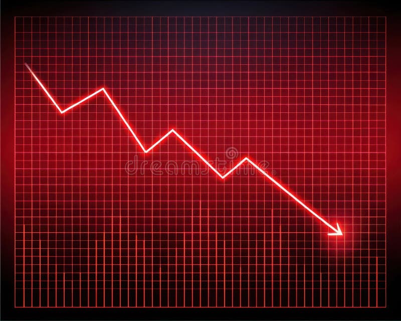
Free with trial A bright red line graph with a steep downward trend is displayed on a glowing red grid against a dark background. Trend decrease illustrations Bright Red Digital Line Graph Showing Steep Decline on Grid image. A bright red line graph with a steep downward trend is displayed on a glowing red grid against a dark background
Free with trial Hand drawn bar chart illustrating a downward trend with a large arrow. Trend decrease vectors Hand drawn bar chart illustrating a downward trend with a large arrow
Free with trial A bar graph with a red line showing a downward trend, indicating a consistent decrease in values over time. Trend decrease illustrations Graph illustrating a steady decline in data over a period of time. A bar graph with a red line showing a downward trend, indicating a consistent decrease in values over time
Free with trial A growth chart with a star signifies progress. It shows upward trends, success, and achievement in business or personal development, indicating positive results. Trend decrease vectors Vector art of growth chart with star, representing progress, success, achievement, and upward trend in business or personal. A growth chart with a star signifies progress. It shows upward trends, success, and achievement in business or personal development, indicating positive results
Free with trial The image depicts a small yellow figure standing on a green circular platform. Above the figure, there are multiple red arrows pointing downwards, suggesting a downward trend or pressure. Trend decrease illustrations Yellow figure standing under red downward arrows on green platform. The image depicts a small yellow figure standing on a green circular platform. Above the figure, there are multiple red arrows pointing downwards, suggesting a downward trend or pressure
Free with trial The image illustrates a descending trend using a series of progressively shorter vertical bars. A bold red downward-sloping arrow emphasizes the decline, suggesting a significant drop in values or performance over time. This visual metaphor is often used in business, finance, and analytics to depict negative growth or reduction. Trend decrease illustrations Decline in performance represented by bar chart and downward arrow. The image illustrates a descending trend using a series of progressively shorter vertical bars. A bold red downward-sloping arrow emphasizes the decline, suggesting a significant drop in values or performance over time. This visual metaphor is often used in business, finance, and analytics to depict negative growth or reduction