Free with trial A detailed close-up of a digital trading screen displaying a bearish stock market trend. The focus is on a white candlestick chart showing a significant price decline, representing financial crisis, recession, or investment loss. The background features other graphs and fluctuating data on a modern blue interface. This image is ideal for concepts related to finance, economics, stock exchange, forex trading, data analysis, risk management, and the global economy, visualizing market volatility and downturns. Trend decrease illustrations Bearish Stock Market Chart on Digital Display. A detailed close-up of a digital trading screen displaying a bearish stock market trend. The focus is on a white candlestick chart showing a significant price decline, representing financial crisis, recession, or investment loss. The background features other graphs and fluctuating data on a modern blue interface. This image is ideal for concepts related to finance, economics, stock exchange, forex trading, data analysis, risk management, and the global economy, visualizing market volatility and downturns.
Free with trial Red arrow going down stock icon on white background. Bankruptcy, financial market crash icon for your web site design, logo, app, UI. graph chart down trend symbol. chart going down sign. Trend decrease vectors Red arrow going down stock icon on white background. Bankruptcy, financial market crash icon for your web site design
Free with trial A bright green 3D arrow icon is depicted against a clean white background. The arrow is stylized with a thick outline and a slightly angled perspective, clearly indicating a downward direction. The object casts a subtle shadow, adding depth and dimension to the graphic. Trend decrease illustrations 3D Green Arrow Icon Pointing Downward on White Background direction symbol. A bright green 3D arrow icon is depicted against a clean white background. The arrow is stylized with a thick outline and a slightly angled perspective, clearly indicating a downward direction. The object casts a subtle shadow, adding depth and dimension to the graphic
Free with trial A minimalist, flat design illustration featuring a simple line graph. The graph has a blue, curved line representing data that initially dips and then rises, with a prominent blue dot marking a key point. It is presented against a clean white background with a black coordinate system, including axes labeled with 'x' and tick marks. This graphic is ideal for representing concepts related to data analysis, growth, trends, statistics, and mathematical functions. Trend decrease vectors Abstract Graph Curve with Axes and Data Point. A minimalist, flat design illustration featuring a simple line graph. The graph has a blue, curved line representing data that initially dips and then rises, with a prominent blue dot marking a key point. It is presented against a clean white background with a black coordinate system, including axes labeled with 'x' and tick marks. This graphic is ideal for representing concepts related to data analysis, growth, trends, statistics, and mathematical functions.
Free with trial A computer screen displaying a stock market graph with red and green bars. the graph shows the stock's performance over time, with the x-axis representing time and the y-axis representing price. the red and green bars indicate the stock's price movements, with red indicating a decrease in price and green indicating an increase. the graph also includes several lines that represent different moving. This image was generated using artificial intelligence. Trend decrease illustrations A computer screen displaying a stock market graph with red and green bars
Free with trial Business decline icon with downward arrow. Loss, failure, or economic crisis symbol vector. Trend decrease vectors Business decline icon with downward arrow. Loss, failure, or economic crisis symbol
Free with trial A hand holds a nearly empty brown leather wallet against a blurred background of a sharply falling red stock market graph. The image powerfully symbolizes financial loss, economic downturn, recession, and the impact of market volatility on personal finances. Ideal for illustrating articles, reports, or presentations on financial hardship, investment risks, and economic instability. Trend decrease illustrations Empty Wallet and Falling Stock Market Graph. A hand holds a nearly empty brown leather wallet against a blurred background of a sharply falling red stock market graph. The image powerfully symbolizes financial loss, economic downturn, recession, and the impact of market volatility on personal finances. Ideal for illustrating articles, reports, or presentations on financial hardship, investment risks, and economic instability.
Free with trial A clean, modern abstract design featuring layered geometric shapes that form a stylized downward-pointing arrow or chevron. The shapes are rendered in soft, gradient-like transitions of light green and turquoise blue, creating a sense of depth and flow. The background is a crisp white, emphasizing the vibrant colors and smooth curves of the design. This graphic is ideal for representing concepts like progress, decline, download, direction, or technology. Trend decrease vectors Abstract Geometric Layers - Downward Arrow Shape. A clean, modern abstract design featuring layered geometric shapes that form a stylized downward-pointing arrow or chevron. The shapes are rendered in soft, gradient-like transitions of light green and turquoise blue, creating a sense of depth and flow. The background is a crisp white, emphasizing the vibrant colors and smooth curves of the design. This graphic is ideal for representing concepts like progress, decline, download, direction, or technology.
Free with trial Black oil barrel with sharp red downward arrow, symbolizing declining oil prices, market downturn, economic losses, and energy sector instability. Generative AI. Trend decrease illustrations Falling Oil Prices With Barrel And Downward Arrow. Black oil barrel with sharp red downward arrow, symbolizing declining oil prices, market downturn, economic losses, and energy sector instability. Generative AI
Free with trial A 3D rendered image displays a collection of business charts on a document. A colorful pie chart with six segments sits to the left of a bar graph with five vertical bars of varying heights and colors. A line graph with multiple colored lines is visible on the document below. The composition is set against a white background. Trend decrease illustrations 3D Rendered Pie Chart Bar Graph and Line Graph on a Document data statistics. A 3D rendered image displays a collection of business charts on a document. A colorful pie chart with six segments sits to the left of a bar graph with five vertical bars of varying heights and colors. A line graph with multiple colored lines is visible on the document below. The composition is set against a white background
Free with trial A simple flat icon vector illustration of two hands adjusting a simple chart with a downturn arrow, symbolizing risk mitigation in a business setting. The simple chart with a downturn arrow is orange with dark gray elements, indicating loss control. White background. Minimalist style with sharp edges and no shadows. Orange and Gray color palette. Vector graphics with rounded corners. High. Trend decrease illustrations Hands Protect Financial Growth Chart Decline, Business Crisis Management. A simple flat icon vector illustration of two hands adjusting a simple chart with a downturn arrow, symbolizing risk mitigation in a business setting. The simple chart with a downturn arrow is orange with dark gray elements, indicating loss control. White background. Minimalist style with sharp edges and no shadows. Orange and Gray color palette. Vector graphics with rounded corners. High
Free with trial Modern vector design of blue downward arrows creating a descending pattern, minimalist and stylish. Trend decrease illustrations Downward arrows forming a descending sequence. Modern vector design of blue downward arrows creating a descending pattern, minimalist and stylish
Free with trial A creative visual representation of the impact of tax increases on savings, featuring a hand holding a 'TAX' block above stacks of coins with percentage blocks, a jar of coins, and a house model in the background. Trend decrease illustrations Tax Increase Concept with Coins and House Model. A creative visual representation of the impact of tax increases on savings, featuring a hand holding a 'TAX' block above stacks of coins with percentage blocks, a jar of coins, and a house model in the background.
Free with trial A stark red arrow points sharply downwards, crossing over a series of stacked white cylindrical objects resembling coins or bars. The stacked objects are arranged in a bar graph formation, with the arrow's path indicating a significant decline. The entire composition is set against a clean white background. Trend decrease illustrations Red Downward Arrow Graphing Over Stacked White Coins on White Background chart. A stark red arrow points sharply downwards, crossing over a series of stacked white cylindrical objects resembling coins or bars. The stacked objects are arranged in a bar graph formation, with the arrow's path indicating a significant decline. The entire composition is set against a clean white background
Free with trial Red downward arrow with percentage symbol next to green house icon with euro sign. Symbolizing decreasing interest rates or property prices. Trend decrease vectors Red arrow pointing down with percentage symbol. Red downward arrow with percentage symbol next to green house icon with euro sign. Symbolizing decreasing interest rates or property prices
Free with trial Financial graph showing growth of investment coins followed by sharp downward red arrow indicating economic loss and bankruptcy crisis. Trend decrease vectors Rising stacks of gold coins illustrating profit decline and market crash. Financial graph showing growth of investment coins followed by sharp downward red arrow indicating economic loss and bankruptcy crisis
Free with trial A bright green, three-dimensional arrow with a glossy finish, indicating a downward direction. Isolated on a white background. Generative AI. Trend decrease illustrations Shiny Green 3D Arrow Symbol Pointing Downwards. A bright green, three-dimensional arrow with a glossy finish, indicating a downward direction. Isolated on a white background. Generative AI
Free with trial A hand in a suit jacket uses a needle to pop a soap bubble containing binary code against a blurred stock market background. AI-generated. Trend decrease illustrations Hand popping a digital data bubble with needle. A hand in a suit jacket uses a needle to pop a soap bubble containing binary code against a blurred stock market background. AI-generated
Free with trial A bold red zigzag arrow points downwards, signifying a significant drop. Trend decrease illustrations Sharp red zigzag arrow symbolizing financial decline and market downturn. A bold red zigzag arrow points downwards, signifying a significant drop
Free with trial This visually compelling chart illustrates a significant reduction in carbon dioxide emissions over time, showcasing a -45% decrease, emphasizing the importance of environmental sustainability and progress. Trend decrease illustrations Chart Showing Significant Reduction in Carbon Dioxide Emissions Over Time with Green Design. This visually compelling chart illustrates a significant reduction in carbon dioxide emissions over time, showcasing a -45% decrease, emphasizing the importance of environmental sustainability and progress
Free with trial A flat-style illustration depicting a falling bar graph, combined with a sad face emoji and recovery arrow for financial analysis. Trend decrease vectors Decreasing bar graph with sad face emoji and upwards arrow showing potential recovery. A flat-style illustration depicting a falling bar graph, combined with a sad face emoji and recovery arrow for financial analysis.
Free with trial A stylized illustration depicts a downward trending graph alongside a factory and a person moving away, suggesting economic hardship and relocation, suitable for business reports and financial visuals. Trend decrease vectors Economic decline graph with factory and person. A stylized illustration depicts a downward trending graph alongside a factory and a person moving away, suggesting economic hardship and relocation, suitable for business reports and financial visuals
Free with trial A striking 3D image depicting a shopping cart overwhelmed by falling cardboard boxes, symbolizing a downturn in sales and economic decline. Ideal for finance, business, and market concepts. Trend decrease illustrations Business Decline, Economic Downturn, Sales Decrease. A striking 3D image depicting a shopping cart overwhelmed by falling cardboard boxes, symbolizing a downturn in sales and economic decline. Ideal for finance, business, and market concepts
Free with trial A clean vector illustration of a descending bar graph, symbolizing a period of financial decline, economic recession, or poor business performance. Trend decrease vectors Descending Bar Chart Showing Financial Decline. A clean vector illustration of a descending bar graph, symbolizing a period of financial decline, economic recession, or poor business performance
Free with trial A visual representation of the indian economy facing a downturn, indicated by a falling graph and the rupee symbol, set against a dark background, highlighting the financial crisis and economic challenges. Trend decrease illustrations Indian economy crisis concept with falling graph and rupee symbol on dark background illustration design. a visual representation of the indian economy facing a downturn, indicated by a falling graph and the rupee symbol, set against a dark background, highlighting the financial crisis and economic challenges.
Free with trial This image depicts a graph with fluctuating data trends over time, represented by both a line chart and bar chart. Trend decrease illustrations Graph showing fluctuating data trends over time. This image depicts a graph with fluctuating data trends over time, represented by both a line chart and bar chart
Free with trial Upward arrows with different heights on blue wooden background. Business cycle, strategic planning, new opportunities concepts. Trend decrease illustrations Upward arrows with different heights on blue wooden background
Free with trial Illustration shows a stock market decline with candlestick charts and downward trending arrow. The design features a light blue background and a simple layout. Useful for financial articles, reports, or any material illustrating loss, recession, or negative trends in commercial sector. Trend decrease illustrations Falling stock market chart showing economic downturn and financial loss. Illustration shows a stock market decline with candlestick charts and downward trending arrow. The design features a light blue background and a simple layout. Useful for financial articles, reports, or any material illustrating loss, recession, or negative trends in commercial sector
Free with trial Collection of eight minimalist line icons representing various types of data visualization, including bar charts, line graphs, pie charts, and progress indicators. Ideal for websites, apps, or presentations needing a clean and modern aesthetic. Trend decrease illustrations Data Visualization Icons. Collection of eight minimalist line icons representing various types of data visualization, including bar charts, line graphs, pie charts, and progress indicators. Ideal for websites, apps, or presentations needing a clean and modern aesthetic.
Free with trial Set of twelve linear icons representing various business and financial concepts. These include documents, briefcase, graphs, charts, and more. Ideal for presentations, websites, or app design. Trend decrease vectors Collection of Business and Finance Line Icons. Set of twelve linear icons representing various business and financial concepts. These include documents, briefcase, graphs, charts, and more. Ideal for presentations, websites, or app design.
Free with trial Steeply falling graph dark background dramatic drop crisis fall Perfect for blogs, articles, and online content. Trend decrease illustrations Steeply falling graph, dark background, dramatic drop, crisis, fall. Steeply falling graph dark background dramatic drop crisis fall Perfect for blogs, articles, and online content
Free with trial Set of twenty different business and finance icons, perfect for presentations, websites, and applications. These simple yet effective line icons represent key concepts in the business world. Trend decrease vectors Collection of Business and Finance Line Icons. Set of twenty different business and finance icons, perfect for presentations, websites, and applications. These simple yet effective line icons represent key concepts in the business world.
Free with trial Flat vector illustration depicting a person adjusting a down-trending graph, representing economic decline or market downturn in a stylized way. Trend decrease illustrations Declining Market Flat Illustration with Person and Arrow Indicating Downturn Economy. Flat vector illustration depicting a person adjusting a down-trending graph, representing economic decline or market downturn in a stylized way.
Free with trial Three blue bars decreasing in height with a red downward zigzag arrow on the right side. Trend decrease illustrations Declining bar chart with downward arrow graphic. Three blue bars decreasing in height with a red downward zigzag arrow on the right side
Free with trial Hand is pointing towards a descending bar chart with bars in shades of red, orange, and yellow on a white background. Trend decrease illustrations The hand points to the bar chart showing a downtrend. hand is pointing towards a descending bar chart with bars in shades of red, orange, and yellow on a white background.
Free with trial Finger Pressing Red Down Arrow Market Indicator. Trend decrease illustrations Finger Pressing Red Down Arrow Market Indicator
Free with trial A 3D visualization of financial data, featuring a colorful pie chart and a series of bar graphs placed on top of a financial report document. The document also includes line graphs, illustrating various data trends and analyses. The composition is set against a white background. Trend decrease illustrations 3D Bar Chart and Pie Chart on Financial Report with Line Graphs data statistics. A 3D visualization of financial data, featuring a colorful pie chart and a series of bar graphs placed on top of a financial report document. The document also includes line graphs, illustrating various data trends and analyses. The composition is set against a white background
Free with trial A simple, clean graphic featuring a bright green arrow pointing upwards and a vibrant red arrow pointing downwards, positioned side-by-side against a stark white background. This iconic representation symbolizes opposing directions, choices, growth and decline, or contrasting concepts. The clear, bold design makes it highly versatile for use in presentations, infographics, web design, and educational materials. Trend decrease vectors Green Up Arrow and Red Down Arrow on White Background. A simple, clean graphic featuring a bright green arrow pointing upwards and a vibrant red arrow pointing downwards, positioned side-by-side against a stark white background. This iconic representation symbolizes opposing directions, choices, growth and decline, or contrasting concepts. The clear, bold design makes it highly versatile for use in presentations, infographics, web design, and educational materials.
Free with trial This high-quality graphic features a bold, vibrant red arrow oriented in a diagonal downward direction. The design is minimalist and clean, utilizing a solid color fill with a subtle drop shadow to create a sense of depth and dimension. It is isolated against a stark white background, making it ideal for use in professional presentations, digital interfaces, or instructional materials. Trend decrease vectors A bright red arrow pointing diagonally downward on a clean white background. This high-quality graphic features a bold, vibrant red arrow oriented in a diagonal downward direction. The design is minimalist and clean, utilizing a solid color fill with a subtle drop shadow to create a sense of depth and dimension. It is isolated against a stark white background, making it ideal for use in professional presentations, digital interfaces, or instructional materials
Free with trial A colorful permanent weight loss chart illustrating phases, plateaus, and breakthroughs. Trend decrease illustrations A colorful permanent weight loss chart illustrating phases, plateaus, and breakthroughs
Free with trial This image showcases twelve diverse data visualization icons, including bar charts, pie charts, line graphs, and other visual representations of data. These icons are ideal for presentations, reports, or digital interfaces needing a modern and aesthetically pleasing design. The color palette is co. Trend decrease illustrations Data Visualization Icons
Free with trial This image contains a collection of 16 line icons representing various data visualization and time-related concepts. The icons are circular and use a consistent color scheme, making them suitable for use in presentations, reports, or websites. The style is clean and modern. Trend decrease illustrations Data Visualization Icons. This image contains a collection of 16 line icons representing various data visualization and time-related concepts. The icons are circular and use a consistent color scheme, making them suitable for use in presentations, reports, or websites. The style is clean and modern.
Free with trial Illustration of a growing budget efficiency with a simple money bag closing tightly, a stylized downward-pointing cost arrow, and a stream of saved coins. Vector flat icon design on a white background for a cost control illustration --chaos 30 --ar 16:9 --v 7 Job ID: 35adf769-e45b-43cf-a8e7-0b2af69479b3. Trend decrease illustrations Money Bag Downward Arrow, Financial Crisis, Economic Downturn, Falling Value. Illustration of a growing budget efficiency with a simple money bag closing tightly, a stylized downward-pointing cost arrow, and a stream of saved coins. Vector flat icon design on a white background for a cost control illustration --chaos 30 --ar 16:9 --v 7 Job ID: 35adf769-e45b-43cf-a8e7-0b2af69479b3
Free with trial A colorful chart illustrating energy consumption trends during the spring months of March, April, and May. The chart features a decreasing line graph with floral accents, representing a decline in energy use. Ideal for illustrating sustainability, environmental reports, or seasonal trends. Trend decrease illustrations Energy Consumption Chart Spring Months Flowers. A colorful chart illustrating energy consumption trends during the spring months of March, April, and May. The chart features a decreasing line graph with floral accents, representing a decline in energy use. Ideal for illustrating sustainability, environmental reports, or seasonal trends
Free with trial A set of twelve colorful icons representing various data visualization methods, including bar charts, pie charts, line graphs, and other visual representations of data analysis. Perfect for presentations, reports, and websites needing clear data insights. Trend decrease illustrations Data Visualization Icons. A set of twelve colorful icons representing various data visualization methods, including bar charts, pie charts, line graphs, and other visual representations of data analysis. Perfect for presentations, reports, and websites needing clear data insights.
Free with trial Set of 16 line icons representing various types of charts, graphs, clocks, and data-related symbols. Perfect for business presentations, reports, or website design. Clean and modern style. Trend decrease illustrations Data Visualization Icons. Set of 16 line icons representing various types of charts, graphs, clocks, and data-related symbols. Perfect for business presentations, reports, or website design. Clean and modern style.
Free with trial Red percentage symbol and downward arrow with graph line, minimalist style, white background, concept of decline or economic drop. 3D Rendering. Trend decrease illustrations Red percentage symbol with downward arrow and graph line on white background. 3D Rendering. Red percentage symbol and downward arrow with graph line, minimalist style, white background, concept of decline or economic drop. 3D Rendering
Free with trial Illustration of a business deal cycle with a handshake, declining graph, and circular arrows, symbolizing downturns and continuous processes. Trend decrease illustrations Business Deal Decline Handshake Downward Graph. Illustration of a business deal cycle with a handshake, declining graph, and circular arrows, symbolizing downturns and continuous processes
Free with trial A blue arrow pointing upwards next to a bar graph, some bars are broken, symbolizing growth and decline in a business or market. Trend decrease illustrations Blue Arrow and Bar Graph Showing Growth and Decline. A blue arrow pointing upwards next to a bar graph, some bars are broken, symbolizing growth and decline in a business or market
Free with trial This graphic features a bold yellow arrow pointing downwards against a clean background. The word costs is printed in a simple black sans-serif font across the center of the arrow. The design uses a flat aesthetic with a subtle drop shadow to create a sense of depth and visual clarity. It serves as a clear conceptual representation of financial reduction or economic trends. Trend decrease vectors A bright yellow downward pointing arrow with the word costs written on it. This graphic features a bold yellow arrow pointing downwards against a clean background. The word costs is printed in a simple black sans-serif font across the center of the arrow. The design uses a flat aesthetic with a subtle drop shadow to create a sense of depth and visual clarity. It serves as a clear conceptual representation of financial reduction or economic trends
Free with trial Hands Holding Tablet with Declining Graph and Alerts, Financial Risk Concept, illustration. Trend decrease illustrations Hands Holding Tablet with Declining Graph and Alerts, Financial Risk Concept
Free with trial Red arrow going down stock icon on white background. Bankruptcy, financial market crash icon for your web site design, logo, app, UI. graph chart down trend symbol. chart going down sign. Trend decrease vectors Red arrow going down stock icon on white background. Bankruptcy, financial market crash icon for your web site design. Red arrow going down stock icon on white background. Bankruptcy, financial market crash icon for your web site design, logo, app, UI. graph chart down trend symbol.chart going down sign.
Free with trial A green upward arrow and a red downward arrow on a white background, often used to represent growth versus decline, or positive versus negative trends in business, finance, or stock market concepts. Trend decrease illustrations Green up arrow and red down arrow on white background. A green upward arrow and a red downward arrow on a white background, often used to represent growth versus decline, or positive versus negative trends in business, finance, or stock market concepts.
Free with trial Illustration showing the decrease in blood pressure after regular exercise. A person exercising with dumbbells is depicted before and after a workout routine, with a graph illustrating the downward trend in blood pressure over time. Trend decrease illustrations Blood Pressure Reduction After Regular Exercise. Illustration showing the decrease in blood pressure after regular exercise. A person exercising with dumbbells is depicted before and after a workout routine, with a graph illustrating the downward trend in blood pressure over time
Free with trial Financial market downturn and global economic crisis. businessman holding falling red stock charts, symbolizing crisis, investment loss, inflation impact, and bearish trend across world economy. Trend decrease illustrations Financial market downturn and global economic crisis. businessman holding falling red stock charts, symbolizing crisis, investment
Free with trial An abstract graphic featuring a series of vertical bars with rounded tops, arranged in varying heights along a horizontal base. The bars display a smooth gradient color transition, starting with blue on the left and shifting to purple and pink on the right. Set against a clean white background, this modern and minimalist design evokes concepts of data visualization, statistical analysis, or an audio equalizer. It's ideal for illustrating growth, progress, or comparative data in presentations, infographics, web design, or technology-related content. Trend decrease vectors Abstract Gradient Bar Chart or Equalizer Graphic. An abstract graphic featuring a series of vertical bars with rounded tops, arranged in varying heights along a horizontal base. The bars display a smooth gradient color transition, starting with blue on the left and shifting to purple and pink on the right. Set against a clean white background, this modern and minimalist design evokes concepts of data visualization, statistical analysis, or an audio equalizer. It's ideal for illustrating growth, progress, or comparative data in presentations, infographics, web design, or technology-related content.
Free with trial The image displays a three-dimensional, red percentage symbol (% sign) prominently centered against a white background, giving it a striking and modern appearance. Trend decrease illustrations Bold red percentage symbol on a plain background. The image displays a three-dimensional, red percentage symbol (% sign) prominently centered against a white background, giving it a striking and modern appearance
Free with trial Geometric design featuring four overlapping downward arrows with a gradient transitioning from yellow at the top to red at the bottom. Each arrow is uniformly shaped, forming a V with pointed edges and a clean finish. The arrows are symmetrically aligned and progressively change color from top to bottom, creating a smooth visual flow. Set against a plain white background, enhancing the gradient effect and geometric precision. Trend decrease vectors Geometric arrow downward gradient design element. Geometric design featuring four overlapping downward arrows with a gradient transitioning from yellow at the top to red at the bottom. Each arrow is uniformly shaped, forming a V with pointed edges and a clean finish. The arrows are symmetrically aligned and progressively change color from top to bottom, creating a smooth visual flow. Set against a plain white background, enhancing the gradient effect and geometric precision.
Free with trial This graphic features a dynamic composition of overlapping line charts and arrows representing fluctuating economic data. Vibrant green and red lines indicate upward and downward trends, while blue nodes highlight specific data points. A stylized building icon and currency symbol are integrated into the design to signify banking and monetary concepts. The clean, flat aesthetic provides a clear. Trend decrease vectors A colorful illustration showing financial growth and market decline trends. This graphic features a dynamic composition of overlapping line charts and arrows. This graphic features a dynamic composition of overlapping line charts and arrows representing fluctuating economic data. Vibrant green and red lines indicate upward and downward trends, while blue nodes highlight specific data points. A stylized building icon and currency symbol are integrated into the design to signify banking and monetary concepts. The clean, flat aesthetic provides a clear
Free with trial A smartphone screen showcases a modern fintech application featuring a blue and white interface with a declining stock market chart in the top left corner, accompanied by various performance graphs and analytical tools including a portfolio dashboard with spending insights, pie charts, and bar graphs illustrating investment distributions, all designed for comprehensive financial data analysis and. Trend decrease illustrations Mobile phone screen displaying fintech app with stock market charts and financial dashboard analytics. A smartphone screen showcases a modern fintech application featuring a blue and white interface with a declining stock market chart in the top left corner, accompanied by various performance graphs and analytical tools including a portfolio dashboard with spending insights, pie charts, and bar graphs illustrating investment distributions, all designed for comprehensive financial data analysis and
Free with trial Two distinct, layered arrow shapes are positioned against a white background. One arrow points upwards, composed of multiple grey and white layers, while the other points downwards, similarly constructed. These abstract geometric forms represent concepts of direction, change, progress, and decline. Trend decrease illustrations Two Layered Arrow Shapes Pointing Up and Down on a White Background arrows up arrow. Two distinct, layered arrow shapes are positioned against a white background. One arrow points upwards, composed of multiple grey and white layers, while the other points downwards, similarly constructed. These abstract geometric forms represent concepts of direction, change, progress, and decline
Free with trial Stacks of coins decrease in height from left to right, with a red arrow indicating a downward trend, symbolizing financial loss or recession. Trend decrease illustrations Financial decline illustrated by falling coin stacks and red arrow. Stacks of coins decrease in height from left to right, with a red arrow indicating a downward trend, symbolizing financial loss or recession
Free with trial A visual representation of financial downturn, showing decreasing stacks of coins and a prominent red downward trending arrow. Trend decrease illustrations Financial decline illustrated by falling coin stacks and red arrow. A visual representation of financial downturn, showing decreasing stacks of coins and a prominent red downward trending arrow
Free with trial Bar chart with downward arrow icon vector. Financial crisis concept. Economy downturn and loss symbol in black circle. Trend decrease vectors Bar chart with downward arrow icon. Financial crisis concept. Economy downturn and loss symbol in black circle
Free with trial A shiny, transparent blue glass arrow curves downwards, pointing towards the bottom right of the frame. The arrow has a smooth, reflective surface and is rendered in 3D. It is presented on a clean white background, casting a subtle shadow. Trend decrease illustrations Blue Glass Arrow Symbol Pointing Downward on White Background transparent. A shiny, transparent blue glass arrow curves downwards, pointing towards the bottom right of the frame. The arrow has a smooth, reflective surface and is rendered in 3D. It is presented on a clean white background, casting a subtle shadow
Free with trial Close-up of a hand using stylus on tablet showing quality improvement and cost increase graph comparison. Trend decrease illustrations Hand pointing at quality vs cost graph on tablet. Close-up of a hand using stylus on tablet showing quality improvement and cost increase graph comparison
Free with trial Cost versus quality optimization concept with business professional analyzing charts by increasing quality while reducing cost representing efficiency, performance improvement, cost management. Trend decrease illustrations Cost versus quality optimization concept with business professional analyzing charts by increasing quality while reducing cost
Free with trial Worn oil barrel with red downward graph and spill, symbolizing falling oil prices, market decline, financial losses, and energy sector instability. Generative AI. Trend decrease illustrations Oil Barrel With Falling Price Graph Economic Decline. Worn oil barrel with red downward graph and spill, symbolizing falling oil prices, market decline, financial losses, and energy sector instability. Generative AI
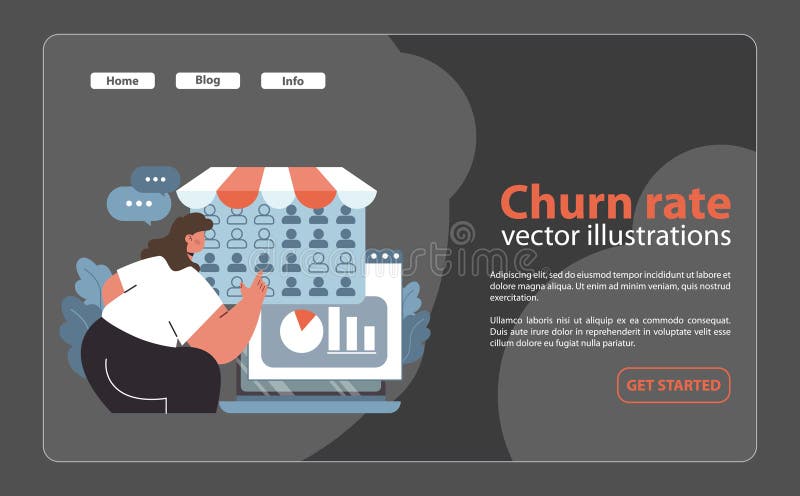
Free with trial Churn rate analytics concept. Woman studying customer retention metrics on a computer screen. Business analysis, graph visualization, and feedback tracking. Flat vector illustration. Trend decrease vectors Churn rate analytics concept. Flat. Churn rate analytics concept. Woman studying customer retention metrics on a computer screen. Business analysis, graph visualization, and feedback tracking. Flat vector illustration
Free with trial A simple yet effective visualization showing data via a pie chart and bar graph Ideal for presentations and reports. Trend decrease illustrations Colorful Pie Chart and Bar Graph Data Visualization. A simple yet effective visualization showing data via a pie chart and bar graph Ideal for presentations and reports
Free with trial A striking 3D rendered red arrow pointing downwards, with a percentage symbol integrated into its design. The arrow is sharp and glossy, casting a subtle shadow on the clean white background. This graphic visually represents concepts such as price reduction, sales, economic decline, or negative financial trends. Trend decrease illustrations Red 3D Percentage Symbol Arrow Pointing Downward on a White Background down arrow. A striking 3D rendered red arrow pointing downwards, with a percentage symbol integrated into its design. The arrow is sharp and glossy, casting a subtle shadow on the clean white background. This graphic visually represents concepts such as price reduction, sales, economic decline, or negative financial trends
Free with trial A 3D rendered image depicting a yellow coin with a white dollar sign at its center. To the left is a red circular button with a downward-pointing arrow and horizontal lines, symbolizing a decrease or loss. To the right is a green circular button with an upward-pointing arrow, representing an increase or profit. This composition visually represents financial concepts like market fluctuations,. Trend decrease illustrations 3D Rendered Yellow Coin with Dollar Sign and Red Down and Green Up Arrows dollar coin money. A 3D rendered image depicting a yellow coin with a white dollar sign at its center. To the left is a red circular button with a downward-pointing arrow and horizontal lines, symbolizing a decrease or loss. To the right is a green circular button with an upward-pointing arrow, representing an increase or profit. This composition visually represents financial concepts like market fluctuations,
Free with trial Financial candlestick charts showing stock market trading data over an abstract blurred city lights background during nighttime. Trend decrease illustrations Financial market data showing city trading analysis. Financial candlestick charts showing stock market trading data over an abstract blurred city lights background during nighttime
Free with trial Bar graph with blue arrow pointing down 3D illustration isolated on transparent background. Trend decrease illustrations Bar graph with blue arrow pointing down 3D
Free with trial A stock market crash illustration with red arrows pointing down indicating financial loss and economic downturn. a visual representation of recession and business failure on a blue grid 200. Trend decrease illustrations Stock market crash recession financial crisis chart falling down economic downturn graph business loss 100. a stock market crash illustration with red arrows pointing down indicating financial loss and economic downturn. a visual representation of recession and business failure on a blue grid 200
Free with trial An illustrative icon depicting a strong blue shield encompassing a red segment of a pie chart and a prominent white downward-pointing arrow. This visual metaphor represents financial protection, risk management, and safeguarding against economic decline or market downturns. It symbolizes strategies to mitigate losses, secure investments, and manage negative trends in business or finance. Ideal for conveying concepts of security, crisis management, and data analysis related to falling statistics or decreasing performance in corporate presentations, reports, and financial articles. Trend decrease vectors Financial Protection Against Economic Decline Icon. An illustrative icon depicting a strong blue shield encompassing a red segment of a pie chart and a prominent white downward-pointing arrow. This visual metaphor represents financial protection, risk management, and safeguarding against economic decline or market downturns. It symbolizes strategies to mitigate losses, secure investments, and manage negative trends in business or finance. Ideal for conveying concepts of security, crisis management, and data analysis related to falling statistics or decreasing performance in corporate presentations, reports, and financial articles.
Free with trial 3D illustration of the black dissolving yen - currency crash. Trend decrease illustrations Black Dissolving Yen. 3d illustration. 3D illustration of the black dissolving yen - currency crash