Free with trial Illustration shows a man facing a thick downward arrow indicating decline or loss in business or finance, creating a serious and contemplative mood. Generative AI. Analysis decrease vectors Man standing near downward arrow symbolizing decline or decrease in business or finance concepts. Illustration shows a man facing a thick downward arrow indicating decline or loss in business or finance, creating a serious and contemplative mood. Generative AI
Free with trial Three black, rounded, vertical bars of progressively increasing height are displayed against a clean white background. The bars are smooth and have a matte finish. This visual representation suggests concepts of growth, progress, data analysis, or a simple bar graph. Analysis decrease illustrations Three black rounded bars of increasing height on a white background bar chart graph. Three black, rounded, vertical bars of progressively increasing height are displayed against a clean white background. The bars are smooth and have a matte finish. This visual representation suggests concepts of growth, progress, data analysis, or a simple bar graph
Free with trial Bar chart with illuminated bars showing an upward trend, depicted against a blurred cityscape at night. Bars increase in height from left to right, symbolizing growth. The glowing blue bars stand out against the dark background, visually representing a bullish financial trend. Various structures and faint lights in the defocused cityscape add context, highlighting the analytical and financial theme. Analysis decrease illustrations Dynamic stock market chart showing bullish trend after downturn for financial analysis reports and presentations. Bar chart with illuminated bars showing an upward trend, depicted against a blurred cityscape at night. Bars increase in height from left to right, symbolizing growth. The glowing blue bars stand out against the dark background, visually representing a bullish financial trend. Various structures and faint lights in the defocused cityscape add context, highlighting the analytical and financial theme.
Free with trial A character runs while holding a significant red downward arrow, representing a decrease or decline concept clearly against a white background. Analysis decrease illustrations Character Holds Large Red Downward Arrow Symbolizing Decline on a White Background. A character runs while holding a significant red downward arrow, representing a decrease or decline concept clearly against a white background
Free with trial Person displays wooden block featuring a chart, emphasizing data visualization ,Generative ai. Analysis decrease illustrations Wooden block chart display, data visualization for business analysis and strategic planning. Person displays wooden block featuring a chart, emphasizing data visualization ,Generative ai
Free with trial Chart with a downward trend line and data points, a sad face emotion, and a pointing hand. Ideal for performance analysis, failure, problem-solving, disappointment, caution, decision-making simple. Analysis decrease vectors Hand pointing at declining data chart with a sad face icon highlighting negative performance trend. Chart with a downward trend line and data points, a sad face emotion, and a pointing hand. Ideal for performance analysis, failure, problem-solving, disappointment, caution, decision-making simple
Free with trial A woman contemplates a declining bar graph, symbolizing business challenges and financial analysis. Analysis decrease vectors Woman Analyzing Declining Bar Graph - Business and Finance Visualization Illustration. A woman contemplates a declining bar graph, symbolizing business challenges and financial analysis.
Free with trial Person holding checklist and tablet with a clock icon, next to a dollar sign and downward arrow. Ideal for financial management, time efficiency, budget planning, productivity, cost reduction. Analysis decrease illustrations Businessperson Analyzing Checklist and Tablet as Costs Decrease Indicated by Downward Dollar Arrow. Person holding checklist and tablet with a clock icon, next to a dollar sign and downward arrow. Ideal for financial management, time efficiency, budget planning, productivity, cost reduction
Free with trial A 3D rendered graph displays a downward trend. Two tall green bars are followed by two shorter pink bars, indicating a decrease in value. A thick yellow arrow with a sharp point descends diagonally across the bars, emphasizing the decline. The background is a solid, light blue color. Analysis decrease illustrations Falling graph with green and pink bars and a yellow arrow pointing down chart decline. A 3D rendered graph displays a downward trend. Two tall green bars are followed by two shorter pink bars, indicating a decrease in value. A thick yellow arrow with a sharp point descends diagonally across the bars, emphasizing the decline. The background is a solid, light blue color
Free with trial A comprehensive set of black and white icons for graphs and charts, illustrating various data visualization types and business-related concepts for digital and print media. Analysis decrease vectors Diverse collection of graph and chart icons representing data analysis and business growth. A comprehensive set of black and white icons for graphs and charts, illustrating various data visualization types and business-related concepts for digital and print media
Free with trial Blue arrow pointing downward on financial graph. Business chart showing descending trend. Digital stock market data visualization for decline analysis. Analysis decrease illustrations Blue arrow pointing downward on financial graph. Business chart showing descending trend
Free with trial A person's open palm supports a glowing digital graph illustrating a decrease in cost and an increase in quality, set against a dark background. Analysis decrease illustrations Hand holding glowing graph showing cost decreasing and quality increasing palm open. A person's open palm supports a glowing digital graph illustrating a decrease in cost and an increase in quality, set against a dark background
Free with trial A character stands isolated on a white background, holding a large red arrow pointing downward, symbolizing decline or decrease. Analysis decrease illustrations Character Holding a Large Red Downward Arrow Representing Decline on a White Background. A character stands isolated on a white background, holding a large red arrow pointing downward, symbolizing decline or decrease
Free with trial Stacks of gold coins with a falling graph line signify financial market decline and analysis This image is great for finance and investment content. Analysis decrease illustrations Analyzing Stock Market Downturn with Golden Coins and Dramatic Red Line. Stacks of gold coins with a falling graph line signify financial market decline and analysis This image is great for finance and investment content
Free with trial Stacks of gold coins with a falling graph line signify financial market decline and analysis This image is great for finance and investment content. Analysis decrease illustrations Analyzing Stock Market Downturn with Golden Coins and Dramatic Red Line. Stacks of gold coins with a falling graph line signify financial market decline and analysis This image is great for finance and investment content
Free with trial A blue line graph displays a sharp decrease in data points, isolated on a clean white background. Analysis decrease illustrations Line graph showing a steep decline in values over time isolated on white background. A blue line graph displays a sharp decrease in data points, isolated on a clean white background
Free with trial A stark pink line graph shows a dramatic downward trend against a dark green grid, symbolizing a significant loss or decrease. Analysis decrease illustrations Sharp decline illustrated by a jagged pink line graph on a dark green grid background. A stark pink line graph shows a dramatic downward trend against a dark green grid, symbolizing a significant loss or decrease
Free with trial A minimalist 3D white bar chart displays a clear downward trend. Four bars of decreasing height are shown, with a sharp white arrow pointing downwards from the top of the second bar, indicating a significant decline. The chart is presented in isolation against a clean white background, emphasizing the concept of financial or economic downturn. Analysis decrease illustrations 3D White Bar Chart with a Downward Trending Arrow Symbolizing Decline graph decrease. A minimalist 3D white bar chart displays a clear downward trend. Four bars of decreasing height are shown, with a sharp white arrow pointing downwards from the top of the second bar, indicating a significant decline. The chart is presented in isolation against a clean white background, emphasizing the concept of financial or economic downturn
Free with trial A 3D illustration depicting financial concepts. A purple rectangular bar shows a sharp red downward trending arrow. Below it, another purple bar displays a candlestick chart with red and blue bars. To the right, a magnifying glass with an orange handle and turquoise lens hovers, suggesting analysis. A small, colorful pie chart with red, yellow, and blue segments is positioned to the left. The. Analysis decrease illustrations 3D Financial Downward Trend Chart with Magnifying Glass and Pie Chart finance stock market. A 3D illustration depicting financial concepts. A purple rectangular bar shows a sharp red downward trending arrow. Below it, another purple bar displays a candlestick chart with red and blue bars. To the right, a magnifying glass with an orange handle and turquoise lens hovers, suggesting analysis. A small, colorful pie chart with red, yellow, and blue segments is positioned to the left. The
Free with trial A handwritten chart depicting a downward trend, possibly representing financial loss or a decrease in value, alongside a red light. Analysis decrease illustrations A downtrend chart drawn on a notebook with a red warning light, symbolizing financial loss. A handwritten chart depicting a downward trend, possibly representing financial loss or a decrease in value, alongside a red light
Free with trial A circular icon with a thick gold border contains a golden DNA helix symbol on a black background. To the right of the DNA helix, two jagged arrows point downwards, indicating a downward trend or decline. The overall design is sleek and symbolic, suggesting concepts related to genetic research, health trends, or scientific data analysis. Analysis decrease illustrations Golden DNA Helix Icon with Downward Trend Arrows on Black Circle with Gold Border genetics. A circular icon with a thick gold border contains a golden DNA helix symbol on a black background. To the right of the DNA helix, two jagged arrows point downwards, indicating a downward trend or decline. The overall design is sleek and symbolic, suggesting concepts related to genetic research, health trends, or scientific data analysis
Free with trial Red bar chart displays performance metrics on a table ,Generative ai. Analysis decrease illustrations Red bar chart illustrating performance metrics on a table, data analysis and visualization. Red bar chart displays performance metrics on a table ,Generative ai
Free with trial This illustration depicts upward and downward trending arrows on a grid, symbolizing market fluctuations, business trends, and financial performance analysis. Analysis decrease vectors Illustration of upward and downward trending arrows on a grid isolated on white background. This illustration depicts upward and downward trending arrows on a grid, symbolizing market fluctuations, business trends, and financial performance analysis
Free with trial A 3D rendered bar chart with yellow, pink, and teal bars stands against a light purple background. A purple magnifying glass with a yellow handle is positioned over the chart, suggesting analysis. A thin line with pink dots connects the tops of the bars, indicating a trend. Analysis decrease illustrations 3D Bar Chart with Magnifying Glass and Trend Line on Purple Background graph statistics. A 3D rendered bar chart with yellow, pink, and teal bars stands against a light purple background. A purple magnifying glass with a yellow handle is positioned over the chart, suggesting analysis. A thin line with pink dots connects the tops of the bars, indicating a trend
Free with trial Stacks of gold coins decrease in size as a red arrow points downwards over a stock market chart, indicating financial decline. Analysis decrease illustrations Stacks of gold coins decreasing in size with a red downward arrow and stock market chart red arrow. Stacks of gold coins decrease in size as a red arrow points downwards over a stock market chart, indicating financial decline
Free with trial A stylized 3D business growth chart depicted against a light blue background. The chart features a blue mountain-like shape representing a peak, with two intersecting lines. One line, marked with pink nodes, shows fluctuations, while another line with green nodes indicates a general upward trend. This visual metaphor conveys concepts of business performance, market trends, and financial analysis. Analysis decrease illustrations 3D Stylized Business Growth Chart with Red and Green Nodes on Blue Background graph data. A stylized 3D business growth chart depicted against a light blue background. The chart features a blue mountain-like shape representing a peak, with two intersecting lines. One line, marked with pink nodes, shows fluctuations, while another line with green nodes indicates a general upward trend. This visual metaphor conveys concepts of business performance, market trends, and financial analysis
Free with trial A 3D illustration depicts financial data analysis. On the left, a purple rectangular panel shows a red downward-trending arrow and a small pie chart with red, yellow, and blue segments. Below it, another purple panel displays a candlestick chart with red and blue bars. To the right, an orange magnifying glass with a turquoise lens hovers, suggesting investigation. The entire composition is set. Analysis decrease illustrations 3D Render of Financial Data Visualization with Downward Trend Graph and Magnifying Glass. A 3D illustration depicts financial data analysis. On the left, a purple rectangular panel shows a red downward-trending arrow and a small pie chart with red, yellow, and blue segments. Below it, another purple panel displays a candlestick chart with red and blue bars. To the right, an orange magnifying glass with a turquoise lens hovers, suggesting investigation. The entire composition is set
Free with trial Red background with a downward arrow and grid pattern, with vertical bars at the bottom, suggesting a decline or decrease in a metric Vertical Mobile Wallpaper. Analysis decrease illustrations Red background, downward arrow with grid pattern, vertical bars suggest decline. red background with a downward arrow and grid pattern, with vertical bars at the bottom, suggesting a decline or decrease in a metric Vertical Mobile Wallpaper
Free with trial Red background with a downward arrow and grid pattern, with vertical bars at the bottom, suggesting a decline or decrease in a metric. Analysis decrease illustrations Red background, downward arrow with grid pattern, vertical bars suggest decline. red background with a downward arrow and grid pattern, with vertical bars at the bottom, suggesting a decline or decrease in a metric
Free with trial Red textured arrows depict market fluctuations and business trends against a textured background symbolizes economic ups and downs, financial analysis, and investment opportunities with market statistics. Analysis decrease illustrations Red arrows symbolizing fluctuations representing business trends on a textured background. red textured arrows depict market fluctuations and business trends against a textured background symbolizes economic ups and downs, financial analysis, and investment opportunities with market statistics
Free with trial AI-powered trend prediction graph showing CSRpoepiojican metrics over time. Data visualization of future trends. Analysis decrease illustrations AI Trend Prediction Graph Visualization: Data Analysis of CSRpoepiojican Metrics Over Time. AI-powered trend prediction graph showing CSRpoepiojican metrics over time. Data visualization of future trends
Free with trial A vibrant red arrow points downward against a clean, solid-colored backdrop, symbolizing a decline or shift in focus. This visual representation effectively conveys motion and change. Analysis decrease illustrations Red downward arrow on a solid background indicating a decrease or direction change in trends. A vibrant red arrow points downward against a clean, solid-colored backdrop, symbolizing a decline or shift in focus. This visual representation effectively conveys motion and change.
Free with trial Three stacks of gold coins decrease in height from left to right, with a red arrow pointing downwards across them. Isolated on a transparent background. Analysis decrease vectors Stacks of gold coins with red downward trend arrow isolated on a transparent background money. Three stacks of gold coins decrease in height from left to right, with a red arrow pointing downwards across them. Isolated on a transparent background
Free with trial This image visually depicts the impact of declining currency and interest rates within an economic context. A percentage model, a fundamental tool in economic analysis, serves as the foundation. The downward-pointing arrow dramatically illustrates the negative trend, signifying a decrease in both the value of a specific currency and the interest rates associated with loans and investments. This. Analysis decrease illustrations Understanding Declining Currency and Interest Rates: A Visual Representation of Economic Trends. This image visually depicts the impact of declining currency and interest rates within an economic context. A percentage model, a fundamental tool in economic analysis, serves as the foundation. The downward-pointing arrow dramatically illustrates the negative trend, signifying a decrease in both the value of a specific currency and the interest rates associated with loans and investments. This
Free with trial This graph chart depicts a significant downward trend in the stock market, indicating a period of market decline. The red arrows clearly show the loss in value across various investment instruments. This market downturn highlights the inherent volatility of financial markets and the need for careful financial analysis. Understanding the factors driving this decline, such as economic downturns,. Analysis decrease illustrations Analyzing a Red Downward Trend Chart Stock Market Decline and Potential Investment Strategies. This graph chart depicts a significant downward trend in the stock market, indicating a period of market decline. The red arrows clearly show the loss in value across various investment instruments. This market downturn highlights the inherent volatility of financial markets and the need for careful financial analysis. Understanding the factors driving this decline, such as economic downturns,
Free with trial Concrete bar graph showing a decline with a downward arrow. Business loss and negative trend concept for financial downturn analysis. Analysis decrease illustrations Concrete bar graph showing a decline with a downward arrow. Business loss and negative trend concept
Free with trial Three stacks of gold coins decrease in height from left to right, overlaid by a red arrow pointing downwards. Isolated on a transparent background. Analysis decrease vectors Stacks of gold coins with red downward trending arrow isolated on a transparent background money. Three stacks of gold coins decrease in height from left to right, overlaid by a red arrow pointing downwards. Isolated on a transparent background
Free with trial A 3D bar chart illustrating a declining trend, perfect for business, finance, and data visualization presentations. Analysis decrease illustrations Colorful 3D bar graph showing a downward trend in business growth and financial data analysis. A 3D bar chart illustrating a declining trend, perfect for business, finance, and data visualization presentations
Free with trial This compelling red zigzag line graph vividly illustrates a downward market trend, offering a concise yet insightful representation of declining stock prices. The dynamic zigzag pattern clearly highlights fluctuations and sharp drops in the data, making it an ideal tool for visualizing market analysis and economic indicators. The falling red line graph effectively communicates the negative. Analysis decrease illustrations Analyzing a Declining Market Trend Visualizing Falling Stock Prices with a Red Zigzag Line Graph. This compelling red zigzag line graph vividly illustrates a downward market trend, offering a concise yet insightful representation of declining stock prices. The dynamic zigzag pattern clearly highlights fluctuations and sharp drops in the data, making it an ideal tool for visualizing market analysis and economic indicators. The falling red line graph effectively communicates the negative
Free with trial A character is gripping a large red arrow pointing downward, representing a decrease or decline in values, set against a clean white background. Analysis decrease illustrations Character Holding a Large Red Downward Arrow Symbolizes Decline Against a Simple White Background. A character is gripping a large red arrow pointing downward, representing a decrease or decline in values, set against a clean white background
Free with trial Vertical bar graph, bars decrease left to right, red arrow points down Vertical Mobile Wallpaper. Analysis decrease illustrations Vertical bar graph, bars decrease left to right, red arrow points down
Free with trial Vertical bar graph, bars decrease left to right, red arrow points down For Social Media Post Size. Analysis decrease illustrations Vertical bar graph, bars decrease left to right, red arrow points down
Free with trial Vertical bar graph, bars decrease left to right, red arrow points down Generative AI. Analysis decrease illustrations Vertical bar graph, bars decrease left to right, red arrow points down
Free with trial A silhouette of a man watches a stock market crash unfold on a screen, with a red chart showing a steep decline. The image conveys a sense of loss and financial crisis during an economic downturn. Analysis decrease illustrations Stock market crash analysis: investor watches falling stock prices on screen during economic downturn. A silhouette of a man watches a stock market crash unfold on a screen, with a red chart showing a steep decline. The image conveys a sense of loss and financial crisis during an economic downturn.
Free with trial A close-up, angled view of a digital stock market ticker board. The screen displays rows of numbers in vibrant red and green LED lights against a dark background. Red numbers typically indicate a price decrease or negative performance, while green signifies an increase or positive performance. The display shows various financial data, including stock prices, trading volumes, and potentially chart lines, creating a dynamic and abstract representation of financial markets and trading. Analysis decrease illustrations Stock Market Ticker Display with Red and Green Numbers. A close-up, angled view of a digital stock market ticker board. The screen displays rows of numbers in vibrant red and green LED lights against a dark background. Red numbers typically indicate a price decrease or negative performance, while green signifies an increase or positive performance. The display shows various financial data, including stock prices, trading volumes, and potentially chart lines, creating a dynamic and abstract representation of financial markets and trading.
Free with trial Orange arrow pointing downward through clouds towards earth. Global economic downturn visualization for market analysis and business decline concept. Analysis decrease illustrations Orange arrow pointing downward through clouds towards earth. Global economic downturn visualization
Free with trial A character stands alone, holding a large red arrow pointing downward, symbolizing a decline or decrease, set against a plain white backdrop. Analysis decrease illustrations Character Holding a Large Red Downward Arrow Indicating Decline on a White Background. A character stands alone, holding a large red arrow pointing downward, symbolizing a decline or decrease, set against a plain white backdrop
Free with trial Modern Robot Hands Interacting with Digital Cost Reduction Concept on Futuristic Background Representing Business Strategy and Brand Analysis Quark. Analysis decrease illustrations Modern Robot Hands Interacting with Digital Cost Reduction Concept on Futuristic Background Representing Business. Strategy and Brand Analysis Quark
Free with trial A 3D illustration depicts a large white dollar sign centered on a vibrant purple circle. Two smaller white circles are positioned on either side of the purple circle. A green upward-pointing arrow is in the top right circle, signifying growth or increase, while a red downward-pointing arrow is in the bottom left circle, indicating decline or decrease. The composition is set against a clean white. Analysis decrease illustrations 3D Dollar Sign with Up and Down Arrows Indicating Financial Growth and Decline on White Background. A 3D illustration depicts a large white dollar sign centered on a vibrant purple circle. Two smaller white circles are positioned on either side of the purple circle. A green upward-pointing arrow is in the top right circle, signifying growth or increase, while a red downward-pointing arrow is in the bottom left circle, indicating decline or decrease. The composition is set against a clean white
Free with trial Visualizes indian rupee devaluation with a falling graph over india's map, symbolizing financial crisis and economic downturn. It represents market decline and investment risk, showing currency loss. Analysis decrease illustrations Indian rupee devaluation concept with falling graph and india map for financial crisis analysis. visualizes indian rupee devaluation with a falling graph over india's map, symbolizing financial crisis and economic downturn. It represents market decline and investment risk, showing currency loss.
Free with trial A character stands isolated and holds a large red downward arrow, representing a decrease in values or metrics. Analysis decrease illustrations Character Holding a Large Red Downward Arrow Symbolizing Decline on a White Background. A character stands isolated and holds a large red downward arrow, representing a decrease in values or metrics
Free with trial A cartoon character is depicted holding a large red downward arrow, representing decrease or decline against a plain white background. Analysis decrease illustrations Character Holding a Large Red Downward Arrow Symbolizing Decline on a White Background. A cartoon character is depicted holding a large red downward arrow, representing decrease or decline against a plain white background
Free with trial This vibrant 3D bar chart illustrates upward trending data, perfect for presentations or reports on financial growth, market analysis, or business success. The colorful blocks represent different data points. Analysis decrease illustrations Colorful 3D Bar Chart Showing Business Growth and Success. This vibrant 3D bar chart illustrates upward trending data, perfect for presentations or reports on financial growth, market analysis, or business success. The colorful blocks represent different data points.
Free with trial The Bangladesh economy faces a decline, as indicated by a downward trending graph and a struggling industrial backdrop. The Bangladeshi flag sits beside the graph, symbolizing the country's economic challenges. This image conveys a sense of financial instability and uncertainty, making it suitable for illustrating economic downturns, trade issues, or market analysis. Analysis decrease illustrations Bangladesh economy decline with downward trending graph and flag. The Bangladesh economy faces a decline, as indicated by a downward trending graph and a struggling industrial backdrop. The Bangladeshi flag sits beside the graph, symbolizing the country's economic challenges. This image conveys a sense of financial instability and uncertainty, making it suitable for illustrating economic downturns, trade issues, or market analysis.
Free with trial Stock market trading technical analysis bar chart fall. Business candlestick graph exchange down trend. Crisis economy and investment loss graph. Trader financial index crash concept. Black background. Analysis decrease vectors Stock market trading technical analysis bar chart fall. Business candlestick graph exchange down trend. Crisis economy
Free with trial A digital globe displays import tariffs data points with percentage decreases in red and blue against a blurred cityscape at night. The globe is rendered in a futuristic style with glowing lines. Analysis decrease illustrations Global Import Tariffs Digital Globe Night Cityscape Data Points Percentage Decrease Red Blue image. A digital globe displays import tariffs data points with percentage decreases in red and blue against a blurred cityscape at night. The globe is rendered in a futuristic style with glowing lines
Free with trial Stock market trading technical analysis bar chart fall. Business exchange graph downtrend. Crisis economy and investment loss graph. Trader financial index crash concept. Eps banner dark background. Analysis decrease vectors Stock market trading technical analysis bar chart fall. Business exchange graph downtrend. Crisis economy and investment
Free with trial Monochrome chart representing big data analysis with peaks and valleys, stock market theme for investment strategy and economic forecast using modern digital infographic. Analysis decrease illustrations Abstract 3d graph with data blocks on white grid background, business analytics concept for financial report and corporate. Monochrome chart representing big data analysis with peaks and valleys, stock market theme for investment strategy and economic forecast using modern digital infographic
Free with trial Reduction chart icon Black line art vector in black and white outline set collection sign. Analysis decrease vectors Decline Chart Icon Illustrating Decrease in Performance, Economic Downturn, and Analytical Data. Reduction chart icon Black line art vector in black and white outline set collection sign
Free with trial Vibrant neon stock market graph showing financial data trends and analysis. Perfect for business, finance, and investment themes. Generative AI Illustration. Analysis decrease illustrations Vibrant Neon Stock Market Graph Showing Financial Data Trends and Analysis. Generative AI Illustration. Vibrant neon stock market graph showing financial data trends and analysis. Perfect for business, finance, and investment themes. Generative AI Illustration
Free with trial The image depicts a business professional in a suit interacting with a transparent digital chart displaying a declining trend in business performance. The visualization includes green bar charts and a line graph, complemented by a prominent downward arrow and percentage symbol indicating a decrease. This modern digital interface symbolizes data-driven decision-making, financial analysis, and real-time monitoring of business metrics for strategic planning. Analysis decrease illustrations Business Performance Decline Visualization with Interactive Data Analytics and Percentage Drop Indicator. The image depicts a business professional in a suit interacting with a transparent digital chart displaying a declining trend in business performance. The visualization includes green bar charts and a line graph, complemented by a prominent downward arrow and percentage symbol indicating a decrease. This modern digital interface symbolizes data-driven decision-making, financial analysis, and real-time monitoring of business metrics for strategic planning.
Free with trial Financial chart illustration. Declining graphic concept. Red arrow decrease Vector. Business diagram symbol. EPS 10. Analysis decrease vectors Financial chart illustration. Declining graphic concept. Red arrow decrease Vector. Business diagram symbol.
Free with trial This sales graph clearly illustrates a concerning downward trend. The visualization displays a significant decline in sales figures over a specified period, potentially indicating a market downturn or other factors impacting business performance. Careful analysis of this data is crucial for understanding the underlying causes. Are sales decreasing across all product lines or specific segments. Analysis decrease illustrations Analyzing Declining Sales Trends A Deep Dive into Market Performance and Potential Recovery Strategies. This sales graph clearly illustrates a concerning downward trend. The visualization displays a significant decline in sales figures over a specified period, potentially indicating a market downturn or other factors impacting business performance. Careful analysis of this data is crucial for understanding the underlying causes. Are sales decreasing across all product lines or specific segments
Free with trial This comprehensive analysis explores the current downturn in the housing market, examining the factors driving falling house prices. We delve into the interconnectedness of real estate trends with broader economic indicators, including interest rates, inflation, and potential recessionary periods. The report visually depicts the negative trajectory of property values, highlighting the. Analysis decrease illustrations Falling House Prices Analyzing Market Trends Impacts and Economic Forecasts for the Real Estate Sector. This comprehensive analysis explores the current downturn in the housing market, examining the factors driving falling house prices. We delve into the interconnectedness of real estate trends with broader economic indicators, including interest rates, inflation, and potential recessionary periods. The report visually depicts the negative trajectory of property values, highlighting the
Free with trial Two sets of three dimensional bar charts. One set shows ascending bars in light colors, shows bars in yellow, beige with decreasing trend. Visual representation aids in data analysis. Analysis decrease illustrations Two sets of three dimensional bar charts. One set shows ascending bars in light colors, shows bars in yellow, beige with
Free with trial This image features six black bar chart icons with red and green arrows showing increase, decrease, and uncertainty trends. It is a clear, simple vector for business or data visuals, informative and clean. Generative AI. Analysis decrease vectors Set of six vector bar chart icons with arrows indicating trends and question mark in black and colored design elements. This image features six black bar chart icons with red and green arrows showing increase, decrease, and uncertainty trends. It is a clear, simple vector for business or data visuals, informative and clean. Generative AI
Free with trial Bar Chart With Downward Arrow Solid Icon. Economic Decline, Financial Loss, And Market Downturn Silhouette Symbol. Business Analysis. Isolated Vector Illustration. Analysis decrease vectors Bar Chart With Downward Arrow Solid Icon. Economic Decline, Financial Loss, And Market Downturn Silhouette Symbol
Free with trial Illustrating a financial downturn with descending blocks. The image conveys a sense of economic decline, investment risk, and potential market instability. A visual representation of financial loss. Analysis decrease illustrations Stock market decline concept showing decrease in value and investment risk with downward trend diagram. Illustrating a financial downturn with descending blocks. The image conveys a sense of economic decline, investment risk, and potential market instability. A visual representation of financial loss.
Free with trial An image showing a downward trending chart with a hand pointing to the decline, symbolizing financial loss, economic downturn, and a stock market crash. It represents business recession and investment risk. Analysis decrease illustrations Stock market crash financial crisis business recession economic downturn investment loss chart analysis. an image showing a downward trending chart with a hand pointing to the decline, symbolizing financial loss, economic downturn, and a stock market crash. It represents business recession and investment risk.
Free with trial Flaming red arrow pointing down on an earth globe. Global financial crisis, market crash, or economic downturn. World economy analysis. Analysis decrease illustrations Flaming red arrow pointing down on an earth globe. Global financial crisis, market crash, or economic downturn
Free with trial Declining Bar Chart With Downward Arrow Icon. Economic Downturn, Financial Loss, And Market Decline Outline Symbol. Business Analysis And Risk Assessment. Editable Stroke. Isolated Vector Illustration. Analysis decrease vectors Declining Bar Chart With Downward Arrow Icon. Economic Downturn, Financial Loss, And Market Decline Outline Symbol
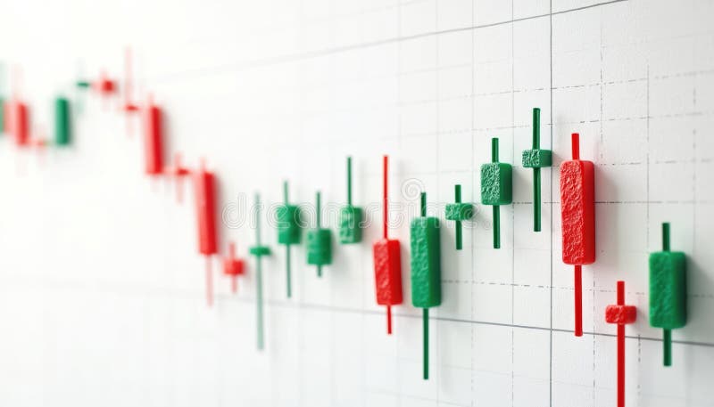
Free with trial Candlestick chart shows stock market fluctuations. Green candles show price increase, red candles pointing price decrease. Financial diagram of investment chart shows up down trends. Analysis decrease illustrations Candlestick chart shows stock market fluctuations. Green candles show price increase, red candles pointing price decrease.
Free with trial Abstract bar graph chart background representing stock market trade growth and financial investment success ideal for business analysis economic data visualization and corporate finance concept designs. Analysis decrease illustrations Abstract bar graph chart stock market trade background showing upward growth financial investment concept. Abstract bar graph chart background representing stock market trade growth and financial investment success ideal for business analysis economic data visualization and corporate finance concept designs
Free with trial The graphic illustrates stable bank withdrawals alongside a growing financial trend with upward movement, Bank withdrawals are currently stable and not showing any significant increase or decrease. Analysis decrease vectors The graphic illustrates stable bank withdrawals alongside a growing financial trend with upward movement, Bank withdrawals are
Free with trial Cost reduction concept shows hands typing on a laptop keyboard with a glowing green icon representing financial savings budget management and efficiency optimization for business strategy planning an. Analysis decrease illustrations Cost reduction savings finance economy budget management efficiency optimization strategy planning analysis. Cost reduction concept shows hands typing on a laptop keyboard with a glowing green icon representing financial savings budget management and efficiency optimization for business strategy planning an
Free with trial Set line Browser window Server Data Cloud upload Search engine Graph chart infographic and Financial growth decrease icon. Vector. Analysis decrease vectors Set line Browser window, Server, Data, Cloud upload, Search engine, Graph chart infographic and Financial growth. Set line Browser window Server Data Cloud upload Search engine Graph chart infographic and Financial growth decrease icon. Vector.
Free with trial A stylized blue cloud graphic features a yellow percentage symbol and a blue downward-pointing arrow, suggesting a decrease in price or a sale. Analysis decrease vectors Cloud icon with a percentage symbol and a downward arrow, isolated on transparent background cyber monday element. A stylized blue cloud graphic features a yellow percentage symbol and a blue downward-pointing arrow, suggesting a decrease in price or a sale
Free with trial Vibrant bar chart visualization with dark background displaying data trends ,Generative ai. Analysis decrease illustrations Colorful bar chart on dark background, data visualization for business performance analysis and trend insights. Vibrant bar chart visualization with dark background displaying data trends ,Generative ai
Free with trial Four stacks of Canadian coins, varying in height, are shown with red downward-pointing arrows on their sides. The isolated object on a white background symbolizes a decrease in currency value or economic downturn. created Ai. Analysis decrease illustrations Canadian currency stacks with downward red arrows indicating financial decline isolated on white background. Four stacks of Canadian coins, varying in height, are shown with red downward-pointing arrows on their sides. The isolated object on a white background symbolizes a decrease in currency value or economic downturn. created Ai
Free with trial A hand with a pen analyzes financial charts on a digital screen, highlighting investment trends, market analysis, and economic growth using visual representation of performance. Analysis decrease illustrations Analyzing financial data with pen on digital screen, showing investment trends and growth. Chart displays performance. A hand with a pen analyzes financial charts on a digital screen, highlighting investment trends, market analysis, and economic growth using visual representation of performance