Free with trial Orange bar chart showing progressive data decline paired with a sad face icon suggesting disappointment. Ideal for business loss, failure, negative feedback, underperformance, worry, challenges. Data decrease vectors Bar Chart with Declining Data and Sad Face Icon Representing Negative Trends. Orange bar chart showing progressive data decline paired with a sad face icon suggesting disappointment. Ideal for business loss, failure, negative feedback, underperformance, worry, challenges
Free with trial Wood lumber price going down decrease cheaper in timber log commodity market international trading market vector. Data decrease vectors Wood lumber price going down decrease cheaper in timber log commodity market international trading market
Free with trial A dark blue background is filled with a pattern of concentric golden circles and dots that form a dynamic spiral. The circles decrease in size as they move towards the center, creating a sense of depth and motion. The dots are strategically placed along the circular paths, adding texture and visual interest. This abstract evokes themes of cosmic phenomena, data flow, or a journey into the unknown. Data decrease illustrations Concentric golden circles and dots forming a spiral on a dark blue background. A dark blue background is filled with a pattern of concentric golden circles and dots that form a dynamic spiral. The circles decrease in size as they move towards the center, creating a sense of depth and motion. The dots are strategically placed along the circular paths, adding texture and visual interest. This abstract evokes themes of cosmic phenomena, data flow, or a journey into the unknown
Free with trial A simple yet impactful vector icon of a downward-pointing arrow, symbolizing a negative trend, decline, or decrease. This design is ideal for financial reports, economic indicators, market analysis, or any data visualization requiring a clear representation of reduction or downturns, vector design Generative AI. Data decrease vectors Downward Trend Arrow, Market Decline, vector design Generative AI. A simple yet impactful vector icon of a downward-pointing arrow, symbolizing a negative trend, decline, or decrease. This design is ideal for financial reports, economic indicators, market analysis, or any data visualization requiring a clear representation of reduction or downturns, vector design Generative AI
Free with trial A simple black and red bar chart displays data with varying heights on a white background. Data decrease illustrations Simple Bar Chart with One Red Bar on White Background graph data. A simple black and red bar chart displays data with varying heights on a white background
Free with trial Collection of simple black vector icons representing financial charts, data analysis graphs, and business statistics. Includes trend arrows, magnifier, and settings symbols. Data decrease vectors Set of black business graph and chart icons for data analysis. Collection of simple black vector icons representing financial charts, data analysis graphs, and business statistics. Includes trend arrows, magnifier, and settings symbols
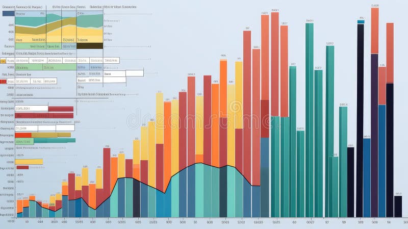
Free with trial This image depicts a combination of line and bar graphs showing comparative data analysis over a period of time. Data decrease illustrations Comparative data analysis over time with line and bar graphs. This image depicts a combination of line and bar graphs showing comparative data analysis over a period of time
Free with trial A businessman wearing a suit analyzes cost reduction versus quality improvement He uses both a laptop and a tablet computer to look at the data and see how these two factors interact to produce the best result for his company and business dealings shown with a graph of numbers going up and down. Data decrease illustrations Cost reduction and quality improvement shown with businessman analyzing data on devices. A businessman wearing a suit analyzes cost reduction versus quality improvement He uses both a laptop and a tablet computer to look at the data and see how these two factors interact to produce the best result for his company and business dealings shown with a graph of numbers going up and down
Free with trial This image shows a simple line graph with increasing and decreasing trends, ideal for visualizing data analysis and presenting key findings. The graph uses a clean, minimalist design to highlight the data points and overall trend. Perfect for presentations and reports. Data decrease illustrations Analyze Your Data. This image shows a simple line graph with increasing and decreasing trends, ideal for visualizing data analysis and presenting key findings. The graph uses a clean, minimalist design to highlight the data points and overall trend. Perfect for presentations and reports.
Free with trial A circular icon containing a stylized representation of financial data. The icon features a series of black vertical bars of varying heights, suggesting a bar chart. Overlaid on the bars are two thin lines, one black and one grey, depicting line graphs with peaks and troughs, indicating fluctuating trends. The overall design is minimalist and symbolic, suitable for representing business analytics. Data decrease illustrations Circular Graph Icon with Bar and Line Charts Representing Financial Data and Trends business. A circular icon containing a stylized representation of financial data. The icon features a series of black vertical bars of varying heights, suggesting a bar chart. Overlaid on the bars are two thin lines, one black and one grey, depicting line graphs with peaks and troughs, indicating fluctuating trends. The overall design is minimalist and symbolic, suitable for representing business analytics
Free with trial Rice grain price going down decrease cheaper in commodity market international trading market vector. Data decrease illustrations Rice grain price going down decrease cheaper in commodity market international trading market
Free with trial A flat design vector illustration depicting a financial market data board or stock ticker. The black-bordered display features various stock symbols, numerical values like '$ ,80K', '$ ,22,50', and indicators of market performance. Prominently highlighted in red is the word 'LOSING', accompanied by a red downward arrow signifying a price drop, and a red downward triangle. Conversely, a green upward arrow indicates a price increase. This icon effectively visualizes concepts of financial loss, gain, market volatility, and investment trends, suitable for business, finance, and economic content. Data decrease illustrations Financial Market Data Board Icon with Loss and Gain Indicators. A flat design vector illustration depicting a financial market data board or stock ticker. The black-bordered display features various stock symbols, numerical values like '$ ,80K', '$ ,22,50', and indicators of market performance. Prominently highlighted in red is the word 'LOSING', accompanied by a red downward arrow signifying a price drop, and a red downward triangle. Conversely, a green upward arrow indicates a price increase. This icon effectively visualizes concepts of financial loss, gain, market volatility, and investment trends, suitable for business, finance, and economic content.
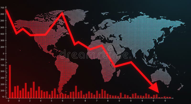
Free with trial World map with a red declining line graph overlay, illustrating a decrease or economic downturn. The graph features sharp declines across various data points, reflecting a downward trend. Red bar chart at the bottom represents additional numerical data against a black background. The map uses a dotted pattern for continents, highlighting regions globally. The image conveys financial analysis, market trends, or economic statistics. Data decrease illustrations World map with a red declining line graph overlay
Free with trial Bar chart icon representing data visualization, financial growth, business analytics, and market trends, indicating increasing and decreasing values for decision making. Data decrease vectors Bar chart icon showing data analysis and statistics. Bar chart icon representing data visualization, financial growth, business analytics, and market trends, indicating increasing and decreasing values for decision making
Free with trial Circular maze with a descending bar chart icon, symbolizing the challenge of navigating business data and analytics amid declines, obstacles, and the search for strategic solutions and recovery. Data decrease illustrations Navigating complex data decline challenges and finding solutions. Circular maze with a descending bar chart icon, symbolizing the challenge of navigating business data and analytics amid declines, obstacles, and the search for strategic solutions and recovery
Free with trial Data metallic style declining sales graph illustration report forecast, revenue market, performance downturn data metallic style declining sales graph. Data decrease illustrations Data metallic style declining sales graph
Free with trial A vibrant, pixelated pink arrow points downwards, set against a dark, textured background with subtle horizontal grey lines. This retro 8-bit style graphic symbolizes decrease, decline, download, or a negative trend. Ideal for illustrating financial data, market downturns, digital alerts, gaming interfaces, or any concept requiring a clear downward direction indicator. Its bold color and distinct pixel art aesthetic make it a versatile design element for technology, business, or creative projects. Data decrease illustrations Pixel Art Down Arrow on Dark Background. A vibrant, pixelated pink arrow points downwards, set against a dark, textured background with subtle horizontal grey lines. This retro 8-bit style graphic symbolizes decrease, decline, download, or a negative trend. Ideal for illustrating financial data, market downturns, digital alerts, gaming interfaces, or any concept requiring a clear downward direction indicator. Its bold color and distinct pixel art aesthetic make it a versatile design element for technology, business, or creative projects.
Free with trial A prominent 3D metallic US dollar sign stands against a dynamic digital background featuring various financial charts and graphs. The background displays a fluctuating line graph and a colorful bar chart, symbolizing market trends, economic data, and investment performance. This image powerfully conveys concepts of finance, global economy, currency strength, stock market analysis, and wealth management in a modern, digital context. Ideal for illustrating reports, presentations, or articles related to business, banking, and financial growth. Data decrease illustrations US Dollar Symbol with Digital Financial Charts and Market Data. A prominent 3D metallic US dollar sign stands against a dynamic digital background featuring various financial charts and graphs. The background displays a fluctuating line graph and a colorful bar chart, symbolizing market trends, economic data, and investment performance. This image powerfully conveys concepts of finance, global economy, currency strength, stock market analysis, and wealth management in a modern, digital context. Ideal for illustrating reports, presentations, or articles related to business, banking, and financial growth.
Free with trial Business growth and decline icon in black circle. Up and down trend chart symbol illustration. Increase and decrease bar graph concept. Data decrease vectors Business growth and decline icon in black circle. Up and down trend chart symbol. Increase and decrease bar graph concept
Free with trial A thick, red, zigzagging line, potentially a stock chart, is superimposed over a dark background with glowing green and red data points and lines. Image. Data decrease illustrations Red Zigzag Line Overlaying Financial Data. A thick, red, zigzagging line, potentially a stock chart, is superimposed over a dark background with glowing green and red data points and lines. Image
Free with trial Silver price going down decrease cheaper in metal commodity market international trading market vector. Data decrease vectors Silver price going down decrease cheaper in metal commodity market international trading market
Free with trial Set line Network cloud connection, Search computing, Binary code and Financial growth decrease icon. Vector. Data decrease illustrations Set line Network cloud connection, Search computing, Binary code and Financial growth decrease icon. Vector
Free with trial Vibrant 3D red bar chart illustrating declining growth trends for business analytics, finance reports, and data visualization projects. Data decrease vectors 3D red bar chart decreasing growth business data analysis concept. Vibrant 3D red bar chart illustrating declining growth trends for business analytics, finance reports, and data visualization projects
Free with trial An isolated vector illustration featuring two prominent, stylized arrows on a clean white background. One arrow, colored in shades of red and pink, points diagonally upwards and to the right, symbolizing growth, increase, or positive trends. The other arrow, rendered in blue and cyan tones, points diagonally downwards and to the left, representing decline, decrease, or negative movement. Both arrows have a modern, slightly textured or sketchy appearance, making them ideal for infographics, business presentations, financial reports, or conceptual designs illustrating contrasting directions, market changes, or comparative data. Data decrease illustrations Growth and Decline Arrows with Sketchy Style. An isolated vector illustration featuring two prominent, stylized arrows on a clean white background. One arrow, colored in shades of red and pink, points diagonally upwards and to the right, symbolizing growth, increase, or positive trends. The other arrow, rendered in blue and cyan tones, points diagonally downwards and to the left, representing decline, decrease, or negative movement. Both arrows have a modern, slightly textured or sketchy appearance, making them ideal for infographics, business presentations, financial reports, or conceptual designs illustrating contrasting directions, market changes, or comparative data.
Free with trial Business Chart and Graph Set with Line, Bar, and Pie Icons for Data Analysis or Statistics in Reports and Research. Vector. Editable stroke. Data decrease vectors Business Chart and Graph Set with Line, Bar, and Pie Icons for Data Analysis or Statistics in Reports and Research
Free with trial Set line Calculator Pie chart infographic Financial growth decrease and Network cloud connection. Business infographic template. Vector. Data decrease illustrations Set line Calculator, Pie chart infographic, Financial growth decrease and Network cloud connection. Business infographic
Free with trial Bar chart representation of data increase growth and finance. Data analysis. Data decrease vectors Bar chart representation of data increase growth and finance. Data analysis
Free with trial 3d blue glass up down right left arrows set - opposite direction sign, increase and decrease value. Transparent ui elements, modern graphics. Double icons, transfer or exchange symbol. 3D illustration. Data decrease illustrations 3d blue glass up down right left arrows set - opposite direction sign, increase and decrease value. Transparent ui elements
Free with trial Pink Financial growth decrease icon isolated on pink background. Increasing revenue. Minimalism concept. 3D render illustration. Data decrease illustrations Pink Financial growth decrease icon isolated on pink background. Increasing revenue. Minimalism concept. 3D render
Free with trial Set Digital speed meter, Financial growth decrease, Browser window and Online shopping on screen icon. Vector. Data decrease illustrations Set Digital speed meter, Financial growth decrease, Browser window and Online shopping on screen icon. Vector
Free with trial A sophisticated 3D rendered bar graph composed of multiple vertical blue glass bars arranged in a line with varying heights, where the tallest bar appears at the bottom right side and the shortest bars are positioned at the top left, creating a visually striking data visualization against a clean white background that emphasizes the transparent glass-like material and realistic lighting effects. Data decrease illustrations 3D rendered blue glass bar graph showing data visualization with vertical columns of varying heights on white background. A sophisticated 3D rendered bar graph composed of multiple vertical blue glass bars arranged in a line with varying heights, where the tallest bar appears at the bottom right side and the shortest bars are positioned at the top left, creating a visually striking data visualization against a clean white background that emphasizes the transparent glass-like material and realistic lighting effects
Free with trial Percent Arrow Icons Set: Growth, Increase, Decrease Filled Up and Down Arrows. Data decrease vectors Percent Arrow Icons Set: Growth, Increase, Decrease Filled Up and Down Arrows
Free with trial Gold price going down decrease cheaper in golden metal commodity market international trading market vector. Data decrease illustrations Gold price going down decrease cheaper in golden metal commodity market international trading market
Free with trial A professional hand gesture overlays a dynamic financial graph, representing market trends and data analysis essential for effective investment strategies. Scalp. Data decrease illustrations Professional Hand Gesture Over Financial Graph Displaying Market Trends and Data Analysis for Investment and Trading. A professional hand gesture overlays a dynamic financial graph, representing market trends and data analysis essential for effective investment strategies. Scalp
Free with trial A collection of nine simple black icons on a white background depicting concepts of decrease loss and downward trends using graphs charts and arrows. Data decrease vectors Set of black decline icons showing business failure and data reduction. A collection of nine simple black icons on a white background depicting concepts of decrease loss and downward trends using graphs charts and arrows
Free with trial Robotic Hand Interacting with Digital Cost Reduction Interface in a Futuristic Cityscape with Data Graphs and Business Icons Quark. Data decrease illustrations Robotic Hand Interacting with Digital Cost Reduction Interface in a Futuristic Cityscape with Data Graphs and Business
Free with trial This vector illustration set features six distinct icons representing key financial and economic concepts. It includes bar charts depicting growth with a green arrow and decline with a red arrow, alongside currency exchange rate indicators for USD, INR, and EUR. Two donut charts visualize data distribution, while a world map colored green and red signifies global market trends or segmentation. Ideal for business presentations, financial reports, economic analysis, and investment-related content, these versatile graphics convey complex data clearly and concisely. Data decrease vectors Financial Growth, Decline, and Global Market Data Visualization Icons Set. This vector illustration set features six distinct icons representing key financial and economic concepts. It includes bar charts depicting growth with a green arrow and decline with a red arrow, alongside currency exchange rate indicators for USD, INR, and EUR. Two donut charts visualize data distribution, while a world map colored green and red signifies global market trends or segmentation. Ideal for business presentations, financial reports, economic analysis, and investment-related content, these versatile graphics convey complex data clearly and concisely.
Free with trial A hand interacts with vibrant financial charts, showcasing data trends through modern technology and digital interfaces, ideal for conveying analytics and growth. Scalp. Data decrease illustrations Hand Interacting with Financial Growth Chart Displaying Data Trends and Indicators Through Interactive Technology and. A hand interacts with vibrant financial. A hand interacts with vibrant financial charts, showcasing data trends through modern technology and digital interfaces, ideal for conveying analytics and growth. Scalp
Free with trial Abstract 3d bar charts illustrating data visualization, financial statistics, and business analysis, presenting growth and decline trends in a report format. Data decrease illustrations Business data visualization showing 3d bar graphs. Abstract 3d bar charts illustrating data visualization, financial statistics, and business analysis, presenting growth and decline trends in a report format
Free with trial Ethanol price goes down drop decrease cheap in global commodity market trade export transaction vector. Data decrease vectors Ethanol price goes down drop decrease cheap in global commodity market trade export transaction
Free with trial Dynamic teal graph visually represents financial data. Professional design elements provide an ideal visual for business reports and presentations , dreamy concept. Data decrease illustrations Abstract Digital Financial Graph with Teal Data. Dynamic teal graph visually represents financial data. Professional design elements provide an ideal visual for business reports and presentations , dreamy concept
Free with trial Year data charts illustration color coded, categories month, total representation year data charts. Data decrease illustrations Year data charts
Free with trial A digital illustration on a black background features a world map rendered in shades of pink and purple with Data Doomsday text above it, divided into sections representing different data levels and centered by a line graph tracking data progression from 2000 to 2100 with green lines showing pre-industrial and contemporary data trends arranged vertically with a legend explaining each metric. Data decrease illustrations Data doomsday digital illustration showing world map with pink purple color scheme and line graph tracking data levels from 2000. A digital illustration on a black background features a world map rendered in shades of pink and purple with Data Doomsday text above it, divided into sections representing different data levels and centered by a line graph tracking data progression from 2000 to 2100 with green lines showing pre-industrial and contemporary data trends arranged vertically with a legend explaining each metric
Free with trial This 3D rendering features a hexagon-shaped icon set against a stark black background, containing a central golden-colored metallic tower composed of multiple symmetrical rows of drawers that decrease in size from the top to the bottom, creating a sleek and organized structure with a reflective finish that evokes concepts of futuristic technology, data storage, security, and sophisticated digital. Data decrease illustrations A 3D rendered hexagon icon containing a golden tower with multiple rows of drawers arranged symmetrically on a black background. This 3D rendering features a hexagon-shaped icon set against a stark black background, containing a central golden-colored metallic tower composed of multiple symmetrical rows of drawers that decrease in size from the top to the bottom, creating a sleek and organized structure with a reflective finish that evokes concepts of futuristic technology, data storage, security, and sophisticated digital
Free with trial A robotic hand interacts with carbon dioxide data in a sleek office space, symbolizing modern solutions to environmental challenges and promoting sustainability initiatives. Auvana. Data decrease illustrations Futuristic robotic hand interacting with CO2 emissions data in a modern office setting promoting sustainability and. A robotic hand interacts with carbon dioxide data in a sleek office space, symbolizing modern solutions to environmental challenges and promoting sustainability initiatives. Auvana
Free with trial A colorful bar chart illustrates a downward trend, with a prominent red arrow indicating a significant decrease in data. Data decrease illustrations Bar chart showing declining trend with red arrow. A colorful bar chart illustrates a downward trend, with a prominent red arrow indicating a significant decrease in data
Free with trial Stylized data illustrates financial increase using dollar signs, bar graphs, and arrows. Some data trends down while other data trends up, showing potential profits and losses. Data decrease illustrations Stock Market Data Shows Economic Growth and Potential Loss in the Future. Stylized data illustrates financial increase using dollar signs, bar graphs, and arrows. Some data trends down while other data trends up, showing potential profits and losses.
Free with trial Basic charts line icon set. Bar diagram, pie and histogram graph. Data visualization, growth and distribution analysis for business and finance. Vector illustration Editable Stroke. Data decrease illustrations Basic charts line icon set. Bar diagram, pie and histogram graph. Data visualization, growth and distribution analysis
Free with trial A minimalist 3D icon rendered in white depicts a downward arrow pointing into a square frame containing a percentage symbol. The icon is presented on a reflective white surface, with a subtle blurred background. This graphic represents concepts such as price decrease, discount, or a downward trend. Data decrease illustrations 3D White Icon Symbolizing Percentage Decrease or Discount with Downward Arrow on Reflective Surface. A minimalist 3D icon rendered in white depicts a downward arrow pointing into a square frame containing a percentage symbol. The icon is presented on a reflective white surface, with a subtle blurred background. This graphic represents concepts such as price decrease, discount, or a downward trend
Free with trial Set line Binary code, Browser with exclamation mark, Financial growth decrease and Sales funnel chart icon. Vector. Data decrease illustrations Set line Binary code, Browser with exclamation mark, Financial growth decrease and Sales funnel chart icon. Vector
Free with trial Up and down directional arrows in vector format for versatile use. Perfect for business infographics and data visualization. EPS 10. Data decrease vectors Up and down directional arrows in vector format for versatile use. Perfect for business infographics and data visualization.
Free with trial Blue bar chart with decreasing values beside a soft cloud shape and horizontal lines. Ideal for data analytics, cloud computing, business growth, technology, forecasts, trends, and innovation. Simple. Data decrease illustrations Minimalist Bar Chart with Cloud Element Representing Data Analysis and Cloud Computing Concepts. Blue bar chart with decreasing values beside a soft cloud shape and horizontal lines. Ideal for data analytics, cloud computing, business growth, technology, forecasts, trends, and innovation. Simple
Free with trial A white line graph with connected points and a bar chart are shown within a dark gray circle icon, representing data analysis. Data decrease illustrations White line graph and bar chart in a dark gray circle icon data statistics. A white line graph with connected points and a bar chart are shown within a dark gray circle icon, representing data analysis
Free with trial A robotic hand extends toward dynamic financial graphs and data in a cosmic setting. This image symbolizes the intersection of technology and finance, showcasing innovation. Scalp. Data decrease illustrations Futuristic robotic hand reaching towards digital financial graphs and data visualizations in a cosmic background with. A robotic hand extends toward dynamic financial graphs and data in a cosmic setting. This image symbolizes the intersection of technology and finance, showcasing innovation. Scalp
Free with trial Robotic Hand Holding Computer Display with Cost Reduction Concept, Analyzing Data and Strategies for Business Growth in Digital World Quark. Data decrease illustrations Robotic Hand Holding Computer Display with Cost Reduction Concept, Analyzing Data and Strategies for Business Growth in
Free with trial Down graph chart arrow drop icon. Decrease downward vector market decrease down trend. Data decrease vectors Down graph chart arrow drop icon. Decrease downward vector market decrease down trend.
Free with trial This vector illustration features a set of two minimalist graphs depicting a significant decline. Each graph includes a downward-sloping line chart with an accompanying filled area, clearly indicating a negative trend. One version is presented in black on a white background, while the other is white on a black background, offering versatile usage. This icon is ideal for illustrating concepts of business loss, economic recession, market downturns, financial crisis, poor performance, or any data showing a decrease. Perfect for presentations, reports, infographics, and web design. Data decrease vectors Declining Business Graph Icon Set - Negative Trend Chart. This vector illustration features a set of two minimalist graphs depicting a significant decline. Each graph includes a downward-sloping line chart with an accompanying filled area, clearly indicating a negative trend. One version is presented in black on a white background, while the other is white on a black background, offering versatile usage. This icon is ideal for illustrating concepts of business loss, economic recession, market downturns, financial crisis, poor performance, or any data showing a decrease. Perfect for presentations, reports, infographics, and web design.
Free with trial Stock market display with a red line graph indicating a downward trend on a digital screen. The graph is composed of jagged peaks and troughs, suggesting instability. Surrounding the graph are numeric data and grid lines, highlighting market performance details. The screen is located in a financial setting with a blurred, busy background, possibly an office or trading floor, enhancing the context of economic activity. The color red typically signifies a decrease or negative trend in market terms. Data decrease illustrations Red Stock Market Crash On Screen. Stock market display with a red line graph indicating a downward trend on a digital screen. The graph is composed of jagged peaks and troughs, suggesting instability. Surrounding the graph are numeric data and grid lines, highlighting market performance details. The screen is located in a financial setting with a blurred, busy background, possibly an office or trading floor, enhancing the context of economic activity. The color red typically signifies a decrease or negative trend in market terms.
Free with trial Set Browser with stocks market Financial growth Pie chart infographic Binary code Cloud computing lock Search data analysis and Data icon. Vector. Data decrease vectors Set Browser with stocks market, Financial growth, Pie chart infographic, Binary code, Cloud computing lock, Search data. Set Browser with stocks market Financial growth Pie chart infographic Binary code Cloud computing lock Search data analysis and Data icon. Vector.
Free with trial A close-up, angled view of a digital stock market ticker display. The screen shows rows of data with company names or codes, numerical values, and percentage changes. Prices are shown in both red, indicating a decrease, and green, indicating an increase. The text and numbers are brightly lit against a dark background, creating a dynamic and information-rich visual. The focus is on the abstract. Data decrease illustrations Close Up of a Digital Stock Market Ticker Display with Fluctuating Prices and Percentages. A close-up, angled view of a digital stock market ticker display. The screen shows rows of data with company names or codes, numerical values, and percentage changes. Prices are shown in both red, indicating a decrease, and green, indicating an increase. The text and numbers are brightly lit against a dark background, creating a dynamic and information-rich visual. The focus is on the abstract
Free with trial Price increase. Inflation icon group. Purchasing power decrease and savings. Services and goods cost rise. Vector illustration. Data decrease vectors Price increase. Inflation icon group. Purchasing power decrease and savings. Services and goods cost rise. Vector illustration.
Free with trial A simple black silhouette of a bar chart with varying heights on a white background. The icon represents data analysis and statistical representation. Data decrease vectors Bar chart icon for data analysis and statistics graph. A simple black silhouette of a bar chart with varying heights on a white background. The icon represents data analysis and statistical representation
Free with trial A graph displays trading data with green and red bars showing price changes during a stock trading session. Investors analyze the fluctuations and trends. Data decrease vectors A graph displays trading data with green and red bars showing price changes during a stock trading session. Investors analyze the
Free with trial Sales data trends illustration figures products, quarter chbar, highlight market sales data trends. Data decrease illustrations Sales data trends
Free with trial A modern business analytics dashboard showcasing key performance indicators (KPIs) with engaging charts and graphs for data visualization Ideal for presentations and reports. Generative AI. Data decrease illustrations Business Analytics Dashboard Graphs Charts Data Performance Growth Metrics KPI. A modern business analytics dashboard showcasing key performance indicators (KPIs) with engaging charts and graphs for data visualization Ideal for presentations and reports. Generative AI
Free with trial A black icon of a graph with a downward sloping curve and an arrow indicating decrease. Data decrease illustrations Black graph showing a downward trend with an arrow and Y axis label chart data. A black icon of a graph with a downward sloping curve and an arrow indicating decrease
Free with trial Electricity energy price going down decrease cheaper in electric commodity market international trading market vector. Data decrease vectors Electricity energy price going down decrease cheaper in electric commodity market international trading market
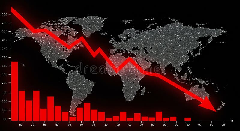
Free with trial World map backdrop with a downward-trending red line graph and red bar graph, set against a black background. The bar graph features various heights, indicating statistical data points, while the line graph suggests a decrease. The map includes continents like Africa, Europe, Asia, and the Americas, with numerous small white dots representing data or illumination. The dramatic red color emphasizes the negative trend, possibly symbolizing economic or market decline on a global scale. Data decrease illustrations World map backdrop with a downward-trending red line graph and red bar graph
Free with trial A pair of minimalist line graphs illustrating a downward trend, presented in a high-contrast black on white and white on black design. The arrow at the end clearly indicates a decline, representing concepts like loss, decrease, negative growth, or recession. Ideal for financial reports, business presentations, economic news, data visualization, or any content requiring a clear symbol for falling statistics or poor performance. Data decrease vectors Downward Trend Graph Icon Set - Black and White Decline Chart. A pair of minimalist line graphs illustrating a downward trend, presented in a high-contrast black on white and white on black design. The arrow at the end clearly indicates a decline, representing concepts like loss, decrease, negative growth, or recession. Ideal for financial reports, business presentations, economic news, data visualization, or any content requiring a clear symbol for falling statistics or poor performance.
Free with trial Descending Bar Chart Illustration Depicting Decrease, Recession, Downturn with Arrow. Data decrease vectors Descending Bar Chart Illustration Depicting Decrease, Recession, Downturn with Arrow
Free with trial Uranium price going down decrease cheaper in metal mineral nuclear commodity market international trading market vector. Data decrease vectors Uranium price going down decrease cheaper in metal mineral nuclear commodity market international trading market
Free with trial A bold red arrow pointing downwards along a slope, indicating a negative trend, decrease, or decline. This clear visual indicator is perfect for financial reports, data visualizations, educational presentations, or any graphic where a reduction in value or progress needs to be highlighted. vector design Generative AI. Data decrease vectors Red Downward Slope Arrow for Negative Trend Indicator, vector design Generative AI. A bold red arrow pointing downwards along a slope, indicating a negative trend, decrease, or decline. This clear visual indicator is perfect for financial reports, data visualizations, educational presentations, or any graphic where a reduction in value or progress needs to be highlighted. vector design Generative AI
Free with trial A set of twelve black icons representing business and data analysis concepts, presented on a white background. The icons include various types of charts and graphs such as bar charts, a pie chart, and line graphs showing trends and fluctuations. There are also icons for data visualization, progress indicators, and reports. The collection is organized in a 3x4 grid. Data decrease vectors Business and data analytics icons bar chart pie chart AI-Generated. A set of twelve black icons representing business and data analysis concepts, presented on a white background. The icons include various types of charts and graphs such as bar charts, a pie chart, and line graphs showing trends and fluctuations. There are also icons for data visualization, progress indicators, and reports. The collection is organized in a 3x4 grid
Free with trial Data cloud spend illustration center cost, analysis servers, computing expenses data cloud spend. Data decrease illustrations Data cloud spend
Free with trial Abstract close-up view of a digital display showing a fluctuating financial chart. The orange graph line is highlighted against a dark blue background with a complex grid pattern, suggesting data streaming and analysis. The image evokes a sense of technology, market trends, and financial information. Suitable for use in articles, presentations, or websites related to finance, technology, data analysis, and business. Data decrease illustrations Dynamic Financial Data Visualization. Abstract close-up view of a digital display showing a fluctuating financial chart. The orange graph line is highlighted against a dark blue background with a complex grid pattern, suggesting data streaming and analysis. The image evokes a sense of technology, market trends, and financial information. Suitable for use in articles, presentations, or websites related to finance, technology, data analysis, and business.
Free with trial A simple graphic showing a percent sign with two down arrows. This icon represents a decrease in percentage, decline, or reduction. Perfect for financial or business concepts. Data decrease vectors Percent sign with down arrows icon for decrease and decline. A simple graphic showing a percent sign with two down arrows. This icon represents a decrease in percentage, decline, or reduction. Perfect for financial or business concepts.
Free with trial A dynamic 3D visualization showcasing financial data. The scene features a rising bar chart with an upward trend arrow, symbolizing growth and success. Adjacent to it, a colorful pie chart represents data segmentation and distribution. The background is a dark, textured surface with subtle grid lines and abstract chart elements, creating a sophisticated and modern aesthetic. This imagery is ideal for presentations, reports, and digital content related to finance, business, economics, and data analysis. Data decrease illustrations 3D Financial Data Visualization: Growth Charts and Pie Graph. A dynamic 3D visualization showcasing financial data. The scene features a rising bar chart with an upward trend arrow, symbolizing growth and success. Adjacent to it, a colorful pie chart represents data segmentation and distribution. The background is a dark, textured surface with subtle grid lines and abstract chart elements, creating a sophisticated and modern aesthetic. This imagery is ideal for presentations, reports, and digital content related to finance, business, economics, and data analysis.
Free with trial A clean, minimalist 3D icon rendered in white against a neutral gray background. The icon features a square border with rounded corners, containing a downward-pointing arrow and a percentage sign. This graphic represents concepts such as a price decrease, discount, or negative financial trend. Data decrease illustrations White 3D Icon Symbolizing Percentage Decrease or Discount with Downward Arrow down arrow. A clean, minimalist 3D icon rendered in white against a neutral gray background. The icon features a square border with rounded corners, containing a downward-pointing arrow and a percentage sign. This graphic represents concepts such as a price decrease, discount, or negative financial trend
Free with trial Illustration showing financial data analysis with charts, idea lightbulb, and location pins, perfect for finance and business concepts. Data decrease illustrations Analyzing Financial Data and Performance Charts Illustration. Illustration showing financial data analysis with charts, idea lightbulb, and location pins, perfect for finance and business concepts
Free with trial Line graph with plotted data points, bar chart, and triangular warning alert. Ideal for analytics, business, risk management, financial trends, forecasting, reporting performance tracking simple. Data decrease vectors Data Analysis with Line Graph, Bar Chart, and Warning Sign for Risk Monitoring. Line graph with plotted data points, bar chart, and triangular warning alert. Ideal for analytics, business, risk management, financial trends, forecasting, reporting performance tracking simple