Free with trial Decline bar chart with downward trend arrow outline icon vector. Decrease, loss, and financial drop symbol in circular line. Data decrease vectors Decline bar chart with downward trend arrow outline icon. Decrease, loss, and financial drop symbol in circular line
Free with trial Person's hand points to stock market data displayed on laptop screen indicating analysis Use for finance or investment themes. Data decrease illustrations Analyzing Stock Market Data on Laptop Screen with Hand Pointing. Person's hand points to stock market data displayed on laptop screen indicating analysis Use for finance or investment themes
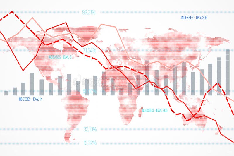
Free with trial Financial data chart featuring declining indexes and bar graphs overlaid on a world map background. Concept of global economic downturn. 3D Rendering. Data decrease illustrations Financial data chart with declining indexes on a world map background. 3D Rendering. Financial data chart featuring declining indexes and bar graphs overlaid on a world map background. Concept of global economic downturn. 3D Rendering
Free with trial Person types on a laptop with financial growth symbols displayed representing investment strategy business success online trading stock market analysis and data driven decision making for financial p. Data decrease illustrations Financial growth investment strategy business success online trading stock market analysis data chart graph money. Person types on a laptop with financial growth symbols displayed representing investment strategy business success online trading stock market analysis and data driven decision making for financial p
Free with trial Trend icon. Zigzag arrow in circle vector illustration. Market chart symbol with upward or downward direction sign. Finance data UI sign. Business growth pictogram. Data decrease vectors Trend icon. Zigzag arrow in circle vector illustration. Market chart symbol with upward or downward direction sign. Finance data
Free with trial Abstract pastel color blocks forming a bar graph on a pink base. Ideal for presentations and reports illustrating business growth or statistical data. Data decrease illustrations Colorful 3D Bar Chart Graph on Pink Base, Business Data Visualization. Abstract pastel color blocks forming a bar graph on a pink base. Ideal for presentations and reports illustrating business growth or statistical data.
Free with trial Chsales data charts illustration company year, color coded, categories month chsales data charts. Data decrease illustrations Chsales data charts
Free with trial A digital illustration of stock market data visualization, featuring green and red arrows on a dark background. The image includes various charts and graphs, with numbers and symbols indicating market trends. The green arrows point upwards, suggesting growth and increase, while the red arrows point downwards, indicating decline and decrease. This image can be used to represent financial analysis, market fluctuations, and economic trends. Data decrease illustrations Stock market data visualization with green and red arrows. A digital illustration of stock market data visualization, featuring green and red arrows on a dark background. The image includes various charts and graphs, with numbers and symbols indicating market trends. The green arrows point upwards, suggesting growth and increase, while the red arrows point downwards, indicating decline and decrease. This image can be used to represent financial analysis, market fluctuations, and economic trends.
Free with trial A minimalist black bar chart icon isolated on a clean white background. This simple graphic features three vertical bars of different heights resting on a horizontal axis, visually representing data, statistics, and comparative information. Ideal for illustrating business performance, financial reports, market trends, analytics, or any concept related to growth, decline, and quantitative analysis in presentations, websites, applications, and infographics. Its clean, flat design makes it versatile for various digital and print media. Data decrease vectors Minimalist Bar Chart Icon for Data Analysis and Statistics. A minimalist black bar chart icon isolated on a clean white background. This simple graphic features. A minimalist black bar chart icon isolated on a clean white background. This simple graphic features three vertical bars of different heights resting on a horizontal axis, visually representing data, statistics, and comparative information. Ideal for illustrating business performance, financial reports, market trends, analytics, or any concept related to growth, decline, and quantitative analysis in presentations, websites, applications, and infographics. Its clean, flat design makes it versatile for various digital and print media.
Free with trial A clean vector icon featuring both a plus and minus symbol, indicating a toggle, increase decrease, or zoom function. This versatile design is ideal for user interfaces, financial apps, or data visualization, providing a clear and concise control for numerical adjustments and interactive elements, suitable for various digital applications, vector design Generative AI. Data decrease vectors Plus Minus Symbol Toggle Vector Icon, vector design Generative AI. A clean vector icon featuring both a plus and minus symbol, indicating a toggle, increase decrease, or zoom function. This versatile design is ideal for user interfaces, financial apps, or data visualization, providing a clear and concise control for numerical adjustments and interactive elements, suitable for various digital applications, vector design Generative AI
Free with trial A comprehensive set of financial and data visualization icons, perfect for illustrating business and economic concepts. This collection includes a growing bar chart with an upward trend, a declining bar chart with a downward trend, and a mixed bar chart. Also featured are stacks of global currencies (USD, Euro, INR), a segmented pie chart, and a world map colored green and red to signify global market conditions or data distribution. Ideal for presentations, reports, websites, and educational materials related to economics, finance, and market analysis. Data decrease vectors Global Financial and Business Data Visualization Icons Set. A comprehensive set of financial and data visualization icons, perfect for illustrating business and economic concepts. This collection includes a growing bar chart with an upward trend, a declining bar chart with a downward trend, and a mixed bar chart. Also featured are stacks of global currencies (USD, Euro, INR), a segmented pie chart, and a world map colored green and red to signify global market conditions or data distribution. Ideal for presentations, reports, websites, and educational materials related to economics, finance, and market analysis.
Free with trial A vibrant red arrow pointing downwards, often used to indicate direction, download, decrease, or decline. This clear graphic element is suitable for web design, presentations, and infographics. Data decrease illustrations Bold red down arrow icon symbolizing direction or decrease. A vibrant red arrow pointing downwards, often used to indicate direction, download, decrease, or decline. This clear graphic element is suitable for web design, presentations, and infographics
Free with trial The image depicts a downward trend arrow on a grid background, with the arrow starting from the top left and pointing towards the bottom right, indicating a decrease or decline in data. Data decrease illustrations A graphic showing a downward trend arrow on a grid background. The image depicts a downward trend arrow on a grid background, with the arrow starting from the top left and pointing towards the bottom right, indicating a decrease or decline in data
Free with trial A clean, minimalist 3D rendering of a declining bar chart in a monochromatic pastel pink color scheme. The bars are arranged in descending order, clearly illustrating a concept of decrease, loss, or a downward trend. This abstract and modern graphic is perfect for business and financial presentations, reports, or infographics about recession, economic downturn, sales reduction, or negative growth. The soft lighting and ample copy space make it a versatile background for various data visualization and corporate concepts. Data decrease illustrations Minimalist Pink 3D Bar Chart Showing a Downward Trend. A clean, minimalist 3D rendering of a declining bar chart in a monochromatic pastel pink color scheme. The bars are arranged in descending order, clearly illustrating a concept of decrease, loss, or a downward trend. This abstract and modern graphic is perfect for business and financial presentations, reports, or infographics about recession, economic downturn, sales reduction, or negative growth. The soft lighting and ample copy space make it a versatile background for various data visualization and corporate concepts.
Free with trial This image features a collection of data visualization icons, including charts, graphs, and organizational structures, perfect for illustrating data analysis and reporting. Data decrease vectors Vector art of collection of data visualization icons showcasing various chart types and organizational structures for data. This image features a collection of data visualization icons, including charts, graphs, and organizational structures, perfect for illustrating data analysis and reporting
Free with trial Abstract image featuring a dense line on the left, gradually dissipating into various shapes like circles, squares, and triangles on a white background. The shapes decrease in size as they move right, creating a sense of dispersion or flow. The arrangement and fading effect provide a sense of movement and transition from order to chaos, with a subtle gradient of pastel colors. The composition suggests themes of data, technology, or transformation. Data decrease illustrations Into various shapes like circles, squares, and triangles on a
Free with trial Data visualization dashboard with various charts and graphs, immersive wallpaper background Generative AI. Data decrease illustrations Data visualization dashboard with various charts and graphs
Free with trial A pen rests on piece of paper with bar chart, suggesting data analysis, business planning, or financial reporting ,Generative ai. Data decrease illustrations Pen and paper with bar chart, a visual representation of data analysis. A pen rests on piece of paper with bar chart, suggesting data analysis, business planning, or financial reporting ,Generative ai
Free with trial This image is a bar chart titled 'Decline Chart' showing the decline of a certain metric over a range. The x-axis represents different intervals, while the y-axis represents the quantity, ranging from 0 to 1000. There are three different data series represented by different colors: dark blue for 'Etb,' gray for 'Decline,' and orange for 'Dec Chart. ' Each interval on the x-axis shows a decline in. Data decrease illustrations Visual representation of data decline over a specific range. This image is a bar chart titled 'Decline Chart' showing the decline of a certain metric over a range. The x-axis represents different intervals, while the y-axis represents the quantity, ranging from 0 to 1000. There are three different data series represented by different colors: dark blue for 'Etb,' gray for 'Decline,' and orange for 'Dec Chart.' Each interval on the x-axis shows a decline in
Free with trial A business report illustration featuring a graph and chart, ideal for presentations and documents, conveying financial data and analysis in a clear and concise manner. Data decrease vectors Illustration of business report with graph and chart, showcasing financial data and analysis for presentations and documents. A business report illustration featuring a graph and chart, ideal for presentations and documents, conveying financial data and analysis in a clear and concise manner
Free with trial Set of black and white icons illustrating various business analytics and data concepts including downward trend charts, funnel, report, magnifying glass, computer display, and focused chart with arrows. Generative AI. Data decrease vectors Black and white business analytics and data icons set with charts and graphs. Set of black and white icons illustrating various business analytics and data concepts including downward trend charts, funnel, report, magnifying glass, computer display, and focused chart with arrows. Generative AI
Free with trial A colorful bar chart with upward and downward arrows and various icons, representing data and analytics. Data decrease vectors Colorful Bar Chart with Downward Arrows and Icons graph data. A colorful bar chart with upward and downward arrows and various icons, representing data and analytics
Free with trial A clear, minimalist vector illustration featuring two distinct directional icons against a clean white background. On the left, a green downward-pointing triangle is paired with four green horizontal rounded bars, symbolizing download, collapse, or a decrease. On the right, a red upward-pointing triangle is combined with four red horizontal rounded bars, representing upload, expand, or an increase. These graphic elements are ideal for user interface design, web applications, mobile apps, presentations, or any project requiring clear visual indicators for data transfer, status, or directional actions. Data decrease vectors Download and Upload Icons: Green Down, Red Up Arrows with Bars. A clear, minimalist vector illustration featuring two distinct directional icons against a clean white background. On the left, a green downward-pointing triangle is paired with four green horizontal rounded bars, symbolizing download, collapse, or a decrease. On the right, a red upward-pointing triangle is combined with four red horizontal rounded bars, representing upload, expand, or an increase. These graphic elements are ideal for user interface design, web applications, mobile apps, presentations, or any project requiring clear visual indicators for data transfer, status, or directional actions.
Free with trial Decline bar chart with downward trend arrow icon vector. Decrease, loss, and financial drop symbol on black circle. Data decrease vectors Decline bar chart with downward trend arrow icon. Decrease, loss, and financial drop symbol on black circle
Free with trial Bar chart with line graph overlay showing annual data trends over time. Data decrease vectors Bar chart showing annual data trends with line graph overlay. Bar chart with line graph overlay showing annual data trends over time
Free with trial Three electronic devices are arranged on a sleek black surface, featuring a central tablet with a vibrant blue screen displaying a detailed line graph where green, pink, and other colored data points track decreasing metrics over time against a dark background illuminated by blue and white lights, creating a futuristic technological atmosphere perfect for concepts involving data analysis, business. Data decrease illustrations Futuristic data analytics dashboard displayed on blue glowing tablet screen with colorful line graph visualization. Three electronic devices are arranged on a sleek black surface, featuring a central tablet with a vibrant blue screen displaying a detailed line graph where green, pink, and other colored data points track decreasing metrics over time against a dark background illuminated by blue and white lights, creating a futuristic technological atmosphere perfect for concepts involving data analysis, business
Free with trial Collection of simple black vector icons representing financial charts, data analysis graphs, and business statistics. Includes trend arrows, magnifier, and settings symbols. Data decrease illustrations Set of black business graph and chart icons for data analysis. Collection of simple black vector icons representing financial charts, data analysis graphs, and business statistics. Includes trend arrows, magnifier, and settings symbols
Free with trial This digital image shows a glowing blue financial graph indicating market trends, growth, and data analysis. Data decrease illustrations Blue digital financial graph representing increasing data and information. This digital image shows a glowing blue financial graph indicating market trends, growth, and data analysis
Free with trial This image features a 3D bar chart with colorful bars in blue, orange, and yellow hues. The bars vary in height, indicating different data values and trends. The chart is set against a white background, emphasizing the vibrant colors and the upward progression of the bars. Data decrease illustrations A colorful 3d bar chart showcasing data growth and comparison. This image features a 3D bar chart with colorful bars in blue, orange, and yellow hues. The bars vary in height, indicating different data values and trends. The chart is set against a white background, emphasizing the vibrant colors and the upward progression of the bars
Free with trial Decrease bar chart icon set on circle line. Statistic sign symbol. Data decrease vectors Decrease bar chart icon set on circle line
Free with trial Colorful neon lines form an abstract financial data chart against a dark background. Multiple lines in blue, orange, pink, green, and purple intersect and spike upwards, creating dynamic, glowing zigzag patterns. Each line ends with an upward-pointing arrow, suggesting positive growth or an upward trend. The vibrant colors create a striking contrast with the black backdrop. This design represents the fluctuating nature of financial markets or data analytics, using visual elements to convey movement and change. Data decrease illustrations Colorful glowing lines form an abstract financial data chart. Colorful neon lines form an abstract financial data chart against a dark background. Multiple lines in blue, orange, pink, green, and purple intersect and spike upwards, creating dynamic, glowing zigzag patterns. Each line ends with an upward-pointing arrow, suggesting positive growth or an upward trend. The vibrant colors create a striking contrast with the black backdrop. This design represents the fluctuating nature of financial markets or data analytics, using visual elements to convey movement and change.
Free with trial Outline vector icon of a line graph showing a downward trend in line art. Represents decrease, loss, decline, or negative performance data. Suitable for financial charts, reports, data visualization, and illustrating negative changes over time, vector design Generative AI. Data decrease vectors Line Graph Downward Trend Outline, Decline Loss Chart Symbol, vector design Generative AI. Outline vector icon of a line graph showing a downward trend in line art. Represents decrease, loss, decline, or negative performance data. Suitable for financial charts, reports, data visualization, and illustrating negative changes over time, vector design Generative AI
Free with trial Declining Bar Graph with Downward Arrow Showing Loss or Decrease. Data decrease vectors Declining Bar Graph with Downward Arrow Showing Loss or Decrease
Free with trial An isometric vector of a downward-pointing arrow on a marked path. This icon is great for representing downloads, decline in data, price reduction, or simply pointing down. A useful UI element for apps and websites. vector design Generative AI. Data decrease vectors A down arrow on a striped path. A concept of decrease or download. vector design Generative AI. An isometric vector of a downward-pointing arrow on a marked path. This icon is great for representing downloads, decline in data, price reduction, or simply pointing down. A useful UI element for apps and websites. vector design Generative AI
Free with trial Dollar arrow up and down icon vector isolated on white background. USD currency increase and decrease concept. Data decrease vectors Dollar arrow up and down icon isolated on white background. USD currency increase and decrease concept
Free with trial Collection of colorful and modern chart and graph icons for business presentations reports and web applications Illustrates various data visualization methods and analytics Perfect for illustrating business success and data trends. Generative AI. Data decrease illustrations Colorful Data Charts Graphs Icons Business Infographic Elements. Collection of colorful and modern chart and graph icons for business presentations reports and web applications Illustrates various data visualization methods and analytics Perfect for illustrating business success and data trends. Generative AI
Free with trial A line graph illustrating the gradual decrease in energy consumption over several months, with lightning bolt icons transitioning to leaf icons, symbolizing a shift from high energy usage to sustainable, cost-effective practices. The x-axis represents time in months, and the y-axis shows energy consumption in kWh, clearly indicating a downward trend in energy use and associated costs. Data decrease illustrations Energy Consumption Decrease Over Time Leading to Cost Reduction. A line graph illustrating the gradual decrease in energy consumption over several months, with lightning bolt icons transitioning to leaf icons, symbolizing a shift from high energy usage to sustainable, cost-effective practices. The x-axis represents time in months, and the y-axis shows energy consumption in kWh, clearly indicating a downward trend in energy use and associated costs
Free with trial The image depicts a declining trend using a combination of yellow bars and a red line chart. The bars represent discrete data points that progressively decrease in height from left to right, indicating a downward trend. The red line connects the tops of the bars, emphasizing the continuous decline over time. This visual effectively communicates a sharp reduction in values or performance over a. Data decrease illustrations Declining trend illustrated with bar and line chart combination. The image depicts a declining trend using a combination of yellow bars and a red line chart. The bars represent discrete data points that progressively decrease in height from left to right, indicating a downward trend. The red line connects the tops of the bars, emphasizing the continuous decline over time. This visual effectively communicates a sharp reduction in values or performance over a
Free with trial A businessman's hands interact with a futuristic virtual interface displaying a declining bar chart, symbolizing cost reduction or performance decrease. This central icon is encircled by various business process icons, representing data analysis, management, and strategy. The concept illustrates managing a business downturn, financial crisis, or economic recession through technology and data-driven decisions. It's an ideal visual for topics like risk management, cost optimization, efficiency improvement, and corporate strategy in a challenging economic environment, set against a modern, dark background. Data decrease illustrations Business Cost Reduction and Performance Decline Analysis Concept. A businessman's hands interact with a futuristic virtual interface displaying a declining bar chart, symbolizing cost reduction or performance decrease. This central icon is encircled by various business process icons, representing data analysis, management, and strategy. The concept illustrates managing a business downturn, financial crisis, or economic recession through technology and data-driven decisions. It's an ideal visual for topics like risk management, cost optimization, efficiency improvement, and corporate strategy in a challenging economic environment, set against a modern, dark background.
Free with trial 3D silver column chart depicting a decreasing sequence of bars from left to right. Each bar is rectangular and has a metallic finish, giving a sleek and reflective appearance. The chart suggests a downward trend, possibly illustrating declining values or losses. The bars are evenly spaced on a flat surface with no additional labels or axes visible. Suitable for representing financial data or general decrease in values. Data decrease vectors Silver 3D column chart or bar chart showing decreasing financial values and losses. 3D silver column chart depicting a decreasing sequence of bars from left to right. Each bar is rectangular and has a metallic finish, giving a sleek and reflective appearance. The chart suggests a downward trend, possibly illustrating declining values or losses. The bars are evenly spaced on a flat surface with no additional labels or axes visible. Suitable for representing financial data or general decrease in values.
Free with trial Decline bar chart with downward trend arrow icon vector. Decrease, loss, and financial crisis sign symbol inside circular outline. Data decrease vectors Decline bar chart with downward trend arrow icon. Decrease, loss, and financial crisis sign symbol inside circular outline
Free with trial A magnifying glass focuses on a declining digital bar chart projected from a smartphone, symbolizing a deep dive into financial data, market analysis, or business performance review. This concept represents the critical scrutiny of a downturn, recession, or investment loss in the modern digital age. Data decrease illustrations Financial Data Analysis Shows Market Decline on Mobile. A magnifying glass focuses on a declining digital bar chart projected from a smartphone, symbolizing a deep dive into financial data, market analysis, or business performance review. This concept represents the critical scrutiny of a downturn, recession, or investment loss in the modern digital age
Free with trial Modern laptop shows real time financial data analytics with line graphs bar charts and a pie chart. Data decrease illustrations Laptop Screen Displaying Live Business Data Charts and Analytics. Modern laptop shows real time financial data analytics with line graphs bar charts and a pie chart
Free with trial Detailed illustration featuring a variety of hand drawn style financial charts and data analysis line icons including growth curves and market trends. Data decrease vectors Collection of business data and financial analytics line icons. detailed illustration featuring a variety of hand drawn style financial charts and data analysis line icons including growth curves and market trends
Free with trial This 3D rendering showcases a vibrant bar graph and pie chart, ideal for visualizing business growth, financial reports, and data analysis. The colorful design makes it visually engaging and easy to understand. Data decrease illustrations Colorful 3D Bar and Pie Chart Illustrating Business Growth and Financial Data. This 3D rendering showcases a vibrant bar graph and pie chart, ideal for visualizing business growth, financial reports, and data analysis. The colorful design makes it visually engaging and easy to understand.
Free with trial A comprehensive set of icons representing various aspects of business, finance, data analysis, growth, and strategy. Data decrease vectors Collection of Business and Finance Icons for Data Analysis and Growth. A comprehensive set of icons representing various aspects of business, finance, data analysis, growth, and strategy
Free with trial A prominent red banner featuring a clear downward-pointing arrow. This design effectively symbolizes a decrease, decline, or negative trend, making it suitable for charts, warning indicators, or data visualization in reports and presentations. Bold and direct communication, vector design Generative AI. Data decrease vectors Red Banner with Downward Trend Arrow, vector design Generative AI. A prominent red banner featuring a clear downward-pointing arrow. This design effectively symbolizes a decrease, decline, or negative trend, making it suitable for charts, warning indicators, or data visualization in reports and presentations. Bold and direct communication, vector design Generative AI
Free with trial The image shows a 3D bar chart with green bars of decreasing height, and a red downward arrow pointing from the tallest bar to the shortest one, indicating a decline in data or performance over time. Data decrease illustrations A 3d bar chart with a red downward arrow indicating a decline in data. The image shows a 3D bar chart with green bars of decreasing height, and a red downward arrow pointing from the tallest bar to the shortest one, indicating a decline in data or performance over time
Free with trial This image showcases data analysis icons, representing data processing, visualization, and interpretation, which are crucial for gaining valuable insights. Data decrease vectors Vector art of data analysis icons representing various aspects of data processing, visualization, and interpretation for insights. This image showcases data analysis icons, representing data processing, visualization, and interpretation, which are crucial for gaining valuable insights
Free with trial The image displays four distinct data visualizations. The top left and bottom left show bar charts with varying heights, indicating different data values. The top right presents a stacked bar chart, where each bar is divided into segments. The bottom right illustrates a line chart, showing data points connected by lines to depict trends over time. Data decrease illustrations Various types of data visualizations including bar and line charts. The image displays four distinct data visualizations. The top left and bottom left show bar charts with varying heights, indicating different data values. The top right presents a stacked bar chart, where each bar is divided into segments. The bottom right illustrates a line chart, showing data points connected by lines to depict trends over time
Free with trial This image features a striking red zigzag arrow pointing downward, symbolizing a decrease, decline, or downward trend. The sharp angles and bold color make it visually impactful, often used in contexts like financial reports, data presentations, or general indicators of reduction. Data decrease illustrations A bold downward zigzag arrow indicating a decline or reduction trend. This image features a striking red zigzag arrow pointing downward, symbolizing a decrease, decline, or downward trend. The sharp angles and bold color make it visually impactful, often used in contexts like financial reports, data presentations, or general indicators of reduction
Free with trial The image depicts a descending bar graph with yellow bars progressively decreasing in height from left to right. A red diagonal arrow overlays the bars, emphasizing the downward trend. This visual representation effectively communicates a consistent decline over a series of intervals or time periods, often used to illustrate reduction, decrease, or negative growth in data sets. Data decrease illustrations Declining trend illustrated through descending bar graph and arrow. The image depicts a descending bar graph with yellow bars progressively decreasing in height from left to right. A red diagonal arrow overlays the bars, emphasizing the downward trend. This visual representation effectively communicates a consistent decline over a series of intervals or time periods, often used to illustrate reduction, decrease, or negative growth in data sets
Free with trial Colorful bar chart visualizing business data, financial growth, and market analysis with a retro aesthetic. Data decrease illustrations Colorful geometric bar chart displaying data visualization progress. Colorful bar chart visualizing business data, financial growth, and market analysis with a retro aesthetic
Free with trial Stock market data with candlestick chart and declining arrow on a blurred light background. Concept of financial decline. 3D Rendering. Data decrease illustrations Abstract image of financial stock market data with declining arrow on light background. 3D Rendering. Stock market data with candlestick chart and declining arrow on a blurred light background. Concept of financial decline. 3D Rendering
Free with trial A minimalist bar chart graphic showcasing fluctuating data points. This visual element is perfect for representing financial growth, performance metrics, or statistical analysis in various applications. Data decrease illustrations Simple bar chart icon representing data growth and analysis trends. A minimalist bar chart graphic showcasing fluctuating data points. This visual element is perfect for representing financial growth, performance metrics, or statistical analysis in various applications
Free with trial This financial data illustration set features a stack of coins with a dollar sign alongside euro and pound currency stacks on the left, while the right side displays six analytical graphs including a blue downward trend graph, a green upward trend graph, a dual-color bar graph representing growth or decline, a bar graph with a green upward arrow indicating value increase, a pound coin illustration. Data decrease illustrations Set of four financial data illustrations showing currency stacks and business graphs with trends for investment analysis and. This financial data illustration set features a stack of coins with a dollar sign alongside euro and pound currency stacks on the left, while the right side displays six analytical graphs including a blue downward trend graph, a green upward trend graph, a dual-color bar graph representing growth or decline, a bar graph with a green upward arrow indicating value increase, a pound coin illustration
Free with trial A visually appealing bar graph illustration against a sleek black background, showcasing business growth, data analysis, and statistical trends. The illustration is suitable for presentations, reports, and web content related to finance, marketing, and technology. Data decrease illustrations Bar Graph Illustration Business Growth, Data Analysis, and Statistics. A visually appealing bar graph illustration against a sleek black background, showcasing business growth, data analysis, and statistical trends. The illustration is suitable for presentations, reports, and web content related to finance, marketing, and technology.
Free with trial A red downward-pointing arrow sits atop a blue bar graph labeled GDP, with white financial data and numbers below on a dark background with a gradient light effect. red, down, arrow. Data decrease illustrations Red down arrow on blue bar graph with g d p text and financial data. A red downward-pointing arrow sits atop a blue bar graph labeled GDP, with white financial data and numbers below on a dark background with a gradient light effect. red, down, arrow
Free with trial The image features a collection of colorful chart icons, including bar graphs, line graphs, and pie charts, symbolizing data analysis, business growth, and financial performance. Data decrease illustrations Colorful chart icons representing data analysis and business growth. The image features a collection of colorful chart icons, including bar graphs, line graphs, and pie charts, symbolizing data analysis, business growth, and financial performance
Free with trial A vibrant blue percentage sign with a downward-pointing arrow visually represents a decrease or discount. This image is perfect for illustrating financial loss or reduction. Data decrease vectors Vector art of blue percentage sign with arrow pointing down, indicating decrease, discount, or financial loss in a visually. A vibrant blue percentage sign with a downward-pointing arrow visually represents a decrease or discount. This image is perfect for illustrating financial loss or reduction
Free with trial Abstract red chart illustrating data trends and fluctuations in finance. This graphic represents market analysis, ideal for professional reports and presentations. Data decrease vectors Red Chart Illustration Showing Data Trends and Variations in Finance. Abstract red chart illustrating data trends and fluctuations in finance. This graphic represents market analysis, ideal for professional reports and presentations
Free with trial An open textbook displays a vertical bar graph composed of six brightly colored orange, yellow, and red bars arranged from highest to lowest, symbolizing data analysis, statistical growth, and performance metrics, set against a plain beige background with scattered white dots that add a dynamic and energetic feel, creating a vibrant visual metaphor for progress, research, and educational. Data decrease illustrations Open book with colorful bar graph on top showing data analysis, statistics, and growth metrics in vibrant orange, yellow, and red. An open textbook displays a vertical bar graph composed of six brightly colored orange, yellow, and red bars arranged from highest to lowest, symbolizing data analysis, statistical growth, and performance metrics, set against a plain beige background with scattered white dots that add a dynamic and energetic feel, creating a vibrant visual metaphor for progress, research, and educational
Free with trial A collection of eight black icons featuring robot heads and bar graphs within speech bubbles, symbolizing data analysis and AI communication. Data decrease vectors Set of eight black icons representing robots and data analysis white. A collection of eight black icons featuring robot heads and bar graphs within speech bubbles, symbolizing data analysis and AI communication
Free with trial Abstract data reduction concept showing declining metrics in a bar chart sequence, perfect for finance analysts and business presentations. This compelling AI-generated visual provides a clear metaphor for optimization, cost-cutting, or efficiency improvements in corporate reporting and digital design projects. Data decrease illustrations Visual decrease in bar chart values indicated by a directional arrow. Abstract data reduction concept showing declining metrics in a bar chart sequence, perfect for finance analysts and business presentations. This compelling AI-generated visual provides a clear metaphor for optimization, cost-cutting, or efficiency improvements in corporate reporting and digital design projects.
Free with trial The image shows a digital speedometer with a prominent red display indicating a substantial decrease of -300 percent. The speedometer has markings for 'RPM' and 'SPEED', with the needle pointing towards the left side, emphasizing the negative value. Data decrease vectors A digital speedometer displaying a significant decrease of -300 percent. The image shows a digital speedometer with a prominent red display indicating a substantial decrease of -300 percent. The speedometer has markings for 'RPM' and 'SPEED', with the needle pointing towards the left side, emphasizing the negative value
Free with trial The image displays a bar chart with eight vertical bars of varying heights. Each bar is colored in teal, and there are red arrows pointing downward on top of each bar, suggesting a decrease in the values they represent. The bars are arranged in a slightly irregular pattern, with the tallest bar positioned in the center of the chart. Data decrease illustrations A bar chart with red arrows indicating a downward trend in data values. The image displays a bar chart with eight vertical bars of varying heights. Each bar is colored in teal, and there are red arrows pointing downward on top of each bar, suggesting a decrease in the values they represent. The bars are arranged in a slightly irregular pattern, with the tallest bar positioned in the center of the chart
Free with trial A grey downward curving arrow path icon, symbolizing decline, decrease, or a negative trend. Useful for financial charts, statistical graphs, and illustrating downward movements in data, vector design Generative AI. Data decrease vectors Downward Curving Arrow Path for Decline, vector design Generative AI. A grey downward curving arrow path icon, symbolizing decline, decrease, or a negative trend. Useful for financial charts, statistical graphs, and illustrating downward movements in data, vector design Generative AI
Free with trial A businessman in a suit uses a magnifying glass to show cost reduction with graphs and financial data visuals. Data decrease illustrations Businessman demonstrating cost reduction with data and graphs for financial analysis purpose image. A businessman in a suit uses a magnifying glass to show cost reduction with graphs and financial data visuals.
Free with trial An open notebook displays two pages of business data visualization with a vertical bar graph on the left page featuring green, red, and blue bars alongside a central pie chart divided into red, blue, and green segments showing 70% in red with upward and downward arrows indicating percentage changes, all set against a clean white background ideal for concepts of analytics, financial reporting,. Data decrease illustrations Business data analysis shown in an open notebook with colorful bar graph and pie chart illustrating statistics and percentages. An open notebook displays two pages of business data visualization with a vertical bar graph on the left page featuring green, red, and blue bars alongside a central pie chart divided into red, blue, and green segments showing 70% in red with upward and downward arrows indicating percentage changes, all set against a clean white background ideal for concepts of analytics, financial reporting,
Free with trial A set of twelve diverse and versatile vector icons depicting various types of charts commonly used in business and data analysis. These include line graphs showing upward and fluctuating trends, bar charts illustrating data comparisons, and pie charts representing proportions. Ideal for presentations, reports, websites, and infographics related to finance, marketing, and statistics. Data decrease vectors Collection of Line and Bar Charts & Pie Charts - Business Data Visualization Icons. A set of twelve diverse and versatile vector icons depicting various types of charts commonly used in business and data analysis. These include line graphs showing upward and fluctuating trends, bar charts illustrating data comparisons, and pie charts representing proportions. Ideal for presentations, reports, websites, and infographics related to finance, marketing, and statistics.
Free with trial A 3D rendered illustration displays a decreasing bar graph composed of blue, purple, and yellow bars, indicating declining numerical data and trends. Data decrease vectors Glossy bar graph with descending data trend on transparent background. A 3D rendered illustration displays a decreasing bar graph composed of blue, purple, and yellow bars, indicating declining numerical data and trends.
Free with trial The image depicts a wooden easel holding a white canvas. On the canvas, there is a red bar graph illustrating a downward trend. The bars decrease in height from left to right, and a red arrow at the top right corner of the graph further emphasizes the downward direction. The overall scene is set against a plain white background, drawing attention to the graph and its message of decline. Data decrease illustrations Decline in data represented by a red downward trend graph on an easel. The image depicts a wooden easel holding a white canvas. On the canvas, there is a red bar graph illustrating a downward trend. The bars decrease in height from left to right, and a red arrow at the top right corner of the graph further emphasizes the downward direction. The overall scene is set against a plain white background, drawing attention to the graph and its message of decline