Free with trial An abstract digital financial chart features multiple vibrant, fluctuating neon lines in blue, green, pink, and white, set against a dark grid background. Prominent red upward and downward arrows, along with a green downward arrow, clearly indicate market trends, growth, and decline. Interspersed geometric shapes connected by lines suggest complex data points and network connections. This dynamic visualization is ideal for illustrating concepts of stock market data, cryptocurrency trends, business analytics, investment volatility, big data, AI, and financial technology, suitable for modern business and tech-related projects. Data decrease illustrations Digital Financial Data Chart with Fluctuating Lines and Arrows. An abstract digital financial chart features multiple vibrant, fluctuating neon lines in blue, green, pink, and white, set against a dark grid background. Prominent red upward and downward arrows, along with a green downward arrow, clearly indicate market trends, growth, and decline. Interspersed geometric shapes connected by lines suggest complex data points and network connections. This dynamic visualization is ideal for illustrating concepts of stock market data, cryptocurrency trends, business analytics, investment volatility, big data, AI, and financial technology, suitable for modern business and tech-related projects.
Free with trial Simple line graph illustrating data points and trends. Ideal for presentations, reports, and infographics related to business analysis, market research, or financial reporting. Data decrease vectors Simple Line Graph, Data Visualization, Business Chart. Simple line graph illustrating data points and trends. Ideal for presentations, reports, and infographics related to business analysis, market research, or financial reporting.
Free with trial A futuristic visualization depicts data analysis, charts, and graphs within a digital, high-tech environment. Data decrease illustrations Complex data analysis illustrated within an abstract futuristic environment. A futuristic visualization depicts data analysis, charts, and graphs within a digital, high-tech environment
Free with trial This image features a minimalist black and white bar graph icon, depicting data analysis. It includes vertical bars of varying heights along horizontal and vertical axes. Data decrease vectors Simple Black and White Bar Graph Icon for Data Visualization. This image features a minimalist black and white bar graph icon, depicting data analysis. It includes vertical bars of varying heights along horizontal and vertical axes.
Free with trial A vector icon in a minimalistic style, depicting a stylized anatomical heart (in pink tones) with a horizontal bar and a downward-pointing arrow. the symbol can mean emotional discharge, data download in medicine, loss or decrease (e. g. , pulse, love, or charge). ideal for themes related to medicine, health, relationships, emotional state, or application functions. Data decrease illustrations Conceptual icon: anatomical heart and downward loading arrow. A vector icon in a minimalistic style, depicting a stylized anatomical heart (in pink tones) with a horizontal bar and a downward-pointing arrow. the symbol can mean emotional discharge, data download in medicine, loss or decrease (e.g., pulse, love, or charge). ideal for themes related to medicine, health, relationships, emotional state, or application functions.
Free with trial A dynamic vector icon of a downward curving arrow, indicating direction, flow, or a decrease. Its clear visual cue makes it versatile for infographics, navigation, or data visualization. Represents progression, change, or a path forward in digital design with a modern touch, vector design Generative AI. Data decrease vectors Downward Curving Arrow Icon, Directional Pointer Vector Graphic, vector design Generative AI. A dynamic vector icon of a downward curving arrow, indicating direction, flow, or a decrease. Its clear visual cue makes it versatile for infographics, navigation, or data visualization. Represents progression, change, or a path forward in digital design with a modern touch, vector design Generative AI
Free with trial A stylized text icon with DOWNWARD TWNND and a down arrow with a heart. Represents downward trends, decline, or negative statistics. Ideal for financial reports, market analysis, or abstract concepts. Visually impactful for data representation, vector design Generative AI. Data decrease vectors Downward Trend Decrease Arrow Icon Vector Design Generative AI. A stylized text icon with DOWNWARD TWNND and a down arrow with a heart. Represents downward trends, decline, or negative statistics. Ideal for financial reports, market analysis, or abstract concepts. Visually impactful for data representation, vector design Generative AI
Free with trial Methanol fuel commodity price in global market going down decrease low cheap international transaction trading market vector. Data decrease vectors Methanol fuel commodity price in global market going down decrease low cheap international transaction trading market
Free with trial AFI strategy framework infographic template with round box container decrease gradually with dark background style with 3 point for slide presentation vector. Data decrease illustrations AFI strategy framework infographic template with round box container decrease gradually with dark background style with 3 point
Free with trial A chart with a brown frame displays a downward trend. Six blue vertical bars decrease in height from left to right. A yellow line with red points intersects the tops of the bars, indicating the declining trend. Two colored bars, green and yellow, are positioned in the top right corner, possibly representing a legend or key. The pale blue background contrasts the elements, emphasizing the descending data visualization. Data decrease vectors Isometric deflation Colorful Flat Illustration. A chart with a brown frame displays a downward trend. Six blue vertical bars decrease in height from left to right. A yellow line with red points intersects the tops of the bars, indicating the declining trend. Two colored bars, green and yellow, are positioned in the top right corner, possibly representing a legend or key. The pale blue background contrasts the elements, emphasizing the descending data visualization.
Free with trial A minimalist dark gray bar chart on a white background displays varying heights, illustrating data fluctuations and trends. Data decrease illustrations Simple bar chart showing increasing and decreasing data trends. A minimalist dark gray bar chart on a white background displays varying heights, illustrating data fluctuations and trends
Free with trial Showing helix graph tracking market data in dotted grid display, with bars and arrowed markers. Financial, technology, innovation, data, analytics, digital, futuristic. Data decrease illustrations Showing helix graph tracking market data in dotted grid display, with bars and arrowed markers
Free with trial Transportation cargo truck price cost of delivery logistics drop going down decrease chart in crisis global map transaction vector. Data decrease vectors Transportation cargo truck price cost of delivery logistics drop going down decrease chart in crisis global map
Free with trial Line chart tracks data trends over time, with a downward arrow implying decline and a globe representing global impact. Ideal for analytics, performance, global strategy, tracking, economics, market. Data decrease illustrations Line Chart with Data Points, Downward Arrow, and Globe for Analysis and Global Trends. Line chart tracks data trends over time, with a downward arrow implying decline and a globe representing global impact. Ideal for analytics, performance, global strategy, tracking, economics, market
Free with trial Blue Glass 3D Bar Chart Showing Data Decline. Data decrease illustrations Blue Glass 3D Bar Chart Showing Data Decline
Free with trial Bar graph showing decreasing values alongside arrows moving toward a minimal cloud. Ideal for data analysis, statistics, regression, performance tracking, economy, analytics, simple flat metaphor. Data decrease vectors Declining Bar Chart with Arrows and Cloud Representing Regression or Data Flow. Bar graph showing decreasing values alongside arrows moving toward a minimal cloud. Ideal for data analysis, statistics, regression, performance tracking, economy, analytics, simple flat metaphor
Free with trial LPG Liquified Petroleum Gas liquid commodity price in global market going down decrease low crisis in international transaction trading market vector. Data decrease vectors LPG Liquified Petroleum Gas liquid commodity price in global market going down decrease low crisis in international
Free with trial Coal price goes down drop decrease cheap in global commodity market trade export transaction energy stone mining vector. Data decrease vectors Coal price goes down drop decrease cheap in global commodity market trade export transaction energy stone mining
Free with trial A hand holds a glowing digital display showing a percentage increase in quality and a percentage decrease in cost symbolizing business success and efficiency. Data decrease illustrations Business growth conceptual hand displaying quality percentage increase and cost percentage decrease. A hand holds a glowing digital display showing a percentage increase in quality and a percentage decrease in cost symbolizing business success and efficiency
Free with trial Stock showing diverse collection of black and white for financial data analysis charts and graphs keywords: financial, data, analysis, charts. Data decrease illustrations Diverse Collection of Black and White for Financial Data Analysis Charts and Graphs Keywords: financial, data
Free with trial Downward arrow, segmented pie chart, and analog clock suggest concepts of time management, data analysis, and decline. Ideal for productivity, efficiency, business, strategy evaluation finance. Data decrease vectors Downward Arrow, Pie Chart, and Clock Representing Time, Decline, and Data Analysis Concept. Downward arrow, segmented pie chart, and analog clock suggest concepts of time management, data analysis, and decline. Ideal for productivity, efficiency, business, strategy evaluation finance
Free with trial Indicating negative trend red arrow slanting down on finance dashboard, with bars and data points. Financial, analytics, data visualization, technology, digital interface, dashboard, statistical. Data decrease illustrations Indicating negative trend red arrow slanting down on finance dashboard, with bars and data points
Free with trial Graphic visual representation of bar chart data analysis for business growth and market trends ,Generative ai. Data decrease illustrations Comprehensive data analysis, visualizing business growth and market trends through bar chart graphics. Graphic visual representation of bar chart data analysis for business growth and market trends ,Generative ai
Free with trial A vibrant, flat-design illustration depicts a bar graph with a downward-trending arrow, suggesting a decline in data. The graph features bars in red, yellow, green, and blue, set against a clean white background. The composition is simple, yet conveys a clear message of financial or performance decrease. Data decrease illustrations Colorful Bar Graph with Declining Trend and Arrows, Business Concept. A vibrant, flat-design illustration depicts a bar graph with a downward-trending arrow, suggesting a decline in data. The graph features bars in red, yellow, green, and blue, set against a clean white background. The composition is simple, yet conveys a clear message of financial or performance decrease
Free with trial Red and green 3D arrows are set against a white background. The red arrow points downward and the green arrow points upward. Both arrows have a white percentage symbol centered on them, indicating a focus on financial or data trends. The scene is clean and minimalist, showcasing the contrast between the arrows and their significance in indicating decrease and increase. Data decrease vectors Red down arrow and green up arrow with percentage signs on black background. Red and green 3D arrows are set against a white background. The red arrow points downward and the green arrow points upward. Both arrows have a white percentage symbol centered on them, indicating a focus on financial or data trends. The scene is clean and minimalist, showcasing the contrast between the arrows and their significance in indicating decrease and increase.
Free with trial A visual representation of contrasting directions using prominent green and red arrows, symbolizing growth and decline, increase and decrease, essential for data and trend analysis. Data decrease illustrations Green and red arrows facing each other on isolated on white background. A visual representation of contrasting directions using prominent green and red arrows, symbolizing growth and decline, increase and decrease, essential for data and trend analysis
Free with trial A minimalist vector icon of a minus sign, symbolizing subtraction, negative values, or reduction. Ideal for calculators, data analysis, and user interfaces, representing a decrease, removal, or a negative quantity in various contexts, vector design Generative AI. Data decrease vectors Minus Sign Abstract Icon, Subtraction and Negative Value, Minimalist, vector design Generative AI. A minimalist vector icon of a minus sign, symbolizing subtraction, negative values, or reduction. Ideal for calculators, data analysis, and user interfaces, representing a decrease, removal, or a negative quantity in various contexts, vector design Generative AI
Free with trial Four vibrant lines undulating on a dark dashboard, illustrating progress over time while emphasizing key data points with distinct circles for enhanced clarity and analysis. Data decrease vectors Four vibrant lines undulating on a dark dashboard, illustrating progress over time while emphasizing key data points
Free with trial Shipping price fee cost of delivery logistics decrease going down in crisis export import transaction freight chart global map transaction vector. Data decrease vectors Shipping price fee cost of delivery logistics decrease going down in crisis export import transaction freight chart
Free with trial An upward trending line graph showcases data points increasing, symbolizing growth and progress. The visual represents success, development, and positive statistics. Data decrease vectors Positive Trend Graph, Data Points Rising Upward. An upward trending line graph showcases data points increasing, symbolizing growth and progress. The visual represents success, development, and positive statistics.
Free with trial Closeup of a hand holding vibrant blue graph, illustrating data trends and analysis ,Generative ai. Data decrease illustrations Hand holding a blue graph, data analysis, trends, and performance insights closeup. Closeup of a hand holding vibrant blue graph, illustrating data trends and analysis ,Generative ai
Free with trial A vector icon of a descending line graph on a green base, illustrating a downward trend, decrease, or decline in data. Represents financial loss, reduced performance, or negative growth. Suitable for business reports, statistical analysis, and economic presentations, vector design Generative AI. Data decrease vectors Descending Line Graph Decline Trend Chart Icon, vector design Generative AI. A vector icon of a descending line graph on a green base, illustrating a downward trend, decrease, or decline in data. Represents financial loss, reduced performance, or negative growth. Suitable for business reports, statistical analysis, and economic presentations, vector design Generative AI
Free with trial Blue flat visualization showing bar chart and downward arrow over data grid with world map overlay. Analytics, finance, data analysis, digital, infographic, corporate, trend. Data decrease illustrations Blue flat visualization showing bar chart and downward arrow over data grid with world map overlay
Free with trial A set of nine minimalist vector icons depicting various types of charts and graphs including bar charts, progress bars, and trend lines for data visualization and analytics. Data decrease vectors Collection of simple black glyph icons representing business charts graphs and data analysis. A set of nine minimalist vector icons depicting various types of charts and graphs including bar charts, progress bars, and trend lines for data visualization and analytics
Free with trial A futuristic digital infographic showcasing business strategy and growth. The scene features glowing charts, bar graphs, circular progress indicators with percentages, and stacks of gold coins, symbolizing financial success. A prominent neon arrow curves upwards, indicating a positive trend and progress. The dark, high-tech background enhances the visual impact, making it ideal for presentations on finance, business, technology, and data analysis. Data decrease illustrations Digital Growth Infographic with Financial Data and Upward Trend Arrow. A futuristic digital infographic showcasing business strategy and growth. The scene features glowing charts, bar graphs, circular progress indicators with percentages, and stacks of gold coins, symbolizing financial success. A prominent neon arrow curves upwards, indicating a positive trend and progress. The dark, high-tech background enhances the visual impact, making it ideal for presentations on finance, business, technology, and data analysis.
Free with trial Icon user interface volume decrease illustration. Data decrease vectors Icon user interface volume decrease
Free with trial A collection of icons featuring increase and decrease symbols in various styles, ideal for financial and business presentations on white background. Data decrease vectors A collection of icons featuring increase and decrease symbols in various styles, ideal for financial and business presentations
Free with trial Sad face symbolizing dissatisfaction or issues, with data point focus and declining performance graph. Ideal for business analytics, performance drops, feedback, emotions, troubleshooting, reporting. Data decrease illustrations Sad face with declining graph and focus on data highlighting underperformance and issues. Sad face symbolizing dissatisfaction or issues, with data point focus and declining performance graph. Ideal for business analytics, performance drops, feedback, emotions, troubleshooting, reporting
Free with trial Colorful line graph illustrating growth and decline over time, with variously colored data points on a dark background, visualizing financial performance and trends. Data decrease vectors Colorful line graph illustrating growth and decline over time, with variously colored data points on a dark background
Free with trial A digital financial chart shows upward market trends. The red line and green bars rise against a grid. A gold data network overlay adds depth to the business graphic. Data decrease illustrations Growing Financial Chart Shows Market Growth With Data Grid Background. A digital financial chart shows upward market trends. The red line and green bars rise against a grid. A gold data network overlay adds depth to the business graphic.
Free with trial This graphic features two distinct 3D arrows. A vibrant green arrow points upward, symbolizing increase, progress, or positive movement. Alongside it, a bold red arrow points downward, indicating a decrease, decline, or negative trend. Data decrease illustrations Green up arrow and red down arrow symbols representing growth and decline finances or data white background. This graphic features two distinct 3D arrows. A vibrant green arrow points upward, symbolizing increase, progress, or positive movement. Alongside it, a bold red arrow points downward, indicating a decrease, decline, or negative trend
Free with trial This image is a simple vector graphic depicting a downward trending line graph. The graph is enclosed in a square with a bold black border and shows a blue line indicating a decrease in values over ti. Data decrease illustrations Downward Trend Graph, Data Decline Icon. This image is a simple vector graphic depicting a downward trending line graph. The graph is enclosed in a square with a bold black border and shows a blue line indicating a decrease in values over ti
Free with trial This image is a simple vector graphic depicting a downward trending line graph. The graph is enclosed in a square with a bold black border and shows a blue line indicating a decrease in values over ti. Data decrease illustrations Downward Trend Graph, Data Decline Icon. This image is a simple vector graphic depicting a downward trending line graph. The graph is enclosed in a square with a bold black border and shows a blue line indicating a decrease in values over ti
Free with trial Simple flat red vector icon showing a minus sign. Used to represent subtraction, decreasing value, removing items, or negative states in user interfaces and data displays. A clear symbol for reduction or removal actions, vector design Generative AI. Data decrease vectors Minus sign icon for removal, decrease, or negative, vector design Generative AI. Simple flat red vector icon showing a minus sign. Used to represent subtraction, decreasing value, removing items, or negative states in user interfaces and data displays. A clear symbol for reduction or removal actions, vector design Generative AI
Free with trial Laptop financial loss. Screen dollar decrease. Business decline graph. Vector economy illustration. EPS 10. Data decrease vectors Laptop financial loss. Screen dollar decrease. Business decline graph. Vector economy illustration.
Free with trial Education fund academic tuition price school university rate quality going down decrease crisis financing money and cap global map transaction vector. Data decrease illustrations Education fund academic tuition price school university rate quality going down decrease crisis financing money and cap
Free with trial A laptop screen displays financial data, illuminated against a blurry background, suggesting analysis. Data decrease illustrations Laptop displays dynamic financial data represented in charts and graphs. A laptop screen displays financial data, illuminated against a blurry background, suggesting analysis
Free with trial Colorful bar chart illustrating a gradual decrease against a transparent background, highlighting a decline in data and signaling a negative financial trend or recession. Data decrease vectors Bar chart gradually decreasing with transparent background. Colorful bar chart illustrating a gradual decrease against a transparent background, highlighting a decline in data and signaling a negative financial trend or recession
Free with trial The image depicts a financial chart, specifically a downward trending line graph, suggesting a stock market crash or economic downturn. the line is orange and jagged, indicating volatility and a significant decrease in value. the background features a dark blue grid with vertical lines, possibly representing data points or time intervals. the overall aesthetic is modern and digital, reinforcing the theme of financial technology and market analysis. the color scheme is dominated by blues and oranges, creating a sense of urgency and concern. Data decrease illustrations Stock market crash illustration with downward trend. the image depicts a financial chart, specifically a downward trending line graph, suggesting a stock market crash or economic downturn. the line is orange and jagged, indicating volatility and a significant decrease in value. the background features a dark blue grid with vertical lines, possibly representing data points or time intervals. the overall aesthetic is modern and digital, reinforcing the theme of financial technology and market analysis. the color scheme is dominated by blues and oranges, creating a sense of urgency and concern.
Free with trial Stock market graph loss icon graphic vector line stroke outline art, negative decrease down trend chart arrow sign symbol pictogram, economy crash indicator image clipart. Data decrease vectors Stock market graph loss icon graphic vector line stroke outline art, negative decrease down trend chart arrow sign symbol
Free with trial Bright, colorful stock chart on dark screen. Fluctuations lines and grid representing data and trends. Stock photo. Data decrease illustrations Bright, colorful stock chart on dark screen. Fluctuations lines and grid representing data and trends
Free with trial A stacked area chart performance data with distinct colored segments in a rainbow gradient. The vertical axis percentages from 0% to 170%, and the horizontal axis percentage values. Data decrease illustrations Stacked area chart showing level performance with rainbow colors and percentage axis graph data. A stacked area chart performance data with distinct colored segments in a rainbow gradient. The vertical axis percentages from 0% to 170%, and the horizontal axis percentage values
Free with trial A line graph illustrates a steady decline in values, featuring a blue line dropping toward a bright red arrow indicating a significant downward trend over time. Data decrease illustrations Declining trend in data representation shows significant decrease over time. A line graph illustrates a steady decline in values, featuring a blue line dropping toward a bright red arrow indicating a significant downward trend over time.
Free with trial A modern flat design concept illustrating business analytics and sales performance. The scene features a laptop and smartphone displaying a dashboard with various charts, graphs, and statistics for a Q3 report. A world map with a magnifying glass signifies global market analysis and regional breakdown. Additional elements like a checklist and growth decrease icons represent strategic planning, auditing, and financial review. This versatile vector illustration is perfect for presentations, marketing materials, and web design related to finance, data visualization, and business intelligence. Data decrease illustrations Business Analytics and Sales Performance Report Dashboard. A modern flat design concept illustrating business analytics and sales performance. The scene features a laptop and smartphone displaying a dashboard with various charts, graphs, and statistics for a Q3 report. A world map with a magnifying glass signifies global market analysis and regional breakdown. Additional elements like a checklist and growth decrease icons represent strategic planning, auditing, and financial review. This versatile vector illustration is perfect for presentations, marketing materials, and web design related to finance, data visualization, and business intelligence.
Free with trial Analyze Data with Graphs on Tablet, Business Growth Concept and Wood Background , subtle gradient. Data decrease illustrations Analyze Data with Graphs on Tablet, Business Growth Concept and Wood Background
Free with trial Eyeglasses reflect financial data and stock market activity with red and green lines Ideal for financial technology and analytics contexts. Data decrease illustrations Glasses reflecting financial stock market chart data. Eyeglasses reflect financial data and stock market activity with red and green lines Ideal for financial technology and analytics contexts
Free with trial An abstract digital rendering of a financial market chart with a prominent red line indicating fluctuations in a stock market or trading scenario, set against a background of data streams and numerical information. It can be used for visualizing economic trends or for representing financial analytics. Data decrease illustrations Abstract financial chart depicting market trends and data analysis interface. An abstract digital rendering of a financial market chart with a prominent red line indicating fluctuations in a stock market or trading scenario, set against a background of data streams and numerical information. It can be used for visualizing economic trends or for representing financial analytics
Free with trial Abstract 3D Bar Chart Showing Data Growth. Data decrease illustrations Abstract 3D Bar Chart Showing Data Growth
Free with trial Downward line graph with sad face reflecting poor performance, folder with binary data, and cloud element. Ideal for finance, analytics, failure, statistics, digital storage, emotions simple flat. Data decrease illustrations Negative trend in data analysis with declining graph, sad face, and digital file management. Downward line graph with sad face reflecting poor performance, folder with binary data, and cloud element. Ideal for finance, analytics, failure, statistics, digital storage, emotions simple flat
Free with trial Modern smartphone displaying financial data generative ai image. Data decrease illustrations Modern smartphone displaying financial data
Free with trial Colorful bar graph with stacked segments illustrating growth and data analysis. Data decrease vectors Colorful bar graph with stacked segments illustrating growth and data analysis
Free with trial A person in a business suit examines a screen displaying market data with downward trending red lines, suggesting analysis of financial trends Perfect for business and investment themes. Data decrease illustrations Analyzing Market Data Shown on Screen by Person in Suit. A person in a business suit examines a screen displaying market data with downward trending red lines, suggesting analysis of financial trends Perfect for business and investment themes
Free with trial Rate showing extensive set of dark gray illustrating financial graphs charts and data analysis symbols keywords: financial, graphs, charts, data. Data decrease illustrations Extensive Set of Dark Gray Illustrating Financial Graphs Charts and Data Analysis Symbols Keywords: financial
Free with trial Candlestick charts with red and green bars display a stock market or forex trading pattern. Each candlestick represents data for a specific time period, showing opening, closing, high, and low values. Red indicates a price decrease, while green signifies an increase. The chart analyzes investment trends and is used for financial decisions in business and trading. The background is dark blue, enhancing the visibility of the vibrant candlestick colors. Data decrease illustrations Stock market chart forex trading candlestick pattern investment finance business graph analysis data trend. Candlestick charts with red and green bars display a stock market or forex trading pattern. Each candlestick represents data for a specific time period, showing opening, closing, high, and low values. Red indicates a price decrease, while green signifies an increase. The chart analyzes investment trends and is used for financial decisions in business and trading. The background is dark blue, enhancing the visibility of the vibrant candlestick colors.
Free with trial Diagram with recession and bankruptcy progress. Graph with decrease report. Business and finance vector. Data decrease vectors Diagram with recession and bankruptcy progress. Graph with decrease report. Business and finance
Free with trial Dollar down and up icon in trendy style. USD currency decrease and increase sign symbol vector. Data decrease vectors Dollar down and up icon in trendy style. USD currency decrease and increase sign symbol
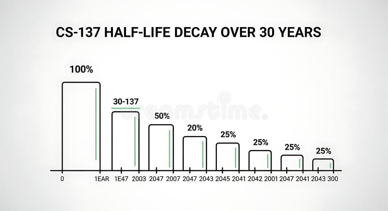
Free with trial A line graph illustrating the decrease in half-life over 30 years with bars representing percentage decay at different years, demonstrating long-term decline suitable for scientific, educational, or research presentations. Data decrease illustrations Half-life Decay Over 30 Years Chart Showing Decrease in Value or Effectiveness. A line graph illustrating the decrease in half-life over 30 years with bars representing percentage decay at different years, demonstrating long-term decline suitable for scientific, educational, or research presentations
Free with trial Black outline of descending bar chart with downward arrow, isolated on white background. concept of economic decline, data analysis, financial crisis, statistics. Data decrease vectors Black outline of descending bar chart with downward arrow, isolated on white background. concept of economic decline, data
Free with trial Bar graph with declining values, percentage on black square, globe in blue square. Ideal for data, statistics, global business, market trends, finance, analysis research flat simple metaphor. Data decrease vectors Bar chart with decreasing bars alongside percentage and globe icons for data and global analytics. Bar graph with declining values, percentage on black square, globe in blue square. Ideal for data, statistics, global business, market trends, finance, analysis research flat simple metaphor
Free with trial Sales word with a decrease chart. Financial crisis. Data decrease illustrations Sales word with a decrease chart. Financial crisis
Free with trial Sales word with a decrease chart. Financial crisis. Data decrease illustrations Sales word with a decrease chart. Financial crisis
Free with trial Sales word with a decrease chart. Financial crisis. Data decrease illustrations Sales word with a decrease chart. Financial crisis
Free with trial Sales word with a decrease chart. Financial crisis. Data decrease illustrations Sales word with a decrease chart. Financial crisis
Free with trial Sales word with a decrease chart. Financial crisis. Data decrease illustrations Sales word with a decrease chart. Financial crisis
Free with trial Sales word with a decrease chart. Financial crisis. Data decrease illustrations Sales word with a decrease chart. Financial crisis