Free with trial Black downward arrow and percentage symbol on a white background representing decrease. Data decrease illustrations Black downward arrow and percentage symbol on white background decrease reduction. Black downward arrow and percentage symbol on a white background representing decrease
Free with trial Collage with person observing rising arrow symbolizing startup growth business income statistics trading decrease increase. Data decrease illustrations Collage with person observing rising arrow symbolizing startup growth business income statistics trading decrease
Free with trial Decrease bar chart icon set. Market crash illustration concept. Data decrease vectors Decrease bar chart icon set. Market crash concept. Decrease bar chart icon set. Market crash illustration concept
Free with trial Black line graph icon with data points showing fluctuations on a white background Clear details and vibrant co. Data decrease illustrations Black line graph icon showing fluctuating data points on a white background chart. Black line graph icon with data points showing fluctuations on a white background Clear details and vibrant co
Free with trial The image shows a bar chart with eight bars of varying heights, illustrating a trend that starts low, gradually increases, peaks twice, dips in the middle, and then rises significantly at the end. The bars are outlined in blue with a slight gradient fill, and the chart is set against a plain light blue background. This type of chart is often used to represent data changes over time or different. Data decrease illustrations A varied bar chart displaying fluctuating data trends across different categories. The image shows a bar chart with eight bars of varying heights, illustrating a. The image shows a bar chart with eight bars of varying heights, illustrating a trend that starts low, gradually increases, peaks twice, dips in the middle, and then rises significantly at the end. The bars are outlined in blue with a slight gradient fill, and the chart is set against a plain light blue background. This type of chart is often used to represent data changes over time or different
Free with trial PPT transformation methodology infographic template with round box container decrease gradually with dark background style with 3 point for slide presentation vector. Data decrease illustrations PPT transformation methodology infographic template with round box container decrease gradually with dark background style with 3
Free with trial Abstract white block chart representing data or business decline on light background. Data decrease illustrations Abstract white block chart representing data or business decline on light background
Free with trial Illustration features worried blocks stacked with a data chart and arrows pointing up and down, in a flat, graphic style. Data decrease vectors Worried blocks stacked with data chart and arrows depicting volatile market conditions or economic uncertainty. Illustration features worried blocks stacked with a data chart and arrows pointing up and down, in a flat, graphic style.
Free with trial The image displays a detailed stock market chart with various lines and data points. The chart shows a significant drop in stock prices, with a prominent red line indicating a decrease of 28. 49%. The background features additional stock data and numbers, highlighting the volatility and dynamic nature of the stock market. Data decrease illustrations A close-up view of a stock market chart showing significant fluctuations in stock prices. The image displays a detailed stock market chart with various lines and data points. The chart shows a significant drop in stock prices, with a prominent red line indicating a decrease of 28.49%. The background features additional stock data and numbers, highlighting the volatility and dynamic nature of the stock market
Free with trial Arrow showing black bar chart with downward arrow indicating financial decline keywords: decline, decrease. Data decrease illustrations Black bar chart with downward arrow indicating financial decline Keywords: decline, decrease
Free with trial Glass display with a bar chart, analysis of trends, transparent screen with data visualization ,Generative ai. Data decrease illustrations Glass display bar chart, data visualization, trend analysis, and transparent screen technology. Glass display with a bar chart, analysis of trends, transparent screen with data visualization ,Generative ai
Free with trial Analyzing Data: Person Presenting Graph Showing Progress and Growth Pointing to Top Data Peak, Achievement Concept. Data decrease illustrations Analyzing Data: Person Presenting Graph Showing Progress and Growth Pointing to Top Data Peak, Achievement Concept
Free with trial Colorful bar chart analysis: growth, trends, and data visualization on a wooden table ,Generative ai. Data decrease illustrations Colorful bar chart data analysis, visualizing growth trends and performance on a wooden table. Colorful bar chart analysis: growth, trends, and data visualization on a wooden table ,Generative ai
Free with trial Business Strategy and Analysis: Lightbulb, Magnifying Glass, Briefcases, and Data Illustration. Data decrease vectors Business Strategy and Analysis Lightbulb Magnifying Glass Briefcases and Data Illustration.
Free with trial A vibrant neon bar graph shows financial growth. The data visualization uses blue, green, and purple hues against a dark background. Modern and abstract design. Data decrease illustrations Neon bar graph data visualization financial growth chart illustration generative ai. A vibrant neon bar graph shows financial growth. The data visualization uses blue, green, and purple hues against a dark background. Modern and abstract design
Free with trial The image features two circular arrows, one red and one green, pointing in opposite directions. The red arrow curves downward with a percentage symbol and a minus sign, indicating a decrease. The green arrow curves upward with a percentage symbol and a plus sign, indicating an increase. Both arrows are set against a plain background, emphasizing the contrast between the upward and downward trends. Data decrease vectors Opposing percentage arrows indicating increase and decrease with contrasting colors. The image features two circular arrows, one red and one green, pointing in opposite directions. The red arrow curves downward with a percentage symbol and a minus sign, indicating a decrease. The green arrow curves upward with a percentage symbol and a plus sign, indicating an increase. Both arrows are set against a plain background, emphasizing the contrast between the upward and downward trends
Free with trial A businessman in a blue shirt sits at a desk with a laptop, analyzing financial data with a mix of increasing and decreasing graphs and charts, indicating market trends. Data decrease illustrations Businessman analyzing financial data on laptop with increasing and decreasing graph. A businessman in a blue shirt sits at a desk with a laptop, analyzing financial data with a mix of increasing and decreasing graphs and charts, indicating market trends
Free with trial Circular Download Arrow Symbol Vector Graphic for Data Transfer and Upload Operations. Data decrease vectors Circular Download Arrow Symbol Vector Graphic for Data Transfer and Upload Operations
Free with trial A digital dashboard displaying financial data and market analytics on a desk with potted plants and greenery accents showcasing a modern technology driven workspace for business economics. Data decrease illustrations Financial Data Analytics Display with Greenery Accents on Office Desk. A digital dashboard displaying financial data and market analytics on a desk with potted plants and greenery accents showcasing a modern technology driven workspace for business economics
Free with trial The image shows a line graph with yellow data points connected by lines, set against a blue grid background. The graph depicts various peaks and troughs, indicating fluctuations in the data over time. Data decrease illustrations A dynamic graph illustrating fluctuating data points on a blue grid background. The image shows a line graph with yellow data points connected by lines, set against a blue grid background. The graph depicts various peaks and troughs, indicating fluctuations in the data over time
Free with trial Decrease bar graph icon on black circle. Market crash illustration concept. Data decrease vectors Decrease bar graph icon on black circle. Market crash concept. Decrease bar graph icon on black circle. Market crash illustration concept
Free with trial Minimalist bar chart created with natural wooden blocks, symbolizing data, financial trends, market fluctuations, and business analysis on a white surface. Data decrease illustrations Wooden blocks bar chart illustrating business data progression on a white background. Minimalist bar chart created with natural wooden blocks, symbolizing data, financial trends, market fluctuations, and business analysis on a white surface.
Free with trial The a hand with a ring on the ring finger interacting with a digital dashboard displayed on a smartphone, tablet, and laptop screen. The dashboard various analytics charts including bar graphs, line graphs, and pie charts. The data metrics include percentages, numbers, and performance indicators. The screens are set against a dark, blurred background with a glowing, futuristic interface. The color. Data decrease illustrations Hand interacting with digital dashboard displaying analytics charts and data metrics. The a hand with a ring on the ring finger interacting with a digital dashboard displayed on a smartphone, tablet, and laptop screen. The dashboard various analytics charts including bar graphs, line graphs, and pie charts. The data metrics include percentages, numbers, and performance indicators. The screens are set against a dark, blurred background with a glowing, futuristic interface. The color
Free with trial The image shows three green downward-pointing arrows, each containing a percentage symbol, suggesting a trend of decline, reduction, or decrease in percentage terms. The arrows are aligned horizontally and are uniformly styled, emphasizing a consistent downward direction. Data decrease vectors Three green downward arrows with percentage signs indicating a decline or decrease. The image shows three green downward-pointing arrows, each containing a percentage symbol, suggesting a trend of decline, reduction, or decrease in percentage terms. The arrows are aligned horizontally and are uniformly styled, emphasizing a consistent downward direction
Free with trial This image is a line graph with a shaded area underneath the line. The x-axis is labeled 'Time' and the y-axis is labeled 'Value'. The data points show an overall upward trend with some fluctuations. The shaded area under the line is filled with a light purple color, and the line itself is a darker purple. Data decrease illustrations A graph displaying the upward trend of data points over a period of time with a shaded area. This image is a line graph with a shaded area underneath the line. The x-axis is labeled 'Time' and the y-axis is labeled 'Value'. The data points show an overall upward trend with some fluctuations. The shaded area under the line is filled with a light purple color, and the line itself is a darker purple
Free with trial The image depicts a striking red zigzag arrow pointing downward sharply against a neutral, plain background. The arrow is thick and bold, emphasizing a significant decline or decrease, often used to symbolize negative trends, downturns, or reductions in various contexts such as economics, performance metrics, or general data representation. Data decrease illustrations A bold downward trend illustrated with a red zigzag arrow on a plain background. The image depicts a striking red zigzag arrow pointing downward sharply against a neutral, plain background. The arrow is thick and bold, emphasizing a significant decline or decrease, often used to symbolize negative trends, downturns, or reductions in various contexts such as economics, performance metrics, or general data representation
Free with trial A magnifying glass focuses on a downward trend in stock market data displayed on a futuristic digital screen, analyzing market trends. Data decrease illustrations A magnifying glass focuses on a downward trend in stock market data displayed on a futuristic digital screen, analyzing market
Free with trial Decrease bar chart icon in generic style. Market crash illustration concept. Data decrease vectors Decrease bar chart icon in generic style. Market crash concept. Decrease bar chart icon in generic style. Market crash illustration concept
Free with trial Line art icon representing financial audit and data analysis of a declining business report. Data decrease vectors Line art icon representing financial audit and data analysis of a declining business report
Free with trial Line art illustration of a financial chart depicting a decrease in money for economic reports. Data decrease vectors Line art illustration of a financial chart depicting a decrease in money for economic reports
Free with trial The image displays a red line graph trending downward on a white graph paper background with a grid pattern, indicating a decline or decrease in the data being represented. Data decrease illustrations Graph showing a sharp decline in a red line on a white graph paper background with grid pattern. The image displays a red line graph trending downward on a white graph paper background with a grid pattern, indicating a decline or decrease in the data being represented
Free with trial Line Graph Chart Line And Solid Icon Set. Data Analysis, Trend Visualization, And Business Growth Symbol Collection. Statistical Representation And Performance Tracking. Isolated Vector Illustration. Data decrease vectors Line Graph Chart Line And Solid Icon Set. Data Analysis, Trend Visualization, And Business Growth Symbol Collection
Free with trial Collage with person observing rising arrow symbolizing startup growth business income statistics trading decrease increase. Data decrease illustrations Collage with person observing rising arrow symbolizing startup growth business income statistics trading decrease
Free with trial Collage with person observing rising arrow symbolizing startup growth business income statistics trading decrease increase. Data decrease illustrations Collage with person observing rising arrow symbolizing startup growth business income statistics trading decrease
Free with trial Collage with person observing rising arrow symbolizing startup growth business income statistics trading decrease increase. Data decrease illustrations Collage with person observing rising arrow symbolizing startup growth business income statistics trading decrease
Free with trial Collage with person observing rising arrow symbolizing startup growth business income statistics trading decrease increase. Data decrease illustrations Collage with person observing rising arrow symbolizing startup growth business income statistics trading decrease
Free with trial Collage with person observing rising arrow symbolizing startup growth business income statistics trading decrease increase. Data decrease illustrations Collage with person observing rising arrow symbolizing startup growth business income statistics trading decrease
Free with trial Collage with person observing rising arrow symbolizing startup growth business income statistics trading decrease increase. Data decrease illustrations Collage with person observing rising arrow symbolizing startup growth business income statistics trading decrease
Free with trial Collage with person observing rising arrow symbolizing startup growth business income statistics trading decrease increase. Data decrease illustrations Collage with person observing rising arrow symbolizing startup growth business income statistics trading decrease
Free with trial A 3D bar chart and a partial pie chart illustrating data and growth, with percentage labels, on a white background. Data decrease illustrations 3D Bar Chart and Pie Chart Showing Growth and Data Analysis on White Background graph statistics. A 3D bar chart and a partial pie chart illustrating data and growth, with percentage labels, on a white background
Free with trial A businessman is shown analyzing financial documents and data on a laptop, with a prominent overlay indicating a -18. 5 MARKET CRASH RECESSION ALERT and downward-pointing arrows, symbolizing economic downturn and market instability. Data decrease illustrations Market Crash Recession Alert - Businessman Analyzing Financial Data with Downward Trends. A businessman is shown analyzing financial documents and data on a laptop, with a prominent overlay indicating a -18.5 MARKET CRASH RECESSION ALERT and downward-pointing arrows, symbolizing economic downturn and market instability
Free with trial Colorful business charts and graphs showing financial growth, data analysis, and stock market trends, ideal for corporate presentations and reports. Data decrease illustrations Business data analysis charts graphs financial growth stock market trend generative ai. colorful business charts and graphs showing financial growth, data analysis, and stock market trends, ideal for corporate presentations and reports.
Free with trial Collage with person observing rising arrow symbolizing startup growth business income statistics trading decrease increase. Data decrease illustrations Collage with person observing rising arrow symbolizing startup growth business income statistics trading decrease
Free with trial Collage with person observing rising arrow symbolizing startup growth business income statistics trading decrease increase. Data decrease illustrations Collage with person observing rising arrow symbolizing startup growth business income statistics trading decrease
Free with trial Collage with person observing rising arrow symbolizing startup growth business income statistics trading decrease increase. Data decrease illustrations Collage with person observing rising arrow symbolizing startup growth business income statistics trading decrease
Free with trial Collage with person observing rising arrow symbolizing startup growth business income statistics trading decrease increase. Data decrease illustrations Collage with person observing rising arrow symbolizing startup growth business income statistics trading decrease
Free with trial Collage with person observing rising arrow symbolizing startup growth business income statistics trading decrease increase. Data decrease illustrations Collage with person observing rising arrow symbolizing startup growth business income statistics trading decrease
Free with trial Collage with person observing rising arrow symbolizing startup growth business income statistics trading decrease increase. Data decrease illustrations Collage with person observing rising arrow symbolizing startup growth business income statistics trading decrease
Free with trial Collage with person observing rising arrow symbolizing startup growth business income statistics trading decrease increase. Data decrease illustrations Collage with person observing rising arrow symbolizing startup growth business income statistics trading decrease
Free with trial Collage with person observing rising arrow symbolizing startup growth business income statistics trading decrease increase. Data decrease illustrations Collage with person observing rising arrow symbolizing startup growth business income statistics trading decrease
Free with trial Collage with person observing rising arrow symbolizing startup growth business income statistics trading decrease increase. Data decrease illustrations Collage with person observing rising arrow symbolizing startup growth business income statistics trading decrease
Free with trial Collage with person observing rising arrow symbolizing startup growth business income statistics trading decrease increase. Data decrease illustrations Collage with person observing rising arrow symbolizing startup growth business income statistics trading decrease
Free with trial Collage with person observing rising arrow symbolizing startup growth business income statistics trading decrease increase. Data decrease illustrations Collage with person observing rising arrow symbolizing startup growth business income statistics trading decrease
Free with trial Collage with person observing rising arrow symbolizing startup growth business income statistics trading decrease increase. Data decrease illustrations Collage with person observing rising arrow symbolizing startup growth business income statistics trading decrease
Free with trial The image displays two sets of vertical bars, one in green and one in red, each accompanied by arrows indicating trends. The green bars show an initial decrease followed by an increase, while the red bars show an initial increase followed by a decrease. The visual is labeled 'Word 100' at the bottom right, potentially indicating a specific data point or category. Data decrease illustrations Comparison of increasing and decreasing bar trends in a visual chart labeled word 100. The image displays two sets of vertical bars, one in green and one in red, each accompanied by arrows indicating trends. The green bars show an initial decrease followed by an increase, while the red bars show an initial increase followed by a decrease. The visual is labeled 'Word 100' at the bottom right, potentially indicating a specific data point or category
Free with trial This is an detailed collection of financial icons depicting various stock market trends, growth curves, and data analysis patterns. Data decrease vectors Financial data and stock market trend line icons set showing growth and volatility curves. This is an detailed collection of financial icons depicting various stock market trends, growth curves, and data analysis patterns
Free with trial A businessman in a suit is intently working on a laptop, analyzing financial data displayed with charts and graphs, including a prominent red percentage symbol and a downward-pointing arrow, indicating a decline in performance or value. Data decrease illustrations Businessman Analyzing Financial Data with Decreasing Percentage and Bar Graphs on Laptop. A businessman in a suit is intently working on a laptop, analyzing financial data displayed with charts and graphs, including a prominent red percentage symbol and a downward-pointing arrow, indicating a decline in performance or value
Free with trial A 3D rendered graphic shows a bright blue arrow pointing downwards, symbolizing a decrease or decline. Attached to the shaft of the arrow is a pink circular badge with a white percentage sign (%) prominently displayed. The arrow and badge have a smooth, glossy finish. The entire composition is isolated against a clean white background, making it suitable for representing concepts related to sales. Data decrease illustrations Blue Downward Arrow with Pink Percentage Sign Badge on White Background decrease decline. A 3D rendered graphic shows a bright blue arrow pointing downwards, symbolizing a decrease or decline. Attached to the shaft of the arrow is a pink circular badge with a white percentage sign (%) prominently displayed. The arrow and badge have a smooth, glossy finish. The entire composition is isolated against a clean white background, making it suitable for representing concepts related to sales
Free with trial Colorful bar chart graph with long shadow in circular background represents data analytics. Data decrease vectors Colorful bar chart graph with long shadow in circular background represents data analytics
Free with trial This image features four different types of graphs and charts that illustrate various trends and data analysis. These visual representations include bar graphs, line graphs, and 3D block charts. Data decrease illustrations Graphs and charts showing trends and data analysis isolated on transparent background. This image features four different types of graphs and charts that illustrate various trends and data analysis. These visual representations include bar graphs, line graphs, and 3D block charts
Free with trial Decrease bar chart icon on black circle. Statistic sign symbol illustration. Data decrease vectors Decrease bar chart icon on black circle. Statistic sign symbol
Free with trial This is an detailed assembly of essential outline icons for business strategy, data visualization, and planning. Data decrease vectors Essential business strategy and data visualization tools in professional outline style. This is an detailed assembly of essential outline icons for business strategy, data visualization, and planning
Free with trial A person's hand is reaching out towards a holographic display that shows various financial data charts and an infinity symbol, representing continuous growth and success in the financial market. Data decrease illustrations Hand interacting with a holographic display showing financial data and an infinity symbol. A person's hand is reaching out towards a holographic display that shows various financial data charts and an infinity symbol, representing continuous growth and success in the financial market
Free with trial Descending bar graph on blue background. 3D render data visualization. Financial market chart, business analysis concept. Economic loss, falling sales, statistics. Ideal for. Data decrease illustrations Descending bar graph on blue background. 3D render data visualization. Financial market chart, business analysis concept.
Free with trial Pink bar chart report on wooden table displaying progress data analysis ,Generative ai. Data decrease illustrations Pink bar chart report displaying progress data analysis on wooden table for business insights. Pink bar chart report on wooden table displaying progress data analysis ,Generative ai
Free with trial Decrease bar chart icon in generic style. Statistic sign symbol illustration. Data decrease vectors Decrease bar chart icon in generic style. Statistic sign symbol
Free with trial Modern graphic business charts set featuring financial growth and decline for data visualization. Data decrease vectors Modern graphic business charts set featuring financial growth and decline for data visualization
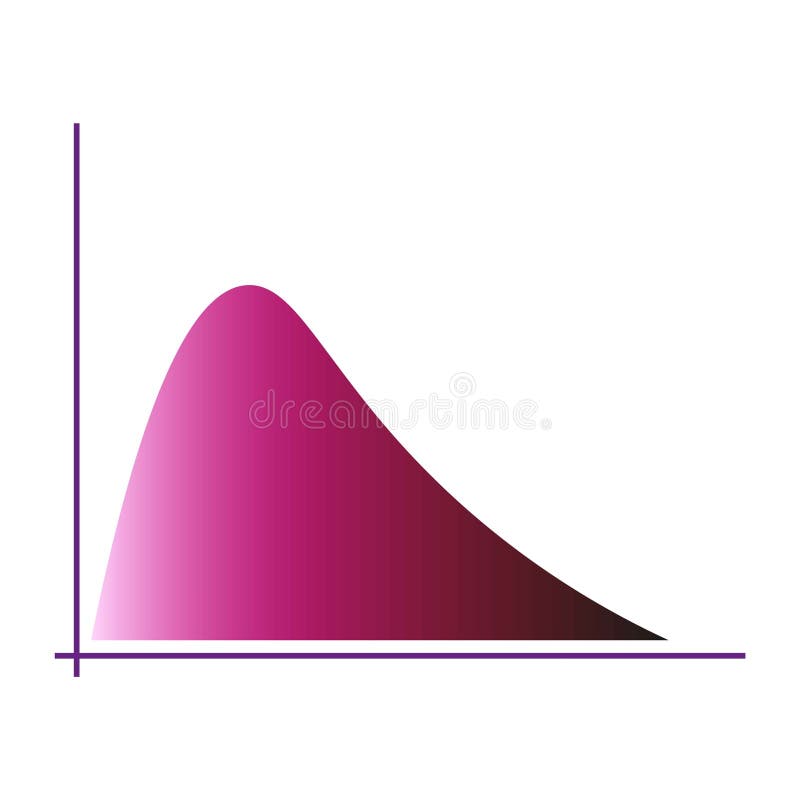
Free with trial Gradient curve chart. Pink color distribution. Graphical data visualization. Modern vector graphic. EPS 10. Data decrease vectors Gradient curve chart. Pink color distribution. Graphical data visualization. Modern vector graphic.
Free with trial A 3D app icon displays an alert for a website traffic decrease of -5. 2% with a red downward arrow. Data decrease illustrations 3D App Icon Alerting to Website Traffic Decrease with Percentage Drop notification warning. A 3D app icon displays an alert for a website traffic decrease of -5.2% with a red downward arrow
Free with trial The image displays a grid of twelve different statistical graphs and charts, each representing various data trends and distributions. The graphs include line charts, bar charts, and area charts, each showcasing unique data patterns. Some graphs show fluctuating data points, while others illustrate steady increases or decreases. The bar charts present different frequencies and distributions. Data decrease illustrations Collection of various statistical graphs and charts illustrating data trends and distributions. The image displays a grid of twelve different statistical graphs and charts, each representing various data trends and distributions. The graphs include line charts, bar charts, and area charts, each showcasing unique data patterns. Some graphs show fluctuating data points, while others illustrate steady increases or decreases. The bar charts present different frequencies and distributions.
Free with trial Collection of icons showing different types of charts graphs and data analysis tools isolated on transparent background. Data decrease vectors Set of various icons representing business data analysis and statistics with charts and graphs. Collection of icons showing different types of charts graphs and data analysis tools isolated on transparent background
Free with trial The image features a bold red zigzag arrow pointing downward, commonly used to symbolize a decline, decrease, or downward trend in various contexts such as economics, performance metrics, or data visualization. Data decrease illustrations A downward zigzag arrow indicating a decline or reduction trend isolated on white background. The image features a bold red zigzag arrow pointing downward, commonly used to symbolize a decline, decrease, or downward trend in various contexts such as economics, performance metrics, or data visualization
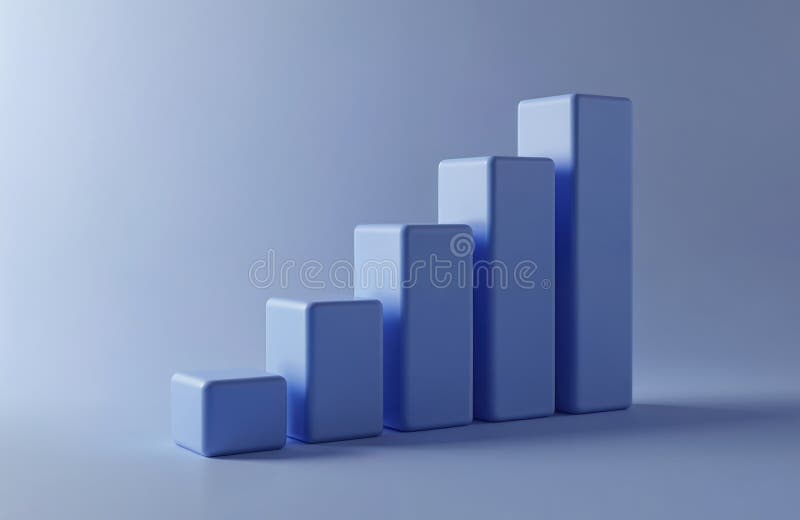
Free with trial Minimalist 3D bar chart with colorful pastel blocks representing data on a clean white background. Data decrease illustrations Minimalist 3D bar chart with colorful pastel blocks representing data on a clean white background
Free with trial A man is presenting business data on a whiteboard, using a laptop. The chart shows growth and success. He is explaining the strategy and planning to his colleagues. Data decrease illustrations Man presenting business data on a whiteboard isolated on white background. A man is presenting business data on a whiteboard, using a laptop. The chart shows growth and success. He is explaining the strategy and planning to his colleagues
Free with trial A businessman analyzes a declining business showing financial loss. He uses a laptop to study financial data charts illustrating a downward trend and falling figures. This image effectively conveys concepts of failure, risk, and economic decline, suitable for business and finance publications. Data decrease illustrations Businessman analyzing declining business performance using laptop and financial data charts. A businessman analyzes a declining business showing financial loss. He uses a laptop to study financial data charts illustrating a downward trend and falling figures. This image effectively conveys concepts of failure, risk, and economic decline, suitable for business and finance publications
Free with trial Man points red arrow on bar chart for analysis professional highlights data trend with arrow on chart,Generative AI. Data decrease illustrations Man points red arrow on bar chart for analysis professional highlights data trend with arrow on chart
Free with trial A dynamic visual representation showcases interest rate volatility, featuring fluctuating lines, percentage symbols, and financial data analysis. The display creates a sense of market flux and economic shifts. Ideal for illustrating financial news, investment strategies, economic forecasts, and mark. Data decrease illustrations Interest Rate Volatility Display Showing Financial Data Trends and Fluctuations for Market Analysis. A dynamic visual representation showcases interest rate volatility, featuring fluctuating lines, percentage symbols, and financial data analysis. The display creates a sense of market flux and economic shifts. Ideal for illustrating financial news, investment strategies, economic forecasts, and mark