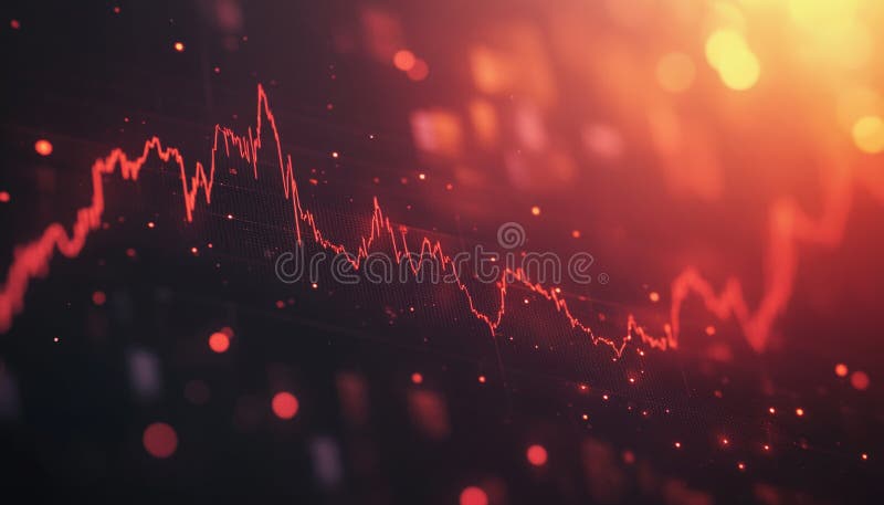
Free with trial High-detail image showing a dynamic orange graph line representing financial data trends and market fluctuations. Ideal for finance and business themes. Data decrease illustrations Dynamic Orange Graph Line Representing Financial Data Trends and Market Fluctuations
Free with trial Set Magnifying glass and delete, Browser files, Financial growth decrease and with shield icon. Vector. Data decrease illustrations Set Magnifying glass and delete, Browser files, Financial growth decrease and with shield icon. Vector
Free with trial Set line Search engine, SEO optimization, Financial growth decrease and Browser setting icon. Vector. Data decrease vectors Set line Search engine, SEO optimization, Financial growth decrease and Browser setting icon. Vector
Free with trial Downward trend bar chart with arrow showing financial economic decline loss decrease. Data decrease vectors Downward trend bar chart with arrow showing financial economic decline loss decrease
Free with trial This 3D rendering showcases a vibrant bar chart illustrating business growth and financial performance. The colorful cylinders represent data points, rising to show increasing success. A line graph adds additional information about trends over time. Data decrease illustrations Colorful 3D Bar Chart with Growth Graph Showing Business Success and Financial Data. This 3D rendering showcases a vibrant bar chart illustrating business growth and financial performance. The colorful cylinders represent data points, rising to show increasing success. A line graph adds additional information about trends over time.
Free with trial A comprehensive set of black and white icons for graphs and charts, illustrating various data visualization types and business-related concepts for digital and print media. Data decrease vectors Diverse collection of graph and chart icons representing data analysis and business growth. A comprehensive set of black and white icons for graphs and charts, illustrating various data visualization types and business-related concepts for digital and print media
Free with trial A blue line graph displays a sharp decrease in data points, isolated on a clean white background. Data decrease illustrations Line graph showing a steep decline in values over time isolated on white background. A blue line graph displays a sharp decrease in data points, isolated on a clean white background
Free with trial Close-up of a modern computer screen displaying stock market data and financial charts. Data decrease illustrations Analyzing live stock market data on a computer screen, offering insights into trends. Close-up of a modern computer screen displaying stock market data and financial charts.
Free with trial Purple graph with bar chart visually representing data analysis and growth ,Generative ai. Data decrease illustrations Purple graph with bar chart, visual representation of data analysis, growth, and business trends. Purple graph with bar chart visually representing data analysis and growth ,Generative ai
Free with trial Downward Trending Graph On Stock Market Display With Red Data Points And A Fiery Red Glow, Generated by AI. Data decrease illustrations Downward Trending Graph On Stock Market Display With Red Data Points And A Fiery Red Glow
Free with trial Colorful bar chart on a blue background showing data analysis and statistical growth. Generative AI. Data decrease illustrations Colorful bar chart on a blue background showing data analysis and statistical growth
Free with trial Tree graphic with bar graph displaying decrease in carbon emissions from wood pellets, Generated by AI. Data decrease illustrations Tree graphic with bar graph displaying decrease in carbon emissions from wood pellets
Free with trial A digital illustration depicting a financial chart with blue and red bars and lines. Neon glows accentuate the data points. The style is abstract and modern. Data decrease illustrations Abstract Blue Red Financial Data Chart Graph Digital Illustration Neon Glow business. A digital illustration depicting a financial chart with blue and red bars and lines. Neon glows accentuate the data points. The style is abstract and modern
Free with trial Cylinder objects pattern. Stacked bar elements. Data visualization Vector. Storage capacity illustration. EPS 10. Data decrease vectors Cylinder objects pattern. Stacked bar elements. Data visualization Vector. Storage capacity illustration.
Free with trial Simple Blue Analytics Diagram Bar Chart Showing Variable Data Trends on White Background � Simple Abstract Business and Analytics Infographic Illustration. Data decrease illustrations Simple Blue Analytics Diagram Bar Chart Showing Variable Data Trends on White Background
Free with trial Descending data analytics line graphic outline icon in white and black colors. descending data analytics line graphic flat vector icon from business collection for web, mobile apps and ui. Data decrease vectors Descending data analytics line graphic outline icon in white and black colors. descending data analytics line graphic flat vector
Free with trial Set pop art Coal mine trolley, Data analysis, and Financial growth decrease icon. Vector. Data decrease illustrations Set pop art Coal mine trolley, Data analysis, and Financial growth decrease icon. Vector
Free with trial Digital financial ticker display is showing real‑time market data with arrows in flat design. Finance, technology, analytics, data, stock, investment, digital. Data decrease illustrations Digital financial ticker display is showing real?time market data with arrows in flat design. Digital financial ticker display is showing real‑time market data with arrows in flat design. Finance, technology, analytics, data, stock, investment, digital
Free with trial Dollar arrow up and down icon. USD currency increase and decrease sign symbol vector. Data decrease vectors Dollar arrow up and down icon. USD currency increase and decrease sign symbol
Free with trial Abstract colorful bar charts display statistical data and financial trend analysis. Data decrease vectors Colorful abstract bar charts representing data analysis and statistical visualization. Abstract colorful bar charts display statistical data and financial trend analysis.
Free with trial Bar chart graph. Colorful falling arrow. Financial data analysis. Vector business symbol. EPS 10. Data decrease vectors Bar chart graph. Colorful falling arrow. Financial data analysis. Vector business symbol.
Free with trial Set line Financial growth decrease, Arrow, Pie chart infographic and Factory icon. Vector. Data decrease illustrations Set line Financial growth decrease, Arrow, Pie chart infographic and Factory icon. Vector
Free with trial Close-up view of a computer monitor displaying a vibrant bar chart, indicating data analysis and progress tracking ,Generative ai. Data decrease illustrations Computer monitor displaying a colorful bar chart for data analysis and progress tracking. Close-up view of a computer monitor displaying a vibrant bar chart, indicating data analysis and progress tracking ,Generative ai
Free with trial Graph icon indicating growth and data analysis, perfect for business presentations and financial reports. visual representation of progress ,Generative ai. Data decrease illustrations Graph icon, a comprehensive symbol of data analysis, growth, and business trends for effective presentations. Graph icon indicating growth and data analysis, perfect for business presentations and financial reports. visual representation of progress ,Generative ai
Free with trial A close-up view of a hand holding a magnifying glass over a business graph, emphasizing the analysis of data trends and performance insights. Data decrease illustrations Analysis of Data Trends with Magnifying Glass on Business Graph for Detailed Observation. A close-up view of a hand holding a magnifying glass over a business graph, emphasizing the analysis of data trends and performance insights
Free with trial Vibrant Digital Financial Analysis With Colorful Graphs And Data Visualization On Screen. Generative AI. Data decrease illustrations Vibrant Digital Financial Analysis With Colorful Graphs And Data Visualization On Screen
Free with trial A 3D rendered blue arrow is pointing downwards, indicating a decrease or decline. Attached to the curve of the arrow is a pink circular badge with a white percentage symbol (%) in the center. The icon is set against a clean white background, suggesting a concept related to price reduction, sales, or negative financial trends. Data decrease illustrations Blue Downward Arrow with Pink Percentage Sign Icon on White Background decrease decline. A 3D rendered blue arrow is pointing downwards, indicating a decrease or decline. Attached to the curve of the arrow is a pink circular badge with a white percentage symbol (%) in the center. The icon is set against a clean white background, suggesting a concept related to price reduction, sales, or negative financial trends
Free with trial A 3D illustration of a blue line graph on a light blue background. The graph features a wavy blue line connecting several data points represented by small pink and green spheres. The overall shape suggests fluctuating data or trends, with some points indicating upward movement. Data decrease illustrations 3D Blue Line Graph with Pink and Green Data Points on Light Blue Background chart statistics. A 3D illustration of a blue line graph on a light blue background. The graph features a wavy blue line connecting several data points represented by small pink and green spheres. The overall shape suggests fluctuating data or trends, with some points indicating upward movement
Free with trial A 3D illustration depicts financial data analysis. On the left, a purple rectangular panel shows a red downward-trending arrow and a small pie chart with red, yellow, and blue segments. Below it, another purple panel displays a candlestick chart with red and blue bars. To the right, an orange magnifying glass with a turquoise lens hovers, suggesting investigation. The entire composition is set. Data decrease illustrations 3D Render of Financial Data Visualization with Downward Trend Graph and Magnifying Glass. A 3D illustration depicts financial data analysis. On the left, a purple rectangular panel shows a red downward-trending arrow and a small pie chart with red, yellow, and blue segments. Below it, another purple panel displays a candlestick chart with red and blue bars. To the right, an orange magnifying glass with a turquoise lens hovers, suggesting investigation. The entire composition is set
Free with trial Financial chart displaying a series of candlestick patterns on a digital screen, used for stock data analysis. The chart features vertical bars in orange against a blue background with grid lines. Each candlestick represents price movements within a specific time frame, showcasing market trends. The background includes a blurred assortment of lights and other graphical elements, indicating a financial data interface, likely used for investment portfolio analysis and trading activities. Data decrease illustrations Financial Chart And Stock Data Analysis For Investment Portfolio. Candle Stick Graph For Trade. Financial chart displaying a series of candlestick patterns on a digital screen, used for stock data analysis. The chart features vertical bars in orange against a blue background with grid lines. Each candlestick represents price movements within a specific time frame, showcasing market trends. The background includes a blurred assortment of lights and other graphical elements, indicating a financial data interface, likely used for investment portfolio analysis and trading activities.
Free with trial Illustration shows a purple downward arrow with a white percentage symbol, representing decrease or discount in a clean style. Calm mood. Generative AI. Data decrease vectors Downward arrow with percentage symbol in purple vector illustration for discount and decrease concepts. Illustration shows a purple downward arrow with a white percentage symbol, representing decrease or discount in a clean style. Calm mood. Generative AI
Free with trial AI-powered trend prediction graph showing CSRpoepiojican metrics over time. Data visualization of future trends. Data decrease illustrations AI Trend Prediction Graph Visualization: Data Analysis of CSRpoepiojican Metrics Over Time. AI-powered trend prediction graph showing CSRpoepiojican metrics over time. Data visualization of future trends
Free with trial A 3D rendered graphic depicts a bar chart with three vertical bars of varying heights: two blue bars flanking a taller yellow bar. At the top of the yellow bar, a central yellow sphere is connected by white rods to two smaller blue spheres, resembling a molecular structure or a network. The entire graphic is isolated on a white background, suggesting concepts of data analysis, growth, and. Data decrease illustrations 3D Rendered Bar Chart with Connecting Spheres Representing Data Analysis graph statistics. A 3D rendered graphic depicts a bar chart with three vertical bars of varying heights: two blue bars flanking a taller yellow bar. At the top of the yellow bar, a central yellow sphere is connected by white rods to two smaller blue spheres, resembling a molecular structure or a network. The entire graphic is isolated on a white background, suggesting concepts of data analysis, growth, and
Free with trial A 3D rendered blue arrow points downwards, symbolizing a decrease or reduction. Adjacent to the arrow is a pink circular icon containing a white percentage symbol. The composition is set against a clean white background, suggesting a concept related to sales, discounts, price drops, or negative financial trends. Data decrease illustrations Downward Arrow with Percentage Symbol on White Background decrease reduction. A 3D rendered blue arrow points downwards, symbolizing a decrease or reduction. Adjacent to the arrow is a pink circular icon containing a white percentage symbol. The composition is set against a clean white background, suggesting a concept related to sales, discounts, price drops, or negative financial trends
Free with trial Business growth and decline icon set. Up and down trend chart symbol illustration. Increase and decrease bar graph concept. Data decrease vectors Business growth and decline icon set. Up and down trend chart symbol. Increase and decrease bar graph concept
Free with trial Stock market data with various ticker symbols and percentages displayed in red and green. Numbers and letters are overlaid on dark background with a grid pattern. Data decrease illustrations Stock market data with various ticker symbols and percentages displayed in red and green
Free with trial Financial Data Graph With Falling And Rising Lines. Stock Market Volatility. Digital Business. , Generated by AI. Data decrease illustrations Financial Data Graph With Falling And Rising Lines. Stock Market Volatility. Digital Business.
Free with trial Abstract digital illustration featuring blue and red bar charts and line graphs on a dark blue background. Orange and light blue points highlight data trends. The style is clean and modern. Data decrease illustrations Abstract Financial Data Visualization Blue Red Charts Graphs Lines Points finance business. Abstract digital illustration featuring blue and red bar charts and line graphs on a dark blue background. Orange and light blue points highlight data trends. The style is clean and modern
Free with trial This vibrant pyramid stack of 3D cubes, meticulously crafted and isolated against a pristine white background, offers a striking and engaging visual element for business presentations and data storytelling. The gradual decrease in cube size from base to apex creates a compelling visual representation of hierarchical data, making complex information easily digestible for audiences of all. Data decrease illustrations Dynamic 3D Cube Pyramid A Colorful Visual for Data Visualization and Business Presentations. This vibrant pyramid stack of 3D cubes, meticulously crafted and isolated against a pristine white background, offers a striking and engaging visual element for business presentations and data storytelling. The gradual decrease in cube size from base to apex creates a compelling visual representation of hierarchical data, making complex information easily digestible for audiences of all
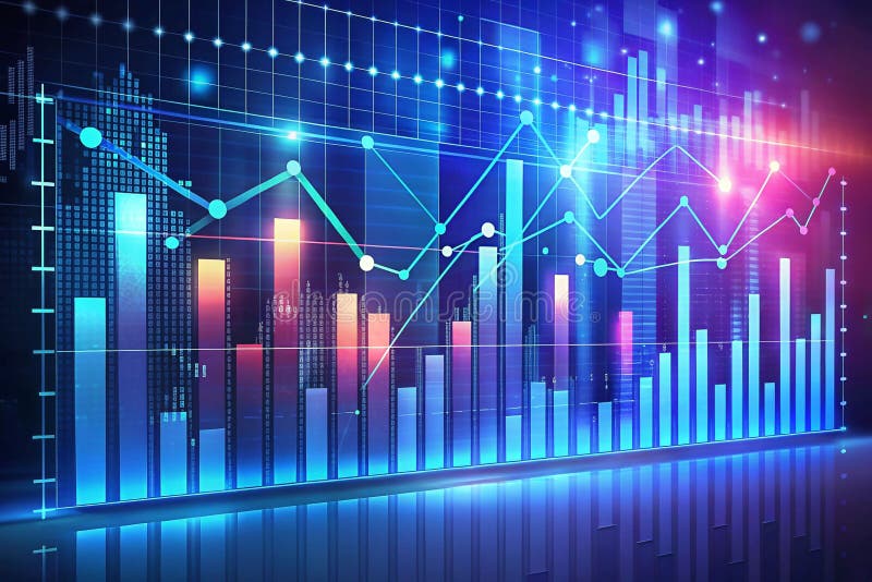
Free with trial Futuristic financial data visualization with graphs and charts showing growth and market trends. Data decrease illustrations Futuristic financial data visualization with graphs and charts showing growth and market trends
Free with trial A colorful bar graph depicting an upward trend with a minor dip, presented as a document icon. The design uses bold colors and clean lines for a modern, data-driven aesthetic. Ideal for presentations or reports. Data decrease illustrations Vibrant Bar Graph on Document Icon: Upward Trend with Slight Dip, Colorful Data Visualization. A colorful bar graph depicting an upward trend with a minor dip, presented as a document icon. The design uses bold colors and clean lines for a modern, data-driven aesthetic. Ideal for presentations or reports
Free with trial Set line Search engine, Mobile phone, Browser window and Financial growth decrease icon. Vector. Data decrease vectors Set line Search engine, Mobile phone, Browser window and Financial growth decrease icon. Vector
Free with trial A green line graph displays fluctuating data points across five days, presented isolated on a clean white background. Data decrease illustrations Green line graph showing fluctuating data trends over five days isolated on white background. A green line graph displays fluctuating data points across five days, presented isolated on a clean white background
Free with trial A character stands alone on a white background, firmly grasping a large green arrow pointing downward, symbolizing decrease or decline. Data decrease illustrations Character Holding a Large Green Downward Arrow on a Clean White Background, Representing Decrease. A character stands alone on a white background, firmly grasping a large green arrow pointing downward, symbolizing decrease or decline
Free with trial 3d bar chart illustrating growth, analysis, and business progress with colorful visual representation of data ,Generative ai. Data decrease illustrations 3d bar chart, visualizing growth, data analysis, and business progress for effective communication. 3d bar chart illustrating growth, analysis, and business progress with colorful visual representation of data ,Generative ai
Free with trial A 3D bar chart illustrating a declining trend, perfect for business, finance, and data visualization presentations. Data decrease illustrations Colorful 3D bar graph showing a downward trend in business growth and financial data analysis. A 3D bar chart illustrating a declining trend, perfect for business, finance, and data visualization presentations
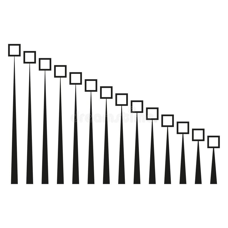
Free with trial Decreasing line graphic. Square point Vector. Minimalist progress chart. Data sequence illustration. EPS 10. Data decrease vectors Decreasing line graphic. Square point Vector. Minimalist progress chart. Data sequence illustration.
Free with trial A character is grasping a big red arrow that points downward, symbolizing decline or decrease against a plain white backdrop. Data decrease illustrations Character Holding a Large Red Downward Arrow on a White Background Indicating Decline or Decrease. A character is grasping a big red arrow that points downward, symbolizing decline or decrease against a plain white backdrop
Free with trial A 3D rendering of a simple bar graph featuring two green and one orange cylinder. This image is perfect for illustrating business concepts, data representation, or as an infographic element. The clean design makes it versatile for various applications. This image was generated with the assistance of artificial intelligence. Data decrease illustrations 3D Bar Graph, Green and Orange Cylinders, Business Chart, Data Visualization, Infographic Element. A 3D rendering of a simple bar graph featuring two green and one orange cylinder. This image is perfect for illustrating business concepts, data representation, or as an infographic element. The clean design makes it versatile for various applications.This image was generated with the assistance of artificial intelligence.
Free with trial A close-up, angled view of a digital stock market ticker board. The screen displays rows of numbers in vibrant red and green LED lights against a dark background. Red numbers typically indicate a price decrease or negative performance, while green signifies an increase or positive performance. The display shows various financial data, including stock prices, trading volumes, and potentially chart lines, creating a dynamic and abstract representation of financial markets and trading. Data decrease illustrations Stock Market Ticker Display with Red and Green Numbers. A close-up, angled view of a digital stock market ticker board. The screen displays rows of numbers in vibrant red and green LED lights against a dark background. Red numbers typically indicate a price decrease or negative performance, while green signifies an increase or positive performance. The display shows various financial data, including stock prices, trading volumes, and potentially chart lines, creating a dynamic and abstract representation of financial markets and trading.
Free with trial Inflation rate graph on digital display vivid data visualization highlighting economic concerns, Generated by AI. Data decrease illustrations Inflation rate graph on digital display vivid data visualization highlighting economic concerns
Free with trial Decreasing line graphic. Circle point Vector. Minimalist growth chart. Data progression illustration. EPS 10. Data decrease vectors Decreasing line graphic. Circle point Vector. Minimalist growth chart. Data progression illustration.
Free with trial Blue folder with chart, business organization, data analysis, and report presentation concept. streamline your workflow ,Generative ai. Data decrease illustrations Blue folder with chart, streamlining business data analysis and report presentation for enhanced workflow. Blue folder with chart, business organization, data analysis, and report presentation concept. streamline your workflow ,Generative ai
Free with trial A man standing in front of a chart with an arrow pointing to it, analyzing sales growth data, Worker analyzes sales growth graph, Simple and minimalist flat Vector Illustration. Data decrease vectors A man standing in front of a chart with an arrow pointing to it, analyzing sales growth data, Worker analyzes sales growth graph
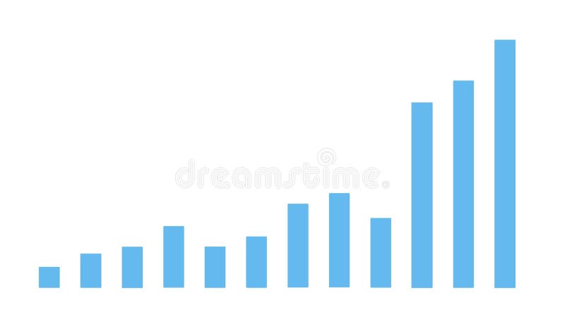
Free with trial Colorful bar graph showing data and trends, perfect for business, finance, or analytics presentations. EPS 10. Data decrease vectors Colorful bar graph showing data and trends, perfect for business, finance, or analytics presentations.
Free with trial A detailed financial chart showing business data analysis and market trend with upward arrow sign. Data decrease illustrations Financial chart business data analysis and market trend view isolated on transparent background. a detailed financial chart showing business data analysis and market trend with upward arrow sign
Free with trial This image shows a falling graph behind a diamond, representing the decrease in the value of precious stones. It's suitable for illustrating financial losses. Data decrease vectors Illustration of a falling graph behind a diamond, symbolizing a decrease in the value of precious stones. This image shows a falling graph behind a diamond, representing the decrease in the value of precious stones. It's suitable for illustrating financial losses
Free with trial Set New chat messages notification, Browser window, files and Financial growth decrease icon. Vector. Data decrease illustrations Set New chat messages notification, Browser window, files and Financial growth decrease icon. Vector
Free with trial Set Server, Data, Web Hosting, security with key, Cloud computing lock and Cost reduction icon. Vector. Data decrease illustrations Set Server, Data, Web Hosting, security with key, Cloud computing lock and Cost reduction icon. Vector
Free with trial A set of black and white icons representing stock market data analysis and financial growth. 94. Data decrease vectors Stock market data analysis charts and graphs business finance and investment vector icon set design 100. a set of black and white icons representing stock market data analysis and financial growth. 94
Free with trial Global tobacco consumption trends illustrated with a world map and data overlays on usage patterns, Generated by AI. Data decrease illustrations Global tobacco consumption trends illustrated with a world map and data overlays on usage patterns
Free with trial Set Financial growth, decrease, Binary code, Cloud download and upload, Folder lock, Server and icon. Vector. Data decrease illustrations Set Financial growth, decrease, Binary code, Cloud download and upload, Folder lock, Server and icon. Vector
Free with trial Set Financial growth decrease, Online shopping on screen, Browser window and on seamless pattern. Vector. Data decrease illustrations Set Financial growth decrease, Online shopping on screen, Browser window and on seamless pattern. Vector
Free with trial Set line Search engine, Laptop with browser window, Financial growth decrease and Browser shield icon. Vector. Data decrease vectors Set line Search engine, Laptop with browser window, Financial growth decrease and Browser shield icon. Vector
Free with trial Chart icons for data analysis vector art design, Minimalist business charts icons bar graphs, line graphs, and pie charts vector illustration on white background the image is generated using AI. Data decrease vectors Chart icons for data analysis vector art design, Minimalist business charts icons bar graphs, line graphs, and pie charts vector
Free with trial Business Analytics And Data Visualization Line Icon Set. Financial Growth, Market Trends, And Performance Analysis Outline Symbol Collection. Editable Stroke. Isolated Vector Illustration. Data decrease vectors Business Analytics And Data Visualization Line Icon Set. Financial Growth, Market Trends, And Performance Analysis
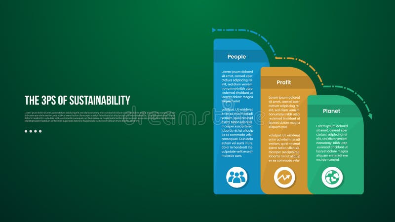
Free with trial The 3 Ps of Sustainability infographic template with round box container decrease gradually with dark background style with 3 point for slide presentation vector. Data decrease illustrations The 3 Ps of Sustainability infographic template with round box container decrease gradually with dark background style with 3
Free with trial Monochrome chart representing big data analysis with peaks and valleys, stock market theme for investment strategy and economic forecast using modern digital infographic. Data decrease illustrations Abstract 3d graph with data blocks on white grid background, business analytics concept for financial report and corporate. Monochrome chart representing big data analysis with peaks and valleys, stock market theme for investment strategy and economic forecast using modern digital infographic
Free with trial Bar chart with arrow pointing down, illustrating economic decline, business loss, or negative trend data. Data decrease vectors Bar chart with arrow pointing down, illustrating economic decline, business loss, or negative trend data
Free with trial Vibrant neon stock market graph showing financial data trends and analysis. Perfect for business, finance, and investment themes. Generative AI Illustration. Data decrease illustrations Vibrant Neon Stock Market Graph Showing Financial Data Trends and Analysis. Generative AI Illustration. Vibrant neon stock market graph showing financial data trends and analysis. Perfect for business, finance, and investment themes. Generative AI Illustration
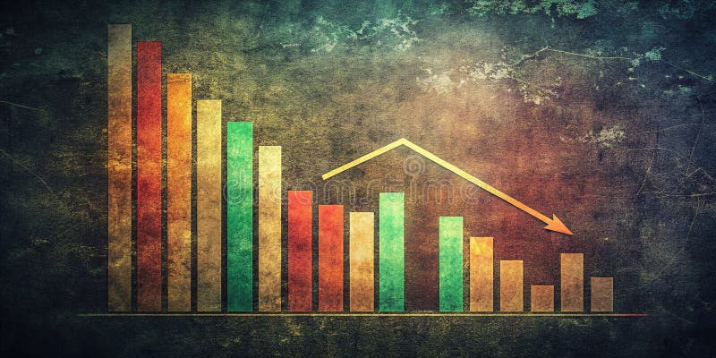
Free with trial This striking vintage-style bar graph, set against a dramatic dark background, visually represents a consistent downward trend in financial data. The muted colors and grainy texture add an authentic, analog feel to the digital visualization, emphasizing the impactful nature of the decline. Ideal for business presentations, financial reports, or investment analysis, this image powerfully. Data decrease illustrations Vintage Bar Graph Depicts Consistent Market Decline A Financial Data Visualization for Trend Analysis. This striking vintage-style bar graph, set against a dramatic dark background, visually represents a consistent downward trend in financial data. The muted colors and grainy texture add an authentic, analog feel to the digital visualization, emphasizing the impactful nature of the decline. Ideal for business presentations, financial reports, or investment analysis, this image powerfully
Free with trial The image depicts a business professional in a suit interacting with a transparent digital chart displaying a declining trend in business performance. The visualization includes green bar charts and a line graph, complemented by a prominent downward arrow and percentage symbol indicating a decrease. This modern digital interface symbolizes data-driven decision-making, financial analysis, and real-time monitoring of business metrics for strategic planning. Data decrease illustrations Business Performance Decline Visualization with Interactive Data Analytics and Percentage Drop Indicator. The image depicts a business professional in a suit interacting with a transparent digital chart displaying a declining trend in business performance. The visualization includes green bar charts and a line graph, complemented by a prominent downward arrow and percentage symbol indicating a decrease. This modern digital interface symbolizes data-driven decision-making, financial analysis, and real-time monitoring of business metrics for strategic planning.
Free with trial Set line Financial growth decrease, Binary code and icon. Vector. Data decrease illustrations Set line Financial growth decrease, Binary code and icon. Vector
Free with trial A stylized cloud icon featuring a red percentage sign and a blue downward arrow, symbolizing price reduction, discounts, or data decrease. Data decrease vectors Cloud icon with percentage symbol and down arrow isolated on transparent background cyber monday element. A stylized cloud icon featuring a red percentage sign and a blue downward arrow, symbolizing price reduction, discounts, or data decrease
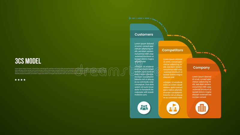
Free with trial 3C analysis business model infographic template with round box container decrease gradually with dark background style with 3 point for slide presentation vector. Data decrease illustrations 3C analysis business model infographic template with round box container decrease gradually with dark background style with 3
Free with trial This image features six black bar chart icons with red and green arrows showing increase, decrease, and uncertainty trends. It is a clear, simple vector for business or data visuals, informative and clean. Generative AI. Data decrease vectors Set of six vector bar chart icons with arrows indicating trends and question mark in black and colored design elements. This image features six black bar chart. This image features six black bar chart icons with red and green arrows showing increase, decrease, and uncertainty trends. It is a clear, simple vector for business or data visuals, informative and clean. Generative AI
Free with trial Set line Search with folder, Server and Financial growth decrease icon. Vector. Data decrease vectors Set line Search with folder, Server and Financial growth decrease icon. Vector
Free with trial A bear in a business suit sitting at a desk surrounded by stock market monitors displaying financial data, symbolizing bearish market trends and investment risks. Generative AI. Data decrease illustrations A bear in a business suit sitting at a desk surrounded by stock market monitors displaying financial data, symbolizing bearish
Free with trial Person analyses stock market trends on mobile phone. Investor views financial data on smartphone display. Stock charts display, market fluctuations. Businessman tracks investment. Data decrease illustrations Person analyses stock market trends on mobile phone. Investor views financial data on smartphone display. Stock charts display
Free with trial Colorful Bar Graph Showing Decrease with a Yellow Arrow Signifying a Downward Trend in Financial Performance. Data decrease vectors Colorful Bar Graph Showing Decrease with a Yellow Arrow Signifying a Downward Trend in Financial Performance