Free with trial FMEA analysis infographic template with round vertical box container gradually decrease on right column dark background style with 4 point for slide presentation vector. Data decrease illustrations FMEA analysis infographic template with round vertical box container gradually decrease on right column dark background style with
Free with trial This vibrant line graph showcases multiple data series, illustrating trends and fluctuations over time with a clear light grid background, perfect for reports. Data decrease illustrations Colorful Line Graph Representing Data Trends Over Time with Multiple Data Series and Fluctuating Values on a Light Grid Background. This vibrant line graph showcases multiple data series, illustrating trends and fluctuations over time with a clear light grid background, perfect for reports
Free with trial Laptop screen displays stock market analysis. Financial data shows investment trends. Person may trader analyst. Investment stock market analysis. Dynamic market graphs. Modern tech. Data decrease illustrations Laptop screen displays stock market analysis. Financial data shows investment trends. Person may trader analyst. Investment
Free with trial Golden coin stacks decrease in height. Red arrow shows downward trend. Financial loss and economic downturn illustration. Minimalist design depicts, budget cut. Data decrease illustrations Golden coin stacks decrease in height. Red arrow shows downward trend. Financial loss and economic downturn illustration.
Free with trial Colorful bar chart displayed on a polished wooden table, representing data analysis and visualization ,Generative ai. Data decrease illustrations Colorful bar chart on wooden table, visualizing data analysis, trends, and performance metrics for business insights. Colorful bar chart displayed on a polished wooden table, representing data analysis and visualization ,Generative ai
Free with trial This icon represents seven percent, symbolizing a discount, interest rate, or statistical value in various contexts such as finance, sales, and data analysis. Data decrease vectors Vector art of seven percent icon, representing a discount, interest rate, or statistical value in finance, sales, and data. This icon represents seven percent, symbolizing a discount, interest rate, or statistical value in various contexts such as finance, sales, and data analysis
Free with trial Decrease vector icon on the white background. EPS 10. Data decrease vectors Decrease thin line vector icon set. Decrease vector icon on the white background. EPS 10
Free with trial Decrease vector icon on the white background. EPS 10. Data decrease vectors Decrease thin line vector icon set. Decrease vector icon on the white background. EPS 10
Free with trial The image displays an abstract graph illustrating fluctuating growth trends with associated data points and bar charts representing additional metrics. Data decrease illustrations Abstract Graph Showing Growth and Data Trends. The image displays an abstract graph illustrating fluctuating growth trends with associated data points and bar charts representing additional metrics
Free with trial This image features multiple percentage decrease icons, symbolizing rate reduction, financial loss, and economic downturn, presented in a minimalist design on white. Data decrease vectors Vector art of multiple percentage decrease icons, , representing rate reduction, financial loss, and economic downturn in a. This image features multiple percentage decrease icons, symbolizing rate reduction, financial loss, and economic downturn, presented in a minimalist design on white
Free with trial Decrease and increase arrows. Red down arrow and green up arrow side by side. Business growth and decline concept. Financial trends represented. Market fluctuation. Data decrease illustrations Red down arrow and green up arrow symbolizing decrease and increase on white background. Decrease and increase arrows. Red down arrow and green up arrow side by side. Business growth and decline concept. Financial trends represented. Market fluctuation
Free with trial Decreasing stacks of gold coins with red arrow pointing down and word Decrease. Economic recession concept. Business decline. Financial crisis. Market crash. Investment loss. Data decrease illustrations Decreasing stacks of gold coins with red arrow pointing down and word Decrease
Free with trial This vibrant abstract graph illustrates the dynamic trends in financial markets, highlighting fluctuations in trading data and investment opportunities. Data decrease illustrations Abstract financial trading graph with vibrant color scheme showcasing fluctuating market trends and data analysis visuals. This vibrant abstract graph. This vibrant abstract graph illustrates the dynamic trends in financial markets, highlighting fluctuations in trading data and investment opportunities
Free with trial A detailed data visualization illustrating market trends over time. The infographic combines a line chart, which shows fluctuating values and percentages, with a bar chart representing data for specific time intervals. The line chart highlights key data points, such as peaks annotated with values like '1. 24%' and '500K'. The x-axis represents a timeline from January to March, while the y-axis. Data decrease illustrations A modern market trend analysis visualization combining a bar and line chart for financial data isolated on white background. A detailed data visualization illustrating market trends over time. The infographic combines a line chart, which shows fluctuating values and percentages, with a bar chart representing data for specific time intervals. The line chart highlights key data points, such as peaks annotated with values like '1.24%' and '500K'. The x-axis represents a timeline from January to March, while the y-axis
Free with trial Abstract blue 3D bar chart with glowing line graph shows market growth. Digital data visualization indicates positive trend. Financial analysis graphic, with bokeh. Data decrease illustrations Abstract blue 3D bar chart with glowing line graph shows market growth. Digital data visualization indicates positive trend.
Free with trial Business analytics, data visualization, market research, financial reports, and growth strategies are symbolized in this image. Elegant empty space crafted for branding, ads, and product presentations. Suitable for marketing campaigns and creative displays. . Generative AI. Data decrease illustrations Colorful Data Charts and Graphs on White Background Business analytics data visualization market research financial reports. Business analytics, data visualization, market research, financial reports, and growth strategies are symbolized in this image. Elegant empty space crafted for branding, ads, and product presentations. Suitable for marketing campaigns and creative displays. . Generative AI
Free with trial Exponential Decay Curve Graph, icon in line design. Exponential, decay, curve, graph, decrease, decline, reduction on white background vector. Exponential Decay Curve Graph editable stroke icon. Data decrease vectors Exponential Decay Curve Graph, icon in line design. Exponential, decay, curve, graph, decrease, decline, reduction on
Free with trial This vibrant image features a collection of colorful 3D bar graphs representing data trends, perfect for visualizing statistics in business presentations and analyses. Data decrease illustrations Colorful Bar Graph with 3D Shapes Representing Data Trends and Visualizing Statistics in Business and Finance Environments. This vibrant image features a collection of colorful 3D bar graphs representing data trends, perfect for visualizing statistics in business presentations and analyses
Free with trial This image features an intricate bar graph displaying colorful statistical data trends, perfect for business reports and presentations. Analyze metrics effectively. Data decrease illustrations Colorful Data Visualization with Bar Graphs and Trends Displaying Statistical Information on a White Background. This image features an intricate bar graph displaying colorful statistical data trends, perfect for business reports and presentations. Analyze metrics effectively
Free with trial Colorful business graph illustrating a decline in data, featuring a bold red arrow pointing downward. Ideal for enhancing presentations and finance reports with clear visual analysis. Data decrease vectors Colorful business graph illustrating a decline in data, featuring a bold red arrow pointing downward. Ideal for
Free with trial A colorful bar chart overlays blueprint showcasing data visualization for business analysis colorful on top of blueprinted paper ,Generative ai. Data decrease illustrations A vibrant and informative colorful bar chart displayed on top of detailed blueprinted paper for comprehensive data analysis. A colorful bar chart overlays blueprint showcasing data visualization for business analysis colorful on top of blueprinted paper ,Generative ai
Free with trial This image displays financial performance indicators, highlighting data trends and market volatility. It represents economic analysis and strategic decision-making processes. Data decrease vectors Vector art of financial performance indicators, showcasing data trends, market volatility, and economic analysis for strategic. This image displays financial performance indicators, highlighting data trends and market volatility. It represents economic analysis and strategic decision-making processes
Free with trial Global financial market chart with downward arrows candlestick data and world map background representing stock decline economic crisis trading volatility and investment risk analysis. Data decrease illustrations AI generated global financial market chart with downward arrows candlestick data and world map background representing stock. global financial market chart with downward arrows candlestick data and world map background representing stock decline economic crisis trading volatility and investment risk analysis
Free with trial Illustration of business downfall with a declining bar chart, downward arrow indicating decrease, and silhouette icons of people representing workforce or customer loss, signifying reduction. Data decrease illustrations Bar chart with downward arrow and people icons showing decline in workforce or sales decrease business downfall illustration. Illustration of business downfall with a declining bar chart, downward arrow indicating decrease, and silhouette icons of people representing workforce or customer loss, signifying reduction
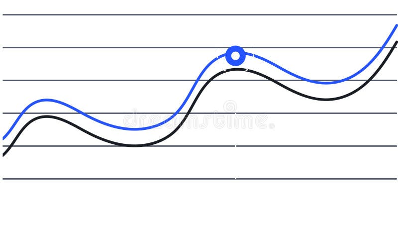
Free with trial Two lines are representing data progression over time, one blue and one black, creating a visual representation of trends and a key intersection point is marked with a blue circle. Data decrease illustrations Two lines are representing data progression over time, one blue and one black, creating a visual representation of
Free with trial Two lines are representing data progression over time, one blue and one black, creating a visual representation of trends and a key intersection point is marked with a blue circle. Data decrease vectors Two lines are representing data progression over time, one blue and one black, creating a visual representation of
Free with trial A neon dollar sign with an arrow pointing down symbolizes financial loss, economic downturn, or decrease in value. The design is modern and visually striking. Data decrease vectors Vector art of neon dollar sign pointing down, symbolizing financial loss, economic downturn, or decrease in value with a modern. A neon dollar sign with an arrow pointing down symbolizes financial loss, economic downturn, or decrease in value. The design is modern and visually striking
Free with trial An abstract image depicting stylized blue mountains and orange data points suggesting growth or a dynamic process. Data decrease illustrations Abstract Blue Mountainscape With Orange Data Points. An abstract image depicting stylized blue mountains and orange data points suggesting growth or a dynamic process
Free with trial A three-dimensional chart displaying colorful lines and coin representations illustrates trends in data, highlighting key financial insights and fluctuations over time. Data decrease illustrations Trend Analysis with Colorful Graph Lines and Currency Coins Representing Data Points on a Three-Dimensional Chart. A three-dimensional chart displaying colorful lines and coin representations illustrates trends in data, highlighting key financial insights and fluctuations over time
Free with trial A vibrant line graph visually representing fluctuating data trends over time, highlighting growth with colorful markers in green, yellow, and orange for better insights. Data decrease illustrations Colorful Line Graph Showing Data Trends with Green, Yellow, and Orange Indicators Representing Growth and Fluctuations Across. A vibrant line graph visually representing fluctuating data trends over time, highlighting growth with colorful markers in green, yellow, and orange for better insights
Free with trial This illustration features two colorful bar graphs on a white background, showcasing data comparison with distinct color palettes for engaging visual analysis and presentations. Data decrease illustrations Colorful Bar Graphs on White Background Representing Data Comparison and Growth with Different Color Schemes for Visual Analysis. This illustration features two colorful bar graphs on a white background, showcasing data comparison with distinct color palettes for engaging visual analysis and presentations
Free with trial Modern abstract zigzag-shaped chart depicting fluctuations in data analysis representing concept. Data decrease illustrations Modern abstract zigzag-shaped line chart representing fluctuations in data analysis concept. Modern abstract zigzag-shaped chart depicting fluctuations in data analysis representing concept
Free with trial This vibrant bar graph displays data trends through colorful segments, ideal for marketing and business presentations. Utilize this minimalistic design for impactful insights. Data decrease illustrations Colorful Bar Graph Showing Data Trends with Various Heights and Colors in a Minimalistic Style for Business and Marketing. This vibrant bar graph displays data trends through colorful segments, ideal for marketing and business presentations. Utilize this minimalistic design for impactful insights
Free with trial A modern data visualization featuring a line graph and bar chart, ideal for illustrating business trends and performance metrics in reports and presentations. Data decrease illustrations Data visualization with a line graph and bar chart representing trends and comparisons in a clear and modern style for business. A modern data visualization featuring a line graph and bar chart, ideal for illustrating business trends and performance metrics in reports and presentations
Free with trial This vibrant image features a collection of colorful 3D bar graphs representing data trends, perfect for visualizing statistics in business presentations and analyses. Data decrease illustrations Colorful Bar Graph with 3D Shapes Representing Data Trends and Visualizing Statistics in Business and Finance Environments. This vibrant image features a collection of colorful 3D bar graphs representing data trends, perfect for visualizing statistics in business presentations and analyses
Free with trial Red percent decrease arrow and green percent increase arrow. Interest rates inflation economy concept. Up and down arrows for financial market change. Price decrease increase symbol. Data decrease illustrations Red percent decrease arrow and green percent increase arrow represent interest rates inflation economy. Red percent decrease arrow and green percent increase arrow. Interest rates inflation economy concept. Up and down arrows for financial market change. Price decrease increase symbol
Free with trial This monochromatic bar graph illustrates data trends over time, showcasing variations in performance and metrics, ideal for presentations and business reports. Data decrease illustrations Black and White Bar Graph with Trend Line Showing Data Variations Over Time for Analysis and Reporting Purposes in Business. This monochromatic bar graph illustrates data trends over time, showcasing variations in performance and metrics, ideal for presentations and business reports
Free with trial Colorful bar chart with a line graph presenting trends and data growth over time, ideal for business analysis, marketing presentations, and financial reports. Data decrease illustrations Colorful Bar Chart with Line Graph Illustrating Trends and Data Growth over Time For Business, Marketing, Finance and Analysis Use. Colorful bar chart with a line graph presenting trends and data growth over time, ideal for business analysis, marketing presentations, and financial reports
Free with trial Colorful bar charts are presenting statistical trends and business performance data across different time periods. Possibly days of the week. Using a vibrant color scheme of blue. Purple. And orange. Data decrease illustrations Colorful bar charts are presenting statistical trends and business performance data across different time periods
Free with trial Four colorful bar charts are displayed on a graph, representing trends, statistics, and timeline data, with a potential focus on business infographics elements. Data decrease illustrations Four colorful bar charts are displayed on a graph, representing trends, statistics, and timeline data, with a potential
Free with trial This illustration features two colorful bar graphs on a white background, showcasing data comparison with distinct color palettes for engaging visual analysis and presentations. Data decrease illustrations Colorful Bar Graphs on White Background Representing Data Comparison and Growth with Different Color Schemes for Visual Analysis. This illustration features two colorful bar graphs on a white background, showcasing data comparison with distinct color palettes for engaging visual analysis and presentations
Free with trial This impactful image features a large, bold red downward arrow on a pristine white background, perfect for conveying a decrease or decline in data. Ideal for use in presentations, reports, and graphs, this professional design element is a clear and effective visual aid. The simplified design and sharp focus on the arrow ensure maximum visual impact and clarity. Whether illustrating a shrinking. Data decrease illustrations Powerful Red Downward Arrow Graphic A Clean Professional Visual Aid for Presentations Reports and Graphs. This impactful image features a large, bold red downward arrow on a pristine white background, perfect for conveying a decrease or decline in data. Ideal for use in presentations, reports, and graphs, this professional design element is a clear and effective visual aid. The simplified design and sharp focus on the arrow ensure maximum visual impact and clarity. Whether illustrating a shrinking
Free with trial This image features a conceptual bar graph, illustrating contrasting trends of growth and decline in business performance, ideal for data analysis presentations. Data decrease illustrations Growth and Decline: Conceptual Bar Graph Illustrating Positive and Negative Trends in Business Performance Data Visualization. This image features a conceptual bar graph, illustrating contrasting trends of growth and decline in business performance, ideal for data analysis presentations
Free with trial This abstract data visualization features smooth blue waves representing trends and fluctuations, ideal for business reports, finance presentations, and analytical insights. Data decrease illustrations Abstract Blue Data Visualization Depicting Trends and Fluctuations in Graphical Format for Business and Finance Presentations. This abstract data visualization features smooth blue waves representing trends and fluctuations, ideal for business reports, finance presentations, and analytical insights
Free with trial Statistic graph progress, financial profit growth, increase, and decrease line icons set. Infographic charts with arrows, circles, and bars thin black outline symbols vector illustration. Data decrease vectors Statistic graph progress, financial profit growth, increase and decrease line icons set. Statistic graph progress, financial profit growth, increase, and decrease line icons set. Infographic charts with arrows, circles, and bars thin black outline symbols vector illustration.
Free with trial Dynamic red and blue stock market graph with data points and financial charts on a dark background. Generative AI. Data decrease illustrations Dynamic red and blue stock market graph with data points and financial charts on a dark background
Free with trial Red arrow going down stock icon on white background. Decrease, Bankruptcy, financial market crash icon for your web site design, logo, app, UI. graph chart downtrend symbol. chart going down sign. Data decrease vectors Red arrow going down stock icon on white background. Decrease, Bankruptcy, financial market crash icon
Free with trial Data analytics descending line graphic outline icon in white and black colors. data analytics descending line graphic flat vector icon from business collection for web, mobile apps and ui. Data decrease vectors Data analytics descending line graphic outline icon in white and black colors. data analytics descending line graphic flat vector
Free with trial Man in blue shirt analyzing colorful bar chart, business performance review and data analysis,Generative AI. Data decrease illustrations Man in blue shirt analyzing colorful bar chart, business performance review and data analysis
Free with trial Vibrant and colorful bar chart illustrating various data metrics, perfect for business or marketing use, highlighting trends and insights visually engaging for audiences. Data decrease illustrations Colorful Bar Chart Showing Data Variations in a Bright and Engaging Style Suitable for Business Presentations or Marketing. Vibrant and colorful bar chart illustrating various data metrics, perfect for business or marketing use, highlighting trends and insights visually engaging for audiences
Free with trial This vibrant bar graph showcases varying heights for data visualization, perfect for representing trends in finance or business analysis against a clean white background. Data decrease illustrations Colorful Bar Graph with Varying Heights Representing Data Trends and Insights in a Minimalist Art Style on White Background. This vibrant bar graph showcases varying heights for data visualization, perfect for representing trends in finance or business analysis against a clean white background
Free with trial A visually appealing line graph illustrates data fluctuations and trends over time. The minimalist design makes it suitable for presentations and reports in various fields. Data decrease illustrations Line graph depicting data trends with fluctuations and peaks over time in a minimalist style, showcasing analytical insights and. A visually appealing line graph illustrates data fluctuations and trends over time. The minimalist design makes it suitable for presentations and reports in various fields
Free with trial Abstract 3D bar graph representation showcasing various data trends with vibrant colors and shadows. Ideal for presentations, reports, and analytics purposes. Data decrease illustrations 3D Visualization of Colorful Bar Graph Illustrating Data Trends with Shadows and Depth in a Minimalistic Style for Data Analysis. Abstract 3D bar graph representation showcasing various data trends with vibrant colors and shadows. Ideal for presentations, reports, and analytics purposes
Free with trial Two colorful lines are representing data points over time, creating a visual representation of trends and fluctuations, with a highlighted period marked in red. Data decrease vectors Two colorful lines are representing data points over time, creating a visual representation of trends and fluctuations
Free with trial These clean, isolated upward and downward green and red arrows are ideal for illustrating various data visualization concepts. Perfect for presentations, reports, infographics, and marketing materials, they effectively communicate growth and decline trends in business, finance, or any field requiring visual representation of progress. The simple, modern design ensures the focus remains on the. Data decrease illustrations Simple Green and Red Arrows Isolated Vector Graphics for Visualizing Growth and Decline Trends in Business Data. These clean, isolated upward and downward green and red arrows are ideal for illustrating various data visualization concepts. Perfect for presentations, reports, infographics, and marketing materials, they effectively communicate growth and decline trends in business, finance, or any field requiring visual representation of progress. The simple, modern design ensures the focus remains on the
Free with trial Chart bars down, icon in line design. Chart, bars, down, decrease, drop, decline, graph on white background vector. Chart bars down editable stroke icon. Data decrease vectors Chart bars down, icon in line design. Chart, bars, down, decrease, drop, decline, graph on white background vector
Free with trial Graph depicting 3D line and bar data visualization in red, white background, financial trends concept. Data decrease illustrations Graph showing 3D line and bar data visualization in red, white background, financial trends concept
Free with trial Bright and colorful bar graph created with blocks illustrates data visualization in a contemporary business context. Ideal for finance and marketing materials. Data decrease illustrations Colorful bar graph made of building blocks representing data visualization and analysis in modern business graphics on a clean. Bright and colorful bar graph created with blocks illustrates data visualization in a contemporary business context. Ideal for finance and marketing materials
Free with trial This vibrant 3D bar graph showcases data trends with a colorful aesthetic, perfect for presentations in business, finance, or technology sectors emphasizing analytics. Data decrease illustrations Colorful Bar Graph Visualization of Data Trends in Modern Business Environment with 3D Perspective and Vibrant Gradient Colors. This vibrant 3D bar graph showcases data trends with a colorful aesthetic, perfect for presentations in business, finance, or technology sectors emphasizing analytics
Free with trial Stock Market Graph With City Lights Background Financial Data, Investment, Trading Concept. , Generated by AI. Data decrease illustrations Stock Market Graph With City Lights Background Financial Data, Investment, Trading Concept.
Free with trial Two colorful lines are representing data points over time, creating a visual representation of trends and fluctuations, with a highlighted period marked in red. Data decrease illustrations Two colorful lines are representing data points over time, creating a visual representation of trends and fluctuations
Free with trial AIDA model infographic template with round vertical box container gradually decrease on right column dark background style with 4 point for slide presentation vector. Data decrease illustrations AIDA model infographic template with round vertical box container gradually decrease on right column dark background style with 4
Free with trial Businessman analyzes financial data on digital tablet. Graphs, charts display performance, cost reduction. Modern business strategy project management concepts in focus. Data analysis. Data decrease illustrations Businessman analyzes financial data on digital tablet. Graphs, charts display performance, cost reduction. Modern business
Free with trial Magnifying glass focuses on downward trend in financial spreadsheet during recession. Spreadsheet data shows, significant decline. Economic downturn evident. Detailed financial analysis. Data decrease illustrations Magnifying glass focuses on downward trend in financial spreadsheet during recession. Spreadsheet data shows significant decline. Magnifying glass focuses on downward trend in financial spreadsheet during recession. Spreadsheet data shows, significant decline. Economic downturn evident. Detailed financial analysis.
Free with trial Set line Unknown search, Many ways directional arrow, Infographic element and Financial growth decrease icon. Vector. Data decrease illustrations Set line Unknown search, Many ways directional arrow, Infographic element and Financial growth decrease icon. Vector
Free with trial A futuristic bear walking through a glowing urban cityscape with stock market data charts and graphs symbolizing a bearish financial market trend. Generative AI. Data decrease illustrations A futuristic bear walking through a glowing urban cityscape with stock market data charts and graphs symbolizing a bearish
Free with trial Financial data shows downward trend. Spreadsheet exhibits economic decline. Magnifying glass focuses on, negative indicators. Business recession impacting market. Stock loss visible. Data decrease illustrations Financial data shows downward trend. Spreadsheet exhibits economic decline. Magnifying glass focuses on negative indicators. Financial data shows downward trend. Spreadsheet exhibits economic decline. Magnifying glass focuses on, negative indicators. Business recession impacting market. Stock loss visible.
Free with trial Magnifying glass focuses on declining spreadsheet numbers during economic downturn. Financial data shows significant drop in figures. Business analyst examines, alarming trend. Data decrease illustrations Magnifying glass focuses on declining spreadsheet numbers during economic downturn. Financial data shows significant drop in
Free with trial Analysis of website traffic using magnifying glass on laptop. Detailed data, graphs reviewed for blog ranking. Online marketing, business performance monitoring key. Research. Data decrease illustrations Analysis of website traffic using magnifying glass on laptop. Detailed data, graphs reviewed for blog ranking. Online marketing
Free with trial Tree illustration with bar graph depicting decrease in carbon emissions from wood pellets, Generated by AI. Data decrease illustrations Tree illustration with bar graph depicting decrease in carbon emissions from wood pellets
Free with trial Close-up view of a graph with vibrant blue background. detailed analysis of data trends, insights, and patterns ,Generative AI. Data decrease illustrations Detailed analysis, exploring data trends and patterns in vibrant blue graph. closeup view of business performance market insights. Close-up view of a graph with vibrant blue background. detailed analysis of data trends, insights, and patterns ,Generative AI
Free with trial A close-up view of a monitor displaying complex financial data, including stock market charts and numerical values. Stock market Data Displayed on a Monitor. Data decrease illustrations Stock market Data Displayed on a Monitor
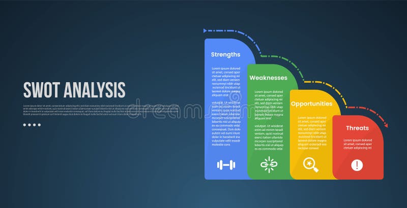
Free with trial SWOT business analysis infographic template with round vertical box container gradually decrease on right column with dark background style. Data decrease illustrations SWOT business analysis infographic template with round vertical box container gradually decrease on right column with dark
Free with trial A simple line chart illustrates a decreasing trend with distinct dot markers representing data points. The design emphasizes the shift in values over time and aids in visualizing performance. Data decrease vectors Chart Displaying a Downward Trend in Data Analysis. A simple line chart illustrates a decreasing trend with distinct dot markers representing data points. The design emphasizes the shift in values over time and aids in visualizing performance.
Free with trial Cash loss graph. Finance inflation schedule, money loss and decrease in income. Trader loss data, budget losses graph or investment bankruptcies isolated vector illustration. Data decrease vectors Money loss and decrease in income. Trader loss data, budget losses graph or
Free with trial Open laptop displaying colorful bar graphs and data analysis on screen, representing growth and business analytics ,Generative AI. Data decrease illustrations Open laptop displaying colorful bar graphs and data analysis on screen, representing growth and business analytics
Free with trial Set Financial growth decrease Server security with padlock and on seamless pattern. Vector. Data decrease vectors Set Financial growth decrease, Server security with padlock and on seamless pattern. Vector
Free with trial A chart displaying data trends on a white background. 3D Rendering. Data decrease illustrations Graphical representation of data trends. 3D Rendering. A chart displaying data trends on a white background. 3D Rendering
Free with trial Decline food sales data illustration fruits vegetables, items year, trend analysis decline food sales data. Data decrease illustrations Decline food sales data
Free with trial Set Mind map infographic, Pie chart, Cloud download and upload and Financial growth decrease icon. Vector. Data decrease vectors Set Mind map infographic, Pie chart, Cloud download and upload and Financial growth decrease icon. Vector