Free with trial Colorful isometric bar chart showing business data and growth with bars of different height, colored blue, yellow and green. Isolated on a transparent background, perfect for business presentations or infographics. Data decrease vectors Colorful business chart illustration on transparent background AI Generated. Colorful isometric bar chart showing business data and growth with bars of different height, colored blue, yellow and green. Isolated on a transparent background, perfect for business presentations or infographics.
Free with trial Red bar chart displays performance metrics on a table ,Generative ai. Data decrease illustrations Red bar chart illustrating performance metrics on a table, data analysis and visualization. Red bar chart displays performance metrics on a table ,Generative ai
Free with trial A 3D rendered image of a businessman presenting financial data on a large screen, showing various charts and graphs. Data decrease illustrations Businessman Presenting Financial Charts and Graphs. A 3D rendered image of a businessman presenting financial data on a large screen, showing various charts and graphs.
Free with trial Area chart illustrating trends in Sareorplojicam and S�snpavai across years. Shows variations over time. Data decrease illustrations . Area chart illustrating trends in Sareorplojicam and S�snpavai across years. Shows variations over time
Free with trial This visually striking graph displays two contrasting trends one line shows a sharp decrease while the other illustrates a significant increase in an engaging orange palette. Data decrease illustrations Dynamic Trends of Change Illustrated Through Contrasting Lines in Orange Hues. This visually striking graph displays two contrasting trends one line shows a sharp decrease while the other illustrates a significant increase in an engaging orange palette
Free with trial A pair of hands holds a sheet of paper displaying a red line graph on a grid pattern the graph illustrates a downward trend, indicating a decline in business, finance or economy the image represents loss, failure, or a recession, generated by AI. Data decrease illustrations Hands holding paper showing a declining red business graph data. a pair of hands holds a sheet of paper displaying a red line graph on a grid pattern the graph illustrates a downward trend, indicating a decline in business, finance or economy the image represents loss, failure, or a recession, generated by AI.
Free with trial A whiteboard easel displays a bar graph with a downward trend and a red arrow indicating a decrease, isolated on a white background. Data decrease illustrations Business bar chart showing decline isolated on white background. A whiteboard easel displays a bar graph with a downward trend and a red arrow indicating a decrease, isolated on a white background
Free with trial A 3D rendering features a bar graph with three vertical bars in blue and yellow. Above the graph, a molecular structure is depicted with a central yellow sphere connected to three blue spheres by white rods. The entire graphic is isolated on a clean white background. Data decrease illustrations 3D bar graph with molecular structure above on a white background chart data. A 3D rendering features a bar graph with three vertical bars in blue and yellow. Above the graph, a molecular structure is depicted with a central yellow sphere connected to three blue spheres by white rods. The entire graphic is isolated on a clean white background
Free with trial Elevate your everyday style with Abu Taher's collection of Typography T-Shirt Designs, where words meet artistry. Data decrease vectors Collection of 32 icons representing increase and decrease in business and finance. Elevate your everyday style with Abu Taher's collection of Typography T-Shirt Designs, where words meet artistry
Free with trial Statistics percentage sign hand drawn. increase decrease, ratio proportion, interest profit statistics percentage sign vector sketch. isolated color illustration. Data decrease illustrations Statistics percentage sign sketch hand drawn vector. statistics percentage sign hand drawn. increase decrease, ratio proportion, interest profit statistics percentage sign vector sketch. isolated color illustration
Free with trial Statistics percentage sign hand drawn. increase decrease, ratio proportion, interest profit statistics percentage sign vector sketch. isolated color illustration. Data decrease illustrations Statistics percentage sign sketch hand drawn vector. statistics percentage sign hand drawn. increase decrease, ratio proportion, interest profit statistics percentage sign vector sketch. isolated color illustration
Free with trial Modern abstract blue bars illustrating business statistics, trends, and analytics. Data decrease vectors Digital data analysis bars in blue hues, conceptualizing statistics and trends. Modern abstract blue bars illustrating business statistics, trends, and analytics.
Free with trial A bright cyan arrow is depicted pointing directly downwards against a plain, light gray background. The arrow has a clean, geometric design with a sharp point and a wide shaft. The 3D rendering gives it a solid, dimensional appearance, casting a subtle shadow on the surface below. This simple yet impactful graphic conveys a sense of direction, decrease, or a downward trend. Data decrease illustrations Bright Cyan Arrow Pointing Downward Against a Light Gray Background direction. A bright cyan arrow is depicted pointing directly downwards against a plain, light gray background. The arrow has a clean, geometric design with a sharp point and a wide shaft. The 3D rendering gives it a solid, dimensional appearance, casting a subtle shadow on the surface below. This simple yet impactful graphic conveys a sense of direction, decrease, or a downward trend
Free with trial A 3D render illustrates a downward trending bar chart. Five light blue vertical bars of decreasing height are arranged from left to right. A bright yellow line with an arrow at its end descends across the bars, indicating a negative trend. The background is a solid, soft pink. Data decrease illustrations Downward Trending Bar Chart with Yellow Arrow on a Pink Background graph data. A 3D render illustrates a downward trending bar chart. Five light blue vertical bars of decreasing height are arranged from left to right. A bright yellow line with an arrow at its end descends across the bars, indicating a negative trend. The background is a solid, soft pink
Free with trial A 3D rendered illustration featuring a bright blue arrow pointing upwards and a vibrant red arrow pointing downwards, positioned side-by-side on a plain white background. The arrows are smooth and rounded, symbolizing concepts of increase and decrease, or positive and negative movement. Data decrease illustrations 3D Rendered Blue Up Arrow and Red Down Arrow on White Background direction movement. A 3D rendered illustration featuring a bright blue arrow pointing upwards and a vibrant red arrow pointing downwards, positioned side-by-side on a plain white background. The arrows are smooth and rounded, symbolizing concepts of increase and decrease, or positive and negative movement
Free with trial A bright red arrow with a hand-drawn texture curves downwards. This graphic element effectively visualizes concepts of falling prices, negative trends, or a downward trajectory. Data decrease illustrations Red downward curved arrow symbol hand drawn style showing decline or decrease. A bright red arrow with a hand-drawn texture curves downwards. This graphic element effectively visualizes concepts of falling prices, negative trends, or a downward trajectory
Free with trial A striking red arrow plunges downwards, symbolizing a significant drop in data trends. This representation highlights a negative change in performance or market activity. Data decrease illustrations A red downward arrow indicating a sharp decline in numbers during market analysis. A striking red arrow plunges downwards, symbolizing a significant drop in data trends. This representation highlights a negative change in performance or market activity.
Free with trial Calculation percentage sign hand drawn. finance statistics, increase decrease, ratio proportion calculation percentage sign vector sketch. isolated black illustration. Data decrease vectors Calculation percentage sign sketch hand drawn vector. calculation percentage sign hand drawn. finance statistics, increase decrease, ratio proportion calculation percentage sign vector sketch. isolated black illustration
Free with trial Calculation percentage sign hand drawn. finance statistics, increase decrease, ratio proportion calculation percentage sign vector sketch. isolated black illustration. Data decrease illustrations Calculation percentage sign sketch hand drawn vector. calculation percentage sign hand drawn. finance statistics, increase decrease, ratio proportion calculation percentage sign vector sketch. isolated black illustration
Free with trial A 3D rendering of a vibrant red arrow pointing upwards and a bright green arrow pointing downwards, representing market fluctuations, economic changes, and data trends. Data decrease illustrations Red up arrow and green down arrow symbolizing financial market trends growth decline. A 3D rendering of a vibrant red arrow pointing upwards and a bright green arrow pointing downwards, representing market fluctuations, economic changes, and data trends
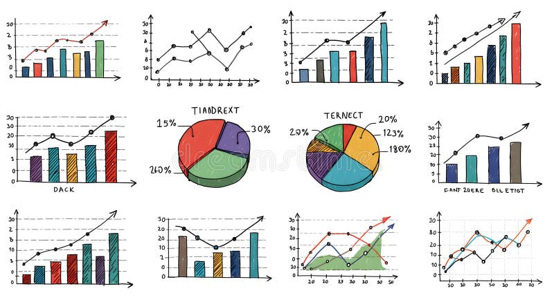
Free with trial A collection of hand-drawn style charts and diagrams that can be used to display data and analyze progress, ideal for business presentations, reports, or data visualizations. Data decrease illustrations Hand-Drawn Collection of Statistical Charts and Diagrams for Business Analytics. A collection of hand-drawn style charts and diagrams that can be used to display data and analyze progress, ideal for business presentations, reports, or data visualizations
Free with trial A character stands alone holding a big red arrow pointing downwards, symbolizing a decrease or decline, against a plain white backdrop. Data decrease illustrations Character Holds Large Red Downward Arrow Representing Decline on White Background. A character stands alone holding a big red arrow pointing downwards, symbolizing a decrease or decline, against a plain white backdrop
Free with trial This 3D rendering showcases colorful bar graphs, pie charts, and a calculator, vividly illustrating concepts of business growth, financial success, and data analysis. The upward-trending arrow emphasizes positive progress. Data decrease illustrations Colorful 3D Charts and Calculator Illustrating Business Growth and Financial Success. This 3D rendering showcases colorful bar graphs, pie charts, and a calculator, vividly illustrating concepts of business growth, financial success, and data analysis. The upward-trending arrow emphasizes positive progress.
Free with trial Financial chart with red and yellow candlesticks and a downward yellow arrow, on a dark background, concept of market crash and recession. 3D Rendering. Data decrease illustrations Abstract financial chart with red and yellow candlesticks showing a downward trend and falling market data on dark background. 3D. Financial chart with red and yellow candlesticks and a downward yellow arrow, on a dark background, concept of market crash and recession. 3D Rendering
Free with trial Illustration shows a man facing a thick downward arrow indicating decline or loss in business or finance, creating a serious and contemplative mood. Generative AI. Data decrease vectors Man standing near downward arrow symbolizing decline or decrease in business or finance concepts. Illustration shows a man facing a thick downward arrow indicating decline or loss in business or finance, creating a serious and contemplative mood. Generative AI
Free with trial A 3D rendered icon featuring a bright yellow circle with a prominent white arrow pointing downwards in the center. The arrow has a rounded top and a sharp arrowhead. This graphic is presented on a white background, commonly used to represent download or decrease actions. Data decrease illustrations 3D Yellow Circle with White Downward Arrow Icon on White Background download direction. A 3D rendered icon featuring a bright yellow circle with a prominent white arrow pointing downwards in the center. The arrow has a rounded top and a sharp arrowhead. This graphic is presented on a white background, commonly used to represent download or decrease actions
Free with trial A 3D blue downward-pointing arrow is depicted with a pink circular tag featuring a white percentage sign attached to its shaft. The graphic is isolated on a white background, symbolizing a decrease or reduction. Data decrease illustrations 3D Blue Downward Arrow with Pink Percentage Sign on White Background image photo. A 3D blue downward-pointing arrow is depicted with a pink circular tag featuring a white percentage sign attached to its shaft. The graphic is isolated on a white background, symbolizing a decrease or reduction
Free with trial A 3D rendered blue arrow points downwards, signifying a decrease or reduction. Attached to the top of the arrow is a bright pink circular icon containing a white percent sign. The entire graphic is isolated on a clean white background, making it suitable for use in presentations, websites, or marketing materials related to sales, discounts, or negative financial trends. Data decrease illustrations 3D Blue Downward Arrow with Pink Circle and White Percent Sign Isolated on White image. A 3D rendered blue arrow points downwards, signifying a decrease or reduction. Attached to the top of the arrow is a bright pink circular icon containing a white percent sign. The entire graphic is isolated on a clean white background, making it suitable for use in presentations, websites, or marketing materials related to sales, discounts, or negative financial trends
Free with trial Person holding checklist and tablet with a clock icon, next to a dollar sign and downward arrow. Ideal for financial management, time efficiency, budget planning, productivity, cost reduction. Data decrease illustrations Businessperson Analyzing Checklist and Tablet as Costs Decrease Indicated by Downward Dollar Arrow. Person holding checklist and tablet with a clock icon, next to a dollar sign and downward arrow. Ideal for financial management, time efficiency, budget planning, productivity, cost reduction
Free with trial Financial chart with red candlesticks showing a downtrend, glowing on a dark background. Represents stock market downturn, financial crisis. 3D Rendering. Data decrease illustrations Financial chart with falling red candlesticks and data on a dark interface backdrop, representing market decline and economic loss. Financial chart with red candlesticks showing a downtrend, glowing on a dark background. Represents stock market downturn, financial crisis. 3D Rendering
Free with trial A 3D rendered graph displays a downward trend. Two tall green bars are followed by two shorter pink bars, indicating a decrease in value. A thick yellow arrow with a sharp point descends diagonally across the bars, emphasizing the decline. The background is a solid, light blue color. Data decrease illustrations Falling graph with green and pink bars and a yellow arrow pointing down chart decline. A 3D rendered graph displays a downward trend. Two tall green bars are followed by two shorter pink bars, indicating a decrease in value. A thick yellow arrow with a sharp point descends diagonally across the bars, emphasizing the decline. The background is a solid, light blue color
Free with trial Visualize decreasing business performance with this striking image. A pink 3D bar chart graphically represents a decline in financial data, highlighting loss and reduction. The falling graph is juxtaposed with a healthy green plant in a pot, emphasizing the contrast between success and setbacks. Ideal for illustrating economic concepts, investment challenges, or business performance issues, Created AI. Data decrease illustrations Decreasing business performance represented by pink graphic and potted green plant. Visualize decreasing business performance with this striking image. A pink 3D bar chart graphically represents a decline in financial data, highlighting loss and reduction. The falling graph is juxtaposed with a healthy green plant in a pot, emphasizing the contrast between success and setbacks. Ideal for illustrating economic concepts, investment challenges, or business performance issues, Created AI
Free with trial A bold, solid blue arrow points downwards, indicating a decrease or decline. To the right of the arrow, a vibrant pink circular icon features a white percentage sign. The entire graphic is isolated on a plain white background, commonly used to represent concepts like sales, discounts, or negative trends. Data decrease illustrations Blue Downward Arrow with Pink Percentage Sign Icon on White Background image photo. A bold, solid blue arrow points downwards, indicating a decrease or decline. To the right of the arrow, a vibrant pink circular icon features a white percentage sign. The entire graphic is isolated on a plain white background, commonly used to represent concepts like sales, discounts, or negative trends
Free with trial Downward trending graph with red and black bars on a whiteboard mounted on an easel. Data decrease illustrations Whiteboard displaying a downward trending graph with red and black bars chart data. Downward trending graph with red and black bars on a whiteboard mounted on an easel
Free with trial Steep downward trending red line graph with an arrow on a whiteboard mounted on an easel. Data decrease illustrations Whiteboard showing a steep downward trending red line graph on an easel chart data. Steep downward trending red line graph with an arrow on a whiteboard mounted on an easel
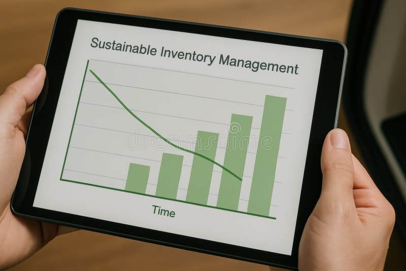
Free with trial A detailed graph displaying sustainable inventory management trends on a tablet device. This image highlights data analytics for business strategy and efficiency. Data decrease illustrations Sustainable Inventory Management Graph on Tablet Device for Business Analytics and Strategy. A detailed graph displaying sustainable inventory management trends on a tablet device. This image highlights data analytics for business strategy and efficiency
Free with trial Blue arrow pointing downward on financial graph. Business chart showing descending trend. Digital stock market data visualization for decline analysis. Data decrease illustrations Blue arrow pointing downward on financial graph. Business chart showing descending trend
Free with trial A person's open palm supports a glowing digital graph illustrating a decrease in cost and an increase in quality, set against a dark background. Data decrease illustrations Hand holding glowing graph showing cost decreasing and quality increasing palm open. A person's open palm supports a glowing digital graph illustrating a decrease in cost and an increase in quality, set against a dark background
Free with trial A clean 3D render of a light blue circle containing a prominent white downward-pointing arrow. This icon is commonly used to represent downloading files, decreasing values, or indicating a downward trend. Data decrease illustrations 3D Icon of a Blue Circle with a White Downward Arrow Symbolizing Download or Decrease. A clean 3D render of a light blue circle containing a prominent white downward-pointing arrow. This icon is commonly used to represent downloading files, decreasing values, or indicating a downward trend
Free with trial A 3D rendered graphic of a bold blue arrow pointing downwards, indicating a decrease or reduction. Attached to the shaft of the arrow is a pink circular badge with a white percentage symbol (%) inside. The entire graphic is isolated on a white background, symbolizing a price reduction or a negative financial trend. Data decrease illustrations 3D Blue Downward Arrow with Percentage Sign Discount Badge on White Background sale. A 3D rendered graphic of a bold blue arrow pointing downwards, indicating a decrease or reduction. Attached to the shaft of the arrow is a pink circular badge with a white percentage symbol (%) inside. The entire graphic is isolated on a white background, symbolizing a price reduction or a negative financial trend
Free with trial This compelling visual representation showcases a clear negative trend. A vibrant red downward arrow icon serves as a potent indicator of decline, positioned prominently against a pristine white background. The simple, yet impactful, chart surrounding the arrow depicts a consistently sloping downward line, visually reinforcing the concept of a fall or decrease in value. This graphic serves as a. Data decrease illustrations Visualizing Declining Trends A Downward Arrow Chart Illustrates Negative Performance. This compelling visual representation showcases a clear negative trend. A vibrant red downward arrow icon serves as a potent indicator of decline, positioned prominently against a pristine white background. The simple, yet impactful, chart surrounding the arrow depicts a consistently sloping downward line, visually reinforcing the concept of a fall or decrease in value. This graphic serves as a
Free with trial A stark pink line graph shows a dramatic downward trend against a dark green grid, symbolizing a significant loss or decrease. Data decrease illustrations Sharp decline illustrated by a jagged pink line graph on a dark green grid background. A stark pink line graph shows a dramatic downward trend against a dark green grid, symbolizing a significant loss or decrease
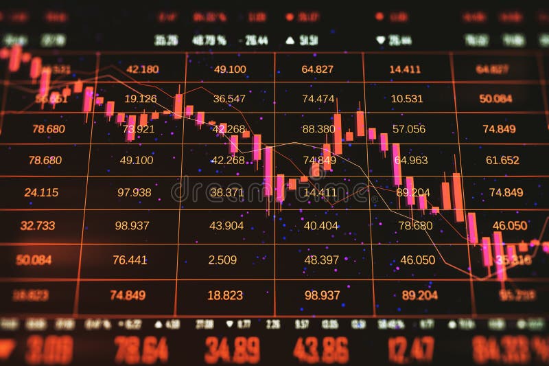
Free with trial Line chart with red and yellow bars on a black grid background, illustrating a steep decline. The graph features jagged peaks and troughs, indicating significant volatility. The use of bright colors against the dark grid enhances the dramatic effect, commonly associated with financial market downturns. Gridlines and numerical axes suggest precise data metrics. Data decrease illustrations Stock Market Chart With Downturn. A Dramatic Finance Graph Depicts Economic Recession. Line chart with red and yellow bars on a black grid background, illustrating a steep decline. The graph features jagged peaks and troughs, indicating significant volatility. The use of bright colors against the dark grid enhances the dramatic effect, commonly associated with financial market downturns. Gridlines and numerical axes suggest precise data metrics.
Free with trial Displaying 3D bar columns on analytics dashboard, with overlaid line graph and numeric labels. Data, visualization, dashboard, analytics, infographic, 3d, abstract. Data decrease illustrations Displaying 3D bar columns on analytics dashboard, with overlaid line graph and numeric labels
Free with trial A minimalist 3D white bar chart displays a clear downward trend. Four bars of decreasing height are shown, with a sharp white arrow pointing downwards from the top of the second bar, indicating a significant decline. The chart is presented in isolation against a clean white background, emphasizing the concept of financial or economic downturn. Data decrease illustrations 3D White Bar Chart with a Downward Trending Arrow Symbolizing Decline graph decrease. A minimalist 3D white bar chart displays a clear downward trend. Four bars of decreasing height are shown, with a sharp white arrow pointing downwards from the top of the second bar, indicating a significant decline. The chart is presented in isolation against a clean white background, emphasizing the concept of financial or economic downturn
Free with trial A vibrant red arrow sharply points downwards, indicating a significant decrease or negative trend. This visual represents market downturns, business losses, or declining performance metrics. Data decrease illustrations Sharp red downward trend arrow symbolizing financial decline or negative performance. A vibrant red arrow sharply points downwards, indicating a significant decrease or negative trend. This visual represents market downturns, business losses, or declining performance metrics
Free with trial A handwritten chart depicting a downward trend, possibly representing financial loss or a decrease in value, alongside a red light. Data decrease illustrations A downtrend chart drawn on a notebook with a red warning light, symbolizing financial loss. A handwritten chart depicting a downward trend, possibly representing financial loss or a decrease in value, alongside a red light
Free with trial Rising thick red arrow filling grid lines in design studio, with blue pink charts, dotted bars. Financial, analytics, data, visualization, digital, technology, infographic. Data decrease illustrations Rising thick red arrow filling grid lines in design studio, with blue pink charts, dotted bars
Free with trial A circular icon with a thick gold border contains a golden DNA helix symbol on a black background. To the right of the DNA helix, two jagged arrows point downwards, indicating a downward trend or decline. The overall design is sleek and symbolic, suggesting concepts related to genetic research, health trends, or scientific data analysis. Data decrease illustrations Golden DNA Helix Icon with Downward Trend Arrows on Black Circle with Gold Border genetics. A circular icon with a thick gold border contains a golden DNA helix symbol on a black background. To the right of the DNA helix, two jagged arrows point downwards, indicating a downward trend or decline. The overall design is sleek and symbolic, suggesting concepts related to genetic research, health trends, or scientific data analysis
Free with trial A 3D bar chart with teal and tan bars shows a pink arrow pointing downwards, representing a decline or negative trend. Clear details and vibrant colors enhance visual appeal. Data decrease illustrations 3D Bar Chart With Teal Bars And Pink Downward Arrow Indicating Decline graph decrease. A 3D bar chart with teal and tan bars shows a pink arrow pointing downwards, representing a decline or negative trend. Clear details and vibrant colors enhance visual appeal
Free with trial Stock market chart featuring a red downtrend line against a black background, fluctuations in financial data. perfect for illustrating concepts in finance, investment analysis, and economic downturns. Generative AI. Data decrease illustrations Dynamic Stock Market Analysis with Red Downtrend Line on Black Background Generative AI. Stock market chart featuring a red downtrend line against a black background, fluctuations in financial data. perfect for illustrating concepts in finance, investment analysis, and economic downturns. Generative AI
Free with trial A simple 3D bar chart composed of three colored cubes stands on a white background. The cubes are arranged in ascending order of height from left to right: a small blue cube, a medium yellow cube, and a tall red cube. This arrangement visually represents increasing data or progress. Data decrease illustrations Colorful Bar Chart with Red, Yellow, and Blue Cubes on White Background graph statistics. A simple 3D bar chart composed of three colored cubes stands on a white background. The cubes are arranged in ascending order of height from left to right: a small blue cube, a medium yellow cube, and a tall red cube. This arrangement visually represents increasing data or progress
Free with trial A 3D illustration depicting financial growth. A line graph with blue and red data points ascends across a light blue background. Interspersed are green and red candlestick bars, representing market fluctuations. Stacks of gold coins and individual coins with dollar signs are arranged at the base of the chart, symbolizing wealth and investment. Data decrease illustrations 3D Financial Growth Chart with Stacks of Gold Coins and Candlestick Bars finance graph. A 3D illustration depicting financial growth. A line graph with blue and red data points ascends across a light blue background. Interspersed are green and red candlestick bars, representing market fluctuations. Stacks of gold coins and individual coins with dollar signs are arranged at the base of the chart, symbolizing wealth and investment
Free with trial Colorful growth chart with red and teal bars showing upward and downward arrows on a light background representing data trends progress decline business performance and financial analytics visual. Data decrease illustrations Colorful growth chart with red and teal bars and upward and downward arrows on light background. colorful growth chart with red and teal bars showing upward and downward arrows on a light background representing data trends progress decline business performance and financial analytics visual
Free with trial A minimalist 3D render displays three rounded rectangular bars representing a bar graph. The tallest bar is a soft blue, followed by a medium green bar, and the shortest is a light pink bar. They are arranged in descending order of height and stand on a plain white background, suggesting data visualization or progress. Data decrease illustrations Three colorful 3D bar graph elements in blue green and pink on a white background chart. A minimalist 3D render displays three rounded rectangular bars representing a bar graph. The tallest bar is a soft blue, followed by a medium green bar, and the shortest is a light pink bar. They are arranged in descending order of height and stand on a plain white background, suggesting data visualization or progress
Free with trial Stacks of gold coins decrease in size as a red arrow points downwards over a stock market chart, indicating financial decline. Data decrease illustrations Stacks of gold coins decreasing in size with a red downward arrow and stock market chart red arrow. Stacks of gold coins decrease in size as a red arrow points downwards over a stock market chart, indicating financial decline
Free with trial Geometric low poly arrow icon representing decrease or download. Futuristic blue neon background with shining stars and plexus lines. High tech creative vector illustration of digital signal. Data decrease vectors Abstract blue wireframe arrow pointing down in digital space with glowing particles and connect lines. Geometric low poly arrow icon representing decrease or. Geometric low poly arrow icon representing decrease or download. Futuristic blue neon background with shining stars and plexus lines. High tech creative vector illustration of digital signal
Free with trial This graphic illustrates various colorful bars and shapes representing data trends and statistics in a bold, abstract style. Data decrease illustrations Colorful abstract data visualization with bars, lines, and circles depicting trends and statistics. This graphic illustrates various colorful bars and shapes representing data trends and statistics in a bold, abstract style.
Free with trial A stylized 3D business growth chart depicted against a light blue background. The chart features a blue mountain-like shape representing a peak, with two intersecting lines. One line, marked with pink nodes, shows fluctuations, while another line with green nodes indicates a general upward trend. This visual metaphor conveys concepts of business performance, market trends, and financial analysis. Data decrease illustrations 3D Stylized Business Growth Chart with Red and Green Nodes on Blue Background graph data. A stylized 3D business growth chart depicted against a light blue background. The chart features a blue mountain-like shape representing a peak, with two intersecting lines. One line, marked with pink nodes, shows fluctuations, while another line with green nodes indicates a general upward trend. This visual metaphor conveys concepts of business performance, market trends, and financial analysis
Free with trial Displaying fuchsia and blue graphs on gridlines with glowing currency symbols on dark trading panel. Finance, data, analytics, technology, investment, market, digital. Data decrease illustrations Displaying fuchsia and blue graphs on gridlines with glowing currency symbols on dark trading panel
Free with trial Red background with a downward arrow and grid pattern, with vertical bars at the bottom, suggesting a decline or decrease in a metric Vertical Mobile Wallpaper. Data decrease illustrations Red background, downward arrow with grid pattern, vertical bars suggest decline. red background with a downward arrow and grid pattern, with vertical bars at the bottom, suggesting a decline or decrease in a metric Vertical Mobile Wallpaper
Free with trial Red background with a downward arrow and grid pattern, with vertical bars at the bottom, suggesting a decline or decrease in a metric. Data decrease illustrations Red background, downward arrow with grid pattern, vertical bars suggest decline. red background with a downward arrow and grid pattern, with vertical bars at the bottom, suggesting a decline or decrease in a metric
Free with trial Three stacks of gold coins decrease in height from left to right, with a red arrow pointing downwards across them. Isolated on a transparent background. Data decrease vectors Stacks of gold coins with red downward trend arrow isolated on a transparent background money. Three stacks of gold coins decrease in height from left to right, with a red arrow pointing downwards across them. Isolated on a transparent background
Free with trial Colorful growth chart featuring orange and teal bars with upward and downward arrows on a clean white background representing progress decline business data trends and financial performance metrics. Data decrease illustrations Colorful growth chart with orange and teal bars and upward and downward arrows on white background. colorful growth chart featuring orange and teal bars with upward and downward arrows on a clean white background representing progress decline business data trends and financial performance metrics
Free with trial A dramatic downward trending graph illustrates the global economic downturn and financial crisis. Red arrows emphasize the sharp decline in the global market, signifying instability, risk, and uncertainty for businesses and investors. Data visualization of a critical economic prediction, generated by AI. Data decrease illustrations Global economic downturn recession financial crisis. A dramatic downward trending graph illustrates the global economic downturn and financial crisis. Red arrows emphasize the sharp decline in the global market, signifying instability, risk, and uncertainty for businesses and investors. Data visualization of a critical economic prediction, generated by AI.
Free with trial UK flag with a declining bar chart and down arrows, symbolizing decline in data, performance, or various national indicators in the country. Data decrease illustrations Flag with a declining bar chart and down arrows
Free with trial Zambia flag with a declining bar chart and down arrows, symbolizing decline in data, performance, or various national indicators in the country. Data decrease illustrations Flag with a declining bar chart and down arrows
Free with trial Yemen flag with a declining bar chart and down arrows, symbolizing decline in data, performance, or various national indicators in the country. Data decrease illustrations Flag with a declining bar chart and down arrows
Free with trial Vietnam flag with a declining bar chart and down arrows, symbolizing decline in data, performance, or various national indicators in the country. Data decrease illustrations Flag with a declining bar chart and down arrows
Free with trial Venezuela flag with a declining bar chart and down arrows, symbolizing decline in data, performance, or various national indicators in the country. Data decrease illustrations Flag with a declining bar chart and down arrows
Free with trial Uruguay flag with a declining bar chart and down arrows, symbolizing decline in data, performance, or various national indicators in the country. Data decrease illustrations Flag with a declining bar chart and down arrows
Free with trial Uzbekistan flag with a declining bar chart and down arrows, symbolizing decline in data, performance, or various national indicators in the country. Data decrease illustrations Flag with a declining bar chart and down arrows
Free with trial USA flag with a declining bar chart and down arrows, symbolizing decline in data, performance, or various national indicators in the country. Data decrease illustrations Flag with a declining bar chart and down arrows
Free with trial Ukraine flag with a declining bar chart and down arrows, symbolizing decline in data, performance, or various national indicators in the country. Data decrease illustrations Flag with a declining bar chart and down arrows
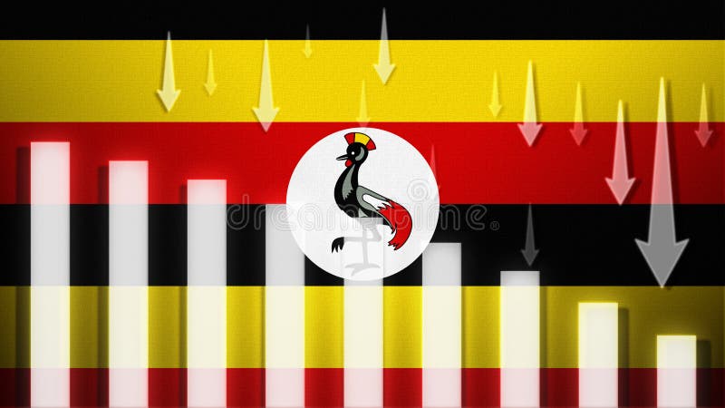
Free with trial Uganda flag with a declining bar chart and down arrows, symbolizing decline in data, performance, or various national indicators in the country. Data decrease illustrations Flag with a declining bar chart and down arrows
Free with trial Taiwan flag with a declining bar chart and down arrows, symbolizing decline in data, performance, or various national indicators in the country. Data decrease illustrations Flag with a declining bar chart and down arrows
Free with trial UAE flag with a declining bar chart and down arrows, symbolizing decline in data, performance, or various national indicators in the country. Data decrease illustrations Flag with a declining bar chart and down arrows
Free with trial Hand-drawn line chart doodle is showing grid backdrop and axis over gradient background, copy space. Data visualization, infographics, analytics, diagram, business, educational, minimalistic. Data decrease illustrations Hand-drawn line chart doodle is showing grid backdrop and axis over gradient background, copy space
Free with trial A financial chart displaying market analysis and business growth with increasing and decreasing trends. Data decrease illustrations Financial chart showing growth and market analysis data isolated on transparent background. A financial chart displaying market analysis and business growth with increasing and decreasing trends.
Free with trial A bold red arrow points downward, symbolizing a negative trend or decline, often associated with financial or performance metrics. This visual representation is commonly used in reports. Data decrease vectors Red downward arrow indicating decline in trends or performance metrics across data visuals. A bold red arrow points downward, symbolizing a negative trend or decline, often associated with financial or performance metrics. This visual representation is commonly used in reports.