Free with trial Eight circular icons with black backgrounds each feature a different chart or graph symbol. The frames are bordered by a sequence of colorful lines: red, green, blue, and yellow. The icons include bar graphs, line graphs, a pie chart, and scatter plots, all depicted in white. Each symbol includes axes and grid patterns, indicating statistical or financial data representation. The arrangement is in two rows of four, emphasizing symmetry and variety in chart types. A i Generated. Decrease arrow chart vectors Collection of eight different chart and graph icons displayed in circular black frames with colorful borders. Eight circular icons with black backgrounds each feature a different chart or graph symbol. The frames are bordered by a sequence of colorful lines: red, green, blue, and yellow. The icons include bar graphs, line graphs, a pie chart, and scatter plots, all depicted in white. Each symbol includes axes and grid patterns, indicating statistical or financial data representation. The arrangement is in two rows of four, emphasizing symmetry and variety in chart types. A i Generated
Free with trial A set of hand-drawn financial graph and chart icons. These icons are suitable for business analysis, investment strategies, and economic growth presentations. Decrease arrow chart vectors Vector art of hand drawn financial graph and chart icons for business analysis, investment, and economic growth in vector format. A set of hand-drawn financial graph and chart icons. These icons are suitable for business analysis, investment strategies, and economic growth presentations
Free with trial Businessmen team pushing a stack of coins to resist a red down arrow. Financial crisis and economic downturn. A minimal style of an effect of inflation, recession, bankruptcy, and financial failure. Decrease arrow chart vectors Businessmen team pushing a stack of coins to resist a red down arrow. Financial crisis and economic downturn. A minimal style of
Free with trial A dynamic stock market chart against a blurred city skyline, symbolizing financial growth and investment opportunities. it represents the intersection of urban finance and economic trends, showcasing potential. Decrease arrow chart illustrations Stock market analysis chart with city skyline background for financial investment growth concept. a dynamic stock market chart against a blurred city skyline, symbolizing financial growth and investment opportunities. it represents the intersection of urban finance and economic trends, showcasing potential.
Free with trial A red arrow with a jagged line points downward, indicating a negative trend. Isolated on a white surface, it symbolizes decline in finance, economy, or investment, suitable for presentations or reports. Decrease arrow chart illustrations Red arrow trending down isolated on white background. for business, financial, economic, or investment use cases. A red arrow with a jagged line points downward, indicating a negative trend. Isolated on a white surface, it symbolizes decline in finance, economy, or investment, suitable for presentations or reports
Free with trial Set Safe, Glass money jar with coin and Dollar rate decrease. Business infographic template. Vector. Decrease arrow chart illustrations Set Safe, Glass money jar with coin and Dollar rate decrease. Business infographic template. Vector
Free with trial Dark arrow with percentage symbol pointing down inside a circle graphic icon for financial decline or discount. Decrease arrow chart vectors Dark arrow with percentage symbol pointing down inside a circle graphic icon for financial decline or discount
Free with trial Businessman runs on a green arrow graph rising on a stack of coins. Business growth, wealth creation, financial planning, investment goal, corporate development, economic achievement, profit and loss. Decrease arrow chart vectors Businessman runs on a green arrow graph rising on a stack of coins. Business growth, wealth creation, financial planning
Free with trial This infographic illustrates a crucial aspect of data analysis: recognizing and interpreting downward trends. The chart clearly displays a decreasing arrow, highlighting a negative slope and a reduction in value over time. Understanding these downward trends is critical in various fields, from finance and business to investment and market analysis. The visual representation aids in quickly. Decrease arrow chart illustrations Analyzing Downward Trends in Data A Comprehensive Guide to Understanding Decreasing Charts and Graphs in Business. This infographic illustrates a crucial aspect of data analysis: recognizing and interpreting downward trends. The chart clearly displays a decreasing arrow, highlighting a negative slope and a reduction in value over time. Understanding these downward trends is critical in various fields, from finance and business to investment and market analysis. The visual representation aids in quickly
Free with trial Trend to go down chart line and solid icon, world sanction concept. Vector graphics. Dollar currency graph, market pressure sign on white background, outline style icon for mobile or web design. Decrease arrow chart vectors Trend to go down chart line and solid icon, world sanction concept. Vector graphics. Dollar currency graph, market
Free with trial A 3D rendering showcasing the concept of crisis and bearish markets viewed from a perspective of a descending red arrow on a dark technological setting. Decrease arrow chart illustrations A 3D rendering showcasing the concept of crisis and bearish markets viewed from a perspective of a descending red arrow
Free with trial Hand interacting with a declining chart, symbolizing market trends and financial analysis ,Generative ai. Decrease arrow chart illustrations Declining chart and hand interaction, visualizing market trends financial analysis for strategic decisionmaking. Hand interacting with a declining chart, symbolizing market trends and financial analysis ,Generative ai
Free with trial Businessmen hold coins, run on stack of money in bar chart. Complete of business competiition, pursuit of economic success, financial management, capital market performance, and profit growth. Decrease arrow chart vectors Businessmen hold coins, run on stack of money in bar chart. Complete of business competiition, pursuit of economic success
Free with trial A bold red arrow zigzags sharply downwards indicating a significant decline or loss, isolated on a clean white background. Decrease arrow chart illustrations A sharp red downward trending arrow symbolizing financial loss and market decline isolated on white background. A bold red arrow zigzags sharply downwards indicating a significant decline or loss, isolated on a clean white background
Free with trial Red arrow crashes through white cracked surface. Downward trend financial market, economic recession, financial crisis concept. Symbol of business failure loss. Decline of economy. 3d. Decrease arrow chart illustrations Red arrow crashes through white cracked surface. Downward trend financial market, economic recession, financial crisis concept.
Free with trial A digital graphic emphasizing crisis and bearish market scenarios, presented as a 3D rendering of a red arrow trending downward on a dark technological background. Decrease arrow chart illustrations A digital graphic emphasizing crisis and bearish market scenarios, presented as a 3D rendering of a red arrow trending
Free with trial Decreasing arrow on a textured, rusty surface. Abstract concept representing economic recession and financial decline, business failure, investment risk. Decrease arrow chart illustrations Decreasing arrow on a textured, rusty surface. Abstract concept representing economic recession and financial decline
Free with trial Economic critical crisis concept. The down arrow on red table background. Recession financial, cryptocurrency, gold, and the stock market. Losing money and cash. Bearish. Decrease arrow chart vectors Economic critical crisis concept. The down arrow on red table background. Recession financial, cryptocurrency, gold, and the stock
Free with trial Colorful Financial growth decrease icon isolated on white background. Increasing revenue. Square button. 3D render illustration. Decrease arrow chart illustrations Colorful Financial growth decrease icon isolated on white background. Increasing revenue. Square button. 3D render
Free with trial Red wooden arrow points down on dark background. Image suggests market decline economic crisis. Used to illustrate economic downturn loss. Dark background creates somber mood. Decrease arrow chart illustrations Red wooden arrow points down on dark background. Image suggests market decline economic crisis. Used to illustrate economic
Free with trial A minimal style of a red decrease graph. Fired and losing a job, unemployment, financial crisis, economic downturn, jobless, lay off concept. A depress and stress businessman, an employee holds a box. Decrease arrow chart vectors A minimal style of a red decrease graph. Fired and losing a job, unemployment, financial crisis, economic downturn, jobless
Free with trial A captivating stock market analysis chart that visualizes financial data and business growth. The blue background enhances the modern design, perfect for illustrating investment trends and economic reports. Decrease arrow chart illustrations Stock market analysis chart financial data graph business investment growth blue background vector illustration. a captivating stock market analysis chart that visualizes financial data and business growth. The blue background enhances the modern design, perfect for illustrating investment trends and economic reports.
Free with trial Black line Financial growth decrease icon isolated on white background. Increasing revenue. Random dynamic shapes. Vector. Decrease arrow chart illustrations Black line Financial growth decrease icon isolated on white background. Increasing revenue. Random dynamic shapes
Free with trial Set line Casino chip with dollar, Financial growth decrease, increase and Lottery ticket. Glowing neon icon. Vector. Decrease arrow chart vectors Set line Casino chip with dollar, Financial growth decrease, increase and Lottery ticket. Glowing neon icon. Vector
Free with trial Filled outline Financial growth decrease icon isolated on white background. Increasing revenue. Flat filled outline style with shadow. Vector. Decrease arrow chart illustrations Filled outline Financial growth decrease icon isolated on white background. Increasing revenue. Flat filled outline
Free with trial White line Financial growth decrease icon isolated seamless pattern on red background. Increasing revenue. Vector. Decrease arrow chart vectors White line Financial growth decrease icon isolated seamless pattern on red background. Increasing revenue. Vector
Free with trial Green Financial growth decrease icon isolated on blue background. Increasing revenue. Minimalism concept. 3D render illustration. Decrease arrow chart illustrations Green Financial growth decrease icon isolated on blue background. Increasing revenue. Minimalism concept. 3D render
Free with trial Grunge Financial growth decrease icon isolated on white background. Increasing revenue. Monochrome vintage drawing. Vector. Decrease arrow chart illustrations Grunge Financial growth decrease icon isolated on white background. Increasing revenue. Monochrome vintage drawing
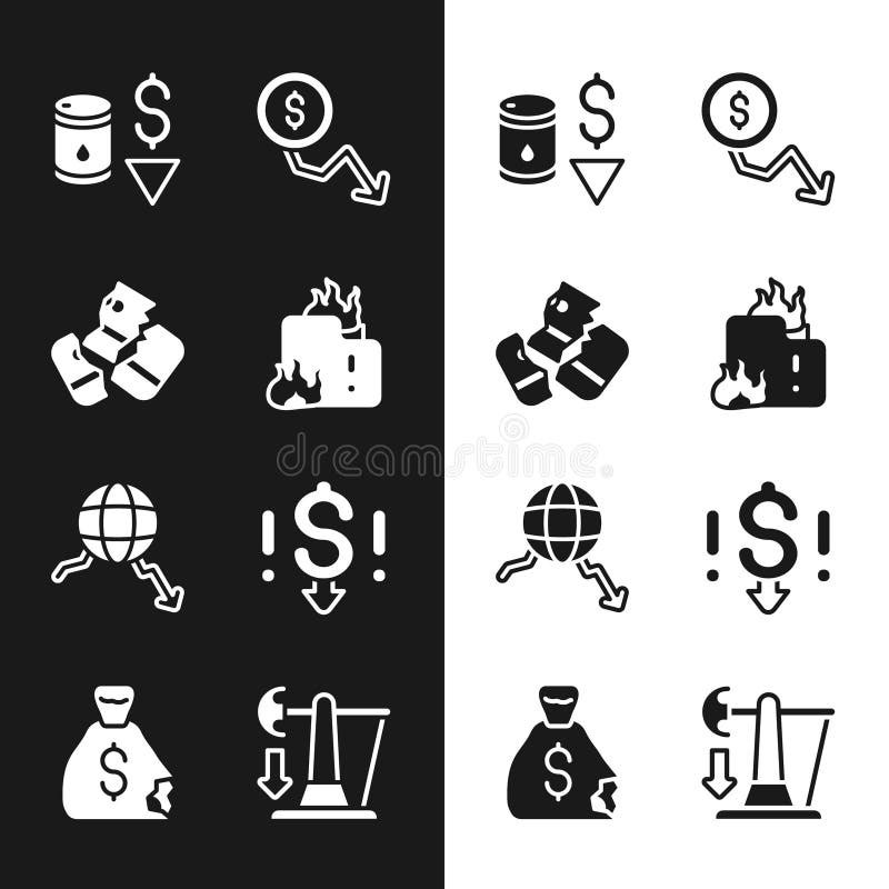
Free with trial Set Fire in burning house Credit card Drop crude oil price Dollar rate decrease Global economic crisis and Money bag icon. Vector. Decrease arrow chart illustrations Set Fire in burning house, Credit card, Drop crude oil price, Dollar rate decrease, Global economic crisis, and Money. Set Fire in burning house Credit card Drop crude oil price Dollar rate decrease Global economic crisis and Money bag icon. Vector.
Free with trial Set Dollar rate decrease, Tearing money banknote, Global economic crisis and Stop delivery cargo truck icon. Vector. Decrease arrow chart illustrations Set Dollar rate decrease, Tearing money banknote, Global economic crisis and Stop delivery cargo truck icon. Vector
Free with trial Businessman runs and holds coins on a green arrow graph rising on a stack of coins to coin slot. Growth, wealth create, financial, investment goal, corporate develop, economic, profit and loss. Decrease arrow chart vectors Businessman runs and holds coins on a green arrow graph rising on a stack of coins to coin slot. Growth, wealth create, financial
Free with trial A businessman holds a coin, runs on stack of money in bar chart. Concepts of business development, pursuit of economic success, financial management, capital market performance, and profit growth. Decrease arrow chart vectors A businessman holds a coin, runs on stack of money in bar chart. Concepts of business development, pursuit of economic success
Free with trial A 3D rendered image featuring two arrows pointing downwards on a white background. A bold red arrow descends sharply, while a thinner blue arrow follows a slightly different path. A small red ring is depicted at the point where the red arrow touches the surface, suggesting a low point or impact. This visual represents a concept of decline or loss. Decrease arrow chart illustrations Red and Blue Arrows Pointing Downward on White Background Representing Decline Keywords: arrow, down, decline, decrease, loss, red. A 3D rendered image featuring two arrows pointing downwards on a white background. A bold red arrow descends sharply, while a thinner blue arrow follows a slightly different path. A small red ring is depicted at the point where the red arrow touches the surface, suggesting a low point or impact. This visual represents a concept of decline or loss
Free with trial Economic critical crisis concept. The red lower arrow and graph icons on white background. Recession financial, cryptocurrency, gold, and the stock market. Losing money and cash. Bearish. Decrease arrow chart vectors Economic critical crisis concept. The red lower arrow and graph icons on white background. Recession financial, cryptocurrency
Free with trial Set line Search data analysis Server Cloud download and upload Binary code Financial growth decrease Browser with exclamation mark Data and icon. Vector. Decrease arrow chart vectors Set line Search data analysis, Server, Cloud download and upload, Binary code, Financial growth decrease, Browser with. Set line Search data analysis Server Cloud download and upload Binary code Financial growth decrease Browser with exclamation mark Data and icon. Vector.
Free with trial Black line Financial growth decrease icon isolated seamless pattern on green background. Increasing revenue. Vector. Decrease arrow chart illustrations Black line Financial growth decrease icon isolated seamless pattern on green background. Increasing revenue. Vector
Free with trial Set Data analysis Financial growth and decrease on seamless pattern. Vector. Decrease arrow chart vectors Set Data analysis, Financial growth and decrease on seamless pattern. Vector
Free with trial A red arrow graph down on a stack of coins. Concepts of business growth, wealth creation, financial planning, investment goal, success, corporate development, economic achievement, profit and loss. Decrease arrow chart vectors A red arrow graph down on a stack of coins. Concepts of business growth, wealth creation, financial planning, investment goal
Free with trial Glowing neon line Financial growth decrease icon isolated on black background. Increasing revenue. Colorful outline concept. Vector. Decrease arrow chart vectors Glowing neon line Financial growth decrease icon isolated on black background. Increasing revenue. Colorful outline
Free with trial Filled outline Financial growth decrease icon isolated on white background. Increasing revenue. Vector. Decrease arrow chart vectors Filled outline Financial growth decrease icon isolated on white background. Increasing revenue. Vector
Free with trial Isometric line Financial growth decrease icon isolated on yellow background. Increasing revenue. Black circle button. Vector. Decrease arrow chart vectors Isometric line Financial growth decrease icon isolated on yellow background. Increasing revenue. Black circle button
Free with trial An arrow graph rising on a stack of coins. Concepts of business growth, wealth creation, financial planning, investment goal, success, corporate development, economic achievement, profit and loss. Decrease arrow chart vectors An arrow graph rising on a stack of coins. Concepts of business growth, wealth creation, financial planning, investment goal
Free with trial Business graph with falling down arrow loss finance animation, city background. Decrease arrow chart illustrations Business graph with falling down arrow loss finance animation, city background
Free with trial Business graph with falling down arrow loss finance animation, city background. Decrease arrow chart illustrations Business graph with falling down arrow loss finance animation, city background
Free with trial Business graph with falling down arrow loss finance animation, city background. Decrease arrow chart illustrations Business graph with falling down arrow loss finance animation, city background
Free with trial Business graph with falling down arrow loss finance animation, city background. Decrease arrow chart illustrations Business graph with falling down arrow loss finance animation, city background
Free with trial Businessmen hold banknotes, run on stack of money in bar chart. Complete of business competiition, pursuit of economic success, financial management, capital market performance, and profit growth. Decrease arrow chart vectors Businessmen hold banknotes, run on stack of money in bar chart. Complete of business competiition, pursuit of economic success
Free with trial A businessman pushing a stack of coins to resist a red down arrow. Financial crisis and economic downturn. A minimal style of an effect of inflation, recession, bankruptcy, and financial failure. Decrease arrow chart vectors A businessman pushing a stack of coins to resist a red down arrow. Financial crisis and economic downturn. A minimal style of an
Free with trial A businessman pushing a stack of money to resist a red down arrow. Financial crisis and economic downturn. A minimal style of an effect of inflation, recession, bankruptcy, and financial failure. Decrease arrow chart vectors A businessman pushing a stack of money to resist a red down arrow. Financial crisis and economic downturn. A minimal style of an
Free with trial An interest rate percentage sign with a downward trend arrow in the sky. illustrating the effects on the economy, Generated AI. Decrease arrow chart illustrations An interest rate percentage sign with a downward trend arrow in the sky, illustrating the effects on the economy, Generated AI
Free with trial Wooden blocks show opposing directional arrows, contrasting trends choices. One block features red up arrow, black down arrow, representing progress decline. Symbols convey concepts of. Decrease arrow chart illustrations Wooden blocks show opposing directional arrows, contrasting trends choices. One block features red up arrow, black down arrow
Free with trial Economic critical crisis concept. The lower line graph and bar chart on red background. Recession financial, cryptocurrency, gold, and the stock market. Losing money and cash. Bearish. Decrease arrow chart vectors Economic critical crisis concept. The lower line graph and bar chart on red background. Recession financial, cryptocurrency, gold
Free with trial Column chart sign. Salaryman, gender equality and alert bell outline icons. Diagram graph line icon. Market analytics symbol. Spy or profile placeholder icon. Vector. Decrease arrow chart vectors Diagram graph line icon. Column chart sign. Salaryman, gender equality and alert bell. Vector. Column chart sign. Salaryman, gender equality and alert bell outline icons. Diagram graph line icon. Market analytics symbol. Diagram graph line sign. Spy or profile placeholder icon. Vector
Free with trial Color Financial growth decrease icon isolated on white background. Increasing revenue. Flat filled outline style with shadow. Vector. Decrease arrow chart illustrations Color Financial growth decrease icon isolated on white background. Increasing revenue. Flat filled outline style with
Free with trial Glowing neon line Financial growth decrease icon isolated on blue background. Increasing revenue. Vector. Decrease arrow chart illustrations Glowing neon line Financial growth decrease icon isolated on blue background. Increasing revenue. Vector
Free with trial Red wooden arrow points down on yellow background. Business, market decline. Indicates economic recession, financial loss, investment risk. Shows negative trends, bankruptcy. Useful for. Decrease arrow chart illustrations Red wooden arrow points down on yellow background. Business, market decline. Indicates economic recession, financial loss
Free with trial Colorful Financial growth decrease icon isolated on white background. Increasing revenue. Minimalism concept. 3D render illustration. Decrease arrow chart illustrations Colorful Financial growth decrease icon isolated on white background. Increasing revenue. Minimalism concept. 3D render
Free with trial Set Isometric line Falling property prices, Dollar rate decrease, Global economic crisis and Debt ball chained to coin icon. Vector. Decrease arrow chart illustrations Set Isometric line Falling property prices, Dollar rate decrease, Global economic crisis and Debt ball chained to coin
Free with trial Set Drop in crude oil price, Calculation of expenses, and Dollar rate decrease on seamless pattern. Vector. Decrease arrow chart vectors Set Drop in crude oil price, Calculation of expenses, and Dollar rate decrease on seamless pattern. Vector
Free with trial Financial Decline Concept with Chinese Flag, Coins, and Red Arrow. Decrease arrow chart illustrations Financial Decline Concept with Chinese Flag, Coins, and Red Arrow
Free with trial Isometric line Financial growth decrease icon isolated on pink and green background. Increasing revenue. Silver square button. Vector. Decrease arrow chart vectors Isometric line Financial growth decrease icon isolated on pink and green background. Increasing revenue. Silver square
Free with trial White line Financial growth decrease icon isolated with long shadow background. Increasing revenue. Blue square button. Vector. Decrease arrow chart vectors White line Financial growth decrease icon isolated with long shadow background. Increasing revenue. Blue square button
Free with trial Filled outline Financial growth decrease icon isolated on blue background. Increasing revenue. Turquoise square button. Vector. Decrease arrow chart vectors Filled outline Financial growth decrease icon isolated on blue background. Increasing revenue. Turquoise square button
Free with trial A stark image depicting the perilous decline of financial markets. A red arrow, plummeting towards a scattering of coins on a rustic wooden table, symbolizes the devastating impact of a market crash. This visual metaphor effectively captures the loss of wealth and investment value during an economic downturn. The image represents a crucial juncture in the financial landscape, highlighting the. Decrease arrow chart illustrations Financial Market Downturn Red Arrow Plunging Towards Coins on Wooden Table A Visual Representation of Investment Loss. A stark image depicting the perilous decline of financial markets. A red arrow, plummeting towards a scattering of coins on a rustic wooden table, symbolizes the devastating impact of a market crash. This visual metaphor effectively captures the loss of wealth and investment value during an economic downturn. The image represents a crucial juncture in the financial landscape, highlighting the
Free with trial Set Global economic crisis, Prison cell door, Dollar rate decrease and Drop in crude oil price icon. Vector. Decrease arrow chart vectors Set Global economic crisis, Prison cell door, Dollar rate decrease and Drop in crude oil price icon. Vector
Free with trial Set Isometric Tearing money banknote, Global economic crisis, Mobile stock trading and Dollar rate decrease icon. Vector. Decrease arrow chart illustrations Set Isometric Tearing money banknote, Global economic crisis, Mobile stock trading and Dollar rate decrease icon. Vector
Free with trial 3D blue arrow points down on white surface. Isolated object indicates direction. Graphic element used for web, design and navigation. Simple symbol shows movement. Decrease arrow chart illustrations 3D blue arrow points down on white surface. Isolated object indicates direction. Graphic element used for web design and. 3D blue arrow points down on white surface. Isolated object indicates direction. Graphic element used for web, design and navigation. Simple symbol shows movement.
Free with trial A businessman holds a coin, runs to stack of money bar chart with green graph up. Extend investment in Bull Economy, economic success, financial management, capital market performance, and profit. Decrease arrow chart vectors A businessman holds a coin, runs to stack of money bar chart with green graph up. Extend investment in Bull Economy, economic
Free with trial A businessman holds banknotes, runs on stack of money in bar chart. Concepts of business development, pursuit of economic success, financial management, capital market performance, and profit growth. Decrease arrow chart vectors A businessman holds banknotes, runs on stack of money in bar chart. Concepts of business development, pursuit of economic success
Free with trial Isometric Financial growth decrease icon isolated on pink, yellow and blue background. Increasing revenue. Square button. Vector. Decrease arrow chart vectors Isometric Financial growth decrease icon isolated on pink, yellow and blue background. Increasing revenue. Square button
Free with trial Line Financial growth decrease icon isolated on white background. Increasing revenue. Abstract banner with liquid shapes. Vector. Decrease arrow chart illustrations Line Financial growth decrease icon isolated on white background. Increasing revenue. Abstract banner with liquid shapes
Free with trial Line Financial growth decrease icon isolated on white and black background. Increasing revenue. Colorful outline concept. Vector. Decrease arrow chart vectors Line Financial growth decrease icon isolated on white and black background. Increasing revenue. Colorful outline concept
Free with trial Red arrow pointing downward on financial spreadsheet. Magnifying glass focuses on economic decline trend. No people. Business recession. Analyzing financial data. Spreadsheet with. Decrease arrow chart illustrations Red arrow pointing downward on financial spreadsheet. Magnifying glass focuses on economic decline trend. No people. Business
Free with trial Miniature shopping cart with red upward trending arrow declining retail sales, negative economic trends. Conceptual image represents falling consumer spending, market downturn financial. Decrease arrow chart illustrations Miniature shopping cart with red upward trending arrow declining retail sales, negative economic trends. Conceptual image
Free with trial Economic downturn with falling red arrow and bearish stock market trend concept. Generative AI. Decrease arrow chart illustrations Economic downturn with falling red arrow and bearish stock market trend concept. Generative AI
Free with trial A businessman pushing banknotes to resist a red down arrow. Financial crisis and economic downturn. A minimal style of an effect of inflation, recession, bankruptcy, and financial failure. Decrease arrow chart vectors A businessman pushing banknotes to resist a red down arrow. Financial crisis and economic downturn. A minimal style of an effect
Free with trial Businessmen team pushing a coin to resist a red down arrow. Financial crisis and economic downturn. A minimal style of an effect of inflation, recession, bankruptcy, and financial failure. Decrease arrow chart vectors Businessmen team pushing a coin to resist a red down arrow. Financial crisis and economic downturn. A minimal style of an effect
Free with trial A fuel pump nozzle is positioned over a declining bar graph with a red arrow indicating a downward trend. This symbolizes decreasing gas prices and the impact on the economy and financial markets. Isolated on white. Decrease arrow chart illustrations Fuel pump over graph isolated on white background. concept for gas price decrease, economy, finance, and business use cases. A fuel pump nozzle is positioned over a declining bar graph with a red arrow indicating a downward trend. This symbolizes decreasing gas prices and the impact on the economy and financial markets. Isolated on white
Free with trial A golden arrow pierces a coin, emphasizing a decline in value against increasing stacks of coins in a soft-focus background highlighting economic instability. Decrease arrow chart illustrations Golden arrow striking a stack of coins represents a downward trend in the monetary market, reflecting economic challenges and. A golden arrow pierces a coin, emphasizing a decline in value against increasing stacks of coins in a soft-focus background highlighting economic instability
Free with trial Red wooden arrow points down on black background. Symbolizes business, market decline or economic crisis. Concept for bad debt, bankruptcy, diagram, investment loss and negative. Decrease arrow chart illustrations Red wooden arrow points down on black background. Symbolizes business, market decline or economic crisis. Concept for bad debt