Free with trial Gold coin with a dollar sign is next to a red arrow pointing down, representing economic decline. Decrease arrow chart illustrations Dollar coin value decreasing showing financial crisis. Gold coin with a dollar sign is next to a red arrow pointing down, representing economic decline
Free with trial The graph of the economy went down, the growth of unemployment. Market trading problems. Women are sitting on the graph and are sad vector illustration. Business is low and arrow fall. Lost money. Decrease arrow chart vectors The graph of the economy went down, the growth of unemployment. Market trading problems. Women are sitting on the graph and are
Free with trial A 3D icon of a building and a downward arrow. Symbolizes real estate decline, property value loss, or a housing market crash. Ideal for financial infographics. Isolated. Decrease arrow chart illustrations 3D Real Estate Decline Icon for Property Value Loss and Housing Market Crash. A 3D icon of a building and a downward arrow. Symbolizes real estate decline, property value loss, or a housing market crash. Ideal for financial infographics. Isolated
Free with trial A conceptual illustration depicting a financial downturn, symbolized by a descending arrow graph over a serene mountain range. Decrease arrow chart vectors Financial Decline Over Mountain Landscape. A conceptual illustration depicting a financial downturn, symbolized by a descending arrow graph over a serene mountain range
Free with trial Laptop displaying a graph with a red arrow pointing down, illustrating a financial crisis. Decrease arrow chart vectors Laptop showing graph going down representing financial crisis. Laptop displaying a graph with a red arrow pointing down, illustrating a financial crisis
Free with trial This 3D rendered image shows a red arrow pointing downwards, illustrating a negative trend. The graphic, generated by AI, is a visual representation of declining values or a market downturn, perfect for illustrating economic reports or presentations. Decrease arrow chart illustrations Red Downward Trend. This 3D rendered image shows a red arrow pointing downwards, illustrating a negative trend. The graphic, generated by AI, is a visual representation of declining values or a market downturn, perfect for illustrating economic reports or presentations.
Free with trial The image shows a downward trending line, illuminated with a bright blue glow, resembling a graph or chart. the line starts high on the left and descends diagonally to the lower right, ending in an arrow pointing downwards. the background is a dark, metallic texture, lit by several spotlights from above, creating a dramatic effect. the floor reflects the blue light, adding depth to the scene. the overall impression is one of decline or failure, possibly related to business or finance. Decrease arrow chart illustrations Declining trend line with arrow in spotlight. the image shows a downward trending line, illuminated with a bright blue glow, resembling a graph or chart. the line starts high on the left and descends diagonally to the lower right, ending in an arrow pointing downwards. the background is a dark, metallic texture, lit by several spotlights from above, creating a dramatic effect. the floor reflects the blue light, adding depth to the scene. the overall impression is one of decline or failure, possibly related to business or finance.
Free with trial A turquoise moon hovers above a stock market graph with rising and falling arrows indicating market trends, useful for illustrating financial concepts. Decrease arrow chart illustrations Stock Market Graph with Moon and Arrow Trends. A turquoise moon hovers above a stock market graph with rising and falling arrows indicating market trends, useful for illustrating financial concepts
Free with trial A miniature wooden house model is depicted alongside a prominent white percentage symbol and a large red arrow pointing downwards, all resting on a light wooden surface. This visual metaphor effectively illustrates concepts related to falling housing prices, decreasing mortgage interest rates, or a general decline in the real estate market. It's ideal for financial news, economic reports, articles on property investment trends, or advertisements highlighting lower rates and market adjustments. The clean, minimalist composition emphasizes the critical financial message. Decrease arrow chart illustrations Falling Home Prices and Mortgage Rates Concept. A miniature wooden house model is depicted alongside a prominent white percentage symbol and a large red arrow pointing downwards, all resting on a light wooden surface. This visual metaphor effectively illustrates concepts related to falling housing prices, decreasing mortgage interest rates, or a general decline in the real estate market. It's ideal for financial news, economic reports, articles on property investment trends, or advertisements highlighting lower rates and market adjustments. The clean, minimalist composition emphasizes the critical financial message.
Free with trial Line chart going down on a website, showing a negative trend in statistics. Decrease arrow chart illustrations Website showing a graph representing decreasing statistics. Line chart going down on a website, showing a negative trend in statistics
Free with trial A visual representation of declining interest rates, depicted by stacks of coins with percentage dice and a downward trending red arrow, symbolizing economic downturn. Decrease arrow chart illustrations Falling interest rates shown by dice and coins. A visual representation of declining interest rates, depicted by stacks of coins with percentage dice and a downward trending red arrow, symbolizing economic downturn
Free with trial A modern 3D rendered abstract illustration featuring a prominent light blue downward-pointing arrow as its base. On top, a geometric structure is composed of a rectangular block, two stylized bar chart-like elements, and a central dark grey multifaceted polyhedron. Set against a clean white background, this graphic symbolizes concepts like data analysis, business trends, financial decline, foundational structures, or urban development. Its minimalist and digital aesthetic makes it suitable for technology, finance, and corporate presentations, infographics, and web design. Decrease arrow chart vectors Abstract 3D Data Structure with Downward Arrow. A modern 3D rendered abstract illustration featuring a prominent light blue downward-pointing arrow as its base. On top, a geometric structure is composed of a rectangular block, two stylized bar chart-like elements, and a central dark grey multifaceted polyhedron. Set against a clean white background, this graphic symbolizes concepts like data analysis, business trends, financial decline, foundational structures, or urban development. Its minimalist and digital aesthetic makes it suitable for technology, finance, and corporate presentations, infographics, and web design.
Free with trial A 3D-rendered image depicts a sharply declining red arrow on a bar graph, symbolizing a significant market downturn. The graph is set against a solid blue background. Decrease arrow chart illustrations 3D Render of a Dramatic Stock Market Crash Graph. A 3D-rendered image depicts a sharply declining red arrow on a bar graph, symbolizing a significant market downturn. The graph is set against a solid blue background.
Free with trial Red hand holding a dollar coin with a downward arrow, symbolizing financial loss or reduced income. Decrease arrow chart vectors Red hand holding a dollar coin with a downward arrow
Free with trial , Applied for Info Graphics, Design Elements, Websites, Presentations, and Application - Vector. Decrease arrow chart illustrations Decrease Icon. Down Symbol within Glyph Style - Vector. , Applied for Info Graphics, Design Elements, Websites, Presentations, and Application - Vector.
Free with trial Business Bar Graph Downturn Arrow Icon Trend Falling. Decrease arrow chart vectors Business Bar Graph Downturn Arrow Icon Trend Falling
Free with trial A black framed display shows a white gridded background with a prominent red arrow depicting a sharp downward trend. The arrow is thick and three-dimensional, clearly indicating a significant decline. The display sits on a light gray surface, with a blurred cityscape visible through a window in the background. The overall mood is one of negative economic or financial news. The image is clean and, generated by AI. Decrease arrow chart illustrations Red Downward Trending Graph on White Display Screen. A black framed display shows a white gridded background with a prominent red arrow depicting a sharp downward trend. The arrow is thick and three-dimensional, clearly indicating a significant decline. The display sits on a light gray surface, with a blurred cityscape visible through a window in the background. The overall mood is one of negative economic or financial news. The image is clean and, generated by AI.
Free with trial Colorful graph showing decreasing lines representing a financial loss. Decrease arrow chart vectors Isometric graph showing financial loss with arrow pointing down. Colorful graph showing decreasing lines representing a financial loss
Free with trial This striking image depicts a 3D rendering of a sharply declining graph, generated by AI, symbolizing a market crash or economic downturn. The red arrow dramatically plunges downwards against a blurred background of white building silhouettes, visually representing the severity of the economic decl. Decrease arrow chart illustrations AI-Generated Market Crash Visualization. This striking image depicts a 3D rendering of a sharply declining graph, generated by AI, symbolizing a market crash or economic downturn. The red arrow dramatically plunges downwards against a blurred background of white building silhouettes, visually representing the severity of the economic decl
Free with trial This striking image depicts a 3D rendering of a dramatic market downturn, generated by AI. The red, origami-style arrow plunges downwards, contrasting sharply with the clean, minimalist background. The visual emphasizes the severity of the economic decline. Decrease arrow chart illustrations AI-Generated Market Crash Visualization. This striking image depicts a 3D rendering of a dramatic market downturn, generated by AI. The red, origami-style arrow plunges downwards, contrasting sharply with the clean, minimalist background. The visual emphasizes the severity of the economic decline.
Free with trial A hand draws a downward-trending line graph on a chalkboard using chalk, illustrating a negative market trend or decline. This visual representation, generated by AI, is often used to symbolize economic recession, stock market crashes, or other forms of decrease. Decrease arrow chart illustrations Downward Trend. A hand draws a downward-trending line graph on a chalkboard using chalk, illustrating a negative market trend or decline. This visual representation, generated by AI, is often used to symbolize economic recession, stock market crashes, or other forms of decrease.
Free with trial A blackboard with a graph on it and a potted plant next to it. The graph shows a downward trend, which could represent a decrease in sales or a decline in a particular stock. Decrease arrow chart illustrations A blackboard with a graph on it and a potted plant next to it
Free with trial Several blue arrows are pointing down, representing a decrease or negative trend. Decrease arrow chart vectors Blue arrows pointing down representing negative trend. Several blue arrows are pointing down, representing a decrease or negative trend
Free with trial A series of black bar graphs are shown with downward-pointing arrows. Some arrows are green, indicating a slight decline, while others are red, signifying a more significant drop. The visual represents financial or data trends of decrease. Decrease arrow chart illustrations Bar Graphs with Downward Arrows in Green and Red downward trend. A series of black bar graphs are shown with downward-pointing arrows. Some arrows are green, indicating a slight decline, while others are red, signifying a more significant drop. The visual represents financial or data trends of decrease
Free with trial A 3D rendering depicts a sharp downturn in a stock market graph, visually representing a significant financial crash. The red arrow emphasizes the dramatic fall in value. Decrease arrow chart illustrations 3D Stock Market Crash Graph Showing Significant Decline. A 3D rendering depicts a sharp downturn in a stock market graph, visually representing a significant financial crash. The red arrow emphasizes the dramatic fall in value.
Free with trial Simple line art illustration of a bar graph with a downward trend, symbolizing negative growth. Decrease arrow chart illustrations Declining bar graph showing negative trend with arrow pointing down. Simple line art illustration of a bar graph with a downward trend, symbolizing negative growth
Free with trial Wooden blocks spelling out decreasing interest rates against a backdrop of falling coins and a downward-trending graph. Illustrates the impact of lower interest rates during an economic downturn or financial crisis, symbolizing investment risk, market instability, and potential budget concerns, generated by AI. Decrease arrow chart illustrations Interest rate decrease financial crisis economic downturn. Wooden blocks spelling out decreasing interest rates against a backdrop of falling coins and a downward-trending graph. Illustrates the impact of lower interest rates during an economic downturn or financial crisis, symbolizing investment risk, market instability, and potential budget concerns, generated by AI.
Free with trial Two bar charts are displayed side by side. One shows a clear upward trend with a green arrow, while the other shows a downward trend with a red arrow. Decrease arrow chart illustrations Bar charts showing contrasting upward and downward trends. Two bar charts are displayed side by side. One shows a clear upward trend with a green arrow, while the other shows a downward trend with a red arrow
Free with trial A financial chart illustrating a bearish stock market trend, depicted by a series of red and green candlesticks forming a downward pattern, indicating a potential price decline. Decrease arrow chart illustrations Bearish stock market trend with red and green candlesticks. A financial chart illustrating a bearish stock market trend, depicted by a series of red and green candlesticks forming a downward pattern, indicating a potential price decline
Free with trial A minimal style of a red down chart of the financial crisis, economic downturn, inflation, recession, failure, bankruptcy concept. An emplyee team pulling a tug of war to change graph direction. Decrease arrow chart vectors An emplyee team pulling a tug of war to change graph direction
Free with trial Calculator alongside arrows indicating increase and decrease, and a line graph with fluctuations. Ideal for finance, budgeting, economics, analysis, statistics, decision-making, simple flat metaphor. Decrease arrow chart illustrations Calculator with Arrows and Graph Representing Financial Analysis and Data Trends. Calculator alongside arrows indicating increase and decrease, and a line graph with fluctuations. Ideal for finance, budgeting, economics, analysis, statistics, decision-making, simple flat metaphor
Free with trial Downward arrow with SALE, analytics dashboard, and a cloud icon. Ideal for ecommerce, marketing, analysis, cloud services, business strategy, financial review simple landing page. Decrease arrow chart vectors Sales Decline with Data Analytics and Cloud Connectivity for Business Insights. Downward arrow with SALE, analytics dashboard, and a cloud icon. Ideal for ecommerce, marketing, analysis, cloud services, business strategy, financial review simple landing page
Free with trial A grid of black icons representing various types of graphs and charts, including bar graphs and line graphs with upward arrows, on a white background. Decrease arrow chart vectors Collection of Ai-Generated black and white graph and chart icons. A grid of black icons representing various types of graphs and charts, including bar graphs and line graphs with upward arrows, on a white background
Free with trial Declining financial data graph with decreasing bars and arrow. Decrease arrow chart vectors Declining financial data graph with decreasing bars and arrow
Free with trial Declining red bar graph shown with a falling red arrow directed towards a grey building against a bright white background, symbolizing financial loss or economic downturn for business concepts. Decrease arrow chart illustrations Falling Red Bar Graph with Grey Building on White Background. Declining red bar graph shown with a falling red arrow directed towards a grey building against a bright white background, symbolizing financial loss or economic downturn for business concepts
Free with trial A hand manipulates a red arrow pointing downwards, superimposed on a bar graph, illustrating a market downturn. This image, generated by AI, symbolizes economic recession, financial crisis, or business failure, showcasing the impact of negative trends. Decrease arrow chart illustrations Declining Market Trend. A hand manipulates a red arrow pointing downwards, superimposed on a bar graph, illustrating a market downturn. This image, generated by AI, symbolizes economic recession, financial crisis, or business failure, showcasing the impact of negative trends.
Free with trial Growth and declining graph bar icon with flat rounded cartoon style. Charts with bar growth and declining. Graph trending upwards arrow and downwards arrow. Eps 10 vector illustration. Decrease arrow chart vectors Growth and declining graph bar icon with flat rounded cartoon style
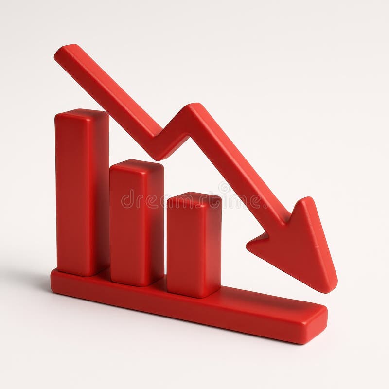
Free with trial A 3D bar graph with a red line graph indicating a significant decrease, isolated on a clean white background. Decrease arrow chart illustrations Bar graph showing downward trend isolated on white background. A 3D bar graph with a red line graph indicating a significant decrease, isolated on a clean white background
Free with trial A white graph of falling from tubes with a down arrow. High quality illustration. Decrease arrow chart illustrations A white graph of falling from tubes with a down arrow.
Free with trial A white graph of falling from tubes with a down arrow. High quality illustration. Decrease arrow chart illustrations A white graph of falling from tubes with a down arrow.
Free with trial Abstract digital illustration depicting two contrasting glowing line graphs. A vibrant blue/cyan line trends steeply upwards with an arrow, while a bright red line trends downwards with its arrow, crossing over the blue line mid-way. Subtle dotted lines and sparkling light effects add detail against the dark, moody background. This dynamic image conveys energy and volatility, suitable for representing concepts like market fluctuations, contrasting financial trends (growth vs. decline), stock market analysis, competition, data comparison, economic divergence, risk assessment, and critical crossover points. Ideal for financial reports, articles on market volatility, illustrating competitive analysis, or business strategy presentations. Decrease arrow chart illustrations Contrasting red downward and blue upward glowing graph arrows crossing. Abstract digital illustration depicting two contrasting glowing line graphs. A vibrant blue/cyan line trends steeply upwards with an arrow, while a bright red line trends downwards with its arrow, crossing over the blue line mid-way. Subtle dotted lines and sparkling light effects add detail against the dark, moody background. This dynamic image conveys energy and volatility, suitable for representing concepts like market fluctuations, contrasting financial trends (growth vs. decline), stock market analysis, competition, data comparison, economic divergence, risk assessment, and critical crossover points. Ideal for financial reports, articles on market volatility, illustrating competitive analysis, or business strategy presentations.
Free with trial Digita blue bar charts descend steadily across a digital grid, illustrating a decline in financial performance and market trends. Downward arrows emphasize loss, negative growth, and economic challenges, while smooth transitions and a tech-inspired layout enhance the visual impact of the data downturn. Decrease arrow chart illustrations Digital blue bar chart with decreasing business concept. Digita blue bar charts descend steadily across a digital grid, illustrating a decline in financial performance and market trends. Downward arrows emphasize loss, negative growth, and economic challenges, while smooth transitions and a tech-inspired layout enhance the visual impact of the data downturn.
Free with trial Businessman pointing at cost reduction graph with glowing arrow showing decreasing expenses financial savings business efficiency investment growth and corporate budget strategy concept. Decrease arrow chart illustrations Businessman pointing at cost reduction graph with glowing arrow showing decreasing expenses financial savings business efficiency
Free with trial This striking image depicts a downward-pointing arrow composed of fragmented red and white blocks, generated by AI. The red blocks represent a decline, while the white blocks symbolize a potential recovery or past stability. The visual metaphor powerfully conveys market instability and potential col. Decrease arrow chart illustrations Market Crash Visualization. This striking image depicts a downward-pointing arrow composed of fragmented red and white blocks, generated by AI. The red blocks represent a decline, while the white blocks symbolize a potential recovery or past stability. The visual metaphor powerfully conveys market instability and potential col
Free with trial A clear vector illustration of a red downward trending line graph, symbolizing a decrease, decline, or negative performance. This icon is essential for financial reports, business presentations, data visualization, or any context indicating a reduction. Its simple, sharp design effectively communicates a downward trend in various metrics, vector design Generative AI. Decrease arrow chart vectors Red Downward Trending Graph Line Icon, vector design Generative AI. A clear vector illustration of a red downward trending line graph, symbolizing a decrease, decline, or negative performance. This icon is essential for financial reports, business presentations, data visualization, or any context indicating a reduction. Its simple, sharp design effectively communicates a downward trend in various metrics, vector design Generative AI
Free with trial A collection of minimalist outline icons representing finance and business data charts, symbols, and indicators for graphic design and web development. Decrease arrow chart vectors Minimalist Outline Finance and Business Data Chart Symbol Icon Set. A collection of minimalist outline icons representing finance and business data charts, symbols, and indicators for graphic design and web development.
Free with trial A striking 3D render visualizes economic decline with a vibrant red bar graph against a clean white background. This impactful image vividly represents a financial crisis and recession, showcasing a clear downward trend through its falling bars and an implied arrow. It symbolizes loss, failure, and potential bankruptcy within the business and finance sectors. Ideal for illustrating articles on the. Decrease arrow chart illustrations Red economic decline bar graph depicting financial downfall and negative trends on white background. A striking 3D render visualizes economic decline with a vibrant red bar graph against a clean white background. This impactful image vividly represents a financial crisis and recession, showcasing a clear downward trend through its falling bars and an implied arrow. It symbolizes loss, failure, and potential bankruptcy within the business and finance sectors. Ideal for illustrating articles on the
Free with trial Two red, downward trending arrow graphs illustrate a significant market decline, representing financial loss or economic downturn. The jagged lines show fluctuating decline. Decrease arrow chart vectors Red Downward Trending Arrows Indicating Market Decline, Financial Loss. Two red, downward trending arrow graphs illustrate a significant market decline, representing financial loss or economic downturn. The jagged lines show fluctuating decline
Free with trial 3D low price icons with red up and down arrows showing rate drop and market decline. Abstract financial vector about price decrease, percent change, and economic fall in modern business design. Decrease arrow chart vectors 3D low price icons with red up and down arrows showing rate drop and market decline. Abstract financial vector about
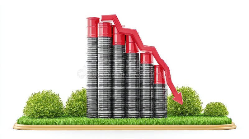
Free with trial 3D rendering of a bar graph showing a decline in production, represented by black and red cylinders on a grassy surface. The downward trend is emphasized by a red arrow AI generative. Decrease arrow chart illustrations Declining Production 3D Render of Bar Graph Showing a Downward Trend. 3D rendering of a bar graph showing a decline in production, represented by black and red cylinders on a grassy surface. The downward trend is emphasized by a red arrow AI generative
Free with trial A collection of simple finance graphic element icons, depicting trends, charts, and money. These icons can be used to visualize various financial concepts, such as growth, decline, and investment. Decrease arrow chart vectors Simple Style Finance Graphic Element Icons with Trend, Chart and Money. A collection of simple finance graphic element icons, depicting trends, charts, and money. These icons can be used to visualize various financial concepts, such as growth, decline, and investment.
Free with trial This image captures a sprawling urban cityscape at dusk, featuring numerous illuminated skyscrapers. A prominent red arrow graphic overlays the scene, indicating a sharp downward trend or decline. The setting sun casts a warm glow on the sky, contrasting with the cool tones of the city lights and buildings. This visual metaphor is ideal for representing financial market crashes, economic recession, business failure, or any concept of negative growth in a metropolitan context. Decrease arrow chart illustrations Cityscape Downturn: Financial Decline Overlay on Urban Skyline at Dusk. This image captures a sprawling urban cityscape at dusk, featuring numerous illuminated skyscrapers. A prominent red arrow graphic overlays the scene, indicating a sharp downward trend or decline. The setting sun casts a warm glow on the sky, contrasting with the cool tones of the city lights and buildings. This visual metaphor is ideal for representing financial market crashes, economic recession, business failure, or any concept of negative growth in a metropolitan context.
Free with trial Clean vector illustration features two sets of parallel arrows against a white background. One set of three arrows is colored bright red and points upwards, each arrow slightly offset from the others, creating a dynamic visual. The second set of three arrows is colored vibrant blue and points downwards, mirroring the arrangement of the red arrows. This contrasting imagery of upward and downward movement is ideal for illustrating concepts of growth versus decline, increase versus decrease, success versus recession, or positive versus negative trends in business, finance, or other data-driven contexts. Decrease arrow chart illustrations Vector Illustration of Contrasting Red Upward and Blue Downward Arrows. clean vector illustration features two sets of parallel arrows against a white background. One set of three arrows is colored bright red and points upwards, each arrow slightly offset from the others, creating a dynamic visual. The second set of three arrows is colored vibrant blue and points downwards, mirroring the arrangement of the red arrows. This contrasting imagery of upward and downward movement is ideal for illustrating concepts of growth versus decline, increase versus decrease, success versus recession, or positive versus negative trends in business, finance, or other data-driven contexts.
Free with trial Profit increase and decrease graph, coin icon. Decrease arrow chart vectors Profit increase and decrease graph
Free with trial Profit increase and decrease graph, coin icon. Decrease arrow chart vectors Profit increase and decrease graph
Free with trial Profit increase and decrease graph, coin icon. Decrease arrow chart vectors Profit increase and decrease graph
Free with trial Profit increase and decrease graph, coin icon. Decrease arrow chart vectors Profit increase and decrease graph
Free with trial Profit increase and decrease graph, coin icon. Decrease arrow chart vectors Profit increase and decrease graph
Free with trial Profit increase and decrease graph, coin icon. Decrease arrow chart vectors Profit increase and decrease graph
Free with trial CO2 inside cloud shape with blue downward arrows indicating reduction, next to bar chart and small cloud. Ideal for sustainability, environment, data, carbon reduction, climate change, eco-friendly. Decrease arrow chart vectors Reducing Carbon Emissions with Data Analysis Highlighted by Cloud Imagery and Downward Arrows. CO2 inside cloud shape with blue downward arrows indicating reduction, next to bar chart and small cloud. Ideal for sustainability, environment, data, carbon reduction, climate change, eco-friendly
Free with trial AI generated illustration of coins stacked near an upward-downward graph arrow line. Decrease arrow chart illustrations AI generated illustration of coins stacked near an upward-downward graph arrow line
Free with trial Elevate your everyday style with Abu Taher's collection of Typography T-Shirt Designs, where words meet artistry. Decrease arrow chart vectors Collection of 32 icons representing increase and decrease in business and finance. Elevate your everyday style with Abu Taher's collection of Typography T-Shirt Designs, where words meet artistry
Free with trial Financial Decline Illustrated by Decreasing Coin Stacks and Downward Arrow Graph. Decrease arrow chart vectors Financial Decline Illustrated by Decreasing Coin Stacks and Downward Arrow Graph
Free with trial Close up of laptop at office workplace with falling red forex candlestick chart on blurry backdrop. Global economic recession, stock market crash, inflation concept. 3D Rendering. Decrease arrow chart illustrations Close up of laptop at office workplace with falling red forex candlestick chart on blurry backdrop. Global economic recession
Free with trial A collection of financial icons in vector format. The transparent background is valuable for designers. Decrease arrow chart vectors Financial Increase and Decrease Icons Vector Illustration on transparent background. A collection of financial icons in vector format. The transparent background is valuable for designers
Free with trial A person's open palm supports a glowing digital graph illustrating a decrease in cost and an increase in quality, set against a dark background. Decrease arrow chart illustrations Hand holding glowing graph showing cost decreasing and quality increasing palm open. A person's open palm supports a glowing digital graph illustrating a decrease in cost and an increase in quality, set against a dark background
Free with trial Stock market bear market. Downward tread chart on the investment. Bear trader wearing eyeglasses sitting at office monitoring stock market. Generative Ai. Decrease arrow chart illustrations Bull trader wearing eyeglasses sitting at office monitoring stock market. Generative Ai. Stock market bear market. Downward tread chart on the investment. Bear trader wearing eyeglasses sitting at office monitoring stock market. Generative Ai
Free with trial A red graph showing a downward trend with an arrow pointing down, isolated against a white area. It represents decline, loss, or a negative trend in business, finance, or the economy. Symbolizes market risk. Decrease arrow chart illustrations Red graph with downward trend isolated on white background. use cases: business, finance. A red graph showing a downward trend with an arrow pointing down, isolated against a white area. It represents decline, loss, or a negative trend in business, finance, or the economy. Symbolizes market risk
Free with trial A stark visual representation of a downward trend in business metrics and market conditions. Decrease arrow chart illustrations Red arrow graph illustrates sharp decline in financial performance and economic downturn. A stark visual representation of a downward trend in business metrics and market conditions
Free with trial Illustration shows a worried businesswoman in front of a falling financial chart with red and green lines depicting economic decline, serious mood. Generative AI. Decrease arrow chart vectors Businesswoman with declining financial graph showing economic downturn and loss trends vector illustration. Illustration shows a worried businesswoman in front of a falling financial chart with red and green lines depicting economic decline, serious mood. Generative AI
Free with trial Image depicts falling market values using coins and a downward arrow. It symbolizes economic downturn and financial instability. Decrease arrow chart illustrations Economic Downturn: Visual Representation of Decreasing Market Value and Financial Instability. Image depicts falling market values using coins and a downward arrow. It symbolizes economic downturn and financial instability
Free with trial Business refers to the organized efforts and activities of individuals or groups to produce, buy, sell, and exchange goods or services for profit. Decrease arrow chart illustrations The Arrow down and coins for Business concept 3d rendering. Business refers to the organized efforts and activities of individuals or groups to produce, buy, sell, and exchange goods or services for profit
Free with trial Business refers to the organized efforts and activities of individuals or groups to produce, buy, sell, and exchange goods or services for profit. Decrease arrow chart illustrations The Arrow down and coins for Business concept 3d rendering. Business refers to the organized efforts and activities of individuals or groups to produce, buy, sell, and exchange goods or services for profit
Free with trial Business refers to the organized efforts and activities of individuals or groups to produce, buy, sell, and exchange goods or services for profit. Decrease arrow chart illustrations The Arrow down and coins for Business concept 3d rendering. Business refers to the organized efforts and activities of individuals or groups to produce, buy, sell, and exchange goods or services for profit
Free with trial Business refers to the organized efforts and activities of individuals or groups to produce, buy, sell, and exchange goods or services for profit. Decrease arrow chart illustrations The Arrow down and coins for Business concept 3d rendering. Business refers to the organized efforts and activities of individuals or groups to produce, buy, sell, and exchange goods or services for profit
Free with trial Business refers to the organized efforts and activities of individuals or groups to produce, buy, sell, and exchange goods or services for profit. Decrease arrow chart illustrations The Arrow down and coins for Business concept 3d rendering. Business refers to the organized efforts and activities of individuals or groups to produce, buy, sell, and exchange goods or services for profit
Free with trial Business refers to the organized efforts and activities of individuals or groups to produce, buy, sell, and exchange goods or services for profit. Decrease arrow chart illustrations The Arrow down and coins for Business concept 3d rendering. Business refers to the organized efforts and activities of individuals or groups to produce, buy, sell, and exchange goods or services for profit
Free with trial Business refers to the organized efforts and activities of individuals or groups to produce, buy, sell, and exchange goods or services for profit. Decrease arrow chart illustrations The Arrow down and coins for Business concept 3d rendering. Business refers to the organized efforts and activities of individuals or groups to produce, buy, sell, and exchange goods or services for profit
Free with trial Business refers to the organized efforts and activities of individuals or groups to produce, buy, sell, and exchange goods or services for profit. Decrease arrow chart illustrations The Arrow down and coins for Business concept 3d rendering. Business refers to the organized efforts and activities of individuals or groups to produce, buy, sell, and exchange goods or services for profit
Free with trial This illustrates the volatility of the precious metal, the decline in the Iranian and Omani gold markets, and the economic impact on investors during times of crisis or financial instability. Decrease arrow chart illustrations Gold bars and a downward-pointing red arrow on the flags of Iran and Oman. This illustrates the volatility of the precious metal, the decline in the Iranian and. This illustrates the volatility of the precious metal, the decline in the Iranian and Omani gold markets, and the economic impact on investors during times of crisis or financial instability.