Free with trial Red arrow graph depicts a stock market decline, moving downward with sharp angles against a white background. The thick arrow starts at the top left, zigzagging before terminating at the bottom right. Red color symbolizes economic downturn or decrease in financial value. Simple, stark design emphasizes decline theme commonly used in financial visuals to depict negative market trends or financial losses. Decrease financial trends illustrations Red Downward Arrow Graph: Stock Market Decline Illustration. Red arrow graph depicts a stock market decline, moving downward with sharp angles against a white background. The thick arrow starts at the top left, zigzagging before terminating at the bottom right. Red color symbolizes economic downturn or decrease in financial value. Simple, stark design emphasizes decline theme commonly used in financial visuals to depict negative market trends or financial losses.
Free with trial This image showcases vibrant 3D bar and pie charts, illustrating growth and statistical data. Perfect for presentations or reports on financial success. Decrease financial trends illustrations Colorful 3D Bar and Pie Charts Showing Business Growth and Statistics. This image showcases vibrant 3D bar and pie charts, illustrating growth and statistical data. Perfect for presentations or reports on financial success.
Free with trial Russian flag overlaid with a stock market chart featuring a candlestick graph. The chart indicates a fluctuating, predominantly downward trend, with multicolored candlesticks suggesting market volatility. The flag's colors�white, blue, and red�are visible, merging with the financial data. Horizontal lines denote different price levels, providing context for the market analysis. This visual combination suggests an economic analysis of the Russian market, with an emphasis on its performance trends. Decrease financial trends illustrations Russia Stock Market Chart. Russia Flag With Stock Market Data Chart, Trading Graph. Candlestick Chart With Falling Trend. Russian flag overlaid with a stock market chart featuring a candlestick graph. The chart indicates a fluctuating, predominantly downward trend, with multicolored candlesticks suggesting market volatility. The flag's colors�white, blue, and red�are visible, merging with the financial data. Horizontal lines denote different price levels, providing context for the market analysis. This visual combination suggests an economic analysis of the Russian market, with an emphasis on its performance trends.
Free with trial Two bar charts, one green showing growth and one red showing decline, with trend lines and arrows. Decrease financial trends illustrations Bar charts showing upward and downward trends. Two bar charts, one green showing growth and one red showing decline, with trend lines and arrows
Free with trial A 3D figure sits on a platform reviewing financial data, using a laptop to analyze bar graphs, pie charts and line graphs representing business performance and growth. Decrease financial trends illustrations 3D Character Analyzing Business Charts and Graphs on Laptop. A 3D figure sits on a platform reviewing financial data, using a laptop to analyze bar graphs, pie charts and line graphs representing business performance and growth.
Free with trial Stock market graph displaying downward trend with red indicators. Generative AI. Decrease financial trends illustrations Stock market graph displaying downward trend with red indicators
Free with trial Netherlands real estate market going down concept with red arrows glowing and house shapes. Decrease financial trends illustrations Netherlands real estate market going down concept with red arrows glowing and house shapes
Free with trial Line graph icons set simple clean and smooth line and fill vector icons in black on a white background. Decrease financial trends vectors Line graph icons set simple clean and smooth line and fill vector icons in black
Free with trial Abstract digital illustration depicting two contrasting glowing line graphs. A vibrant blue/cyan line trends steeply upwards with an arrow, while a bright red line trends downwards with its arrow, crossing over the blue line mid-way. Subtle dotted lines and sparkling light effects add detail against the dark, moody background. This dynamic image conveys energy and volatility, suitable for representing concepts like market fluctuations, contrasting financial trends (growth vs. decline), stock market analysis, competition, data comparison, economic divergence, risk assessment, and critical crossover points. Ideal for financial reports, articles on market volatility, illustrating competitive analysis, or business strategy presentations. Decrease financial trends illustrations Contrasting red downward and blue upward glowing graph arrows crossing. Abstract digital illustration depicting two contrasting glowing line graphs. A vibrant blue/cyan line trends steeply upwards with an arrow, while a bright red line trends downwards with its arrow, crossing over the blue line mid-way. Subtle dotted lines and sparkling light effects add detail against the dark, moody background. This dynamic image conveys energy and volatility, suitable for representing concepts like market fluctuations, contrasting financial trends (growth vs. decline), stock market analysis, competition, data comparison, economic divergence, risk assessment, and critical crossover points. Ideal for financial reports, articles on market volatility, illustrating competitive analysis, or business strategy presentations.
Free with trial Digita blue bar charts descend steadily across a digital grid, illustrating a decline in financial performance and market trends. Downward arrows emphasize loss, negative growth, and economic challenges, while smooth transitions and a tech-inspired layout enhance the visual impact of the data downturn. Decrease financial trends illustrations Digital blue bar chart with decreasing business concept. Digita blue bar charts descend steadily across a digital grid, illustrating a decline in financial performance and market trends. Downward arrows emphasize loss, negative growth, and economic challenges, while smooth transitions and a tech-inspired layout enhance the visual impact of the data downturn.
Free with trial This image features a vibrant 3D representation of a bar chart, composed of translucent, glowing blocks in shades of pink, yellow, and cyan. The bars are arranged in varying heights, suggesting growth or data representation. The background is a dark green digital grid with subtle light effects and floating particles, creating a futuristic and technological atmosphere. This visual is ideal for concepts related to finance, data analysis, technology, growth, and digital trends. Decrease financial trends illustrations Abstract 3D Bar Chart with Neon Glow on Green Digital Background. This image features a vibrant 3D representation of a bar chart, composed of translucent, glowing blocks in shades of pink, yellow, and cyan. The bars are arranged in varying heights, suggesting growth or data representation. The background is a dark green digital grid with subtle light effects and floating particles, creating a futuristic and technological atmosphere. This visual is ideal for concepts related to finance, data analysis, technology, growth, and digital trends.
Free with trial This image shows a graph depicting a sharp market downturn, generated by AI. The downward trend is emphasized by large black arrows, illustrating a significant and rapid decline. The rolled-up paper suggests the ongoing nature of the crisis, implying further potential losses. Decrease financial trends illustrations Market Crash Visualization. This image shows a graph depicting a sharp market downturn, generated by AI. The downward trend is emphasized by large black arrows, illustrating a significant and rapid decline. The rolled-up paper suggests the ongoing nature of the crisis, implying further potential losses.
Free with trial This striking image depicts a sharply declining stock market graph, generated by AI. The artistic style, combining a distressed frame and ink splatters, emphasizes the volatility and uncertainty of the market downturn. The red line dramatically highlights the severity of the fall. Decrease financial trends illustrations Market Crash Visualization. This striking image depicts a sharply declining stock market graph, generated by AI. The artistic style, combining a distressed frame and ink splatters, emphasizes the volatility and uncertainty of the market downturn. The red line dramatically highlights the severity of the fall.
Free with trial Decreasing bar chart diagram with down arrow showing negative growth. Decrease financial trends vectors Decreasing bar chart diagram with down arrow showing negative growth
Free with trial Energy Consumption Decline Chart. Visual representation of decreasing power utilization trends, indicating effective resource management and environmental efficiency. Decrease financial trends vectors (Energy Consumption Decline Chart. Visual representation of decreasing. Energy Consumption Decline Chart. Visual representation of decreasing power utilization trends, indicating effective resource management and environmental efficiency
Free with trial Simple bar graph showing downward trend with arrow, decline in progress. Decrease financial trends vectors Simple bar graph showing downward trend with arrow, decline in progress
Free with trial Vector drawing illustration stacked coins and arrow trending down, decreasing statistical graphic concept, drawn in black and white color. Decrease financial trends vectors Vector drawn illustration black and white icon coins and down arrow trend. vector drawing illustration stacked coins and arrow trending down, decreasing statistical graphic concept, drawn in black and white color
Free with trial Sad Character Observing a Declining Graph in a Minimalist Illustration j. Decrease financial trends illustrations Sad Character Observing a Declining Graph in a Minimalist Illustration
Free with trial Real estate market crash and housing crisis in Spain concept with glowing house and arrows going down. Decrease financial trends illustrations Real estate market crash and housing crisis in Spain concept with glowing house and arrows going down
Free with trial Analyze Gold Coins and Economic Growth with Magnifying Glass on Stock Chart , stunning visual effect. Decrease financial trends illustrations Analyze Gold Coins and Economic Growth with Magnifying Glass on Stock Chart
Free with trial This image shows a stock market graph with a downward trend, generated by AI. The red line vividly depicts a significant market decline, potentially indicating economic instability or investor uncertainty. Analyzing this data requires further context and analysis. Decrease financial trends illustrations AI-Generated Stock Market Decline. This image shows a stock market graph with a downward trend, generated by AI. The red line vividly depicts a significant market decline, potentially indicating economic instability or investor uncertainty. Analyzing this data requires further context and analysis.
Free with trial Gold coins with bitcoin and dollar signs showing contrasting financial trends with long shadows on a blue background. Decrease financial trends illustrations Bitcoin increasing while dollar decreasing showing cryptocurrency investment success. Gold coins with bitcoin and dollar signs showing contrasting financial trends with long shadows on a blue background
Free with trial This 3D rendering shows vibrant bar and pie charts illustrating business growth, data analysis, and statistical visualization. Perfect for presentations, reports, or marketing materials. Decrease financial trends illustrations Colorful 3D Bar and Pie Charts Representing Business Growth and Data Analysis. This 3D rendering shows vibrant bar and pie charts illustrating business growth, data analysis, and statistical visualization. Perfect for presentations, reports, or marketing materials.
Free with trial This image showcases colorful 3D rendered charts and graphs displayed on a digital tablet, perfect for business presentations or reports illustrating growth and data analysis. The vibrant colors and clean design make it visually appealing and easy to understand. Decrease financial trends illustrations Colorful 3D Charts and Graphs on Digital Tablet for Business Presentation. This image showcases colorful 3D rendered charts and graphs displayed on a digital tablet, perfect for business presentations or reports illustrating growth and data analysis. The vibrant colors and clean design make it visually appealing and easy to understand.
Free with trial Vector icons showing business growth and decline trends with arrows and magnifying glass for detailed analysis, representing financial and market data in a clear style. Professional and informative. Generative AI. Decrease financial trends vectors Business growth and decline infographic icons with arrows and magnifying glass for analysis. Vector icons showing business growth and decline trends with arrows. Vector icons showing business growth and decline trends with arrows and magnifying glass for detailed analysis, representing financial and market data in a clear style. Professional and informative. Generative AI
Free with trial This 3D render shows a calculator with a colorful bar chart made of cubes illustrating growth and success in business and finance. Perfect for presentations and infographics. Decrease financial trends illustrations Colorful 3D Calculator with Growing Bar Chart Cubes for Business and Finance. This 3D render shows a calculator with a colorful bar chart made of cubes illustrating growth and success in business and finance. Perfect for presentations and infographics.
Free with trial A striking red arrow plunges downwards, symbolizing a significant drop in data trends. This representation highlights a negative change in performance or market activity. Decrease financial trends illustrations A red downward arrow indicating a sharp decline in numbers during market analysis. A striking red arrow plunges downwards, symbolizing a significant drop in data trends. This representation highlights a negative change in performance or market activity.
Free with trial A graphic display of multiple red arrows pointing downwards, each featuring a percentage symbol. This visual metaphor suggests declining financial markets, price reductions, or negative trends. Decrease financial trends illustrations Red arrows with percentage symbols indicate market downturn or decreasing prices. A graphic display of multiple red arrows pointing downwards, each featuring a percentage symbol. This visual metaphor suggests declining financial markets, price reductions, or negative trends
Free with trial Visual representation of financial trends with euro symbols, depicting both upward and downward movements in bar graph format, suitable for economic analysis. Decrease financial trends vectors Bar charts showing euro currency growth and decline isolated on transparent background. Visual representation of financial trends with euro symbols, depicting both upward and downward movements in bar graph format, suitable for economic analysis
Free with trial Meta tags with sample numbers for stock market. Decrease financial trends illustrations Meta tags with sample numbers for stock market
Free with trial This striking image depicts a red arrow, sharply pointed downward against a somber black background. The wooden arrow symbolizes the precipitous decline in the stock market and broader economy. It serves as a stark visual representation of a market crash, business recession, and economic crisis. Falling prices are a clear indicator of instability and uncertainty, creating a sense of loss and. Decrease financial trends illustrations Visualizing the Downward Spiral A Red Arrow Signals Market Crash and Economic Crisis. This striking image depicts a red arrow, sharply pointed downward against a somber black background. The wooden arrow symbolizes the precipitous decline in the stock market and broader economy. It serves as a stark visual representation of a market crash, business recession, and economic crisis. Falling prices are a clear indicator of instability and uncertainty, creating a sense of loss and
Free with trial Meta tags with sample numbers for stock market. Decrease financial trends illustrations Meta tags with sample numbers for stock market
Free with trial Meta tags with sample numbers for stock market. Decrease financial trends illustrations Meta tags with sample numbers for stock market
Free with trial Meta tags with sample numbers for stock market. Decrease financial trends illustrations Meta tags with sample numbers for stock market
Free with trial Falling Sales: Declining Chart with Tag, Downward Trend Arrow and Business Graph Concept. Decrease financial trends vectors Falling Sales: Declining Chart with Tag, Downward Trend Arrow and Business Graph Concept
Free with trial Bar Graph Illustration Showing Downward Trend Represented by Candles with Dripping Wax. Decrease financial trends vectors Bar Graph Illustration Showing Downward Trend Represented by Candles with Dripping Wax
Free with trial 3D infographics analyze trade deficits? impact on imports, exports, and economy. Decrease financial trends illustrations Analyzing economic effects of trade deficits with 3D infographics on imports and exports. 3D infographics analyze trade deficits? impact on imports, exports, and economy
Free with trial Graph icon indicating growth and data analysis, perfect for business presentations and financial reports. visual representation of progress ,Generative ai. Decrease financial trends illustrations Graph icon, a comprehensive symbol of data analysis, growth, and business trends for effective presentations. Graph icon indicating growth and data analysis, perfect for business presentations and financial reports. visual representation of progress ,Generative ai
Free with trial A 3D illustration of a blue line graph on a light blue background. The graph features a wavy blue line connecting several data points represented by small pink and green spheres. The overall shape suggests fluctuating data or trends, with some points indicating upward movement. Decrease financial trends illustrations 3D Blue Line Graph with Pink and Green Data Points on Light Blue Background chart statistics. A 3D illustration of a blue line graph on a light blue background. The graph features a wavy blue line connecting several data points represented by small pink and green spheres. The overall shape suggests fluctuating data or trends, with some points indicating upward movement
Free with trial A red bar graph with a downward-pointing arrow illustrates a decline. The graph, isolated on a white surface, suggests financial loss or economic downturn. It represents negative trends. Decrease financial trends illustrations Red bar graph with downward arrow isolated on white background. use cases: finance, economy. A red bar graph with a downward-pointing arrow illustrates a decline. The graph, isolated on a white surface, suggests financial loss or economic downturn. It represents negative trends
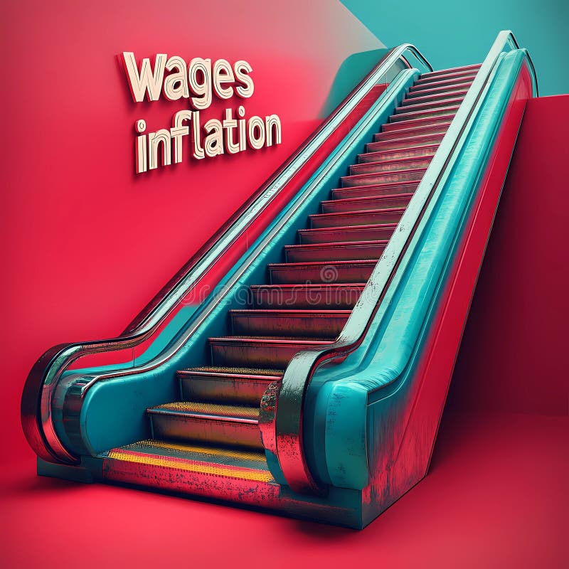
Free with trial Staircase with vibrant colors illustrates the concept of wages and inflation, emphasizing their relationship. Decrease financial trends illustrations Visual representation highlighting wages in relation to inflation on a stylized staircase. Staircase with vibrant colors illustrates the concept of wages and inflation, emphasizing their relationship.
Free with trial Stock market data with various ticker symbols and percentages displayed in red and green. Numbers and letters are overlaid on dark background with a grid pattern. Decrease financial trends illustrations Stock market data with various ticker symbols and percentages displayed in red and green
Free with trial This vibrant pyramid stack of 3D cubes, meticulously crafted and isolated against a pristine white background, offers a striking and engaging visual element for business presentations and data storytelling. The gradual decrease in cube size from base to apex creates a compelling visual representation of hierarchical data, making complex information easily digestible for audiences of all. Decrease financial trends illustrations Dynamic 3D Cube Pyramid A Colorful Visual for Data Visualization and Business Presentations. This vibrant pyramid stack of 3D cubes, meticulously crafted and isolated against a pristine white background, offers a striking and engaging visual element for business presentations and data storytelling. The gradual decrease in cube size from base to apex creates a compelling visual representation of hierarchical data, making complex information easily digestible for audiences of all
Free with trial A bold red arrow points downward, symbolizing a negative trend or decline, often associated with financial or performance metrics. This visual representation is commonly used in reports. Decrease financial trends vectors Red downward arrow indicating decline in trends or performance metrics across data visuals. A bold red arrow points downward, symbolizing a negative trend or decline, often associated with financial or performance metrics. This visual representation is commonly used in reports.
Free with trial Declining bar graph on a trolley, showing a downward arrow, stock market trend, loss illustration. Decrease financial trends vectors Declining bar graph on a trolley, showing a downward arrow, stock market trend, loss illustration
Free with trial A laptop computer showing various graphs and charts representing trend analysis for website traffic, Incorporate trend analysis for website traffic fluctuations. Decrease financial trends illustrations A laptop computer showing various graphs and charts representing trend analysis for website traffic, Incorporate trend analysis
Free with trial This vibrant 3D bar chart illustrates upward trending data, perfect for presentations or reports on financial growth, market analysis, or business success. The colorful blocks represent different data points. Decrease financial trends illustrations Colorful 3D Bar Chart Showing Business Growth and Success. This vibrant 3D bar chart illustrates upward trending data, perfect for presentations or reports on financial growth, market analysis, or business success. The colorful blocks represent different data points.
Free with trial A red graph with a descending arrow. It illustrates decline, loss, or recession. The graph is isolated on a white surface, visually representing negative trends in finance, market, or economy. Perfect for reports. Decrease financial trends illustrations Red decline graph isolated on white background for financial reports and presentations use cases. A red graph with a descending arrow. It illustrates decline, loss, or recession. The graph is isolated on a white surface, visually representing negative trends in finance, market, or economy. Perfect for reports
Free with trial Generative ai, A red grid background with a white arrow pointing downwards which is overlaid on top of red bars to portray a negative trend. Decrease financial trends illustrations A red, gridded background shows a white arrow dramatically plummeting downward indicating a sharp decline. generative ai, A red grid background with a white arrow pointing downwards which is overlaid on top of red bars to portray a negative trend
Free with trial Bar chart with arrow pointing down, illustrating economic decline, business loss, or negative trend data. Decrease financial trends vectors Bar chart with arrow pointing down, illustrating economic decline, business loss, or negative trend data
Free with trial A 3D rendering depicting a downward trending bar graph topped with houses symbolizing a decrease in property values and a potential housing market slump or economic decline. Decrease financial trends illustrations Real estate market downturn graph visualizing declining housing values and economic recession trends. A 3D rendering depicting a downward trending bar graph topped with houses symbolizing a decrease in property values and a potential housing market slump or economic decline
Free with trial This sales graph clearly illustrates a concerning downward trend. The visualization displays a significant decline in sales figures over a specified period, potentially indicating a market downturn or other factors impacting business performance. Careful analysis of this data is crucial for understanding the underlying causes. Are sales decreasing across all product lines or specific segments. Decrease financial trends illustrations Analyzing Declining Sales Trends A Deep Dive into Market Performance and Potential Recovery Strategies. This sales graph clearly illustrates a concerning downward trend. The visualization displays a significant decline in sales figures over a specified period, potentially indicating a market downturn or other factors impacting business performance. Careful analysis of this data is crucial for understanding the underlying causes. Are sales decreasing across all product lines or specific segments
Free with trial Sketch of a decreasing bar graph showing negative business trend with a downward arrow, decline illustration. Decrease financial trends vectors Sketch of a decreasing bar graph showing negative business trend with a downward arrow, decline illustration
Free with trial Vibrant bar chart visualization with dark background displaying data trends ,Generative ai. Decrease financial trends illustrations Colorful bar chart on dark background, data visualization for business performance analysis and trend insights. Vibrant bar chart visualization with dark background displaying data trends ,Generative ai
Free with trial Colorful data visualization with various charts and graphs. Visual representation of growth and performance metrics, breathtaking wallpaper background Generative AI. Decrease financial trends illustrations Colorful data visualization with various charts and graphs. Visual representation of growth and performance metrics
Free with trial Analyzing the Decline: Understanding the Downward Trend in Graph Data and Its Implications. Decrease financial trends illustrations Analyzing the Decline Understanding the Downward Trend in Graph Data and Its Implications
Free with trial Analyzing the Decline: Understanding the Downward Trend in Graph Data and Its Implications. Decrease financial trends illustrations Analyzing the Decline Understanding the Downward Trend in Graph Data and Its Implications
Free with trial Analyzing the Decline: Understanding the Downward Trend in Graph Data and Its Implications. Decrease financial trends illustrations Analyzing the Decline: Understanding the Downward Trend in Graph Data and Its Implications
Free with trial Abstract red line chart graphic shows market decline. Digital data screen displays, finance failure. Economy drops down. Background bokeh lights. Decrease financial trends illustrations Abstract red line chart graphic shows market decline. Digital data screen displays finance failure. Economy drops down. Abstract red line chart graphic shows market decline. Digital data screen displays, finance failure. Economy drops down. Background bokeh lights.
Free with trial An interest rate percentage sign with a downward trend arrow in the sky. illustrating the effects on the economy, Generated AI. Decrease financial trends illustrations An interest rate percentage sign with a downward trend arrow in the sky, illustrating the effects on the economy, Generated AI
Free with trial Stock market chart shows fluctuating data with traders in the background. Growing intensity in the economic environment. no focus. Decrease financial trends illustrations Stock market chart shows fluctuating data with traders in the background. Growing intensity in the economic environment. no focus
Free with trial This captivating 3D image portrays the intriguing concept of food inflation in a surreal and thought-provoking manner. Instead of the typical visual representation of rising prices, this unique perspective depicts shrinking food items, suggesting a decrease in cost. The imagery is not literal, but rather a symbolic representation of the economic climate. The shrinking fruits and vegetables,. Decrease financial trends illustrations Visualizing Economic Growth 3D Food Inflation Depicts Shrinking Prices and a Booming Economy Through Surreal Imagery. This captivating 3D image portrays the intriguing concept of food inflation in a surreal and thought-provoking manner. Instead of the typical visual representation of rising prices, this unique perspective depicts shrinking food items, suggesting a decrease in cost. The imagery is not literal, but rather a symbolic representation of the economic climate. The shrinking fruits and vegetables,
Free with trial A hand is shown adjusting wooden blocks that display the numbers '2022' and a falling '6%' symbol. This imagery strongly suggests a change in economic conditions, potentially a decrease in interest rates or a recession. Decrease financial trends illustrations Wooden blocks form 2022 and 6% falling suggesting economic downturn or rate change. A hand is shown adjusting wooden blocks that display the numbers '2022' and a falling '6%' symbol. This imagery strongly suggests a change in economic conditions, potentially a decrease in interest rates or a recession
Free with trial The image depicts several miniature Chinese flags placed on a stock market graph showing a significant decline, symbolizing economic instability. Decrease financial trends illustrations Chinese Flags on a Declining Stock Market Graph. The image depicts several miniature Chinese flags placed on a stock market graph showing a significant decline, symbolizing economic instability
Free with trial The image shows a declining stock market graph overlaid with the Chinese flag suggesting economic downturn in China. Decrease financial trends illustrations Chinese Flag Overlays A Negative Stock Market Graph. The image shows a declining stock market graph overlaid with the Chinese flag suggesting economic downturn in China
Free with trial Pakistan GDP decreasing shown with arrows going down, business and finance concept backdrop. Decrease financial trends illustrations Pakistan GDP decreasing shown with arrows going down, business and finance concept backdrop
Free with trial A bear market, such as stocks or cryptocurrencies, that is in a downtrend , which creates a huge disaster for investors. It is suitable to use the image in articles analyzing various price trends. Decrease financial trends illustrations A bear market, such as stocks or cryptocurrencies, that is in a downtrend , which creates a huge disaster for investors. It is
Free with trial A bear market, such as stocks or cryptocurrencies, that is in a downtrend , which creates a huge disaster for investors. It is suitable to use the image in articles analyzing various price trends. Decrease financial trends illustrations A bear market, such as stocks or cryptocurrencies, that is in a downtrend , which creates a huge disaster for investors. It is
Free with trial A bear market, such as stocks or cryptocurrencies, that is in a downtrend , which creates a huge disaster for investors. It is suitable to use the image in articles analyzing various price trends. Decrease financial trends illustrations A bear market, such as stocks or cryptocurrencies, that is in a downtrend , which creates a huge disaster for investors. It is
Free with trial A bear market, such as stocks or cryptocurrencies, that is in a downtrend , which creates a huge disaster for investors. It is suitable to use the image in articles analyzing various price trends. Decrease financial trends illustrations A bear market, such as stocks or cryptocurrencies, that is in a downtrend , which creates a huge disaster for investors. It is
Free with trial A bear market, such as stocks or cryptocurrencies, that is in a downtrend , which creates a huge disaster for investors. It is suitable to use the image in articles analyzing various price trends. Decrease financial trends illustrations A bear market, such as stocks or cryptocurrencies, that is in a downtrend , which creates a huge disaster for investors. It is
Free with trial A bear market, such as stocks or cryptocurrencies, that is in a downtrend , which creates a huge disaster for investors. It is suitable to use the image in articles analyzing various price trends. Decrease financial trends illustrations A bear market, such as stocks or cryptocurrencies, that is in a downtrend , which creates a huge disaster for investors. It is
Free with trial A bear market, such as stocks or cryptocurrencies, that is in a downtrend , which creates a huge disaster for investors. It is suitable to use the image in articles analyzing various price trends. Decrease financial trends illustrations A bear market, such as stocks or cryptocurrencies, that is in a downtrend , which creates a huge disaster for investors. It is
Free with trial A bear market, such as stocks or cryptocurrencies, that is in a downtrend , which creates a huge disaster for investors. It is suitable to use the image in articles analyzing various price trends. Decrease financial trends illustrations A bear market, such as stocks or cryptocurrencies, that is in a downtrend , which creates a huge disaster for investors. It is
Free with trial A bear market, such as stocks or cryptocurrencies, that is in a downtrend , which creates a huge disaster for investors. It is suitable to use the image in articles analyzing various price trends. Decrease financial trends illustrations A bear market, such as stocks or cryptocurrencies, that is in a downtrend , which creates a huge disaster for investors. It is
Free with trial A bear market, such as stocks or cryptocurrencies, that is in a downtrend , which creates a huge disaster for investors. It is suitable to use the image in articles analyzing various price trends. Decrease financial trends illustrations A bear market, such as stocks or cryptocurrencies, that is in a downtrend , which creates a huge disaster for investors. It is
Free with trial A bear market, such as stocks or cryptocurrencies, that is in a downtrend , which creates a huge disaster for investors. It is suitable to use the image in articles analyzing various price trends. Decrease financial trends illustrations A bear market, such as stocks or cryptocurrencies, that is in a downtrend , which creates a huge disaster for investors. It is
Free with trial A bear market, such as stocks or cryptocurrencies, that is in a downtrend , which creates a huge disaster for investors. It is suitable to use the image in articles analyzing various price trends. Decrease financial trends illustrations A bear market, such as stocks or cryptocurrencies, that is in a downtrend , which creates a huge disaster for investors. It is
Free with trial A bear market, such as stocks or cryptocurrencies, that is in a downtrend , which creates a huge disaster for investors. It is suitable to use the image in articles analyzing various price trends. Decrease financial trends illustrations A bear market, such as stocks or cryptocurrencies, that is in a downtrend , which creates a huge disaster for investors. It is
Free with trial A bear market, such as stocks or cryptocurrencies, that is in a downtrend , which creates a huge disaster for investors. It is suitable to use the image in articles analyzing various price trends. Decrease financial trends illustrations A bear market, such as stocks or cryptocurrencies, that is in a downtrend , which creates a huge disaster for investors. It is