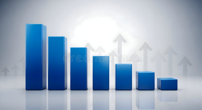
Free with trial A 3D render of a blue bar chart displaying a downward trend, with bars decreasing in height from left to right. The background features a subtle pattern of translucent upward-pointing arrows, suggesting growth or recovery despite the current decline. The scene is set against a clean, gradient gray backdrop with reflections, creating a modern and professional aesthetic. This image is ideal for representing financial downturns, market analysis, economic challenges, or the concept of overcoming obstacles. Decrease financial trends illustrations Declining Blue Bar Chart with Upward Arrows Background. A 3D render of a blue bar chart displaying a downward trend, with bars decreasing in height from left to right. The background features a subtle pattern of translucent upward-pointing arrows, suggesting growth or recovery despite the current decline. The scene is set against a clean, gradient gray backdrop with reflections, creating a modern and professional aesthetic. This image is ideal for representing financial downturns, market analysis, economic challenges, or the concept of overcoming obstacles.
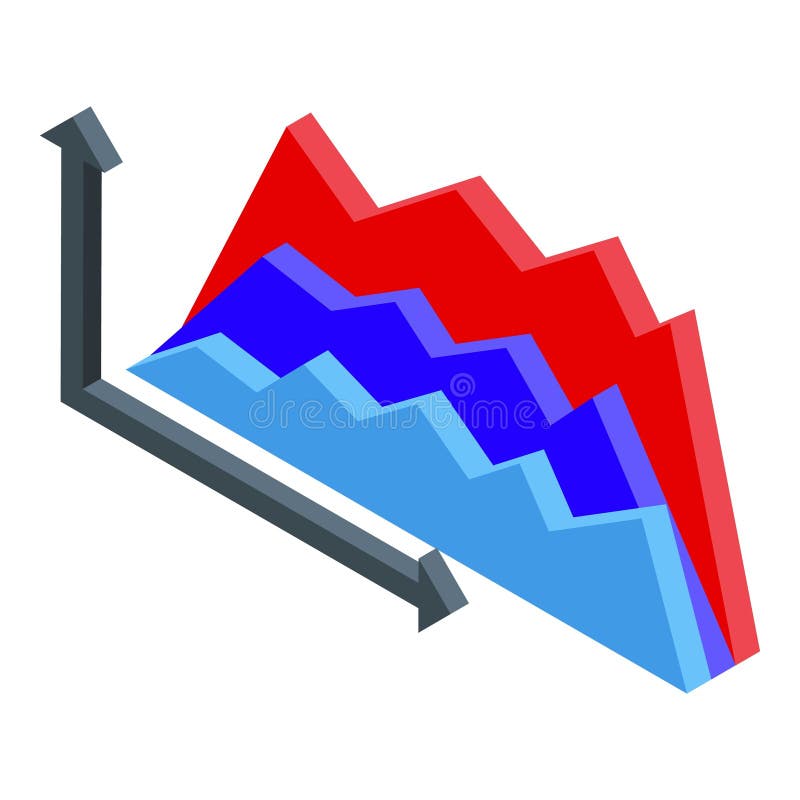
Free with trial Isometric graph showing different trends with ups and downs, concept of trading and business analysis. Decrease financial trends illustrations Isometric graph showing different trends with ups and downs
Free with trial A grid of black and white icons depicting financial charts with rising and falling trends, magnifying glasses with download arrows, and dollar signs. Decrease financial trends vectors Collection of black and white icons representing financial charts and data analysis graph bar chart. A grid of black and white icons depicting financial charts with rising and falling trends, magnifying glasses with download arrows, and dollar signs
Free with trial Simple Bar Chart Showing Business Growth and Data Trends. Decrease financial trends vectors Simple Bar Chart Showing Business Growth and Data Trends
Free with trial A depiction of business challenges with a figure expressing concern over declining market trends, represented by stacks of coins and a decreasing chart. Decrease financial trends illustrations Business Struggles and Market Trends with Coins and Figure. A depiction of business challenges with a figure expressing concern over declining market trends, represented by stacks of coins and a decreasing chart
Free with trial 3d bar graph illustrating financial growth with upward green arrow and downward red arrows indicating trends. Decrease financial trends vectors Bar graph rising with arrows showing increase decrease. 3d bar graph illustrating financial growth with upward green arrow and downward red arrows indicating trends
Free with trial A graphic illustrating the concept of home value trends. A green arrow pointing upwards represents growth, while a red arrow pointing downwards signifies decline. A family icon is placed above the arrows. Decrease financial trends illustrations Family Home Value: Upward Trend, Downward Trend, Financial Concepts. A graphic illustrating the concept of home value trends. A green arrow pointing upwards represents growth, while a red arrow pointing downwards signifies decline. A family icon is placed above the arrows
Free with trial A striking visual representation of economic decline or market volatility. A bold red line graph plunges downwards against a textured, abstract background, suggesting a financial crisis or loss. The image evokes a sense of urgency and concern, suitable for illustrating concepts related to finance, economics, business, and market trends. The abstract background adds a modern and dynamic feel. Decrease financial trends illustrations Economic Downturn: Red Line Graph on Abstract Background. A striking visual representation of economic decline or market volatility. A bold red line graph plunges downwards against a textured, abstract background, suggesting a financial crisis or loss. The image evokes a sense of urgency and concern, suitable for illustrating concepts related to finance, economics, business, and market trends. The abstract background adds a modern and dynamic feel.
Free with trial This illustration depicts currency exchange rates with dollar and euro symbols and arrows indicating upward and downward trends, suitable for financial reports and business presentations. Decrease financial trends vectors Currency exchange rates with upward and downward arrows. This illustration depicts currency exchange rates with dollar and euro symbols and arrows indicating upward and downward trends, suitable for financial reports and business presentations
Free with trial This is an isometric 3D illustration depicting a dynamic data visualization. It features a combination of bar charts and a line graph, showcasing rising trends and fluctuating data points. The color palette includes shades of blue, teal, and coral, creating a modern and professional aesthetic. This graphic is ideal for representing financial reports, business analytics, market trends, growth, and performance metrics in a visually engaging and easy-to-understand format. Decrease financial trends illustrations Isometric 3D Bar and Line Graph with Data Visualization. This is an isometric 3D illustration depicting a dynamic data visualization. It features a combination of bar charts and a line graph, showcasing rising trends and fluctuating data points. The color palette includes shades of blue, teal, and coral, creating a modern and professional aesthetic. This graphic is ideal for representing financial reports, business analytics, market trends, growth, and performance metrics in a visually engaging and easy-to-understand format.
Free with trial A detailed data visualization illustrating market trends over time. The infographic combines a line chart, which shows fluctuating values and percentages, with a bar chart representing data for specific time intervals. The line chart highlights key data points, such as peaks annotated with values like '1. 24%' and '500K'. The x-axis represents a timeline from January to March, while the y-axis. Decrease financial trends illustrations A modern market trend analysis visualization combining a bar and line chart for financial data isolated on white background. A detailed data visualization illustrating market trends over time. The infographic combines a line chart, which shows fluctuating values and percentages, with a bar chart representing data for specific time intervals. The line chart highlights key data points, such as peaks annotated with values like '1.24%' and '500K'. The x-axis represents a timeline from January to March, while the y-axis
Free with trial Several stacks of coins are positioned along a blue line graph on a white background, illustrating financial progress and positive market trends. Decrease financial trends illustrations Coins arranged on a financial chart indicating progress. Several stacks of coins are positioned along a blue line graph on a white background, illustrating financial progress and positive market trends
Free with trial A comprehensive set of black grunge-textured icons representing the US Dollar (USD) and its market dynamics. The collection features various symbols indicating upward trends, downward trends, stability, and currency exchange or circulation, often incorporating arrows and graph-like elements. Ideal for financial reports, economic analyses, investment platforms, business presentations, and any design requiring visual representation of money flow, market performance, or currency value changes in a distinct, distressed style. Decrease financial trends vectors Grunge USD Dollar Market Movement and Exchange Icons Set. A comprehensive set of black grunge-textured icons representing the US Dollar (USD) and its market dynamics. The collection features various symbols indicating upward trends, downward trends, stability, and currency exchange or circulation, often incorporating arrows and graph-like elements. Ideal for financial reports, economic analyses, investment platforms, business presentations, and any design requiring visual representation of money flow, market performance, or currency value changes in a distinct, distressed style.
Free with trial Collection of red percentage signs with up and down arrows. Represents financial growth, decline, discounts, and sales. Decrease financial trends vectors Percentage icon set, finance up and down arrows red symbols. Collection of red percentage signs with up and down arrows. Represents financial growth, decline, discounts, and sales
Free with trial Golden coins stack with arrow graph showing growth and decline. Financial success and loss concept. Business and finance illustration. Decrease financial trends vectors Golden coins stack with upward and downward trending graph. Golden coins stack with arrow graph showing growth and decline. Financial success and loss concept. Business and finance illustration
Free with trial Icons representing financial growth, decline, and trends. Perfect for business presentations and data visualization design. Decrease financial trends illustrations Four business growth and decline bar chart icons with arrows. Icons representing financial growth, decline, and trends. Perfect for business presentations and data visualization design
Free with trial Two arrows, one pointing up and the other pointing down, indicating direction or movement. Ideal for navigation, decision-making, data trends, stock market, business strategies. Simple vector style. Decrease financial trends illustrations Two Light Blue Arrows Side by Side, Pointing Up and Down. Two arrows, one pointing up and the other pointing down, indicating direction or movement. Ideal for navigation, decision-making, data trends, stock market, business strategies. Simple vector style.
Free with trial Minimalist 3D conceptual illustration showing financial market trends with upward and downward directional arrows. Decrease financial trends illustrations Blue Business Growth and Decline Arrows on Staircase Background. Minimalist 3D conceptual illustration showing financial market trends with upward and downward directional arrows
Free with trial Abstract image of stock market graph represented by orange glowing line against dark blue background with swirling blue clouds. Fiery line financial data, volatility, market trends in. Decrease financial trends illustrations Abstract image of stock market graph represented by orange glowing line against dark blue background with swirling blue clouds.
Free with trial A detailed close-up shot of a stock market chart display featuring multiple graphs and charts divided into sections representing different market aspects, including a red line graph labeled OTC Markets, a blue line graph showing a downward trend, another section with an upward trend marked by a red downward arrow, and additional charts on the right side displaying stock performance over time with. Decrease financial trends illustrations Close-up view of multiple stock market charts and graphs showing OTC markets performance with upward and downward trends. A detailed close-up shot of a stock market chart display featuring multiple graphs and charts divided into sections representing different market aspects, including a red line graph labeled OTC Markets, a blue line graph showing a downward trend, another section with an upward trend marked by a red downward arrow, and additional charts on the right side displaying stock performance over time with
Free with trial A shopping cart filled with financial symbols and graphs, representing economic growth and market trends. Decrease financial trends illustrations Illustration of shopping cart with financial symbols and graphs. A shopping cart filled with financial symbols and graphs, representing economic growth and market trends
Free with trial Illustration of an oil barrel on fire with a sharp downward red arrow indicating a decline in oil prices or energy sector instability. Suitable for financial reports, advertising campaigns and business presentations related to fuel markets and economic trends. Decrease financial trends illustrations Oil barrel with flame and downtrend symbolizing energy crisis anddescription. Illustration of an oil barrel on fire with a sharp downward red arrow indicating a decline in oil prices or energy sector instability. Suitable for financial reports, advertising campaigns and business presentations related to fuel markets and economic trends
Free with trial Red neon arrows moving down, financial loss abstract vector background. Modern downward graphic, negative market trend, stock recession metrics, and business decrease concept 4k background. Decrease financial trends illustrations Red neon arrows moving down, financial loss business background. Red neon arrows moving down, financial loss abstract vector background. Modern downward graphic, negative market trend, stock recession metrics, and business decrease concept 4k background
Free with trial A striking 3D illustration depicts a shrinking dollar sign with a downward arrow, symbolizing economic downturn and financial risk for investment visuals. Decrease financial trends illustrations Contracting Dollar Sign Illustration Economic Decline Market Risk. A striking 3D illustration depicts a shrinking dollar sign with a downward arrow, symbolizing economic downturn and financial risk for investment visuals
Free with trial The image depicts a three-dimensional, bold red zigzag arrow pointing downward. This type of arrow is commonly used in visual representations to symbolize a decline, reduction, or decrease in values, such as financial downturns, performance drops, or other negative trends. The arrow's vibrant color and sharp angles emphasize the concept of a significant downward movement. Decrease financial trends illustrations A bold red downward zigzag arrow indicating decline or reduction. The image depicts a three-dimensional, bold red zigzag arrow pointing downward. This type of arrow is commonly used in visual representations to symbolize a decline, reduction, or decrease in values, such as financial downturns, performance drops, or other negative trends. The arrow's vibrant color and sharp angles emphasize the concept of a significant downward movement
Free with trial Several red, blue, and green arrows pointing in different directions are on a light yellow square grid. Some arrows point up, while others point down. This represents various economic trends. Decrease financial trends illustrations Colorful Painted Arrows Move up and Down on Graph Paper Background. Several red, blue, and green arrows pointing in different directions are on a light yellow square grid. Some arrows point up, while others point down. This represents various economic trends.
Free with trial A visually appealing bar graph illustration against a sleek black background, showcasing business growth, data analysis, and statistical trends. The illustration is suitable for presentations, reports, and web content related to finance, marketing, and technology. Decrease financial trends illustrations Bar Graph Illustration Business Growth, Data Analysis, and Statistics. A visually appealing bar graph illustration against a sleek black background, showcasing business growth, data analysis, and statistical trends. The illustration is suitable for presentations, reports, and web content related to finance, marketing, and technology.
Free with trial Red arrow pointing down with black grunge paint splatter on a white rectangular block. Ideal for illustrating negative trends, market decline, economic crisis, or warning. Decrease financial trends illustrations Red downward arrow grunge splattered on white, representing decrease. Red arrow pointing down with black grunge paint splatter on a white rectangular block. Ideal for illustrating negative trends, market decline, economic crisis, or warning.
Free with trial A white background hosts two prominent 3D rendered thermometers, one red for "HOT" and one blue for "COLD," displaying contrasting temperature levels. Various weather are scattered around them, including suns, clouds with rain, and a snowflake. To the left, red up and down arrows signify rising and falling trends, while to the right, a bar graph with red and blue bars data or statistics,. Decrease financial trends illustrations Hot and cold thermometers with weather and up down arrows. A white background hosts two prominent 3D rendered thermometers, one red for "HOT" and one blue for "COLD," displaying contrasting temperature levels. Various weather are scattered around them, including suns, clouds with rain, and a snowflake. To the left, red up and down arrows signify rising and falling trends, while to the right, a bar graph with red and blue bars data or statistics,
Free with trial Graphic features stylized oil barrel, pump jack, and pipeline alongside stock market indices including S&P 500 and Dow Jones. Detailed candlestick charts and volatility metrics illustrate energy market dynamics, supply demand trends, and global economic indicators. Decrease financial trends illustrations Oil market dynamics illustrated with graphs and price per barrel updates. Graphic features stylized oil barrel, pump jack, and pipeline alongside stock market. Graphic features stylized oil barrel, pump jack, and pipeline alongside stock market indices including S&P 500 and Dow Jones. Detailed candlestick charts and volatility metrics illustrate energy market dynamics, supply demand trends, and global economic indicators
Free with trial A collection of simple, business and growth icons, perfect for financial reports, websites, or presentations on market trends and data. The set features a clean, minimal, thin line style. Decrease financial trends vectors Simple business and growth icons set, thin line style, minimal vector illustration perfect for financial reports, websites, or pre. A collection of simple, business and growth icons, perfect for financial reports, websites, or presentations on market trends and data. The set features a clean, minimal, thin line style.
Free with trial A 3D rendered visualization of a stock market candlestick chart is presented on a white background. The chart displays a series of red and green candlesticks, representing price movements over time. Red candles indicate a price decrease, while green candles signify a price increase, illustrating market fluctuations and trends. Decrease financial trends illustrations 3D Rendered Candlestick Stock Market Chart with Red and Green Bars on White Background trading. A 3D rendered visualization of a stock market candlestick chart is presented on a white background. The chart displays a series of red and green candlesticks, representing price movements over time. Red candles indicate a price decrease, while green candles signify a price increase, illustrating market fluctuations and trends
Free with trial Minimalist vector icons illustrating financial growth, savings, ice cream treat, and energy efficiency. Ideal for business presentations, infographics, and educational materials on economics or sustainability. Decrease financial trends vectors Flat design icons for financial trends and energy consumption concepts. Minimalist vector icons illustrating financial growth, savings, ice cream treat, and energy efficiency. Ideal for business presentations, infographics, and educational materials on economics or sustainability
Free with trial Red neon arrows moving down, financial loss abstract vector background. Modern downward graphic, negative market trend, stock recession metrics, and business decrease concept 4k background. Decrease financial trends illustrations Red neon arrows moving down, financial loss abstract vector background
Free with trial The image shows a smartphone displaying a financial chart with upward and downward trends in green and red, alongside a stack of golden coins. The chart likely represents stock market performance or investment growth, while the coins symbolize wealth accumulation and financial success. Decrease financial trends illustrations Financial growth illustrated by smartphone chart and golden coins stack. The image shows a smartphone displaying a financial chart with upward and downward trends in green and red, alongside a stack of golden coins. The chart likely represents stock market performance or investment growth, while the coins symbolize wealth accumulation and financial success
Free with trial This image depicts a stock chart with candlesticks, illustrating price movements and trends over a specific period. The chart includes green and red candlesticks, indicating price increases and decreases respectively, along with a trend line that highlights the overall direction of the stock's price. Decrease financial trends illustrations A detailed stock chart showcasing price movements and trends over time. This image depicts a stock chart with candlesticks, illustrating price movements and trends over a specific period. The chart includes green and red candlesticks, indicating price increases and decreases respectively, along with a trend line that highlights the overall direction of the stock's price
Free with trial A green arrow points downward, while a red arrow points upward, symbolizing opposing forces, trends, or choices on a white background. created ai. Decrease financial trends illustrations Green down arrow and red up arrow representing contrasting trends or directions. A green arrow points downward, while a red arrow points upward, symbolizing opposing forces, trends, or choices on a white background.created ai
Free with trial A red translucent low poly bear figure stands isolated on a clean white background. This modern 3D render symbolizes financial market trends and investment concepts. Decrease financial trends illustrations Red Low Poly Bear Standing Isolated on White Background Investment Concept. A red translucent low poly bear figure stands isolated on a clean white background. This modern 3D render symbolizes financial market trends and investment concepts.
Free with trial The image illustrates a combination of bar and line graphs to represent business performance trends. The bars show an overall upward trend in growth, while the red line indicates a recent decline after a period of increase. This visualization is often used in financial reports, market analysis, or business presentations to depict fluctuations in data over time, such as revenue, market share, or. Decrease financial trends illustrations Growth and decline in business performance visualized with bar and line graphs. The image illustrates a combination of bar and line graphs to represent business performance trends. The bars show an overall upward trend in growth, while the red line indicates a recent decline after a period of increase. This visualization is often used in financial reports, market analysis, or business presentations to depict fluctuations in data over time, such as revenue, market share, or
Free with trial The image displays a thick, solid red zigzag arrow that initially trends downward with a sharp angle, then reverses direction and trends upward with another sharp angle. The arrow is filled in solid red and has a bold, thick outline, giving it a strong visual impact. This type of arrow is often used to symbolize fluctuations or volatility in trends, such as in financial charts or data. Decrease financial trends illustrations A bold red zigzag arrow pointing downward and then upward in a sharp angle. The image displays a thick, solid red zigzag arrow that initially trends downward with a sharp angle, then reverses direction and trends upward with another sharp angle. The arrow is filled in solid red and has a bold, thick outline, giving it a strong visual impact. This type of arrow is often used to symbolize fluctuations or volatility in trends, such as in financial charts or data
Free with trial Black oil barrels are arranged with a large red downward-trending arrow pointing downwards, symbolizing a decrease in oil prices. The barrels are positioned on a white circular platform, highlighting the concept of falling market values. The red arrow standing out against the black barrels signifies financial decline or economic trends related to oil markets. Decrease financial trends vectors Black oil barrels with a red downward trending arrow indicating falling prices. Black oil barrels are arranged with a large red downward-trending arrow pointing downwards, symbolizing a decrease in oil prices. The barrels are positioned on a white circular platform, highlighting the concept of falling market values. The red arrow standing out against the black barrels signifies financial decline or economic trends related to oil markets.
Free with trial This image features a large golden dollar sign symbol in the center, surrounded by two curved arrows. One arrow is red and points downward, representing financial decline or loss, while the other arrow is green and points upward, symbolizing financial growth or gain. The contrasting colors emphasize the duality of economic trends and investment outcomes. Decrease financial trends vectors Financial growth and decline represented by colorful arrows and a dollar sign icon. This image features a large golden dollar sign symbol in the center, surrounded by two curved arrows. One arrow is red and points downward, representing financial decline or loss, while the other arrow is green and points upward, symbolizing financial growth or gain. The contrasting colors emphasize the duality of economic trends and investment outcomes
Free with trial Detailed collection of linear icons representing various business trends, financial growth metrics, and candlestick market data. Decrease financial trends vectors Financial business graph and chart line icons for data analysis and kpi tracking. detailed collection of linear icons representing various business trends, financial growth metrics, and candlestick market data
Free with trial This colorful bar graph is representing market trends and data analysis. Decrease financial trends vectors Colorful bar graph showing market trends and data analysis. This colorful bar graph is representing market trends and data analysis
Free with trial The image shows a line graph with a downward slope, featuring multiple red arrows pointing downward at various points along the line. This visual typically represents a continuous decline or drop in values over time, often used in financial, economic, or statistical contexts to illustrate negative trends or losses. Decrease financial trends illustrations Graphical representation of a downward trend with red arrows indicating declines. The image shows a line graph with a downward slope, featuring multiple red arrows pointing downward at various points along the line. This visual typically represents a continuous decline or drop in values over time, often used in financial, economic, or statistical contexts to illustrate negative trends or losses
Free with trial This image features four graphical elements that symbolize financial growth and decline. The top row displays two percentage signs with arrows indicating upward and downward trends. The bottom row shows two bar graphs, one with an upward trend and the other with a downward trend. These visuals are commonly used in finance to represent changes in data over time. Decrease financial trends illustrations Graphical representation of financial growth and decline. This image features four graphical elements that symbolize financial growth and decline. The top row displays two percentage signs with arrows indicating upward and downward trends. The bottom row shows two bar graphs, one with an upward trend and the other with a downward trend. These visuals are commonly used in finance to represent changes in data over time
Free with trial 3D render of green and red bar chart icons with upward and downward arrows symbolizing business growth and financial decline or loss. Decrease financial trends illustrations Green Growth and Red Decline Bar Chart Icons Representing Business Financial Trends. 3D render of green and red bar chart icons with upward and downward arrows symbolizing business growth and financial decline or loss
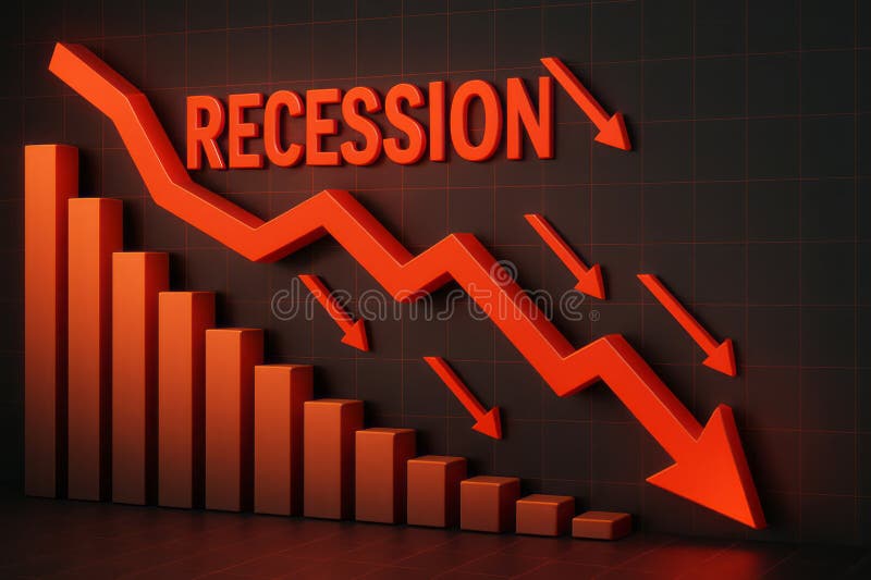
Free with trial This image visually represents an economic recession through downward trends and statistics. The vibrant red arrows emphasize the significant decline in growth, making it an impactful visual for financial analysis. Decrease financial trends illustrations Dramatic Decline in Economic Growth with Recession Indicator and Downward Arrows in Red. This image visually represents an economic recession through downward trends and statistics. The vibrant red arrows emphasize the significant decline in growth, making it an impactful visual for financial analysis
Free with trial The image displays a stylized percentage symbol (%) with a downward red arrow and an upward green arrow intersecting it. The design suggests a contrast between a decrease and an increase in percentage values, possibly representing financial or statistical fluctuations, trends, or changes over time. The arrows are bold and clearly indicate opposing directions of movement. Decrease financial trends vectors Percentage symbol with downward and upward arrows indicating fluctuation in value. The image displays a stylized percentage symbol (%) with a downward red arrow and an upward green arrow intersecting it. The design suggests a contrast between a decrease and an increase in percentage values, possibly representing financial or statistical fluctuations, trends, or changes over time. The arrows are bold and clearly indicate opposing directions of movement
Free with trial Demand spelled out with wooden blocks arranged in a descending staircase pattern against a light blue background represents economic principles of supply and demand market trends and financial analys. Decrease financial trends illustrations Demand supply economics business market finance investment strategy planning growth decrease increase concept analysis forecast tr. Demand spelled out with wooden blocks arranged in a descending staircase pattern against a light blue background represents economic principles of supply and demand market trends and financial analys
Free with trial Colorful bar chart analysis: growth, trends, and data visualization on a wooden table ,Generative ai. Decrease financial trends illustrations Colorful bar chart data analysis, visualizing growth trends and performance on a wooden table. Colorful bar chart analysis: growth, trends, and data visualization on a wooden table ,Generative ai
Free with trial The image shows three stacks of copper coins, each progressively smaller, with a large downward-pointing arrow made of a rolled-up piece of paper. This visual metaphor emphasizes a reduction or decrease, often used to represent financial decline, declining savings, or diminishing resources over time. The use of coins suggests a focus on monetary value or economic trends. Decrease financial trends illustrations Decline in savings illustrated by diminishing copper coin stacks and downward arrow. The image shows three stacks of copper coins, each progressively smaller, with a large downward-pointing arrow made of a rolled-up piece of paper. This visual metaphor emphasizes a reduction or decrease, often used to represent financial decline, declining savings, or diminishing resources over time. The use of coins suggests a focus on monetary value or economic trends
Free with trial The image displays two contrasting zigzag arrows, one green ascending arrow and one red descending arrow, symbolizing opposing trends or market movements. The green arrow indicates growth, increase, or positive progression, while the red arrow signifies decline, decrease, or negative progression. This visual is often used in financial contexts to represent bullish and bearish market trends,. Decrease financial trends illustrations Contrasting upward and downward zigzag arrows representing market or trend fluctuations. The image displays two contrasting zigzag arrows, one green ascending arrow and one red descending arrow, symbolizing opposing trends or market movements. The green arrow indicates growth, increase, or positive progression, while the red arrow signifies decline, decrease, or negative progression. This visual is often used in financial contexts to represent bullish and bearish market trends,
Free with trial Financial market analysis document with diamond icon, representing a stock investment value increasing or decreasing. Decrease financial trends illustrations Diamond value stock market investment report with percentage sign. Financial market analysis document with diamond icon, representing a stock investment value increasing or decreasing
Free with trial Magnifying glass focuses on a blue bar graph with a visible downward trend line, set against a dark, blurred financial backdrop. Bars decrease in height from left to right, emphasizing a decline. The atmosphere is enhanced by subtle ambient reflections and lighting that highlight the graph's detail, symbolizing analysis of negative financial or economic trends. Decrease financial trends illustrations Magnifying glass focused on a declining bar graph with a downward trend line on a dark background. Magnifying glass focuses on a blue bar graph with a visible downward trend line, set against a dark, blurred financial backdrop. Bars decrease in height from left to right, emphasizing a decline. The atmosphere is enhanced by subtle ambient reflections and lighting that highlight the graph's detail, symbolizing analysis of negative financial or economic trends.
Free with trial This image symbolizes deflation, which is a decrease in the general price level of goods and services in an economy. The deflating balloon represents the shrinking purchasing power and overall , refined elegance. Decrease financial trends illustrations Economic Downturn. Deflation concept. This image symbolizes deflation, which is a decrease in the general price level of goods and services in an economy. The deflating balloon represents the shrinking purchasing power and overall , refined elegance
Free with trial A visual representation of deflation, showing a decrease in the general pricing and economic activity , high resolution. Decrease financial trends illustrations Economic Downturn. Deflation concept. A visual representation of deflation, showing a decrease in the general pricing and economic activity , high resolution
Free with trial Flat design illustration showing colorful bar graph combined with a line chart, both displaying data trends against a simple black background. Decrease financial trends vectors Colorful Bar Graph and Line Chart on Black Background Illustrating Data Analysis and Trends. Flat design illustration showing colorful bar graph combined with a line chart, both displaying data trends against a simple black background.
Free with trial This striking visual depicts a steep downturn in data, signifying negative trends and potential instability within the economic landscape. Decrease financial trends illustrations Dramatic red arrow pointing downward on financial chart representing market decline and economic loss. This striking visual depicts a steep downturn in data, signifying negative trends and potential instability within the economic landscape
Free with trial Two contrasting icons depict upward trends. On the left, a black percentage symbol inside a circle overlaps with two ascending black arrows on a white background. On the right, the design is reversed: a white percentage symbol and arrows on a black background. Both icons illustrate concepts of growth or increase, commonly associated with financial or statistical data. Decrease financial trends vectors Increase Icon. Solid glyph series icon. Two contrasting icons depict upward trends. On the left, a black percentage symbol inside a circle overlaps with two ascending black arrows on a white background. On the right, the design is reversed: a white percentage symbol and arrows on a black background. Both icons illustrate concepts of growth or increase, commonly associated with financial or statistical data.
Free with trial A digital graphic depicting a financial chart with two prominent line graphs. A blue line trends upward, representing a rising stock price, while a red line trends downward, indicating a decrease in trading volume. The chart is set against a faint, blurred city background, featuring a grid system on the vertical axis labeled 'Volume' and a horizontal axis labeled 'Time', with a red arrow at the. Decrease financial trends illustrations A financial line chart showing the inverse relationship between stock price and trading volume data. A digital graphic depicting a financial chart with two prominent line graphs. A blue line trends upward, representing a rising stock price, while a red line trends downward, indicating a decrease in trading volume. The chart is set against a faint, blurred city background, featuring a grid system on the vertical axis labeled 'Volume' and a horizontal axis labeled 'Time', with a red arrow at the
Free with trial Stylized graphics depict market trends with up and down arrows. Flat design with simple shapes for business and financial presentations. Decrease financial trends vectors Stylized infographics illustrating growth and decline with upward and downward arrows on black background. Stylized graphics depict market trends with up and down arrows. Flat design with simple shapes for business and financial presentations.
Free with trial The image showcases a dynamic circular arrangement of percentage symbols in varying sizes and colors. Each symbol includes a positive or negative indicator, emphasizing the duality of increases and decreases. The design is visually striking, with black and red colors dominating the composition, and it appears to be used for illustrating financial metrics, statistical data, or performance. Decrease financial trends illustrations Creative illustration of percentage signs in a circular arrangement with positive and negative indicators. The image showcases a dynamic circular arrangement of percentage symbols in varying sizes and colors. Each symbol includes a positive or negative indicator, emphasizing the duality of increases and decreases. The design is visually striking, with black and red colors dominating the composition, and it appears to be used for illustrating financial metrics, statistical data, or performance
Free with trial A set of twenty-two black chart icons, illustrating various graph types on a white background. The icons feature line graphs, bar graphs, and pie charts, each depicting trends such as growth, decline, and fluctuations. Magnifying glass icons are used to represent analysis. The charts convey concepts of data visualization, statistical analysis, and business metrics tracking. The minimalistic design is characterized by simple, clean lines and solid fill, suitable for use in reports, presentations, or digital interfaces. Decrease financial trends vectors Increase and decrease glyph solid icons collection. A set of twenty-two black chart icons, illustrating various graph types on a white background. The icons feature line graphs, bar graphs, and pie charts, each depicting trends such as growth, decline, and fluctuations. Magnifying glass icons are used to represent analysis. The charts convey concepts of data visualization, statistical analysis, and business metrics tracking. The minimalistic design is characterized by simple, clean lines and solid fill, suitable for use in reports, presentations, or digital interfaces.
Free with trial A 3D rendered yellow Bitcoin coin with the iconic 'B' symbol is centrally placed. To its left, a green circle with an upward arrow signifies growth, while to its right, a red circle with a downward arrow represents decline. These elements are presented on a clean white background, illustrating cryptocurrency market trends. Decrease financial trends illustrations 3D Rendered Bitcoin Symbol with Up and Down Arrows Indicating Cryptocurrency Market Trends on a White Background. A 3D rendered yellow Bitcoin coin with the iconic 'B' symbol is centrally placed. To its left, a green circle with an upward arrow signifies growth, while to its right, a red circle with a downward arrow represents decline. These elements are presented on a clean white background, illustrating cryptocurrency market trends
Free with trial Laptop screen with two graphs showing opposite trends. Perfect for illustrating financial data, market analysis, business statistics in presentations. Decrease financial trends illustrations Laptop screen with two graphs showing opposite trends.
Free with trial Global economy faces slowdown with inflation and recession risks impacting finance, business, and market trends during this economic crisis. Generative AI. Decrease financial trends illustrations Global economy faces slowdown with inflation and recession risks impacting finance business and market trends during this. Global economy faces slowdown with inflation and recession risks impacting finance, business, and market trends during this economic crisis. Generative AI
Free with trial The image portrays a downward graph representing deflation, symbolizing a period of economic decline and reduced consumer spending , timeless background beauty. Decrease financial trends illustrations Economic Downturn. Deflation is a decrease in the general price level in an economy. The image portrays a downward graph representing deflation, symbolizing a period of economic decline and reduced consumer spending , timeless background beauty
Free with trial The image illustrates the concept of deflation, showing a downward trend in the overall price level of goods and services in the economy , vintage charm. Decrease financial trends illustrations Economic downturn. Deflation is a decrease in the general price level in an economy. The image illustrates the concept of deflation, showing a downward trend in the overall price level of goods and services in the economy , vintage charm
Free with trial Bright, colorful stock chart on dark screen. Fluctuations lines and grid representing data and trends. Stock photo. Decrease financial trends illustrations Bright, colorful stock chart on dark screen. Fluctuations lines and grid representing data and trends
Free with trial Bar chart showing decreasing bars, with silhouetted heads and a downward arrow. Represents decline, loss, negative trend, recession, or drop in performance. Useful for financial reports, business analysis, or social trends. Decrease financial trends illustrations Downward trending bar chart with silhouette heads and arrow signifying decline in economy or popularity vector graphic. Bar chart showing decreasing bars, with silhouetted heads and a downward arrow. Represents decline, loss, negative trend, recession, or drop in performance. Useful for financial reports, business analysis, or social trends
Free with trial Global economy faces slowdown with inflation and recession causing finance crisis impacting business and market trends negatively. Generative AI. Decrease financial trends illustrations Global economy faces slowdown with inflation and recession causing finance crisis impacting business and market trends negativ
Free with trial A detailed data visualization illustrating market trends over time. The infographic combines a line chart, which shows fluctuating values and percentages, with a bar chart representing data for specific time intervals. The line chart highlights key data points, such as peaks annotated with values like '1. 24%' and '500K'. The x-axis represents a timeline from January to March, while the y-axis. Decrease financial trends illustrations A modern market trend analysis visualization combining a bar and line chart for financial data isolated on white background. A detailed data visualization illustrating market trends over time. The infographic combines a line chart, which shows fluctuating values and percentages, with a bar chart representing data for specific time intervals. The line chart highlights key data points, such as peaks annotated with values like '1.24%' and '500K'. The x-axis represents a timeline from January to March, while the y-axis
Free with trial Two lines are representing increasing and declining trends over a grid background, symbolizing market analysis, financial performance, or business progress. Decrease financial trends illustrations Two lines are representing increasing and declining trends over a grid background, symbolizing market analysis
Free with trial Decline Curve A Visual Representation of Increasing Trends Curving Downward and Overcoming Previous Bars Against a Dark Blue Background by SD. Decrease financial trends illustrations Decline Curve A Visual Representation of Increasing Trends Curving Downward and Overcoming Previous Bars Against a Dark Blue Backg
Free with trial Gross Domestic Product (GDP) text on a world map, indicating economic analysis direction with up and down arrows, symbolizing global investment and financial trends. Decrease financial trends illustrations Gross Domestic Product GDP text in center of global map with arrows indicating economic analysis direction of stock and investment. Gross Domestic Product (GDP) text on a world map, indicating economic analysis direction with up and down arrows, symbolizing global investment and financial trends
Free with trial Colorful bar charts illustrating positive and negative business trends from january to may provide a clear visual representation of performance. Decrease financial trends vectors Colorful bar charts illustrating positive and negative business trends from january to may provide a clear visual
Free with trial Colorful bar charts illustrating positive and negative business trends from january to may provide a clear visual representation of performance. Decrease financial trends illustrations Colorful bar charts illustrating positive and negative business trends from january to may provide a clear visual
Free with trial Colorful horizontal bar chart is displaying monthly statistics from january to may, indicating trends and performance with a speech bubble above. Decrease financial trends vectors Colorful horizontal bar chart is displaying monthly statistics from january to may, indicating trends and performance