Free with trial A financial graph depicting a decline, featuring vibrant red and yellow candlesticks on a sleek digital background, conveying market downturns. Decrease indicators illustrations Digital stock market chart showing a downward trend with red and yellow candlesticks. A financial graph depicting a decline, featuring vibrant red and yellow candlesticks on a sleek digital background, conveying market downturns
Free with trial Stock market data with candlestick chart and declining arrow on a blurred light background. Concept of financial decline. 3D Rendering. Decrease indicators illustrations Abstract image of financial stock market data with declining arrow on light background. 3D Rendering. Stock market data with candlestick chart and declining arrow on a blurred light background. Concept of financial decline. 3D Rendering
Free with trial This image shows a striking contrast between a green upward arrow and a red downward arrow, symbolizing percentage changes in various contexts such as finance and growth metrics. Vector illustration. Decrease indicators vectors Green and Red Arrows Indicating Percent Change Trend. This image shows a striking contrast between a green upward arrow and a red downward arrow, symbolizing percentage changes in various contexts such as finance and growth metrics. Vector illustration
Free with trial This image shows a calculator, tablet, and financial charts, all generated by AI for illustrative purposes. The blue color scheme emphasizes the data-driven nature of modern finance and business analytics. The image suggests efficiency and precision in financial planning and analysis. Decrease indicators illustrations Financial Data Analysis. This image shows a calculator, tablet, and financial charts, all generated by AI for illustrative purposes. The blue color scheme emphasizes the data-driven nature of modern finance and business analytics. The image suggests efficiency and precision in financial planning and analysis.
Free with trial This vector illustration presents a comprehensive set of four distinct volume level icons, ideal for user interface design. Each icon features a stylized blue and black speaker, accompanied by horizontal bars indicating varying sound intensities: high, medium, low, and mute. The set also includes subtle arrows suggesting volume adjustment. Perfect for web applications, mobile apps, multimedia players, or any digital interface requiring clear and intuitive audio control indicators. The clean, modern design ensures versatility across various platforms and projects. Decrease indicators vectors Volume Level Icon Set. This vector illustration presents a comprehensive set of four distinct volume level icons, ideal for user interface design. Each icon features a stylized blue and black speaker, accompanied by horizontal bars indicating varying sound intensities: high, medium, low, and mute. The set also includes subtle arrows suggesting volume adjustment. Perfect for web applications, mobile apps, multimedia players, or any digital interface requiring clear and intuitive audio control indicators. The clean, modern design ensures versatility across various platforms and projects.
Free with trial This image depicts a computer screen displaying a sharply declining stock market graph, generated by AI. The red line dramatically illustrates a significant market downturn, accompanied by numerous data points and financial indicators. The dark aesthetic enhances the sense of urgency and potential. Decrease indicators illustrations AI-Generated Stock Market Decline. This image depicts a computer screen displaying a sharply declining stock market graph, generated by AI. The red line dramatically illustrates a significant market downturn, accompanied by numerous data points and financial indicators. The dark aesthetic enhances the sense of urgency and potential
Free with trial Red line graph shows a sharp stock market decline. Economic downturn visualized. Decrease indicators illustrations Stock Market Decline: A Visual Representation of Economic Downturn. Red line graph shows a sharp stock market decline. Economic downturn visualized
Free with trial This isometric illustration shows a delicious breakfast plate alongside a stock market graph, representing the connection between food trends and market data. The visual, generated by AI, is perfect for illustrating articles about food market analysis or investment opportunities in the food industr. Decrease indicators illustrations Breakfast Market Trends. This isometric illustration shows a delicious breakfast plate alongside a stock market graph, representing the connection between food trends and market data. The visual, generated by AI, is perfect for illustrating articles about food market analysis or investment opportunities in the food industr
Free with trial Bearish market and trading concept with perspective view on digital graphic falling red arrow on dark technological background with forex chart indicators. 3D rendering. Decrease indicators illustrations Bearish market and trading concept
Free with trial Tablet displaying financial stock chart against black background. Possible use Stock market analysis. Decrease indicators illustrations Stock Market Data on Tablet Displaying Red Bearish Trend Chart and Figures. Tablet displaying financial stock chart against black background. Possible use Stock market analysis
Free with trial This vibrant 3D rendering showcases a bar chart and pie chart, illustrating data growth and proportions. Ideal for presentations, reports, or educational materials. The colorful design makes it visually appealing and easy to understand. Decrease indicators illustrations Colorful 3D Bar Chart and Pie Chart Data Presentation. This vibrant 3D rendering showcases a bar chart and pie chart, illustrating data growth and proportions. Ideal for presentations, reports, or educational materials. The colorful design makes it visually appealing and easy to understand.
Free with trial This image showcases a dynamic graph, generated by AI, illustrating fluctuating data patterns. The abstract, wave-like design creates a visually engaging representation of complex information, perfect for presentations or reports needing a modern aesthetic. Its cool blue tones evoke a sense of calm. Decrease indicators illustrations Abstract Data Visualization. This image showcases a dynamic graph, generated by AI, illustrating fluctuating data patterns. The abstract, wave-like design creates a visually engaging representation of complex information, perfect for presentations or reports needing a modern aesthetic. Its cool blue tones evoke a sense of calm
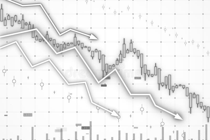
Free with trial A graph showing a downward trend on a grid background. 3D Rendering. Decrease indicators illustrations Declining stock market trend illustration. 3D Rendering. A graph showing a downward trend on a grid background. 3D Rendering
Free with trial A clear and modern set of speaker and volume level icons, featuring a black loudspeaker symbol paired with progressive green bar indicators. This collection visually represents various sound intensities, from low to high, ideal for user interface design. Perfect for web applications, mobile apps, multimedia players, and any digital project requiring intuitive audio control elements. The flat design ensures versatility and readability across different platforms. Decrease indicators illustrations Speaker Volume Level Icons Set. A clear and modern set of speaker and volume level icons, featuring a black loudspeaker symbol paired with progressive green bar indicators. This collection visually represents various sound intensities, from low to high, ideal for user interface design. Perfect for web applications, mobile apps, multimedia players, and any digital project requiring intuitive audio control elements. The flat design ensures versatility and readability across different platforms.
Free with trial A financial chart showing declining index lines in blue shades on a grid-style white background. Concept of market analysis and trends. 3D Rendering. Decrease indicators illustrations Financial chart with declining index lines on grid background. 3D Rendering. A financial chart showing declining index lines in blue shades on a grid-style white background. Concept of market analysis and trends. 3D Rendering
Free with trial A downward trending candlestick chart with gray bars against a dark green background. Generative AI. Decrease indicators illustrations A downward trending candlestick chart with gray bars against a dark green background
Free with trial This image illustrates the concept of inflation, which is the rate at which the general level of prices for goods and services is rising, leading to a decrease in purchasing , abstract background. Decrease indicators illustrations Understanding Inflation, The Basics. This image illustrates the concept of inflation, which is the rate at which the general level of prices for goods and services is rising, leading to a decrease in purchasing , abstract background
Free with trial A stylized, abstract arrow graphic descends diagonally from the upper left to the lower right. The arrow is composed of three distinct, curved layers in vibrant colors: teal, orange, and a lighter shade of orange. The smooth, flowing lines suggest movement and direction. This graphic is ideal for representing concepts like decline, progress, data trends, or simple directional indicators in various design projects. Decrease indicators vectors Abstract Downward Arrow with Layers. A stylized, abstract arrow graphic descends diagonally from the upper left to the lower right. The arrow is composed of three distinct, curved layers in vibrant colors: teal, orange, and a lighter shade of orange. The smooth, flowing lines suggest movement and direction. This graphic is ideal for representing concepts like decline, progress, data trends, or simple directional indicators in various design projects.
Free with trial Close-up shot of a digital screen displaying real-time stock market data. The image shows a series of percentage changes, both positive and negative, in a clean, modern font. The blue background and bright white text create a high-contrast visual, suggesting financial analysis, trading, and economic trends. Perfect for illustrating finance, investment, business, and market volatility. Decrease indicators illustrations Stock Market Data Displayed on Screen. Close-up shot of a digital screen displaying real-time stock market data. The image shows a series of percentage changes, both positive and negative, in a clean, modern font. The blue background and bright white text create a high-contrast visual, suggesting financial analysis, trading, and economic trends. Perfect for illustrating finance, investment, business, and market volatility.
Free with trial A modern digital tablet is placed on a sleek marble desk, displaying a prominent graph illustrating a rising inflation rate. The graph features a jagged, upward trend in red and orange hues, indicating economic volatility. Beside the tablet, a stack of white cards, a pen, and a pair of reading glasses suggest a business or analytical setting. A small green potted plant adds a touch of life to the scene. This image is ideal for representing economic analysis, financial planning, market trends, and the challenges of managing inflation. Decrease indicators illustrations Digital Tablet Displaying Inflation Rate Graph on a Marble Desk. A modern digital tablet is placed on a sleek marble desk, displaying a prominent graph illustrating a rising inflation rate. The graph features a jagged, upward trend in red and orange hues, indicating economic volatility. Beside the tablet, a stack of white cards, a pen, and a pair of reading glasses suggest a business or analytical setting. A small green potted plant adds a touch of life to the scene. This image is ideal for representing economic analysis, financial planning, market trends, and the challenges of managing inflation.
Free with trial Colorful financial data displayed on laptop, urban background, detailed background Generative AI, visually striking background Generative AI. Decrease indicators illustrations Colorful financial data displayed on laptop, urban background
Free with trial Stacks of coins rise against a backdrop of financial charts and a blurred global map, illustrating financial growth and global investment. This image, generated by AI, depicts the complex interplay between monetary value and market trends, suggesting success and potential. Decrease indicators illustrations AI-Generated Financial Growth Visualization. Stacks of coins rise against a backdrop of financial charts and a blurred global map, illustrating financial growth and global investment. This image, generated by AI, depicts the complex interplay between monetary value and market trends, suggesting success and potential.
Free with trial A collection of simple arrow icons pointing both up and down, displayed in a clean black and white design, suitable for use as navigation symbols or indicators. Decrease indicators vectors Arrow icons set upward and downward direction. A collection of simple arrow icons pointing both up and down, displayed in a clean black and white design, suitable for use as navigation symbols or indicators
Free with trial A close-up shot of a stock market display board, showcasing real-time financial data. The image features rows of red and green numbers, representing stock prices, with upward and downward arrows indicating market trends. The dark background emphasizes the bright, glowing numbers and symbols, creating a sense of urgency and activity. This image is ideal for illustrating financial news, investment strategies, trading concepts, and economic reports. Decrease indicators illustrations Stock Market Display: Rising and Falling Trends. A close-up shot of a stock market display board, showcasing real-time financial data. The image features rows of red and green numbers, representing stock prices, with upward and downward arrows indicating market trends. The dark background emphasizes the bright, glowing numbers and symbols, creating a sense of urgency and activity. This image is ideal for illustrating financial news, investment strategies, trading concepts, and economic reports.
Free with trial Collection of eight minimalist line icons representing various types of data visualization, including bar charts, line graphs, pie charts, and progress indicators. Ideal for websites, apps, or presentations needing a clean and modern aesthetic. Decrease indicators illustrations Data Visualization Icons. Collection of eight minimalist line icons representing various types of data visualization, including bar charts, line graphs, pie charts, and progress indicators. Ideal for websites, apps, or presentations needing a clean and modern aesthetic.
Free with trial CGI shows how trade deficits influence import export markets and economics. Decrease indicators illustrations CGI visuals illustrating how trade deficits influence import and export market dynamics. CGI shows how trade deficits influence import export markets and economics
Free with trial This image features a comprehensive set of 12 flat-style, grayscale user interface (UI) and user experience (UX) icons arranged on a clean white background. The collection includes common symbols for navigation, actions, and concepts such as up and down arrows, refresh, recycle, expand, close, balance, upload, and process indicators. These versatile vector icons are ideal for web design, mobile applications, software interfaces, infographics, and various digital projects requiring clear, minimalist visual communication. Their simple, modern aesthetic ensures broad applicability across different platforms and themes. Decrease indicators vectors Grayscale UI UX Icons Set for Web and App Design. This image features a comprehensive set of 12 flat-style, grayscale user interface (UI) and user experience (UX) icons arranged on a clean white background. The collection includes common symbols for navigation, actions, and concepts such as up and down arrows, refresh, recycle, expand, close, balance, upload, and process indicators. These versatile vector icons are ideal for web design, mobile applications, software interfaces, infographics, and various digital projects requiring clear, minimalist visual communication. Their simple, modern aesthetic ensures broad applicability across different platforms and themes.
Free with trial Red candlestick chart with ruble currency symbol, dark background, digital screen texture, concept of market crash and economic recession, 3D Rendering. Decrease indicators illustrations Russian ruble crisis symbol with falling candlestick chart and red market crash indicators on dark screen background representing. Red candlestick chart with ruble currency symbol, dark background, digital screen texture, concept of market crash and economic recession, 3D Rendering
Free with trial Close-up view of financial charts in shades of blue with two pens resting on the document. The charts display various lines and bar graphs indicating data trends. The image has a cool tone and a shallow depth of field. Decrease indicators illustrations Closeup Blue Financial Charts Two Pens Business Data Analysis Report Graphs Statistics business report. Close-up view of financial charts in shades of blue with two pens resting on the document. The charts display various lines and bar graphs indicating data trends. The image has a cool tone and a shallow depth of field
Free with trial A comprehensive vector icon set featuring essential symbols for business, finance, time management, and status indicators. The collection includes icons representing growth, trends, success, failure, deadlines, time tracking, and financial assets like coin stacks and currency. Designed in a clean, flat style, these versatile pictograms are ideal for web interfaces, mobile applications, presentations, infographics, and various digital projects requiring clear visual communication of progress, results, and financial concepts. Perfect for illustrating reports, dashboards, or user feedback. Decrease indicators vectors Business, Time, and Financial Status Vector Icons Set. A comprehensive vector icon set featuring essential symbols for business, finance, time management, and status indicators. The collection includes icons representing growth, trends, success, failure, deadlines, time tracking, and financial assets like coin stacks and currency. Designed in a clean, flat style, these versatile pictograms are ideal for web interfaces, mobile applications, presentations, infographics, and various digital projects requiring clear visual communication of progress, results, and financial concepts. Perfect for illustrating reports, dashboards, or user feedback.
Free with trial Financial data chart, glowing lines, digital display. Stock image showing trends. Decrease indicators illustrations Digital financial graph with candlestick chart, data analytics, stock market trend, technology concept. Financial data chart, glowing lines, digital display. Stock image showing trends
Free with trial This image displays two distinct charts illustrating annual revenue performance over quarters. The left chart features a line graph with shaded areas, showing trends and cumulative revenue. The right chart presents a bar graph with stacked segments, offering a clear comparison of revenue contributions across different quarters. Both charts use a clean, modern design with blue, green, and gray color palettes, suitable for business presentations, financial reports, and data visualization. Decrease indicators illustrations Annual Revenue Performance Charts: Line and Bar Graphs. This image displays two distinct charts illustrating annual revenue performance over quarters. The left chart features a line graph with shaded areas, showing trends and cumulative revenue. The right chart presents a bar graph with stacked segments, offering a clear comparison of revenue contributions across different quarters. Both charts use a clean, modern design with blue, green, and gray color palettes, suitable for business presentations, financial reports, and data visualization.
Free with trial This image showcases vibrant 3D bar and pie charts illustrating upward trending business growth and financial success. Perfect for presentations or reports. Decrease indicators illustrations Colorful 3D Bar Charts and Pie Charts Showing Business Growth. This image showcases vibrant 3D bar and pie charts illustrating upward trending business growth and financial success. Perfect for presentations or reports.
Free with trial Global stock market fluctuations shown on a tablet in a business office, breathtaking wallpaper background Generative AI. Decrease indicators illustrations Global stock market fluctuations shown on a tablet in a business office
Free with trial The image displays two percentage symbols, one red with the word 'decline' beneath it and another green with the word 'growth' beneath it. The red symbol is crossed out, indicating a negative trend, while the green symbol has a check mark, indicating a positive trend. The design is simple and visually contrasts decline and growth concepts. Decrease indicators vectors Percentage indicators showing decline and growth trends. The image displays two percentage symbols, one red with the word 'decline' beneath it and another green with the word 'growth' beneath it. The red symbol is crossed out, indicating a negative trend, while the green symbol has a check mark, indicating a positive trend. The design is simple and visually contrasts decline and growth concepts
Free with trial A dramatic red arrow plunging downwards on a world map background, symbolizing the global economic downturn and financial crisis. Ideal for illustrating recession, market crash, investment risk, and financial instability. Perfect for news, business, and finance publications, generated by AI. Decrease indicators illustrations Global economic downturn financial crisis recession. A dramatic red arrow plunging downwards on a world map background, symbolizing the global economic downturn and financial crisis. Ideal for illustrating recession, market crash, investment risk, and financial instability. Perfect for news, business, and finance publications, generated by AI.
Free with trial Person With Up And Down Arrows Icon Set. Height Measurement, Growth Tracking, And Size Adjustment Symbol Collection. Human Figure With Directional Indicators. Isolated Vector Illustration. Decrease indicators vectors Person With Up And Down Arrows Icon Set. Height Measurement, Growth Tracking, And Size Adjustment Symbol Collection
Free with trial The image depicts a candlestick chart commonly used in stock market analysis. The chart displays various candlesticks representing price movements over time. Prominently, there are two large buttons labeled 'SELL' and 'BUY', indicating the actions a trader might take based on the market trends shown in the chart. The background of the chart is white, with the candlesticks in different colors to. Decrease indicators illustrations Stock market buy and sell indicators in candlestick chart. The image depicts a candlestick chart commonly used in stock market analysis. The chart displays. The image depicts a candlestick chart commonly used in stock market analysis. The chart displays various candlesticks representing price movements over time. Prominently, there are two large buttons labeled 'SELL' and 'BUY', indicating the actions a trader might take based on the market trends shown in the chart. The background of the chart is white, with the candlesticks in different colors to
Free with trial Illustration displays key financial indicators like rising charts, currency bags, and gold bars suggesting market analysis or investment decisions. Ideal for finance presentations or educational content. Decrease indicators illustrations Analyzing Financial Market Trends with Gold, Currency, and Global Impact. Illustration displays key financial indicators like rising charts, currency bags, and gold bars suggesting market analysis or investment decisions. Ideal for finance presentations or educational content
Free with trial 3D rendering of various financial charts and graphs in red and pink tones on a white background. Concept of business analytics. Decrease indicators illustrations 3D Rendering of financial charts and graphs on a white background. 3D Rendering. 3D rendering of various financial charts and graphs in red and pink tones on a white background. Concept of business analytics
Free with trial A graphic illustration depicts a bear symbolizing a bear market, juxtaposed with a descending stock chart. A prominent red arrow points downward, indicating a decrease. The background features a grid of fluctuating stock prices and numerical indicators, emphasizing market downturn. The overall color scheme is blue with red accents. The image conveys the concept of declining financial performance in stock markets. Decrease indicators illustrations Bear Market Illustration with Stock Chart and Decreasing Arrow. A graphic illustration depicts a bear symbolizing a bear market, juxtaposed with a descending stock chart. A prominent red arrow points downward, indicating a decrease. The background features a grid of fluctuating stock prices and numerical indicators, emphasizing market downturn. The overall color scheme is blue with red accents. The image conveys the concept of declining financial performance in stock markets.
Free with trial This vibrant 3D rendering displays a dynamic bar chart alongside a detailed pie chart, illustrating impressive business growth and financial success. The colorful segments and bars clearly present data, making it perfect for presentations or reports. Decrease indicators illustrations Colorful 3D Bar and Pie Chart Showing Business Growth and Financial Success. This vibrant 3D rendering displays a dynamic bar chart alongside a detailed pie chart, illustrating impressive business growth and financial success. The colorful segments and bars clearly present data, making it perfect for presentations or reports.
Free with trial Stock market decline, digital display, trading screen, red arrows and numbers, lavish wallpaper background Generative AI. Decrease indicators illustrations Stock market decline, digital display, trading screen, red arrows and numbers
Free with trial The image shows a series of red downward-pointing arrows arranged in a descending sequence from left to right. The arrows vary in size, with the first being the largest and each subsequent arrow being progressively smaller, indicating a decrease in magnitude or quantity. Decrease indicators illustrations Decreasing sequence of red downward arrows on white background. The image shows a series of red downward-pointing arrows arranged in a descending sequence from left to right. The arrows vary in size, with the first being the largest and each subsequent arrow being progressively smaller, indicating a decrease in magnitude or quantity
Free with trial A person in a suit holding a magnifying glass showing blue upward and red downward percentage arrows. Decrease indicators illustrations Person holding magnifying glass with percentage arrows hand blue. A person in a suit holding a magnifying glass showing blue upward and red downward percentage arrows.
Free with trial A striking 3D illustration depicts a shrinking dollar sign with a downward arrow, symbolizing economic downturn and financial risk for investment visuals. Decrease indicators illustrations Contracting Dollar Sign Illustration Economic Decline Market Risk. A striking 3D illustration depicts a shrinking dollar sign with a downward arrow, symbolizing economic downturn and financial risk for investment visuals
Free with trial Minimalist red arrow going down diagonally on black background, representing economic decline, stock crash or business loss. Great for finance or crisis-related content. Red arrow on black background. Decrease indicators illustrations Red zigzag arrow pointing down on black background symbolizing stock market crash or financial loss. Minimalist red arrow going down diagonally on black background, representing economic decline, stock crash or business loss. Great for finance or crisis-related content. Red arrow on black background
Free with trial This image captures a downward trend line, symbolizing a financial market decline and representing challenges faced by investors. Decrease indicators illustrations Downward Trend Line Representing Financial Market Decline and Loss. This image captures a downward trend line, symbolizing a financial market decline and representing challenges faced by investors
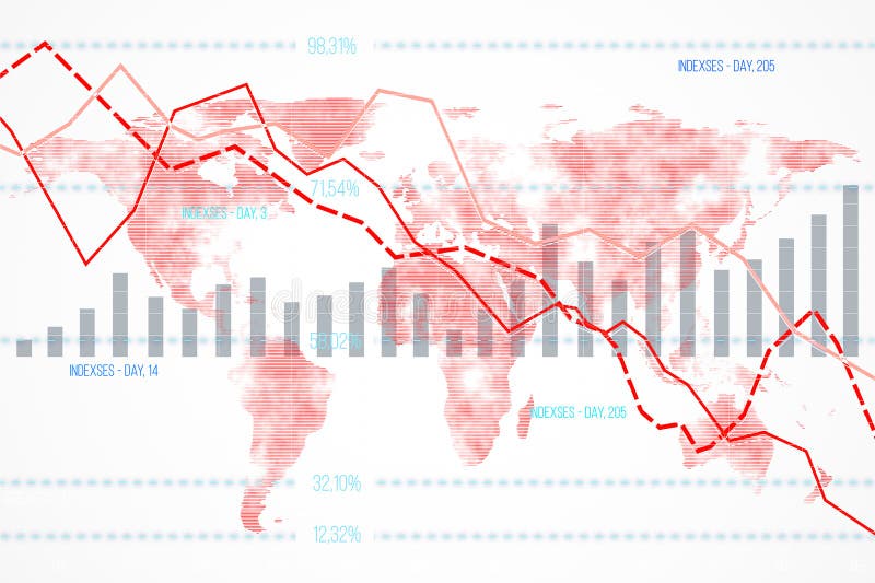
Free with trial Financial data chart featuring declining indexes and bar graphs overlaid on a world map background. Concept of global economic downturn. 3D Rendering. Decrease indicators illustrations Financial data chart with declining indexes on a world map background. 3D Rendering. Financial data chart featuring declining indexes and bar graphs overlaid on a world map background. Concept of global economic downturn. 3D Rendering
Free with trial This financial data illustration set features a stack of coins with a dollar sign alongside euro and pound currency stacks on the left, while the right side displays six analytical graphs including a blue downward trend graph, a green upward trend graph, a dual-color bar graph representing growth or decline, a bar graph with a green upward arrow indicating value increase, a pound coin illustration. Decrease indicators illustrations Set of four financial data illustrations showing currency stacks and business graphs with trends for investment analysis and. This financial data illustration set features a stack of coins with a dollar sign alongside euro and pound currency stacks on the left, while the right side displays six analytical graphs including a blue downward trend graph, a green upward trend graph, a dual-color bar graph representing growth or decline, a bar graph with a green upward arrow indicating value increase, a pound coin illustration
Free with trial Graphic features stylized oil barrel, pump jack, and pipeline alongside stock market indices including S&P 500 and Dow Jones. Detailed candlestick charts and volatility metrics illustrate energy market dynamics, supply demand trends, and global economic indicators. Decrease indicators illustrations Oil market dynamics illustrated with graphs and price per barrel updates. Graphic features stylized oil barrel, pump jack, and pipeline alongside stock market indices including S&P 500 and Dow Jones. Detailed candlestick charts and volatility metrics illustrate energy market dynamics, supply demand trends, and global economic indicators
Free with trial Dramatic image showing a sharp decline in stock market data on a tablet screen. Decrease indicators illustrations A person interacting with a tablet displaying a falling stock market chart. Dramatic image showing a sharp decline in stock market data on a tablet screen
Free with trial This image showcases two large, bold arrows with gradient fills. The arrow on the left points upward and transitions from light to dark green, symbolizing positive growth or improvement. The arrow on the right points downward with a gradient from light to dark red, indicating a negative trend or decline. Both arrows have a sleek, modern design with a smooth gradient effect, making them visually. Decrease indicators illustrations Upward and downward gradient arrows contrasting positive and negative trends. This image showcases two large, bold arrows with gradient fills. The arrow on the left points upward and transitions from light to dark green, symbolizing positive growth or improvement. The arrow on the right points downward with a gradient from light to dark red, indicating a negative trend or decline. Both arrows have a sleek, modern design with a smooth gradient effect, making them visually
Free with trial This is an detailed collection of line icons depicting market fluctuations, financial downturns, recovery patterns, and technical analysis indicators. Decrease indicators vectors Market volatility and financial loss icons with bull and bear market cycle symbols. This is an detailed collection of line icons depicting market fluctuations, financial downturns, recovery patterns, and technical analysis indicators
Free with trial Food prices fluctuate constantly, impacting consumers and businesses alike. This visual representation breaks down the dynamics of these price changes. The upward and downward arrows clearly illustrate cost increases and decreases for various food items. Understanding these trends is crucial for informed decision-making across the entire food supply chain. From farm to fork, the price. Decrease indicators illustrations Food Price Volatility Understanding Cost Increases Decreases and ProfitLoss Implications for the Food Industry. Food prices fluctuate constantly, impacting consumers and businesses alike. This visual representation breaks down the dynamics of these price changes. The upward and downward arrows clearly illustrate cost increases and decreases for various food items. Understanding these trends is crucial for informed decision-making across the entire food supply chain. From farm to fork, the price
Free with trial Falling Bar Chart Showing Decline with Downward Arrow, Financial Loss Indicator. Decrease indicators vectors Falling Bar Chart Showing Decline with Downward Arrow, Financial Loss Indicator
Free with trial The image displays a stock chart with candlestick patterns, where green candlesticks indicate price increases and red candlesticks indicate price decreases. The chart also includes trend lines and indicators to help analyze market trends and make informed trading decisions. Decrease indicators illustrations A detailed stock chart showing price movements with green and red candlesticks. The image displays a stock chart with candlestick patterns, where green candlesticks indicate price increases and red candlesticks indicate price decreases. The chart also includes trend lines and indicators to help analyze market trends and make informed trading decisions
Free with trial Three dimensional red bar chart graphic illustrating a continuous downward trend in business statistics or performance indicators. Decrease indicators vectors Three dimensional red bar chart showing decreasing metrics on white background. Three dimensional red bar chart graphic illustrating a continuous downward trend in business statistics or performance indicators.
Free with trial Bar Chart With Arrows Line And Solid Icon Set. Financial Growth And Decline Trend Analysis Symbol Collection. Economic Performance Indicators. Isolated Vector Illustration. Decrease indicators vectors Bar Chart With Arrows Line And Solid Icon Set. Financial Growth And Decline Trend Analysis Symbol Collection. Economic
Free with trial Depicting Arrows Going Up and Down to Represent Progress and Decline, Highlighting Changes. Decrease indicators vectors Depicting Arrows Going Up and Down to Represent Progress and Decline, Highlighting Changes
Free with trial An illustration of a declining stock market graph against a modern building facade the downwardsloping chart represents a bear market, economic downturn, financial loss, or potential recession the urban environment emphasizes the impact of financial fluctuations, generated by AI. Decrease indicators illustrations Declining stock market graph on building exterior representing economic downturn. an illustration of a declining stock market graph against a modern building facade the downwardsloping chart represents a bear market, economic downturn, financial loss, or potential recession the urban environment emphasizes the impact of financial fluctuations, generated by AI.
Free with trial A downward arrow made from smoke represents a decline, while bar graphs show reduced economic performance. Decrease indicators illustrations Downward arrow made of smoke symbolizes economic loss in dim setting Generative AI. A downward arrow made from smoke represents a decline, while bar graphs show reduced economic performance
Free with trial Financial graph with red arrows indicating declining stock prices on a white background. Concept of market downturn and economic crisis. 3D Rendering. Decrease indicators illustrations Financial graph showing declining stock prices with red arrows on white background. 3D Rendering. Financial graph with red arrows indicating declining stock prices on a white background. Concept of market downturn and economic crisis. 3D Rendering
Free with trial An up-close, brightly colored display of stock market data in red, with falling indicators. This image showcases concepts like economic downturn, financial loss, volatility, and investment risk. It could be used to illustrate articles on finance, investment, economics, market analysis, and trading s. Decrease indicators illustrations Red Stock Market Ticker Display: Economic Downturn and Financial Investment Analysis Overview Display. An up-close, brightly colored display of stock market data in red, with falling indicators. This image showcases concepts like economic downturn, financial loss, volatility, and investment risk. It could be used to illustrate articles on finance, investment, economics, market analysis, and trading s
Free with trial The image features declining business graphs illustrated with pie charts and falling arrow indicators, representing financial analysis and reports on downward trends, decreases in performance metrics, and economic risks. It effectively visualizes key data related to investment and marketing losses. This representation has been created using AI. Decrease indicators vectors Declining Business Graphs Falling Arrow Chart and Pie Chart for Financial Analysis and Reports. The image features declining business graphs illustrated with pie charts and falling arrow indicators, representing financial analysis and reports on downward trends, decreases in performance metrics, and economic risks. It effectively visualizes key data related to investment and marketing losses. This representation has been created using AI.
Free with trial The a hand with a ring on the ring finger interacting with a digital dashboard displayed on a smartphone, tablet, and laptop screen. The dashboard various analytics charts including bar graphs, line graphs, and pie charts. The data metrics include percentages, numbers, and performance indicators. The screens are set against a dark, blurred background with a glowing, futuristic interface. The color. Decrease indicators illustrations Hand interacting with digital dashboard displaying analytics charts and data metrics. The a hand with a ring on the ring finger interacting with a digital dashboard displayed on a smartphone, tablet, and laptop screen. The dashboard various analytics charts including bar graphs, line graphs, and pie charts. The data metrics include percentages, numbers, and performance indicators. The screens are set against a dark, blurred background with a glowing, futuristic interface. The color
Free with trial A downward trending graph with a red arrow pointing to the decline, set against a blue background with grid lines and various colored bars at the bottom. Decrease indicators illustrations Downward trend analysis showing significant decline over time with various data points. A downward trending graph with a red arrow pointing to the decline, set against a blue background with grid lines and various colored bars at the bottom
Free with trial Red arrows and metallic percentage signs are falling down against white background. Good discounts, sales. Price go down. Header, 3D render. Decrease indicators illustrations Red arrows and metallic percentage signs are falling down against white background. Good discounts, sales. Price go down. Header
Free with trial This image depicts a clear downward trend in statistics, signifying loss or poor results and illustrating economic challenges. Decrease indicators illustrations A dramatic decline in financial performance represented by a red arrow and decreasing bar graph. This image depicts a clear downward trend in statistics, signifying loss or poor results and illustrating economic challenges
Free with trial The image illustrates the concept of deflation, showing a downward trend in the general price level of goods and services in an economy , timeless background beauty. Decrease indicators illustrations Economic Downturn. Deflation concept. The image illustrates the concept of deflation, showing a downward trend in the general price level of goods and services in an economy , timeless background beauty
Free with trial Colorful flat design depicts bull and bear market fluctuation. Rising and falling arrows symbolize investment direction with a simple yet informative design. Decrease indicators vectors Bull and Bear Market Illustration with Price Fluctuation Indicators on Black Background. Colorful flat design depicts bull and bear market fluctuation. Rising and falling arrows symbolize investment direction with a simple yet informative design.
Free with trial This image visualizes business strategy, featuring a businessman pointing towards interactive displays of "QUALITY" with an upward arrow and "COST" with a downward arrow, representing optimization goals. Decrease indicators illustrations A businessman points towards holographic indicators for increasing quality and decreasing cost. This image visualizes business strategy, featuring a businessman pointing towards interactive displays of "QUALITY" with an upward arrow and "COST" with a downward arrow, representing optimization goals.
Free with trial Empty office spaces are a stark visual representation of the current economic downturn. The impact is widespread, affecting corporate growth and employment across various sectors. Reduced business activity, coupled with rising interest rates and inflation, has led to a significant decrease in demand for office space. Companies are scaling back operations, consolidating teams, and embracing. Decrease indicators illustrations Empty Office Buildings Signal Recession Economic Downturn Impacts Corporate Growth and Employment. Empty office spaces are a stark visual representation of the current economic downturn. The impact is widespread, affecting corporate growth and employment across various sectors. Reduced business activity, coupled with rising interest rates and inflation, has led to a significant decrease in demand for office space. Companies are scaling back operations, consolidating teams, and embracing
Free with trial Comprehensive Financial Business Stock Data Indicator Charts for Analyzing Market Trends Effectively, Generated by AI. Decrease indicators illustrations Comprehensive Financial Business Stock Data Indicator Charts for Analyzing Market Trends Effectively