Free with trial Two wooden blocks symbolize contrasting trends, with one showing red up arrow, black down arrow. Blocks represent opposing forces, choices, directional indicators in concepts like. Decrease indicators illustrations Two wooden blocks symbolize contrasting trends, with one showing red up arrow, black down arrow. Blocks represent opposing
Free with trial Explore the dynamic world of crypto trading with insights on market trends and financial strategies. Discover how fluctuations can impact investment decisions. Decrease indicators illustrations Crypto Trading Trends and Future Perspectives. Explore the dynamic world of crypto trading with insights on market trends and financial strategies. Discover how fluctuations can impact investment decisions
Free with trial Chart showing downward trend with red nodes, sad face, recovery checkmark, warning alerts, and webpage visuals. Ideal for finance, business, analysis, recovery strategy monitoring evaluation. Decrease indicators illustrations Negative Market Trends and Analytics with Recovery Progress Indicators. Chart showing downward trend with red nodes, sad face, recovery checkmark, warning alerts, and webpage visuals. Ideal for finance, business, analysis, recovery strategy monitoring evaluation
Free with trial Decreasing financial interest rates illustration. Stacks of coins with percentage blocks. Red arrow showing financial decline. Decrease indicators illustrations Decreasing financial interest rates illustration. Stacks of coins with percentage blocks. Red arrow showing decline
Free with trial Black and white line icons depicting currency devaluation, falling stocks, and market data analysis. Decrease indicators vectors Financial downturn and market analysis icons. Black and white line icons depicting currency devaluation, falling stocks, and market data analysis
Free with trial This compelling macro photography showcases a stark decline in investment fund values. The blue cubes, transitioning to red arrows pointing downward, vividly illustrate the negative trends in the stock market. This visual representation of investment data highlights the critical need for in-depth financial analysis and proactive investment strategies. The chart, created using advanced AI. Decrease indicators illustrations Macro Financial Chart Depicts Declining Investment Funds A Visual Analysis of Market Trends and Potential Risks. This compelling macro photography showcases a stark decline in investment fund values. The blue cubes, transitioning to red arrows pointing downward, vividly illustrate the negative trends in the stock market. This visual representation of investment data highlights the critical need for in-depth financial analysis and proactive investment strategies. The chart, created using advanced AI
Free with trial This captivating 3D image portrays the intriguing concept of food inflation in a surreal and thought-provoking manner. Instead of the typical visual representation of rising prices, this unique perspective depicts shrinking food items, suggesting a decrease in cost. The imagery is not literal, but rather a symbolic representation of the economic climate. The shrinking fruits and vegetables,. Decrease indicators illustrations Visualizing Economic Growth 3D Food Inflation Depicts Shrinking Prices and a Booming Economy Through Surreal Imagery. This captivating 3D image portrays the intriguing concept of food inflation in a surreal and thought-provoking manner. Instead of the typical visual representation of rising prices, this unique perspective depicts shrinking food items, suggesting a decrease in cost. The imagery is not literal, but rather a symbolic representation of the economic climate. The shrinking fruits and vegetables,
Free with trial This vibrant abstract graph illustrates the dynamic trends in financial markets, highlighting fluctuations in trading data and investment opportunities. Decrease indicators illustrations Abstract financial trading graph with vibrant color scheme showcasing fluctuating market trends and data analysis visuals. This vibrant abstract graph. This vibrant abstract graph illustrates the dynamic trends in financial markets, highlighting fluctuations in trading data and investment opportunities
Free with trial A three-dimensional chart displaying colorful lines and coin representations illustrates trends in data, highlighting key financial insights and fluctuations over time. Decrease indicators illustrations Trend Analysis with Colorful Graph Lines and Currency Coins Representing Data Points on a Three-Dimensional Chart. A three-dimensional chart displaying colorful lines and coin representations illustrates trends in data, highlighting key financial insights and fluctuations over time
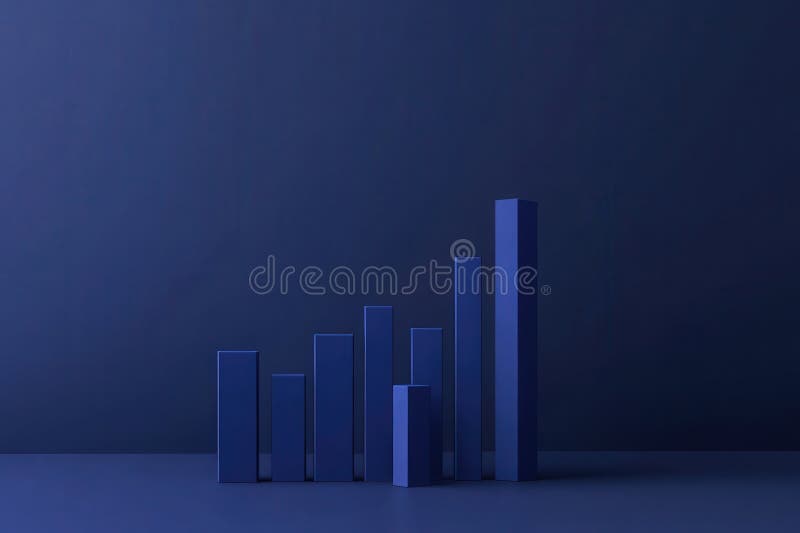
Free with trial Decline Curve A Visual Representation of Increasing Trends Curving Downward and Overcoming Previous Bars Against a Dark Blue Background by SD. Decrease indicators illustrations Decline Curve A Visual Representation of Increasing Trends Curving Downward and Overcoming Previous Bars Against a Dark Blue Backg
Free with trial The visual depicts a financial bar chart in a minimalist style, showcasing a decline with bars in gradient hues, creating a striking contrast against a dark background. Decrease indicators illustrations A minimalist representation of a collapsing financial bar chart with vibrant colors. The visual depicts a financial bar chart in a minimalist style, showcasing a decline with bars in gradient hues, creating a striking contrast against a dark background.
Free with trial A clean, minimalist bar chart displays a gradual decline in financial performance, with rising bars depicted in soft blue against a serene teal background. Decrease indicators illustrations Minimalist financial bar chart illustrating gradual decline in economic performance. A clean, minimalist bar chart displays a gradual decline in financial performance, with rising bars depicted in soft blue against a serene teal background.
Free with trial This image features a conceptual bar graph, illustrating contrasting trends of growth and decline in business performance, ideal for data analysis presentations. Decrease indicators illustrations Growth and Decline: Conceptual Bar Graph Illustrating Positive and Negative Trends in Business Performance Data Visualization. This image features a conceptual bar graph, illustrating contrasting trends of growth and decline in business performance, ideal for data analysis presentations
Free with trial Red and green arrows isolated on white for economic infographics and website design elements. Decrease indicators illustrations Red and green arrows isolated on white for economic infographics and website design elements
Free with trial Laptop screen displays stock market analysis. Financial data shows investment trends. Person may trader analyst. Investment stock market analysis. Dynamic market graphs. Modern tech. Decrease indicators illustrations Laptop screen displays stock market analysis. Financial data shows investment trends. Person may trader analyst. Investment
Free with trial This sleek, minimalist linear bar graph is perfect for showcasing downward trends in your business data. Ideal for presentations, reports, and dashboards, this editable graphic allows you to easily customize stroke width and colors to match your brand. The clean design and simple layout make complex data easily digestible, highlighting key performance indicators and areas needing attention. Decrease indicators illustrations Editable Linear Bar Graph Visualize Downward Trends for Powerful Business Analytics Reports and Presentations. This sleek, minimalist linear bar graph is perfect for showcasing downward trends in your business data. Ideal for presentations, reports, and dashboards, this editable graphic allows you to easily customize stroke width and colors to match your brand. The clean design and simple layout make complex data easily digestible, highlighting key performance indicators and areas needing attention.
Free with trial The visual displays a clean and minimalist bar chart, illustrating a notable decrease in financial performance over a recent quarter, with a focus on dark blue tones to enhance impact. Decrease indicators illustrations Minimalist financial bar chart showing significant decline in earnings over the past quarter. The visual displays a clean and minimalist bar chart, illustrating a notable decrease in financial performance over a recent quarter, with a focus on dark blue tones to enhance impact.
Free with trial Magnifying glass focuses on downward trend in financial spreadsheet during recession. Spreadsheet data shows, significant decline. Economic downturn evident. Detailed financial analysis. Decrease indicators illustrations Magnifying glass focuses on downward trend in financial spreadsheet during recession. Spreadsheet data shows significant decline. Magnifying glass focuses on downward trend in financial spreadsheet during recession. Spreadsheet data shows, significant decline. Economic downturn evident. Detailed financial analysis.
Free with trial Image displaying stock market chart, rising or falling trends Generative AI. Decrease indicators illustrations Image displaying stock market chart, rising or falling trends
Free with trial Financial decline highlighted by magnifying glass over spreadsheet. Red arrow chart trend downward on document during recession. Analysis of negative market indicator, with business. Decrease indicators illustrations Financial decline highlighted by magnifying glass over spreadsheet. Red arrow chart trend downward on document during recession.
Free with trial The sales target schedule displays flat trends alongside varying performance metrics in a colorful chart Sales target schedule is trending flat. Decrease indicators vectors The sales target schedule displays flat trends alongside varying performance metrics in a colorful chart Sales target schedule is
Free with trial A close-up view of a monitor displaying complex financial data, including stock market charts and numerical values. Stock market Data Displayed on a Monitor. Decrease indicators illustrations Stock market Data Displayed on a Monitor
Free with trial Clean animated bar chart visualizing rising and falling market trends with green bars representing growth, profit, and positive performance, and red bars indicating decline, loss, and negative movement. Symbolizes financial volatility, stock market cycles, economic fluctuations, investment performance, and business analytics. Ideal for illustrating bullish and bearish phases, economic indicators, trading activity, and financial data visualization. Decrease indicators illustrations Financial Market Trend Animation Showing Upturn and Downturn Phases. Clean animated bar chart visualizing rising and falling market trends with green bars representing growth, profit, and positive performance, and red bars indicating decline, loss, and negative movement. Symbolizes financial volatility, stock market cycles, economic fluctuations, investment performance, and business analytics. Ideal for illustrating bullish and bearish phases, economic indicators, trading activity, and financial data visualization.
Free with trial A simple line chart illustrates a decreasing trend with distinct dot markers representing data points. The design emphasizes the shift in values over time and aids in visualizing performance. Decrease indicators vectors Chart Displaying a Downward Trend in Data Analysis. A simple line chart illustrates a decreasing trend with distinct dot markers representing data points. The design emphasizes the shift in values over time and aids in visualizing performance.
Free with trial Statistics and analysis concept with bottom view on graphs and stats indicators on dark squared background. 3D rendering. Decrease indicators illustrations Statistics and analysis concept
Free with trial Photo Interest rate and mortgage rates rise, financial growth concept Vertical Mobile Wallpaper. Decrease indicators illustrations Photo Interest rate and mortgage rates rise, financial growth concept
Free with trial Photo Interest rate and mortgage rates rise, financial growth concept For Social Media Post Size. Decrease indicators illustrations Photo Interest rate and mortgage rates rise, financial growth concept
Free with trial Photo Interest rate and mortgage rates rise, financial growth concept Vertical Mobile Wallpaper. Decrease indicators illustrations Photo Interest rate and mortgage rates rise, financial growth concept
Free with trial Photo Interest rate and mortgage rates rise, financial growth concept Vertical Mobile Wallpaper. Decrease indicators illustrations Photo Interest rate and mortgage rates rise, financial growth concept
Free with trial Photo Interest rate and mortgage rates rise, financial growth concept Generative AI. Decrease indicators illustrations Photo Interest rate and mortgage rates rise, financial growth concept
Free with trial Photo Interest rate and mortgage rates rise, financial growth concept Generative AI. Decrease indicators illustrations Photo Interest rate and mortgage rates rise, financial growth concept
Free with trial A close-up of a magnifying glass revealing intricate lines of code, generated by AI. The image evokes a sense of mystery and technological advancement, hinting at the power and potential of artificial intelligence in data analysis and cybersecurity. Decrease indicators illustrations AI Magnifies Code. A close-up of a magnifying glass revealing intricate lines of code, generated by AI. The image evokes a sense of mystery and technological advancement, hinting at the power and potential of artificial intelligence in data analysis and cybersecurity.
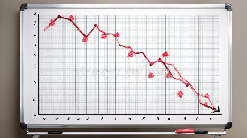
Free with trial A whiteboard displays a hand-drawn graph depicting a significant downward trend, marked by red triangles indicating decreasing values. This visual representation of a negative trend was generated by AI for illustrative purposes, possibly showcasing market decline or economic downturn. Decrease indicators illustrations Downward Trend Graph. A whiteboard displays a hand-drawn graph depicting a significant downward trend, marked by red triangles indicating decreasing values. This visual representation of a negative trend was generated by AI for illustrative purposes, possibly showcasing market decline or economic downturn.
Free with trial This image shows a rolled-up graph with a red line depicting a downturn, generated by AI. It visually represents a negative trend or decline in data, potentially illustrating economic recession, market loss, or other negative statistical trends. The clean design allows for easy visualization of the. Decrease indicators illustrations Declining Graph Report. This image shows a rolled-up graph with a red line depicting a downturn, generated by AI. It visually represents a negative trend or decline in data, potentially illustrating economic recession, market loss, or other negative statistical trends. The clean design allows for easy visualization of the
Free with trial Illustration of reduce risk level concept. Businessman pull risk indicators to low. Illustrations for websites, landing pages, mobile apps, posters and banners. Decrease indicators vectors Illustration of reduce risk level concept
Free with trial This image depicts a sharply declining stock market graph, generated by AI, highlighting the severity of the downturn. The red arrow emphasizes the dramatic fall in market values, representing a potential crisis for investors. Decrease indicators illustrations Market Crash: Red Alert. This image depicts a sharply declining stock market graph, generated by AI, highlighting the severity of the downturn. The red arrow emphasizes the dramatic fall in market values, representing a potential crisis for investors.
Free with trial A hand adds to a graph depicting a sharp decline in the global economy, shown as a cracked map. This AI-generated image symbolizes the fragility of the world's financial systems and the potential for widespread economic crisis. The red line emphasizes the severity of the downturn. Decrease indicators illustrations Global Economic Decline. A hand adds to a graph depicting a sharp decline in the global economy, shown as a cracked map. This AI-generated image symbolizes the fragility of the world's financial systems and the potential for widespread economic crisis. The red line emphasizes the severity of the downturn.
Free with trial This image depicts a domino effect illustrating a market crash, with a downward trend generated by AI. The falling dominos symbolize the cascading impact of economic instability, highlighting the fragility of financial systems and the potential for rapid decline. Decrease indicators illustrations Domino Effect: Market Crash. This image depicts a domino effect illustrating a market crash, with a downward trend generated by AI. The falling dominos symbolize the cascading impact of economic instability, highlighting the fragility of financial systems and the potential for rapid decline.
Free with trial This image showcases a colorful bar graph with a downward-pointing arrow, generated by AI, illustrating a negative trend or decline. The vibrant colors and simplistic design make the message clear and easily understood. The image is perfect for representing economic downturns, market dips, or any s. Decrease indicators illustrations Downward Trend Visualization. This image showcases a colorful bar graph with a downward-pointing arrow, generated by AI, illustrating a negative trend or decline. The vibrant colors and simplistic design make the message clear and easily understood. The image is perfect for representing economic downturns, market dips, or any s
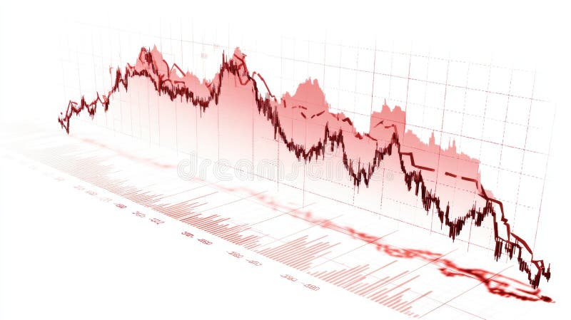
Free with trial This image depicts a dramatic stock market decline, visualized as a falling graph in intense orange and red hues, generated by AI. The dark background emphasizes the severity of the downturn, suggesting potential financial instability or market volatility. The bokeh effect adds a sense of depth and. Decrease indicators illustrations AI-Generated Stock Market Dip. This image depicts a dramatic stock market decline, visualized as a falling graph in intense orange and red hues, generated by AI. The dark background emphasizes the severity of the downturn, suggesting potential financial instability or market volatility. The bokeh effect adds a sense of depth and
Free with trial Up-Down 3D Icon isolated on white background. Decrease indicators illustrations Up-Down 3D Icon isolated on white background
Free with trial Stacks of transparent glass coins depict a downward trend, generated by AI, symbolizing financial downturn or economic recession. The image uses a dark background to highlight the contrast between the fragility of the glass coins and the severity of the market decline. Decrease indicators illustrations AI-Generated Glass Coin Decline. Stacks of transparent glass coins depict a downward trend, generated by AI, symbolizing financial downturn or economic recession. The image uses a dark background to highlight the contrast between the fragility of the glass coins and the severity of the market decline.
Free with trial Close-up of a smartphone displaying a stock trading application. The screen shows real-time stock charts, including candlestick charts and line graphs, with green and red indicators representing price increases and decreases. The app also features portfolio summaries and details for various stocks, such as AAPL, GOOG, and MSFT. The image represents investment, finance, and the use of technology in stock market analysis. Decrease indicators illustrations Stock Trading App on Smartphone. Close-up of a smartphone displaying a stock trading application. The screen shows real-time stock charts, including candlestick charts and line graphs, with green and red indicators representing price increases and decreases. The app also features portfolio summaries and details for various stocks, such as AAPL, GOOG, and MSFT. The image represents investment, finance, and the use of technology in stock market analysis.
Free with trial This image depicts a white pillar with a red downward trending arrow, generated by AI. It symbolizes economic decline, market instability, or a negative trend in a specific industry. The clean, minimalist style emphasizes the severity of the drop. Decrease indicators illustrations Falling Market Trend. This image depicts a white pillar with a red downward trending arrow, generated by AI. It symbolizes economic decline, market instability, or a negative trend in a specific industry. The clean, minimalist style emphasizes the severity of the drop.
Free with trial This 3D rendering shows a stylized stock market chart, generated by AI, displayed on a sleek, blue metallic stand. The vibrant blue color and modern design make it visually appealing and ideal for representing technological advancements in finance. Decrease indicators illustrations AI-Generated Stock Market Display. This 3D rendering shows a stylized stock market chart, generated by AI, displayed on a sleek, blue metallic stand. The vibrant blue color and modern design make it visually appealing and ideal for representing technological advancements in finance.
Free with trial This image depicts a dramatic market decline, visualized as a 3D graph showing a sharp downward trend. The red color emphasizes the severity of the losses, and the detailed chart is generated by AI, offering a realistic representation of financial instability. It can be used to illustrate economic. Decrease indicators illustrations Red Market Crash Graph. This image depicts a dramatic market decline, visualized as a 3D graph showing a sharp downward trend. The red color emphasizes the severity of the losses, and the detailed chart is generated by AI, offering a realistic representation of financial instability. It can be used to illustrate economic
Free with trial This image depicts a 3D rendering of a downward trending graph, generated by AI, showcasing a clear visual representation of market decline or economic downturn. The red bars and arrow emphasize the severity of the fall, suggesting potential financial instability or crisis. Decrease indicators illustrations Declining Market Trends. This image depicts a 3D rendering of a downward trending graph, generated by AI, showcasing a clear visual representation of market decline or economic downturn. The red bars and arrow emphasize the severity of the fall, suggesting potential financial instability or crisis.
Free with trial Set of audio icon variations: volume, mute, adjustments, and speaker symbols. Decrease indicators vectors Set of audio icon variations: volume, mute, adjustments, and speaker symbols
Free with trial Multiple line charts showing data trends over months on a grid background. Concept of data analysis and financial growth. 3D Rendering. Decrease indicators illustrations Multiple line charts showing data trends over months on grid background. 3D Rendering. Multiple line charts showing data trends over months on a grid background. Concept of data analysis and financial growth. 3D Rendering
Free with trial This image shows a hand-drawn graph depicting a sharp decline, generated by AI for illustrative purposes. It's a simple yet effective visual representation of negative growth or market downturn, useful for presentations or reports. Decrease indicators illustrations Downward Trend on Whiteboard. This image shows a hand-drawn graph depicting a sharp decline, generated by AI for illustrative purposes. It's a simple yet effective visual representation of negative growth or market downturn, useful for presentations or reports.
Free with trial Water Drop Levels Showing Decreasing Progression. Four water droplets illustrate decreasing water levels, symbolizing concepts like depletion, conservation, measurement, or environmental decline. Decrease indicators vectors Water Drop Levels Showing Decreasing Progression
Free with trial This image shows a whiteboard displaying a graph with a downward trending red line, generated by AI. The visual clearly represents a negative trend or decline in a certain metric. The use of a whiteboard suggests a presentation or meeting context. Decrease indicators illustrations Declining Trend on Whiteboard. This image shows a whiteboard displaying a graph with a downward trending red line, generated by AI. The visual clearly represents a negative trend or decline in a certain metric. The use of a whiteboard suggests a presentation or meeting context.
Free with trial A pair of hands gently cradles four small, wooden house models against a backdrop of financial charts and graphs. The image evokes concepts of real estate investment, market analysis, and the security of owning property. The wooden houses symbolize homes and the charts represent market trends, making it suitable for illustrating financial articles, investment advice, or real estate services. Decrease indicators illustrations Real Estate Market Analysis and Investment. A pair of hands gently cradles four small, wooden house models against a backdrop of financial charts and graphs. The image evokes concepts of real estate investment, market analysis, and the security of owning property. The wooden houses symbolize homes and the charts represent market trends, making it suitable for illustrating financial articles, investment advice, or real estate services.
Free with trial 3D rendering of a dynamic presentation stand showcasing financial data. Colorful, geometric shapes and infographics present market statistics, including percentages, dollar amounts, and bar graphs. Stacks of coins and various data elements are displayed on a dark blue platform with orange accents. Suitable for illustrating financial reports, market analysis, investment strategies, or business presentations. Decrease indicators illustrations Modern Financial Data Visualization Display. 3D rendering of a dynamic presentation stand showcasing financial data. Colorful, geometric shapes and infographics present market statistics, including percentages, dollar amounts, and bar graphs. Stacks of coins and various data elements are displayed on a dark blue platform with orange accents. Suitable for illustrating financial reports, market analysis, investment strategies, or business presentations.
Free with trial This 3D rendered image shows a red arrow pointing downwards, illustrating a negative trend. The graphic, generated by AI, is a visual representation of declining values or a market downturn, perfect for illustrating economic reports or presentations. Decrease indicators illustrations Red Downward Trend. This 3D rendered image shows a red arrow pointing downwards, illustrating a negative trend. The graphic, generated by AI, is a visual representation of declining values or a market downturn, perfect for illustrating economic reports or presentations.
Free with trial Business growth presentation with charts and graphs showing progress, statistics, and performance. The image showcases key financial indicators in a clear, concise format. Decrease indicators vectors Financial Data Analysis Report on Screen Display. Business growth presentation with charts and graphs showing progress, statistics, and performance. The image showcases key financial indicators in a clear, concise format.
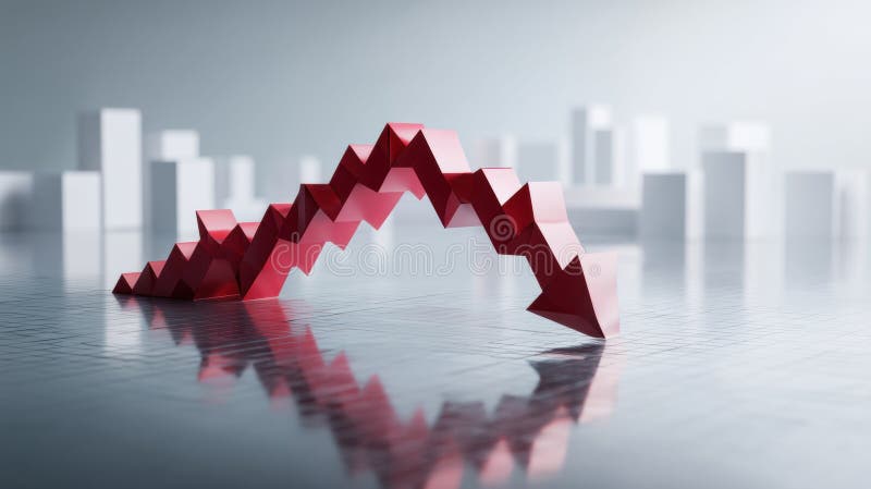
Free with trial This striking image depicts a 3D rendering of a sharply declining graph, generated by AI, symbolizing a market crash or economic downturn. The red arrow dramatically plunges downwards against a blurred background of white building silhouettes, visually representing the severity of the economic decl. Decrease indicators illustrations AI-Generated Market Crash Visualization. This striking image depicts a 3D rendering of a sharply declining graph, generated by AI, symbolizing a market crash or economic downturn. The red arrow dramatically plunges downwards against a blurred background of white building silhouettes, visually representing the severity of the economic decl
Free with trial A hand holds a piece of paper with a hand-drawn graph showing a sharp decline, symbolizing a market downturn. The image, generated by AI, highlights the concept of economic recession and financial instability. Coins and banknotes are blurred in the background, emphasizing the tangible impact of fa. Decrease indicators illustrations Falling Market. A hand holds a piece of paper with a hand-drawn graph showing a sharp decline, symbolizing a market downturn. The image, generated by AI, highlights the concept of economic recession and financial instability. Coins and banknotes are blurred in the background, emphasizing the tangible impact of fa
Free with trial Red downward arrow with stock market data and candlestick chart on white background, showcasing financial decline, business concept. 3D Rendering. Decrease indicators illustrations Red downward arrow with stock market data and candlestick chart on white background. 3D Rendering. Red downward arrow with stock market data and candlestick chart on white background, showcasing financial decline, business concept. 3D Rendering
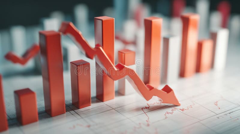
Free with trial This 3D graphic depicts a sharp market downturn, visualized with a red arrow plummeting downwards along a gridded bar chart. The image is generated by AI, offering a compelling visual representation of economic decline and financial loss. It showcases the potential for significant drops in various. Decrease indicators illustrations AI-Generated Market Decline Visualization. This 3D graphic depicts a sharp market downturn, visualized with a red arrow plummeting downwards along a gridded bar chart. The image is generated by AI, offering a compelling visual representation of economic decline and financial loss. It showcases the potential for significant drops in various
Free with trial This image showcases a vibrant 3D rendering of various financial charts, including bar graphs, pie charts, and a rising arrow, symbolizing growth and profitability. Ideal for presentations, reports, and financial articles. Decrease indicators illustrations Colorful 3D Financial Charts Showing Growth and Profit. This image showcases a vibrant 3D rendering of various financial charts, including bar graphs, pie charts, and a rising arrow, symbolizing growth and profitability. Ideal for presentations, reports, and financial articles.
Free with trial 3D colorful bar chart, pie chart, rising arrow, dollar sign, and stacks of coins illustrate financial growth and success. Perfect for business, finance, and investment presentations. Decrease indicators illustrations Financial Growth Chart with Dollar Sign and Coin Stacks. 3D colorful bar chart, pie chart, rising arrow, dollar sign, and stacks of coins illustrate financial growth and success. Perfect for business, finance, and investment presentations.
Free with trial A striking red arrow points downward over white bars, indicating a significant decrease. Decrease indicators illustrations Red arrow falls over white bars indicating growth decline. A striking red arrow points downward over white bars, indicating a significant decrease
Free with trial Description: A 3D rendering of a businessman figure presenting a bar chart showing upward growth trend on a whiteboard. The chart illustrates business success and progress. Decrease indicators illustrations Businessman Presenting Positive Growth Chart on Whiteboard. Description: A 3D rendering of a businessman figure presenting a bar chart showing upward growth trend on a whiteboard. The chart illustrates business success and progress.
Free with trial Thermometer and falling bar chart with a directional arrow symbolizing temperature drop, analysis, and reduction. Ideal for climate change, trends, progress, energy, analytics, business metrics. Decrease indicators illustrations Thermometer and Declining Bar Chart Representing Cooling Trends and Data Insights. Thermometer and falling bar chart with a directional arrow symbolizing temperature drop, analysis, and reduction. Ideal for climate change, trends, progress, energy, analytics, business metrics
Free with trial This 3D rendering shows a downward trending graph, illustrating a market decline. The red arrows and translucent grid highlight the severity of the fall, generated by AI for visual representation of economic downturn. Decrease indicators illustrations Declining Market Trend. This 3D rendering shows a downward trending graph, illustrating a market decline. The red arrows and translucent grid highlight the severity of the fall, generated by AI for visual representation of economic downturn.
Free with trial This insightful graph illustrates the fundamental principles of supply and demand in economics. The visual representation clearly shows how supply and demand curves interact to determine the equilibrium price and quantity in a market. The equilibrium point, where the supply and demand curves intersect, signifies the market-clearing price �' the price at which the quantity supplied equals the. Decrease indicators illustrations Understanding Supply and Demand A Visual Guide to Equilibrium. This insightful graph illustrates the fundamental principles of supply and demand in economics. The visual representation clearly shows how supply and demand curves interact to determine the equilibrium price and quantity in a market. The equilibrium point, where the supply and demand curves intersect, signifies the market-clearing price �' the price at which the quantity supplied equals the
Free with trial This image shows colorful financial charts and graphs, generated by AI, illustrating various data points and percentages. The overlaid arrows suggest a downward trend, potentially indicating a negative market shift or economic decline. The visual representation aids in quick understanding of compl. Decrease indicators illustrations Financial Data Analysis. This image shows colorful financial charts and graphs, generated by AI, illustrating various data points and percentages. The overlaid arrows suggest a downward trend, potentially indicating a negative market shift or economic decline. The visual representation aids in quick understanding of compl
Free with trial A close-up image of an orange percentage symbol leaning against a wooden surface. Decrease indicators illustrations Increasing Percentage Interest Rate Shown with Stacks of Coins. A close-up image of an orange percentage symbol leaning against a wooden surface.
Free with trial Stock market showing closeup of stock market display with green and red percentage changes and arrows. resolution use. Clear details and vibrant colors enhance visual appeal. stock market, financial data, percentage changes. Decrease indicators illustrations Closeup of stock market display with green and red percentage changes and arrows
Free with trial Bright green glossy 3d arrow vector illustration. Perfect for download icons, navigation pointers, or direction indicators. Trendy and eye-catching for web and app design. Decrease indicators vectors Bright green glossy 3d arrow vector illustration. Perfect for download icons, navigation pointers, or direction
Free with trial This striking image depicts a sharply declining stock market graph, generated by AI. The artistic style, combining a distressed frame and ink splatters, emphasizes the volatility and uncertainty of the market downturn. The red line dramatically highlights the severity of the fall. Decrease indicators illustrations Market Crash Visualization. This striking image depicts a sharply declining stock market graph, generated by AI. The artistic style, combining a distressed frame and ink splatters, emphasizes the volatility and uncertainty of the market downturn. The red line dramatically highlights the severity of the fall.
Free with trial This cheerful 3D rendered illustration depicts a friendly cartoon businessman confidently presenting positive business growth charts and data, showcasing key performance indicators and financial success. The image is ideal for business, finance, and marketing concepts. Decrease indicators illustrations Charming 3D Cartoon Businessman Presenting Growth Charts and Data. This cheerful 3D rendered illustration depicts a friendly cartoon businessman confidently presenting positive business growth charts and data, showcasing key performance indicators and financial success. The image is ideal for business, finance, and marketing concepts.
Free with trial Bar graph depicts a downward trend in data, using various colors to illustrate the decline effectively. Decrease indicators illustrations Graph illustrating data trends showing a steady decline over time. Bar graph depicts a downward trend in data, using various colors to illustrate the decline effectively.
Free with trial A collection of minimalist outline icons representing finance and business data charts, symbols, and indicators for graphic design and web development. Decrease indicators vectors Minimalist Outline Finance and Business Data Chart Symbol Icon Set. A collection of minimalist outline icons representing finance and business data charts, symbols, and indicators for graphic design and web development.
Free with trial This image depicts a vibrant and modern representation of financial success, featuring 3D bar graphs, pie charts, and a calculator, all set against a clean white background. The upward-trending graph showcases growth and progress. Decrease indicators illustrations Colorful 3D Financial Charts and Calculator Showing Business Growth. This image depicts a vibrant and modern representation of financial success, featuring 3D bar graphs, pie charts, and a calculator, all set against a clean white background. The upward-trending graph showcases growth and progress.
Free with trial This image showcases a vibrant infographic with 3D bar, pie, and line charts. The colorful elements are displayed on a teal platform, ideal for presentations or reports. Decrease indicators illustrations Colorful 3D Bar Chart, Pie Chart, and Line Graph Infographic on Teal Platform. This image showcases a vibrant infographic with 3D bar, pie, and line charts. The colorful elements are displayed on a teal platform, ideal for presentations or reports.
Free with trial This image depicts a vibrant blue calculator positioned next to a colorful bar graph and stack of gold coins, symbolizing financial success and growth. The scene is clean and bright, perfect for illustrating financial concepts. Decrease indicators illustrations Colorful Calculator, Bar Graph, and Coins Representing Financial Growth. This image depicts a vibrant blue calculator positioned next to a colorful bar graph and stack of gold coins, symbolizing financial success and growth. The scene is clean and bright, perfect for illustrating financial concepts.
Free with trial This image shows a stock market graph with a downward trend, generated by AI. The red line vividly depicts a significant market decline, potentially indicating economic instability or investor uncertainty. Analyzing this data requires further context and analysis. Decrease indicators illustrations AI-Generated Stock Market Decline. This image shows a stock market graph with a downward trend, generated by AI. The red line vividly depicts a significant market decline, potentially indicating economic instability or investor uncertainty. Analyzing this data requires further context and analysis.
Free with trial A detailed blue candlestick chart depicting stock market price fluctuations and trends over time Ideal for illustrating financial concepts market analysis and investment strategies The graphic is clean modern and visually engaging. Decrease indicators illustrations Blue Financial Chart Candlestick Graph Showing Stock Market Trend Analysis. A detailed blue candlestick chart depicting stock market price fluctuations and trends over time Ideal for illustrating financial concepts market analysis and investment strategies The graphic is clean modern and visually engaging