Free with trial A black graph displays a downward curving line within a rectangular frame. Clear details and vibrant colors en. Decrease line graph illustrations Black graph showing a downward curve within a frame chart decline. A black graph displays a downward curving line within a rectangular frame. Clear details and vibrant colors en
Free with trial Illustrative line graph charting downward trend, representing losses, recession or market decline, isolated stock diagram. Decrease line graph vectors Illustrative line graph charting downward trend, representing losses, recession or market decline, isolated stock
Free with trial This image is a simple vector graphic depicting a downward trending line graph. The graph is enclosed in a square with a bold black border and shows a blue line indicating a decrease in values over ti. Decrease line graph illustrations Downward Trend Graph, Data Decline Icon. This image is a simple vector graphic depicting a downward trending line graph. The graph is enclosed in a square with a bold black border and shows a blue line indicating a decrease in values over ti
Free with trial Red bar graph with a descending line and arrow on a white background. The graph features four bars of varying heights, depicting a decline in values from left to right. The red line starts at the top of the first bar, dips below the second, rises over the third, then slopes downward with a pronounced arrow pointing to the right, indicating a decrease in data or performance. The image suggests themes of loss or negative financial trends. Decrease line graph vectors Red bar graph with a descending line and arrow on a white background.
Free with trial A sophisticated 3D rendered bar graph composed of multiple vertical blue glass bars arranged in a line with varying heights, where the tallest bar appears at the bottom right side and the shortest bars are positioned at the top left, creating a visually striking data visualization against a clean white background that emphasizes the transparent glass-like material and realistic lighting effects. Decrease line graph illustrations 3D rendered blue glass bar graph showing data visualization with vertical columns of varying heights on white background. A sophisticated 3D rendered bar graph composed of multiple vertical blue glass bars arranged in a line with varying heights, where the tallest bar appears at the bottom right side and the shortest bars are positioned at the top left, creating a visually striking data visualization against a clean white background that emphasizes the transparent glass-like material and realistic lighting effects
Free with trial A magnifying glass focuses on a declining bar graph and a file folder, symbolizing a decrease in sales and the need for. Decrease line graph illustrations Declining Sales Analysis Magnifying Glass, Downward Graph. A magnifying glass focuses on a declining bar graph and a file folder, symbolizing a decrease in sales and the need for.
Free with trial A black upward arrow merges into a downward curving line graph on a white background. Decrease line graph illustrations Black upward arrow and downward curve graph on white background chart. A black upward arrow merges into a downward curving line graph on a white background
Free with trial Set line Gold bars Glass money jar with coin Employee dismissal Drop crude oil price Bank building Pie chart infographic Briefcase and Dollar rate decrease icon. Vector. Decrease line graph illustrations Set line Gold bars, Glass money jar with coin, Employee dismissal, Drop crude oil price, Bank building, Pie chart. Set line Gold bars Glass money jar with coin Employee dismissal Drop crude oil price Bank building Pie chart infographic Briefcase and Dollar rate decrease icon. Vector.
Free with trial A black line graph icon showing a downward trend with an arrow pointing down on a white background. Decrease line graph illustrations Downward Trend Graph Icon with Arrow on White Background chart decline. A black line graph icon showing a downward trend with an arrow pointing down on a white background
Free with trial Black and red arrow pointing downward on financial graph showing a decline. Business growth chart with falling trend line for investment analysis. Decrease line graph illustrations Black and red arrow pointing downward on financial graph showing a decline
Free with trial Set line Dollar rate decrease Mobile stock trading Shutdown of factory Falling property prices Global economic crisis Briefcase and Contract money and pen icon. Vector. Decrease line graph illustrations Set line Dollar rate decrease, Mobile stock trading, Shutdown of factory, Falling property prices, Global economic. Set line Dollar rate decrease Mobile stock trading Shutdown of factory Falling property prices Global economic crisis Briefcase and Contract money and pen icon. Vector.
Free with trial A downward trending graph line with arrow is featured against a dark night sky filled with stars, suggesting economic downturn. Decrease line graph illustrations Decreasing Graph in Night Sky. A downward trending graph line with arrow is featured against a dark night sky filled with stars, suggesting economic downturn
Free with trial A black curve graph depicts a revenue slowdown on a white background. Clear details and vibrant colors enhance. Decrease line graph illustrations Black curve graph showing revenue slowdown on white background chart line. A black curve graph depicts a revenue slowdown on a white background. Clear details and vibrant colors enhance
Free with trial Graph with a red heart at the start and downward trend line, symbolizing breakup, relationship decline, and emotional loss over time. Decrease line graph vectors Graph with a red heart at the start and downward trend line, symbolizing breakup, relationship decline, and emotional loss over
Free with trial A multi-colored line graph compares pharmaceutical or medical dosage levels across different countries from the year 2000 onward, featuring seven distinct colored lines in orange, yellow, green, red, blue, purple, and pink that represent various dose types arranged in wave-like patterns with the orange line positioned highest on the left side indicating elevated doses while the green line shows. Decrease line graph illustrations Comparative dose graph showing multiple countries and years with colored lines representing different pharmaceutical or medical. A multi-colored line graph compares pharmaceutical or medical dosage levels across different countries from the year 2000 onward, featuring seven distinct colored lines in orange, yellow, green, red, blue, purple, and pink that represent various dose types arranged in wave-like patterns with the orange line positioned highest on the left side indicating elevated doses while the green line shows
Free with trial This vector illustration features a set of two minimalist graphs depicting a significant decline. Each graph includes a downward-sloping line chart with an accompanying filled area, clearly indicating a negative trend. One version is presented in black on a white background, while the other is white on a black background, offering versatile usage. This icon is ideal for illustrating concepts of business loss, economic recession, market downturns, financial crisis, poor performance, or any data showing a decrease. Perfect for presentations, reports, infographics, and web design. Decrease line graph vectors Declining Business Graph Icon Set - Negative Trend Chart. This vector illustration features a set of two minimalist graphs depicting a significant decline. Each graph includes a downward-sloping line chart with an accompanying filled area, clearly indicating a negative trend. One version is presented in black on a white background, while the other is white on a black background, offering versatile usage. This icon is ideal for illustrating concepts of business loss, economic recession, market downturns, financial crisis, poor performance, or any data showing a decrease. Perfect for presentations, reports, infographics, and web design.
Free with trial Set line Global economic crisis Drop in crude oil price Briefcase Dollar rate decrease Calculation of expenses and Fire burning house icon. Vector. Decrease line graph illustrations Set line Global economic crisis, Drop in crude oil price, Briefcase, Dollar rate decrease, Calculation of expenses and. Set line Global economic crisis Drop in crude oil price Briefcase Dollar rate decrease Calculation of expenses and Fire burning house icon. Vector.
Free with trial Black and white graph showing a fluctuating trend line with an upward and a downward arrow. Decrease line graph illustrations Black and white graph showing fluctuating trend with up and down arrows chart data. Black and white graph showing a fluctuating trend line with an upward and a downward arrow
Free with trial A graph with a curved line labeled "SOFT LANDING" shows a gradual decline on white. Decrease line graph illustrations Graph showing a soft landing curve with text on white background chart decline. A graph with a curved line labeled "SOFT LANDING" shows a gradual decline on white
Free with trial A yellow line graph shows a steep decline against a dark background, potentially representing a downturn in sales or investments. Decrease line graph illustrations Declining Graph on Black Background. A yellow line graph shows a steep decline against a dark background, potentially representing a downturn in sales or investments
Free with trial A pair of minimalist line graphs illustrating a downward trend, presented in a high-contrast black on white and white on black design. The arrow at the end clearly indicates a decline, representing concepts like loss, decrease, negative growth, or recession. Ideal for financial reports, business presentations, economic news, data visualization, or any content requiring a clear symbol for falling statistics or poor performance. Decrease line graph vectors Downward Trend Graph Icon Set - Black and White Decline Chart. A pair of minimalist line graphs illustrating a downward trend, presented in a high-contrast black on white and white on black design. The arrow at the end clearly indicates a decline, representing concepts like loss, decrease, negative growth, or recession. Ideal for financial reports, business presentations, economic news, data visualization, or any content requiring a clear symbol for falling statistics or poor performance.
Free with trial A minimalist set of hand-drawn icons featuring a dynamic arrow indicating movement or progress and a line graph displaying data trends, perfect for illustrating concepts of growth, analysis, and chang. Decrease line graph vectors Arrow and graph icons set isolated on transparent background. A minimalist set of hand-drawn icons featuring a dynamic arrow indicating movement or progress and a line graph displaying data trends, perfect for illustrating concepts of growth, analysis, and chang
Free with trial Gear beside a chart showing a declining line and sad face emphasizes failure, setback, frustration. Ideal for business analytics, challenges, productivity, negativity, technology, performance drop. Decrease line graph illustrations Declining Performance Representation with Sad Face and Falling Graph Line. Gear beside a chart showing a declining line and sad face emphasizes failure, setback, frustration. Ideal for business analytics, challenges, productivity, negativity, technology, performance drop
Free with trial This image showcases a comprehensive collection of blue bar graphs and line graphs, presented in a grid format. Each graph depicts various data trends, including upward and downward movements, fluctuating patterns, and steady growth. The clean, modern design makes these icons ideal for representing financial data, market analysis, performance metrics, and business growth in presentations, reports, and websites. Decrease line graph illustrations Collection of Blue Bar and Line Graphs for Business Analytics. This image showcases a comprehensive collection of blue bar graphs and line graphs, presented in a grid format. Each graph depicts various data trends, including upward and downward movements, fluctuating patterns, and steady growth. The clean, modern design makes these icons ideal for representing financial data, market analysis, performance metrics, and business growth in presentations, reports, and websites.
Free with trial A simple line graph with an orange shaded area showing inflow and outflow dynamics with labeled axes and curves. Decrease line graph illustrations Upward and Downward Sloping Curves Illustrating Inflow and Outflow Dynamics graph chart. A simple line graph with an orange shaded area showing inflow and outflow dynamics with labeled axes and curves
Free with trial A clean and modern digital illustration of a financial candlestick chart, displaying market trends and stock performance. The graph features blue candlesticks indicating price movements over time, accompanied by a solid blue line graph and subtle dashed trend lines. Set against a crisp white background with a clear grid, this visualization is ideal for illustrating concepts related to finance, investment, business analytics, economic forecasts, and data reporting. It conveys growth, volatility, and strategic decision-making in the stock market. Decrease line graph illustrations Financial Candlestick Chart with Trend Line on White Background. A clean and modern digital illustration of a financial candlestick chart, displaying market trends and stock performance. The graph features blue candlesticks indicating price movements over time, accompanied by a solid blue line graph and subtle dashed trend lines. Set against a crisp white background with a clear grid, this visualization is ideal for illustrating concepts related to finance, investment, business analytics, economic forecasts, and data reporting. It conveys growth, volatility, and strategic decision-making in the stock market.
Free with trial The image displays a green line graph illustrating a sharp decline. the graph is set against a backdrop of a stylized forest scene, also rendered in shades of green. the overall impression is one of environmental or economic downturn, with the forest possibly symbolizing natural resources or a green economy. the graph's dramatic downward trajectory emphasizes the severity of the decline being depicted. Decrease line graph illustrations Green decline graph with forest background. the image displays a green line graph illustrating a sharp decline. the graph is set against a backdrop of a stylized forest scene, also rendered in shades of green. the overall impression is one of environmental or economic downturn, with the forest possibly symbolizing natural resources or a green economy. the graph's dramatic downward trajectory emphasizes the severity of the decline being depicted.
Free with trial A descending line graph illustrates a negative financial trend against a backdrop of a dimly lit room with a window, symbolizing economic downturns. Decrease line graph illustrations Downward Financial Trend Graph in Dark Room. A descending line graph illustrates a negative financial trend against a backdrop of a dimly lit room with a window, symbolizing economic downturns
Free with trial Coins, Donation money and Decreasing graph line icons for web app. Glare of light effect. Message icon. Pack of Cashback card, Bitcoin, Salary pictogram icons. Vector. Decrease line graph vectors Coins, Donation money and Decreasing graph line icons for web app. Pictogram icon. Glare of light icons. Vector. Coins, Donation money and Decreasing graph line icons for web app. Glare of light effect. Message icon. Pack of Cashback card, Bitcoin, Salary pictogram icons. Vector
Free with trial A hand drawn line graph on crumpled graph paper depicts fluctuating market trends. Decrease line graph illustrations Hand drawn financial graph on crumpled paper with red and blue lines. A hand drawn line graph on crumpled graph paper depicts fluctuating market trends
Free with trial The image depicts a white line graph sharply declining against a dark, grid-like background. the graph starts at a higher point on the left and then plummets downwards, eventually leveling out near the bottom of the frame. the grid provides a visual reference for the scale of the decline. the overall impression is one of a significant drop or downturn, possibly representing financial loss or a similar negative trend. Decrease line graph illustrations Falling graph on dark grid background concept. the image depicts a white line graph sharply declining against a dark, grid-like background. the graph starts at a higher point on the left and then plummets downwards, eventually leveling out near the bottom of the frame. the grid provides a visual reference for the scale of the decline. the overall impression is one of a significant drop or downturn, possibly representing financial loss or a similar negative trend.
Free with trial A conceptual image representing financial loss, economic downturn, or business failure. A person's hands are holding and seemingly guiding a glowing red line graph that is pointing sharply downwards. The arrow at the end confirms the negative trend. The neutral background keeps the focus on this clear symbol of decline. Generative AI. Decrease line graph illustrations Two hands holding a glowing red line graph that is trending downwards. A conceptual image representing financial loss, economic downturn, or business failure. A person's hands are holding and seemingly guiding a glowing red line graph that is pointing sharply downwards. The arrow at the end confirms the negative trend. The neutral background keeps the focus on this clear symbol of decline. Generative AI.
Free with trial An upward trending line graph showcases data points increasing, symbolizing growth and progress. The visual represents success, development, and positive statistics. Decrease line graph vectors Positive Trend Graph, Data Points Rising Upward. An upward trending line graph showcases data points increasing, symbolizing growth and progress. The visual represents success, development, and positive statistics.
Free with trial A red line graph with data points illustrating a downward trend over time, suggesting a decrease in measured values. Decrease line graph illustrations Declining Trend in Data Analysis Representation. a red line graph with data points illustrating a downward trend over time, suggesting a decrease in measured values
Free with trial The image shows a neon pink graph descending sharply against a dark blue, grid-patterned background. the graph starts high on the left, then plummets downwards with some zigzags before leveling out near the bottom. an arrow at the end of the line points downwards, emphasizing the decline. the overall effect is a visual representation of a significant drop or loss. Decrease line graph illustrations Descending neon graph on a dark blue background. the image shows a neon pink graph descending sharply against a dark blue, grid-patterned background. the graph starts high on the left, then plummets downwards with some zigzags before leveling out near the bottom. an arrow at the end of the line points downwards, emphasizing the decline. the overall effect is a visual representation of a significant drop or loss.
Free with trial The image features a neon white line graph depicting a downward trend, suggesting a decline in value or performance. the graph is set against a dark background, creating a stark contrast that emphasizes the neon light. the presence of shimmering particles around the line adds a sense of movement. a reflective surface below mirrors the graph, enhancing the visual impact and creating a sense of depth. Decrease line graph illustrations Neon downward trend line with reflection effect. the image features a neon white line graph depicting a downward trend, suggesting a decline in value or performance. the graph is set against a dark background, creating a stark contrast that emphasizes the neon light. the presence of shimmering particles around the line adds a sense of movement. a reflective surface below mirrors the graph, enhancing the visual impact and creating a sense of depth.
Free with trial A neon red line graph displayed on a black board shows a downward trend, reflected on a glossy surface in a modern room, illustrating financial loss. Decrease line graph illustrations Red Graph on Black Board Showing Downward Trend. A neon red line graph displayed on a black board shows a downward trend, reflected on a glossy surface in a modern room, illustrating financial loss
Free with trial A simple red line graph showing a sharp downward trend, indicating a significant decrease or loss in value, isolated against a clean white background for clarity. Decrease line graph illustrations Red downward trending graph isolated on white background. A simple red line graph showing a sharp downward trend, indicating a significant decrease or loss in value, isolated against a clean white background for clarity
Free with trial Simple hand drawn black and white illustration of a declining graph on a white background, indicating loss, decrease, or economic downturn and representing a negative trend in business or finance. Decrease line graph vectors Hand Drawn Declining Graph Illustration on White Background Stock Image. Simple hand drawn black and white illustration of a declining graph on a white background, indicating loss, decrease, or economic downturn and representing a negative trend in business or finance.
Free with trial This image is a simple vector graphic depicting a downward trending line graph. The graph is enclosed in a square with a bold black border and shows a blue line indicating a decrease in values over ti. Decrease line graph illustrations Downward Trend Graph, Data Decline Icon. This image is a simple vector graphic depicting a downward trending line graph. The graph is enclosed in a square with a bold black border and shows a blue line indicating a decrease in values over ti
Free with trial A financial graph depicting a downward trend with a red arrow, blue bar chart, and white line graph on a dark blue grid background. Ideal for illustrating market decline, revenue loss, or negative performance in business, finance, and economic presentations. Decrease line graph illustrations Declining Financial Graph Red Arrow and Bar Chart on Dark Grid Background. A financial graph depicting a downward trend with a red arrow, blue bar chart, and white line graph on a dark blue grid background. Ideal for illustrating market decline, revenue loss, or negative performance in business, finance, and economic presentations.
Free with trial A neon purple line graph shows a steep downward trend against a stark black background, symbolizing financial loss or negative performance. Decrease line graph illustrations Vibrant neon purple graph illustrates sharp decline on black background. A neon purple line graph shows a steep downward trend against a stark black background, symbolizing financial loss or negative performance
Free with trial The image depicts a financial chart, specifically a downward trending line graph, suggesting a stock market crash or economic downturn. the line is orange and jagged, indicating volatility and a significant decrease in value. the background features a dark blue grid with vertical lines, possibly representing data points or time intervals. the overall aesthetic is modern and digital, reinforcing the theme of financial technology and market analysis. the color scheme is dominated by blues and oranges, creating a sense of urgency and concern. Decrease line graph illustrations Stock market crash illustration with downward trend. the image depicts a financial chart, specifically a downward trending line graph, suggesting a stock market crash or economic downturn. the line is orange and jagged, indicating volatility and a significant decrease in value. the background features a dark blue grid with vertical lines, possibly representing data points or time intervals. the overall aesthetic is modern and digital, reinforcing the theme of financial technology and market analysis. the color scheme is dominated by blues and oranges, creating a sense of urgency and concern.
Free with trial A vector graphic of a line graph showing a downward trend with an arrow. Represents decline, loss, decrease, negative progress, or recession. Useful graphic for financial reports, statistics, or negative outcomes. Illustrating a drop in value, vector design Generative AI. Decrease line graph vectors Downward Trend Arrow Vector Graphic, Decline and Loss Icon, vector design Generative AI. A vector graphic of a line graph showing a downward trend with an arrow. Represents decline, loss, decrease, negative progress, or recession. Useful graphic for financial reports, statistics, or negative outcomes. Illustrating a drop in value, vector design Generative AI
Free with trial A pair of hands holds a sheet of paper displaying a red line graph on a grid pattern the graph illustrates a downward trend, indicating a decline in business, finance or economy the image represents loss, failure, or a recession, generated by AI. Decrease line graph illustrations Hands holding paper showing a declining red business graph data. a pair of hands holds a sheet of paper displaying a red line graph on a grid pattern the graph illustrates a downward trend, indicating a decline in business, finance or economy the image represents loss, failure, or a recession, generated by AI.
Free with trial A red line graph shows a steady decline in values over a period. The downward trajectory reflects a significant decrease, with data points plotted against a grid background. Decrease line graph illustrations Declining trend line illustrates significant downward movement in data over time. A red line graph shows a steady decline in values over a period. The downward trajectory reflects a significant decrease, with data points plotted against a grid background.
Free with trial This graph illustrates the fluctuation of interest rates over the last 12 months, ranging from 3. 5% to 7%. The line chart provides a visual representation of the trend, allowing for easy analysis and understanding of the data. The graph is a valuable resource for businesses, investors, and individuals looking to stay informed about the current state of the economy and make informed decisions about their financial planning and strategy. Decrease line graph illustrations A graph showing interest rate fluctuation over the last 12 months. This graph illustrates the fluctuation of interest rates over the last 12 months, ranging from 3.5% to 7%. The line chart provides a visual representation of the trend, allowing for easy analysis and understanding of the data. The graph is a valuable resource for businesses, investors, and individuals looking to stay informed about the current state of the economy and make informed decisions about their financial planning and strategy.
Free with trial A glowing neon blue line graph depicts a steep downward trend with an arrow indicating a significant fall. Decrease line graph illustrations Neon blue graph illustrating a sharp decline and downward trend on a dark background. A glowing neon blue line graph depicts a steep downward trend with an arrow indicating a significant fall
Free with trial Red line graph showing a sharp decline overlays a world map, symbolizing a global financial crisis and market downturn. The graph, illuminated in red, sharply contrasts the dark background, highlighting volatility and economic instability. The map features continents in a subdued light, enhancing the focus on the graph's fluctuating line. This visual concept emphasizes the widespread impact of economic recession. Decrease line graph illustrations Glowing red graph showing a stock market crash and economic recession over a world map. Red line graph showing a sharp decline overlays a world map, symbolizing a global financial crisis and market downturn. The graph, illuminated in red, sharply contrasts the dark background, highlighting volatility and economic instability. The map features continents in a subdued light, enhancing the focus on the graph's fluctuating line. This visual concept emphasizes the widespread impact of economic recession.
Free with trial Simple line art business icons set featuring a magnifying glass, minus symbol, pie chart, and rising bar graph for financial data analysis. Decrease line graph vectors Simple line art business icons set featuring a magnifying glass, minus symbol, pie chart, and rising bar graph for
Free with trial Line art percentage icon set featuring discount tags and financial decrease symbols for sales, economics, and business. Decrease line graph vectors Line art percentage icon set featuring discount tags and financial decrease symbols for sales, economics, and business
Free with trial A flat, cartoon-style line graph on a white grid background shows a green upward-pointing arrow representing growth and a red downward-pointing arrow indicating decline, with a red dollar sign placed atop the green arrow to symbolize financial gain, illustrating contrasting economic trends in a simplified, visually engaging manner ideal for business, finance, and investment-related content that. Decrease line graph illustrations Upward and downward financial trend with green and red arrows on grid graph. A flat, cartoon-style line graph on a white grid background shows a green upward-pointing arrow representing growth and a red downward-pointing arrow indicating decline, with a red dollar sign placed atop the green arrow to symbolize financial gain, illustrating contrasting economic trends in a simplified, visually engaging manner ideal for business, finance, and investment-related content that
Free with trial A green zigzag arrow graph pointing downwards, symbolizing a decrease, decline, or downward trend. This can be used for financial charts showing a market drop or for any data visualization representing a reduction or loss. vector design Generative AI. Decrease line graph vectors Green Arrow Graph Pointing Down for Financial and Data Trends, vector design Generative AI. A green zigzag arrow graph pointing downwards, symbolizing a decrease, decline, or downward trend. This can be used for financial charts showing a market drop or for any data visualization representing a reduction or loss. vector design Generative AI
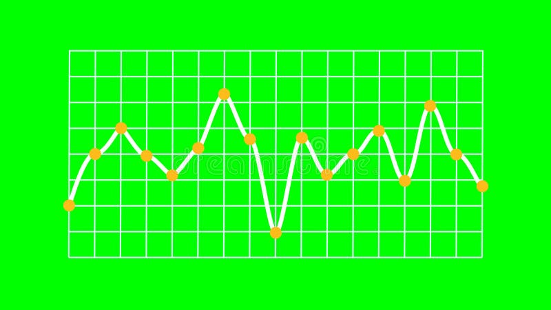
Free with trial Rendered line graph showing a single white line indicating data trends with distinct fluctuations. Yellow marker points animate vertically from the X-axis, and each plotted value features an orange circular dot. The white line runs over a structured white grid on a bright green screen background, enabling chroma keying. No axis values or units are present, emphasizing visual representation of abstract data and business trends. Decrease line graph illustrations Business Trend Line Graph Showing Trading on Green Screen. Rendered line graph showing a single white line indicating data trends with distinct fluctuations. Yellow marker points animate vertically from the X-axis, and each plotted value features an orange circular dot. The white line runs over a structured white grid on a bright green screen background, enabling chroma keying. No axis values or units are present, emphasizing visual representation of abstract data and business trends.
Free with trial This image displays a bar graph visualizing a clear downward trend. Nine vertical blue bars gradually decrease in height from left to right, signifying a consistent decline in values. A white arrowed line diagonally descends across the graph, reinforcing the negative trend. Blue horizontal and vertical grid lines aid in alignment. The background is green screen, allowing for chroma key use. This chart effectively communicates decline in areas like business, finance, or performance. Decrease line graph illustrations Downward Bar Graph Showing Financial Decline on Green Screen. This image displays a bar graph visualizing a clear downward trend. Nine vertical blue bars gradually decrease in height from left to right, signifying a consistent decline in values. A white arrowed line diagonally descends across the graph, reinforcing the negative trend. Blue horizontal and vertical grid lines aid in alignment. The background is green screen, allowing for chroma key use. This chart effectively communicates decline in areas like business, finance, or performance.
Free with trial Growth and reduction arrow, up and down, line icon set. Rise and fall, increase and decrease. Graphic signs. Vector flat illustration. Decrease line graph illustrations Growth and reduction arrow, up and down, line icon set. Rise and fall, increase and decrease. Graphic signs. Vector illustration
Free with trial A line graph showing a declining stock market trend over time, with a downward sloping orange line and multiple blue and. Decrease line graph illustrations Stock Market Decline Graph. A line graph showing a declining stock market trend over time, with a downward sloping orange line and multiple blue and.
Free with trial Ai-Generated. a collection of twentyone minimalistic graph chart icons these icons illustrate different types of data trends suitable for representing business information, statistical analysis, and financial reports each icon features a unique line graph, bar chart, or diagram style. Decrease line graph vectors Collection of minimalistic graph chart icons presenting different types of business data trends. Ai-Generated. a collection of twentyone minimalistic graph chart icons these icons illustrate different types of data trends suitable for representing business information, statistical analysis, and financial reports each icon features a unique line graph, bar chart, or diagram style
Free with trial A clean, minimalist illustration featuring a combined line graph and bar chart on a white background. The line graph, with circular data points, shows an upward trend with fluctuations. It is overlaid on a series of vertical bars, alternating in black and white, representing discrete data values. The grid lines behind the charts suggest a data analysis or financial context. This graphic is ideal for presentations, reports, and websites related to statistics, business growth, market trends, and data visualization. Decrease line graph vectors Line and Bar Chart Combination. A clean, minimalist illustration featuring a combined line graph and bar chart on a white background. The line graph, with circular data points, shows an upward trend with fluctuations. It is overlaid on a series of vertical bars, alternating in black and white, representing discrete data values. The grid lines behind the charts suggest a data analysis or financial context. This graphic is ideal for presentations, reports, and websites related to statistics, business growth, market trends, and data visualization.
Free with trial This minimalist vector illustration depicts a line chart indicating a negative performance or decline. The design features a clean blue line with circular data points connected by segments, ending in a sharp red arrow pointing downwards. The background is a soft, neutral shade, emphasizing the clear visual representation of financial loss or decreasing statistics. Decrease line graph vectors A simple line graph showing a downward trend with a red arrow. This minimalist vector illustration depicts a line chart indicating a negative performance or decline. The design features a clean blue line with circular data points connected by segments, ending in a sharp red arrow pointing downwards. The background is a soft, neutral shade, emphasizing the clear visual representation of financial loss or decreasing statistics
Free with trial Declining Line Graph icon vector. Suitable for mobile apps, web apps and print media. Decrease line graph vectors Rising Line Graph icon vector. Declining Line Graph icon vector. Suitable for mobile apps, web apps and print media.
Free with trial A stark black background with a white grid displays a sharp descending line graph, symbolizing a significant financial downturn. Decrease line graph illustrations Sharp downward trend on a dark financial graph indicating market decline and economic recession. A stark black background with a white grid displays a sharp descending line graph, symbolizing a significant financial downturn
Free with trial This minimalist graphic illustration features a bold red line chart indicating a significant decline. The visual composition uses a clean white background to emphasize the downward trajectory of the data points. The aesthetic is professional and modern, suitable for business presentations or financial reports. Decrease line graph vectors A red line graph showing a downward trend on a white background. This minimalist graphic illustration features a bold red line chart indicating a significant. This minimalist graphic illustration features a bold red line chart indicating a significant decline. The visual composition uses a clean white background to emphasize the downward trajectory of the data points. The aesthetic is professional and modern, suitable for business presentations or financial reports
Free with trial Illustration of global stock market data. The graphic includes a world map background bar charts and a line graph. Represents finance investment and trading, trends across international. Decrease line graph illustrations Illustration of global stock market data. The graphic includes a world map background bar charts and a line graph. Represents
Free with trial The image depicts a line graph with a downward trend. The red line starts at a higher point on the y-axis and gradually declines, indicating a decrease over time. The x-axis represents time or another independent variable, while the y-axis represents the dependent variable that is decreasing. Decrease line graph illustrations Graph showing downward trend. The image depicts a line graph with a downward trend. The red line starts at a higher point on the y-axis and gradually declines, indicating a decrease over time. The x-axis represents time or another independent variable, while the y-axis represents the dependent variable that is decreasing
Free with trial Simple line art business icons set featuring a magnifying glass, minus symbol, pie chart, and rising bar graph for financial data analysis. Decrease line graph vectors Simple line art business icons set featuring a magnifying glass, minus symbol, pie chart, and rising bar graph for
Free with trial A stark, neon yellow line graph depicts a sharp downward trend on a dark, grid-lined background, symbolizing economic recession. Decrease line graph illustrations Neon yellow downward trending graph illustrating financial decline against a dark grid background. A stark, neon yellow line graph depicts a sharp downward trend on a dark, grid-lined background, symbolizing economic recession
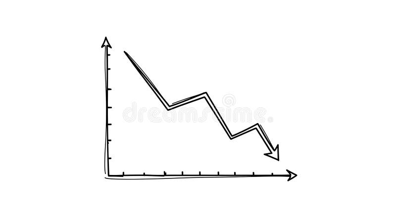
Free with trial A minimalist black line graph icon on a clean white background, clearly illustrating a downward trend. The zigzagging line culminates in a sharp arrow pointing downwards, symbolizing decline, decrease, or negative performance. This versatile vector illustration is ideal for representing financial losses, economic downturns, sales drops, market crashes, or any data indicating a negative trajectory. Perfect for business reports, presentations, websites, apps, and infographics requiring a clear visual indicator of reduction or poor results. Decrease line graph vectors Downward Trend Graph with Arrow Icon. A minimalist black line graph icon on a clean white background, clearly illustrating a downward trend. The zigzagging line culminates in a sharp arrow pointing downwards, symbolizing decline, decrease, or negative performance. This versatile vector illustration is ideal for representing financial losses, economic downturns, sales drops, market crashes, or any data indicating a negative trajectory. Perfect for business reports, presentations, websites, apps, and infographics requiring a clear visual indicator of reduction or poor results.