Free with trial Stock market decline is visualized through a magnifying glass focusing on a falling graph line representing financial loss and economic downturn. Decrease line graph illustrations Stock market decline shown through a magnifying glass with falling graph line. Stock market decline is visualized through a magnifying glass focusing on a falling graph line representing financial loss and economic downturn.
Free with trial Decrease vector icon on the white background. EPS 10. Decrease line graph vectors Decrease thin line vector icon set. Decrease vector icon on the white background. EPS 10
Free with trial US dollar tumbling down as symbol for inflation and devaluation. Digital financial visualization of red stock market graph line trending downward on a dark background. Economic falling and recession. Generative Ai. Decrease line graph illustrations US dollar tumbling down as symbol for inflation and devaluation. Digital financial visualization of red stock market graph line
Free with trial A digital graph displaying a red line trending downwards, indicating a decline, set against a blue grid background with bright highlights. Decrease line graph illustrations Graph showing a sharp decline in trend on a digital screen with grid background. A digital graph displaying a red line trending downwards, indicating a decline, set against a blue grid background with bright highlights
Free with trial This image is a line graph depicting the trend of data points. The graph has a clear peak in the middle, with data points tapering off towards both ends. The x-axis is labeled with numerical values from 0 to 9, and the y-axis is labeled with values ranging from 0 to 100. The title of the graph is 'Data Trend. Decrease line graph illustrations Graph showing the trend of data points with a peak in the middle and tapering ends. This image is a line graph depicting the trend of data points. The graph has a clear peak in the middle, with data points tapering off towards both ends. The x-axis is labeled with numerical values from 0 to 9, and the y-axis is labeled with values ranging from 0 to 100. The title of the graph is 'Data Trend
Free with trial This is an detailed collection of minimalist line icons representing various business graphs and data trends. Decrease line graph vectors Professional business graph and data visualization line icon set for reports. This is an detailed collection of minimalist line icons representing various business graphs and data trends
Free with trial Line art illustration of a bar chart depicting financial decrease for business analysis. Decrease line graph vectors Line art illustration of a bar chart depicting financial decrease for business analysis
Free with trial This image displays a graph illustrating trends and data progression over time with bars and a line chart. Decrease line graph illustrations Graph showing trends and data progression over time isolated on white background. This image displays a graph illustrating trends and data progression over time with bars and a line chart
Free with trial The image shows a wooden easel holding a whiteboard with a declining trend chart. The chart features a combination of red vertical bars and a downward-sloping red line, indicating a decrease in values over time. The easel stands on a light gray surface, and the chart appears to be used for visual presentations or data analysis. Decrease line graph illustrations Declining trend chart displayed on an easel with red bar and line graph elements. The image shows a wooden easel holding a whiteboard with a declining trend chart. The chart features a combination of red vertical bars and a downward-sloping red line, indicating a decrease in values over time. The easel stands on a light gray surface, and the chart appears to be used for visual presentations or data analysis
Free with trial The image depicts a bar chart with a superimposed red line showing a clear downward trend. Each bar represents a progressively smaller value, indicating a consistent decrease in data over time. The chart uses a gradient from taller to shorter bars, suggesting a significant drop in the measured quantity, which is reinforced by the downward-sloping line connecting the tops of the bars. Decrease line graph illustrations Declining bar chart graph illustrating a downward trend in data values over time. The image depicts a bar chart with a superimposed red line showing a clear downward trend. Each bar represents a progressively smaller value, indicating a consistent decrease in data over time. The chart uses a gradient from taller to shorter bars, suggesting a significant drop in the measured quantity, which is reinforced by the downward-sloping line connecting the tops of the bars
Free with trial Minimalist 3D concept of glowing red neon line graph plummeting downwards on dark background, financial crash and crisis. Decrease line graph illustrations Minimalist 3D concept of glowing red neon line graph plummeting downwards on dark background
Free with trial The image shows a 3D-rendered easel holding a canvas with a bar and line chart. The bar chart illustrates a declining trend in growth, with the first bar being the tallest and each subsequent bar progressively shorter. Overlaid on the bars is a red downward-sloping line, emphasizing the decrease. The scene is set against a plain white background, highlighting the chart's elements clearly. Decrease line graph illustrations Easing economic growth depicted through a declining bar and line chart on an easel. The image shows a 3D-rendered easel holding a canvas with a bar and line chart. The bar chart illustrates a declining trend in growth, with the first bar being the tallest and each subsequent bar progressively shorter. Overlaid on the bars is a red downward-sloping line, emphasizing the decrease. The scene is set against a plain white background, highlighting the chart's elements clearly
Free with trial The image depicts a combination of bar and line charts. The bar chart shows three descending bars in orange, yellow, and a lighter shade, indicating a decline in values. Overlaid on this is a downward-sloping line chart, reinforcing the trend of decrease. The overall design suggests a visual representation of a downward market trend or decline in performance metrics over time. Decrease line graph illustrations Graphic illustration of declining market trends with bar and line chart combination. The image depicts a combination of bar and line charts. The bar chart shows three descending bars in orange, yellow, and a lighter shade, indicating a decline in values. Overlaid on this is a downward-sloping line chart, reinforcing the trend of decrease. The overall design suggests a visual representation of a downward market trend or decline in performance metrics over time
Free with trial The image shows a line graph with yellow data points connected by lines, set against a blue grid background. The graph depicts various peaks and troughs, indicating fluctuations in the data over time. Decrease line graph illustrations A dynamic graph illustrating fluctuating data points on a blue grid background. The image shows a line graph with yellow data points connected by lines, set against a blue grid background. The graph depicts various peaks and troughs, indicating fluctuations in the data over time
Free with trial Line art bar graph icon set featuring upward and downward trend arrows for business analysis. Decrease line graph vectors Line art bar graph icon set featuring upward and downward trend arrows for business analysis
Free with trial This image is a line graph with a shaded area underneath the line. The x-axis is labeled 'Time' and the y-axis is labeled 'Value'. The data points show an overall upward trend with some fluctuations. The shaded area under the line is filled with a light purple color, and the line itself is a darker purple. Decrease line graph illustrations A graph displaying the upward trend of data points over a period of time with a shaded area. This image is a line graph with a shaded area underneath the line. The x-axis is labeled 'Time' and the y-axis is labeled 'Value'. The data points show an overall upward trend with some fluctuations. The shaded area under the line is filled with a light purple color, and the line itself is a darker purple
Free with trial A line graph with a blue arrow pointing downwards, indicating a decline in value over time. the graph has a white background and features a series of colored sections, gradating from blue to green to yellow. Decrease line graph illustrations A graph showing a downward trend over time with a blue arrow isolated on white background. a line graph with a blue arrow pointing downwards, indicating a decline in value over time. the graph has a white background and features a series of colored sections, gradating from blue to green to yellow
Free with trial A graph showing a downward trend with a red line that peaks at the beginning and gradually decreases with fluctuations, ending with a downward arrow. Decrease line graph illustrations Graph illustrating a downward trend with fluctuations and a decreasing pattern over time. A graph showing a downward trend with a red line that peaks at the beginning and gradually decreases with fluctuations, ending with a downward arrow
Free with trial Three-dimensional line graph with a metallic silver appearance, showing a decreasing trend in a zigzag pattern. The graph is set against a plain white background, with prominent vertical and horizontal axes, representing a financial or statistical decline. The lines are sleek and reflective, resembling metal tubing, enhancing the visual impact of a significant downturn. Decrease line graph vectors 3D line chart with decreasing trend and silver metallic effect representing financial losses. Three-dimensional line graph with a metallic silver appearance, showing a decreasing trend in a zigzag pattern. The graph is set against a plain white background, with prominent vertical and horizontal axes, representing a financial or statistical decline. The lines are sleek and reflective, resembling metal tubing, enhancing the visual impact of a significant downturn.
Free with trial Magnifying glass focuses on a blue bar graph with a visible downward trend line, set against a dark, blurred financial backdrop. Bars decrease in height from left to right, emphasizing a decline. The atmosphere is enhanced by subtle ambient reflections and lighting that highlight the graph's detail, symbolizing analysis of negative financial or economic trends. Decrease line graph illustrations Magnifying glass focused on a declining bar graph with a downward trend line on a dark background. Magnifying glass focuses on a blue bar graph with a visible downward trend line, set against a dark, blurred financial backdrop. Bars decrease in height from left to right, emphasizing a decline. The atmosphere is enhanced by subtle ambient reflections and lighting that highlight the graph's detail, symbolizing analysis of negative financial or economic trends.
Free with trial A 3D illustration depicts a bar graph with a downward red trend line, accompanied by icons for a calculator, gears, and pie chart, illustrating cost. Decrease line graph illustrations Bar Chart with Downward Trend Line and Icons Representing Cost Optimization and Expense Control. A 3D illustration depicts a bar graph with a downward red trend line, accompanied by icons for a calculator, gears, and pie chart, illustrating cost
Free with trial This image features a bar chart with orange bars representing performance metrics that steadily decrease over time, accompanied by a downward-sloping line graph that tracks the same trend against a blurred office background. Decrease line graph illustrations A bar chart showing a steady decline in performance metrics over a series of sequential periods. This image features a bar chart with orange bars representing performance metrics that steadily decrease over time, accompanied by a downward-sloping line graph that tracks the same trend against a blurred office background
Free with trial Computer monitor displaying a descending red line graph with an arrow indicating a downward trend. Decrease line graph vectors Computer monitor displaying a descending red line graph with an arrow indicating a downward trend
Free with trial Hand Drawn Bar Chart Line Graph with Downtrend Arrow Showcasing Loss and Negative Economic Growth. Decrease line graph vectors Hand Drawn Bar Chart Line Graph with Downtrend Arrow Showcasing Loss and Negative Economic Growth
Free with trial Dynamic stock market chart illuminates dark trading room reflects financial volatility. Red line graph shows fluctuations. Trader analyzes data on multiple screens. Global financial. Decrease line graph illustrations Dynamic stock market chart illuminates dark trading room, reflects financial volatility. Red line graph shows fluctuations. Dynamic stock market chart illuminates dark trading room reflects financial volatility. Red line graph shows fluctuations. Trader analyzes data on multiple screens. Global financial.
Free with trial A modern graphic illustration of cryptocurrency coins and market trends. this image shows a fluctuating line graph representing the ups and downs of digital currency trading and financial investment concepts. Decrease line graph vectors Modern graphic illustration of cryptocurrency coins with a fluctuating financial market line graph. a modern graphic illustration of cryptocurrency coins and market trends. this image shows a fluctuating line graph representing the ups and downs of digital currency trading and financial investment concepts
Free with trial A line graph displaying fluctuating values over a 28-day period with notable peaks at day 14 and day 21. Decrease line graph illustrations Graph showing fluctuating values over time with peaks at day 14 and day 21 isolated on white background. A line graph displaying fluctuating values over a 28-day period with notable peaks at day 14 and day 21
Free with trial A financial concept image featuring a tall stack of silver coins next to several gold bars, with a red jagged line graph overlaying the scene, clearly pointing downward to symbolize a market crash, economic decline, or a decrease in the value of precious metals. Decrease line graph illustrations A conceptual illustration showing gold bars and silver coins with a red line indicating a downturn. A financial concept image featuring a tall stack of silver coins next to several gold bars, with a red jagged line graph overlaying the scene, clearly pointing downward to symbolize a market crash, economic decline, or a decrease in the value of precious metals
Free with trial A 3D bar graph with a jagged trend line shows rising data followed by a sudden drop, set against a bright blue background. Decrease line graph illustrations A 3D bar graph with a jagged trend line shows rising data followed by a sudden drop, set against a bright blue background
Free with trial A red line graph depicting a downward trend in stock prices over time, with specific percentage decreases marked at various points. Decrease line graph illustrations Stock market graph showing significant decline over several months with percentage drops highlighted. A red line graph depicting a downward trend in stock prices over time, with specific percentage decreases marked at various points
Free with trial The image displays a line graph with a blue line that increases over time, with a shaded area underneath it, the graph has a white background with a light blue gradient and features various small icons related to business and finance such as bar graphs, pie charts, and dollar signs, the icons are light blue and scattered around the graph, the overall design is simple and clean, making it easy to. This image was generated using artificial intelligence. Decrease line graph illustrations A line graph showing revenue growth over time with various icons surrounding it to represent different aspects of business and. the image displays a line graph with a blue line that increases over time, with a shaded area underneath it, the graph has a white background with a light blue gradient and features various small icons related to business and finance such as bar graphs, pie charts, and dollar signs, the icons are light blue and scattered around the graph, the overall design is simple and clean, making it easy to. This image was generated using artificial intelligence.
Free with trial Graph depicting contrasting trends one line decreasing while the other increases in orange hues, Generated by AI. Decrease line graph illustrations Graph depicting contrasting trends one line decreasing while the other increases in orange hues
Free with trial A minimalist illustration showing a decreasing bar graph with an arrow, and a magnifying glass over a dollar sign. Flat style with grey and orange. Decrease line graph vectors Economic Downturn and Financial Analysis: Decrease Graph with Magnifying Glass Over Dollar Sign. A minimalist illustration showing a decreasing bar graph with an arrow, and a magnifying glass over a dollar sign. Flat style with grey and orange.
Free with trial A sharply declining red line graph against a dark grid evokes a sense of financial market downturn. Decrease line graph illustrations A sharply declining red line graph against a dark grid evokes a sense of financial market downturn
Free with trial Two contrasting graphs are displayed on a white background. The left graph a green upward trending arrow and dotted line representing profit. The. Decrease line graph illustrations Upward green arrow graph indicating profit growth next to downward red arrow graph showing financial loss on white. Two contrasting graphs are displayed on a white background. The left graph a green upward trending arrow and dotted line representing profit. The
Free with trial Two contrasting graphs are displayed on a white background. The left graph a green upward trending arrow and dotted line representing profit. The. Decrease line graph illustrations Upward green arrow graph indicating profit growth next to downward red arrow graph showing financial loss on white. Two contrasting graphs are displayed on a white background. The left graph a green upward trending arrow and dotted line representing profit. The
Free with trial A collection of silver bars arranged in perspective with a green line graph superimposed over them, suggesting a rising trend. The bars are reflective and metallic, representing financial concepts related to silver investments. The image conveys notions of value appreciation and economic analysis. Decrease line graph illustrations Silver bars with a green line graph. a rising trend in the price or value of silver. financial concepts design element. A collection of silver bars arranged in perspective with a green line graph superimposed over them, suggesting a rising trend. The bars are reflective and metallic, representing financial concepts related to silver investments. The image conveys notions of value appreciation and economic analysis.
Free with trial A visual representation of a stock market crash, showcasing a downward trend with a red line and bar graph, indicating financial loss and economic downturn. it is a risk analysis chart. Decrease line graph illustrations Stock market crash graph, financial analysis, investment risk, economic downturn, recession chart, loss trend. a visual representation of a stock market crash, showcasing a downward trend with a red line and bar graph, indicating financial loss and economic downturn. it is a risk analysis chart.
Free with trial Line drawing of a flipchart showing a decreasing graph, illustrating negative business results. Decrease line graph vectors Flipchart with decreasing graph presenting business results. Line drawing of a flipchart showing a decreasing graph, illustrating negative business results
Free with trial Vibrant data visualization featuring bar and line graphs, sun icon, and descending trend lines against a stark black background in a flat style. Decrease line graph vectors Colorful data visualization with bar graphs, line graph, sun icon, and descending trends on a black background. Vibrant data visualization featuring bar and line graphs, sun icon, and descending trend lines against a stark black background in a flat style.
Free with trial Decrease vector icon on the white background. EPS 10. Decrease line graph vectors Decrease thin line vector icon set. Decrease vector icon on the white background. EPS 10
Free with trial Decrease vector icon on the white background. EPS 10. Decrease line graph vectors Decrease thin line vector icon set. Decrease vector icon on the white background. EPS 10
Free with trial Decrease vector icon on the white background. EPS 10. Decrease line graph vectors Decrease thin line vector icon set. Decrease vector icon on the white background. EPS 10
Free with trial Decrease vector icon on the white background. EPS 10. Decrease line graph vectors Decrease thin line vector icon set. Decrease vector icon on the white background. EPS 10
Free with trial Decrease vector icon on the white background. EPS 10. Decrease line graph vectors Decrease thin line vector icon set. Decrease vector icon on the white background. EPS 10
Free with trial Decrease vector icon on the white background. EPS 10. Decrease line graph vectors Decrease thin line vector icon set. Decrease vector icon on the white background. EPS 10
Free with trial Decrease vector icon on the white background. EPS 10. Decrease line graph vectors Decrease thin line vector icon set. Decrease vector icon on the white background. EPS 10
Free with trial Decrease vector icon on the white background. EPS 10. Decrease line graph vectors Decrease thin line vector icon set. Decrease vector icon on the white background. EPS 10
Free with trial Smartphone is displaying a simple line graph that is decreasing, suggesting negative performance. Decrease line graph vectors Smartphone showing decreasing bar graph icon vector outline. Smartphone is displaying a simple line graph that is decreasing, suggesting negative performance
Free with trial Businessman throwing red line graph arrow to target on falling gold coins bar graph for investment rebalancing and gold market risk management crisis concept. Decrease line graph vectors Businessman throwing red line graph arrow to target on falling gold coins bar graph for investment rebalancing and gold market
Free with trial A document with bar and line graphs is being examined with a magnifying glass. This suggests a detailed analysis of data, trends, and insights. It is isolated on white background. Decrease line graph vectors Vector art of analyzing data with a magnifying glass on a report it shows bar graphs and a line graph indicating trends and. A document with bar and line graphs is being examined with a magnifying glass. This suggests a detailed analysis of data, trends, and insights. It is isolated on white background
Free with trial Decrease vector icon on the white background. EPS 10. Decrease line graph vectors Decrease thin line vector icon set. Decrease vector icon on the white background. EPS 10
Free with trial Businessman throwing red line graph arrow to target on falling gold bars bar graph for precious metal investment rebalancing and risk management during market crash. Decrease line graph vectors Businessman throwing red line graph arrow to target on falling gold bars bar graph for precious metal investment rebalancing and
Free with trial Businessman throwing red line graph arrow to target on falling banknotes bar graph for risk management investment rebalancing and financial loss prevention concept. Decrease line graph vectors Businessman throwing red line graph arrow to target on falling banknotes bar graph for risk management investment rebalancing and. Financial loss prevention
Free with trial Professional vector illustration of downward sloping bar graph and connected dots line represents decreasing profits market loss economic recession data analysis results reduction in growth levels and monthly revenue falling. Decrease line graph illustrations Descending bar chart icon with line graph showing negative business trends and financial decline on transparent background. Professional vector illustration of downward sloping bar graph and connected dots line represents decreasing profits market loss economic recession data analysis results reduction in growth levels and monthly revenue falling
Free with trial 3D rendering of a bar graph illustrating a downward trend with blue bars decreasing in height and a red line graph charting the decline set against a dark backdrop signifying business loss economic downturn and financial risk. Decrease line graph illustrations 3D Bar Chart Showing Downward Trend with Red Line Graph Illustrating Business Loss and Economic Decline on Dark Background. 3D rendering of a bar graph illustrating a downward trend with blue bars decreasing in height and a red line graph charting the decline set against a dark backdrop signifying business loss economic downturn and financial risk
Free with trial Line drawing of a flipchart showing a graph with a downward arrow representing economic downturn. Decrease line graph vectors Flipchart showing arrow graph going down representing financial crisis. Line drawing of a flipchart showing a graph with a downward arrow representing economic downturn
Free with trial This monochromatic bar graph illustrates data trends over time, showcasing variations in performance and metrics, ideal for presentations and business reports. Decrease line graph illustrations Black and White Bar Graph with Trend Line Showing Data Variations Over Time for Analysis and Reporting Purposes in Business. This monochromatic bar graph illustrates data trends over time, showcasing variations in performance and metrics, ideal for presentations and business reports
Free with trial Graphical depiction of declining gold prices Three labeled gold bars on line graph showing downturn trend Red arrow indicates decrease against grid patterned background, suggesting financial or economic analysis related to gold markets For Social Media Post Size. Decrease line graph illustrations Declining gold prices depicted with red arrow, gold bars, downturn trend. Graphical depiction of declining gold prices Three labeled gold bars on line graph showing downturn trend Red arrow indicates decrease against grid patterned background, suggesting financial or economic analysis related to gold markets For Social Media Post Size
Free with trial Graphical depiction of declining gold prices Three labeled gold bars on line graph showing downturn trend Red arrow indicates decrease against grid patterned background, suggesting financial or economic analysis related to gold markets. Decrease line graph illustrations Declining gold prices depicted with red arrow, gold bars, downturn trend. Graphical depiction of declining gold prices Three labeled gold bars on line graph showing downturn trend Red arrow indicates decrease against grid patterned background, suggesting financial or economic analysis related to gold markets
Free with trial Housing Market Crash Graph Piercing Through Homes Envision a sharp, downward graph line piercing through a row of homes, illustrating the brutal impact of a housing market crash. Decrease line graph illustrations Housing Market Crash Graph Piercing Through Homes Envision a sharp, downward graph line piercing through a row of homes
Free with trial Housing Market Crash Graph Piercing Through Homes Envision a sharp, downward graph line piercing through a row of homes, illustrating the brutal impact of a housing market crash. Decrease line graph illustrations Housing Market Crash Graph Piercing Through Homes Envision a sharp, downward graph line piercing through a row of homes
Free with trial Declining bar graph with trend line symbolizing financial loss or business decrease. Decrease line graph illustrations Declining Bar Chart with Downward Trend Line Illustration. Declining bar graph with trend line symbolizing financial loss or business decrease.
Free with trial 3D render icon Line graph tracking energy consumption with a playful narrative icon 3d analysis. Generative AI. Decrease line graph illustrations 3D render icon Line graph tracking energy consumption with a playful narrative icon 3d analysis
Free with trial 3D render icon Line graph tracking energy consumption with a playful narrative icon 3d analysis. Generative AI. Decrease line graph illustrations 3D render icon Line graph tracking energy consumption with a playful narrative icon 3d analysis
Free with trial 3D render icon Line graph tracking energy consumption with a playful narrative icon 3d analysis. Generative AI. Decrease line graph illustrations 3D render icon Line graph tracking energy consumption with a playful narrative icon 3d analysis
Free with trial 3D render icon Line graph tracking energy consumption with a playful narrative icon 3d analysis. Generative AI. Decrease line graph illustrations 3D render icon Line graph tracking energy consumption with a playful narrative icon 3d analysis
Free with trial 3D render icon Line graph tracking energy consumption with a playful narrative icon 3d analysis. Generative AI. Decrease line graph illustrations 3D render icon Line graph tracking energy consumption with a playful narrative icon 3d analysis
Free with trial This image shows a red line graph with a downward trend on a blue background. Vector illustration design using ai tool. Decrease line graph vectors Financial crisis graph. This image shows a red line graph with a downward trend on a blue background. Vector illustration design using ai tool.
Free with trial Downward trend line color icon. Statistical chart, metric analysis. Performance decrease, data visualization. Isolated vector illustration. Flat colorful symbol design. Editable stroke. Decrease line graph vectors Downward trend line color icon
Free with trial Trend stretching line chart illustration axis graph, scale plot, point x trend stretching line chart. Decrease line graph illustrations Trend stretching line chart
Free with trial A person is analyzing a bar graph with a downward trend line, indicating a decrease in stock value. Vector art design using ai tool. Decrease line graph vectors Sell Stock Graph Illustration. A person is analyzing a bar graph with a downward trend line, indicating a decrease in stock value. Vector art design using ai tool.
Free with trial This image shows a rolled-up graph with a red line depicting a downturn, generated by AI. It visually represents a negative trend or decline in data, potentially illustrating economic recession, market loss, or other negative statistical trends. The clean design allows for easy visualization of the. Decrease line graph illustrations Declining Graph Report. This image shows a rolled-up graph with a red line depicting a downturn, generated by AI. It visually represents a negative trend or decline in data, potentially illustrating economic recession, market loss, or other negative statistical trends. The clean design allows for easy visualization of the
Free with trial Set line Dollar rate decrease Glass money jar with coin Global economic crisis Broken piggy bank Calculation of expenses Hanging sign Sale and Drop crude oil price icon. Vector. Decrease line graph vectors Set line Dollar rate decrease, Glass money jar with coin, Global economic crisis, Broken piggy bank, Calculation of. Set line Dollar rate decrease Glass money jar with coin Global economic crisis Broken piggy bank Calculation of expenses Hanging sign Sale and Drop crude oil price icon. Vector.
Free with trial Square icon with rounded edges featuring a red downward-trending bar graph on a white background. The graph has five bars of varying heights, each decreasing from left to right, with a red arrow descending across the tops of the bars. The icon is set against a plain gray background, highlighting the contrast between the red graph and the white square. The design suggests a decrease or decline in data or statistics, commonly used in business or financial contexts. Decrease line graph illustrations Square icon with rounded edges featuring a red downward-trending bar graph on a
Free with trial The image shows a neon-style graph illustrating a business downturn. the graph features an orange line depicting a downward trend, punctuated by blue vertical lines that may represent key milestones or events. the background is dark, emphasizing the neon glow of the graph elements. the graph suggests a decline in business performance, with the orange line representing a decrease in value or profit over time. Decrease line graph illustrations Business downturn neon chart illustration. the image shows a neon-style graph illustrating a business downturn. the graph features an orange line depicting a downward trend, punctuated by blue vertical lines that may represent key milestones or events. the background is dark, emphasizing the neon glow of the graph elements. the graph suggests a decline in business performance, with the orange line representing a decrease in value or profit over time.
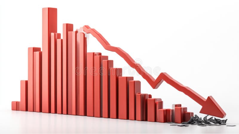
Free with trial A 3D rendering of a bar graph depicting a sharp decline in values. The red bars decrease in size, culminating in a large downward red arrow, symbolizing a significant economic downturn or market crash. The broken pieces at the bottom represent the loss or damage incurred. Decrease line graph illustrations Red Bar Graph Showing Decline. A 3D rendering of a bar graph depicting a sharp decline in values. The red bars decrease in size, culminating in a large downward red arrow, symbolizing a significant economic downturn or market crash. The broken pieces at the bottom represent the loss or damage incurred.
Free with trial A minimalist white 3D bar graph illustrates a significant downward trend. The bars decrease in height from left to right, connected by a dashed line that forms a descending path, culminating in an arrow pointing downwards. The graphic is rendered in an isometric perspective on a white background, representing decline, loss, or negative performance. Decrease line graph illustrations White 3D Bar Graph Showing a Downward Trend chart decline. A minimalist white 3D bar graph illustrates a significant downward trend. The bars decrease in height from left to right, connected by a dashed line that forms a descending path, culminating in an arrow pointing downwards. The graphic is rendered in an isometric perspective on a white background, representing decline, loss, or negative performance
Free with trial A simple and modern black silhouette icon of a business graph, isolated on a white background. This flat vector illustration combines a bar chart with an overlaid line graph, showing a fluctuating trend with a general decline. The graphic symbolizes concepts such as data analysis, financial reporting, market statistics, economic downturn, and business performance metrics. It's an ideal visual element for presentations, infographics, websites, and applications related to finance, economics, and analytics, representing concepts of decrease, loss, or market volatility. Decrease line graph vectors Business Data Analytics Chart Icon. A simple and modern black silhouette icon of a business graph, isolated on a white background. This flat vector illustration combines a bar chart with an overlaid line graph, showing a fluctuating trend with a general decline. The graphic symbolizes concepts such as data analysis, financial reporting, market statistics, economic downturn, and business performance metrics. It's an ideal visual element for presentations, infographics, websites, and applications related to finance, economics, and analytics, representing concepts of decrease, loss, or market volatility.