Free with trial Hand Drawn Downward Trend Arrow On white Background. Decrease line graph illustrations Hand-drawn black zigzag line ending with a downward arrow On white Background, symbolizing decline or negative trend. Hand Drawn Downward Trend Arrow On white. Hand Drawn Downward Trend Arrow On white Background
Free with trial An isometric bar chart displays a series of rectangular bars arranged in a descending line. The bars transition in color from blue at the tallest end to orange at the shortest end, set against a light, neutral background. Decrease line graph illustrations Isometric Bar Chart with Decreasing Bars in Gradient Colors graph data. An isometric bar chart displays a series of rectangular bars arranged in a descending line. The bars transition in color from blue at the tallest end to orange at the shortest end, set against a light, neutral background
Free with trial Set of twelve linear icons representing various business and financial concepts. These include documents, briefcase, graphs, charts, and more. Ideal for presentations, websites, or app design. Decrease line graph vectors Collection of Business and Finance Line Icons. Set of twelve linear icons representing various business and financial concepts. These include documents, briefcase, graphs, charts, and more. Ideal for presentations, websites, or app design.
Free with trial A collage of various hand-drawn charts and graphs in shades of blue, illustrating business growth, data analysis, and financial trends. The collection includes bar charts, line graphs, and pie charts, all rendered with a sketchy, artistic style. These visuals are perfect for presentations, reports, or any project requiring a dynamic and informative representation of data and progress. Decrease line graph illustrations Hand-Drawn Business Growth Charts and Graphs Collection. A collage of various hand-drawn charts and graphs in shades of blue, illustrating business growth, data analysis, and financial trends. The collection includes bar charts, line graphs, and pie charts, all rendered with a sketchy, artistic style. These visuals are perfect for presentations, reports, or any project requiring a dynamic and informative representation of data and progress.
Free with trial A set of twelve black icons representing business and data analysis concepts, presented on a white background. The icons include various types of charts and graphs such as bar charts, a pie chart, and line graphs showing trends and fluctuations. There are also icons for data visualization, progress indicators, and reports. The collection is organized in a 3x4 grid. Decrease line graph vectors Business and data analytics icons bar chart pie chart AI-Generated. A set of twelve black icons representing business and data analysis concepts, presented on a white background. The icons include various types of charts and graphs such as bar charts, a pie chart, and line graphs showing trends and fluctuations. There are also icons for data visualization, progress indicators, and reports. The collection is organized in a 3x4 grid
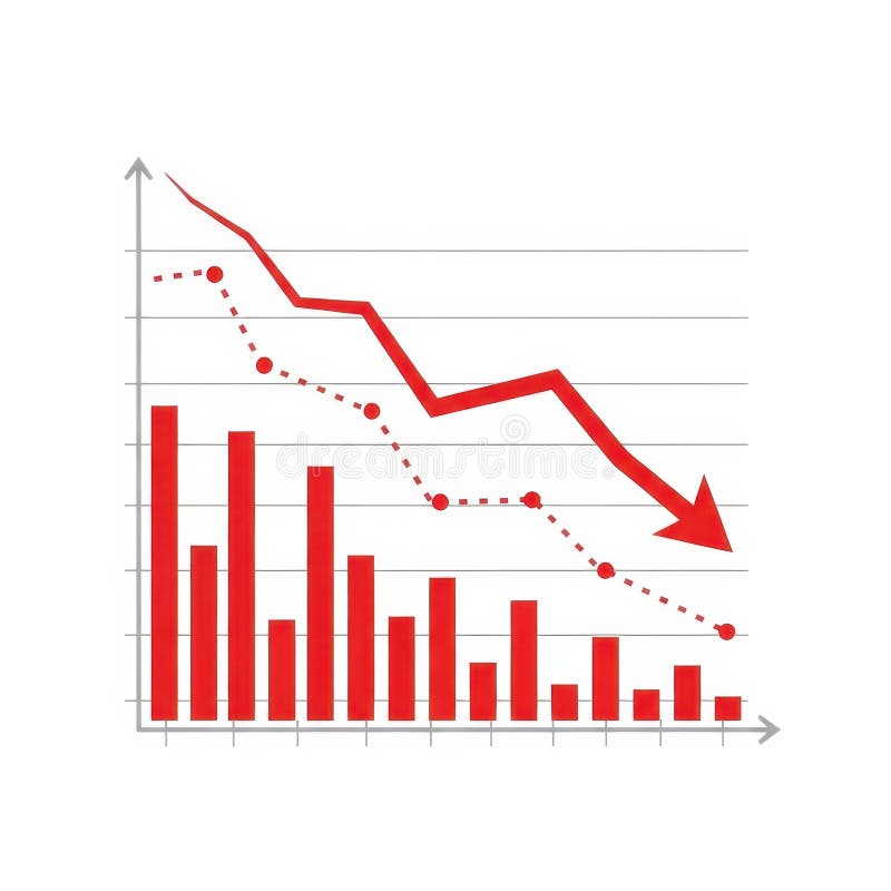
Free with trial A visual representation of negative financial performance, illustrating a significant downward trend with a red arrow pointing downwards, indicating a loss or decline in value. Decrease line graph illustrations Red graph showing a downward trend isolated on white background. A visual representation of negative financial performance, illustrating a significant downward trend with a red arrow pointing downwards, indicating a loss or decline in value
Free with trial Illustrated business chart displays a drop in finances, demonstrated through declining bar graphs and a downward trending line. Geometric shapes and a dollar sign add visual interest to the illustration. Decrease line graph illustrations Financial Decline Shown by Business Chart with Graphic Elements. Illustrated business chart displays a drop in finances, demonstrated through declining bar graphs and a downward trending line. Geometric shapes and a dollar sign add visual interest to the illustration.
Free with trial Conceptual image depicting real estate market analysis. A magnifying glass focuses on a brightly lit house model, surrounded by other house models and a rising graph, all set on a reflective surface. The scene suggests research, investment, and growth in the housing market. Ideal for illustrating articles or presentations on real estate trends, property valuation, and housing market forecasts. Decrease line graph illustrations Real Estate Market Analysis
Free with trial A high-quality conceptual image featuring a row of smooth wooden cubes spelling the word "PESSIMISM" on a wooden surface. The arrangement includes a stacked block showing a sad face emoticon and a downward-sloping line graph, symbolizing financial loss, recession, negative market sentiment, and psychological discouragement in a professional or personal context. Decrease line graph illustrations Wooden Blocks Spelling Pessimism with Sad Face Icon and Downward Trend Graph. A high-quality conceptual image featuring a row of smooth wooden cubes spelling the word "PESSIMISM" on a wooden surface. The arrangement includes a stacked block showing a sad face emoticon and a downward-sloping line graph, symbolizing financial loss, recession, negative market sentiment, and psychological discouragement in a professional or personal context.
Free with trial The image displays a financial trend chart superimposed on a modern office setting. the chart depicts a declining trend, indicated by a downward-sloping line with an arrow pointing downwards. the background features a blurred office environment with windows, a plant, and furniture, creating a sense of realism and context for the financial data. the overall composition suggests a reflection or projection of financial performance within a contemporary workspace. Decrease line graph illustrations Financial decline chart in modern office space. the image displays a financial trend chart superimposed on a modern office setting. the chart depicts a declining trend, indicated by a downward-sloping line with an arrow pointing downwards. the background features a blurred office environment with windows, a plant, and furniture, creating a sense of realism and context for the financial data. the overall composition suggests a reflection or projection of financial performance within a contemporary workspace.
Free with trial The image displays a stylized representation of a stock market crash and subsequent recovery. a red neon line charts a sharp decline, culminating in a point of impact with sparks. the line then reflects upwards, indicating a rebound. the background is a dark, reflective surface, enhancing the neon glow. the right side of the image shows a blurred, bright room with window panes. the overall effect is a visual metaphor for financial volatility. Decrease line graph illustrations Red neon stock market crash and recovery chart. the image displays a stylized representation of a stock market crash and subsequent recovery. a red neon line charts a sharp decline, culminating in a point of impact with sparks. the line then reflects upwards, indicating a rebound. the background is a dark, reflective surface, enhancing the neon glow. the right side of the image shows a blurred, bright room with window panes. the overall effect is a visual metaphor for financial volatility.
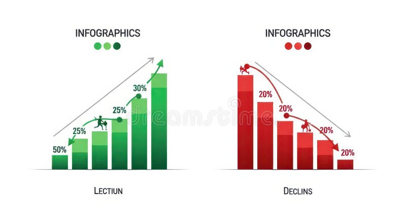
Free with trial The image displays two infographics side by side. the left infographic, titled "lection," depicts a green bar graph showing growth, starting at 50% and increasing to 30% with a figure climbing the bars. an upward-pointing arrow indicates positive growth. the right infographic, titled "declins," shows a red bar graph illustrating decline, starting at 20% and decreasing to 20% with a figure falling down the bars. a downward-pointing arrow indicates negative growth. Decrease line graph illustrations Infographics showing growth and decline charts. the image displays two infographics side by side. the left infographic, titled "lection," depicts a green bar graph showing growth, starting at 50% and increasing to 30% with a figure climbing the bars. an upward-pointing arrow indicates positive growth. the right infographic, titled "declins," shows a red bar graph illustrating decline, starting at 20% and decreasing to 20% with a figure falling down the bars. a downward-pointing arrow indicates negative growth.
Free with trial This graphic depicts a bar chart with a downward trending line, observed closely with a magnifying glass, symbolizing scrutiny, analysis, and potential performance decline or investigation of data. Decrease line graph vectors Declining Chart with Magnifying Glass: Analysis and Performance Review. This graphic depicts a bar chart with a downward trending line, observed closely with a magnifying glass, symbolizing scrutiny, analysis, and potential performance decline or investigation of data.
Free with trial A digital financial chart shows upward market trends. The red line and green bars rise against a grid. A gold data network overlay adds depth to the business graphic. Decrease line graph illustrations Growing Financial Chart Shows Market Growth With Data Grid Background. A digital financial chart shows upward market trends. The red line and green bars rise against a grid. A gold data network overlay adds depth to the business graphic.
Free with trial This image showcases vibrant 3D bar and line charts, generated by AI, offering a dynamic visual representation of business data. The colorful design effectively communicates trends and comparisons across multiple data sets, providing a clear and engaging overview of key performance indicators. Decrease line graph illustrations AI-Generated 3D Business Charts. This image showcases vibrant 3D bar and line charts, generated by AI, offering a dynamic visual representation of business data. The colorful design effectively communicates trends and comparisons across multiple data sets, providing a clear and engaging overview of key performance indicators.
Free with trial A vibrant collection of hand-drawn business charts and graphs, rendered in blue tones. The set includes various types of visualizations like bar charts, line graphs, and a pie chart, all with a sketchy, illustrative style. These visuals are ideal for presentations, reports, and infographics related to finance, data analysis, growth, and business performance. Decrease line graph illustrations Hand-Drawn Business Charts and Graphs Collection. A vibrant collection of hand-drawn business charts and graphs, rendered in blue tones. The set includes various types of visualizations like bar charts, line graphs, and a pie chart, all with a sketchy, illustrative style. These visuals are ideal for presentations, reports, and infographics related to finance, data analysis, growth, and business performance.
Free with trial Candlestick charts with red and green bars display a stock market or forex trading pattern. Each candlestick represents data for a specific time period, showing opening, closing, high, and low values. Red indicates a price decrease, while green signifies an increase. The chart analyzes investment trends and is used for financial decisions in business and trading. The background is dark blue, enhancing the visibility of the vibrant candlestick colors. Decrease line graph illustrations Stock market chart forex trading candlestick pattern investment finance business graph analysis data trend. Candlestick charts with red and green bars display a stock market or forex trading pattern. Each candlestick represents data for a specific time period, showing opening, closing, high, and low values. Red indicates a price decrease, while green signifies an increase. The chart analyzes investment trends and is used for financial decisions in business and trading. The background is dark blue, enhancing the visibility of the vibrant candlestick colors.
Free with trial Red falling arrow and declining chart with stock market data overlay on office interior background, symbolizing global financial collapse impact. Decrease line graph illustrations Financial market crash with red downward arrow and stock graph lines descending sharply over modern office background during. Red falling arrow and declining chart with stock market data overlay on office interior background, symbolizing global financial collapse impact
Free with trial Digital illustration depicting a financial decline with red downward-trending graphs, coin stacks, and scattered currency symbols. Set against a dark grid background with neon highlights, this image conveys themes of market loss, economic recession, and financial analysis�ideal for business, editorial, and presentation use. Decrease line graph illustrations Economic Downturn Illustration Red Decline Graph with Coin Stacks on Digital Grid. Digital illustration depicting a financial decline with red downward-trending graphs, coin stacks, and scattered currency symbols. Set against a dark grid background with neon highlights, this image conveys themes of market loss, economic recession, and financial analysis�ideal for business, editorial, and presentation use.
Free with trial A modern workspace features a desktop computer displaying hand-drawn charts and graphs, representing data analysis and business insights. The screen shows various types of charts including bar graphs, line graphs, and pie charts. The overall image projects a sense of productivity and strategic pla. Decrease line graph illustrations Data Visualization on Desktop. A modern workspace features a desktop computer displaying hand-drawn charts and graphs, representing data analysis and business insights. The screen shows various types of charts including bar graphs, line graphs, and pie charts. The overall image projects a sense of productivity and strategic pla
Free with trial 3D illustration of a red bar chart with a downward arrow, isolated on a transparent background. Symbolizes financial loss, economic crisis, revenue drop, or business decline. Ideal for presentations, finance reports, investment warnings, stock market analysis, and economic downturn visuals. Decrease line graph illustrations 3D Red Downward Arrow Graph Icon Showing Financial Decline on Transparent Background. 3D illustration of a red bar chart with a downward arrow, isolated on a transparent background. Symbolizes financial loss, economic crisis, revenue drop, or business decline. Ideal for presentations, finance reports, investment warnings, stock market analysis, and economic downturn visuals.
Free with trial Close-up of a financial chart showing a red line declining. The chart is on a piece of white paper and the red line is the main focus. Decrease line graph illustrations Financial Chart Showing Decline. Close-up of a financial chart showing a red line declining. The chart is on a piece of white paper and the red line is the main focus
Free with trial A conceptual vector illustration depicting the duality of business performance. On a modern teal background, two reports are shown side-by-side. One features a rising red graph symbolizing growth, profit, and success, while the other displays a descending graph representing decline, loss, and failure. This flat design graphic is ideal for financial analysis, market trend comparisons, business presentations, and infographics illustrating opposite outcomes or strategic choices. The long shadow effect adds a contemporary feel to the design. Decrease line graph vectors Growth and Decline Business Charts Comparison. A conceptual vector illustration depicting the duality of business performance. On a modern teal background, two reports are shown side-by-side. One features a rising red graph symbolizing growth, profit, and success, while the other displays a descending graph representing decline, loss, and failure. This flat design graphic is ideal for financial analysis, market trend comparisons, business presentations, and infographics illustrating opposite outcomes or strategic choices. The long shadow effect adds a contemporary feel to the design.
Free with trial An optical illusion featuring a geometric, 3D tunneling effect created with a red and white checkered pattern. The squares decrease in size toward the center, enhancing the illusion of depth and perspective. The design is framed by thin red lines, emphasizing the rectangular shape. Clean lines and contrasting colors contribute to the visual impact of the artwork. Decrease line graph vectors Vector art of data analysis and business analytics concept, business people analyzing financial graph and chart. An optical illusion featuring a geometric, 3D tunneling effect created with a red and white checkered pattern. The squares decrease in size toward the center, enhancing the illusion of depth and perspective. The design is framed by thin red lines, emphasizing the rectangular shape. Clean lines and contrasting colors contribute to the visual impact of the artwork.
Free with trial This image depicts a computer screen displaying a sharply declining stock market graph, generated by AI. The red line dramatically illustrates a significant market downturn, accompanied by numerous data points and financial indicators. The dark aesthetic enhances the sense of urgency and potential. Decrease line graph illustrations AI-Generated Stock Market Decline. This image depicts a computer screen displaying a sharply declining stock market graph, generated by AI. The red line dramatically illustrates a significant market downturn, accompanied by numerous data points and financial indicators. The dark aesthetic enhances the sense of urgency and potential
Free with trial This 3D rendered image shows a computer screen displaying various charts and graphs, including bar charts, pie charts, and line graphs. The data visualization is colorful and easy to understand, generated by AI for quick data interpretation. The design is simple and modern, ideal for presentations. Decrease line graph illustrations AI-Generated Data Dashboard. This 3D rendered image shows a computer screen displaying various charts and graphs, including bar charts, pie charts, and line graphs. The data visualization is colorful and easy to understand, generated by AI for quick data interpretation. The design is simple and modern, ideal for presentations
Free with trial Red line graph shows a sharp stock market decline. Economic downturn visualized. Decrease line graph illustrations Stock Market Decline: A Visual Representation of Economic Downturn. Red line graph shows a sharp stock market decline. Economic downturn visualized
Free with trial Percent arrows up and down icon set. Income and cost increase and decrease arrow icons. Decrease line graph vectors Percent arrows up and down icon set
Free with trial A bold, black arrow pointing diagonally downwards against a clean white background. The arrow is stylized with broken lines suggesting rapid decline or disruption. This versatile graphic can represent economic downturn, market crash, failure, decrease, or negative trends. It's suitable for business presentations, financial reports, and website design. Decrease line graph illustrations Downward Trend Arrow Icon. A bold, black arrow pointing diagonally downwards against a clean white background. The arrow is stylized with broken lines suggesting rapid decline or disruption. This versatile graphic can represent economic downturn, market crash, failure, decrease, or negative trends. It's suitable for business presentations, financial reports, and website design.
Free with trial A world map with a grid overlay, featuring two trend lines in blue and orange. The blue line starts high on the left sid. Decrease line graph illustrations Global Trend Analysis Map. A world map with a grid overlay, featuring two trend lines in blue and orange. The blue line starts high on the left sid.
Free with trial A set of black icons representing percentage changes, including arrows and circular symbols. The icons depict various concepts such as decrease, increase, and rotation, all incorporating percentage signs. The simple design makes them versatile for use in financial, statistical, or educational materials. Decrease line graph illustrations Black percentage icons set. A set of black icons representing percentage changes, including arrows and circular symbols. The icons depict various concepts such as decrease, increase, and rotation, all incorporating percentage signs. The simple design makes them versatile for use in financial, statistical, or educational materials.
Free with trial A dynamic display of market trends with charts and graphs in a cool blue color scheme. Decrease line graph illustrations Financial market analysis with data charts and line graphs in blue tone. a dynamic display of market trends with charts and graphs in a cool blue color scheme
Free with trial An upward trending bar graph displayed on a laptop screen, illuminated against a backdrop of blurred city lights at night. Shows financial success and progress. Decrease line graph illustrations Financial Growth Chart on Laptop Screen at Night. An upward trending bar graph displayed on a laptop screen, illuminated against a backdrop of blurred city lights at night. Shows financial success and progress.
Free with trial A graph showing a downward trend on a grid background. 3D Rendering. Decrease line graph illustrations Declining stock market trend illustration. 3D Rendering. A graph showing a downward trend on a grid background. 3D Rendering
Free with trial A modern, clean isometric illustration showcasing various data visualizations. Multiple charts and graphs, including bar charts, line graphs, and pie charts, are displayed on floating screens, representing data analysis, business intelligence, or financial reporting. Ideal for presentations, reports, or website banners related to data-driven concepts. Decrease line graph illustrations Isometric 3D Data Visualization: Charts and Graphs on Floating Screens. A modern, clean isometric illustration showcasing various data visualizations. Multiple charts and graphs, including bar charts, line graphs, and pie charts, are displayed on floating screens, representing data analysis, business intelligence, or financial reporting. Ideal for presentations, reports, or website banners related to data-driven concepts.
Free with trial A simple line drawing of a hand with a percentage sign hovering above it. Decrease line graph vectors A hand holding a percentage sign. A simple line drawing of a hand with a percentage sign hovering above it
Free with trial This graphic illustration depicts the concepts of stress, calmness, energy level, and mental load. The image features four distinct sections, each representing one of these aspects. The stress section is represented by a gauge with a needle pointing to a high level, indicating a sense of anxiety or overwhelm. The calmness section features a wavy line, symbolizing a peaceful and serene state. The energy level section is illustrated with a bar graph, showing a decrease in energy. The mental load section is represented by a gauge with a needle pointing to a high level, indicating a heavy mental burden. This illustration can be used to represent the importance of maintaining a balance between stress and calmness, and the impact it has on our mental health and well-being. Decrease line graph vectors Mental health A graphic illustration of stress, calmness, energy level, and mental load. This graphic illustration depicts the concepts of stress, calmness, energy level, and mental load. The image features four distinct sections, each representing one of these aspects. The stress section is represented by a gauge with a needle pointing to a high level, indicating a sense of anxiety or overwhelm. The calmness section features a wavy line, symbolizing a peaceful and serene state. The energy level section is illustrated with a bar graph, showing a decrease in energy. The mental load section is represented by a gauge with a needle pointing to a high level, indicating a heavy mental burden. This illustration can be used to represent the importance of maintaining a balance between stress and calmness, and the impact it has on our mental health and well-being.
Free with trial A bold red arrow, depicted as a sharp, angular zigzag line pointing downwards and to the right, symbolizing a negative trend or decline, isolated against a stark white backdrop for clear visual emphas. Decrease line graph illustrations Red downward trending arrow isolated on white background. A bold red arrow, depicted as a sharp, angular zigzag line pointing downwards and to the right, symbolizing a negative trend or decline, isolated against a stark white backdrop for clear visual emphas
Free with trial World map with a prominent red downward trend line indicating a global recession or financial market crash. Red arrows pointing downwards are superimposed over different continents, emphasizing a global economic downturn. The map is illuminated in shades of blue and purple against a dark background, enhancing the visual impact of the red elements. The composition suggests widespread economic decline across various regions. Decrease line graph illustrations Global recession and financial market crash shown by a declining red graph and arrows over a world map. World map with a prominent red downward trend line indicating a global recession or financial market crash. Red arrows pointing downwards are superimposed over different continents, emphasizing a global economic downturn. The map is illuminated in shades of blue and purple against a dark background, enhancing the visual impact of the red elements. The composition suggests widespread economic decline across various regions.
Free with trial A simple yet effective graphic representing a negative trend or declining business chart, perfect for illustrating downward data or economic downturn. Decrease line graph vectors Negative Trend Graph, Decreasing Business Chart, Downward Data Illustration. A simple yet effective graphic representing a negative trend or declining business chart, perfect for illustrating downward data or economic downturn.
Free with trial A seamless pattern featuring various business and finance-related doodles, including graphs, charts, currencies, and other financial symbols. The doodles are drawn in a simple line style on a white background. This image can be used as a background or texture for presentations, reports, or websites related to business, finance, and economics. Decrease line graph vectors Business finance doodle pattern. A seamless pattern featuring various business and finance-related doodles, including graphs, charts, currencies, and other financial symbols. The doodles are drawn in a simple line style on a white background. This image can be used as a background or texture for presentations, reports, or websites related to business, finance, and economics.
Free with trial A simple flat icon vector illustration of two hands adjusting a simple chart with a downturn arrow, symbolizing risk mitigation in a business setting. The simple chart with a downturn arrow is orange with dark gray elements, indicating loss control. White background. Minimalist style with sharp edges and no shadows. Orange and Gray color palette. Vector graphics with rounded corners. High. Decrease line graph illustrations Business Downturn Graph Two Hands Hold Downward Trend Chart. A simple flat icon vector illustration of two hands adjusting a simple chart with a downturn arrow, symbolizing risk mitigation in a business setting. The simple chart with a downturn arrow is orange with dark gray elements, indicating loss control. White background. Minimalist style with sharp edges and no shadows. Orange and Gray color palette. Vector graphics with rounded corners. High
Free with trial A grid of black and white icons depicting financial charts with rising and falling trends, magnifying glasses with download arrows, and dollar signs. Decrease line graph vectors Collection of black and white icons representing financial charts and data analysis graph bar chart. A grid of black and white icons depicting financial charts with rising and falling trends, magnifying glasses with download arrows, and dollar signs
Free with trial A comprehensive overview of financial data is presented through various charts and graphs. The scene includes line graphs, bar charts, pie charts, and donut charts, accompanied by stacks of coins. The color palette is muted, featuring shades of beige, brown, and gray, creating a professional and clean aesthetic. This image is suitable for illustrating finance, business, investment, and data analysis concepts. Decrease line graph illustrations Financial Data and Charts Overview. A comprehensive overview of financial data is presented through various charts and graphs. The scene includes line graphs, bar charts, pie charts, and donut charts, accompanied by stacks of coins. The color palette is muted, featuring shades of beige, brown, and gray, creating a professional and clean aesthetic. This image is suitable for illustrating finance, business, investment, and data analysis concepts.
Free with trial A vivid red zigzag arrow is depicted, pointing downwards, symbolizing a decline or decrease. Decrease line graph illustrations Red zigzag arrow pointing downwards. A vivid red zigzag arrow is depicted, pointing downwards, symbolizing a decline or decrease
Free with trial A graph showing global sales growth trends on a printed document with multiple colored lines. Decrease line graph illustrations Global Sales Growth Chart on Document. A graph showing global sales growth trends on a printed document with multiple colored lines
Free with trial A flat design illustration of a bar chart showing a declining trend, with a red arrow pointing downwards, symbolizing a decrease in performance or value. Decrease line graph illustrations Bar chart with a downward trend isolated on white background. A flat design illustration of a bar chart showing a declining trend, with a red arrow pointing downwards, symbolizing a decrease in performance or value
Free with trial A red line on a chart with a downward trend, indicating a decline or loss in the stock market. Generative AI. Decrease line graph illustrations Red Downward Trend. A red line on a chart with a downward trend, indicating a decline or loss in the stock market. Generative AI
Free with trial A black and white image of a downward trend, represented by a jagged line with an arrow pointing to the right, set against a white background. Decrease line graph vectors A black and white image of a downward trend
Free with trial Red arrow pointing down, falling concept of loss market crash, falling red arrow indicating a decrease in value, big red arrow going down, business loss financial decline economic fall recession. Decrease line graph vectors Red arrow pointing down, falling concept of loss market crash. Red arrow pointing down, falling concept of loss market crash, falling red arrow indicating a decrease in value, big red arrow going down, business loss financial decline economic fall recession.
Free with trial Red piggy bank with cracks spilling coins onto a surface. A large downward-pointing red arrow and a declining bar graph in the background suggest a decrease in value or a financial downturn. Coins, including ones with cryptocurrency symbols, fall from the piggy bank, symbolizing financial loss. The scene conveys economic themes such as recession or investment loss, against a stark, contrasting backdrop. Decrease line graph illustrations Red line down, falling price and piggy bank. Red piggy bank with cracks spilling coins onto a surface. A large downward-pointing red arrow and a declining bar graph in the background suggest a decrease in value or a financial downturn. Coins, including ones with cryptocurrency symbols, fall from the piggy bank, symbolizing financial loss. The scene conveys economic themes such as recession or investment loss, against a stark, contrasting backdrop.
Free with trial Graph depicting a sharp decline in factory production, illustrating the impact of an economic downturn. The chart showcases falling production levels, symbolizing a struggling manufacturing industry and potential recessionary consequences for businesses and workers globally. Ideal for illustrating economic news, financial reports, or investment risk, generated by AI. Decrease line graph illustrations Factory production decline economic downturn. Graph depicting a sharp decline in factory production, illustrating the impact of an economic downturn. The chart showcases falling production levels, symbolizing a struggling manufacturing industry and potential recessionary consequences for businesses and workers globally. Ideal for illustrating economic news, financial reports, or investment risk, generated by AI.
Free with trial A comprehensive set of line icons illustrating investment attraction and market notifications. Icons feature money magnets, growth sprouts, piggy banks with brain symbols, and various notification bells for price alerts. Ideal for stock trading applications, investment advice blogs, and financial education materials that focus on wealth accumulation, strategy building, and staying. Decrease line graph vectors Financial Attraction and Market Alert Icon Set. A comprehensive set of line icons illustrating investment attraction and market notifications. Icons feature money magnets, growth sprouts, piggy banks with brain symbols, and various notification bells for price alerts. Ideal for stock trading applications, investment advice blogs, and financial education materials that focus on wealth accumulation, strategy building, and staying
Free with trial A minimalist and modern abstract background featuring a single, smooth orange wave flowing across a warm gradient. The background transitions seamlessly from a soft coral or reddish-orange at the top to a gentle peach tone at the bottom. This clean and elegant design evokes a sense of movement, rhythm, and gentle energy. It's a versatile graphic perfect for website headers, presentation slides, corporate branding, digital art, banners, and other creative projects that require a simple yet sophisticated and warm aesthetic with ample copy space. Decrease line graph illustrations Abstract Wavy Line on Warm Gradient Background. A minimalist and modern abstract background featuring a single, smooth orange wave flowing across a warm gradient. The background transitions seamlessly from a soft coral or reddish-orange at the top to a gentle peach tone at the bottom. This clean and elegant design evokes a sense of movement, rhythm, and gentle energy. It's a versatile graphic perfect for website headers, presentation slides, corporate branding, digital art, banners, and other creative projects that require a simple yet sophisticated and warm aesthetic with ample copy space.
Free with trial A conceptual illustration depicting a line graph, structured like a broken bridge, dramatically falling and sinking into the water. This powerful visual metaphor represents a severe economic downturn, financial crisis, stock market crash, or business failure. The collapsing structure plunging into the sea symbolizes recession, bankruptcy, overwhelming debt, and hitting rock bottom. The minimalist vector art style makes it a versatile image for presentations and articles on finance, risk, and economic collapse. Decrease line graph vectors Economic Downturn and Financial Crisis Concept. A conceptual illustration depicting a line graph, structured like a broken bridge, dramatically falling and sinking into the water. This powerful visual metaphor represents a severe economic downturn, financial crisis, stock market crash, or business failure. The collapsing structure plunging into the sea symbolizes recession, bankruptcy, overwhelming debt, and hitting rock bottom. The minimalist vector art style makes it a versatile image for presentations and articles on finance, risk, and economic collapse.
Free with trial Collection of eight minimalist line icons representing various types of data visualization, including bar charts, line graphs, pie charts, and progress indicators. Ideal for websites, apps, or presentations needing a clean and modern aesthetic. Decrease line graph illustrations Data Visualization Icons. Collection of eight minimalist line icons representing various types of data visualization, including bar charts, line graphs, pie charts, and progress indicators. Ideal for websites, apps, or presentations needing a clean and modern aesthetic.
Free with trial This image showcases twelve diverse data visualization icons, including bar charts, pie charts, line graphs, and other visual representations of data. These icons are ideal for presentations, reports, or digital interfaces needing a modern and aesthetically pleasing design. The color palette is co. Decrease line graph illustrations Data Visualization Icons
Free with trial This image contains a collection of 16 line icons representing various data visualization and time-related concepts. The icons are circular and use a consistent color scheme, making them suitable for use in presentations, reports, or websites. The style is clean and modern. Decrease line graph illustrations Data Visualization Icons. This image contains a collection of 16 line icons representing various data visualization and time-related concepts. The icons are circular and use a consistent color scheme, making them suitable for use in presentations, reports, or websites. The style is clean and modern.
Free with trial A colorful chart illustrating energy consumption trends during the spring months of March, April, and May. The chart features a decreasing line graph with floral accents, representing a decline in energy use. Ideal for illustrating sustainability, environmental reports, or seasonal trends. Decrease line graph illustrations Energy Consumption Chart Spring Months Flowers. A colorful chart illustrating energy consumption trends during the spring months of March, April, and May. The chart features a decreasing line graph with floral accents, representing a decline in energy use. Ideal for illustrating sustainability, environmental reports, or seasonal trends
Free with trial A set of twelve colorful icons representing various data visualization methods, including bar charts, pie charts, line graphs, and other visual representations of data analysis. Perfect for presentations, reports, and websites needing clear data insights. Decrease line graph illustrations Data Visualization Icons. A set of twelve colorful icons representing various data visualization methods, including bar charts, pie charts, line graphs, and other visual representations of data analysis. Perfect for presentations, reports, and websites needing clear data insights.
Free with trial Set of 16 line icons representing various types of charts, graphs, clocks, and data-related symbols. Perfect for business presentations, reports, or website design. Clean and modern style. Decrease line graph illustrations Data Visualization Icons. Set of 16 line icons representing various types of charts, graphs, clocks, and data-related symbols. Perfect for business presentations, reports, or website design. Clean and modern style.
Free with trial Red arrow going down stock icon on white background. Bankruptcy, financial market crash icon for your web site design, logo, app, UI. graph chart down trend symbol. chart going down sign. Decrease line graph vectors Red arrow going down stock icon on white background. Bankruptcy, financial market crash icon for your web site design
Free with trial This clean, minimalist line art illustration features a speaker icon with sound waves emanating from it, symbolizing audio output. To its right, a series of bar graphs represent a sound level or volume control, with plus and minus symbols indicating adjustment options, and a crossed-out circle signifying mute or silence. The graphic is presented on a white background, making it versatile for various design applications related to sound, music, technology, and user interface elements. Decrease line graph illustrations Volume Control Icons: Speaker and Sound Level Bar. This clean, minimalist line art illustration features a speaker icon with sound waves emanating from it, symbolizing audio output. To its right, a series of bar graphs represent a sound level or volume control, with plus and minus symbols indicating adjustment options, and a crossed-out circle signifying mute or silence. The graphic is presented on a white background, making it versatile for various design applications related to sound, music, technology, and user interface elements.
Free with trial This graphic features a dynamic composition of overlapping line charts and arrows representing fluctuating economic data. Vibrant green and red lines indicate upward and downward trends, while blue nodes highlight specific data points. A stylized building icon and currency symbol are integrated into the design to signify banking and monetary concepts. The clean, flat aesthetic provides a clear. Decrease line graph vectors A colorful illustration showing financial growth and market decline trends. This graphic features a dynamic composition of overlapping line charts and arrows representing fluctuating economic data. Vibrant green and red lines indicate upward and downward trends, while blue nodes highlight specific data points. A stylized building icon and currency symbol are integrated into the design to signify banking and monetary concepts. The clean, flat aesthetic provides a clear
Free with trial Stacked coins illustrate financial decline, overlaid with a red trend line and world map, symbolizing global economic downturn and investment risk. Decrease line graph illustrations Global Financial Downturn: Stacked Coins with Declining Red Trend Line and World Map. Stacked coins illustrate financial decline, overlaid with a red trend line and world map, symbolizing global economic downturn and investment risk
Free with trial A striking red arrow pointing downwards illustrates a significant economic downturn or market crash, superimposed over a green bar chart and line graph. Decrease line graph illustrations Economic Downturn and Market Crash Concept with Red Decreasing Arrow and Chart. A striking red arrow pointing downwards illustrates a significant economic downturn or market crash, superimposed over a green bar chart and line graph
Free with trial This image showcases a variety of modern, flat-design charts and graphs commonly used in business, finance, and data analysis. It includes bar charts, pie charts, and line graphs, presented in a clean, minimalist style with teal and gray color accents. These visual representations are ideal for illustrating trends, statistics, performance, and financial data in presentations, reports, and web content. Decrease line graph illustrations Collection of Business and Financial Charts and Graphs. This image showcases a variety of modern, flat-design charts and graphs commonly used in business, finance, and data analysis. It includes bar charts, pie charts, and line graphs, presented in a clean, minimalist style with teal and gray color accents. These visual representations are ideal for illustrating trends, statistics, performance, and financial data in presentations, reports, and web content.
Free with trial Economic crisis icon of economy depreciation and business downturn, vector line symbol. Banking investment recession, stock exchange trade fall and money value inflation icon of financial crisis. Decrease line graph vectors Economic crisis icon economy business depreciation. Economic crisis icon of economy depreciation and business downturn, vector line symbol. Banking investment recession, stock exchange trade fall and money value inflation icon of financial crisis
Free with trial Simple set of isometric line icons for finance 3. Contains such symbols as Objective, Decision, Time is Money and Decrease. Decrease line graph vectors Simple set of isometric line icons for finance 3
Free with trial A grid of diverse icons representing different types of charts and graphs, including bar, line, and pie charts, symbolizing data analysis and business performance metrics. Decrease line graph vectors Collection of various business and financial chart icons. A grid of diverse icons representing different types of charts and graphs, including bar, line, and pie charts, symbolizing data analysis and business performance metrics
Free with trial A comprehensive set of monochromatic icons representing various financial and statistical growth metrics. The icons include bar graphs, line charts, pie charts, and other graphical representations of data. Some icons depict upward trends, stability, percentages, and financial symbols such as dollar signs and coins. The overall theme is focused on financial analysis, economic growth, and data. Decrease line graph illustrations Collection of financial and statistical growth icons. A comprehensive set of monochromatic icons representing various financial and statistical growth metrics. The icons include bar graphs, line charts, pie charts, and other graphical representations of data. Some icons depict upward trends, stability, percentages, and financial symbols such as dollar signs and coins. The overall theme is focused on financial analysis, economic growth, and data
Free with trial A collection of eight black silhouette representing various business analytics charts, including bar graphs, pie charts, and line graphs, against a white background. Decrease line graph vectors Set of black silhouette for business analytics charts. A collection of eight black silhouette representing various business analytics charts, including bar graphs, pie charts, and line graphs, against a white background
Free with trial Three blue apple icons are depicted. The top apple stands alone, and the two below have arrows beside them. The left apple has a downward arrow, indicating a decrease, while the right apple is paired with an upward arrow, suggesting an increase. Each apple is solid blue with a small leaf, symbolizing fruit-related data or trends. The arrangement is simple and symmetrical on a white background, with the icons representing changes in quantity or direction. Decrease line graph vectors Apples with up and down arrows with fruit icon with directional arrows. Three blue apple icons are depicted. The top apple stands alone, and the two below have arrows beside them. The left apple has a downward arrow, indicating a decrease, while the right apple is paired with an upward arrow, suggesting an increase. Each apple is solid blue with a small leaf, symbolizing fruit-related data or trends. The arrangement is simple and symmetrical on a white background, with the icons representing changes in quantity or direction.
Free with trial A red arrow graphic with a jagged line that initially points upward then turns to point downward. Decrease line graph illustrations A red arrow pointing downward with an upward trend. a red arrow graphic with a jagged line that initially points upward then turns to point downward
Free with trial This is a detailed line art illustration of a dog representing a financial crash or loss in trading. Decrease line graph vectors Shiba Inu looking sad while a market arrow points down. This is a detailed line art illustration of a dog representing a financial crash or loss in trading
Free with trial A collection of nine flat vector icons for data visualization including bar graphs, line charts, pie charts, and performance meters isolated on a white background. Decrease line graph vectors Simple black data analysis and business chart icon set. A collection of nine flat vector icons for data visualization including bar graphs, line charts, pie charts, and performance meters isolated on a white background