Free with trial CPI consumer price index going down decrease number consumption confidence in economy crisis purchasing power vector. Decrease statistics vectors CPI consumer price index going down decrease number consumption confidence in economy crisis purchasing power
Free with trial Decline bar chart with downward trend arrow icon vector. Decrease, loss, and financial drop symbol on black circle. Decrease statistics vectors Decline bar chart with downward trend arrow icon. Decrease, loss, and financial drop symbol on black circle
Free with trial Decline bar chart with downward trend arrow icon vector. Decrease, loss, and financial crisis sign symbol inside circular outline. Decrease statistics vectors Decline bar chart with downward trend arrow icon. Decrease, loss, and financial crisis sign symbol inside circular outline
Free with trial Methanol fuel commodity price in global market going down decrease low cheap international transaction trading market vector. Decrease statistics vectors Methanol fuel commodity price in global market going down decrease low cheap international transaction trading market
Free with trial Transportation cargo truck price cost of delivery logistics drop going down decrease chart in crisis global map transaction vector. Decrease statistics vectors Transportation cargo truck price cost of delivery logistics drop going down decrease chart in crisis global map
Free with trial LPG Liquified Petroleum Gas liquid commodity price in global market going down decrease low crisis in international transaction trading market vector. Decrease statistics vectors LPG Liquified Petroleum Gas liquid commodity price in global market going down decrease low crisis in international
Free with trial Shipping price fee cost of delivery logistics decrease going down in crisis export import transaction freight chart global map transaction vector. Decrease statistics vectors Shipping price fee cost of delivery logistics decrease going down in crisis export import transaction freight chart
Free with trial A clear vector icon showing a downward arrow on a line graph, symbolizing downturn, decline, or negative statistics. Ideal for financial reports, economic trends, and business analysis. This graphic effectively visualizes a decrease or setback, vector design Generative AI. Decrease statistics vectors Downturn Decline Graph Arrow Statistic Icon, vector design Generative AI. A clear vector icon showing a downward arrow on a line graph, symbolizing downturn, decline, or negative statistics. Ideal for financial reports, economic trends, and business analysis. This graphic effectively visualizes a decrease or setback, vector design Generative AI
Free with trial LNG Liquified Natural Gas price in global market going down decrease low international transaction trading commodity market vector. Decrease statistics vectors LNG Liquified Natural Gas price in global market going down decrease low international transaction trading commodity
Free with trial A collection of icons featuring increase and decrease symbols in various styles, ideal for financial and business presentations on white background. Decrease statistics vectors A collection of icons featuring increase and decrease symbols in various styles, ideal for financial and business presentations
Free with trial Downward Trend Chart Illustration with Bars and Arrow Signifying Decrease Business and Finance Data. Decrease statistics vectors Downward Trend Chart Illustration with Bars and Arrow Signifying Decrease Business and Finance Data
Free with trial Education fund academic tuition price school university rate quality going down decrease crisis financing money and cap global map transaction vector. Decrease statistics illustrations Education fund academic tuition price school university rate quality going down decrease crisis financing money and cap
Free with trial A vector graphic of a line graph showing a downward trend with an arrow. Represents decline, loss, decrease, negative progress, or recession. Useful graphic for financial reports, statistics, or negative outcomes. Illustrating a drop in value, vector design Generative AI. Decrease statistics vectors Downward Trend Arrow Vector Graphic, Decline and Loss Icon, vector design Generative AI. A vector graphic of a line graph showing a downward trend with an arrow. Represents decline, loss, decrease, negative progress, or recession. Useful graphic for financial reports, statistics, or negative outcomes. Illustrating a drop in value, vector design Generative AI
Free with trial A modern flat design concept illustrating business analytics and sales performance. The scene features a laptop and smartphone displaying a dashboard with various charts, graphs, and statistics for a Q3 report. A world map with a magnifying glass signifies global market analysis and regional breakdown. Additional elements like a checklist and growth decrease icons represent strategic planning, auditing, and financial review. This versatile vector illustration is perfect for presentations, marketing materials, and web design related to finance, data visualization, and business intelligence. Decrease statistics illustrations Business Analytics and Sales Performance Report Dashboard. A modern flat design concept illustrating business analytics and sales performance. The scene features a laptop and smartphone displaying a dashboard with various charts, graphs, and statistics for a Q3 report. A world map with a magnifying glass signifies global market analysis and regional breakdown. Additional elements like a checklist and growth decrease icons represent strategic planning, auditing, and financial review. This versatile vector illustration is perfect for presentations, marketing materials, and web design related to finance, data visualization, and business intelligence.
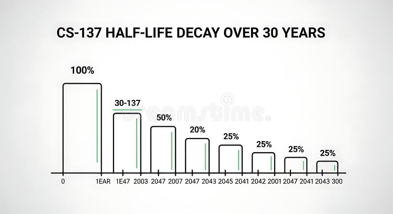
Free with trial A line graph illustrating the decrease in half-life over 30 years with bars representing percentage decay at different years, demonstrating long-term decline suitable for scientific, educational, or research presentations. Decrease statistics illustrations Half-life Decay Over 30 Years Chart Showing Decrease in Value or Effectiveness. A line graph illustrating the decrease in half-life over 30 years with bars representing percentage decay at different years, demonstrating long-term decline suitable for scientific, educational, or research presentations
Free with trial Black silhouette of descending bar chart with arrow, isolated on white background. concept of financial decline, statistics, economic downturn, data analysis, business graph. Decrease statistics vectors Black silhouette of descending bar chart with arrow, isolated on white background. concept of financial decline, statistics
Free with trial A flat vector icon of a line graph showing a downward trend. Represents financial loss, market decline, negative statistics, or decreasing performance. Suitable for business reports, financial news, or graphics illustrating economic downturns, vector design Generative AI. Decrease statistics vectors Downward trending line graph icon financial market decrease, vector design Generative AI. A flat vector icon of a line graph showing a downward trend. Represents financial loss, market decline, negative statistics, or decreasing performance. Suitable for business reports, financial news, or graphics illustrating economic downturns, vector design Generative AI
Free with trial A flat vector icon showing a line graph with a distinct downward trend. Represents decline, decrease, negative growth, or falling performance. Suitable for business analysis, financial reports, or graphics illustrating negative progress or statistics, vector design Generative AI. Decrease statistics vectors Downward line graph icon representing negative trend decline, vector design Generative AI. A flat vector icon showing a line graph with a distinct downward trend. Represents decline, decrease, negative growth, or falling performance. Suitable for business analysis, financial reports, or graphics illustrating negative progress or statistics, vector design Generative AI
Free with trial Hand drawn style bar graph displaying a continuous downward trend and data decrease arrow. Decrease statistics vectors Hand drawn style bar graph displaying a continuous downward trend and data decrease arrow
Free with trial Percentage with up and down arrows line icon. Percent symbol showing increase and decrease. Financial analytics sign for banking, credit, interest rates, statistics, and economic trends. Decrease statistics vectors Percentage with up and down arrows line icon. Percent symbol showing increase and decrease. Financial analytics sign for banking
Free with trial Trend melting line graph illustration analysis visualization, ice decrease, plot statistics trend melting line graph. Decrease statistics illustrations Trend melting line graph
Free with trial Bar chart with a declining arrow, representing decrease, business, finance, economic recession. Decrease statistics vectors Bar chart with a declining arrow, representing decrease, business, finance, economic recession
Free with trial A 3D rendered red arrow sign pointing downwards, mounted on a black circular base. The image is set against a plain white background, highlighting the contrast between the red arrow and the dark base. This image can be used to represent decline, decrease, or downward trend in various contexts such as finance, statistics, or presentations. Decrease statistics illustrations Red Arrow Sign on Black Base. A 3D rendered red arrow sign pointing downwards, mounted on a black circular base. The image is set against a plain white background, highlighting the contrast between the red arrow and the dark base. This image can be used to represent decline, decrease, or downward trend in various contexts such as finance, statistics, or presentations.
Free with trial Business decline bar chart icon vector. Decrease, loss, and financial collapse sign symbol on black circle. Decrease statistics vectors Business decline bar chart icon. Decrease, loss, and financial collapse sign symbol on black circle
Free with trial Graph growth with arrow up and reduction with arrow down, line chart icon. Financial invest, fall, increase and decrease. Statistics and analytics. Vector flat illustration. Decrease statistics vectors Graph growth with arrow up and reduction with arrow down, line chart icon. Financial invest, fall, increase and decrease
Free with trial Graph growth with arrow up and reduction with arrow down, line chart icon. Financial invest, fall, increase and decrease. Statistics and analytics. Vector flat illustration. Decrease statistics vectors Graph growth with arrow up and reduction with arrow down, line chart icon. Financial invest, fall, increase and decrease
Free with trial Graph growth with arrow up and reduction with arrow down, line chart icon. Financial invest, fall, increase and decrease. Statistics and analytics. Vector flat illustration. Decrease statistics vectors Graph growth with arrow up and reduction with arrow down, line chart icon. Financial invest, fall, increase and decrease
Free with trial Hand pointing at bar chart with different colored bars featuring statistics, data, analysis with. Decrease statistics vectors Hand pointing at bar chart with different colored bars featuring statistics, data, analysis with
Free with trial A red arrow pointing downwards with a jagged line indicating a decline or decrease in something, possibly related to finance or statistics. the arrow is pointing downwards to indicate a negative trend. Decrease statistics illustrations A red downward trend line with a jagged line. a red arrow pointing downwards with a jagged line indicating a decline or decrease in something, possibly related to finance or statistics. the arrow is pointing downwards to indicate a negative trend
Free with trial A 3D rendered image of a shiny red arrow pointing downwards, standing on a metallic circular base, isolated on a white background. The arrow is reflective and has a glossy finish, giving it a modern and sleek appearance. This image can be used to represent decline, decrease, or downward trend in various contexts such as finance, statistics, or presentations. Decrease statistics illustrations Red Arrow Down Symbol on Metallic Base. A 3D rendered image of a shiny red arrow pointing downwards, standing on a metallic circular base, isolated on a white background. The arrow is reflective and has a glossy finish, giving it a modern and sleek appearance. This image can be used to represent decline, decrease, or downward trend in various contexts such as finance, statistics, or presentations.
Free with trial Red bar chart depicting a downward trend on a white background. The bars progressively decrease in height from left to right. An upward-pointing arrow emerges from the first bar, indicating initial growth. A curved, downward-pointing arrow overlays the bars, emphasizing the overall decline. The clear design conveys concepts of financial loss, decreasing statistics, or declining data points. Decrease statistics vectors Red bar chart showing a downward trend with an upward arrow and a falling arrow isolated on white background. Red bar chart depicting a downward trend on a white background. The bars progressively decrease in height from left to right. An upward-pointing arrow emerges from the first bar, indicating initial growth. A curved, downward-pointing arrow overlays the bars, emphasizing the overall decline. The clear design conveys concepts of financial loss, decreasing statistics, or declining data points.
Free with trial Decline bar chart with downward trend arrow icon vector. Decrease, loss, and financial drop symbol. Editable stroke. Decrease statistics vectors Decline bar chart with downward trend arrow icon. Decrease, loss, and financial drop symbol. Editable stroke
Free with trial Creative collection of wooden block icons illustrating various business growth statistics with positive and negative trends, perfect for presentations and reports. Decrease statistics illustrations Colorful business growth statistics blocks. Creative collection of wooden block icons illustrating various business growth statistics with positive and negative trends, perfect for presentations and reports
Free with trial Creative collection of wooden block icons illustrating various business growth statistics with positive and negative trends, perfect for presentations and reports. Decrease statistics illustrations Colorful business growth statistics blocks. Creative collection of wooden block icons illustrating various business growth statistics with positive and negative trends, perfect for presentations and reports
Free with trial A clean vector illustration of a down arrow, often used to symbolize download, decrease, or selection. Ideal for file sharing, data statistics, or user interface controls. This icon clearly indicates moving content downwards or confirming choice, vector design Generative AI. Decrease statistics vectors Download Arrow Icon Vector, Data Transfer Symbol, vector design Generative AI. A clean vector illustration of a down arrow, often used to symbolize download, decrease, or selection. Ideal for file sharing, data statistics, or user interface controls. This icon clearly indicates moving content downwards or confirming choice, vector design Generative AI
Free with trial The image features a bold, downward-pointing red arrow with a white percentage symbol (%) in the center, symbolizing a decrease or decline in percentage terms. The design is simple, using high contrast for emphasis, and is often used in contexts like financial reports, statistics, or data presentations to indicate a reduction or negative trend. Decrease statistics vectors Red downward arrow with percentage symbol indicating decline isolated on transparent background. The image features a bold, downward-pointing red arrow with a white percentage symbol (%) in the center, symbolizing a decrease or decline in percentage terms. The design is simple, using high contrast for emphasis, and is often used in contexts like financial reports, statistics, or data presentations to indicate a reduction or negative trend
Free with trial Business decline bar chart icon. Decrease, loss, and financial collapse sign symbol vector. Decrease statistics vectors Business decline bar chart icon. Decrease, loss, and financial collapse sign symbol
Free with trial This vibrant vector illustration showcases a collection of red and orange gradient arrows, all pointing downwards. The set includes both straight and dynamically curved arrows, effectively symbolizing various forms of decline, decrease, or negative trends. Perfect for use in business presentations, financial reports, infographics, or any design requiring a clear visual representation of falling statistics, market drops, recession, loss, or a general downward movement. The clean, modern flat design ensures versatility and impact. Decrease statistics vectors Downward Trend Red Gradient Arrows Vector Set. This vibrant vector illustration showcases a collection of red and orange gradient arrows, all pointing downwards. The set includes both straight and dynamically curved arrows, effectively symbolizing various forms of decline, decrease, or negative trends. Perfect for use in business presentations, financial reports, infographics, or any design requiring a clear visual representation of falling statistics, market drops, recession, loss, or a general downward movement. The clean, modern flat design ensures versatility and impact.
Free with trial A red arrow with a jagged line pattern pointing downwards, indicating a decline or decrease in something, possibly related to finance or statistics. Decrease statistics illustrations A red arrow pointing downwards in a jagged line. A red arrow with a jagged line pattern pointing downwards, indicating a decline or decrease in something, possibly related to finance or statistics
Free with trial A red arrow with a jagged line pattern pointing downwards, indicating a decline or decrease in something, possibly related to finance or statistics. Decrease statistics illustrations A red arrow pointing downwards in a jagged line. A red arrow with a jagged line pattern pointing downwards, indicating a decline or decrease in something, possibly related to finance or statistics
Free with trial Shiny blue bar graph depicts growth then decline, presented on a financial document Useful for showcasing data analysis and reporting. Decrease statistics illustrations Analyzing Business Graph Illustration Showing Decrease and Growth Statistics Report. Shiny blue bar graph depicts growth then decline, presented on a financial document Useful for showcasing data analysis and reporting
Free with trial The image shows a red downward-pointing arrow with a percentage symbol, indicating a decrease. Next to it, there is a green upward-pointing arrow shaped like a house with a percentage symbol, indicating an increase. Decrease statistics illustrations Illustration of percentage increase and decrease with arrows and house shapes. The image shows a red downward-pointing arrow with a percentage symbol, indicating a decrease. Next to it, there is a green upward-pointing arrow shaped like a house with a percentage symbol, indicating an increase
Free with trial Set line Financial growth decrease Sales funnel with chart Pie infographic and Binary code with long shadow. Red square button. Vector. Decrease statistics illustrations Set line Financial growth decrease, Sales funnel with chart, Pie infographic and Binary code with long shadow. Red. Set line Financial growth decrease Sales funnel with chart Pie infographic and Binary code with long shadow. Red square button. Vector.
Free with trial Decline bar chart with downward trend arrow icon. Decrease, loss, and financial crisis sign symbol vector. Decrease statistics vectors Decline bar chart with downward trend arrow icon. Decrease, loss, and financial crisis sign symbol
Free with trial This vibrant image features a white cube with a prominent black percentage symbol, seemingly floating above a row of five identical white cubes, each displaying a clear black downward arrow. Set against a bright yellow background, the composition powerfully symbolizes a concept of reduction, decline, or decrease. It's ideal for illustrating topics such as falling interest rates, economic downturns, sales reductions, discounts, negative trends, or any financial or business concept involving a downward movement in percentages. The clean, minimalist design offers versatility for various editorial and commercial uses. Decrease statistics illustrations Percentage Decrease Concept with Downward Arrows. This vibrant image features a white cube with a prominent black percentage symbol, seemingly floating above a row of five identical white cubes, each displaying a clear black downward arrow. Set against a bright yellow background, the composition powerfully symbolizes a concept of reduction, decline, or decrease. It's ideal for illustrating topics such as falling interest rates, economic downturns, sales reductions, discounts, negative trends, or any financial or business concept involving a downward movement in percentages. The clean, minimalist design offers versatility for various editorial and commercial uses.
Free with trial An image showing two arrows, one red pointing up with a percentage symbol and a white upward arrow inside, and one green pointing down with a percentage symbol and a white downward arrow inside, likely used to represent increase and decrease in percentages. Decrease statistics illustrations Up and down percentage arrows for increase and decrease. An image showing two arrows, one red pointing up with a percentage symbol and a white upward arrow inside, and one green pointing down with a percentage symbol and a white downward arrow inside, likely used to represent increase and decrease in percentages
Free with trial A clean and informative energy report summary displaying winter usage data. The graphic shows a 15% decrease in energy consumption compared to the previous year, indicated by a green checkmark. Ideal for illustrating energy efficiency, sustainability, or cost savings. Decrease statistics illustrations Energy Report Summary with Winter Usage Statistics. A clean and informative energy report summary displaying winter usage data. The graphic shows a 15% decrease in energy consumption compared to the previous year, indicated by a green checkmark. Ideal for illustrating energy efficiency, sustainability, or cost savings
Free with trial A minimalist 3D rendered white graph depicting a sharp downward trend with jagged peaks and valleys. The graph is isolated on a white background, casting a subtle shadow. The visual represents a decline or decrease, suitable for concepts related to finance, economics, or data analysis. Decrease statistics illustrations White 3D Jagged Line Graph Showing Decline Isolated on White Background chart decrease. A minimalist 3D rendered white graph depicting a sharp downward trend with jagged peaks and valleys. The graph is isolated on a white background, casting a subtle shadow. The visual represents a decline or decrease, suitable for concepts related to finance, economics, or data analysis
Free with trial The image depicts a 3D bar graph with three orange bars of varying heights. A blue arrow curves downward from left to right, pointing to the percentage symbol on the right side of the image. The graph appears to illustrate a substantial decrease in percentage, likely representing a decline in data or performance. The background is a plain white surface, allowing the graph and its elements to take. Decrease statistics illustrations A bar graph showing a significant decrease in percentage. The image depicts a 3D bar graph with three orange bars of varying heights. A blue arrow curves downward from left to right, pointing to the percentage symbol on the right side of the image. The graph appears to illustrate a substantial decrease in percentage, likely representing a decline in data or performance. The background is a plain white surface, allowing the graph and its elements to take
Free with trial A critical flat vector icon showing a downward trending line graph, symbolizing business decline, negative statistics, and falling values. Essential for financial warnings, market analysis, risk assessment, or performance reviews. It clearly visualizes a decrease in metrics and potential challenges, vector design Generative AI. Decrease statistics vectors Downward Trending Line Graph Icon for Business Decline, vector design Generative AI. A critical flat vector icon showing a downward trending line graph, symbolizing business decline, negative statistics, and falling values. Essential for financial warnings, market analysis, risk assessment, or performance reviews. It clearly visualizes a decrease in metrics and potential challenges, vector design Generative AI
Free with trial Decline bar chart with downward trend arrow outline icon vector. Decrease, loss, and financial drop symbol in circular line. Decrease statistics vectors Decline bar chart with downward trend arrow outline icon. Decrease, loss, and financial drop symbol in circular line
Free with trial Business Graph Declining Trend Downward Arrow Arrow Symbol Graph Statistics. Decrease statistics vectors Business Graph Declining Trend Downward Arrow Arrow Symbol Graph Statistics
Free with trial Declining Bar Graph with Downward Arrow Showing Loss or Decrease. Decrease statistics vectors Declining Bar Graph with Downward Arrow Showing Loss or Decrease
Free with trial A bold, clean red zigzag arrow pointing downward, representing decline, decrease, drop, or negative trend. Perfect for business, finance, or data visualization projects. Decrease statistics illustrations Red downward zigzag arrow icon illustrating decline or decrease. A bold, clean red zigzag arrow pointing downward, representing decline, decrease, drop, or negative trend. Perfect for business, finance, or data visualization projects
Free with trial A line graph illustrating the gradual decrease in energy consumption over several months, with lightning bolt icons transitioning to leaf icons, symbolizing a shift from high energy usage to sustainable, cost-effective practices. The x-axis represents time in months, and the y-axis shows energy consumption in kWh, clearly indicating a downward trend in energy use and associated costs. Decrease statistics illustrations Energy Consumption Decrease Over Time Leading to Cost Reduction. A line graph illustrating the gradual decrease in energy consumption over several months, with lightning bolt icons transitioning to leaf icons, symbolizing a shift from high energy usage to sustainable, cost-effective practices. The x-axis represents time in months, and the y-axis shows energy consumption in kWh, clearly indicating a downward trend in energy use and associated costs
Free with trial A collection of 50 black and white line that visually represent increase and decrease trends. The include various styles of graphs, charts, and arrows, depicted in a minimalist and clean flat Each uses simple lines and shapes to convey different types of data trends, such as upward and downward movements, comparisons, and statistical representations. The are designed with editable strokes,. Decrease statistics vectors Set of 50 black and white line showing increase and decrease trends. a collection of 50 black and white line that visually represent increase and decrease trends. The include various styles of graphs, charts, and arrows, depicted in a minimalist and clean flat Each uses simple lines and shapes to convey different types of data trends, such as upward and downward movements, comparisons, and statistical representations. The are designed with editable strokes,
Free with trial Declining Bar Graph Representing Downturn or Reduction in Statistics. Decrease statistics vectors Declining Bar Graph Representing Downturn or Reduction in Statistics
Free with trial This conceptual scientific illustration features a dramatic black hole on the left, rendered with a deep blue cosmic background and radiant rays of light emanating from its center, visually paired with a clean, modern bar graph on the right that charts a significant decrease in mass drop events over time, directly comparing a 10x mass decrease against a 100x mass drop with clear white data labels. Decrease statistics illustrations An illustration of a black hole with a tenfold mass decrease and hundredfold mass drop alongside a comparative bar graph showing. This conceptual scientific illustration features a dramatic black hole on the left, rendered with a deep blue cosmic background and radiant rays of light emanating from its center, visually paired with a clean, modern bar graph on the right that charts a significant decrease in mass drop events over time, directly comparing a 10x mass decrease against a 100x mass drop with clear white data labels
Free with trial The image displays two curved arrows, one red and one green, each with a percentage symbol and a percent sign. The red arrow curves downward and leftward, indicating a decrease, while the green arrow curves upward and rightward, symbolizing an increase. The arrows are stylized with a bold, three-dimensional effect to emphasize their directional meanings. Decrease statistics vectors Percentage increase and decrease arrows with red and green color contrast. The image displays two curved arrows, one red and one green, each with a percentage symbol and a percent sign. The red arrow curves downward and leftward, indicating a decrease, while the green arrow curves upward and rightward, symbolizing an increase. The arrows are stylized with a bold, three-dimensional effect to emphasize their directional meanings
Free with trial The image shows two arrows, one green pointing upward labeled increase and another red pointing downward labeled decrease, commonly used to indicate trends or changes in data. Decrease statistics illustrations Visual representation of increase and decrease indicators using arrows. The image shows two arrows, one green pointing upward labeled increase and another red pointing downward labeled decrease, commonly used to indicate trends or changes in data
Free with trial The image shows two curved arrows pointing in opposite directions, one red downward arrow with a percent sign and one green upward arrow with a percent sign, symbolizing financial or statistical increase and decrease. Decrease statistics vectors Opposing arrows indicating increase and decrease with percentage signs. The image shows two curved arrows pointing in opposite directions, one red downward arrow with a percent sign and one green upward arrow with a percent sign, symbolizing financial or statistical increase and decrease
Free with trial The image features various financial data visualizations, including declining bar charts, pie charts, and downward trend graphs, which collectively illustrate a decrease in financial performance metrics. These elements serve as effective tools for analyzing business statistics and presenting reports. The visuals are designed to convey a clear message about trends and losses in the economy. This composition is made with AI. Decrease statistics vectors Declining Bar Charts Pie Chart and Downward Trend Graphs for Financial Data Analysis and Business Reports. The image features various financial data visualizations, including declining bar charts, pie charts, and downward trend graphs, which collectively illustrate a decrease in financial performance metrics. These elements serve as effective tools for analyzing business statistics and presenting reports. The visuals are designed to convey a clear message about trends and losses in the economy. This composition is made with AI.
Free with trial A striking red downward arrow symbolizing decline and decrease in performance or value, perfect for finance, marketing, and business-related projects. Decrease statistics illustrations Red Downward Arrow Symbol Representing Decrease in Performance or Value. A striking red downward arrow symbolizing decline and decrease in performance or value, perfect for finance, marketing, and business-related projects
Free with trial The image depicts a series of vertical bars in teal color, showing a gradual decrease in height from left to right. A large red downward-pointing arrow overlays the bars, emphasizing the trend of decline in the data represented. This visual is commonly used to illustrate decreasing performance, sales, or other metrics over time. Decrease statistics illustrations Declining bar chart with a downward arrow indicating a decrease in values. The image depicts a series of vertical bars in teal color, showing a gradual decrease in height from left to right. A large red downward-pointing arrow overlays the bars, emphasizing the trend of decline in the data represented. This visual is commonly used to illustrate decreasing performance, sales, or other metrics over time
Free with trial Falling red arrow illustrating financial downturn on dark grid statistics decline Can be used as a banner or header image. Decrease statistics illustrations Falling red arrow illustrating financial downturn on dark grid , statistics, decline. Falling red arrow illustrating financial downturn on dark grid statistics decline Can be used as a banner or header image
Free with trial A colorful bar graph showing an increase and decrease represented by wooden blocks. Decrease statistics illustrations Colorful wooden block bar graph showing increase and decrease of progress. A colorful bar graph showing an increase and decrease represented by wooden blocks
Free with trial A vibrant 3D rendered blue arrow points downwards, signifying a decrease or decline. Attached to the arrow is a pink circular emblem featuring a white percentage sign. This graphic is isolated on a white background, making it suitable for representing concepts like price drops, sales, economic downturns, or negative trends. Decrease statistics illustrations 3D Blue Downward Arrow with a Pink Percentage Sign Emblem decrease decline. A vibrant 3D rendered blue arrow points downwards, signifying a decrease or decline. Attached to the arrow is a pink circular emblem featuring a white percentage sign. This graphic is isolated on a white background, making it suitable for representing concepts like price drops, sales, economic downturns, or negative trends
Free with trial A graph showing a downward trend with a red arrow pointing downwards, indicating a decline or decrease in value or quantity over time. Decrease statistics illustrations Declining trend indicated by red arrow on graph showing decrease over time. A graph showing a downward trend with a red arrow pointing downwards, indicating a decline or decrease in value or quantity over time
Free with trial A 3D rendered bar graph displays a series of six distinct bars, arranged in descending order of height from left to right. The bars are colored in a gradient from blue to orange, resting on a white, slightly angled platform. A subtle shadow is cast to the left, emphasizing the three-dimensional nature of the graphic. The visual represents a downward trend or decrease in data. Decrease statistics illustrations 3D rendered bar graph showing a downward trend with colorful bars on a white platform chart statistics. A 3D rendered bar graph displays a series of six distinct bars, arranged in descending order of height from left to right. The bars are colored in a gradient from blue to orange, resting on a white, slightly angled platform. A subtle shadow is cast to the left, emphasizing the three-dimensional nature of the graphic. The visual represents a downward trend or decrease in data
Free with trial The image shows a bar graph with a red line indicating a downward trend. The bars decrease in height from left to right, suggesting a significant decline in the measured data over time. Decrease statistics illustrations A downward trend graph illustrating a significant decrease in data over time. The image shows a bar graph with a red line indicating a downward trend. The bars decrease in height from left to right, suggesting a significant decline in the measured data over time
Free with trial The image shows a series of vertical bars in descending order of height, colored from dark blue to light purple. A bold red diagonal arrow overlays the bars, pointing downward, symbolizing a decline or reduction in values over time. This visual is often used to represent a decrease in metrics such as sales, performance, or other quantifiable data trends. Decrease statistics illustrations Declining bar chart with downward trend arrow indicating a decrease in values. The image shows a series of vertical bars in descending order of height, colored from dark blue to light purple. A bold red diagonal arrow overlays the bars, pointing downward, symbolizing a decline or reduction in values over time. This visual is often used to represent a decrease in metrics such as sales, performance, or other quantifiable data trends
Free with trial Diagram chart line icon. Neumorphic, Red gradient, 3d pin buttons. Statistics timer sign. Market analytics symbol. Line icons. Neumorphic buttons with outline signs. Vector. Decrease statistics vectors Diagram chart line icon. Statistics timer sign. Line icons. Vector. Diagram chart line icon. Neumorphic, Red gradient, 3d pin buttons. Statistics timer sign. Market analytics symbol. Line icons. Neumorphic buttons with outline signs. Vector
Free with trial A vibrant red three-dimensional arrow curves and points downward, symbolizing a decrease, decline, or negative trend. Object isolated on white. Decrease statistics illustrations Curved red 3d arrow pointing downwards indicating decrease or decline isolated. A vibrant red three-dimensional arrow curves and points downward, symbolizing a. A vibrant red three-dimensional arrow curves and points downward, symbolizing a decrease, decline, or negative trend. Object isolated on white
Free with trial A stylized black and white illustration shows a bar chart with bars of decreasing height, leading to a sharp downward-pointing arrow. Decrease statistics vectors Decreasing bar chart with downward arrow decrease downward recession statistics negative. A stylized black and white illustration shows a bar chart with bars of decreasing height, leading to a sharp downward-pointing arrow
Free with trial The image depicts a stylized, three-dimensional green arrow pointing downward against a plain background, giving a sense of motion and direction. The arrow has a glossy finish with a slight gradient effect, making it appear dynamic and modern. This type of visual is often used in contexts such as indicating a decrease, downward trends, or reduction in various fields like finance, statistics, or. Decrease statistics illustrations A sleek green downward arrow symbolizing decline or reduction in a modern design. The image depicts a stylized, three-dimensional green arrow pointing downward against a plain background, giving a sense of motion and direction. The arrow has a glossy finish with a slight gradient effect, making it appear dynamic and modern. This type of visual is often used in contexts such as indicating a decrease, downward trends, or reduction in various fields like finance, statistics, or
Free with trial The image depicts a striking 3D graphic of a large percentage symbol in black, positioned above a bold red downward-pointing arrow against a plain background. This visual metaphor commonly represents a decline, reduction, or decrease in financial or statistical terms, such as a drop in interest rates, stock prices, or percentage points. Decrease statistics illustrations A bold downward arrow symbolizing a decrease in percentage or financial decline. The image depicts a striking 3D graphic of a large percentage symbol in black, positioned above a bold red downward-pointing arrow against a plain background. This visual metaphor commonly represents a decline, reduction, or decrease in financial or statistical terms, such as a drop in interest rates, stock prices, or percentage points