Free with trial Sharp retail sales decline graph with a shopping cart, isolated on white & transparent background. Ideal for illustrating economic recession, consumer spending drops, business losses, this image is generated using AI. Illustrating decrease vectors Sharp retail sales decline graph with a shopping cart, isolated on white & transparent background. Ideal for illustrating economic
Free with trial Falling red arrows intersect with a black digital display board showing financial information, creating a dramatic and concerning mood ideal for illustrating market decline or economic downturn. Illustrating decrease illustrations Red Arrows Indicating Falling Prices on Digital Display Board. Falling red arrows intersect with a black digital display board showing financial information, creating a dramatic and concerning mood ideal for illustrating market decline or economic downturn
Free with trial A 3D icon illustrating financial loss isolated on a white background, ideal for financial and business themes. Illustrating decrease illustrations 3D Financial Loss Icon isolated. A 3D icon illustrating financial loss isolated on a white background, ideal for financial and business themes
Free with trial A modern data visualization featuring a line graph and bar chart, ideal for illustrating business trends and performance metrics in reports and presentations. Illustrating decrease illustrations Data visualization with a line graph and bar chart representing trends and comparisons in a clear and modern style for business. A modern data visualization featuring a line graph and bar chart, ideal for illustrating business trends and performance metrics in reports and presentations
Free with trial Colorful bar chart with a line graph presenting trends and data growth over time, ideal for business analysis, marketing presentations, and financial reports. Illustrating decrease illustrations Colorful Bar Chart with Line Graph Illustrating Trends and Data Growth over Time For Business, Marketing, Finance and Analysis Use. Colorful bar chart with a line graph presenting trends and data growth over time, ideal for business analysis, marketing presentations, and financial reports
Free with trial Colorful bar charts illustrating positive and negative business trends from january to may provide a clear visual representation of performance. Illustrating decrease vectors Colorful bar charts illustrating positive and negative business trends from january to may provide a clear visual
Free with trial Elevate your financial presentations and data visualizations with these captivating vintage-style arrow graphics. Perfect for illustrating price fluctuations, interest rate movements, and market trends, these retro-inspired up and down arrow designs are a visually engaging way to convey complex information. The sepia tone and textured background add a touch of vintage charm, bringing a classic. Illustrating decrease illustrations Vintage-Inspired Arrow Graphics for Illustrating Price & Interest Rate Trends: A Retro Style Design Element. Elevate your financial presentations and data visualizations with these captivating vintage-style arrow graphics. Perfect for illustrating price fluctuations, interest rate movements, and market trends, these retro-inspired up and down arrow designs are a visually engaging way to convey complex information. The sepia tone and textured background add a touch of vintage charm, bringing a classic
Free with trial This impactful image features a large, bold red downward arrow on a pristine white background, perfect for conveying a decrease or decline in data. Ideal for use in presentations, reports, and graphs, this professional design element is a clear and effective visual aid. The simplified design and sharp focus on the arrow ensure maximum visual impact and clarity. Whether illustrating a shrinking. Illustrating decrease illustrations Powerful Red Downward Arrow Graphic A Clean Professional Visual Aid for Presentations Reports and Graphs. This impactful image features a large, bold red downward arrow on a pristine white background, perfect for conveying a decrease or decline in data. Ideal for use in presentations, reports, and graphs, this professional design element is a clear and effective visual aid. The simplified design and sharp focus on the arrow ensure maximum visual impact and clarity. Whether illustrating a shrinking
Free with trial Single black hand drawn arrow curving downwards, effectively illustrating a downward trend or direction, perfect for emphasizing various design elements and concepts. Illustrating decrease vectors Single black hand drawn arrow curving downwards, effectively illustrating a downward trend or direction, perfect for
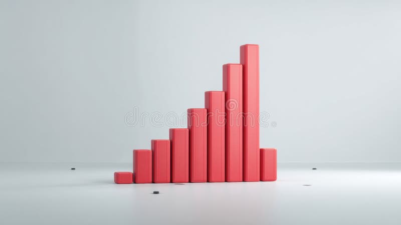
Free with trial Vibrant and colorful bar chart illustrating various data metrics, perfect for business or marketing use, highlighting trends and insights visually engaging for audiences. Illustrating decrease illustrations Colorful Bar Chart Showing Data Variations in a Bright and Engaging Style Suitable for Business Presentations or Marketing. Vibrant and colorful bar chart illustrating various data metrics, perfect for business or marketing use, highlighting trends and insights visually engaging for audiences
Free with trial Colorful bar charts illustrating positive and negative business trends from january to may provide a clear visual representation of performance. Illustrating decrease illustrations Colorful bar charts illustrating positive and negative business trends from january to may provide a clear visual
Free with trial Abstract 3D bar graph representation showcasing various data trends with vibrant colors and shadows. Ideal for presentations, reports, and analytics purposes. Illustrating decrease illustrations 3D Visualization of Colorful Bar Graph Illustrating Data Trends with Shadows and Depth in a Minimalistic Style for Data Analysis. Abstract 3D bar graph representation showcasing various data trends with vibrant colors and shadows. Ideal for presentations, reports, and analytics purposes
Free with trial A tall stack of coins is shown, with a red downward arrow prominently positioned beside it. The coins are various denominations, and the background is a blurred, out-of-focus image suggesting a neutral, possibly slightly textured surface. The overall impression is one of financial loss and economic downturn. Illustrating decrease illustrations DecreasingValue A Stack of Coins Diminishes, symbolized by a sharp red downward arrow, illustrating financial decline and economic. A tall stack of coins is shown, with a red downward arrow prominently positioned beside it. The coins are various denominations, and the background is a blurred, out-of-focus image suggesting a neutral, possibly slightly textured surface. The overall impression is one of financial loss and economic downturn
Free with trial Featuring four vibrant business charts illustrating increasing, decreasing, fluctuating, and peaking trends, perfect for enhancing presentations and reports with clear visual data analysis. Illustrating decrease vectors Featuring four vibrant business charts illustrating increasing, decreasing, fluctuating, and peaking trends, perfect for
Free with trial Single black hand drawn arrow curving downwards, effectively illustrating a downward trend or direction, perfect for emphasizing various design elements and concepts. Illustrating decrease illustrations Single black hand drawn arrow curving downwards, effectively illustrating a downward trend or direction, perfect for
Free with trial This vibrant line graph showcases multiple data series, illustrating trends and fluctuations over time with a clear light grid background, perfect for reports. Illustrating decrease illustrations Colorful Line Graph Representing Data Trends Over Time with Multiple Data Series and Fluctuating Values on a Light Grid Background. This vibrant line graph. This vibrant line graph showcases multiple data series, illustrating trends and fluctuations over time with a clear light grid background, perfect for reports
Free with trial Featuring four vibrant business charts illustrating increasing, decreasing, fluctuating, and peaking trends, perfect for enhancing presentations and reports with clear visual data analysis. Illustrating decrease illustrations Featuring four vibrant business charts illustrating increasing, decreasing, fluctuating, and peaking trends, perfect for
Free with trial This high-quality vector graphic features a simple, hand-drawn red arrow pointing downwards. It's perfect for illustrating decline, decrease, or negative trends in presentations, reports, websites, and infographics. The clean and minimalist style ensures versatility across various design projects. Easily scalable and editable, this vector graphic is a valuable addition to any designer's toolkit. Its simple design makes it suitable for a wide range of applications and audiences. Illustrating decrease illustrations Hand-Drawn Red Down Arrow: Simple, Clean, and Versatile Vector Graphic for Presentations, Websites, and More. Perfect. This high-quality vector graphic features a simple, hand-drawn red arrow pointing downwards. It's perfect for illustrating decline, decrease, or negative trends in presentations, reports, websites, and infographics. The clean and minimalist style ensures versatility across various design projects. Easily scalable and editable, this vector graphic is a valuable addition to any designer's toolkit. Its simple design makes it suitable for a wide range of applications and audiences.
Free with trial Stock market charts depicting a downward trend, symbolizing a financial crisis, set on a dark, abstract background, illustrating the concept of economic decline. Illustrating decrease illustrations Stock market charts depicting a downward trend, symbolizing a financial crisis, set on a dark, abstract background, illustrating
Free with trial Reduction chart icon Vector symbol or sign set collection in black and white outline. Illustrating decrease vectors Decline Chart Icon Illustrating Decrease in Performance, Economic Downturn, and Analytical Data. Reduction chart icon Vector symbol or sign set collection in black and white outline
Free with trial Outline of hand lets simple red circle coins slip through fingers, illustrating loss. Illustrating decrease illustrations Minimalist design: outline hand with simple red circle coins slipping through fingers on grey background, illustrating money loss. Outline of hand lets simple red circle coins slip through fingers, illustrating loss.
Free with trial A dynamic 3D illustration of a glossy red arrow pointing downwards in a jagged, volatile path. Isolated on a white background, this graphic icon is a powerful symbol for negative concepts. It represents decline, decrease, failure, loss, and crisis. This visual is perfect for illustrating stock market crashes, economic recession, financial downturns, poor business performance, or any downward trend in data and statistics. An ideal element for reports, presentations, and financial news, with ample copy space. Illustrating decrease illustrations Red Jagged Arrow of Decline - Financial Crisis Concept. A dynamic 3D illustration of a glossy red arrow pointing downwards in a jagged, volatile path. Isolated on a white background, this graphic icon is a powerful symbol for negative concepts. It represents decline, decrease, failure, loss, and crisis. This visual is perfect for illustrating stock market crashes, economic recession, financial downturns, poor business performance, or any downward trend in data and statistics. An ideal element for reports, presentations, and financial news, with ample copy space.
Free with trial This image features two variations of a graph icon showing a downward trend. One is a simple outline, while the other is a solid black silhouette. Both depict a graph with a sharp decline, represented by a line with a downward-pointing arrow. The icons are suitable for illustrating concepts like financial loss, economic downturn, negative growth, or any situation involving a decrease in value or performance. Illustrating decrease illustrations Declining Graph Icon Set. This image features two variations of a graph icon showing a downward trend. One is a simple outline, while the other is a solid black silhouette. Both depict a graph with a sharp decline, represented by a line with a downward-pointing arrow. The icons are suitable for illustrating concepts like financial loss, economic downturn, negative growth, or any situation involving a decrease in value or performance.
Free with trial This image features two variations of a decreasing graph icon. One is an outline version, and the other is a solid black version. Both show a bar graph with descending bars and a curved arrow pointing downwards, symbolizing a decline or decrease. These icons are suitable for illustrating concepts like loss, recession, negative trends, or falling statistics in various contexts. Illustrating decrease illustrations Decreasing Graph Icon Set. This image features two variations of a decreasing graph icon. One is an outline version, and the other is a solid black version. Both show a bar graph with descending bars and a curved arrow pointing downwards, symbolizing a decline or decrease. These icons are suitable for illustrating concepts like loss, recession, negative trends, or falling statistics in various contexts.
Free with trial A 3D rendered image of a large, glossy red arrow curving downwards on a clean, white background. The arrow's smooth, rounded shape and vibrant color create a sense of direction and emphasis. The image is suitable for illustrating concepts such as decline, decrease, failure, or downward trends in various contexts like finance, business, or statistics. Illustrating decrease illustrations Red Arrow Pointing Downward. A 3D rendered image of a large, glossy red arrow curving downwards on a clean, white background. The arrow's smooth, rounded shape and vibrant color create a sense of direction and emphasis. The image is suitable for illustrating concepts such as decline, decrease, failure, or downward trends in various contexts like finance, business, or statistics.
Free with trial A captivating image featuring a descending bar graph composed of miniature candy canes against a bokeh background of twinkling Christmas lights and miniature snow-covered evergreen trees. The candy canes, in classic red and white stripes, visually represent a declining trend or decrease. The scene evokes a festive yet subtly concerning mood, ideal for illustrating concepts related to holiday. Illustrating decrease illustrations Christmas Candy Cane Graph Decline. A captivating image featuring a descending bar graph composed of miniature candy canes against a bokeh background of twinkling Christmas lights and miniature snow-covered evergreen trees. The candy canes, in classic red and white stripes, visually represent a declining trend or decrease. The scene evokes a festive yet subtly concerning mood, ideal for illustrating concepts related to holiday
Free with trial A single image file depicting two side-by-side illustrations showing a person reviewing tax information on a laptop. The left illustration visualizes a negative tax analysis scenario with a downward trending graph and red indicators. The right illustration contrasts this with a positive tax analysis scenario, showing an upward trending graph, dollar sign, coins and green indicators, illustrating both potential tax decreases and benefits. Illustrating decrease vectors Contrasting Tax Analysis Scenarios on Laptop. A single image file depicting two side-by-side illustrations showing a person reviewing tax information on a laptop. The left illustration visualizes a negative tax analysis scenario with a downward trending graph and red indicators. The right illustration contrasts this with a positive tax analysis scenario, showing an upward trending graph, dollar sign, coins and green indicators, illustrating both potential tax decreases and benefits
Free with trial A close-up view of a laptop displaying a stock market chart with fluctuating trends, illustrating concepts of financial volatility and market analysis - generated AI. Illustrating decrease illustrations Stock market crash concept with graph on laptop screen. A close-up view of a laptop displaying a stock market chart with fluctuating trends, illustrating concepts of financial volatility and market analysis - generated AI
Free with trial Wooden house model with percentage blocks, illustrating mortgage and finance concept. 3D Render. Illustrating decrease illustrations Wooden house model with percentage blocks, illustrating mortgage and finance concept
Free with trial A laptop screen showing a graph illustrating a stock market crash, highlighting financial decline and volatility in the stock exchange - generated AI. Illustrating decrease illustrations Laptop displaying stock market crash with declining graph. A laptop screen showing a graph illustrating a stock market crash, highlighting financial decline and volatility in the stock exchange - generated AI
Free with trial A stock chart shows a red arrow trending upwards with a sharp decline represented by a red bar, juxtaposed with green bars, illustrating market fluctuations for financial analysis. Illustrating decrease illustrations Stock Chart with Red Arrow and Green Bars. A stock chart shows a red arrow trending upwards with a sharp decline represented by a red bar, juxtaposed with green bars, illustrating market fluctuations for financial analysis
Free with trial A golden bitcoin stands next to a downward trending red arrow chart, illustrating a financial downturn, perfect for articles about market analysis and investment risks. Illustrating decrease illustrations Bitcoin Value Falling with Red Arrow Chart. A golden bitcoin stands next to a downward trending red arrow chart, illustrating a financial downturn, perfect for articles about market analysis and investment risks
Free with trial This minimalist vector illustration features two identical line graphs, presented in contrasting black and white themes. The left graph displays a black line on a white background, while the right shows a white line on a black background. Both graphs depict a clear downward trend with jagged fluctuations, symbolizing decline, loss, or negative growth over time. This versatile icon set is ideal for illustrating concepts such as economic downturns, financial losses, market crashes, business failures, or any data showing a significant decrease. Perfect for presentations, reports, infographics, and web design. Illustrating decrease vectors Declining Line Graph Icon Set - Black and White. This minimalist vector illustration features two identical line graphs, presented in contrasting black and white themes. The left graph displays a black line on a white background, while the right shows a white line on a black background. Both graphs depict a clear downward trend with jagged fluctuations, symbolizing decline, loss, or negative growth over time. This versatile icon set is ideal for illustrating concepts such as economic downturns, financial losses, market crashes, business failures, or any data showing a significant decrease. Perfect for presentations, reports, infographics, and web design.
Free with trial This 3D bar graph, generated by AI, visually represents a significant downward trend. The red bars show a decrease in value over time, culminating in a sharp drop indicated by the prominent red arrow. This image is ideal for illustrating economic downturns, market crashes, or any scenario depicting. Illustrating decrease illustrations Declining Bar Graph. This 3D bar graph, generated by AI, visually represents a significant downward trend. The red bars show a decrease in value over time, culminating in a sharp drop indicated by the prominent red arrow. This image is ideal for illustrating economic downturns, market crashes, or any scenario depicting
Free with trial A turquoise moon hovers above a stock market graph with rising and falling arrows indicating market trends, useful for illustrating financial concepts. Illustrating decrease illustrations Stock Market Graph with Moon and Arrow Trends. A turquoise moon hovers above a stock market graph with rising and falling arrows indicating market trends, useful for illustrating financial concepts
Free with trial A descending bar graph with a dollar coin and downward pointing arrow signifies a decrease in the stock market, suitable for illustrating financial loss. Illustrating decrease illustrations Stock Market Plunge with Dollar Coin and Graph. A descending bar graph with a dollar coin and downward pointing arrow signifies a decrease in the stock market, suitable for illustrating financial loss
Free with trial A red arrow zigzags downward on a light blue surface showing a negative trend or decline, suitable for illustrating concepts related to losses or downturns. Illustrating decrease illustrations Red Arrow Pointing Downward on Blue Background. A red arrow zigzags downward on a light blue surface showing a negative trend or decline, suitable for illustrating concepts related to losses or downturns
Free with trial An infographic illustrating the dynamics of growth and decline, represented by two distinct groups of people forming a pyramid. Illustrating decrease vectors Business Growth and Decline Infographic Concept. An infographic illustrating the dynamics of growth and decline, represented by two distinct groups of people forming a pyramid
Free with trial Metal arrow pointing downwards represents a decline or falling trend, useful for illustrating negative growth or regression in presentations and reports. Illustrating decrease illustrations Downward Trending Arrow Shows Decline or Decrease. Metal arrow pointing downwards represents a decline or falling trend, useful for illustrating negative growth or regression in presentations and reports
Free with trial A 3D white bar chart shows a significant downward trend indicated by a sharp, angled arrow pointing downwards. The bars decrease in height from left to right, illustrating a concept of decline or loss. The clean white background emphasizes the minimalist design and the stark visual representation of negative growth. Illustrating decrease illustrations 3D White Bar Chart with Downward Trending Arrow on White Background graph decline. A 3D white bar chart shows a significant downward trend indicated by a sharp, angled arrow pointing downwards. The bars decrease in height from left to right, illustrating a concept of decline or loss. The clean white background emphasizes the minimalist design and the stark visual representation of negative growth
Free with trial Stacks of coins visually represent decreasing wealth, signified by a downward-pointing red arrow, indicating financial loss or decline for illustrating economic concepts. Illustrating decrease illustrations Coin Stack with Red Arrow Showing Financial Decline. Stacks of coins visually represent decreasing wealth, signified by a downward-pointing red arrow, indicating financial loss or decline for illustrating economic concepts
Free with trial Black and white icon of a dollar coin with three arrows pointing down, illustrating a decrease in value. Illustrating decrease vectors Dollar coin with three down arrows representing decreasing value. Black and white icon of a dollar coin with three arrows pointing down, illustrating a decrease in value
Free with trial Angled downward arrow with jagged design suggests a declining trend in metallic tones against a clean background Great for illustrating concepts of decrease and downturn. Illustrating decrease illustrations Downward Arrow Graphic Showing Zigzag Trend on White. Angled downward arrow with jagged design suggests a declining trend in metallic tones against a clean background Great for illustrating concepts of decrease and downturn
Free with trial Abstract graphic showing currency symbols and arrows to visually represent financial market changes and exchange rate fluctuations Ideal for illustrating finance topics. Illustrating decrease illustrations Currency Exchange Rate Fluctuations Abstract Graphic. Abstract graphic showing currency symbols and arrows to visually represent financial market changes and exchange rate fluctuations Ideal for illustrating finance topics
Free with trial Red metallic bars show a downward trend against a colorful bokeh background. Perfect for illustrating financial reports or presentations. Illustrating decrease illustrations Decreasing Bar Graph Chart Showing Financial Decline. Red metallic bars show a downward trend against a colorful bokeh background. Perfect for illustrating financial reports or presentations
Free with trial Glowing orange chart illustrating a downward trend, with bar graph and line graph, set against a dark blue backdrop. Illustrating decrease illustrations Glowing Downward Trend Chart on Dark Blue Background. Glowing orange chart illustrating a downward trend, with bar graph and line graph, set against a dark blue backdrop
Free with trial A hand draws a downward-trending line graph on a chalkboard using chalk, illustrating a negative market trend or decline. This visual representation, generated by AI, is often used to symbolize economic recession, stock market crashes, or other forms of decrease. Illustrating decrease illustrations Downward Trend. A hand draws a downward-trending line graph on a chalkboard using chalk, illustrating a negative market trend or decline. This visual representation, generated by AI, is often used to symbolize economic recession, stock market crashes, or other forms of decrease.
Free with trial Bold plus and cross symbols in yellow and white are displayed on dark rounded squares with long shadows Great for illustrating choices and decisions. Illustrating decrease illustrations Plus and Cross Symbols on Dark Background with Shadows. Bold plus and cross symbols in yellow and white are displayed on dark rounded squares with long shadows Great for illustrating choices and decisions
Free with trial A businessman in a suit draws a red downward trend line over a bar graph, illustrating cost reduction and financial decline. Illustrating decrease illustrations Businessman Drawing a Downward Trend Line on a Cost Graph. A businessman in a suit draws a red downward trend line over a bar graph, illustrating cost reduction and financial decline
Free with trial Golden coins are falling with a downward pointing red arrow on a dark background, creating a financial decline concept, suitable for illustrating economic downturns and investment risks. Illustrating decrease illustrations Falling Golden Coins with Red Arrow on Dark Background. Golden coins are falling with a downward pointing red arrow on a dark background, creating a financial decline concept, suitable for illustrating economic downturns and investment risks
Free with trial This dynamic graphic depicts a sharp downward trend, visualized by a bold red arrow dramatically descending across a grey, jagged line graph. The graph itself shows significant fluctuations, but the overarching movement is a steep decline, symbolizing losses, negative growth, or a crisis. The clean white background isolates the data representation, making it ideal for conveying financial downturns, market crashes, or any situation involving a significant decrease. Illustrating decrease illustrations Sharp Decline: Red Arrow Graph Illustrating Downward Trend. This dynamic graphic depicts a sharp downward trend, visualized by a bold red arrow dramatically descending across a grey, jagged line graph. The graph itself shows significant fluctuations, but the overarching movement is a steep decline, symbolizing losses, negative growth, or a crisis. The clean white background isolates the data representation, making it ideal for conveying financial downturns, market crashes, or any situation involving a significant decrease.
Free with trial This 3D rendered bar graph, generated by AI, visually represents a downward trend. The red bars progressively decrease in height, illustrating a clear decline. Perfect for illustrating concepts related to loss, decrease, or decline in presentations and reports. Illustrating decrease illustrations Declining Bar Graph. This 3D rendered bar graph, generated by AI, visually represents a downward trend. The red bars progressively decrease in height, illustrating a clear decline. Perfect for illustrating concepts related to loss, decrease, or decline in presentations and reports.
Free with trial A person holds a graph showing a sharp market downturn, illustrating a significant decrease in value. The red line highlights the negative trend, generated by AI for illustrative purposes. This image is perfect for representing financial losses or economic instability. Illustrating decrease illustrations Declining Market Trend. A person holds a graph showing a sharp market downturn, illustrating a significant decrease in value. The red line highlights the negative trend, generated by AI for illustrative purposes. This image is perfect for representing financial losses or economic instability.
Free with trial This 3D illustration shows a colorful bar graph with pastel-colored cylinders on a white circular base, representing upward business growth trends. The chart includes a line graph illustrating various data points. Illustrating decrease illustrations 3D Colorful Cylindrical Bar Graph Chart Showing Business Growth. This 3D illustration shows a colorful bar graph with pastel-colored cylinders on a white circular base, representing upward business growth trends. The chart includes a line graph illustrating various data points.
Free with trial A red arrow points downwards on a green field, symbolizing a negative trend against a backdrop of a city skyline and stormy weather, useful for illustrating economic downturns. Illustrating decrease illustrations Red Arrow Shows Downward Trend on Green Field with City and Storm. A red arrow points downwards on a green field, symbolizing a negative trend against a backdrop of a city skyline and stormy weather, useful for illustrating economic downturns
Free with trial A vibrant glossy red arrow curves downwards, symbolizing a negative trend, decline, or reduction. This eye-catching graphic is perfect for presentations and reports illustrating falling data or negative performance. Illustrating decrease illustrations Glossy red downward arrow graphic sign indicating trend decline or decrease white background. A vibrant glossy red arrow curves downwards, symbolizing a negative trend, decline, or reduction. This eye-catching graphic is perfect for presentations and reports illustrating falling data or negative performance
Free with trial Two distinct lines converge in an engaging graph, illustrating contrasting trends. The sharp gradient colors enhance the visual impact, emphasizing change and growth. Illustrating decrease illustrations Dynamic Trends Revealed Through Shifting Data in Vibrant Gradient Hues. Two distinct lines converge in an engaging graph, illustrating contrasting trends. The sharp gradient colors enhance the visual impact, emphasizing change and growth
Free with trial Visualize impactful data with this dynamic water intensity graph, showcasing a strong downward trend over time. Perfect for illustrating progress in conservation and efficiency. Illustrating decrease vectors Dramatic water graph visually represents declining water intensity over time, showing efficiency gains. Visualize impactful data with this dynamic water intensity graph, showcasing a strong downward trend over time. Perfect for illustrating progress in conservation and efficiency
Free with trial Clean vector illustration features two sets of parallel arrows against a white background. One set of three arrows is colored bright red and points upwards, each arrow slightly offset from the others, creating a dynamic visual. The second set of three arrows is colored vibrant blue and points downwards, mirroring the arrangement of the red arrows. This contrasting imagery of upward and downward movement is ideal for illustrating concepts of growth versus decline, increase versus decrease, success versus recession, or positive versus negative trends in business, finance, or other data-driven contexts. Illustrating decrease illustrations Vector Illustration of Contrasting Red Upward and Blue Downward Arrows. clean vector illustration features two sets of parallel arrows against a white background. One set of three arrows is colored bright red and points upwards, each arrow slightly offset from the others, creating a dynamic visual. The second set of three arrows is colored vibrant blue and points downwards, mirroring the arrangement of the red arrows. This contrasting imagery of upward and downward movement is ideal for illustrating concepts of growth versus decline, increase versus decrease, success versus recession, or positive versus negative trends in business, finance, or other data-driven contexts.
Free with trial Illustrating market decline and data analysis with modern visual elements. Illustrating decrease vectors Red arrow downtrend graph and bar chart in digital and tech theme. Illustrating market decline and data analysis with modern visual elements.
Free with trial Illustrating market decline and data analysis with modern visual elements. Illustrating decrease vectors Red arrow downtrend graph and bar chart in digital and tech theme. Illustrating market decline and data analysis with modern visual elements.
Free with trial Stack of gold coins accompanied by a bold red downward arrow demonstrates a negative economic trend against a dark background, ideal for illustrating financial crisis, market decline, or investment risks. Illustrating decrease illustrations Gold Coins with Red Arrow Showing Economic Downturn on Dark Background. Stack of gold coins accompanied by a bold red downward arrow demonstrates a negative economic trend against a dark background, ideal for illustrating financial crisis, market decline, or investment risks
Free with trial Euro coin stack with a red arrow going down, illustrating the concept of euro depreciation. Illustrating decrease illustrations Red arrow going down over euro coins stack illustrating economic crisis. Euro coin stack with a red arrow going down, illustrating the concept of euro depreciation
Free with trial Euro coin stack with a red arrow going down, illustrating the concept of euro depreciation. Illustrating decrease vectors Red arrow going down over euro coins stack illustrating economic crisis. Euro coin stack with a red arrow going down, illustrating the concept of euro depreciation
Free with trial Wooden blocks spelling TAX with the last block showing up and down arrows, illustrating the concept of tax changes, fluctuations, and economic uncertainty. The image conveys the dynamic nature of taxation and its potential impact. Illustrating decrease illustrations Tax concept wooden blocks illustrating changes fluctuations and uncertainty. Wooden blocks spelling TAX with the last block showing up and down arrows, illustrating the concept of tax changes, fluctuations, and economic uncertainty. The image conveys the dynamic nature of taxation and its potential impact
Free with trial This 3D rendering showcases colorful bar graphs, pie charts, and a calculator, vividly illustrating concepts of business growth, financial success, and data analysis. The upward-trending arrow emphasizes positive progress. Illustrating decrease illustrations Colorful 3D Charts and Calculator Illustrating Business Growth and Financial Success. This 3D rendering showcases colorful bar graphs, pie charts, and a calculator, vividly illustrating concepts of business growth, financial success, and data analysis. The upward-trending arrow emphasizes positive progress.
Free with trial A digital stock market chart showing a downward trend arrow against a blue and black background, illustrating an economic downturn concept. Illustrating decrease illustrations A digital stock market chart showing a downward trend arrow against a blue and black background, illustrating an economic downturn
Free with trial This 3D rendering showcases a vibrant bar chart illustrating business growth and financial performance. The colorful cylinders represent data points, rising to show increasing success. A line graph adds additional information about trends over time. Illustrating decrease illustrations Colorful 3D Bar Chart with Growth Graph Showing Business Success and Financial Data. This 3D rendering showcases a vibrant bar chart illustrating business growth and financial performance. The colorful cylinders represent data points, rising to show increasing success. A line graph adds additional information about trends over time.
Free with trial Blue Toned Financial Chart With Pen, Showing Downward Trend, Illustrating Market Volatility. , Generated by AI. Illustrating decrease illustrations Blue Toned Financial Chart With Pen, Showing Downward Trend, Illustrating Market Volatility.
Free with trial Bar chart with decreasing orange bars and a downward red arrow illustrating financial decline. Illustrating decrease vectors Bar chart with decreasing orange bars and a downward red arrow illustrating financial decline
Free with trial This powerful visual concept depicts a devastating financial crisis and economic downturn. Symbolic wooden blocks, including a crumbling bank structure, represent bank failure and the ensuing recession. A cracked block and a falling arrow down highlight the downward trend and potential for loss in the stock market crash. Ideal for illustrating themes of investment risk, debt, finance, business. Illustrating decrease illustrations Financial crisis concept illustrating bank failure and economic decline with symbolic blocks. This powerful visual concept depicts a devastating financial crisis and economic downturn. Symbolic wooden blocks, including a crumbling bank structure, represent bank failure and the ensuing recession. A cracked block and a falling arrow down highlight the downward trend and potential for loss in the stock market crash. Ideal for illustrating themes of investment risk, debt, finance, business
Free with trial A graph visually depicts two distinct lines, one showing a pronounced increase while the other reflects a steady decline, all presented in striking orange tones. Illustrating decrease illustrations Trends in Data Representation Illustrating Contrasting Growth and Decline Patterns in Vibrant Hues. A graph visually depicts two distinct lines, one showing a pronounced increase while the other reflects a steady decline, all presented in striking orange tones
Free with trial Gas pump nozzle next to stock market graph illustrating fuel price trends in realistic photography, Generated by AI. Illustrating decrease illustrations Gas pump nozzle next to stock market graph illustrating fuel price trends in realistic photography
Free with trial Concept of falling interest rates, showing a descending graph and coins dropping, illustrating economic impact and financial trends. Illustrating decrease illustrations Falling Interest Rates with Graph and Coins Symbolizing Impact. Concept of falling interest rates, showing a descending graph and coins dropping, illustrating economic impact and financial trends
Free with trial Concept of falling interest rates, showing a descending graph and coins dropping, illustrating economic impact and financial trends. Illustrating decrease illustrations Falling Interest Rates with Graph and Coins Symbolizing Impact. Concept of falling interest rates, showing a descending graph and coins dropping, illustrating economic impact and financial trends
Free with trial Concept of falling interest rates, showing a descending graph and coins dropping, illustrating economic impact and financial trends. Illustrating decrease illustrations Falling Interest Rates with Graph and Coins Symbolizing Impact. Concept of falling interest rates, showing a descending graph and coins dropping, illustrating economic impact and financial trends
Free with trial Concept of falling interest rates, showing a descending graph and coins dropping, illustrating economic impact and financial trends. Illustrating decrease illustrations Falling Interest Rates with Graph and Coins Symbolizing Impact. Concept of falling interest rates, showing a descending graph and coins dropping, illustrating economic impact and financial trends
Free with trial Reduction chart icon Black line art vector in black and white outline set collection sign. Illustrating decrease vectors Decline Chart Icon Illustrating Decrease in Performance, Economic Downturn, and Analytical Data. Reduction chart icon Black line art vector in black and white outline set collection sign
Free with trial Bar chart with arrow pointing down, illustrating economic decline, business loss, or negative trend data. Illustrating decrease vectors Bar chart with arrow pointing down, illustrating economic decline, business loss, or negative trend data
Free with trial Declining bar graph illustrating business recession trend or financial downturn with line chart overlay. Illustrating decrease vectors Declining bar graph illustrating business recession trend or financial downturn with line chart overlay