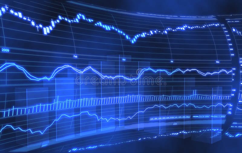
Free with trial A stock market chart background deisgn. Increase decrease graph illustrations Stock market chart
Free with trial Business graph data in a bar chart showing increase and decrease with blue line illustration on plain background. Increase decrease graph vectors Business graph data in a bar chart showing increase and decrease with blue line illustration on plain background
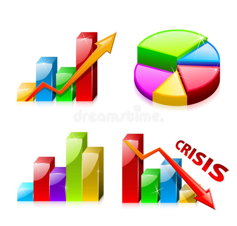
Free with trial Business process diagrams, bar graph, business diagram, circle chart, business process. Increase decrease graph vectors Graphic business diagram collection. Business process diagrams, bar graph, business diagram, circle chart, business process
Free with trial Set 1 of glassy graphs with diagram (finance). Increase decrease graph vectors Set 1 of glassy graphs with diagram
Free with trial Nine different business charts and graphs - additional ai and eps format available on request. Increase decrease graph vectors Different business charts
Free with trial An illustration of a green arrow pointing upwards and a red arrow pointing downwards on a graph background. The green arrow represents growth or increase, while the red arrow represents decline or decrease. The image can be used to symbolize contrasting trends or outcomes in various contexts such as business, finance, or economics. Increase decrease graph illustrations Green and Red Arrows on a Graph. An illustration of a green arrow pointing upwards and a red arrow pointing downwards on a graph background. The green arrow represents growth or increase, while the red arrow represents decline or decrease. The image can be used to symbolize contrasting trends or outcomes in various contexts such as business, finance, or economics.
Free with trial Vector illustration of people climbing ladder. Increase decrease graph vectors To The Top. Vector illustration of people climbing ladder
Free with trial Statistics - 3d isolated multicolor diagram. Increase decrease graph illustrations 3d statistics. Statistics - 3d isolated multicolor diagram
Free with trial The image depicts a bar graph with two distinct sections. The left section of the graph shows an upward trend with green bars and a green arrow pointing upwards, indicating an increase. The right section of the graph shows a downward trend with red bars and a red arrow pointing downwards, indicating a decrease. The graph visually represents contrasting trends in data. Increase decrease graph illustrations Bar graph with up and down trends. The image depicts a bar graph with two distinct sections. The left section of the graph shows an upward trend with green bars and a green arrow pointing upwards, indicating an increase. The right section of the graph shows a downward trend with red bars and a red arrow pointing downwards, indicating a decrease. The graph visually represents contrasting trends in data
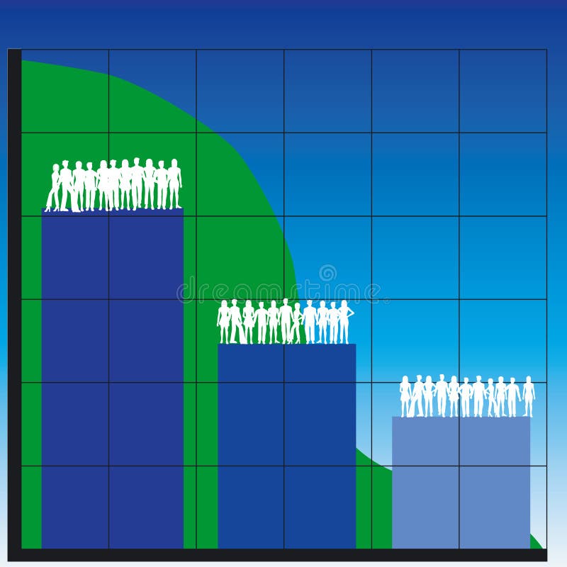
Free with trial Silhouettes of men and women with business charts-teamwork - additional ai and eps format available on request. Increase decrease graph vectors Business charts
Free with trial Silhouettes of women and business charts - additional ai and eps format available on request. Increase decrease graph vectors Business charts
Free with trial A business compass for finding the right way in the stock market. Increase decrease graph illustrations Business compass
Free with trial The image depicts a bar graph with two distinct sections. The left section of the graph shows an upward trend with green bars and a green arrow pointing upwards, indicating an increase. The right section of the graph shows a downward trend with red bars and a red arrow pointing downwards, indicating a decrease. The graph visually represents contrasting trends in data. Increase decrease graph illustrations Bar graph with up and down trends. The image depicts a bar graph with two distinct sections. The left section of the graph shows an upward trend with green bars and a green arrow pointing upwards, indicating an increase. The right section of the graph shows a downward trend with red bars and a red arrow pointing downwards, indicating a decrease. The graph visually represents contrasting trends in data
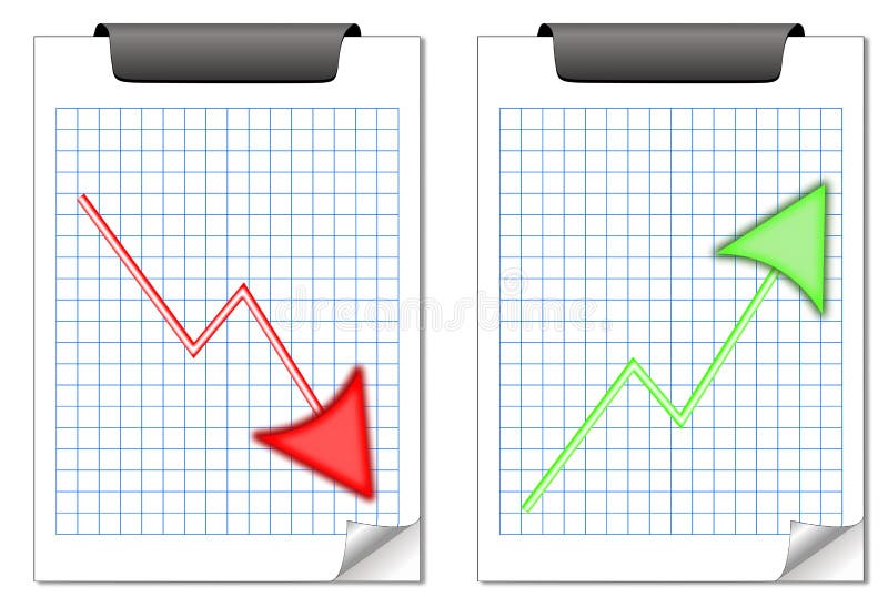
Free with trial Two squared note pads with opposite trends. Increase decrease graph vectors Up and down notes. Two squared note pads with opposite trends
Free with trial Rising real estate concept house arrow growing up 3d. Increase decrease graph illustrations Rising real estate concept house arrow growing up
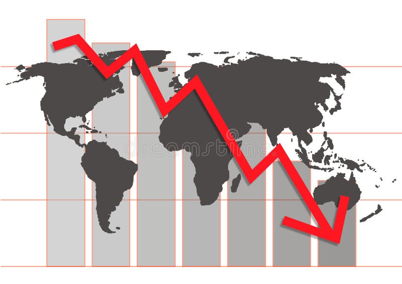
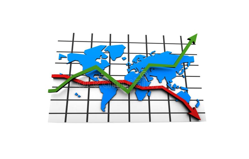
Free with trial World crisis chart in business market - ial illustration. Increase decrease graph illustrations World crisis chart
Free with trial The image depicts a bar graph with two distinct sections. The left section of the graph shows an upward trend with green bars and a green arrow pointing upwards, indicating an increase. The right section of the graph shows a downward trend with red bars and a red arrow pointing downwards, indicating a decrease. The graph visually represents contrasting trends in data. Increase decrease graph illustrations Bar graph with up and down trends. The image depicts a bar graph with two distinct sections. The left section of the graph shows an upward trend with green bars and a green arrow pointing upwards, indicating an increase. The right section of the graph shows a downward trend with red bars and a red arrow pointing downwards, indicating a decrease. The graph visually represents contrasting trends in data
Free with trial Business concept. Separated on white. Increase decrease graph illustrations Business scheme. Leadership. Business concept. Separated on white
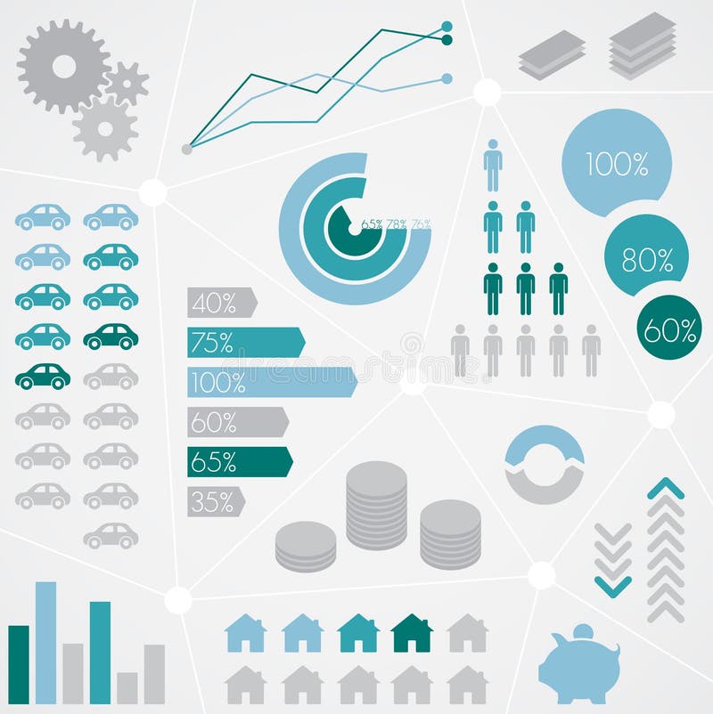
Free with trial Data Information Infographic Technology Connecting Concept. Increase decrease graph illustrations Data Information Infographic Technology Connecting Concept
Free with trial Business diagram glas bars in motion building a stair and showing success. Increase decrease graph illustrations Bar Chart In Motion. Business diagram glas bars in motion building a stair and showing success
Free with trial Blue up arrow and orange down arrow, concept of increase, decrease, progress, and decline, opposite direction. Increase decrease graph illustrations Blue upward arrow and orange downward arrow, concept of increase and decrease. Blue up arrow and orange down arrow, concept of increase, decrease, progress, and. Blue up arrow and orange down arrow, concept of increase, decrease, progress, and decline, opposite direction
Free with trial Green 3D arrow isolated on white background. Increase decrease graph illustrations Green 3D arrow
Free with trial Three dimensional orange chart isolated on white background. Increase decrease graph vectors Three dimensional orange chart
Free with trial Business crisis concept, arrow hitting the ground (3d render). Increase decrease graph illustrations Business crisis
Free with trial This image depicts a bar and line graph that illustrates fluctuating values over a period of time. The x-axis represents time, while the y-axis represents the value. The graph shows an overall upward trend with several peaks and troughs, indicating periods of increase and decrease in value. The bars provide a visual representation of the value at specific intervals, while the line connects these. Increase decrease graph illustrations Graph showing fluctuating values over time. This image depicts a bar and line graph that illustrates fluctuating values over a period of time. The x-axis represents time, while the y-axis represents the value. The graph shows an overall upward trend with several peaks and troughs, indicating periods of increase and decrease in value. The bars provide a visual representation of the value at specific intervals, while the line connects these
Free with trial Loan outline icon set. Editable stroke. Pixel perfect. Easy to resize. Increase decrease graph vectors Loan outline icon set
Free with trial Type of colorful arrow set, create by vector. Increase decrease graph vectors Type of colorful arrow set
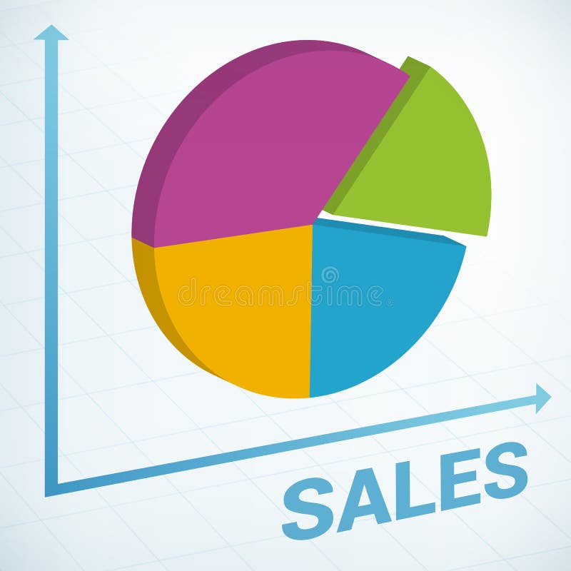
Free with trial An image of a graphical pie chart, it could be useful for business concepts. Increase decrease graph illustrations Pie Chart 133. An image of a graphical pie chart, it could be useful for business concepts.
Free with trial The image depicts a dollar sign in the center with a red downward arrow on the left and a green upward arrow on the right. This visual metaphor represents financial trends, specifically a decrease and an increase in monetary value or economic indicators. Increase decrease graph illustrations Financial trend illustration showing increase and decrease with dollar sign. The image depicts a dollar sign in the center with a red downward arrow on the left and a green upward arrow on the right. This visual metaphor represents financial trends, specifically a decrease and an increase in monetary value or economic indicators
Free with trial Bar Graphs on white background. Increase decrease graph vectors Vector Bar graphs. Bar Graphs on white background
Free with trial Handshake abstract sign vector design template. Business creative concept. Deal, contract, team, cooperation symbol icon. Increase decrease graph vectors Handshake abstract sign vector design template. Bu
Free with trial Positive business sales chart width red arrow background. Increase decrease graph vectors Positive business sales chart arrow. Positive business sales chart width red arrow background
Free with trial An image showing two arrows, one red pointing up with a percentage symbol and a white upward arrow inside, and one green pointing down with a percentage symbol and a white downward arrow inside, likely used to represent increase and decrease in percentages. Increase decrease graph illustrations Up and down percentage arrows for increase and decrease. An image showing two arrows, one red pointing up with a percentage symbol and a white upward arrow inside, and one green pointing down with a percentage symbol and a white downward arrow inside, likely used to represent increase and decrease in percentages
Free with trial An image of a graphical pie chart, it could be useful for business concepts. Increase decrease graph illustrations Pie Chart 127. An image of a graphical pie chart, it could be useful for business concepts.
Free with trial Business concept. Separated on white. Increase decrease graph illustrations Flowchart with people. Business concept. Separated on white
Free with trial Classic pyramid scheme. Flowchart with people. Increase decrease graph illustrations Classic pyramid scheme
Free with trial An image showing a bar graph with tax rates represented on blue blocks with coins on top. The middle block has a red arrow pointing down, indicating a decrease, while the right block is the tallest, indicating an increase. Increase decrease graph illustrations Tax rates decreasing then increasing on bar graph with coins on top. An image showing a bar graph with tax rates represented on blue blocks with coins on top. The middle block has a red arrow pointing down, indicating a decrease, while the right block is the tallest, indicating an increase
Free with trial 16 office and business internet icons set. Increase decrease graph vectors Stickers - Office and Business Web icons. 16 office and business internet icons set
Free with trial Business graphs showing progress and success, with business people silhouettes - additional ai and eps format available on request. Increase decrease graph illustrations Graphs for business use. Business graphs showing progress and success, with business people silhouettes - additional ai and eps format available on request
Free with trial The image shows two arrows, one green pointing upward labeled increase and another red pointing downward labeled decrease, commonly used to indicate trends or changes in data. Increase decrease graph illustrations Visual representation of increase and decrease indicators using arrows. The image shows two arrows, one green pointing upward labeled increase and another red pointing downward labeled decrease, commonly used to indicate trends or changes in data
Free with trial Statistic. Data analysis. Business and financial concept. Increase decrease graph vectors Statistic
Free with trial Businessmen are joining the effort to restore decreasing trend. Increase decrease graph illustrations Restoring decreasing trend. Businessmen are joining the effort to restore decreasing trend
Free with trial Blue 3D arrow isolated on white background. Increase decrease graph illustrations Blue 3D arrow
Free with trial This vector illustration shows business icons representing time management, financial growth, investment, profit increase and decrease with simple human figures in black. Professional mood. Generative AI. Increase decrease graph vectors Business icons time management financial growth investment profit increase decrease vector illustration. This vector illustration shows business icons representing time management, financial growth, investment, profit increase and decrease with simple human figures in black. Professional mood. Generative AI
Free with trial An image of a graphical pie chart, it could be useful for business concepts. Increase decrease graph illustrations Pie Chart 161. An image of a graphical pie chart, it could be useful for business concepts.
Free with trial Positive business sales chart icon background. Increase decrease graph vectors Positive business sales chart
Free with trial Business graphs showing progress and success, with business people silhouettes - additional ai and eps format available on request. Increase decrease graph illustrations Graphs for business use. Business graphs showing progress and success, with business people silhouettes - additional ai and eps format available on request
Free with trial Calorie Counting Concept with Piece of Cake in a Circular Diagram Showing Decrease and Increase. Increase decrease graph vectors Calorie Counting Concept with Piece of Cake in a Circular Diagram Showing Decrease and Increase
Free with trial Blue broken 3D arrow isolated on white background. Increase decrease graph illustrations Blue broken 3D arrow
Free with trial House market up and down illustration design over white. Increase decrease graph illustrations House market up and down
Free with trial The image depicts a bar graph with blue bars that increase in height initially, then gradually decrease, symbolizing growth followed by decline. An upward-pointing arrow overlays the graph, indicating an overall upward trend or potential future growth despite the current decline in the bars' heights. This visual is often used in business, finance, and analytics to illustrate performance trends. Increase decrease graph illustrations Growth trend represented by increasing and then decreasing blue bar graph with upward arrow. The image depicts a bar graph with blue bars that increase in height initially, then gradually decrease, symbolizing growth followed by decline. An upward-pointing arrow overlays the graph, indicating an overall upward trend or potential future growth despite the current decline in the bars' heights. This visual is often used in business, finance, and analytics to illustrate performance trends
Free with trial Business concept. Separated on white. Increase decrease graph illustrations Business scheme. Leadership. Business concept. Separated on white
Free with trial Chart illustrating Gross Domestic Product drop, macroeconomic concept. Increase decrease graph illustrations Chart illustrating GDP drop, macroeconomic indicator concept. Chart illustrating Gross Domestic Product drop, macroeconomic concept
Free with trial Statistics - 3d isolated multicolor diagram. Increase decrease graph illustrations 3d statistics. Statistics - 3d isolated multicolor diagram
Free with trial The image shows a 3D bar graph with blue bars of varying heights. Two large red arrows cross over the graph: one pointing upward to the right, symbolizing growth or increase, and the other pointing downward to the right, symbolizing decline or decrease. This visual metaphor emphasizes conflicting trends or mixed signals in data. Increase decrease graph illustrations Contradictory growth and decline indicators represented by a bar graph with crossed arrows. The image shows a 3D bar graph with blue bars of varying heights. Two large red arrows cross over the graph: one pointing upward to the right, symbolizing growth or increase, and the other pointing downward to the right, symbolizing decline or decrease. This visual metaphor emphasizes conflicting trends or mixed signals in data
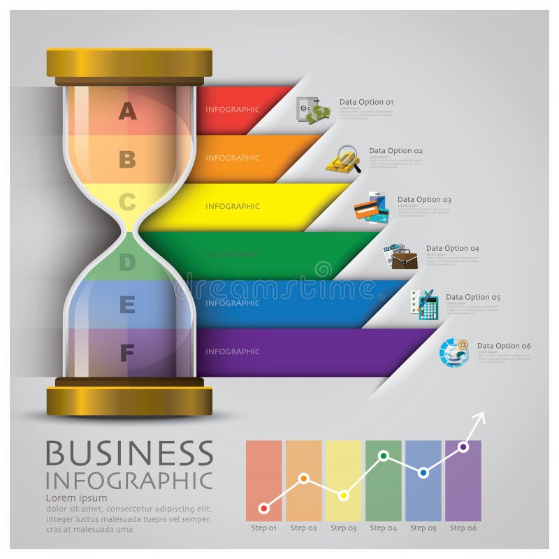
Free with trial Sandglass Money And Financial Business Infographic Design Template. Increase decrease graph vectors Sandglass Money And Financial Business Infographic
Free with trial Upward business sales chart background. Increase decrease graph vectors Upward business sales chart
Free with trial Crisis in the world business market - illustration. Increase decrease graph illustrations Crisis in the world business market
Free with trial Decrease and increase arrows. Red down arrow and green up arrow side by side. Business growth and decline concept. Financial trends represented. Market fluctuation. Increase decrease graph illustrations Red down arrow and green up arrow symbolizing decrease and increase on white background. Decrease and increase arrows. Red down arrow and green up arrow side by side. Business growth and decline concept. Financial trends represented. Market fluctuation
Free with trial Infographic and chart icon set 5, eps10. Increase decrease graph illustrations Infographic and chart icon set 5, eps10
Free with trial Illustration of stress chart and arrow. Increase decrease graph illustrations Stress chart illustration. Illustration of stress chart and arrow.
Free with trial A business compass for finding the right way in the stock market. Increase decrease graph illustrations Business navigation. A business compass for finding the right way in the stock market .
Free with trial Red percent decrease arrow and green percent increase arrow. Interest rates inflation economy concept. Up and down arrows for financial market change. Price decrease increase symbol. Increase decrease graph illustrations Red percent decrease arrow and green percent increase arrow represent interest rates inflation economy. Red percent decrease arrow and green percent increase arrow. Interest rates inflation economy concept. Up and down arrows for financial market change. Price decrease increase symbol
Free with trial Business sales chart background. Increase decrease graph vectors Business sales chart
Free with trial Infographic and chart icon set 3, vector eps10. Increase decrease graph vectors Infographic and chart icon set 3, vector eps10
Free with trial Red and blue 3D arrows isolated on white background. Increase decrease graph illustrations Red and blue 3D arrows
Free with trial A detailed line graph visualization titled Global Climate Trends presents annual data from 2011 through 2013, plotting precipitation levels and CO2 emissions on the y-axis against years on the x-axis, where a blue line indicates a steady increase in precipitation over time, a green line shows corresponding CO2 levels, and a separate green trend line suggests a potential decrease in another. Increase decrease graph illustrations A line graph showing global climate trends from 2011 to 2013 with precipitation and CO2 levels visualized in blue and green. A detailed line graph visualization titled Global Climate Trends presents annual data from 2011 through 2013, plotting precipitation levels and CO2 emissions on the y-axis against years on the x-axis, where a blue line indicates a steady increase in precipitation over time, a green line shows corresponding CO2 levels, and a separate green trend line suggests a potential decrease in another
Free with trial A cylinder chart in red and green. Increase decrease graph illustrations Cylinder chart
Free with trial World stats chart whit tabs for text message background illustration of global development. Increase decrease graph vectors World background. World stats chart whit tabs for text message background illustration of global development .
Free with trial Finance Statistical Info Graphic Set vector made in illustrator. Increase decrease graph vectors Finance Statistical Info Graphic Set
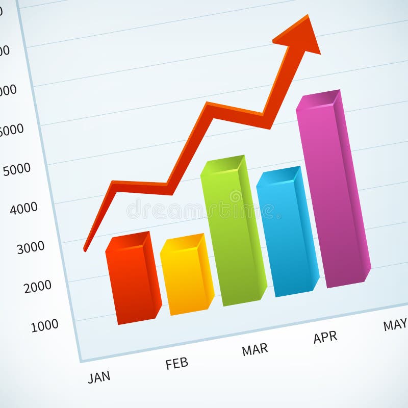
Free with trial 3d colorful bar chart with arrow, vector illustration. Increase decrease graph vectors 3d colorful bar chart with arrow
Free with trial Statistics - 3d isolated diagram on white. Increase decrease graph illustrations Statistics
Free with trial Papers with different graphs and charts, vector eps10 illustration. Increase decrease graph vectors Charts
Free with trial Continuous one line drawing of up and down arrows. Minimalist vector illustration of business growth graph symbol. Single line art icon representing increase and decrease trends. Increase decrease graph vectors Continuous one line drawing of up and down arrows. Minimalist vector illustration of business growth graph symbol. Single line art
Free with trial Financial chart of revenue and loss. Increase decrease graph vectors Profit Revenue Chart. Financial chart of revenue and loss
Free with trial Graphic business diagram vector for use in business artwork. Increase decrease graph vectors Graphic business diagram