Free with trial Business growth and decline icon set. Up and down trend chart symbol illustration. Increase and decrease bar graph concept. Increase decrease graph vectors Business growth and decline icon set. Up and down trend chart symbol. Increase and decrease bar graph concept
Free with trial This image depicts a bar and line graph that illustrates fluctuating values over a period of time. The x-axis represents time, while the y-axis represents the value. The graph shows an overall upward trend with several peaks and troughs, indicating periods of increase and decrease in value. The bars provide a visual representation of the value at specific intervals, while the line connects these. Increase decrease graph illustrations Graph showing fluctuating values over time. This image depicts a bar and line graph that illustrates fluctuating values over a period of time. The x-axis represents time, while the y-axis represents the value. The graph shows an overall upward trend with several peaks and troughs, indicating periods of increase and decrease in value. The bars provide a visual representation of the value at specific intervals, while the line connects these
Free with trial The image depicts a dollar sign in the center with a red downward arrow on the left and a green upward arrow on the right. This visual metaphor represents financial trends, specifically a decrease and an increase in monetary value or economic indicators. Increase decrease graph illustrations Financial trend illustration showing increase and decrease with dollar sign. The image depicts a dollar sign in the center with a red downward arrow on the left and a green upward arrow on the right. This visual metaphor represents financial trends, specifically a decrease and an increase in monetary value or economic indicators
Free with trial Set Pie chart infographic Graph chart diagram Financial growth decrease increase Factory Delivery tracking and Dollar symbol icon. Vector. Increase decrease graph illustrations Set Pie chart infographic, Graph, chart, diagram, Financial growth decrease, increase, Factory, Delivery tracking and. Set Pie chart infographic Graph chart diagram Financial growth decrease increase Factory Delivery tracking and Dollar symbol icon. Vector.
Free with trial A graph showing the increase in unemployment rates and decrease in GDP for multiple countries all linked to the initial economic downturn in a small economy.. Vector illustration. Increase decrease graph vectors A graph showing the increase in unemployment rates and decrease in GDP for multiple countries all linked to the initial
Free with trial Crisis chart and graph. Economic downturn with Increase and decrease arrow on the top of wooden blocks steps on desk, eco style. The business volatility trend process, finance, and economic concept , Generative Ai. Increase decrease graph illustrations Crisis chart and graph. Economic downturn with Increase and decrease arrow on the top of wooden blocks steps on desk, eco style.
Free with trial Crisis chart and graph. Economic downturn with Increase and decrease arrow on the top of wooden blocks steps on desk, eco style. The business volatility trend process, finance, and economic concept , Generative Ai. Increase decrease graph illustrations Crisis chart and graph. Economic downturn with Increase and decrease arrow on the top of wooden blocks steps on desk, eco style.
Free with trial Business growth and decline icon in circular outline. Up and down trend chart symbol illustration. Increase and decrease bar graph concept. Increase decrease graph vectors Business growth and decline icon in circular outline. Up and down trend chart symbol. Increase and decrease bar graph concept
Free with trial Set line Factory Graph chart diagram Dollar symbol Arrow Pie infographic Financial growth increase decrease and icon. Vector. Increase decrease graph vectors Set line Factory, Graph, chart, diagram, Dollar symbol, Arrow, Pie infographic, Financial growth increase, decrease and. Set line Factory Graph chart diagram Dollar symbol Arrow Pie infographic Financial growth increase decrease and icon. Vector.
Free with trial Gold bars on graph and arrow up, growth, chart gold with increase and decrease, gold profit and loss concept. Increase decrease graph vectors Gold bars on graph and arrow up, growth, chart gold with increase and decrease, gold profit and loss concept
Free with trial Profit icon. Coin growth vector illustration. Investment increase and decrease infographic. Statistic arrow symbol. Financial chart sign. Stock graph pictogram isolated. Increase decrease graph vectors Profit icon. Coin growth vector illustration. Investment increase and decrease infographic. Statistic arrow symbol. Financial
Free with trial Money arrow up and down icon set. Price change symbol. Increase and decrease arrow with dollar sign. Cash currency rate. Stock graph. Income and loss vector illustration. Red and green money arrow set. Increase decrease graph vectors Money arrow up and down icon set. Price change symbol. Increase and decrease arrow with dollar sign. Cash currency rate. Stock
Free with trial A line graph shows a steady increase in sales over the past five years while a corresponding bar graph demonstrates the decrease in operating expenses during the same period.. Vector. Increase decrease graph illustrations A line graph shows a steady increase in sales over the past five years while a corresponding bar graph demonstrates the
Free with trial Gold bars on graph and arrow down, fall, chart gold with increase and decrease, gold profit and loss concept. Increase decrease graph vectors Gold bars on graph and arrow down, fall, chart gold with increase and decrease, gold profit and loss concept
Free with trial Increase and decrease solid icon set, Arrow Growth icon, and statistic symbol set. Business growth icon, increase, personal development, graph, and chart-related line vector. Increase decrease graph vectors Increase and decrease solid icon set, Arrow Growth icon, and statistic symbol set
Free with trial Decrease and increase percentage business concept. Words "INCREASE" on wooden block changing to "DECREASE," turning by hand with percentage symbol, growth and down chart graph icon on BLUE background. Increase decrease graph illustrations Words 'INCREASE' on wooden block changing to 'DECREASE,' turning by hand with percentage symbol, growth and down chart graph icon. Decrease and increase percentage business concept. Words "INCREASE" on wooden block changing to "DECREASE," turning by hand with percentage symbol, growth and down chart graph icon on BLUE background.
Free with trial Financial graph, Business concept, Price increase, Price decrease. Increase decrease graph vectors Financial graph, Business concept, Price increase, Price decrease
Free with trial A modern flat design graphic set featuring two icons: opposing arrows indicating increase decrease and a bar chart showing financial growth or decline, perfect for business concepts. Increase decrease graph vectors Increase and decrease arrows with bar chart icon. A modern flat design graphic set featuring two icons: opposing arrows indicating increase decrease and a bar chart showing financial growth or decline, perfect for business concepts
Free with trial Simple black and white vector illustration showing bar charts indicating increase and decrease, perfect for financial or data concepts. Increase decrease graph vectors Bar chart icon showing increase and decrease data. Simple black and white vector illustration showing bar charts indicating increase and decrease, perfect for financial or data concepts
Free with trial Bar chart showing stock market increase and decrease. Increase decrease graph vectors Bar chart showing stock market increase and decrease.
Free with trial This graphic displays two circular icons, one depicting a downward-pointing arrow with a dollar sign, symbolizing a decrease in value, and the other an upward arrow with a dollar sign, representing an increase. Increase decrease graph vectors Cost decrease or increase icon. Downward vs upward dollar signs. This graphic displays two circular icons, one depicting a downward-pointing arrow with a dollar sign, symbolizing a decrease in value, and the other an upward arrow with a dollar sign, representing an increase.
Free with trial Decrease and increase chart icon with arrow. Negative and positive trend symbol illustration. Increase decrease graph vectors Decrease and increase chart icon with arrow. Negative and positive trend symbol
Free with trial Financial graph with green and red pointers, Business strategy, Business concept, Price increase, Price decrease. Increase decrease graph vectors Financial graph with green and red pointers, Business strategy, Business concept
Free with trial Financial graph with green and red pointers, Business strategy, Business concept, Price increase, Price decrease. Increase decrease graph vectors Financial graph with green and red pointers, Business strategy, Business concept
Free with trial Financial graph with green and red pointers, Business strategy, Business concept, Price increase, Price decrease. Increase decrease graph vectors Financial graph with green and red pointers, Business strategy, Business concept
Free with trial Arrow icon with percent symbol, economic growth, increase, decrease arrow, up and down arrow icon. Increase decrease graph vectors Arrow icon with percent symbol, economic growth, increase, decrease arrow, up and down arrow icon
Free with trial Arrow icon with percent symbol, economic growth, increase, decrease arrow, up and down arrow icon. Increase decrease graph vectors Arrow icon with percent symbol, economic growth, increase, decrease arrow, up and down arrow icon.
Free with trial Revenue flowing sales graph illustration growth metrics, visualization forecast, increase decrease revenue flowing sales graph. Increase decrease graph illustrations Revenue flowing sales graph
Free with trial Analysis growing loss graph illustration data visualization, metrics performance, decrease increase analysis growing loss graph. Increase decrease graph illustrations Analysis growing loss graph
Free with trial Analysis spiraling line graph illustration curve plot, statistics diagram, increase decrease analysis spiraling line graph. Increase decrease graph illustrations Analysis spiraling line graph
Free with trial Percentage arrow. rate increase and decrease concept. Increase decrease graph vectors Percentage arrow. rate increase and decrease concept.
Free with trial Analysis stretching line graph illustration chvisualization axis, points curve, increase decrease analysis stretching line graph. Increase decrease graph illustrations Analysis stretching line graph
Free with trial Set line Location, Financial growth decrease, Old hourglass with sand and increase icon. Vector. Increase decrease graph illustrations Set line Location, Financial growth decrease, Old hourglass with sand and increase icon. Vector
Free with trial Set line Pie chart infographic, Financial growth increase, decrease and Old hourglass with sand icon. Vector. Increase decrease graph vectors Set line Pie chart infographic, Financial growth increase, decrease and Old hourglass with sand icon. Vector
Free with trial Percent Arrow Icons Set: Growth, Increase, Decrease Filled Up and Down Arrows. Increase decrease graph vectors Percent Arrow Icons Set: Growth, Increase, Decrease Filled Up and Down Arrows
Free with trial Price increase. Inflation icon group. Purchasing power decrease and savings. Services and goods cost rise. Vector illustration. Increase decrease graph vectors Price increase. Inflation icon group. Purchasing power decrease and savings. Services and goods cost rise. Vector illustration.
Free with trial Set Isometric Financial growth increase Football betting money decrease and Casino dealer icon. Purple hexagon button. Vector. Increase decrease graph vectors Set Isometric Financial growth increase, Football betting money, decrease and Casino dealer icon. Purple hexagon button
Free with trial Set line Casino chips, Financial growth increase, Hand holding casino and decrease icon. Vector. Increase decrease graph vectors Set line Casino chips, Financial growth increase, Hand holding casino and decrease icon. Vector
Free with trial Increase and Decrease Stroke icon collections. Containing Increase, Decrease, Growth, Fall, up, down icons. Editable Stroke icon collections. Increase decrease graph vectors Increase and Decrease Stroke icon collections.
Free with trial Dollar down and up icon in trendy style. USD currency decrease and increase sign symbol vector. Increase decrease graph vectors Dollar down and up icon in trendy style. USD currency decrease and increase sign symbol
Free with trial This image shows a colorful 3D bar graph representing growth or progress. The bars increase in height, then decrease slightly before another sharp increase, indicating fluctuations in data. The wooden background adds a rustic and visually appealing contrast. Increase decrease graph illustrations Colorful Bar Graph on Wooden Background. This image shows a colorful 3D bar graph representing growth or progress. The bars increase in height, then decrease slightly before another sharp increase, indicating fluctuations in data. The wooden background adds a rustic and visually appealing contrast.
Free with trial Percentage increase decrease arrow up down icon simple line stroke outline icon graphic set, money price cost loss growth sign symbol pictogram label, fund interest revenue rate results image. Increase decrease graph vectors Percentage increase decrease arrow up down icon simple line stroke outline icon graphic set, money price cost loss growth sign
Free with trial Percentage increase decrease arrow up down icon simple line stroke outline icon graphic set, money price cost loss growth sign symbol pictogram label, fund interest revenue rate results image. Increase decrease graph illustrations Percentage increase decrease arrow up down icon simple line stroke outline icon graphic set, money price cost loss growth sign
Free with trial Business graph data in a bar chart showing increase and decrease with blue line illustration on plain background. Increase decrease graph vectors Business graph data in a bar chart showing increase and decrease with blue line illustration on plain background
Free with trial Growth and reduction arrow, up and down, line icon set. Rise and fall, increase and decrease. Graphic signs. Vector flat illustration. Increase decrease graph illustrations Growth and reduction arrow, up and down, line icon set. Rise and fall, increase and decrease. Graphic signs. Vector illustration
Free with trial Growth and reduction arrow, up and down, line icon set. Rise and fall, increase and decrease. Graphic signs. Vector flat illustration. Increase decrease graph vectors Growth and reduction arrow, up and down, line icon set. Rise and fall, increase and decrease. Graphic signs. Vector illustration
Free with trial An illustration of a green arrow pointing upwards and a red arrow pointing downwards on a graph background. The green arrow represents growth or increase, while the red arrow represents decline or decrease. The image can be used to symbolize contrasting trends or outcomes in various contexts such as business, finance, or economics. Increase decrease graph illustrations Green and Red Arrows on a Graph. An illustration of a green arrow pointing upwards and a red arrow pointing downwards on a graph background. The green arrow represents growth or increase, while the red arrow represents decline or decrease. The image can be used to symbolize contrasting trends or outcomes in various contexts such as business, finance, or economics.
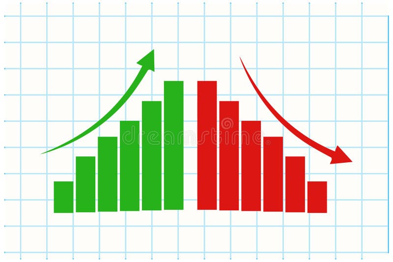
Free with trial The image depicts a bar graph with two distinct sections. The left section of the graph shows an upward trend with green bars and a green arrow pointing upwards, indicating an increase. The right section of the graph shows a downward trend with red bars and a red arrow pointing downwards, indicating a decrease. The graph visually represents contrasting trends in data. Increase decrease graph illustrations Bar graph with up and down trends. The image depicts a bar graph with two distinct sections. The left section of the graph shows an upward trend with green bars and a green arrow pointing upwards, indicating an increase. The right section of the graph shows a downward trend with red bars and a red arrow pointing downwards, indicating a decrease. The graph visually represents contrasting trends in data
Free with trial The image depicts a bar graph with two distinct sections. The left section of the graph shows an upward trend with green bars and a green arrow pointing upwards, indicating an increase. The right section of the graph shows a downward trend with red bars and a red arrow pointing downwards, indicating a decrease. The graph visually represents contrasting trends in data. Increase decrease graph illustrations Bar graph with up and down trends. The image depicts a bar graph with two distinct sections. The left section of the graph shows an upward trend with green bars and a green arrow pointing upwards, indicating an increase. The right section of the graph shows a downward trend with red bars and a red arrow pointing downwards, indicating a decrease. The graph visually represents contrasting trends in data
Free with trial The image depicts a bar graph with two distinct sections. The left section of the graph shows an upward trend with green bars and a green arrow pointing upwards, indicating an increase. The right section of the graph shows a downward trend with red bars and a red arrow pointing downwards, indicating a decrease. The graph visually represents contrasting trends in data. Increase decrease graph illustrations Bar graph with up and down trends. The image depicts a bar graph with two distinct sections. The left section of the graph shows an upward trend with green bars and a green arrow pointing upwards, indicating an increase. The right section of the graph shows a downward trend with red bars and a red arrow pointing downwards, indicating a decrease. The graph visually represents contrasting trends in data
Free with trial Blue up arrow and orange down arrow, concept of increase, decrease, progress, and decline, opposite direction. Increase decrease graph illustrations Blue upward arrow and orange downward arrow, concept of increase and decrease. Blue up arrow and orange down arrow, concept of increase, decrease, progress, and decline, opposite direction
Free with trial Dollar arrow up and down icon on circle line. USD currency increase and decrease concept vector. Increase decrease graph vectors Dollar arrow up and down icon on circle line. USD currency increase and decrease concept
Free with trial Stock quotes icons set in outline stroke design for web. Pack line pictograms with increase, decrease, exchange currency, investment portfolio, bear, bull, watch list, other. Vector illustration. Increase decrease graph vectors Stock quotes icons set in outline stroke design for web. Pack line pictograms with increase, decrease, exchange currency
Free with trial Dollar arrow up and down icon vector on black circle. USD currency increase and decrease concept. Increase decrease graph vectors Dollar arrow up and down icon on black circle. USD currency increase and decrease concept
Free with trial Decrease and increase chart icon illustration with arrow. Negative and positive trend symbol in black circle. Increase decrease graph vectors Decrease and increase chart icon with arrow. Negative and positive trend symbol in black circle
Free with trial Up and down percent icon. Increase and decrease percentage arrow sign symbol vector. Increase decrease graph vectors Up and down percent icon. Increase and decrease percentage arrow sign symbol
Free with trial Twenty-five colorful icons depict various financial and business concepts related to growth and decline. Each icon combines elements like arrows, charts, coins, and gears in vibrant red, yellow, and blue colors. Labels such as "Chart Focus," "Growth Arrow," "Money Stock," "Market Decline," and "Data Analytics" accompany each icon, suggesting themes of financial analysis and performance metrics. Set against a white background with a maroon accent on the left that reads "Increase Decrease Icons," these symbols visually represent economic trends and business strategies. Increase decrease graph vectors Increase Decrease Icon Set - Business Growth Analytics, Up Down Arrows, Charts and Performance Statistics Vector Icons Collection. Twenty-five colorful icons depict various financial and business concepts related to growth and decline. Each icon combines elements like arrows, charts, coins, and gears in vibrant red, yellow, and blue colors. Labels such as "Chart Focus," "Growth Arrow," "Money Stock," "Market Decline," and "Data Analytics" accompany each icon, suggesting themes of financial analysis and performance metrics. Set against a white background with a maroon accent on the left that reads "Increase Decrease Icons," these symbols visually represent economic trends and business strategies.
Free with trial An image showing two arrows, one red pointing up with a percentage symbol and a white upward arrow inside, and one green pointing down with a percentage symbol and a white downward arrow inside, likely used to represent increase and decrease in percentages. Increase decrease graph illustrations Up and down percentage arrows for increase and decrease. An image showing two arrows, one red pointing up with a percentage symbol and a white upward arrow inside, and one green pointing down with a percentage symbol and a white downward arrow inside, likely used to represent increase and decrease in percentages
Free with trial Dollar arrow up and down icon vector isolated on white background. USD currency increase and decrease concept. Increase decrease graph vectors Dollar arrow up and down icon isolated on white background. USD currency increase and decrease concept
Free with trial Arrow percent icon set. Increase and decrease percentage sign symbol vector. Increase decrease graph vectors Arrow percent icon set. Increase and decrease percentage sign symbol
Free with trial Graph and Chart icon set. Containing data, increase, growth, pie chart, data analytics, business and more. Vector graph icon set. Increase decrease graph vectors Graph and Chart icon set. Containing data, increase, growth, pie chart, data analytics, business and more.
Free with trial An image showing a bar graph with tax rates represented on blue blocks with coins on top. The middle block has a red arrow pointing down, indicating a decrease, while the right block is the tallest, indicating an increase. Increase decrease graph illustrations Tax rates decreasing then increasing on bar graph with coins on top. An image showing a bar graph with tax rates represented on blue blocks with coins on top. The middle block has a red arrow pointing down, indicating a decrease, while the right block is the tallest, indicating an increase
Free with trial The image shows two arrows, one green pointing upward labeled increase and another red pointing downward labeled decrease, commonly used to indicate trends or changes in data. Increase decrease graph illustrations Visual representation of increase and decrease indicators using arrows. The image shows two arrows, one green pointing upward labeled increase and another red pointing downward labeled decrease, commonly used to indicate trends or changes in data
Free with trial Percent growth and decline arrow icon vector on black circle. Increase and decrease percentage concept. Increase decrease graph vectors Percent growth and decline arrow icon on black circle. Increase and decrease percentage concept
Free with trial Set line Graph, chart, diagram, Wrench and gear and Financial growth decrease. Business infographic template. Vector. Increase decrease graph vectors Set line Graph, chart, diagram, Wrench and gear and Financial growth decrease. Business infographic template. Vector
Free with trial This vector illustration shows business icons representing time management, financial growth, investment, profit increase and decrease with simple human figures in black. Professional mood. Generative AI. Increase decrease graph vectors Business icons time management financial growth investment profit increase decrease vector illustration. This vector illustration shows business icons representing time management, financial growth, investment, profit increase and decrease with simple human figures in black. Professional mood. Generative AI
Free with trial Calorie Counting Concept with Piece of Cake in a Circular Diagram Showing Decrease and Increase. Increase decrease graph vectors Calorie Counting Concept with Piece of Cake in a Circular Diagram Showing Decrease and Increase
Free with trial The image depicts a bar graph with blue bars that increase in height initially, then gradually decrease, symbolizing growth followed by decline. An upward-pointing arrow overlays the graph, indicating an overall upward trend or potential future growth despite the current decline in the bars' heights. This visual is often used in business, finance, and analytics to illustrate performance trends. Increase decrease graph illustrations Growth trend represented by increasing and then decreasing blue bar graph with upward arrow. The image depicts a bar graph with blue bars that increase in height initially, then gradually decrease, symbolizing growth followed by decline. An upward-pointing arrow overlays the graph, indicating an overall upward trend or potential future growth despite the current decline in the bars' heights. This visual is often used in business, finance, and analytics to illustrate performance trends
Free with trial Set line Financial growth decrease, Graph, chart, diagram and Clock icon. Vector. Increase decrease graph illustrations Set line Financial growth decrease, Graph, chart, diagram and Clock icon. Vector
Free with trial Percent growth and decline icon vector. Increase and decrease percentage arrow concept. Increase decrease graph vectors Percent growth and decline icon. Increase and decrease percentage arrow concept
Free with trial The image shows a 3D bar graph with blue bars of varying heights. Two large red arrows cross over the graph: one pointing upward to the right, symbolizing growth or increase, and the other pointing downward to the right, symbolizing decline or decrease. This visual metaphor emphasizes conflicting trends or mixed signals in data. Increase decrease graph illustrations Contradictory growth and decline indicators represented by a bar graph with crossed arrows. The image shows a 3D bar graph with blue bars of varying heights. Two large red arrows cross over the graph: one pointing upward to the right, symbolizing growth or increase, and the other pointing downward to the right, symbolizing decline or decrease. This visual metaphor emphasizes conflicting trends or mixed signals in data
Free with trial The graph of the growth and fall of valuable assets is black, three-dimensional, in a modern digital style. Exchange, trading, decrease, increase concept. Generative Ai. Increase decrease graph illustrations The graph of the growth and fall of valuable assets is black, three-dimensional, in a modern digital style. Exchange, trading
Free with trial Percent growth and decline icon. Increase and decrease percentage arrow sign symbol vector. Increase decrease graph vectors Percent growth and decline icon. Increase and decrease percentage arrow sign symbol
Free with trial Percent growth and decline arrow icon vector. Increase and decrease percentage arrow sign symbol. Increase decrease graph vectors Percent growth and decline arrow icon. Increase and decrease percentage arrow sign symbol
Free with trial Up and down arrow icon on circle line. Increase and decrease sign symbol illustration. Increase decrease graph vectors Up and down arrow icon on circle line. Increase and decrease sign symbol
Free with trial Decrease and increase arrows. Red down arrow and green up arrow side by side. Business growth and decline concept. Financial trends represented. Market fluctuation. Increase decrease graph illustrations Red down arrow and green up arrow symbolizing decrease and increase on white background. Decrease and increase arrows. Red down arrow and green up arrow side by side. Business growth and decline concept. Financial trends represented. Market fluctuation
Free with trial Red percent decrease arrow and green percent increase arrow. Interest rates inflation economy concept. Up and down arrows for financial market change. Price decrease increase symbol. Increase decrease graph illustrations Red percent decrease arrow and green percent increase arrow represent interest rates inflation economy. Red percent decrease arrow and green percent increase arrow. Interest rates inflation economy concept. Up and down arrows for financial market change. Price decrease increase symbol