Free with trial This 3D rendering showcases a vibrant bar graph and pie chart, ideal for visualizing business growth, financial reports, and data analysis. The colorful design makes it visually engaging and easy to understand. Performance decrease illustrations Colorful 3D Bar and Pie Chart Illustrating Business Growth and Financial Data. This 3D rendering showcases a vibrant bar graph and pie chart, ideal for visualizing business growth, financial reports, and data analysis. The colorful design makes it visually engaging and easy to understand.
Free with trial An abstract 3D bar chart showing growth and decline trend in silver and yellow colors. Performance decrease illustrations Growth and decline concept using 3D bar chart in silver and yellow colors. An abstract 3D bar chart showing growth and decline trend in silver and yellow colors
Free with trial A 3D rendered visualization of a stock market candlestick chart is presented on a white background. The chart displays a series of red and green candlesticks, representing price movements over time. Red candles indicate a price decrease, while green candles signify a price increase, illustrating market fluctuations and trends. Performance decrease illustrations 3D Rendered Candlestick Stock Market Chart with Red and Green Bars on White Background trading. A 3D rendered visualization of a stock market candlestick chart is presented on a white background. The chart displays a series of red and green candlesticks, representing price movements over time. Red candles indicate a price decrease, while green candles signify a price increase, illustrating market fluctuations and trends
Free with trial Japanese Yen Exchange Rate Chart Illustration Forecast. Performance decrease illustrations Japanese Yen Exchange Rate Chart Illustration Forecast
Free with trial A holographic projection of a downward-trending cost graph with the word Cost displayed above it, emanating from a tablet, with a laptop visible in the background, illustrating financial efficiency and technological integration. Performance decrease illustrations Cost Reduction Graph Projected from Tablet with Laptop Background. A holographic projection of a downward-trending cost graph with the word Cost displayed above it, emanating from a tablet, with a laptop visible in the background, illustrating financial efficiency and technological integration
Free with trial Bright, glowing lines depict market fluctuations on a digital grid, representing data analysis created AI. Performance decrease illustrations Dynamic financial charts with glowing lines and a grid background. Bright, glowing lines depict market fluctuations on a digital grid, representing data analysis created AI
Free with trial A 3D bar chart displays a downward trend, with bars decreasing in height from left to right. A red arrow follows the trend, pointing downwards. The chart is placed on a reflective glass table, casting a clear reflection. Sunlight casts diagonal shadows on a plain white wall in the background. The overall composition suggests a financial or business decline. Performance decrease illustrations Downward Trend Bar Chart with Red Arrow on Glass Table graph data. A 3D bar chart displays a downward trend, with bars decreasing in height from left to right. A red arrow follows the trend, pointing downwards. The chart is placed on a reflective glass table, casting a clear reflection. Sunlight casts diagonal shadows on a plain white wall in the background. The overall composition suggests a financial or business decline
Free with trial The image depicts a graph with a downward trend, displaying both percentage and numerical values at various points. Performance decrease illustrations Graph showing downward trend with percentage and numerical values. The image depicts a graph with a downward trend, displaying both percentage and numerical values at various points
Free with trial Fingers point to wooden blocks illustrating a business strategy of increasing quality while decreasing costs, symbolizing efficiency and success in commerce. Performance decrease illustrations Quality Up, Cost Down: Business Strategy Concept with Wooden Blocks. Fingers point to wooden blocks illustrating a business strategy of increasing quality while decreasing costs, symbolizing efficiency and success in commerce
Free with trial A sharp, red zigzag arrow points downwards, visually representing a significant decline or negative trend in financial markets, economic performance, or any data set showing a downward trajectory. Performance decrease vectors Red downward trending arrow graphic, isolated on transparent background. A sharp, red zigzag arrow points downwards, visually representing a significant decline or negative trend in financial markets, economic performance, or any data set showing a downward trajectory
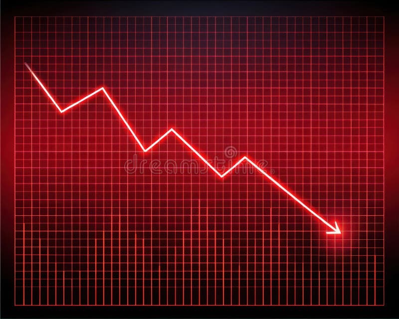
Free with trial A bright red line graph with a steep downward trend is displayed on a glowing red grid against a dark background. Performance decrease illustrations Bright Red Digital Line Graph Showing Steep Decline on Grid image. A bright red line graph with a steep downward trend is displayed on a glowing red grid against a dark background
Free with trial An detailed set of professional financial line graphs and business reporting icons for data visualization and statistics. Performance decrease vectors Professional financial line graphs and business reporting icons
Free with trial A vibrant red and orange arrow symbolizes a downward trend against a dark chart. This image represents financial decline, market analysis, and economic challenges. Performance decrease illustrations Red and Orange Arrow Indicating Downward Trend on Chart Background. A vibrant red and orange arrow symbolizes a downward trend against a dark chart. This image represents financial decline, market analysis, and economic challenges
Free with trial This image captures a downward trend line, symbolizing a financial market decline and representing challenges faced by investors. Performance decrease illustrations Downward Trend Line Representing Financial Market Decline and Loss. This image captures a downward trend line, symbolizing a financial market decline and representing challenges faced by investors
Free with trial This image showcases data analysis icons, representing data processing, visualization, and interpretation, which are crucial for gaining valuable insights. Performance decrease vectors Vector art of data analysis icons representing various aspects of data processing, visualization, and interpretation for insights. This image showcases data analysis icons, representing data processing, visualization, and interpretation, which are crucial for gaining valuable insights
Free with trial A growth chart with a star signifies progress. It shows upward trends, success, and achievement in business or personal development, indicating positive results. Performance decrease vectors Vector art of growth chart with star, representing progress, success, achievement, and upward trend in business or personal. A growth chart with a star signifies progress. It shows upward trends, success, and achievement in business or personal development, indicating positive results
Free with trial Set of three bar charts illustrating data trends, growth, and comparisons with varying heights and styles for business or financial presentations. Performance decrease illustrations Three different types of bar charts showing data growth and trends. Set of three bar charts illustrating data trends, growth, and comparisons with varying. Set of three bar charts illustrating data trends, growth, and comparisons with varying heights and styles for business or financial presentations
Free with trial A businessman is shown from an elevated perspective, diligently typing on a laptop. Beside him, a 3D bar graph illustrates a downward trend, accompanied by a prominent green arrow and a COST sign, symbolizing cost reduction and financial efficiency. Performance decrease illustrations Businessman working on laptop with decreasing cost graph and arrow. A businessman is shown from an elevated perspective, diligently typing on a laptop. Beside him, a 3D bar graph illustrates a downward trend, accompanied by a prominent green arrow and a COST sign, symbolizing cost reduction and financial efficiency
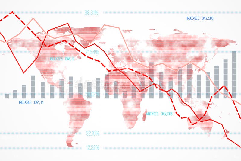
Free with trial Financial data chart featuring declining indexes and bar graphs overlaid on a world map background. Concept of global economic downturn. 3D Rendering. Performance decrease illustrations Financial data chart with declining indexes on a world map background. 3D Rendering. Financial data chart featuring declining indexes and bar graphs overlaid on a world map background. Concept of global economic downturn. 3D Rendering
Free with trial Detailed statistics, a white background, and a downward arrow depicting a stock market crash. 3D rendering. Performance decrease illustrations Detailed statistics, a white background, and a downward arrow depicting a stock market crash. 3D rendering.
Free with trial A striking red umbrella stands over blue financial graphs, symbolizing risk management and the protection of money in this 3D illustration. Perfect for finance and business themes. Performance decrease illustrations Red Umbrella Over Financial Graphs Representing Risk Management and Protection of Money in 3D Illustration. A striking red umbrella stands over blue financial graphs, symbolizing risk management and the protection of money in this 3D illustration. Perfect for finance and business themes
Free with trial Collection of various business and financial chart icons in a modern, flat style, set against a dark blue background. Perfect for infographics, presentations, and websites requiring data visualization elements. Performance decrease illustrations Business and Financial Icons Set on Dark Blue Background for Design Elements. Collection of various business and financial chart icons in a modern, flat style, set against a dark blue background. Perfect for infographics, presentations, and websites requiring data visualization elements
Free with trial Stock market data with candlestick chart and declining arrow on a blurred light background. Concept of financial decline. 3D Rendering. Performance decrease illustrations Abstract image of financial stock market data with declining arrow on light background. 3D Rendering. Stock market data with candlestick chart and declining arrow on a blurred light background. Concept of financial decline. 3D Rendering
Free with trial A red arrow symbolizing decline rests on a wooden table, capturing the essence of financial downturn and negative trends in business environments and evaluations. Performance decrease illustrations Red Declining Arrow on Wooden Table Representing Financial Downturn. A red arrow symbolizing decline rests on a wooden table, capturing the essence of financial downturn and negative trends in business environments and evaluations
Free with trial The image depicts a bar graph with a series of red vertical bars that decrease in height from left to right, indicating a downward trend. A large red arrow, outlined in white, points diagonally downward and to the right, emphasizing the decline. Performance decrease illustrations A downward trend graph with a prominent red arrow indicating decline. The image depicts a bar graph with a series of red vertical bars that decrease in height from left to right, indicating a downward trend. A large red arrow, outlined in white, points diagonally downward and to the right, emphasizing the decline
Free with trial A series of colorful bars representing a graph, each with water droplets, illuminated by a spotlight against a dark background with blurred city lights. Performance decrease illustrations Colorful bar graph with water droplets under a spotlight on a dark background with bokeh city lights. A series of colorful bars representing a graph, each with water droplets, illuminated by a spotlight against a dark background with blurred city lights
Free with trial This financial data illustration set features a stack of coins with a dollar sign alongside euro and pound currency stacks on the left, while the right side displays six analytical graphs including a blue downward trend graph, a green upward trend graph, a dual-color bar graph representing growth or decline, a bar graph with a green upward arrow indicating value increase, a pound coin illustration. Performance decrease illustrations Set of four financial data illustrations showing currency stacks and business graphs with trends for investment analysis and. This financial data illustration set features a stack of coins with a dollar sign alongside euro and pound currency stacks on the left, while the right side displays six analytical graphs including a blue downward trend graph, a green upward trend graph, a dual-color bar graph representing growth or decline, a bar graph with a green upward arrow indicating value increase, a pound coin illustration
Free with trial A black magnifying glass is placed over a bar graph on a white background. Clear details and vibrant colors en. Performance decrease illustrations Magnifying Glass Over Bar Graph Icon on White Background chart data. A black magnifying glass is placed over a bar graph on a white background. Clear details and vibrant colors en
Free with trial Black graph showing upward and downward trends with jagged peaks on white. Clear details and vibrant colors en. Performance decrease illustrations Up and down trend graph with jagged peaks on white background chart. Black graph showing upward and downward trends with jagged peaks on white. Clear details and vibrant colors en
Free with trial This image illustrates business concepts such as profit growth and cost reduction using graphical representations on digital devices A businessman points a pen towards the graphics highlighting the importance of financial strategy and positive business outcomes It emphasizes the analytical aspect of monitoring progress. Performance decrease illustrations Profit growth and cost reduction depicted with graphs and a businessman. This image illustrates business concepts such as profit growth and cost reduction using graphical representations on digital devices A businessman points a pen towards the graphics highlighting the importance of financial strategy and positive business outcomes It emphasizes the analytical aspect of monitoring progress
Free with trial A golden percentage symbol (%) with a red and blue financial graph representing stock market analysis, trends, and fluctuations. Ideal for financial reports, investments, and economic topics. Performance decrease illustrations Gold Percentage Symbol with Red and Blue Financial Graph Background. A golden percentage symbol (%) with a red and blue financial graph representing stock market analysis, trends, and fluctuations. Ideal for financial reports, investments, and economic topics.
Free with trial A 3D bar chart with white bars and red bases shows a downward trend. A thick red arrow points downwards across the grid background. Isolated on white. Performance decrease illustrations 3 D red arrow graph chart showing decline on white background image. A 3D bar chart with white bars and red bases shows a downward trend. A thick red arrow points downwards across the grid background. Isolated on white
Free with trial A golden percentage symbol (%) with a red and blue financial graph representing stock market analysis, trends, and fluctuations. Ideal for financial reports, investments, and economic topics. Performance decrease illustrations Gold Percentage Symbol with Red and Blue Financial Graph Background. A golden percentage symbol (%) with a red and blue financial graph representing stock market analysis, trends, and fluctuations. Ideal for financial reports, investments, and economic topics.
Free with trial An isometric bar chart illustrating a negative financial trend with a downward red arrow, isolated on a white background, representing economic decline and business challenges. Performance decrease illustrations Bar chart with downward trending arrow isolated on white background. An isometric bar chart illustrating a negative financial trend with a downward red arrow, isolated on a white background, representing economic decline and business challenges
Free with trial A flat style vector illustration showcasing a laptop displaying a colorful bar chart and a downward trending arrow indicating financial decline or loss. Performance decrease illustrations Laptop Screen Displaying Colorful Bar Chart and Downward Trending Arrow Symbolizing Financial Loss. A flat style vector illustration showcasing a laptop displaying a colorful bar chart and a downward trending arrow indicating financial decline or loss.
Free with trial A visually appealing bar chart composed of colorful blocks arranged to represent fluctuating data and growth patterns. Performance decrease illustrations Colorful bar graph showing upward and downward trends on a clean white surface. A visually appealing bar chart composed of colorful blocks arranged to represent fluctuating data and growth patterns
Free with trial A hand places a block on a decreasing bar graph, symbolizing cost reduction, with a magnifying glass highlighting the word COST. Performance decrease illustrations Cost Reduction Strategy Illustrated with Blocks and Magnifying Glass. A hand places a block on a decreasing bar graph, symbolizing cost reduction, with a magnifying glass highlighting the word COST
Free with trial A large green upward arrow stands tall, surrounded by multiple red downward arrows, symbolizing contrasting trends of growth and decline. Performance decrease illustrations Green up arrow dominates red down arrows showing growth and decline. A large green upward arrow stands tall, surrounded by multiple red downward arrows, symbolizing contrasting trends of growth and decline
Free with trial Abstract red chart illustrating data trends and fluctuations in finance. This graphic represents market analysis, ideal for professional reports and presentations. Performance decrease vectors Red Chart Illustration Showing Data Trends and Variations in Finance. Abstract red chart illustrating data trends and fluctuations in finance. This graphic represents market analysis, ideal for professional reports and presentations
Free with trial Reduction chart icon Black line art vector in black and white outline set collection sign. Performance decrease vectors Reduction chart icon Thin line art collection. Reduction chart icon Black line art vector in black and white outline set collection sign
Free with trial The image depicts a bar graph with a series of red vertical bars that decrease in height from left to right, indicating a downward trend. A large red arrow, outlined in white, points diagonally downward and to the right, emphasizing the decline. Performance decrease illustrations A downward trend graph with a prominent red arrow indicating decline. The image depicts a bar graph with a series of red vertical bars that decrease in height from left to right, indicating a downward trend. A large red arrow, outlined in white, points diagonally downward and to the right, emphasizing the decline
Free with trial Icon financial loss analytics with declining bar chart, down arrow and dollar sign, gear with cross for failed settings, minimal outline symbol for business report. Performance decrease vectors Icon financial loss analytics with declining bar chart, down arrow and dollar sign, gear with cross for failed settings, minimal
Free with trial Two wooden baseball bats with brown barrels and green handles are crossed in an X formation against a dark black background featuring a subtle grid pattern, with a vibrant pink line graph positioned centrally between them displaying a clear downward trend labeled RUNS PER GAME and accompanied by a bold black downward-pointing arrow, creating a conceptual sports analytics visual about declining. Performance decrease illustrations Two crossed brown baseball bats with green handles over black grid background with pink line graph showing decreasing runs per. Two wooden baseball bats with brown barrels and green handles are crossed in an X formation against a dark black background featuring a subtle grid pattern, with a vibrant pink line graph positioned centrally between them displaying a clear downward trend labeled RUNS PER GAME and accompanied by a bold black downward-pointing arrow, creating a conceptual sports analytics visual about declining
Free with trial A collection of eight black icons featuring robot heads and bar graphs within speech bubbles, symbolizing data analysis and AI communication. Performance decrease vectors Set of eight black icons representing robots and data analysis white. A collection of eight black icons featuring robot heads and bar graphs within speech bubbles, symbolizing data analysis and AI communication
Free with trial 3D bar chart illustrating decline, financial loss, or negative growth. Purple bars and arrow on white. Performance decrease illustrations Purple bar graph showing downward trend with arrow, financial concept. 3D bar chart illustrating decline, financial loss, or negative growth. Purple bars and arrow on white
Free with trial A red graph on a transparent background displaying a downward trend with bars and a prominent arrow indicating a sharp decline. Performance decrease illustrations Graph showing a significant decline in trend with red bars and arrow. A red graph on a transparent background displaying a downward trend with bars and a prominent arrow indicating a sharp decline
Free with trial A businessman in a suit gestures towards a yellow upward-curving arrow representing success and growth, while several blue arrows point downwards in the background, symbolizing overcoming market decline and achieving positive results. Performance decrease illustrations Businessman Pointing at Rising Yellow Arrow and Falling Blue Arrows. A businessman in a suit gestures towards a yellow upward-curving arrow representing success and growth, while several blue arrows point downwards in the background, symbolizing overcoming market decline and achieving positive results
Free with trial Cartoon illustration depicting a man in a blue suit and red tie sliding down a descending red arrow, representing a financial or market decline. His expression is concerned, and his hands are raised. In contrast, a blue arrow pointing upwards signifies growth or recovery. The arrows are jagged, emphasizing volatility in the depicted scenario. Performance decrease vectors Businessman Falling Down on Red Decreasing Stock Market Graph Concept. Cartoon illustration depicting a man in a blue suit and red tie sliding down a descending red arrow, representing a financial or market decline. His expression is concerned, and his hands are raised. In contrast, a blue arrow pointing upwards signifies growth or recovery. The arrows are jagged, emphasizing volatility in the depicted scenario.
Free with trial A 3D bar chart with red, blue, and orange bars displayed on a white board with a red frame and easel legs. Isolated on a transparent background. Performance decrease vectors 3 D Bar Chart on Easel isolated on a transparent background graph data. A 3D bar chart with red, blue, and orange bars displayed on a white board with a red frame and easel legs. Isolated on a transparent background
Free with trial Pink bar graph showing a downward trend on a pink background, financial concept. Performance decrease illustrations Pink bar graph showing a downward trend on a pink background, financial concept
Free with trial A bold black 95% symbol against a white backdrop. Represents a high percentage, score, or discount, ideal for finance, sales, and statistical contexts. Performance decrease vectors Vector art of black ninetyfive percent symbol, representing a high percentage or score with a modern and bold design element. A bold black 95% symbol against a white backdrop. Represents a high percentage, score, or discount, ideal for finance, sales, and statistical contexts
Free with trial An open notebook displays two pages of business data visualization with a vertical bar graph on the left page featuring green, red, and blue bars alongside a central pie chart divided into red, blue, and green segments showing 70% in red with upward and downward arrows indicating percentage changes, all set against a clean white background ideal for concepts of analytics, financial reporting,. Performance decrease illustrations Business data analysis shown in an open notebook with colorful bar graph and pie chart illustrating statistics and percentages. An open notebook displays two pages of business data visualization with a vertical bar graph on the left page featuring green, red, and blue bars alongside a central pie chart divided into red, blue, and green segments showing 70% in red with upward and downward arrows indicating percentage changes, all set against a clean white background ideal for concepts of analytics, financial reporting,
Free with trial Bar chart illustrating financial decline with a red arrow pointing downwards towards a dollar symbol. Represents economic recession, loss, and market crash. Performance decrease illustrations Financial graph showing downward trend with red arrow and dollar sign. Bar chart illustrating financial decline with a red arrow pointing downwards towards a dollar symbol. Represents economic recession, loss, and market crash
Free with trial A financial candlestick chart illustrating a bearish market trend with a series of red and blue candles indicating a consistent decline in value over time. Performance decrease illustrations Candlestick chart showing market decline isolated on white background. A financial candlestick chart illustrating a bearish market trend with a series of red and blue candles indicating a consistent decline in value over time
Free with trial A graph showing a downward trend with a red arrow pointing downwards, indicating a decline or loss in value or quantity, set against a blue background with grid lines and faint white graphs. Performance decrease illustrations Declining trend indicated by red arrow on graph showing loss in value. A graph showing a downward trend with a red arrow pointing downwards, indicating a decline or loss in value or quantity, set against a blue background with grid lines and faint white graphs
Free with trial Red wooden blocks forming a declining bar graph on a financial document. Shows a negative trend in business or market data. Performance decrease illustrations Red Wooden Blocks Showing Declining Bar Graph on Financial Report Ai generated. Red wooden blocks forming a declining bar graph on a financial document. Shows a negative trend in business or market data
Free with trial This image depicts a 3D bar graph with red bars. Initially, there is a sharp decline, followed by a significant upward trend, indicating a recovery or growth phase. The graph is set against a plain white background. Performance decrease illustrations A 3d graph showing a sharp decline followed by a significant upward trend. This image depicts a 3D bar graph with red bars. Initially, there is a sharp decline, followed by a significant upward trend, indicating a recovery or growth phase. The graph is set against a plain white background
Free with trial This stunning image features a paper craft of a downward arrow placed on a blue gradient background. The simplicity of the design is striking, and the contrast between the white paper and the blue background creates a visually captivating effect. The downward arrow can symbolize a variety of themes, such as a decrease in performance or a downturn in the economy. This image could be used to convey a sense of caution or to illustrate the concept of a downward trend in business or finance. The overall effect of the image is both elegant and impactful, making it a great choice for a variety of creative projects. Performance decrease illustrations Downward Arrow Business Paper Craft on Blue Gradient Background. This stunning image features a paper craft of a downward arrow placed on a blue gradient background. The simplicity of the design is striking, and the contrast between the white paper and the blue background creates a visually captivating effect. The downward arrow can symbolize a variety of themes, such as a decrease in performance or a downturn in the economy. This image could be used to convey a sense of caution or to illustrate the concept of a downward trend in business or finance. The overall effect of the image is both elegant and impactful, making it a great choice for a variety of creative projects.
Free with trial The image depicts a series of blue ascending bars representing a growth trend, transitioning into a red descending line, symbolizing a decline or downturn. The yellow line at the top of the bars adds emphasis to the peak before the decline begins, indicating a pivotal point in the trend. This visual metaphor is often used in business, economics, or market analysis to represent shifts from positive. Performance decrease illustrations Graphic illustrating a decline after a period of growth and stability. The image depicts a series of blue ascending bars representing a growth trend, transitioning into a red descending line, symbolizing a decline or downturn. The yellow line at the top of the bars adds emphasis to the peak before the decline begins, indicating a pivotal point in the trend. This visual metaphor is often used in business, economics, or market analysis to represent shifts from positive
Free with trial Business chart showing negative trend with red arrow and descending bars. Performance decrease vectors Business chart showing negative trend with red arrow and descending bars
Free with trial Blue arrow pointing downward on a grid. Business graph with falling trend line. Digital stock market data visualization for investment analysis. Performance decrease illustrations Blue arrow pointing downward on a grid. Business graph with falling trend line
Free with trial The image depicts a bar graph with a series of red bars that are progressively decreasing in height from left to right. A large red arrow is pointing downwards, emphasizing the downward trend. Performance decrease illustrations Graph showing a downward trend with a large red arrow pointing downwards. The image depicts a bar graph with a series of red bars that are progressively decreasing in height from left to right. A large red arrow is pointing downwards, emphasizing the downward trend
Free with trial Simple and clean blue gradient line graph is going up and down showing growth and decline over a period of time. Performance decrease vectors Blue gradient line graph showing growth and decline over time. Simple and clean blue gradient line graph is going up and down showing growth and decline over a period of time
Free with trial A downward trending graph chart isolated on a white background, representing financial loss, downturn, or market analysis. Performance decrease illustrations Downward graph chart on white background. A downward trending graph chart isolated on a white background, representing financial loss, downturn, or market analysis
Free with trial Computer screen displaying a simple statistical business graph, perfect for illustrating concepts like data analysis. Performance decrease illustrations Computer showing statistical business graph on screen. Computer screen displaying a simple statistical business graph, perfect for illustrating concepts like data analysis
Free with trial Color-coded bars with arrows indicate up/down movements and are separated by a line. Performance decrease vectors Color-coded vertical bars separated by a grey line with up/down arrows. Color-coded bars with arrows indicate up/down movements and are separated by a line.
Free with trial Dramatic image showing a sharp decline in stock market data on a tablet screen. Performance decrease illustrations A person interacting with a tablet displaying a falling stock market chart. Dramatic image showing a sharp decline in stock market data on a tablet screen
Free with trial This image shows two sets of 3D bar charts, one with green bars indicating a consistent upward trend and growth, while the other with red bars depicts a downward trend and decline. The green chart has arrows pointing upwards, symbolizing positive growth, while the red chart has arrows pointing downwards, indicating a negative trend. Performance decrease illustrations Contrasting upward and downward trends in a 3d bar chart visualization. This image shows two sets of 3D bar charts, one with green bars indicating a consistent upward trend and growth, while the other with red bars depicts a downward trend and decline. The green chart has arrows pointing upwards, symbolizing positive growth, while the red chart has arrows pointing downwards, indicating a negative trend
Free with trial Financial concept with upward and downward arrows and stock chart background. Performance decrease illustrations Financial concept with upward and downward arrows and stock chart background
Free with trial Green stock chart growth and upward trend on a vibrant green background ,Generative ai. Performance decrease illustrations Green stock chart indicates upward growth trend in a bull market on green background. Green stock chart growth and upward trend on a vibrant green background ,Generative ai
Free with trial Red bar graph showing downward trend and financial decline on a red background. Performance decrease illustrations Red bar graph showing downward trend and financial decline on a red background.
Free with trial This image features a red zigzag arrow pointing downward and to the right, with the word Loss displayed in bold white text along its length. The arrow casts a faint shadow that adds depth while keeping the layout simple. The strong contrast between the red shape and the light background makes the message clear and direct. The design uses minimal elements to communicate a sense of decline or reduction, relying on familiar visual cues associated with downward trends. The overall composition is steady and uncluttered, allowing the viewer to focus on the central symbol without distraction. Performance decrease illustrations Loss arrow graphic with red zigzag downward shape and bold white text. This image features a red zigzag arrow pointing downward and to the right, with the word Loss displayed in bold white text along its length. The arrow casts a faint shadow that adds depth while keeping the layout simple. The strong contrast between the red shape and the light background makes the message clear and direct. The design uses minimal elements to communicate a sense of decline or reduction, relying on familiar visual cues associated with downward trends. The overall composition is steady and uncluttered, allowing the viewer to focus on the central symbol without distraction.
Free with trial A vibrant infographic illustrating business growth, financial analysis, and data visualization with charts, graphs, and icons. Performance decrease vectors Infographic of Business Growth and Financial Analysis with Charts and Icons. A vibrant infographic illustrating business growth, financial analysis, and data visualization with charts, graphs, and icons
Free with trial The image shows a series of colorful blocks decreasing in height from left to right, accompanied by a bold red downward arrow, symbolizing a downward trend or decline. The blocks are arranged in a gradient of colors from pink to blue, emphasizing the reduction visually. Performance decrease illustrations Declining trend represented by colorful blocks and a red downward arrow. The image shows a series of colorful blocks decreasing in height from left to right, accompanied by a bold red downward arrow, symbolizing a downward trend or decline. The blocks are arranged in a gradient of colors from pink to blue, emphasizing the reduction visually
Free with trial The image shows a smartphone displaying a financial chart with upward and downward trends in green and red, alongside a stack of golden coins. The chart likely represents stock market performance or investment growth, while the coins symbolize wealth accumulation and financial success. Performance decrease illustrations Financial growth illustrated by smartphone chart and golden coins stack. The image shows a smartphone displaying a financial chart with upward and downward trends in green and red, alongside a stack of golden coins. The chart likely represents stock market performance or investment growth, while the coins symbolize wealth accumulation and financial success
Free with trial Hand drawn bar graph showing a sharp downward trend with a descending arrow. Performance decrease vectors Hand drawn bar graph showing a sharp downward trend with a descending arrow
Free with trial The image depicts a 3D graph with white blocks forming a staircase pattern. A red arrow points downward, indicating a decline, while a blue arrow points upward, signifying growth. The arrows intersect at the base of the staircase. Performance decrease illustrations Graphic representation of upward and downward trends with arrows and blocks. The image depicts a 3D graph with white blocks forming a staircase pattern. A red arrow points downward, indicating a decline, while a blue arrow points upward, signifying growth. The arrows intersect at the base of the staircase
Free with trial A 3D rendered representation of a bar chart displayed within a simplified interface window. The chart features ascending bars in shades of green and a single pink bar at the end, suggesting data and growth. The window has a purple top bar with three colored dots and the text "ISO 1600". The entire graphic floats against a light purple background. Performance decrease illustrations 3D Bar Chart with Green and Pink Bars Showing Growth and Data on a Purple Background with ISO 1600 Label. A 3D rendered representation of a bar chart displayed within a simplified interface window. The chart features ascending bars in shades of green and a single pink bar at the end, suggesting data and growth. The window has a purple top bar with three colored dots and the text "ISO 1600". The entire graphic floats against a light purple background
Free with trial A colorful 3D pie chart, segmented in blue, pink, and teal, is shown against a light purple background. A yellow coin with an upward arrow is positioned above the chart, and a pink coin with a downward arrow is placed beside it. This imagery represents financial data, growth, and decline. Performance decrease illustrations Pie Chart with Up and Down Arrows and Coins for Financial Growth graph data. A colorful 3D pie chart, segmented in blue, pink, and teal, is shown against a light purple background. A yellow coin with an upward arrow is positioned above the chart, and a pink coin with a downward arrow is placed beside it. This imagery represents financial data, growth, and decline
Free with trial A person holds a smartphone displaying a glowing blue neon graph with descending bars and a line indicating a significant cost reduction, Created AI. Performance decrease illustrations Digital graph showing declining costs and percentage reduction displayed on a smartphone held by a person. A person holds a smartphone displaying a glowing blue neon graph with descending bars and a line indicating a significant cost reduction, Created AI