Free with trial Simple black icon of a declining bar chart with a downward arrow showing financial loss. Performance decrease vectors Simple black icon of a declining bar chart with a downward arrow showing financial loss
Free with trial Person analyzes growth chart, market trends, financial data, stock exchange, investment portfolio,Generative AI. Performance decrease illustrations Business person analyzes growth charts, market trends, and financial data on an interactive screen. Person analyzes growth chart, market trends, financial data, stock exchange, investment portfolio,Generative AI
Free with trial Man pointing at declining chart in office symbolizing loss and economic downturn in business strategy a man pointing at a declining chart ,Generative ai. Performance decrease illustrations Businessman Pointing at Declining Chart Showing Negative Growth in Financial Analysis Presentation Businessman. Man pointing at declining chart in office symbolizing loss and economic downturn in business strategy a man pointing at a declining chart ,Generative ai
Free with trial Black line graph icon with data points showing fluctuations on a white background Clear details and vibrant co. Performance decrease illustrations Black line graph icon showing fluctuating data points on a white background chart. Black line graph icon with data points showing fluctuations on a white background Clear details and vibrant co
Free with trial Heights showing black bar chart icon with varying heights on white background keywords: bar chart, graph. Performance decrease illustrations Black bar chart icon with varying heights on white background Keywords: bar chart, graph, data. Heights showing black bar chart icon with varying heights on white background keywords: bar chart, graph
Free with trial A digital bar graph transitions from exploding orange bars to a glowing green upward trend line with text. Performance decrease illustrations Broken plan fixed plan Exploding orange bar graph transforming into green upward trend. A digital bar graph transitions from exploding orange bars to a glowing green upward trend line with text
Free with trial The image depicts a stylized 3D bar chart with alternating red and blue bars representing fluctuations in data trends. The bars ascend and descend, symbolizing periods of growth and decline. The chart has a modern, gradient design with a clear upward trajectory at the end, suggesting recovery or improvement after a period of instability. The visual representation emphasizes the variability and. Performance decrease illustrations Dynamic 3d bar chart illustrating fluctuating growth and decline trends over time. The image depicts a stylized 3D bar chart with alternating red and blue bars representing fluctuations in data trends. The bars ascend and descend, symbolizing periods of growth and decline. The chart has a modern, gradient design with a clear upward trajectory at the end, suggesting recovery or improvement after a period of instability. The visual representation emphasizes the variability and
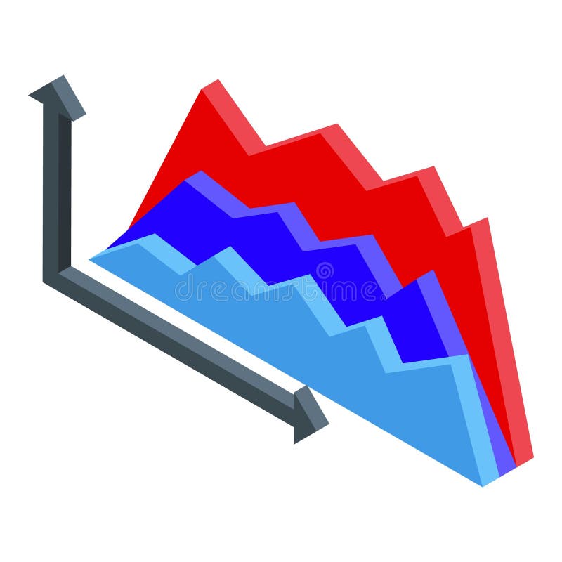
Free with trial The image depicts a series of vertical bars of varying heights, transitioning from red to blue, indicating a shift in values. An upward red arrow points towards the right, suggesting an overall positive trend despite some fluctuations. A downward red arrow is positioned near the end, indicating a recent decline or correction within an otherwise upward trajectory, commonly used to represent market. Performance decrease illustrations Graphic representation of fluctuating market trends with upward growth trajectory. The image depicts a series of vertical bars of varying heights, transitioning from red to blue, indicating a shift in values. An upward red arrow points towards the right, suggesting an overall positive trend despite some fluctuations. A downward red arrow is positioned near the end, indicating a recent decline or correction within an otherwise upward trajectory, commonly used to represent market
Free with trial This image depicts a stock market graph with a clear upward trend, featuring significant fluctuations and notable peaks and troughs over a specified period. The graph includes trend lines and an arrow indicating the overall upward movement. Performance decrease illustrations Stock market graph showing upward trend with significant fluctuations over time. This image depicts a stock market graph with a clear upward trend, featuring significant fluctuations and notable peaks and troughs over a specified period. The graph includes trend lines and an arrow indicating the overall upward movement
Free with trial Wooden blocks arranged as declining graph on vibrant red background, business concept. Performance decrease illustrations Wooden blocks arranged as declining graph on vibrant red background, business concept
Free with trial Declining Bar Chart With Downward Arrow Line And Solid Icon Set. Financial Loss, Economic Downturn, And Business Decline Symbol Collection. Risk Assessment. Isolated Vector Illustration. Performance decrease vectors Declining Bar Chart With Downward Arrow Line And Solid Icon Set. Financial Loss, Economic Downturn, And Business Decline
Free with trial Cac cost acquisition is represented by wooden blocks and stacks of coins showing decreasing investment and financial return on marketing strategy business planning and customer acquisition for sales. Performance decrease illustrations Cac cost acquisition marketing business finance investment strategy return growth analysis budget advertising customer sales reven. Cac cost acquisition is represented by wooden blocks and stacks of coins showing decreasing investment and financial return on marketing strategy business planning and customer acquisition for sales
Free with trial Graph line icon. Continuous line with share plane. Column chart sign. Growth diagram symbol. 3d heart in speech bubble. Graph chart single line ribbon. Loop curve pattern. Vector. Performance decrease illustrations Graph line icon. Column chart sign. Continuous line with plane. Vector. Graph line icon. Continuous line with share plane. Column chart sign. Growth diagram symbol. 3d heart in speech bubble. Graph chart single line ribbon. Loop curve pattern. Vector
Free with trial Graph line icon. Continuous line with share plane. Column chart sign. Growth diagram symbol. 3d heart in speech bubble. Graph chart single line ribbon. Loop curve pattern. Vector. Performance decrease illustrations Graph line icon. Column chart sign. Continuous line with plane. Vector. Graph line icon. Continuous line with share plane. Column chart sign. Growth diagram symbol. 3d heart in speech bubble. Graph chart single line ribbon. Loop curve pattern. Vector
Free with trial Graph line icon. Continuous line with share plane. Column chart sign. Growth diagram symbol. 3d heart in speech bubble. Graph chart single line ribbon. Loop curve pattern. Vector. Performance decrease vectors Graph line icon. Column chart sign. Continuous line with plane. Vector. Graph line icon. Continuous line with share plane. Column chart sign. Growth diagram symbol. 3d heart in speech bubble. Graph chart single line ribbon. Loop curve pattern. Vector
Free with trial A minimalist black line graph with circular data points and vertical bars is depicted on a white background. Performance decrease illustrations Simple black line graph with bars and circles on white background chart statistics. A minimalist black line graph with circular data points and vertical bars is depicted on a white background
Free with trial A black icon illustrating a falling stock market graph with a prominent downward arrow. Performance decrease illustrations Black icon of a falling stock market graph with a downward arrow on a white background. A black icon illustrating a falling stock market graph with a prominent downward arrow
Free with trial A 3D bar chart composed of four colored bars (orange, green, white, and blue) stands on a black base. A line graph with red dots connects the tops of the bars, showing a fluctuating trend that culminates in a sharp downward movement indicated by a red arrow. This visual represents a negative financial trend or economic decline. Performance decrease illustrations 3D Bar Chart with Downward Trend Line and Arrow Indicating Financial Decline graph. A 3D bar chart composed of four colored bars (orange, green, white, and blue) stands on a black base. A line graph with red dots connects the tops of the bars, showing a fluctuating trend that culminates in a sharp downward movement indicated by a red arrow. This visual represents a negative financial trend or economic decline
Free with trial Glass display with a bar chart, analysis of trends, transparent screen with data visualization ,Generative ai. Performance decrease illustrations Glass display bar chart, data visualization, trend analysis, and transparent screen technology. Glass display with a bar chart, analysis of trends, transparent screen with data visualization ,Generative ai
Free with trial Analyzing Data: Person Presenting Graph Showing Progress and Growth Pointing to Top Data Peak, Achievement Concept. Performance decrease illustrations Analyzing Data: Person Presenting Graph Showing Progress and Growth Pointing to Top Data Peak, Achievement Concept
Free with trial The image shows a wooden easel holding a whiteboard with a declining trend chart. The chart features a combination of red vertical bars and a downward-sloping red line, indicating a decrease in values over time. The easel stands on a light gray surface, and the chart appears to be used for visual presentations or data analysis. Performance decrease illustrations Declining trend chart displayed on an easel with red bar and line graph elements. The image shows a wooden easel holding a whiteboard with a declining trend chart. The chart features a combination of red vertical bars and a downward-sloping red line, indicating a decrease in values over time. The easel stands on a light gray surface, and the chart appears to be used for visual presentations or data analysis
Free with trial The image displays two arrows, one green pointing upwards and another red pointing downwards, symbolizing positive growth and negative decline respectively. The arrows are simple, bold, and positioned side by side for easy comparison. Performance decrease illustrations Contrasting arrows indicating upward growth and downward decline in a visual format. The image displays two arrows, one green pointing upwards and another red pointing downwards, symbolizing positive growth and negative decline respectively. The arrows are simple, bold, and positioned side by side for easy comparison
Free with trial A minimalist teal illustration shows a declining bar graph with a downward arrow against a stark black background. Indicating negative trend and recession. Performance decrease vectors Downward trend graph illustration indicating loss or decline in a minimalist style. A minimalist teal illustration shows a declining bar graph with a downward arrow against a stark black background. Indicating negative trend and recession.
Free with trial This image depicts a thought bubble with a declining graph inside, symbolizing a bad idea or financial loss. The graph shows a downward trend, indicating a decrease in value or performance. The image can be used to represent a business concept, economic downturn, or stock market failure. It can also be used to convey a sense of disappointment, frustration, or sadness. The image is simple, yet effective in communicating a complex idea. It can be used in a variety of contexts, including presentations, reports, and marketing materials. Performance decrease vectors A thought bubble with a declining graph inside, symbolizing a bad idea or financial loss
Free with trial A digital dashboard displaying financial data and market analytics on a desk with potted plants and greenery accents showcasing a modern technology driven workspace for business economics. Performance decrease illustrations Financial Data Analytics Display with Greenery Accents on Office Desk. A digital dashboard displaying financial data and market analytics on a desk with potted plants and greenery accents showcasing a modern technology driven workspace for business economics
Free with trial A monochrome illustration depicts a man in a suit sitting at a desk with his head in his hands, appearing stressed. A chart on the desk titled "Monthly Revenue" displays a downward trend in bar graph format. Crumpled papers are scattered on the floor, and a mug rests on the desk. The scene communicates a sense of financial or business-related stress. Performance decrease vectors Stressed Businessman at Desk with Declining Monthly Revenue Chart and Financial Loss. A monochrome illustration depicts a man in a suit sitting at a desk with his head in his hands, appearing stressed. A chart on the desk titled "Monthly Revenue" displays a downward trend in bar graph format. Crumpled papers are scattered on the floor, and a mug rests on the desk. The scene communicates a sense of financial or business-related stress.
Free with trial Financial graph with red arrows indicating declining stock prices on a white background. Concept of market downturn and economic crisis. 3D Rendering. Performance decrease illustrations Financial graph showing declining stock prices with red arrows on white background. 3D Rendering. Financial graph with red arrows indicating declining stock prices on a white background. Concept of market downturn and economic crisis. 3D Rendering
Free with trial Close up of businessman hand touching a falling arrow and bar chart. Business Loss and Risk Management. Performance decrease illustrations Close up of businessman hand touching a falling arrow and bar chart. Business Loss and Risk Management.
Free with trial A downward trending bar graph in shades of blue, illustrating a financial decline with sleek, minimalistic lines and a clear visual impact. Generative AI. Performance decrease vectors Downward trending bar graph in flat design style showcasing financial decline vector illustration. A downward trending bar graph in shades of blue, illustrating a financial decline with sleek, minimalistic lines and a clear visual impact. Generative AI
Free with trial This image depicts a stark, downward-pointing arrow rendered in a dark, almost black silhouette against a vibrant, fiery red backdrop, evoking feelings of loss, failure, or market crash. Performance decrease illustrations Dramatic red descent a sharp decline symbolized by a falling arrow in a fiery background. This image depicts a stark, downward-pointing arrow rendered in a dark, almost black silhouette against a vibrant, fiery red backdrop, evoking feelings of loss, failure, or market crash
Free with trial A white bar graph icon with bars of different heights is displayed within a black circle, representing data and analytics. Performance decrease illustrations White bar graph icon with varying height bars inside a black circle chart statistics. A white bar graph icon with bars of different heights is displayed within a black circle, representing data and analytics
Free with trial A white rectangular featuring a bar chart with blue and gray bars and a line graph with blue and gray lines. Upward and downward arrows with horizontal bars are positioned to the right of the. Performance decrease illustrations Blue and gray bar chart with upward and downward arrows on a white background line graph. A white rectangular featuring a bar chart with blue and gray bars and a line graph with blue and gray lines. Upward and downward arrows with horizontal bars are positioned to the right of the
Free with trial Minimalist bar chart created with natural wooden blocks, symbolizing data, financial trends, market fluctuations, and business analysis on a white surface. Performance decrease illustrations Wooden blocks bar chart illustrating business data progression on a white background. Minimalist bar chart created with natural wooden blocks, symbolizing data, financial trends, market fluctuations, and business analysis on a white surface.
Free with trial Man in a beige shirt and jeans holding a paper with charts, isolated yellow background. AI-generated. Performance decrease illustrations Hands holding a paper with financial business charts, yellow background. Man in a beige shirt and jeans holding a paper with charts, isolated yellow background. AI-generated
Free with trial A magnifying glass focuses on a downward trend in stock market data displayed on a futuristic digital screen, analyzing market trends. Performance decrease illustrations A magnifying glass focuses on a downward trend in stock market data displayed on a futuristic digital screen, analyzing market
Free with trial Isometric graph showing different trends with ups and downs, concept of trading and business analysis. Performance decrease illustrations Isometric graph showing different trends with ups and downs
Free with trial Line art icon representing financial audit and data analysis of a declining business report. Performance decrease vectors Line art icon representing financial audit and data analysis of a declining business report
Free with trial Simple black bar chart with two bars of different heights on a white background graph. Performance decrease illustrations Simple black bar chart with two bars of different heights on a white background graph
Free with trial A black bar graph icon illustrating a downward trend with a down arrow on a white background. Performance decrease illustrations Black bar graph icon showing a downward trend with an arrow on white background chart. A black bar graph icon illustrating a downward trend with a down arrow on a white background
Free with trial Black icon showing a declining graph with a falling arrow and ice cube. Clear details and vibrant colors enhan. Performance decrease illustrations Black icon of a downward trending graph with a falling arrow and ice cube chart decline. Black icon showing a declining graph with a falling arrow and ice cube. Clear details and vibrant colors enhan
Free with trial A white bar graph icon with a metallic silver rim is presented within a black circle on a dark gray background. Performance decrease illustrations White bar graph icon with metallic rim inside a black circle on a dark background chart. A white bar graph icon with a metallic silver rim is presented within a black circle on a dark gray background
Free with trial The image features a striking red zigzag arrow that begins at the top left and extends downwards to the bottom right, set against a clean white background. The arrow's zigzag pattern adds a sense of dynamic movement and volatility to the otherwise straightforward indication of a downward trend. The use of red for the arrow emphasizes the negative direction, drawing immediate attention to the. Performance decrease illustrations A red zigzag arrow pointing downwards indicates a significant decline or downward trend. The image features a striking red zigzag arrow that begins at the top left and extends downwards to the bottom right, set against a clean white background. The arrow's zigzag pattern adds a sense of dynamic movement and volatility to the otherwise straightforward indication of a downward trend. The use of red for the arrow emphasizes the negative direction, drawing immediate attention to the
Free with trial A 3D rendered illustration showing a bar graph with bars decreasing in height, symbolizing a decline. Above the graph, a prominent red triangle with a white exclamation mark signifies a warning or alert. The background is a soft peach color, and the overall composition conveys a sense of financial or economic concern. Performance decrease illustrations 3D Illustration of a Falling Bar Graph with a Red Exclamation Mark Warning Symbol chart. A 3D rendered illustration showing a bar graph with bars decreasing in height, symbolizing a decline. Above the graph, a prominent red triangle with a white exclamation mark signifies a warning or alert. The background is a soft peach color, and the overall composition conveys a sense of financial or economic concern
Free with trial The image depicts a wooden easel holding a white board with a downward-trending red line, a pie chart showing a small green segment, and a red warning triangle. Below the easel, three stacks of gold coins symbolize financial loss or economic downturn. The visual elements collectively suggest financial warnings, market decline, or poor investment returns. Performance decrease illustrations Financial decline illustrated with warning and pie chart graphics on easel with gold coins. The image depicts a wooden easel holding a white board with a downward-trending red line, a pie chart showing a small green segment, and a red warning triangle. Below the easel, three stacks of gold coins symbolize financial loss or economic downturn. The visual elements collectively suggest financial warnings, market decline, or poor investment returns
Free with trial A black line graph with an arrow indicating a downward trend on a white background. Performance decrease illustrations Black line graph showing a downward trend with arrow on white background chart decline. A black line graph with an arrow indicating a downward trend on a white background
Free with trial A 3D bar chart and a partial pie chart illustrating data and growth, with percentage labels, on a white background. Performance decrease illustrations 3D Bar Chart and Pie Chart Showing Growth and Data Analysis on White Background graph statistics. A 3D bar chart and a partial pie chart illustrating data and growth, with percentage labels, on a white background
Free with trial A black line graph depicts a sharp downward trend with the text Drawdown Phase below. Performance decrease illustrations Black line graph showing a sharp downward trend with text Drawdown Phase chart decline. A black line graph depicts a sharp downward trend with the text Drawdown Phase below
Free with trial A black graph illustrating a steep downward trend with multiple curved lines and an arrow. Performance decrease illustrations Black graph showing a steep downward trend with multiple lines and arrow chart decline. A black graph illustrating a steep downward trend with multiple curved lines and an arrow
Free with trial A downward trending graph with a red arrow pointing to the decline, set against a blue background with grid lines and various colored bars at the bottom. Performance decrease illustrations Downward trend analysis showing significant decline over time with various data points. A downward trending graph with a red arrow pointing to the decline, set against a blue background with grid lines and various colored bars at the bottom
Free with trial Colorful business charts and graphs showing financial growth, data analysis, and stock market trends, ideal for corporate presentations and reports. Performance decrease illustrations Business data analysis charts graphs financial growth stock market trend generative ai. colorful business charts and graphs showing financial growth, data analysis, and stock market trends, ideal for corporate presentations and reports.
Free with trial Vector illustration of a statistical bar graph, with a green arrow with an upward trend. Performance decrease vectors Statistical bar graph
Free with trial Three-dimensional line graph with a metallic silver appearance, showing a decreasing trend in a zigzag pattern. The graph is set against a plain white background, with prominent vertical and horizontal axes, representing a financial or statistical decline. The lines are sleek and reflective, resembling metal tubing, enhancing the visual impact of a significant downturn. Performance decrease vectors 3D line chart with decreasing trend and silver metallic effect representing financial losses. Three-dimensional line graph with a metallic silver appearance, showing a decreasing trend in a zigzag pattern. The graph is set against a plain white background, with prominent vertical and horizontal axes, representing a financial or statistical decline. The lines are sleek and reflective, resembling metal tubing, enhancing the visual impact of a significant downturn.
Free with trial Wooden blocks arranged as a declining graph on a red background, representing financial loss. Performance decrease illustrations Wooden blocks arranged as a declining graph on a red background, representing financial loss
Free with trial This abstract 3D composition features purple graphs symbolizing growth and decline, set against a soft purple backdrop, ideal for business concepts. Performance decrease illustrations Abstract 3D Purple Graphs Representing Growth and Decline on a Soft Purple Background. This abstract 3D composition features purple graphs symbolizing growth and decline, set against a soft purple backdrop, ideal for business concepts
Free with trial The image depicts a bar chart showing a progressive increase in values, likely representing investments or costs, while a red downward-sloping line indicates a decrease in profits or returns over the same period. A green dollar sign emphasizes the financial theme. Performance decrease vectors Graphic illustration of declining profits despite increasing investments or costs. The image depicts a bar chart showing a progressive increase in values, likely representing investments or costs, while a red downward-sloping line indicates a decrease in profits or returns over the same period. A green dollar sign emphasizes the financial theme
Free with trial Black line graph showing a downward trend with an arrow on a white background Clear details and vibrant colors. Performance decrease illustrations Black line graph showing a downward trend with arrow on white background Keywords: graph, chart. Black line graph showing a downward trend with an arrow on a white background Clear details and vibrant colors
Free with trial Wooden blocks arranged in descending steps with red arrow indicating a decline on red backdrop. Performance decrease illustrations Wooden blocks arranged in descending steps with red arrow indicating a decline on red backdrop
Free with trial This is an detailed collection of financial icons depicting various stock market trends, growth curves, and data analysis patterns. Performance decrease vectors Financial data and stock market trend line icons set showing growth and volatility curves. This is an detailed collection of financial icons depicting various stock market trends, growth curves, and data analysis patterns
Free with trial Orange bars show a decreasing trend with a bold red arrow pointing downwards. Isolated on a transparent background. Performance decrease vectors Orange bar chart with red downward arrow isolated on a transparent background graph. Orange bars show a decreasing trend with a bold red arrow pointing downwards. Isolated on a transparent background
Free with trial A purple analog alarm clock is positioned on a cylindrical pedestal in front of a stylized bar graph. The bars on the left are green and represent an upward growth trend, while the bars on the right are orange and red, depicting a downward trend with a red arrow pointing down to indicate a decrease. Performance decrease illustrations A purple alarm clock sits in front of a bar graph showing a trend of growth followed by decline. A purple analog alarm clock is positioned on a cylindrical pedestal in front of a stylized bar graph. The bars on the left are green and represent an upward growth trend, while the bars on the right are orange and red, depicting a downward trend with a red arrow pointing down to indicate a decrease
Free with trial Colorful bar chart graph with long shadow in circular background represents data analytics. Performance decrease vectors Colorful bar chart graph with long shadow in circular background represents data analytics
Free with trial Negative growth graph with white 3d pillars on grid floor against blue background for market trend analysis. Performance decrease illustrations Business bar chart with declining red arrow showing financial loss and economic recession. Negative growth graph with white 3d pillars on grid floor against blue background for market trend analysis
Free with trial Red arrows and metallic percentage signs are falling down against white background. Good discounts, sales. Price go down. Header, 3D render. Performance decrease illustrations Red arrows and metallic percentage signs are falling down against white background. Good discounts, sales. Price go down. Header
Free with trial This image features four different types of graphs and charts that illustrate various trends and data analysis. These visual representations include bar graphs, line graphs, and 3D block charts. Performance decrease illustrations Graphs and charts showing trends and data analysis isolated on transparent background. This image features four different types of graphs and charts that illustrate various trends and data analysis. These visual representations include bar graphs, line graphs, and 3D block charts
Free with trial The image shows a transparent screen displaying a graph with a red downward trend, placed on a desk in a dimly lit office environment with a laptop in the background. Performance decrease illustrations A downward trending graph is displayed on a transparent screen in a dimly lit office setting. The image shows a transparent screen displaying a graph with a red downward trend, placed on a desk in a dimly lit office environment with a laptop in the background
Free with trial A businessman looking at financial charts on screen, dark background, cinematic lighting, success concept. Performance decrease illustrations A businessman looking at financial charts on screen, dark background, cinematic lighting, success concept
Free with trial This is an detailed assembly of essential outline icons for business strategy, data visualization, and planning. Performance decrease vectors Essential business strategy and data visualization tools in professional outline style. This is an detailed assembly of essential outline icons for business strategy, data visualization, and planning
Free with trial A person's hands hover over a laptop displaying a vibrant green home energy efficiency graphic with a bar chart showing energy consumption levels A, B, and G. The overall tone is dark and moody. Performance decrease illustrations Dark toned image of hands interacting with a glowing green home energy efficiency graphic. A person's hands hover over a laptop displaying a vibrant green home energy efficiency graphic with a bar chart showing energy consumption levels A, B, and G. The overall tone is dark and moody
Free with trial A black curved arrow points downwards towards a horizontal line on a white background. Performance decrease illustrations Black curved arrow descending towards a horizontal line on white background down movement. A black curved arrow points downwards towards a horizontal line on a white background
Free with trial Teal bars show a decreasing trend with a red arrow pointing downwards. Isolated on a transparent background. Performance decrease vectors Teal bar graph with red downward trending arrow isolated on a transparent background. Teal bars show a decreasing trend with a red arrow pointing downwards. Isolated on a transparent background
Free with trial Pink bar chart report on wooden table displaying progress data analysis ,Generative ai. Performance decrease illustrations Pink bar chart report displaying progress data analysis on wooden table for business insights. Pink bar chart report on wooden table displaying progress data analysis ,Generative ai
Free with trial This image is a flat design showing a decreasing red bar graph on a black background. It symbolizes a decline or negative trend. Performance decrease vectors Decreasing Red Bar Graph on Black Background Representing Decline or Negative Trends. This image is a flat design showing a decreasing red bar graph on a black background. It symbolizes a decline or negative trend.
Free with trial A minimal upward arrow symbolizing financial growth, business success and strategic progress in a modern conceptual design. Performance decrease illustrations Upward growth and financial success concept with abstract arrow, business progress and strategy. A minimal upward arrow symbolizing financial growth, business success and strategic progress in a modern conceptual design
Free with trial Magnifying glass focuses on a blue bar graph with a visible downward trend line, set against a dark, blurred financial backdrop. Bars decrease in height from left to right, emphasizing a decline. The atmosphere is enhanced by subtle ambient reflections and lighting that highlight the graph's detail, symbolizing analysis of negative financial or economic trends. Performance decrease illustrations Magnifying glass focused on a declining bar graph with a downward trend line on a dark background. Magnifying glass focuses on a blue bar graph with a visible downward trend line, set against a dark, blurred financial backdrop. Bars decrease in height from left to right, emphasizing a decline. The atmosphere is enhanced by subtle ambient reflections and lighting that highlight the graph's detail, symbolizing analysis of negative financial or economic trends.
Free with trial Collection of icons showing different types of charts graphs and data analysis tools isolated on transparent background. Performance decrease vectors Set of various icons representing business data analysis and statistics with charts and graphs. Collection of icons showing different types of charts graphs and data analysis tools isolated on transparent background
Free with trial A grid of thin line icons illustrating business growth and financial concepts, featuring charts, graphs, money symbols, and people. Performance decrease illustrations Business Growth and Financial Analytics Icon Collection with Charts and Money Keywords: business, growth, finance, analytics. A grid of thin line icons illustrating business growth and financial concepts, featuring charts, graphs, money symbols, and people
Free with trial Dynamic graph showcasing a decreasing line and an increasing line in vibrant shades of orange, Generated by AI. Performance decrease illustrations Dynamic graph showcasing a decreasing line and an increasing line in vibrant shades of orange
Free with trial Minimalist 3D bar chart with colorful pastel blocks representing data on a clean white background. Performance decrease illustrations Minimalist 3D bar chart with colorful pastel blocks representing data on a clean white background
Free with trial Vector icon of a bar chart and graph showing a downward trend financial crisis and recession concept. Performance decrease vectors Vector icon of a bar chart and graph showing a downward trend financial crisis and recession concept