Free with trial Chef hat, Customer survey, Fast delivery line icons. Settings gear, Message, Inflation icons. Approved application, Scissors cutting ribbon, Artificial intelligence icons. Vector. Time decrease vectors Chef hat, Customer survey, Fast delivery line icons. Approved application, Scissors cutting ribbon Vector. Chef hat, Customer survey, Fast delivery line icons. Settings gear, Message, Inflation icons. Approved application, Scissors cutting ribbon, Artificial intelligence icons. Vector
Free with trial This infographic illustrates the decline of water resources over time, from 2000 to 2030, highlighting the impact of drought, industrial overuse, and decreased water availability. The visual representation uses a series of water droplets to convey the decreasing trend, accompanied by icons and labels to explain the contributing factors. Time decrease vectors Water Conservation Timeline Infographic. This infographic illustrates the decline of water resources over time, from 2000 to 2030, highlighting the impact of drought, industrial overuse, and decreased water availability. The visual representation uses a series of water droplets to convey the decreasing trend, accompanied by icons and labels to explain the contributing factors.
Free with trial Set line Online sports betting Calendar Casino chip with dollar chips Hand holding casino Automated teller machine money Football and Financial growth decrease icon. Vector. Time decrease vectors Set line Online sports betting, Calendar, Casino chip with dollar, chips, Hand holding casino, Automated teller machine. Set line Online sports betting Calendar Casino chip with dollar chips Hand holding casino Automated teller machine money Football and Financial growth decrease icon. Vector.
Free with trial A bar graph illustrating growth trends with notable peaks and valleys, highlighting significant increases and decreases over time. Time decrease illustrations Graph showing steady growth with peaks and valleys. A bar graph illustrating growth trends with notable peaks and valleys, highlighting significant increases and decreases over time
Free with trial This vector graphic depicts declining performance with a gear, descending graph, downward arrow, and a 24-hour clock. Time decrease illustrations Declining Performance Gear, Graph, Arrow, 24 Hours Icon. This vector graphic depicts declining performance with a gear, descending graph, downward arrow, and a 24-hour clock.
Free with trial Visualization melting line chart illustration trend graph, temperature plot, axis series visualization melting line chart. Time decrease illustrations Visualization melting line chart
Free with trial Composite trend artwork sketch image 3D photo collage of team two young lady work office walk arrow way down clock deadline attention. Time decrease illustrations Composite trend artwork sketch image 3D photo collage of team two young lady work office walk arrow way down clock
Free with trial A minimalist 3D render featuring the number '5%' in a metallic gold finish, prominently displayed on a textured gold surface. To the right, a soft, gradient background transitions from a warm beige to a lighter cream, with a subtle vertical light strip adding depth. This image is ideal for representing discounts, interest rates, financial offers, or percentage-based promotions in marketing and business contexts. Time decrease illustrations Golden 5% Discount or Interest Rate with Soft Background. A minimalist 3D render featuring the number '5%' in a metallic gold finish, prominently displayed on a textured gold surface. To the right, a soft, gradient background transitions from a warm beige to a lighter cream, with a subtle vertical light strip adding depth. This image is ideal for representing discounts, interest rates, financial offers, or percentage-based promotions in marketing and business contexts.
Free with trial A striking 3D render showcases the numbers '638' in a brushed gold metallic finish. The numbers have a substantial, three-dimensional quality with subtle highlights and shadows that emphasize their form. They are positioned against a soft, out-of-focus background of deep blue and purple hues, creating a sense of depth and sophistication. This image is ideal for representing data, statistics, financial figures, achievements, or any concept related to numerical value and success. Time decrease illustrations Golden 3D Numbers 638 with Metallic Texture and Soft Bokeh Background. A striking 3D render showcases the numbers '638' in a brushed gold metallic finish. The numbers have a substantial, three-dimensional quality with subtle highlights and shadows that emphasize their form. They are positioned against a soft, out-of-focus background of deep blue and purple hues, creating a sense of depth and sophistication. This image is ideal for representing data, statistics, financial figures, achievements, or any concept related to numerical value and success.
Free with trial This image illustrates a bar graph showing an upward trend in financial growth, accompanied by a line graph depicting market fluctuations over time. Time decrease illustrations Graphical representation of financial growth and fluctuation. This image illustrates a bar graph showing an upward trend in financial growth, accompanied by a line graph depicting market fluctuations over time
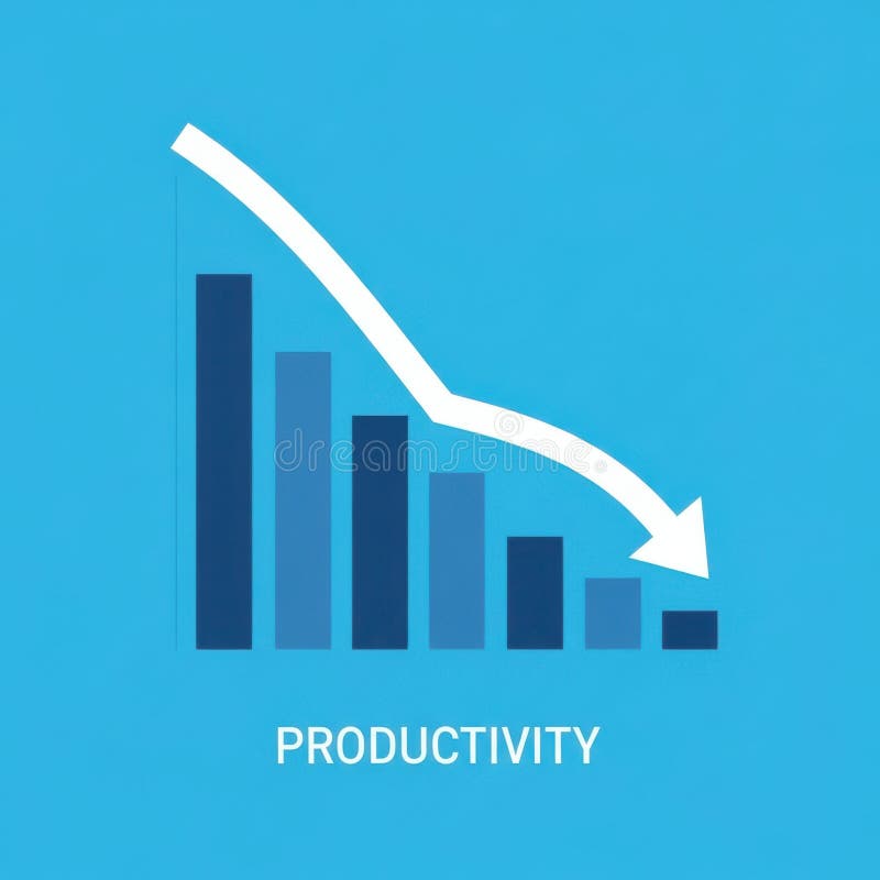
Free with trial A bar graph visually represents a downward trend in productivity over time, indicating a decline in efficiency or output. Time decrease illustrations Decreasing Productivity Graph Showing Decline. A bar graph visually represents a downward trend in productivity over time, indicating a decline in efficiency or output
Free with trial A circular diagram illustrates the seasonal changes in daylight during Spring. Daylight hours increase while nighttime hours decrease from March to May. Time decrease illustrations Daylight hours increasing during springtime in March, April, and May. A circular diagram illustrates the seasonal changes in daylight during Spring. Daylight hours increase while nighttime hours decrease from March to May
Free with trial A digital illustration on a black background features a world map rendered in shades of pink and purple with Data Doomsday text above it, divided into sections representing different data levels and centered by a line graph tracking data progression from 2000 to 2100 with green lines showing pre-industrial and contemporary data trends arranged vertically with a legend explaining each metric. Time decrease illustrations Data doomsday digital illustration showing world map with pink purple color scheme and line graph tracking data levels from 2000. A digital illustration on a black background features a world map rendered in shades of pink and purple with Data Doomsday text above it, divided into sections representing different data levels and centered by a line graph tracking data progression from 2000 to 2100 with green lines showing pre-industrial and contemporary data trends arranged vertically with a legend explaining each metric
Free with trial Set line Casino chips, with dollar, Playing card clubs symbol, exchange, win, Lucky player and Calendar icon. Vector. Time decrease vectors Set line Casino chips, with dollar, Playing card clubs symbol, exchange, win, Lucky player and Calendar icon. Vector
Free with trial A 3D blue bar chart and a dark blue line graph illustrate a significant downward trend, indicating a decline in data over time. Time decrease illustrations Blue bar chart and line graph showing downward trend. A 3D blue bar chart and a dark blue line graph illustrate a significant downward trend, indicating a decline in data over time.
Free with trial Graph with a red heart at the start and downward trend line, symbolizing breakup, relationship decline, and emotional loss over time. Time decrease vectors Graph with a red heart at the start and downward trend line, symbolizing breakup, relationship decline, and emotional loss over
Free with trial Illustration showing financial data analysis with charts, idea lightbulb, and location pins, perfect for finance and business concepts. Time decrease illustrations Analyzing Financial Data and Performance Charts Illustration. Illustration showing financial data analysis with charts, idea lightbulb, and location pins, perfect for finance and business concepts
Free with trial Woman suffers from slow internet and pushes loading bar with snail, needing to connect to 5G network. Problems with internet causing decrease in productivity for completing work tasks. Time decrease vectors Woman suffers from slow internet and pushes loading bar with snail, needing to connect to 5G network
Free with trial Featuring "LOW PRICE" text on a lightbox overlaid with downward candlestick charts and percentage performance data. Time decrease illustrations Low price trends and market entry opportunities reflected through real-time financial metrics and volatile trading indicators. Featuring "LOW PRICE" text on a lightbox overlaid with downward candlestick charts and percentage performance data.
Free with trial This image features a candlestick chart isolated on a white background. The chart displays price movements with green and red candlesticks, where green indicates an increase in price and red indicates a decrease. The candlesticks are arranged in a sequence, showing fluctuations in price over a period of time. The white background provides a clear contrast, making the chart easy to read and analyze. Time decrease illustrations Candlestick chart isolated on white background. This image features a candlestick chart isolated on a white background. The chart displays price movements with green and red candlesticks, where green indicates an increase in price and red indicates a decrease. The candlesticks are arranged in a sequence, showing fluctuations in price over a period of time. The white background provides a clear contrast, making the chart easy to read and analyze
Free with trial This image features a candlestick chart isolated on a white background. The chart displays price movements over time with blue and red candlesticks, where blue indicates an increase in price and red indicates a decrease. The candlesticks are accompanied by vertical lines representing the range of price fluctuations. This visual representation is commonly used in financial analysis and trading. Time decrease illustrations Candlestick chart isolated on white background. This image features a candlestick chart isolated on a white background. The chart displays price movements over time with blue and red candlesticks, where blue indicates an increase in price and red indicates a decrease. The candlesticks are accompanied by vertical lines representing the range of price fluctuations. This visual representation is commonly used in financial analysis and trading
Free with trial This image features a candlestick chart isolated on a white background. The chart displays price movements over time with green and red candlesticks. Green candlesticks indicate an increase in price, while red candlesticks indicate a decrease. The chart is commonly used in financial analysis and trading. Time decrease illustrations Candlestick chart isolated on white background. This image features a candlestick chart isolated on a white background. The chart displays price movements over time with green and red candlesticks. Green candlesticks indicate an increase in price, while red candlesticks indicate a decrease. The chart is commonly used in financial analysis and trading
Free with trial This image features a candlestick chart isolated on a white background. The chart displays price movements over time with green and red candlesticks, where green indicates an increase in price and red indicates a decrease. The chart is a popular tool used in financial analysis and trading to visualize market trends. Time decrease illustrations Candlestick chart isolated on white background. This image features a candlestick chart isolated on a white background. The chart displays price movements over time with green and red candlesticks, where green indicates an increase in price and red indicates a decrease. The chart is a popular tool used in financial analysis and trading to visualize market trends
Free with trial This image features a candlestick chart isolated on a white background. The chart displays price movements over time with green and red candlesticks, where green indicates an increase in price and red indicates a decrease. The candlesticks are arranged in a horizontal sequence, with each candlestick showing the open, close, high, and low prices for a specific time period. The white background. Time decrease illustrations Candlestick chart isolated on white background. This image features a candlestick chart isolated on a white background. The chart displays price movements over time with green and red candlesticks, where green indicates an increase in price and red indicates a decrease. The candlesticks are arranged in a horizontal sequence, with each candlestick showing the open, close, high, and low prices for a specific time period. The white background
Free with trial A clean and modern digital illustration of a financial candlestick chart, displaying market trends and stock performance. The graph features blue candlesticks indicating price movements over time, accompanied by a solid blue line graph and subtle dashed trend lines. Set against a crisp white background with a clear grid, this visualization is ideal for illustrating concepts related to finance, investment, business analytics, economic forecasts, and data reporting. It conveys growth, volatility, and strategic decision-making in the stock market. Time decrease illustrations Financial Candlestick Chart with Trend Line on White Background. A clean and modern digital illustration of a financial candlestick chart, displaying market trends and stock performance. The graph features blue candlesticks indicating price movements over time, accompanied by a solid blue line graph and subtle dashed trend lines. Set against a crisp white background with a clear grid, this visualization is ideal for illustrating concepts related to finance, investment, business analytics, economic forecasts, and data reporting. It conveys growth, volatility, and strategic decision-making in the stock market.
Free with trial Line chart tracks data trends over time, with a downward arrow implying decline and a globe representing global impact. Ideal for analytics, performance, global strategy, tracking, economics, market. Time decrease illustrations Line Chart with Data Points, Downward Arrow, and Globe for Analysis and Global Trends. Line chart tracks data trends over time, with a downward arrow implying decline and a globe representing global impact. Ideal for analytics, performance, global strategy, tracking, economics, market
Free with trial Conceptual image showing a broken coffee cup, deteriorating leather wallet, cracked smartphone, and damaged watch dissolving into dust, symbolizing loss of value and inflation in everyday possessions. Time decrease illustrations Strong Visual Metaphor of Inflation and Loss of Value with Dissolving Objects. Conceptual image showing a broken coffee cup, deteriorating leather wallet, cracked smartphone, and damaged watch dissolving into dust, symbolizing loss of value and inflation in everyday possessions
Free with trial Conceptual image showing a black handbag, antique clock, coins, and teacup dissolving into particles, symbolizing loss of value and inflation with a powerful visual metaphor of economic decline. Time decrease illustrations Strong Visual Metaphor of Loss of Value and Inflation with Dissolving Objects. Conceptual image showing a black handbag, antique clock, coins, and teacup dissolving into particles, symbolizing loss of value and inflation with a powerful visual metaphor of economic decline
Free with trial Conceptual image showing a wallet, watch, glasses, and phone dissolving into dust. This symbolizes the loss of value caused by inflation with a strong visual metaphor of financial and material depreciation. Time decrease illustrations Dissolving Wallet and Objects as a Strong Visual Metaphor for Inflation Loss. Conceptual image showing a wallet, watch, glasses, and phone dissolving into dust. This symbolizes the loss of value caused by inflation with a strong visual metaphor of financial and material depreciation
Free with trial Illustration showing declining sales after initial product launch and strategic recovery using drip promotions, seasonal marketing refreshes, and bundle offers. Time decrease illustrations . illustration showing declining sales after initial product launch and strategic recovery using drip promotions, seasonal marketing refreshes, and bundle offers.
Free with trial Brain rot toxic social media addiction causing depression concept. Human brain rot with toxic social media. Time decrease vectors Brain rot toxic social media addiction causing depression. Brain rot toxic social media addiction causing depression concept. Human brain rot with toxic social media.
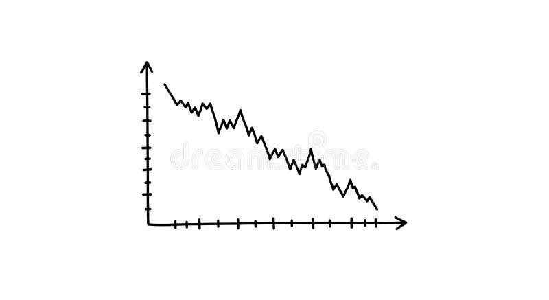
Free with trial A simple, hand-drawn line graph displayed on a plain white background illustrates a notable downward trend. The black line demonstrates decreasing values over time along the defined axes. Time decrease vectors Descending line graph displays a downward trend, isolated on white background. A simple, hand-drawn line graph displayed on a plain white background illustrates a notable downward trend. The black line demonstrates decreasing values over time along the defined axes.
Free with trial Candlestick charts with red and green bars display a stock market or forex trading pattern. Each candlestick represents data for a specific time period, showing opening, closing, high, and low values. Red indicates a price decrease, while green signifies an increase. The chart analyzes investment trends and is used for financial decisions in business and trading. The background is dark blue, enhancing the visibility of the vibrant candlestick colors. Time decrease illustrations Stock market chart forex trading candlestick pattern investment finance business graph analysis data trend. Candlestick charts with red and green bars display a stock market or forex trading pattern. Each candlestick represents data for a specific time period, showing opening, closing, high, and low values. Red indicates a price decrease, while green signifies an increase. The chart analyzes investment trends and is used for financial decisions in business and trading. The background is dark blue, enhancing the visibility of the vibrant candlestick colors.
Free with trial This chart depicts a significant downward trend in stock value over a period. The red line graphically represents the declining prices, indicating a bearish market or a stock facing substantial losses. Time decrease illustrations Stock market downturn visualized red line chart showing price decline over time. This chart depicts a significant downward trend in stock value over a period. The red line graphically represents the declining prices, indicating a bearish market or a stock facing substantial losses
Free with trial The image shows a visual representation of a downward trend using a bar chart and a bold red arrow pointing downward. The chart is displayed on a light-colored easel with a small figure standing behind it, suggesting a presentation or analysis of decreasing values over time, possibly in a business or financial context. Time decrease illustrations Declining trend illustrated with bar chart and arrow on easel. The image shows a visual representation of a downward trend using a bar chart and a bold red arrow pointing downward. The chart is displayed on a light-colored easel with a small figure standing behind it, suggesting a presentation or analysis of decreasing values over time, possibly in a business or financial context
Free with trial This graph illustrates the fluctuation of interest rates over the last 12 months, ranging from 3. 5% to 7%. The line chart provides a visual representation of the trend, allowing for easy analysis and understanding of the data. The graph is a valuable resource for businesses, investors, and individuals looking to stay informed about the current state of the economy and make informed decisions about their financial planning and strategy. Time decrease illustrations A graph showing interest rate fluctuation over the last 12 months. This graph illustrates the fluctuation of interest rates over the last 12 months, ranging from 3.5% to 7%. The line chart provides a visual representation of the trend, allowing for easy analysis and understanding of the data. The graph is a valuable resource for businesses, investors, and individuals looking to stay informed about the current state of the economy and make informed decisions about their financial planning and strategy.
Free with trial A close-up shot of a printed financial report showing market fluctuations indicated by a red line graph. Time decrease illustrations A financial document showing a fluctuating red line graph displayed. A close-up shot of a printed financial report showing market fluctuations indicated by a red line graph
Free with trial This image showcases a person using a tablet to interact with business analytics data, generated by AI. The visualization includes graphs and charts, providing real-time insights into key performance indicators. This technology streamlines business decision-making. Time decrease illustrations AI-Powered Business Analytics. This image showcases a person using a tablet to interact with business analytics data, generated by AI. The visualization includes graphs and charts, providing real-time insights into key performance indicators. This technology streamlines business decision-making.
Free with trial Candlestick chart with red and white bars representing stock price changes over time. Red candles indicate price decrease, while white suggest price increase. Vertical lines, or "wicks," show high and low prices. A white line, possibly a moving average, intersects the candles, offering a smooth trend indication. The background is dark blue with faint grid lines and circular elements, enhancing the financial data visualization aspect. Time decrease illustrations Candlestick chart showing stock market trends and financial analysis. Candlestick chart with red and white bars representing stock price changes over time. Red candles indicate price decrease, while white suggest price increase. Vertical lines, or "wicks," show high and low prices. A white line, possibly a moving average, intersects the candles, offering a smooth trend indication. The background is dark blue with faint grid lines and circular elements, enhancing the financial data visualization aspect.
Free with trial A line graph showing a declining stock market trend over time, with a downward sloping orange line and multiple blue and. Time decrease illustrations Stock Market Decline Graph. A line graph showing a declining stock market trend over time, with a downward sloping orange line and multiple blue and.
Free with trial This image displays a financial growth chart, featuring both a candlestick chart and a bar graph, laid out on a wooden surface. The candlestick chart illustrates stock market fluctuations with red and green candles, while the bar graph shows increasing values over time. The overall composition suggests positive financial trends, investment performance, and economic progress. It's ideal for representing concepts like business growth, market analysis, financial planning, and investment strategies. Time decrease illustrations Financial Growth Chart with Candlestick and Bar Graph. This image displays a financial growth chart, featuring both a candlestick chart and a bar graph, laid out on a wooden surface. The candlestick chart illustrates stock market fluctuations with red and green candles, while the bar graph shows increasing values over time. The overall composition suggests positive financial trends, investment performance, and economic progress. It's ideal for representing concepts like business growth, market analysis, financial planning, and investment strategies.
Free with trial An upward trending bar graph displayed on a laptop screen, illuminated against a backdrop of blurred city lights at night. Shows financial success and progress. Time decrease illustrations Financial Growth Chart on Laptop Screen at Night. An upward trending bar graph displayed on a laptop screen, illuminated against a backdrop of blurred city lights at night. Shows financial success and progress.
Free with trial A clean and modern vector illustration of a line graph, isolated on a white background. This flat design icon features two distinct lines, one blue and one brown, plotting various data points to show trends and comparisons over time. It's a versatile graphic representing concepts like data analysis, business analytics, financial statistics, market research, and performance tracking. Ideal for use in presentations, infographics, websites, business reports, and marketing materials to visualize progress, growth, or economic fluctuations. Time decrease vectors Data Analysis Line Graph Icon. A clean and modern vector illustration of a line graph, isolated on a white background. This flat design icon features two distinct lines, one blue and one brown, plotting various data points to show trends and comparisons over time. It's a versatile graphic representing concepts like data analysis, business analytics, financial statistics, market research, and performance tracking. Ideal for use in presentations, infographics, websites, business reports, and marketing materials to visualize progress, growth, or economic fluctuations.
Free with trial This hand-drawn bar chart, generated by AI, visually represents growth over time. The chart shows an initial decline followed by a significant upward trend, highlighting potential recovery or resurgence after a setback. The artistic style adds a unique touch. Time decrease illustrations AI-Generated Growth Chart. This hand-drawn bar chart, generated by AI, visually represents growth over time. The chart shows an initial decline followed by a significant upward trend, highlighting potential recovery or resurgence after a setback. The artistic style adds a unique touch.
Free with trial Man experiencing financial problems with money, hourglass, and declining charts signaling inflation. Time decrease illustrations Man feeling stress during economic crisis and financial loss. Man experiencing financial problems with money, hourglass, and declining charts signaling inflation
Free with trial A simple bar chart with alternating blue and green bars illustrates a clear downward trend over time. Time decrease illustrations Bar chart showing declining trend. A simple bar chart with alternating blue and green bars illustrates a clear downward trend over time
Free with trial This image visually represents the concept of "Falling Prices" using letters formed from vibrant autumn leaves. The warm hues of red, orange, and yellow leaves create a festive and seasonal atmosphere. The text is layered over a soft, blurred background, drawing attention to the message. Below the text, a scattering of fallen leaves, some dusted with a hint of frost or snow, reinforces the autumn theme and the idea of a seasonal sale or clearance event. This image is ideal for advertising promotions, discounts, and end-of-season sales. Time decrease illustrations Falling Prices Autumn Sale Concept. This image visually represents the concept of "Falling Prices" using letters formed from vibrant autumn leaves. The warm hues of red, orange, and yellow leaves create a festive and seasonal atmosphere. The text is layered over a soft, blurred background, drawing attention to the message. Below the text, a scattering of fallen leaves, some dusted with a hint of frost or snow, reinforces the autumn theme and the idea of a seasonal sale or clearance event. This image is ideal for advertising promotions, discounts, and end-of-season sales.
Free with trial Round green sticker shows fifteen percent off. Bright white text announces special price reduction. Simple graphic highlights savings, for shoppers. Great for ads. Time decrease illustrations Round green sticker shows fifteen percent off. Bright white text announces special price reduction. Simple graphic highlights
Free with trial A minimalist, flat design illustration of a bar chart featuring three vertical bars of varying heights. The bars are colored teal, orange, and beige, with dark blue outlines. They stand on a light yellow base and are arranged from tallest to shortest, indicating a declining trend. This graphic is ideal for representing data, statistics, financial reports, or progress over time in a clean and modern visual style. Time decrease illustrations Colorful Bar Chart with Declining Trend. A minimalist, flat design illustration of a bar chart featuring three vertical bars of varying heights. The bars are colored teal, orange, and beige, with dark blue outlines. They stand on a light yellow base and are arranged from tallest to shortest, indicating a declining trend. This graphic is ideal for representing data, statistics, financial reports, or progress over time in a clean and modern visual style.
Free with trial This image presents a clean, minimalist graphic illustrating economic trends. It features two distinct charts: a line graph on the left showing fluctuating data points over time, and a bar chart on the right comparing values across categories. The charts use a simple black and white color scheme with grayscale elements, making them versatile for various business and financial contexts. Labels like 'ECONOMIC', 'PARCTIRUM', and 'PLACTIRUM' suggest analysis of economic performance and market data. The overall design emphasizes clarity and data visualization. Time decrease vectors Economic Growth Trends: Line and Bar Charts. This image presents a clean, minimalist graphic illustrating economic trends. It features two distinct charts: a line graph on the left showing fluctuating data points over time, and a bar chart on the right comparing values across categories. The charts use a simple black and white color scheme with grayscale elements, making them versatile for various business and financial contexts. Labels like 'ECONOMIC', 'PARCTIRUM', and 'PLACTIRUM' suggest analysis of economic performance and market data. The overall design emphasizes clarity and data visualization.
Free with trial A set of three distinct candlestick chart icons, rendered in a clean, flat vector style against a white background. The green candle typically represents a bullish trend or price increase, the red candle signifies a bearish trend or price decrease, and the gray candle can denote neutrality or indecision in the market. These versatile symbols are ideal for illustrating financial concepts, stock market analysis, trading platforms, investment apps, economic reports, and educational materials related to forex, cryptocurrency, and general business trends. Time decrease vectors Candlestick Chart Icons for Financial Analysis. A set of three distinct candlestick chart icons, rendered in a clean, flat vector style against a white background. The green candle typically represents a bullish trend or price increase, the red candle signifies a bearish trend or price decrease, and the gray candle can denote neutrality or indecision in the market. These versatile symbols are ideal for illustrating financial concepts, stock market analysis, trading platforms, investment apps, economic reports, and educational materials related to forex, cryptocurrency, and general business trends.
Free with trial This image features a candlestick chart isolated on a white background. The chart displays price movements over time with blue and red candlesticks, each representing a specific time period. The blue candlesticks indicate an increase in price, while the red candlesticks indicate a decrease. The chart is useful for financial analysis and trading strategies. Time decrease illustrations Candlestick chart isolated on white background. This image features a candlestick chart isolated on a white background. The chart displays price movements over time with blue and red candlesticks, each representing a specific time period. The blue candlesticks indicate an increase in price, while the red candlesticks indicate a decrease. The chart is useful for financial analysis and trading strategies
Free with trial This image features a candlestick chart isolated on a white background. The chart displays price movements with green and red candlesticks, where green indicates an increase in price and red indicates a decrease. The candlesticks are arranged in a sequence, showing fluctuations in price over a period of time. The white background provides a clear contrast, making the chart easy to read and analyze. Time decrease illustrations Candlestick chart isolated on white background. This image features a candlestick chart isolated on a white background. The chart displays price movements with green and red candlesticks, where green indicates an increase in price and red indicates a decrease. The candlesticks are arranged in a sequence, showing fluctuations in price over a period of time. The white background provides a clear contrast, making the chart easy to read and analyze
Free with trial This image features a candlestick chart isolated on a white background. The chart displays price movements over time with green and red candlesticks, where green indicates an increase in price and red indicates a decrease. This visual representation is commonly used in financial analysis and trading. Time decrease illustrations Candlestick chart isolated on white background. This image features a candlestick chart isolated on a white background. The chart displays price movements over time with green and red candlesticks, where green indicates an increase in price and red indicates a decrease. This visual representation is commonly used in financial analysis and trading
Free with trial Set of twelve linear icons representing various business and financial concepts. These include documents, briefcase, graphs, charts, and more. Ideal for presentations, websites, or app design. Time decrease vectors Collection of Business and Finance Line Icons. Set of twelve linear icons representing various business and financial concepts. These include documents, briefcase, graphs, charts, and more. Ideal for presentations, websites, or app design.
Free with trial Set of twenty different business and finance icons, perfect for presentations, websites, and applications. These simple yet effective line icons represent key concepts in the business world. Time decrease vectors Collection of Business and Finance Line Icons. Set of twenty different business and finance icons, perfect for presentations, websites, and applications. These simple yet effective line icons represent key concepts in the business world.
Free with trial Set of 16 line icons representing various types of charts, graphs, clocks, and data-related symbols. Perfect for business presentations, reports, or website design. Clean and modern style. Time decrease illustrations Data Visualization Icons. Set of 16 line icons representing various types of charts, graphs, clocks, and data-related symbols. Perfect for business presentations, reports, or website design. Clean and modern style.
Free with trial Illustration showing the decrease in blood pressure after regular exercise. A person exercising with dumbbells is depicted before and after a workout routine, with a graph illustrating the downward trend in blood pressure over time. Time decrease illustrations Blood Pressure Reduction After Regular Exercise. Illustration showing the decrease in blood pressure after regular exercise. A person exercising with dumbbells is depicted before and after a workout routine, with a graph illustrating the downward trend in blood pressure over time
Free with trial A 3d rendered clock icon with a red downward arrow, isolated on black background. Time decrease vectors Clock icon with downward arrow blue red 3d render. a 3d rendered clock icon with a red downward arrow, isolated on black background
Free with trial Simple vector illustration of a download button with a timer countdown inside. Perfect for websites or applications showing progress. Time decrease vectors Download Button Icon: Timer Countdown, Circle Arrow. Simple vector illustration of a download button with a timer countdown inside. Perfect for websites or applications showing progress.
Free with trial A striking image showcasing the word "SALE" spelled out with large, red, balloon-like letters against a stark black background. Scattered confetti adds a festive touch, suggesting a celebratory or promotional event. This image is ideal for advertising campaigns, retail promotions, or seasonal sales announcements. Time decrease illustrations Red SALE Balloons with Confetti on Black Background. A striking image showcasing the word "SALE" spelled out with large, red, balloon-like letters against a stark black background. Scattered confetti adds a festive touch, suggesting a celebratory or promotional event. This image is ideal for advertising campaigns, retail promotions, or seasonal sales announcements.
Free with trial Set of black icons showing a digital clock, triangular shape within a square, bar chart with line graph overlay, atomic model, upward arrows, and a ruler with a downward arrow. Generative AI. Time decrease vectors Black digital clock triangle chart atom arrows and ruler icons. Set of black icons showing a digital clock, triangular shape within a square, bar chart with line graph overlay, atomic model, upward arrows, and a ruler with a downward arrow. Generative AI
Free with trial A comprehensive set of black silhouette icons representing various aspects of auctions, e-commerce, and financial transactions. This collection includes symbols like gavels, money, shopping carts, sold signs, and security shields, making it ideal for websites, apps, or presentations related to online marketplaces, retail, finance, and legal services. Time decrease vectors Auction and E-commerce Business Icons for Buying and Selling. A comprehensive set of black silhouette icons representing various aspects of auctions, e-commerce, and financial transactions. This collection includes symbols like gavels, money, shopping carts, sold signs, and security shields, making it ideal for websites, apps, or presentations related to online marketplaces, retail, finance, and legal services.
Free with trial The image depicts a series of descending blue bars with a red downward-sloping line overlay, symbolizing a decline or reduction in value. At the bottom of the bars, a pile of gold bars is shown, indicating a potential loss or diminishing worth of assets or investments over time. The visual metaphor emphasizes economic downturn or depreciation in financial value. Time decrease illustrations Declining value represented by falling bars and gold bars. The image depicts a series of descending blue bars with a red downward-sloping line overlay. The image depicts a series of descending blue bars with a red downward-sloping line overlay, symbolizing a decline or reduction in value. At the bottom of the bars, a pile of gold bars is shown, indicating a potential loss or diminishing worth of assets or investments over time. The visual metaphor emphasizes economic downturn or depreciation in financial value