Free with trial A colorful oscillating graph illustrating exponential decay and ringing phenomena. The graph features multiple wavy lines in various colors, showcasing how oscillations decrease over time with some lines exhibiting ringing or sustained oscillations. The terms 'Exponential Decay' and 'Ringing' are labeled, making it a useful visual aid for educational or presentation purposes. Time decrease vectors Oscillating Graph with Exponential Decay and Ringing. A colorful oscillating graph illustrating exponential decay and ringing phenomena. The graph features multiple wavy lines in various colors, showcasing how oscillations decrease over time with some lines exhibiting ringing or sustained oscillations. The terms 'Exponential Decay' and 'Ringing' are labeled, making it a useful visual aid for educational or presentation purposes.
Free with trial The image shows three stacks of gold-colored coins with red centers, arranged in descending order from left to right. A large red arrow points downward from the top right, suggesting a trend of reduction, loss, or decline in quantity or value over time. Time decrease illustrations Decreasing stack of gold coins with a downward arrow indicating reduction or decline. The image shows three stacks of gold-colored coins with red centers, arranged in descending order from left to right. A large red arrow points downward from the top right, suggesting a trend of reduction, loss, or decline in quantity or value over time
Free with trial Colorful bar graph showing decreasing trend, perfect for illustrating negative growth or decline. Time decrease illustrations Colorful bar graph showing decreasing trend over time. Colorful bar graph showing decreasing trend, perfect for illustrating negative growth or decline
Free with trial A set of sixteen modern line icons depicting various business and finance concepts, including graphs, charts, planning, ideas, and global connectivity. Perfect for presentations, reports, and websites. Time decrease vectors Collection of Business and Finance Line Icons Set. A set of sixteen modern line icons depicting various business and finance concepts, including graphs, charts, planning, ideas, and global connectivity. Perfect for presentations, reports, and websites.
Free with trial Conceptual image depicting declining sales and the need for analysis. Time decrease illustrations Declining Sales Analysis Magnifying Glass, Chart, Calendar. Conceptual image depicting declining sales and the need for analysis.
Free with trial The image depicts a candlestick chart commonly used in stock market analysis. The chart displays various candlesticks representing price movements over time. Prominently, there are two large buttons labeled 'SELL' and 'BUY', indicating the actions a trader might take based on the market trends shown in the chart. The background of the chart is white, with the candlesticks in different colors to. Time decrease illustrations Stock market buy and sell indicators in candlestick chart. The image depicts a candlestick chart commonly used in stock market analysis. The chart displays various candlesticks representing price movements over time. Prominently, there are two large buttons labeled 'SELL' and 'BUY', indicating the actions a trader might take based on the market trends shown in the chart. The background of the chart is white, with the candlesticks in different colors to
Free with trial This image illustrates the concept of inflation rate, showing a decreasing graph, coins, and a balloon, symbolizing economic challenges and financial instability. Time decrease vectors Vector art of illustration depicting the concept of inflation rate with decreasing graph isolated on white background. This image illustrates the concept of inflation rate, showing a decreasing graph, coins, and a balloon, symbolizing economic challenges and financial instability
Free with trial Bar chart with line graph overlay showing annual data trends over time. Time decrease vectors Bar chart showing annual data trends with line graph overlay. Bar chart with line graph overlay showing annual data trends over time
Free with trial Bar graph showing decreasing values, financial downturn, negative trend, data analysis, loss, economic decline, risk. Time decrease illustrations Blue bar chart indicates decline and negative trend over time. Bar graph showing decreasing values, financial downturn, negative trend, data analysis, loss, economic decline, risk
Free with trial A powerful still life image featuring four lit candles, meticulously crafted to resemble 100 and 50 US dollar bills, and 100 and 50 Euro bills. The candles are actively burning and melting, with colorful wax dripping down and pooling on a clean white background. This visual metaphor strikingly illustrates concepts of financial loss, inflation, economic decline, and the diminishing value of money, making it ideal for articles, reports, and presentations on economic challenges and investment risks. Time decrease illustrations Melting Currency Candles: Symbol of Financial Loss and Inflation. A powerful still life image featuring four lit candles, meticulously crafted to resemble 100. A powerful still life image featuring four lit candles, meticulously crafted to resemble 100 and 50 US dollar bills, and 100 and 50 Euro bills. The candles are actively burning and melting, with colorful wax dripping down and pooling on a clean white background. This visual metaphor strikingly illustrates concepts of financial loss, inflation, economic decline, and the diminishing value of money, making it ideal for articles, reports, and presentations on economic challenges and investment risks.
Free with trial This line graph depicts the fluctuating values over a period of four weeks. The values show significant peaks and troughs, indicating variability in the measured parameter. Time decrease illustrations Weekly value fluctuations over four weeks. This line graph depicts the fluctuating values over a period of four weeks. The values show significant peaks and troughs, indicating variability in the measured parameter
Free with trial Circular arrow icon showing download progress. Simple and modern design, perfect for website and app interfaces. Time decrease vectors Download Icon, Progress Indicator, Loading Symbol, Data Transfer, Circular Arrow, Process Completion. Circular arrow icon showing download progress. Simple and modern design, perfect for website and app interfaces.
Free with trial Red neon arrows moving down, financial loss abstract vector background. Modern downward graphic, negative market trend, stock recession metrics, and business decrease concept 4k background. Time decrease illustrations Red neon arrows moving down, financial loss business background. Red neon arrows moving down, financial loss abstract vector background. Modern downward graphic, negative market trend, stock recession metrics, and business decrease concept 4k background
Free with trial The image shows a 3D bar chart with green bars of decreasing height, and a red downward arrow pointing from the tallest bar to the shortest one, indicating a decline in data or performance over time. Time decrease illustrations A 3d bar chart with a red downward arrow indicating a decline in data. The image shows a 3D bar chart with green bars of decreasing height, and a red downward arrow pointing from the tallest bar to the shortest one, indicating a decline in data or performance over time
Free with trial Black and white line drawing of a magnifying glass focused on a declining bar graph with a downward arrow and a 24-hour. Time decrease illustrations Decline Analysis Magnifying Glass on Downward Trend Chart, 24 Hours. Black and white line drawing of a magnifying glass focused on a declining bar graph with a downward arrow and a 24-hour.
Free with trial This image showcases data analysis icons, representing data processing, visualization, and interpretation, which are crucial for gaining valuable insights. Time decrease vectors Vector art of data analysis icons representing various aspects of data processing, visualization, and interpretation for insights. This image showcases data analysis icons, representing data processing, visualization, and interpretation, which are crucial for gaining valuable insights
Free with trial The image illustrates a descending trend using a series of progressively shorter vertical bars. A bold red downward-sloping arrow emphasizes the decline, suggesting a significant drop in values or performance over time. This visual metaphor is often used in business, finance, and analytics to depict negative growth or reduction. Time decrease illustrations Decline in performance represented by bar chart and downward arrow. The image illustrates a descending trend using a series of progressively shorter vertical bars. A bold red downward-sloping arrow emphasizes the decline, suggesting a significant drop in values or performance over time. This visual metaphor is often used in business, finance, and analytics to depict negative growth or reduction
Free with trial This image depicts a candlestick chart typically used in financial markets to illustrate the price movements of a cryptocurrency over time. The chart features green and red candles, where green indicates a price increase (bullish) and red indicates a price decrease (bearish). The chart shows a sequence of rising and falling prices, including sharp upward spikes and significant drops, which are. Time decrease illustrations Cryptocurrency price chart displaying bullish and bearish trends. This image depicts a candlestick chart typically used in financial markets to illustrate the price movements of a cryptocurrency over time. The chart features green and red candles, where green indicates a price increase (bullish) and red indicates a price decrease (bearish). The chart shows a sequence of rising and falling prices, including sharp upward spikes and significant drops, which are
Free with trial A financial candlestick chart illustrating a bearish market trend with a series of red and blue candles indicating a consistent decline in value over time. Time decrease illustrations Candlestick chart showing market decline isolated on white background. A financial candlestick chart illustrating a bearish market trend with a series of red and blue candles indicating a consistent decline in value over time
Free with trial The image depicts a bar graph with a series of bars showing a downward trend. A red arrow is pointing downwards, indicating a decline in values over time. Time decrease illustrations A downward trending graph with a red arrow indicating a decline in values. The image depicts a bar graph with a series of bars showing a downward trend. A red arrow is pointing downwards, indicating a decline in values over time
Free with trial This graph illustrates the fluctuations in value over a six-month period, from January to June. The values show significant peaks in February, April, and June, indicating periods of high value, while March, May, and June exhibit lower values. Time decrease illustrations Monthly value fluctuations from january to june. This graph illustrates the fluctuations in value over a six-month period, from January to June. The values show significant peaks in February, April, and June, indicating periods of high value, while March, May, and June exhibit lower values
Free with trial A 3D rendered visualization of a stock market candlestick chart is presented on a white background. The chart displays a series of red and green candlesticks, representing price movements over time. Red candles indicate a price decrease, while green candles signify a price increase, illustrating market fluctuations and trends. Time decrease illustrations 3D Rendered Candlestick Stock Market Chart with Red and Green Bars on White Background trading. A 3D rendered visualization of a stock market candlestick chart is presented on a white background. The chart displays a series of red and green candlesticks, representing price movements over time. Red candles indicate a price decrease, while green candles signify a price increase, illustrating market fluctuations and trends
Free with trial Red neon arrows moving down, financial loss abstract vector background. Modern downward graphic, negative market trend, stock recession metrics, and business decrease concept 4k background. Time decrease illustrations Red neon arrows moving down, financial loss abstract vector background
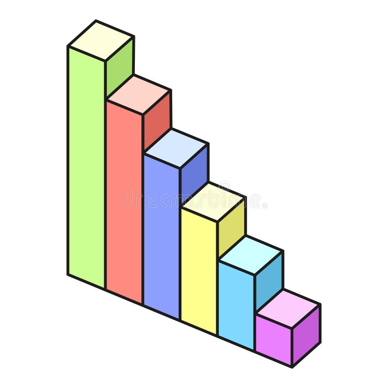
Free with trial This image features a bar chart with five bars of varying heights, all in shades of blue. The bars decrease in height from left to right, indicating a downward trend. The first bar is the tallest, and the last bar is the shortest, suggesting a consistent decline in the data values represented. Time decrease illustrations A bar chart showing a decreasing trend in data values over time. This image features a bar chart with five bars of varying heights, all in shades of blue. The bars decrease in height from left to right, indicating a downward trend. The first bar is the tallest, and the last bar is the shortest, suggesting a consistent decline in the data values represented
Free with trial This image depicts a stock chart with candlesticks, illustrating price movements and trends over a specific period. The chart includes green and red candlesticks, indicating price increases and decreases respectively, along with a trend line that highlights the overall direction of the stock's price. Time decrease illustrations A detailed stock chart showcasing price movements and trends over time. This image depicts a stock chart with candlesticks, illustrating price movements and trends over a specific period. The chart includes green and red candlesticks, indicating price increases and decreases respectively, along with a trend line that highlights the overall direction of the stock's price
Free with trial A vibrant and detailed bar chart with a line graph overlay, showcasing financial data trends over time. The chart features a variety of colors, including shades of green, purple, and blue, with data points marked by small diamond shapes. The background is a dark blue grid, providing a stark contrast to the colorful data visualization. Time decrease illustrations Colorful bar chart and line graph representing financial data trends. A vibrant and detailed bar chart with a line graph overlay, showcasing financial data trends over time. The chart features a variety of colors, including shades of green, purple, and blue, with data points marked by small diamond shapes. The background is a dark blue grid, providing a stark contrast to the colorful data visualization
Free with trial A visually appealing design that blends creativity with professionalism. The composition offers a sense of balance, warmth, and clarity, making it adaptable for different contexts and purposes. Time decrease vectors Business icon pattern with graphs, money bags, people, bulbs, clocks on white. A visually appealing design that blends creativity with professionalism. The composition offers a sense of balance, warmth, and clarity, making it adaptable for different contexts and purposes.
Free with trial The image shows a white easel holding a presentation board with a combination of a red bar and line graph. The graph illustrates a downward trend, starting with high values that progressively decrease over time. The bars are tall initially and shorten as they move rightward, while the line graph follows a similar declining pattern, emphasizing a significant drop in values. Time decrease illustrations Declining trend represented by a bar and line graph on an easel display. The image shows a white easel holding a presentation board with a combination of a red bar and line graph. The graph illustrates a downward trend, starting with high values that progressively decrease over time. The bars are tall initially and shorten as they move rightward, while the line graph follows a similar declining pattern, emphasizing a significant drop in values
Free with trial The image shows a series of vertical bars in decreasing height from left to right, each bar colored differently (blue, green, yellow, orange). A bold red diagonal line with an arrow at the end overlays the bars, indicating a downward trend or decline in values. This visual representation is often used to depict a reduction in data metrics over time or categories. Time decrease illustrations Declining bar chart with a downward trend line overlaying colorful bars. The image shows a series of vertical bars in decreasing height from left to right, each bar colored differently (blue, green, yellow, orange). A bold red diagonal line with an arrow at the end overlays the bars, indicating a downward trend or decline in values. This visual representation is often used to depict a reduction in data metrics over time or categories
Free with trial The image illustrates a combination of bar and line graphs to represent business performance trends. The bars show an overall upward trend in growth, while the red line indicates a recent decline after a period of increase. This visualization is often used in financial reports, market analysis, or business presentations to depict fluctuations in data over time, such as revenue, market share, or. Time decrease illustrations Growth and decline in business performance visualized with bar and line graphs. The image illustrates a combination of bar and line graphs to represent business performance trends. The bars show an overall upward trend in growth, while the red line indicates a recent decline after a period of increase. This visualization is often used in financial reports, market analysis, or business presentations to depict fluctuations in data over time, such as revenue, market share, or
Free with trial The image displays a line graph with a yellow line showing fluctuations in data over a blue grid background. The graph illustrates the rise and fall of data points, indicating trends and patterns. Time decrease illustrations A detailed graphical representation of fluctuating data trends over time. The image displays a line graph with a yellow line showing fluctuations in data over a blue grid background. The graph illustrates the rise and fall of data points, indicating trends and patterns
Free with trial Modern 3D render showcasing a dynamic sales promotion with various discount signs shopping bags and gift boxes for special offers. Time decrease illustrations Vibrant 3d Sales Promotion Display with Discount Percentages and Gift Boxes. Modern 3D render showcasing a dynamic sales promotion with various discount signs shopping bags and gift boxes for special offers
Free with trial Colorful bar graph showing market growth and success over time. Time decrease vectors Colorful bar graph showing market growth and success
Free with trial The image shows a descending stack of three gold-colored coins, each smaller than the one below it, with a red downward-pointing arrow cutting through them. This visual metaphor suggests a decline in value, savings, or financial loss over time. Time decrease vectors Decreasing stack of gold coins with downward arrow indicating financial loss. The image shows a descending stack of three gold-colored coins, each smaller than the one below it, with a red downward-pointing arrow cutting through them. This visual metaphor suggests a decline in value, savings, or financial loss over time
Free with trial The image depicts a downward trend using three vertical bars of decreasing height in blue, with a large red, orange, and yellow arrow pointing diagonally downwards, symbolizing a decline or drop in performance, metrics, or values over time. The visual metaphor emphasizes a significant reduction or negative trend in a clear and impactful manner. Time decrease illustrations Decline in performance represented by colorful block chart and downward arrow. The image depicts a downward trend using three vertical bars of decreasing height in blue, with a large red, orange, and yellow arrow pointing diagonally downwards, symbolizing a decline or drop in performance, metrics, or values over time. The visual metaphor emphasizes a significant reduction or negative trend in a clear and impactful manner
Free with trial A close-up shot of a hand holding a smartphone displaying a stock performance graph with a downward trend. the graph shows a red line decreasing over time. the background is blurred and appears to be an indoor setting. Time decrease illustrations A hand holding a smartphone with a declining stock performance graph on the screen. a close-up shot of a hand holding a smartphone displaying a stock performance graph with a downward trend. the graph shows a red line decreasing over time. the background is blurred and appears to be an indoor setting
Free with trial The image shows a collection of silver coins scattered on a surface, with a graph of fluctuating values in the background. The graph lines are in blue and red, indicating possible trends in the value of the coins over time. Time decrease illustrations A collection of silver coins with a graph of fluctuating values in the background. The image shows a collection of silver coins scattered on a surface, with a graph of fluctuating values in the background. The graph lines are in blue and red, indicating possible trends in the value of the coins over time
Free with trial This image features four graphical elements that symbolize financial growth and decline. The top row displays two percentage signs with arrows indicating upward and downward trends. The bottom row shows two bar graphs, one with an upward trend and the other with a downward trend. These visuals are commonly used in finance to represent changes in data over time. Time decrease illustrations Graphical representation of financial growth and decline. This image features four graphical elements that symbolize financial growth and decline. The top row displays two percentage signs with arrows indicating upward and downward trends. The bottom row shows two bar graphs, one with an upward trend and the other with a downward trend. These visuals are commonly used in finance to represent changes in data over time
Free with trial The image depicts a stylized 3D bar chart with alternating red and blue bars representing fluctuations in data trends. The bars ascend and descend, symbolizing periods of growth and decline. The chart has a modern, gradient design with a clear upward trajectory at the end, suggesting recovery or improvement after a period of instability. The visual representation emphasizes the variability and. Time decrease illustrations Dynamic 3d bar chart illustrating fluctuating growth and decline trends over time. The image depicts a stylized 3D bar chart with alternating red and blue bars representing fluctuations in data trends. The bars ascend and descend, symbolizing periods of growth and decline. The chart has a modern, gradient design with a clear upward trajectory at the end, suggesting recovery or improvement after a period of instability. The visual representation emphasizes the variability and
Free with trial The image shows a bar chart with eight bars of varying heights, illustrating a trend that starts low, gradually increases, peaks twice, dips in the middle, and then rises significantly at the end. The bars are outlined in blue with a slight gradient fill, and the chart is set against a plain light blue background. This type of chart is often used to represent data changes over time or different. Time decrease illustrations A varied bar chart displaying fluctuating data trends across different categories. The image shows a bar chart with eight bars of varying heights, illustrating a trend that starts low, gradually increases, peaks twice, dips in the middle, and then rises significantly at the end. The bars are outlined in blue with a slight gradient fill, and the chart is set against a plain light blue background. This type of chart is often used to represent data changes over time or different
Free with trial The image depicts three stacks of gold coins progressively decreasing in height, positioned against a background with a downward-sloping red arrow. This visual metaphorically represents a decline in financial savings, investments, or economic losses over time. The contrast between the coins and the arrow emphasizes the concept of reduction or downturn. Time decrease illustrations Decline in savings or financial losses represented by diminishing stacks of coins. The image depicts three stacks of gold coins progressively decreasing in height, positioned against a background with a downward-sloping red arrow. This visual metaphorically represents a decline in financial savings, investments, or economic losses over time. The contrast between the coins and the arrow emphasizes the concept of reduction or downturn
Free with trial Graph showing a decrease in co2 levels with a green cloud symbolizing a cleaner environment. Time decrease illustrations Reducing co2 emissions over time with sustainable practices and renewable energy. Graph showing a decrease in co2 levels with a green cloud symbolizing a cleaner environment
Free with trial The image shows a wooden easel holding a whiteboard with a declining trend chart. The chart features a combination of red vertical bars and a downward-sloping red line, indicating a decrease in values over time. The easel stands on a light gray surface, and the chart appears to be used for visual presentations or data analysis. Time decrease illustrations Declining trend chart displayed on an easel with red bar and line graph elements. The image shows a wooden easel holding a whiteboard with a declining trend chart. The chart features a combination of red vertical bars and a downward-sloping red line, indicating a decrease in values over time. The easel stands on a light gray surface, and the chart appears to be used for visual presentations or data analysis
Free with trial The image shows a line graph with yellow data points connected by lines, set against a blue grid background. The graph depicts various peaks and troughs, indicating fluctuations in the data over time. Time decrease illustrations A dynamic graph illustrating fluctuating data points on a blue grid background. The image shows a line graph with yellow data points connected by lines, set against a blue grid background. The graph depicts various peaks and troughs, indicating fluctuations in the data over time
Free with trial The image depicts a bar chart with a descending red arrow overlay, illustrating a significant decline in values. The bars transition from tall blue to shorter purple, symbolizing a downward trend in metrics such as sales, performance, or growth over time. Time decrease illustrations Graphic representation of declining performance or downward trend in bar chart format. The image depicts a bar chart with a descending red arrow overlay, illustrating a significant decline in values. The bars transition from tall blue to shorter purple, symbolizing a downward trend in metrics such as sales, performance, or growth over time
Free with trial A downward trending graph with a red arrow pointing to the decline, set against a blue background with grid lines and various colored bars at the bottom. Time decrease illustrations Downward trend analysis showing significant decline over time with various data points. A downward trending graph with a red arrow pointing to the decline, set against a blue background with grid lines and various colored bars at the bottom
Free with trial A graph showing a downward trend with a red line that peaks at the beginning and gradually decreases with fluctuations, ending with a downward arrow. Time decrease illustrations Graph illustrating a downward trend with fluctuations and a decreasing pattern over time. A graph showing a downward trend with a red line that peaks at the beginning and gradually decreases with fluctuations, ending with a downward arrow
Free with trial This image presents a simple visual showing a falling financial trend, using a red arrow that moves downward in a stepped motion to suggest a steady reduction over time. The arrow sits above the words financial decline, which reinforces the theme of reduced performance or weakening conditions. The pale background and central dividing line help keep the focus on the arrow and text, making the message clear without distraction. The overall layout communicates the idea of shrinking results, reduced revenue, or broader economic pressure. This type of visual is often used in reports, presentations, and articles that discuss downturns, risk, or negative outcomes in business or economic settings. The clean style makes it suitable for a wide range of professional uses where a direct and uncomplicated representation of loss or reduction is needed. The image can support topics such as market shifts, budget cuts, operational challenges, or general financial stress. It can also be used to highlight the impact of external factors that influence performance, helping viewers quickly understand the direction of change being described. Time decrease illustrations Red downward arrow chart showing financial decline trend with financial decline text on pale background. This image presents a simple visual showing a falling financial trend, using a red arrow that moves downward in a stepped motion to suggest a steady reduction over time. The arrow sits above the words financial decline, which reinforces the theme of reduced performance or weakening conditions. The pale background and central dividing line help keep the focus on the arrow and text, making the message clear without distraction. The overall layout communicates the idea of shrinking results, reduced revenue, or broader economic pressure. This type of visual is often used in reports, presentations, and articles that discuss downturns, risk, or negative outcomes in business or economic settings. The clean style makes it suitable for a wide range of professional uses where a direct and uncomplicated representation of loss or reduction is needed. The image can support topics such as market shifts, budget cuts, operational challenges, or general financial stress. It can also be used to highlight the impact of external factors that influence performance, helping viewers quickly understand the direction of change being described.
Free with trial Visualization helps you track embedding space similarity over time, identify when cosine similarity drops below a critical threshold, and take action before performance declines. Time decrease illustrations Embedding Drift Monitoring Dashboard Track Model Version Similarity & Auto Reindex Alerts. visualization helps you track embedding space similarity over time, identify when cosine similarity drops below a critical threshold, and take action before performance declines.
Free with trial A purple analog alarm clock is positioned on a cylindrical pedestal in front of a stylized bar graph. The bars on the left are green and represent an upward growth trend, while the bars on the right are orange and red, depicting a downward trend with a red arrow pointing down to indicate a decrease. Time decrease illustrations A purple alarm clock sits in front of a bar graph showing a trend of growth followed by decline. A purple analog alarm clock is positioned on a cylindrical pedestal in front of a stylized bar graph. The bars on the left are green and represent an upward growth trend, while the bars on the right are orange and red, depicting a downward trend with a red arrow pointing down to indicate a decrease
Free with trial A flat, high-contrast, black-and-white icon depicting a bar graph with a downward-pointing arrow. The bars represent a data set that is shrinking or declining over time, with the final arrow emphasizing a negative or losing trend in business or financial metrics. Time decrease vectors A minimalist black and white icon showing a downward bar chart indicating a significant loss trend. A flat, high-contrast, black-and-white icon depicting a bar graph with a downward-pointing arrow. The bars represent a data set that is shrinking or declining over time, with the final arrow emphasizing a negative or losing trend in business or financial metrics
Free with trial This image depicts a canvas with an easel showing a bar and line graph combination illustrating a downward trend. The bars start high and gradually decline, while the line graph also trends downward, indicating a decrease in values. Such visuals are often used in business to represent declining sales, market performance, or economic downturns over time. Time decrease illustrations Visual Representation Of Declining Trends In Business Performance And Market Analysis. This image depicts a canvas with an easel showing a bar and line graph combination illustrating a downward trend. The bars start high and gradually decline, while the line graph also trends downward, indicating a decrease in values. Such visuals are often used in business to represent declining sales, market performance, or economic downturns over time
Free with trial A 3D bar graph with blue bars decreasing in height from left to right, accompanied by a large red arrow pointing downwards, symbolizing a sharp decline or drop in data over a certain period. Time decrease vectors Graph showing a significant decline in values over time with a red arrow indicating downward trend. A 3D bar graph with blue bars decreasing in height from left to right, accompanied by a large red arrow pointing downwards, symbolizing a sharp decline or drop in data over a certain period
Free with trial A 3D bar graph with blue bars decreasing in height from left to right, accompanied by a large red arrow pointing downwards, symbolizing a sharp decline or drop in data over a certain period. Time decrease illustrations Graph showing a significant decline in values over time with a red arrow indicating downward trend. A 3D bar graph with blue bars decreasing in height from left to right, accompanied by a large red arrow pointing downwards, symbolizing a sharp decline or drop in data over a certain period
Free with trial The image depicts a visual metaphor for an economic decline, featuring two businesspeople observing a descending bar graph. The graph shows a steady decrease in values, accompanied by a downward-pointing arrow. At the base of the graph are stacks of gold bars, symbolizing wealth or financial assets diminishing over time. The overall scene suggests a financial crisis or market downturn affecting. Time decrease illustrations Economic downturn illustrated with declining bar graph and gold bars isolated on white background. The image depicts a visual metaphor for an economic decline, featuring two businesspeople observing a descending bar graph. The graph shows a steady decrease in values, accompanied by a downward-pointing arrow. At the base of the graph are stacks of gold bars, symbolizing wealth or financial assets diminishing over time. The overall scene suggests a financial crisis or market downturn affecting
Free with trial Black and white line graph showing decreasing population statistics over time. Time decrease vectors Line graph showing decreasing population statistics icon. Black and white line graph showing decreasing population statistics over time
Free with trial Graph showing a decline in CO2 levels represented by a green cloud and a downward trend arrow. Time decrease illustrations Reducing carbon dioxide emissions over time with sustainable practices and environmental conservation. Graph showing a decline in CO2 levels represented by a green cloud and a downward trend arrow
Free with trial A 3D illustration representing financial concepts. It features a white document with a pink dollar sign and blue horizontal lines indicating text. A purple clock with white hands sits to the right, and a teal arrow curves downwards from the left, pointing towards the clock. The composition is set against a soft blue background with subtle shadow effects. Time decrease illustrations 3D Illustration Of Financial Document With Dollar Sign Clock And Downward Arrow Keywords: finance, money, dollar sign, document. A 3D illustration representing financial concepts. It features a white document with a pink dollar sign and blue horizontal lines indicating text. A purple clock with white hands sits to the right, and a teal arrow curves downwards from the left, pointing towards the clock. The composition is set against a soft blue background with subtle shadow effects
Free with trial A digital graphic depicting a financial chart with two prominent line graphs. A blue line trends upward, representing a rising stock price, while a red line trends downward, indicating a decrease in trading volume. The chart is set against a faint, blurred city background, featuring a grid system on the vertical axis labeled 'Volume' and a horizontal axis labeled 'Time', with a red arrow at the. Time decrease illustrations A financial line chart showing the inverse relationship between stock price and trading volume data. A digital graphic depicting a financial chart with two prominent line graphs. A blue line trends upward, representing a rising stock price, while a red line trends downward, indicating a decrease in trading volume. The chart is set against a faint, blurred city background, featuring a grid system on the vertical axis labeled 'Volume' and a horizontal axis labeled 'Time', with a red arrow at the
Free with trial The image depicts a visual metaphor for financial decline or decreasing value. Four stacks of gold coins progressively reduce in size from left to right, illustrating a downward trend. A red line with a downward slope connects the top of each stack, emphasizing the reduction in quantity or value over time. This could symbolize economic downturns, depreciation, or other financial challenges. Time decrease illustrations Declining financial stability represented by diminishing stacks of gold coins and a downward trend line. The image depicts a visual metaphor for financial decline or decreasing value. Four stacks of gold coins progressively reduce in size from left to right, illustrating a downward trend. A red line with a downward slope connects the top of each stack, emphasizing the reduction in quantity or value over time. This could symbolize economic downturns, depreciation, or other financial challenges
Free with trial Of a black metal server rack with six rows, each containing a display screen displaying a different color - green, red, yellow, and orange. The green display screen shows a steady increase in value over. Time decrease illustrations Close-up black metal server rack rows each containing display screen displaying different color green red yell. Of a black metal server rack with six rows, each containing a display screen displaying a different color - green, red, yellow, and orange. The green display screen shows a steady increase in value over
Free with trial This icon set is about wealth, banking, investment, finance, money, business and more. Time decrease vectors People managing finances, making deals, taking loans and investing money icon set. This icon set is about wealth, banking, investment, finance, money, business and more
Free with trial A set of business and data analysis icons, perfect for presentations, reports, and dashboards. These icons cover various aspects of data management and reporting. Time decrease vectors Vector art of collection of business and data analysis icons, representing various aspects of data management and reporting. A set of business and data analysis icons, perfect for presentations, reports, and dashboards. These icons cover various aspects of data management and reporting
Free with trial Chef hat, Customer survey, Fast delivery line icons. Interest rate, AI generate, Inflation icons. Approved application, Scissors cutting ribbon, Artificial intelligence icons. Vector. Time decrease vectors Chef hat, Customer survey, Fast delivery line icons. Approved application, Scissors cutting ribbon Vector. Chef hat, Customer survey, Fast delivery line icons. Interest rate, AI generate, Inflation icons. Approved application, Scissors cutting ribbon, Artificial intelligence icons. Vector
Free with trial A tree stands tall in a field as the sun sets in the background, casting a warm glow over the landscape. Time decrease illustrations Tree in Field With Setting Sun. A tree stands tall in a field as the sun sets in the background, casting a warm glow over the landscape.
Free with trial This image displays financial performance indicators, highlighting data trends and market volatility. It represents economic analysis and strategic decision-making processes. Time decrease vectors Vector art of financial performance indicators, showcasing data trends, market volatility, and economic analysis for strategic. This image displays financial performance indicators, highlighting data trends and market volatility. It represents economic analysis and strategic decision-making processes
Free with trial Discount price tag graphic: gray 'before', red 'after', linked by arrow. Perfect for e-commerce sales, Black Friday, Cyber Monday, holiday deals, promotions, and advertising, this image is generated using AI. Time decrease vectors Discount price tag graphic: gray \'before\', red \'after\', linked by arrow. Perfect for e-commerce sales, Black Friday, Cyber Mon. Discount price tag graphic: gray 'before', red 'after', linked by arrow. Perfect for e-commerce sales, Black Friday, Cyber Monday, holiday deals, promotions, and advertising, this image is generated using AI
Free with trial Loan Related and Investment Line Vector Icon. Investment, Percentage, Interest Rate. Low total cost icon vector image. Thin Outline Vector illustration isolated on background. Time decrease vectors Loan Related and Investment Line Vector Icon. Investment, Percentage, Interest Rate. Low total cost icon vector image.
Free with trial Loan Related and Investment Line Vector Icon. Investment, Percentage, Interest Rate. Low total cost icon vector image. Thin Outline Vector illustration isolated on background. Time decrease vectors Loan Related and Investment Line Vector Icon. Investment, Percentage, Interest Rate. Low total cost icon vector image.
Free with trial Loan Related and Investment Line Vector Icon. Investment, Percentage, Interest Rate. Low total cost icon vector image. Thin Outline Vector illustration isolated on background. Time decrease vectors Loan Related and Investment Line Vector Icon. Investment, Percentage, Interest Rate. Low total cost icon vector image.
Free with trial Loan Related and Investment Line Vector Icon. Investment, Percentage, Interest Rate. Low total cost icon vector image. Thin Outline Vector illustration isolated on background. Time decrease vectors Loan Related and Investment Line Vector Icon. Investment, Percentage, Interest Rate. Low total cost icon vector image.
Free with trial Loan Related and Investment Line Vector Icon. Investment, Percentage, Interest Rate. Low total cost icon vector image. Thin Outline Vector illustration isolated on background. Time decrease illustrations Loan Related and Investment Line Vector Icon. Investment, Percentage, Interest Rate. Low total cost icon vector image.
Free with trial Loan Related and Investment Line Vector Icon. Investment, Percentage, Interest Rate. Low total cost icon vector image. Thin Outline Vector illustration isolated on background. Time decrease vectors Loan Related and Investment Line Vector Icon. Investment, Percentage, Interest Rate. Low total cost icon vector image.
Free with trial Loan Related and Investment Line Vector Icon. Investment, Percentage, Interest Rate. Low total cost icon vector image. Thin Outline Vector illustration isolated on background. Time decrease vectors Loan Related and Investment Line Vector Icon. Investment, Percentage, Interest Rate. Low total cost icon vector image.
Free with trial Loan Related and Investment Line Vector Icon. Investment, Percentage, Interest Rate. Low total cost icon vector image. Thin Outline Vector illustration isolated on background. Time decrease vectors Loan Related and Investment Line Vector Icon. Investment, Percentage, Interest Rate. Low total cost icon vector image.