Free with trial A simple line graph illustration showing fluctuations and an upward trend. The graph is drawn on a grid with a black line and red data points, indicating a period of increase, followed by a decrease, and then a final increase. This image can be used to represent business trends, financial analysis, stock market data, or any data that shows changes over time. Time decrease vectors Line Graph with Fluctuations. A simple line graph illustration showing fluctuations and an upward trend. The graph is drawn on a grid with a black line and red data points, indicating a period of increase, followed by a decrease, and then a final increase. This image can be used to represent business trends, financial analysis, stock market data, or any data that shows changes over time.
Free with trial Creative Productivity Falling Chart Made of Clock Symbols on Yellow Background. Deadline Pressure and Productivity Decline. Time decrease illustrations Creative Productivity Falling Chart Made of Clock Symbols on Yellow Background. Deadline Pressure and Productivity Decline
Free with trial Colorful line graph showing growth and decline of different data from 2018, 2019 and 2020, providing a visual representation of performance trends over time. Time decrease vectors Colorful line graph showing growth and decline of different data from 2018, 2019 and 2020, providing a visual
Free with trial Real-Time Market Data Analysis with Candlestick Chart vector concept icon or symbol. Time decrease vectors Real-Time Market Data Analysis with Candlestick Chart vector icon or symbol
Free with trial Economies of scale. Company scale of operation, amount of output produced per unit of time. Mass production efficiency. Flat vector illustration. Time decrease vectors Economies of scale. Company scale of operation, amount of output
Free with trial Close-up of a smartphone displaying a stock trading application. The screen shows real-time stock charts, including candlestick charts and line graphs, with green and red indicators representing price increases and decreases. The app also features portfolio summaries and details for various stocks, such as AAPL, GOOG, and MSFT. The image represents investment, finance, and the use of technology in stock market analysis. Time decrease illustrations Stock Trading App on Smartphone. Close-up of a smartphone displaying a stock trading application. The screen shows real-time stock charts, including candlestick charts and line graphs, with green and red indicators representing price increases and decreases. The app also features portfolio summaries and details for various stocks, such as AAPL, GOOG, and MSFT. The image represents investment, finance, and the use of technology in stock market analysis.
Free with trial Economies of scale set. Company scale of operation, amount of output produced per unit of time. Mass production efficiency. Flat vector illustration. Time decrease vectors Economies of scale set. Company scale of operation, amount of output
Free with trial Economies of scale set. Company scale of operation, amount of output produced per unit of time. Mass production efficiency. Flat vector illustration. Time decrease vectors Economies of scale set. Company scale of operation, amount of output
Free with trial This image shows a whiteboard displaying a bar graph with a downward trend, generated by AI. The graph illustrates a clear decline in performance over time, potentially indicating financial losses or market setbacks. The simple, clean presentation highlights the severity of the decrease. Time decrease illustrations Declining Business Graph. This image shows a whiteboard displaying a bar graph with a downward trend, generated by AI. The graph illustrates a clear decline in performance over time, potentially indicating financial losses or market setbacks. The simple, clean presentation highlights the severity of the decrease.
Free with trial Economies of scale dark or night mode web or landing. Company scale of operation, amount of output produced per unit of time. Mass production efficiency. Flat vector illustration. Time decrease vectors Economies of scale dark or night mode web or landing. Company
Free with trial Hourglass measuring fluctuating interest rates with arrows going up and down. Time decrease vectors Hourglass measuring fluctuating interest rates over time. Hourglass measuring fluctuating interest rates with arrows going up and down
Free with trial This minimalist vector illustration features two identical line graphs, presented in contrasting black and white themes. The left graph displays a black line on a white background, while the right shows a white line on a black background. Both graphs depict a clear downward trend with jagged fluctuations, symbolizing decline, loss, or negative growth over time. This versatile icon set is ideal for illustrating concepts such as economic downturns, financial losses, market crashes, business failures, or any data showing a significant decrease. Perfect for presentations, reports, infographics, and web design. Time decrease vectors Declining Line Graph Icon Set - Black and White. This minimalist vector illustration features two identical line graphs, presented in contrasting black and white themes. The left graph displays a black line on a white background, while the right shows a white line on a black background. Both graphs depict a clear downward trend with jagged fluctuations, symbolizing decline, loss, or negative growth over time. This versatile icon set is ideal for illustrating concepts such as economic downturns, financial losses, market crashes, business failures, or any data showing a significant decrease. Perfect for presentations, reports, infographics, and web design.
Free with trial This 3D bar graph, generated by AI, visually represents a significant downward trend. The red bars show a decrease in value over time, culminating in a sharp drop indicated by the prominent red arrow. This image is ideal for illustrating economic downturns, market crashes, or any scenario depicting. Time decrease illustrations Declining Bar Graph. This 3D bar graph, generated by AI, visually represents a significant downward trend. The red bars show a decrease in value over time, culminating in a sharp drop indicated by the prominent red arrow. This image is ideal for illustrating economic downturns, market crashes, or any scenario depicting
Free with trial Wooden block with the time to fix the system symbol. The process of solving complex problems. Resolving the company's declining financial issues. Marketing Trends concept. Set Trend Modern vector flat illustration. Time decrease vectors The process of solving complex problems.
Free with trial A visual representation of data showing a decline over a period. The blue bars are arranged in descending order of height, each marked with numerical indicators, suggesting a decrease in value or quantity. Time decrease illustrations Blue bar chart showing decreasing trend over time with numerical labels. A visual representation of data showing a decline over a period. The blue bars are arranged in descending order of height, each marked with numerical indicators, suggesting a decrease in value or quantity
Free with trial A striking graph displays two distinct lines, one rising and the other falling, representing contrasting trends. The vivid gradient colors create a dynamic visual effect. Time decrease illustrations Lines of Change in Vibrant Gradients Illustrate Contrasting Trends Over Time. A striking graph displays two distinct lines, one rising and the other falling, representing contrasting trends. The vivid gradient colors create a dynamic visual effect
Free with trial A blue line graph displays a sharp decrease in data points, isolated on a clean white background. Time decrease illustrations Line graph showing a steep decline in values over time isolated on white background. A blue line graph displays a sharp decrease in data points, isolated on a clean white background
Free with trial Increase and decrease, optimization of price, competition thin black and red outline symbols vector illustration Price and discount, cost reduction, profit growth financial strategy line icon set. Time decrease vectors Price and discount, cost reduction, profit growth financial strategy line icon set
Free with trial Digital financial ticker display is showing real‑time market data with arrows in flat design. Finance, technology, analytics, data, stock, investment, digital. Time decrease illustrations Digital financial ticker display is showing real?time market data with arrows in flat design. Digital financial ticker display is showing real‑time market data with arrows in flat design. Finance, technology, analytics, data, stock, investment, digital
Free with trial A visual representation of declining data points connected by a red line. This graphic effectively illustrates a negative trend or decrease over time, suitable for financial or performance reports. Time decrease illustrations Data trend analysis showing downward trajectory with red dots and connecting line vector. A visual representation of declining data points connected by a red line. This graphic effectively illustrates a negative trend or decrease over time, suitable for financial or performance reports
Free with trial This detailed graph highlights the stark contrast between a declining and ascending trend, using vibrant orange shades to showcase dynamic changes over time. Time decrease illustrations Graphical Representation of Contrasting Trends in Shades of Orange Exhibiting Dynamic Changes. This detailed graph highlights the stark contrast between a declining and ascending trend, using vibrant orange shades to showcase dynamic changes over time
Free with trial Attention Shoppers Unbelievable Ninety Percent Off Sale on Selected Items, Limited Time Offer, Generated by AI. Time decrease illustrations Attention Shoppers Unbelievable Ninety Percent Off Sale on Selected Items, Limited Time Offer
Free with trial Two lines traverse the canvas, one descending and the other ascending, embodying contrasting trends in a warm orange spectrum that captivates the observer's eye. Time decrease illustrations Dynamic Trends Illustrated in Warm Shades of Orange Showcasing Contrasting Movements Over Time. Two lines traverse the canvas, one descending and the other ascending, embodying contrasting trends in a warm orange spectrum that captivates the observer's eye
Free with trial The image depicts a business professional in a suit interacting with a transparent digital chart displaying a declining trend in business performance. The visualization includes green bar charts and a line graph, complemented by a prominent downward arrow and percentage symbol indicating a decrease. This modern digital interface symbolizes data-driven decision-making, financial analysis, and real-time monitoring of business metrics for strategic planning. Time decrease illustrations Business Performance Decline Visualization with Interactive Data Analytics and Percentage Drop Indicator. The image depicts a business professional in a suit interacting with a transparent digital chart displaying a declining trend in business performance. The visualization includes green bar charts and a line graph, complemented by a prominent downward arrow and percentage symbol indicating a decrease. This modern digital interface symbolizes data-driven decision-making, financial analysis, and real-time monitoring of business metrics for strategic planning.
Free with trial Discover the correlation between age and salary growth. A visual representation highlights trends in compensation over time. Time decrease illustrations Explore the balance between age and creativity. Understand how they decline and improve in the professional journey. Discover the correlation between age and salary growth. A visual representation highlights trends in compensation over time
Free with trial Discover the correlation between age and salary growth. A visual representation highlights trends in compensation over time. Time decrease illustrations Explore the balance between age and creativity. Understand how they decline and improve in the professional journey. Discover the correlation between age and salary growth. A visual representation highlights trends in compensation over time
Free with trial This black and white illustration features various battery icons, a lightning bolt, and a clock, conveying themes of energy, time, and alerts in a clean, modern design. Time decrease vectors Illustration of battery icons showing different levels of charge and a lightning bolt, , in black and white color scheme. This black and white illustration features various battery icons, a lightning bolt, and a clock, conveying themes of energy, time, and alerts in a clean, modern design
Free with trial Digital tablet displaying real-time gold price chart with line graphs, market indicators. Investment analysis, financial market data, trading concept. Tablet is on gold bars financial. Time decrease illustrations Digital tablet displaying real-time gold price chart with line graphs, market indicators. Investment analysis, financial market
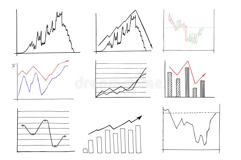
Free with trial Chart line set. Graph, finance report, income growth, economy statistic, diagram, infographic, mind map, data visualization vector illustration. Outline signs of analytic. Editable Stroke. Time decrease vectors Analytical graphic chart with trend lines, columns set hand drawn ink sketch. Change in time of election results or income, plans. Chart line set. Graph, finance report, income growth, economy statistic, diagram, infographic, mind map, data visualization vector illustration. Outline signs of analytic. Editable Stroke
Free with trial Abstract 3D blue graph representing market data fluctuations over time, showing peaks and valleys on a financial report, detailed background Generative AI. Time decrease illustrations Abstract 3D blue graph representing market data fluctuations over time, showing peaks and valleys on a financial report
Free with trial The image showcases a candlestick chart, a common tool used in financial markets to represent the price movements of assets over time. the chart is displayed against a dark background, enhancing the visibility of the red and green candlesticks. the red candlesticks indicate a decrease in price, while the green ones represent an increase. the overall trend depicted by the chart suggests a. Time decrease illustrations A visual representation of a stock market crash, featuring a candlestick chart with red and green bars indicating price fluctuatio. the image showcases a candlestick chart, a common tool used in financial markets to represent the price movements of assets over time. the chart is displayed against a dark background, enhancing the visibility of the red and green candlesticks. the red candlesticks indicate a decrease in price, while the green ones represent an increase. the overall trend depicted by the chart suggests a
Free with trial This AI-generated image depicts a calculator displaying "TAX-2025" alongside a bar graph, illustrating potential tax revenue projections for the year. The graph, generated by AI, shows a projected decrease in tax revenue over time. This visualization is helpful for financial planning and forecastin. Time decrease illustrations Tax Projections 2025. This AI-generated image depicts a calculator displaying "TAX-2025" alongside a bar graph, illustrating potential tax revenue projections for the year. The graph, generated by AI, shows a projected decrease in tax revenue over time. This visualization is helpful for financial planning and forecastin
Free with trial The graph illustrates a significant decline in value from 2018 to 2022. The value starts at 100 in 2018 and steadily decreases each year, reaching near zero by 2022. The shaded blue area represents the range of values, with the dark blue line indicating the average trend. Time decrease illustrations Decline in value over time. The graph illustrates a significant decline in value from 2018 to 2022. The value starts at 100 in 2018 and steadily decreases each year, reaching near zero by 2022. The shaded blue area represents the range of values, with the dark blue line indicating the average trend
Free with trial The image depicts a 3D bar graph showing a decreasing trend over a period of years. The y-axis represents values ranging from 0 to 100,000, while the x-axis represents years from 2000 to 2025. The bars start high in 2000 and gradually decrease, indicating a downward trend. An arrow at the end of the curve suggests a continuing decline. Time decrease illustrations Decreasing trend over time. The image depicts a 3D bar graph showing a decreasing trend over a period of years. The y-axis represents values ranging from 0 to 100,000, while the x-axis represents years from 2000 to 2025. The bars start high in 2000 and gradually decrease, indicating a downward trend. An arrow at the end of the curve suggests a continuing decline
Free with trial This image displays a candlestick chart on a white background, illustrating financial data over a period of time. The chart features green and red candlesticks representing price movements, with green indicating an increase and red indicating a decrease. The chart is accompanied by a vertical axis showing price levels and a horizontal axis indicating time periods from 2008 to 2018. Time decrease illustrations Candlestick chart data isolated on white background. This image displays a candlestick chart on a white background, illustrating financial data over a period of time. The chart features green and red candlesticks representing price movements, with green indicating an increase and red indicating a decrease. The chart is accompanied by a vertical axis showing price levels and a horizontal axis indicating time periods from 2008 to 2018
Free with trial Decline from happy new year 2025 to 2026. Falling black arrow symbol. Wooden blocks representing time passing with grey background. Time decrease illustrations Decline concept of happy new year from 2025 to 2026 on wooden blocks with falling black arrow symbol over grey background. Decline from happy new year 2025 to 2026. Falling black arrow symbol. Wooden blocks representing time passing with grey background
Free with trial Set of vector solid icons related to loan, bank credit rate, finance and investment. Symbols for website or app ui, logo design, illustration. Time decrease vectors Vector solid icons of money credit and loan. Set of vector solid icons related to loan, bank credit rate, finance and investment. Symbols for website or app ui, logo design, illustration
Free with trial Dollar, bitcoin and economy. Growth and fall of dollar. Set of duotone line icons. Vector file. Time decrease vectors Business. Balance, growth and fall, analysis. Line icons. Vector file. Dollar, bitcoin and economy. Growth and fall of dollar. Set of duotone line icons. Vector file.
Free with trial A clean, minimalist icon representing an analytics graph. It features a series of vertical bars of varying heights, symbolizing data or trends. A line graph with circular data points connects the tops of some of the bars, illustrating growth, progress, or fluctuations over time. This graphic is ideal for representing business intelligence, financial data, research, or any concept related to data analysis and performance. Time decrease vectors Analytics Graph Icon with Data Points. A clean, minimalist icon representing an analytics graph. It features a series of vertical bars of varying heights, symbolizing data or trends. A line graph with circular data points connects the tops of some of the bars, illustrating growth, progress, or fluctuations over time. This graphic is ideal for representing business intelligence, financial data, research, or any concept related to data analysis and performance.
Free with trial Trend Down : Trend down indicates a decrease in financial performance, market value, or economic indicators over time. Time decrease vectors Trend Down
Free with trial Decline Chart : A decline chart illustrates a decrease in financial performance, sales, or market value over time. Time decrease illustrations Decline Chart
Free with trial Set of vector line icons related to loan, bank credit rate, finance and investment. Symbols for website or app ui, logo design, illustration. Time decrease vectors Vector line icons of money credit and loan. Set of vector line icons related to loan, bank credit rate, finance and investment. Symbols for website or app ui, logo design, illustration
Free with trial A detailed infographic illustrates the process of topsoil settling over a three-year period, highlighting the reduction in soil height from 12 inches to 6 inches, with specific measurements provided for each year in a clear and visually engaging format. The image uses a vertical layout with labeled markers to indicate the settling progression against a dark, contrasting background. Time decrease illustrations Infographic Showing Topsoil Settling Over Three Years with Measurements. A detailed infographic illustrates the process of topsoil settling over a three-year period, highlighting the reduction in soil height from 12 inches to 6 inches, with specific measurements provided for each year in a clear and visually engaging format. The image uses a vertical layout with labeled markers to indicate the settling progression against a dark, contrasting background
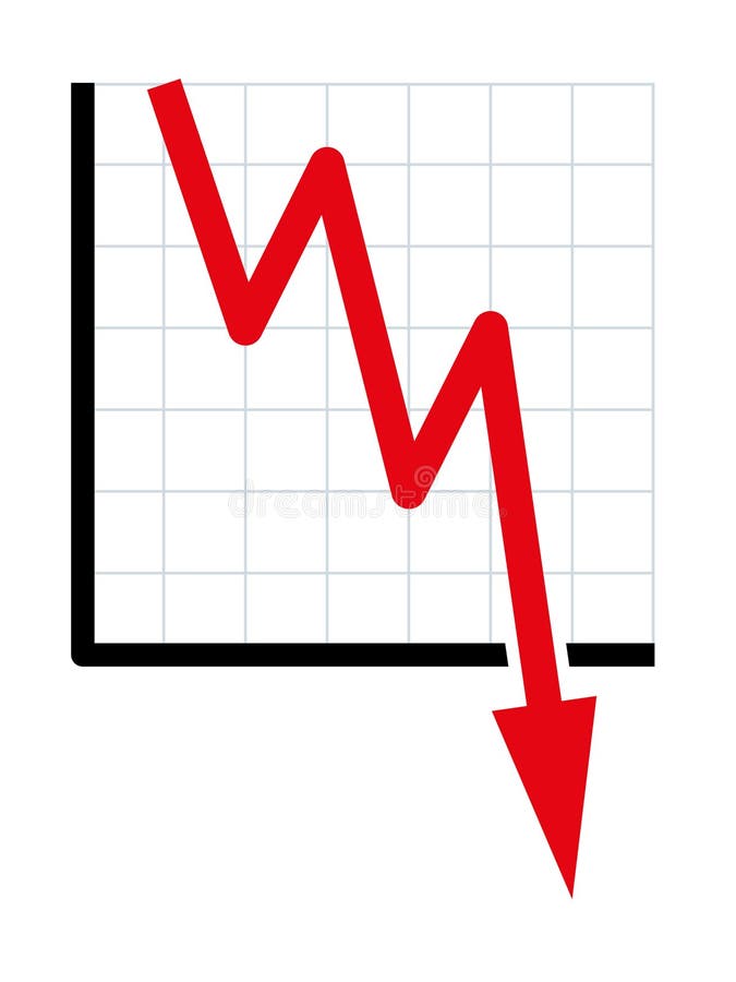
Free with trial Downward trend, symbolic chart for falling prices. Decreasing red line of a diagram falls with fluctuations into the bottomless, indicating sudden heavy losses, bursting bubbles and downward movement. Time decrease vectors Downward trend, symbolic chart for falling prices
Free with trial Data displays price changes for various stocks. Time decrease illustrations Market trends show price movements for stocks and investments over time. Data displays price changes for various stocks
Free with trial Loan line icons. Interest rate, AI generate, Inflation icons. Set of Investment, Interest rate and Percentage diagram linear icons. Vector. Time decrease vectors Loan line icons. Set of Investment, Interest rate and Percentage diagram icons. App line icons. Vector. Loan line icons. Interest rate, AI generate, Inflation icons. Set of Investment, Interest rate and Percentage diagram linear icons. Vector
Free with trial Set of vector line icons related to loan, bank credit rate, finance and investment. Symbols for website or app UI, logo design, illustration. Time decrease vectors Vector line icons of money credit and loan. Set of vector line icons related to loan, bank credit rate, finance and investment. Symbols for website or app UI, logo design, illustration
Free with trial Set of vector solid icons related to loan, bank credit rate, finance and investment. Symbols for website or app UI, logo design, illustration. Time decrease vectors Vector solid icons of money credit and loan. Set of vector solid icons related to loan, bank credit rate, finance and investment. Symbols for website or app UI, logo design, illustration
Free with trial Icons in two tones about energy management. Sustainable development Contains such icons as saving, regulation, price rise, consumption and efficiency. Editable stroke. Time decrease vectors Icons in two tones about energy management. Sustainable development
Free with trial Data combining line graph style illustration analysis visualization, ch series, point plot data combining line graph style. Time decrease illustrations Data combining line graph style
Free with trial Energy line icons. Interest rate, AI generate, Inflation icons. Electric power, Charge station and Electricity price inflation set. Vector. Time decrease vectors Energy line icons. Electric power, Charge station and Electricity price inflation set. App line icons. Vector. Energy line icons. Interest rate, AI generate. Energy line icons. Interest rate, AI generate, Inflation icons. Electric power, Charge station and Electricity price inflation set. Vector
Free with trial Icons in two colors about energy management. Sustainable development Contains such icons as saving, regulation, price rise, consumption and efficiency. Editable stroke. Time decrease vectors Icons in two colors about energy management. Sustainable development
Free with trial A bar graph with a red downward arrow illustrates a decline in data over time. Time decrease illustrations Decline in bar graph indicates downward trend. A bar graph with a red downward arrow illustrates a decline in data over time