Free with trial Three electronic devices are arranged on a sleek black surface, featuring a central tablet with a vibrant blue screen displaying a detailed line graph where green, pink, and other colored data points track decreasing metrics over time against a dark background illuminated by blue and white lights, creating a futuristic technological atmosphere perfect for concepts involving data analysis, business. Time decrease illustrations Futuristic data analytics dashboard displayed on blue glowing tablet screen with colorful line graph visualization. Three electronic devices are arranged on a sleek black surface, featuring a central tablet with a vibrant blue screen displaying a detailed line graph where green, pink, and other colored data points track decreasing metrics over time against a dark background illuminated by blue and white lights, creating a futuristic technological atmosphere perfect for concepts involving data analysis, business
Free with trial A three-dimensional chart displaying colorful lines and coin representations illustrates trends in data, highlighting key financial insights and fluctuations over time. Time decrease illustrations Trend Analysis with Colorful Graph Lines and Currency Coins Representing Data Points on a Three-Dimensional Chart. A three-dimensional chart displaying colorful lines and coin representations illustrates trends in data, highlighting key financial insights and fluctuations over time
Free with trial Two colorful lines are representing data points over time, creating a visual representation of trends and fluctuations, with a highlighted period marked in red. Time decrease illustrations Two colorful lines are representing data points over time, creating a visual representation of trends and fluctuations
Free with trial This clear and simple graph illustrates two opposing trends over time. Trend A, depicted in red, shows a steady decline, starting from a high value and decreasing as time progresses. In contrast, Trend B, shown in blue, demonstrates a consistent upward trajectory, beginning at zero and increasing over the same time period. The intersection point signifies a critical juncture where the values of both trends are equal. This visual is ideal for explaining concepts like competition, growth versus decline, or contrasting performance metrics. Time decrease vectors Conflicting Trends: Upward vs. Downward Trajectories on a Graph. This clear and simple graph illustrates two opposing trends over time. Trend A, depicted in red, shows a steady decline, starting from a high value and decreasing as time progresses. In contrast, Trend B, shown in blue, demonstrates a consistent upward trajectory, beginning at zero and increasing over the same time period. The intersection point signifies a critical juncture where the values of both trends are equal. This visual is ideal for explaining concepts like competition, growth versus decline, or contrasting performance metrics.
Free with trial A detailed close-up shot of a stock market chart display featuring multiple graphs and charts divided into sections representing different market aspects, including a red line graph labeled OTC Markets, a blue line graph showing a downward trend, another section with an upward trend marked by a red downward arrow, and additional charts on the right side displaying stock performance over time with. Time decrease illustrations Close-up view of multiple stock market charts and graphs showing OTC markets performance with upward and downward trends. A detailed close-up shot of a stock market chart display featuring multiple graphs and charts divided into sections representing different market aspects, including a red line graph labeled OTC Markets, a blue line graph showing a downward trend, another section with an upward trend marked by a red downward arrow, and additional charts on the right side displaying stock performance over time with
Free with trial A 3D rendering of a red desk calendar with a white page. The page has a large, red downward arrow symbol printed on it, indicating a downward direction or decrease. Time decrease illustrations Red calendar with a white page displaying a downward arrow symbol. A 3D rendering of a red desk calendar with a white page. The page has a large, red downward arrow symbol printed on it, indicating a downward direction or decrease
Free with trial The image depicts a declining trend using a combination of yellow bars and a red line chart. The bars represent discrete data points that progressively decrease in height from left to right, indicating a downward trend. The red line connects the tops of the bars, emphasizing the continuous decline over time. This visual effectively communicates a sharp reduction in values or performance over a. Time decrease illustrations Declining trend illustrated with bar and line chart combination. The image depicts a declining trend using a combination of yellow bars and a red line chart. The. The image depicts a declining trend using a combination of yellow bars and a red line chart. The bars represent discrete data points that progressively decrease in height from left to right, indicating a downward trend. The red line connects the tops of the bars, emphasizing the continuous decline over time. This visual effectively communicates a sharp reduction in values or performance over a
Free with trial The image shows a bar chart with green bars that progressively decrease in height from left to right, illustrating a downward trend. A bold red diagonal arrow points downward, emphasizing the decline in values or performance over time. Time decrease illustrations Decline in bar chart growth represented by a downward red arrow. The image shows a bar chart with green bars that progressively decrease in height from left to right, illustrating a downward trend. A bold red diagonal arrow points downward, emphasizing the decline in values or performance over time
Free with trial The image depicts a small yellow character standing on a green circular platform with a series of bar graphs behind it. The bars are colored in shades of pink and red, showing a descending trend. A large red downward arrow is superimposed over the bars, indicating a decline or decrease in values or performance over time. Time decrease illustrations Falling bar chart with a small figure standing on a green platform. The image depicts a small yellow character standing on a green circular platform with a series of bar graphs behind it. The bars are colored in shades of pink and red, showing a descending trend. A large red downward arrow is superimposed over the bars, indicating a decline or decrease in values or performance over time
Free with trial Modern laptop shows real time financial data analytics with line graphs bar charts and a pie chart. Time decrease illustrations Laptop Screen Displaying Live Business Data Charts and Analytics. Modern laptop shows real time financial data analytics with line graphs bar charts and a pie chart
Free with trial This graph illustrates the trends in volume and not frequency over several quarters, with notable peaks observed in Q3. Time decrease illustrations Graph showing volume and not frequency over time with peaks in q3. This graph illustrates the trends in volume and not frequency over several quarters, with notable peaks observed in Q3
Free with trial The image displays four distinct data visualizations. The top left and bottom left show bar charts with varying heights, indicating different data values. The top right presents a stacked bar chart, where each bar is divided into segments. The bottom right illustrates a line chart, showing data points connected by lines to depict trends over time. Time decrease illustrations Various types of data visualizations including bar and line charts. The image displays four distinct data visualizations. The top left and bottom left show bar charts with varying heights, indicating different data values. The top right presents a stacked bar chart, where each bar is divided into segments. The bottom right illustrates a line chart, showing data points connected by lines to depict trends over time
Free with trial A line graph illustrating a decrease in energy consumption over time, transitioning from lightning bolt icons to leaf icons, symbolizing a shift towards sustainable and eco-friendly practices. Time decrease illustrations Energy Consumption Reduction Graph with Lightning Bolts and Leaves. A line graph illustrating a decrease in energy consumption over time, transitioning from lightning bolt icons to leaf icons, symbolizing a shift towards sustainable and eco-friendly practices
Free with trial The image depicts a line graph with a purple line illustrating a fluctuating trend. The area under the line is shaded in light purple, indicating the cumulative value over time. The graph has a steady upward trend with several peaks and troughs, suggesting variability in the data. Time decrease illustrations A graph showing a fluctuating trend with a purple line and shaded area. The image depicts a line graph with a purple line illustrating a fluctuating trend. The area under the line is shaded in light purple, indicating the cumulative value over time. The graph has a steady upward trend with several peaks and troughs, suggesting variability in the data
Free with trial A red downward trending graph on a white background, indicating a decline or decrease in value or quantity, with a red arrow pointing downwards to emphasize the trend. Time decrease illustrations Downward trend graph showing decline in value or quantity over time. A red downward trending graph on a white background, indicating a decline or decrease in value or quantity, with a red arrow pointing downwards to emphasize the trend
Free with trial The image depicts a flip chart with a bar chart showing a downward trend in performance or data values. Overlaid on the bar chart is a red line graph that also trends downward, emphasizing a continuous decline. The chart is likely used to visually communicate negative trends or reductions in metrics over time, such as sales, productivity, or other measurable quantities. Time decrease illustrations Declining performance illustrated by a bar and line chart on a flip chart. The image depicts a flip chart with a bar chart showing a downward trend in performance or data values. Overlaid on the bar chart is a red line graph that also trends downward, emphasizing a continuous decline. The chart is likely used to visually communicate negative trends or reductions in metrics over time, such as sales, productivity, or other measurable quantities
Free with trial A bar graph showing a decrease in CO2 emissions with a green cloud and downward trend arrow. Time decrease illustrations Reducing carbon dioxide emissions over time as shown in the bar graph. A bar graph showing a decrease in CO2 emissions with a green cloud and downward trend arrow
Free with trial Simple and clean blue gradient line graph is going up and down showing growth and decline over a period of time. Time decrease vectors Blue gradient line graph showing growth and decline over time. Simple and clean blue gradient line graph is going up and down showing growth and decline over a period of time
Free with trial A bar graph showing a decrease in CO2 emissions with a green cloud and downward trend arrow. Time decrease illustrations Reducing carbon dioxide emissions over time as shown in the bar graph. A bar graph showing a decrease in CO2 emissions with a green cloud and downward trend arrow
Free with trial This image depicts a jagged, downward-sloping line against a bright yellow background. The line appears to be a stock market graph showing a significant decline over time. Time decrease illustrations Stock market decline illustrated by downward graph. This image depicts a jagged, downward-sloping line against a bright yellow background. The line appears to be a stock market graph showing a significant decline over time
Free with trial A line graph displaying a downward trend with a red arrow indicating a significant drop, multiple blue lines represent different data sets. Time decrease illustrations Graph showing a sharp decline in value over time with multiple data lines. A line graph displaying a downward trend with a red arrow indicating a significant drop, multiple blue lines represent different data sets
Free with trial The image depicts a bar chart with a downward trend, illustrating a decrease in values or performance over time. An arrow points downward from the last bar to a green dollar sign, symbolizing a decline in financial metrics or economic performance. The visual emphasizes a negative trend in monetary terms or financial health. Time decrease illustrations Graphic showing decline in value or performance with dollar symbol emphasis. The image depicts a bar chart with a downward trend, illustrating a decrease in values or performance over time. An arrow points downward from the last bar to a green dollar sign, symbolizing a decline in financial metrics or economic performance. The visual emphasizes a negative trend in monetary terms or financial health
Free with trial An image of a wooden easel holding a whiteboard with a bar graph and a red arrow indicating a downward trend, symbolizing a decrease or decline. Time decrease illustrations A graph on an easel showing a decline in values over time with a downward trend. An image of a wooden easel holding a whiteboard with a bar graph and a red arrow indicating a downward trend, symbolizing a decrease or decline
Free with trial This image depicts a series of vertical bars of varying heights, each accompanied by directional arrows indicating upward or downward trends. The bars suggest a progression over time, with some periods showing growth (upward arrows) and others showing decline (downward arrows). The varying shades of blue-green add a visual element to differentiate between the bars, emphasizing the changes in trend. Time decrease illustrations Visual representation of fluctuating market trends with directional arrows. This image depicts a series of vertical bars of varying heights, each accompanied by directional arrows indicating upward or downward trends. The bars suggest a progression over time, with some periods showing growth (upward arrows) and others showing decline (downward arrows). The varying shades of blue-green add a visual element to differentiate between the bars, emphasizing the changes in trend
Free with trial The image shows a bar graph with a red line trending downward, indicating a significant decline in data points over time. The bars start tall on the left and gradually decrease in height towards the right, with the red line following the same downward trajectory, ending with a large red arrow pointing downwards. Time decrease illustrations A downward trending graph illustrating a significant decline in data points. The image shows a bar graph with a red line trending downward, indicating a significant decline in data points over time. The bars start tall on the left and gradually decrease in height towards the right, with the red line following the same downward trajectory, ending with a large red arrow pointing downwards
Free with trial A glowing blue holographic graph showing stress hormone reduction over time is projected onto a wall in a bright, minimalist room. Two beige armchairs and a small wooden table with a plant are arranged in front of the display. Time decrease illustrations Holographic stress hormone reduction graph displayed in a modern minimalist room with two chairs and a plant. A glowing blue holographic graph showing stress hormone reduction over time is projected onto a wall in a bright, minimalist room. Two beige armchairs and a small wooden table with a plant are arranged in front of the display
Free with trial Silhouette of a scientist pointing at a glowing holographic display showing three graphs of viral load reduction over time. Laboratory equipment is visible in the background. Time decrease illustrations Scientist points to holographic display showing viral load reduction graphs in laboratory setting research. Silhouette of a scientist pointing at a glowing holographic display showing three graphs of viral load reduction over time. Laboratory equipment is visible in the background
Free with trial The image shows a line graph with a downward slope, featuring multiple red arrows pointing downward at various points along the line. This visual typically represents a continuous decline or drop in values over time, often used in financial, economic, or statistical contexts to illustrate negative trends or losses. Time decrease illustrations Graphical representation of a downward trend with red arrows indicating declines. The image shows a line graph with a downward slope, featuring multiple red arrows pointing downward at various points along the line. This visual typically represents a continuous decline or drop in values over time, often used in financial, economic, or statistical contexts to illustrate negative trends or losses
Free with trial The image depicts a series of blue bars representing a decreasing trend, with a red downward-sloping arrow cutting across. This visual metaphor is commonly used to illustrate a decline in performance, sales, revenue, or other business metrics over time. The combination of the bars and the arrow emphasizes a sharp reduction, suggesting caution or a need for strategic reassessment in a business. Time decrease illustrations Graphic illustration of declining growth or downward trend in business metrics. The image depicts a series of blue bars representing a decreasing trend, with a red downward-sloping arrow cutting across. This visual metaphor is commonly used to illustrate a decline in performance, sales, revenue, or other business metrics over time. The combination of the bars and the arrow emphasizes a sharp reduction, suggesting caution or a need for strategic reassessment in a business
Free with trial The image displays a stylized percentage symbol (%) with a downward red arrow and an upward green arrow intersecting it. The design suggests a contrast between a decrease and an increase in percentage values, possibly representing financial or statistical fluctuations, trends, or changes over time. The arrows are bold and clearly indicate opposing directions of movement. Time decrease vectors Percentage symbol with downward and upward arrows indicating fluctuation in value. The image displays a stylized percentage symbol (%) with a downward red arrow and an upward green arrow intersecting it. The design suggests a contrast between a decrease and an increase in percentage values, possibly representing financial or statistical fluctuations, trends, or changes over time. The arrows are bold and clearly indicate opposing directions of movement
Free with trial This image depicts a stock market graph with a clear upward trend, featuring significant fluctuations and notable peaks and troughs over a specified period. The graph includes trend lines and an arrow indicating the overall upward movement. Time decrease illustrations Stock market graph showing upward trend with significant fluctuations over time. This image depicts a stock market graph with a clear upward trend, featuring significant fluctuations and notable peaks and troughs over a specified period. The graph includes trend lines and an arrow indicating the overall upward movement
Free with trial The image shows a gold coin with a dollar sign on it placed in front of a bar chart with a downward trend. The bars are gray and the trend line is red, indicating a decrease in value or performance over time. Time decrease illustrations A gold coin with a dollar sign on it sits in front of a bar chart with a downward trend. The image shows a gold coin with a dollar sign on it placed in front of a bar chart with a downward trend. The bars are gray and the trend line is red, indicating a decrease in value or performance over time
Free with trial Set line Hierarchy organogram chart Many ways directional arrow Graph diagram Dollar symbol Financial growth decrease Clock Intersection point and Arrow icon. Vector. Time decrease vectors Set line Hierarchy organogram chart, Many ways directional arrow, Graph, diagram, Dollar symbol, Financial growth. Set line Hierarchy organogram chart Many ways directional arrow Graph diagram Dollar symbol Financial growth decrease Clock Intersection point and Arrow icon. Vector.
Free with trial The image shows three stacks of copper coins, each progressively smaller, with a large downward-pointing arrow made of a rolled-up piece of paper. This visual metaphor emphasizes a reduction or decrease, often used to represent financial decline, declining savings, or diminishing resources over time. The use of coins suggests a focus on monetary value or economic trends. Time decrease illustrations Decline in savings illustrated by diminishing copper coin stacks and downward arrow. The image shows three stacks of copper coins, each progressively smaller, with a large downward-pointing arrow made of a rolled-up piece of paper. This visual metaphor emphasizes a reduction or decrease, often used to represent financial decline, declining savings, or diminishing resources over time. The use of coins suggests a focus on monetary value or economic trends
Free with trial The image depicts a combination of bar and line charts. The bar chart shows three descending bars in orange, yellow, and a lighter shade, indicating a decline in values. Overlaid on this is a downward-sloping line chart, reinforcing the trend of decrease. The overall design suggests a visual representation of a downward market trend or decline in performance metrics over time. Time decrease illustrations Graphic illustration of declining market trends with bar and line chart combination. The image depicts a combination of bar and line charts. The bar chart shows three descending bars in orange, yellow, and a lighter shade, indicating a decline in values. Overlaid on this is a downward-sloping line chart, reinforcing the trend of decrease. The overall design suggests a visual representation of a downward market trend or decline in performance metrics over time
Free with trial This image shows several stacks of coins in decreasing height and quantity, arranged in a pyramid shape. The stacks appear to be made of gold and silver coins, representing financial growth, savings, or investment concepts. The visual metaphor emphasizes progression and accumulation over time. Time decrease illustrations Stacks of coins arranged in descending order of quantity to symbolize growth or savings. This image shows several stacks of coins in decreasing height and quantity, arranged in a pyramid shape. The stacks appear to be made of gold and silver coins, representing financial growth, savings, or investment concepts. The visual metaphor emphasizes progression and accumulation over time
Free with trial The image shows a series of red bars of varying heights, each with an arrow pointing downwards, illustrating a decline in values. The bars represent data points that decrease over time, with the arrows emphasizing the downward trend. Time decrease illustrations A visual representation of fluctuating data trends with arrows indicating changes. The image shows a series of red bars of varying heights, each with an arrow pointing downwards, illustrating a decline in values. The bars represent data points that decrease over time, with the arrows emphasizing the downward trend
Free with trial This image features a bar chart with orange bars representing performance metrics that steadily decrease over time, accompanied by a downward-sloping line graph that tracks the same trend against a blurred office background. Time decrease illustrations A bar chart showing a steady decline in performance metrics over a series of sequential periods. This image features a bar chart with orange bars representing performance metrics that steadily decrease over time, accompanied by a downward-sloping line graph that tracks the same trend against a blurred office background
Free with trial The image depicts a bar graph with blue bars that increase in height initially, then gradually decrease, symbolizing growth followed by decline. An upward-pointing arrow overlays the graph, indicating an overall upward trend or potential future growth despite the current decline in the bars' heights. This visual is often used in business, finance, and analytics to illustrate performance trends. Time decrease illustrations Growth trend represented by increasing and then decreasing blue bar graph with upward arrow. The image depicts a bar graph with blue bars that increase in height initially, then gradually decrease, symbolizing growth followed by decline. An upward-pointing arrow overlays the graph, indicating an overall upward trend or potential future growth despite the current decline in the bars' heights. This visual is often used in business, finance, and analytics to illustrate performance trends
Free with trial This image shows a candlestick chart, which is a type of financial chart used to describe price movements of securities, derivatives, or currencies. Each candlestick typically shows one day's worth of price data, with green bars indicating an increase in price and red bars indicating a decrease. The chart provides a visual representation of the opening, closing, high, and low prices for each. Time decrease illustrations A candlestick chart displaying stock market price movements over time with green and red bars. This image shows a candlestick chart, which is a type of financial chart used to describe price movements of securities, derivatives, or currencies. Each candlestick typically shows one day's worth of price data, with green bars indicating an increase in price and red bars indicating a decrease. The chart provides a visual representation of the opening, closing, high, and low prices for each
Free with trial The image depicts a series of stacks of gold coins progressively decreasing in height from left to right, accompanied by a large red downward arrow. This visual metaphorically represents a decline in financial growth, savings, or economic performance over time. Time decrease illustrations Declining financial growth represented by diminishing stacks of gold coins and downward arrow. The image depicts a series of stacks of gold coins progressively decreasing in height from left to right, accompanied by a large red downward arrow. This visual metaphorically represents a decline in financial growth, savings, or economic performance over time
Free with trial The image depicts a downward trend using a combination of bar and line chart elements. The yellow bars gradually decrease in height from left to right, indicating a consistent decline. A red line overlays the bars, further emphasizing the downward trajectory, ending with a large red arrow pointing downwards to signify a significant drop. This visual representation is often used to show reductions. Time decrease illustrations Declining trend illustrated through bar and line chart visualization isolated on white background. The image depicts a downward trend using a combination of bar and line chart elements. The yellow bars gradually decrease in height from left to right, indicating a consistent decline. A red line overlays the bars, further emphasizing the downward trajectory, ending with a large red arrow pointing downwards to signify a significant drop. This visual representation is often used to show reductions
Free with trial A line graph displaying fluctuating values over a 28-day period with notable peaks at day 14 and day 21. Time decrease illustrations Graph showing fluctuating values over time with peaks at day 14 and day 21 isolated on white background. A line graph displaying fluctuating values over a 28-day period with notable peaks at day 14 and day 21
Free with trial A red line graph depicting a downward trend in stock prices over time, with specific percentage decreases marked at various points. Time decrease illustrations Stock market graph showing significant decline over several months with percentage drops highlighted. A red line graph depicting a downward trend in stock prices over time, with specific percentage decreases marked at various points
Free with trial A line graph displays two curves, one in green and one in red, indicating fluctuations in data over a set. Time decrease illustrations Graph showing statistical trends with positive and negative fluctuations over time in a simple line format. A line graph displays two curves, one in green and one in red, indicating fluctuations in data over a set
Free with trial Declining graph with downward arrow illustrating economic recession and financial loss over time for business. Time decrease vectors Declining graph with downward arrow illustrating economic recession and financial loss over time for business
Free with trial A series of wooden cylinders with percentage signs on them, arranged in descending order of height, accompanied by a red arrow trending downwards, indicating a decline in percentage values. Time decrease illustrations A visual representation of decreasing percentage values over time, symbolizing a downward trend in financial data. A series of wooden cylinders with percentage signs on them, arranged in descending order of height, accompanied by a red arrow trending downwards, indicating a decline in percentage values
Free with trial A detailed data visualization illustrating market trends over time. The infographic combines a line chart, which shows fluctuating values and percentages, with a bar chart representing data for specific time intervals. The line chart highlights key data points, such as peaks annotated with values like '1. 24%' and '500K'. The x-axis represents a timeline from January to March, while the y-axis. Time decrease illustrations A modern market trend analysis visualization combining a bar and line chart for financial data isolated on white background. A detailed data visualization illustrating market trends over time. The infographic combines a line chart, which shows fluctuating values and percentages, with a bar chart representing data for specific time intervals. The line chart highlights key data points, such as peaks annotated with values like '1.24%' and '500K'. The x-axis represents a timeline from January to March, while the y-axis
Free with trial Abstract rainbow tunnel with glowing concentric rings creating futuristic portal illusion and vibrant light motion effect. This image features a visually stunning tunnel composed of concentric rings glowing in vibrant rainbow colors. The rings gradually decrease in size toward the center, creating a strong sense of depth and perspective that resembles a portal or passage through space. The colors are highly saturated and smoothly blended, forming a continuous gradient that flows through the entire composition. The luminous effect enhances the sense of motion and draws the viewer inward. Lighting plays a major role in defining the????? (shape) and depth of the tunnel. Each ring emits a soft glow, contributing to the immersive and futuristic atmosphere. The reflections and gradients add a polished and professional finish. Conceptually, the image can represent time travel, digital portals, virtual reality, or transitions between different states or dimensions. It is highly suitable for creative storytelling and futuristic themes. The symmetrical structure provides balance and harmony, while the vibrant colors add excitement and visual energy. This makes the image effective for both artistic and commercial applications. The clean composition allows for easy integration into designs, including advertisements, websites, and multimedia projects. It can also serve as a captivating background. Post-processing enhancements likely refined the color gradients, glow intensity, and clarity of the rings, ensuring a high-quality visual output. The tunnel effect creates a strong focal point, making the image engaging and memorable. It is ideal for projects that aim to capture attention and convey innovation. Overall, the image combines artistic creativity with technical precision, resulting in a powerful and versatile visual asset. Keywords: tunnel, rainbow, abstract, portal, rings, glow, light, colorful, futuristic, vortex, perspective, depth, motion, digital, energy, vibrant, design, background, sci fi, virtual reality, time travel, gradient, pattern, visual, effect, modern, fantasy, technology, immersive, circle, symmetry, neon, bright, concept, transition, space, digital art, creative, color spectrum, luminous, dynamic, portal effect, light rings, futuristic design, visual tunnel, abstract background. Time decrease illustrations Abstract rainbow tunnel with glowing concentric rings creating futuristic portal illusion and vibrant light motion effect
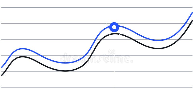
Free with trial Two lines are representing data progression over time, one blue and one black, creating a visual representation of trends and a key intersection point is marked with a blue circle. Time decrease illustrations Two lines are representing data progression over time, one blue and one black, creating a visual representation of
Free with trial Two lines are representing data progression over time, one blue and one black, creating a visual representation of trends and a key intersection point is marked with a blue circle. Time decrease vectors Two lines are representing data progression over time, one blue and one black, creating a visual representation of
Free with trial A vibrant line graph visually representing fluctuating data trends over time, highlighting growth with colorful markers in green, yellow, and orange for better insights. Time decrease illustrations Colorful Line Graph Showing Data Trends with Green, Yellow, and Orange Indicators Representing Growth and Fluctuations Across. A vibrant line graph visually representing fluctuating data trends over time, highlighting growth with colorful markers in green, yellow, and orange for better insights
Free with trial This vibrant line chart illustrates growth and decline trends with colored circles, making it suitable for business presentations, reports, and educational material. Time decrease illustrations Colorful Line Chart Showing Growth and Decline Trends with Green, Yellow, and Red Circles Representing Data Points over Time. This vibrant line chart illustrates growth and decline trends with colored circles, making it suitable for business presentations, reports, and educational material
Free with trial Colorful bar charts are presenting statistical trends and business performance data across different time periods. Possibly days of the week. Using a vibrant color scheme of blue. Purple. And orange. Time decrease illustrations Colorful bar charts are presenting statistical trends and business performance data across different time periods
Free with trial Intersecting colorful lines trending up and down across a graph illustrate weekly progress from monday to sunday, capturing fluctuations in performance over time. Time decrease illustrations Intersecting colorful lines trending up and down across a graph illustrate weekly progress from monday to sunday
Free with trial Two colorful lines are representing data points over time, creating a visual representation of trends and fluctuations, with a highlighted period marked in red. Time decrease vectors Two colorful lines are representing data points over time, creating a visual representation of trends and fluctuations
Free with trial Simple set of isometric flat icons for finance 3. Contains such symbols as Objective, Decision, Time is Money and Decrease. Time decrease vectors Simple set of isometric flat icons for finance 3
Free with trial A golden hourglass with digital currency symbols flowing from the upper to the lower bulb encapsulating the passage of wealth over time. Generative AI. Time decrease illustrations A golden hourglass with digital currency symbols flowing from the upper to the lower bulb encapsulating the passage of wealth
Free with trial Discover the correlation between age and salary growth. A visual representation highlights trends in compensation over time. Time decrease illustrations Explore the balance between age and creativity. Understand how they decline and improve in the professional journey. Discover the correlation between age and salary growth. A visual representation highlights trends in compensation over time
Free with trial Graph table graphs illustration data variables, time precision, connection interpret graph table graphs. Time decrease illustrations Graph table graphs
Free with trial Economies of scale web or landing. Company scale of operation, amount of output produced per unit of time. Mass production efficiency. Flat vector illustration. Time decrease vectors Economies of scale web or
Free with trial Economies of scale web or landing. Company scale of operation, amount of output produced per unit of time. Mass production efficiency. Flat vector illustration. Time decrease vectors Economies of scale web or
Free with trial Economies of scale web or landing. Company scale of operation, amount of output produced per unit of time. Mass production efficiency. Flat vector illustration. Time decrease vectors Economies of scale web or
Free with trial Economies of scale web or landing. Company scale of operation, amount of output produced per unit of time. Mass production efficiency. Flat vector illustration. Time decrease vectors Economies of scale web or
Free with trial Economies of scale web or landing. Company scale of operation, amount of output produced per unit of time. Mass production efficiency. Flat vector illustration. Time decrease vectors Economies of scale web or
Free with trial Economies of scale. Company scale of operation, amount of output produced per unit of time. Mass production efficiency. Flat vector illustration. Time decrease vectors Economies of scale. Company scale
Free with trial Economies of scale dark or night mode web or landing. Company scale of operation, amount of output produced per unit of time. Mass production efficiency. Flat vector illustration. Time decrease vectors Economies of scale dark or
Free with trial Economies of scale. Company scale of operation, amount of output produced per unit of time. Mass production efficiency. Flat vector illustration. Time decrease vectors Economies of scale. Company scale
Free with trial Set line icons of diabetes isolated on black. Thirst, patient card, libido decrease, blood test, insulin injection, medical accessories. Vector illustration. Time decrease vectors Set line icons of diabetes
Free with trial Company graphs data illustration time valleys, volatility market, background trend company graphs data. Time decrease illustrations Company graphs data
Free with trial An icon showing a switch with a timer function and a minus sign, indicating time reduction, can be used in digital interfaces. Time decrease illustrations Timer Switch Setting. An icon showing a switch with a timer function and a minus sign, indicating time reduction, can be used in digital interfaces
Free with trial Generated with the use of AI. Fountain where water usually flows, but instead, it's a cascade of coins splashing into the basin. Over time, the coins lose their shine and become tarnished, with 'DEFLATION' prominently displayed. Time decrease illustrations Fountain where water usually flows but instead its a cascade of coins splashing into the basin. Over time the coins lose their. Generated with the use of AI. Fountain where water usually flows, but instead, it's a cascade of coins splashing into the basin. Over time, the coins lose their shine and become tarnished, with 'DEFLATION' prominently displayed
Free with trial A line graph with a decreasing trend is commonly used to depict scenarios like declining sales, decreasing stock prices, or any situation where a decrease in values over time or across categories is a significant aspect of the data. It provides a clear and intuitive way to understand trends and make informed interpretations about the decreasing values being represented. Time decrease illustrations Chart with decreasing line graph. A line graph with a decreasing trend is commonly used to depict scenarios like declining sales, decreasing stock prices, or any situation where a decrease in values over time or across categories is a significant aspect of the data. It provides a clear and intuitive way to understand trends and make informed interpretations about the decreasing values being represented.