Free with trial Clean vector illustration features two sets of parallel arrows against a white background. One set of three arrows is colored bright red and points upwards, each arrow slightly offset from the others, creating a dynamic visual. The second set of three arrows is colored vibrant blue and points downwards, mirroring the arrangement of the red arrows. This contrasting imagery of upward and downward movement is ideal for illustrating concepts of growth versus decline, increase versus decrease, success versus recession, or positive versus negative trends in business, finance, or other data-driven contexts. Trend decrease illustrations Vector Illustration of Contrasting Red Upward and Blue Downward Arrows. clean vector illustration features two sets of parallel arrows against a white background. One set of three arrows is colored bright red and points upwards, each arrow slightly offset from the others, creating a dynamic visual. The second set of three arrows is colored vibrant blue and points downwards, mirroring the arrangement of the red arrows. This contrasting imagery of upward and downward movement is ideal for illustrating concepts of growth versus decline, increase versus decrease, success versus recession, or positive versus negative trends in business, finance, or other data-driven contexts.
Free with trial A 3D blue downward-pointing arrow is depicted with a pink circular tag featuring a white percentage sign attached to its shaft. The graphic is isolated on a white background, symbolizing a decrease or reduction. Trend decrease illustrations 3D Blue Downward Arrow with Pink Percentage Sign on White Background image photo. A 3D blue downward-pointing arrow is depicted with a pink circular tag featuring a white percentage sign attached to its shaft. The graphic is isolated on a white background, symbolizing a decrease or reduction
Free with trial A visual representation of a financial downturn, featuring a downward-pointing arrow, a dollar coin, and a bar graph indicating a decline. this image depicts economic challenges and potential losses. Trend decrease vectors A downward trend with a yellow arrow and a dollar coin in a bar graph on a white background. a visual representation of a financial downturn, featuring a downward-pointing arrow, a dollar coin, and a bar graph indicating a decline. this image depicts economic challenges and potential losses.
Free with trial Growth and decline chart. Market trend analysis. Vector illustration. EPS 10. Stock image. Trend decrease vectors Growth and decline chart. Market trend analysis. Vector illustration. EPS 10.
Free with trial Dollar coin next to declining bar graph and directional arrow illustrating financial downturn. Ideal for finance, economics, investment, stock market, loss, budget analysis, simple flat metaphor. Trend decrease illustrations Dollar Sign Coin and Declining Bar Chart with Arrow Indicating Financial Downward Trend. Dollar coin next to declining bar graph and directional arrow illustrating financial downturn. Ideal for finance, economics, investment, stock market, loss, budget analysis, simple flat metaphor
Free with trial A sharp, red arrow zigzags downwards, indicating a significant decline or negative trend in financial markets or business performance. Trend decrease illustrations Red arrow pointing downwards isolated on white background. A sharp, red arrow zigzags downwards, indicating a significant decline or negative trend in financial markets or business performance
Free with trial Stack of gold coins accompanied by a bold red downward arrow demonstrates a negative economic trend against a dark background, ideal for illustrating financial crisis, market decline, or investment risks. Trend decrease illustrations Gold Coins with Red Arrow Showing Economic Downturn on Dark Background. Stack of gold coins accompanied by a bold red downward arrow demonstrates a negative economic trend against a dark background, ideal for illustrating financial crisis, market decline, or investment risks
Free with trial A 3D bar chart with a red line graph indicating a significant decline, isolated on a white background. Trend decrease illustrations Financial bar chart showing downward trend isolated on white background. A 3D bar chart with a red line graph indicating a significant decline, isolated on a white background
Free with trial A bright red line charts a steep downward trend against a blurred, abstract blue background with horizontal lines. Trend decrease illustrations Red downward trending graph line against abstract blue background chart. A bright red line charts a steep downward trend against a blurred, abstract blue background with horizontal lines
Free with trial Two lines illustrate a contrasting trend, one declining and the other rising, blending harmoniously in shades of orange, evoking a sense of change. Trend decrease illustrations Dynamic Trends Showcased Through Contrasting Lines in Warm Hues of Orange. Two lines illustrate a contrasting trend, one declining and the other rising, blending harmoniously in shades of orange, evoking a sense of change
Free with trial This image shows a stock market graph with a downward trend, generated by AI. The red line vividly depicts a significant market decline, potentially indicating economic instability or investor uncertainty. Analyzing this data requires further context and analysis. Trend decrease illustrations AI-Generated Stock Market Decline. This image shows a stock market graph with a downward trend, generated by AI. The red line vividly depicts a significant market decline, potentially indicating economic instability or investor uncertainty. Analyzing this data requires further context and analysis.
Free with trial A detailed blue candlestick chart depicting stock market price fluctuations and trends over time Ideal for illustrating financial concepts market analysis and investment strategies The graphic is clean modern and visually engaging. Trend decrease illustrations Blue Financial Chart Candlestick Graph Showing Stock Market Trend Analysis. A detailed blue candlestick chart depicting stock market price fluctuations and trends over time Ideal for illustrating financial concepts market analysis and investment strategies The graphic is clean modern and visually engaging
Free with trial A whiteboard displays a hand-drawn graph showing a significant downward trend in stock prices. This visual representation of a market downturn was generated by AI and emphasizes the volatility and potential risks associated with stock market investments. The image is a clear, concise illustration o. Trend decrease illustrations AI-Generated Stock Market Decline. A whiteboard displays a hand-drawn graph showing a significant downward trend in stock prices. This visual representation of a market downturn was generated by AI and emphasizes the volatility and potential risks associated with stock market investments. The image is a clear, concise illustration o
Free with trial Red arrow showing downward trend over supermarket shelves with scarce product. Economic crisis and inflation impact on food supply or demand. Trend decrease illustrations Red arrow showing downward trend over supermarket shelves with scarce product
Free with trial Conceptual image featuring a pink arrow pointing downwards, symbolizing decrease or reduction. Trend decrease illustrations Abstract geometric composition with a downward arrow, representing decline. Conceptual image featuring a pink arrow pointing downwards, symbolizing decrease or reduction
Free with trial A 3D illustration featuring a bar chart with four ascending blue bars of varying heights, representing data growth. To the right of the chart are two white arrows, one pointing upwards and the other downwards, symbolizing increase and decrease respectively. The entire graphic is presented on a clean white background. Trend decrease illustrations 3D Bar Chart with Up and Down Arrows on White Background graph statistics. A 3D illustration featuring a bar chart with four ascending blue bars of varying heights, representing data growth. To the right of the chart are two white arrows, one pointing upwards and the other downwards, symbolizing increase and decrease respectively. The entire graphic is presented on a clean white background
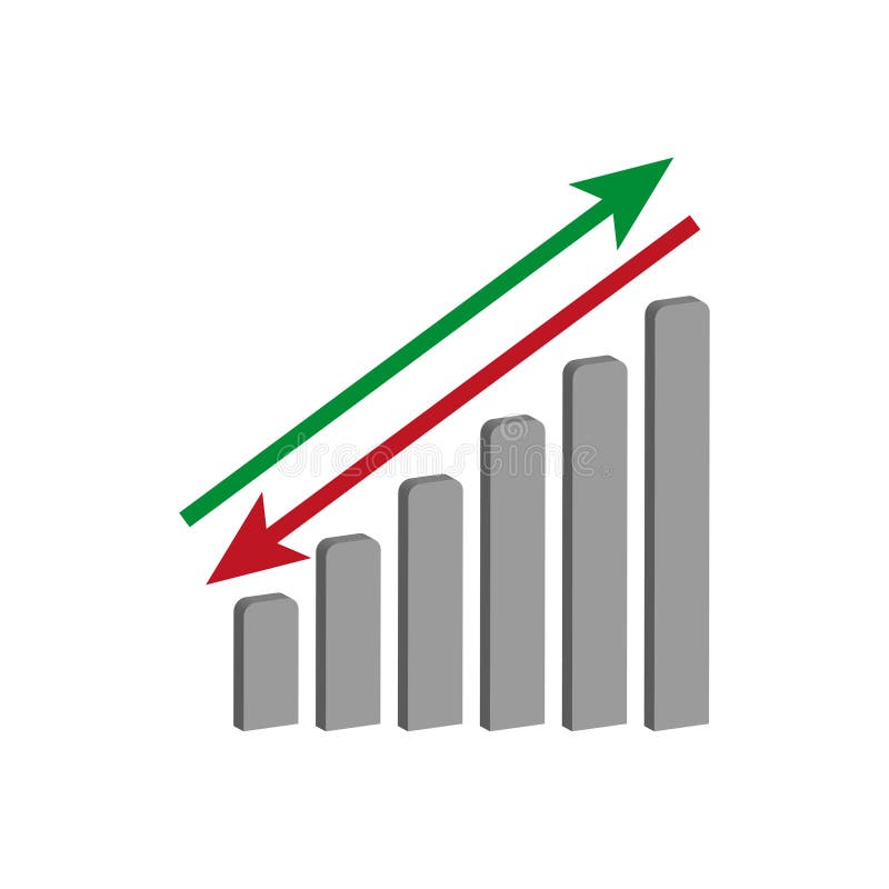
Free with trial A bright red arrow points upwards symbolizing growth and profit, while a vibrant green arrow points downwards signifying a decrease or loss. Ideal for finance and business concepts. Trend decrease vectors Red up arrow and green down arrow symbols representing financial growth and decline. A bright red arrow points upwards symbolizing growth and profit, while a vibrant green arrow points downwards signifying a decrease or loss. Ideal for finance and business concepts
Free with trial A hand uses a stylus to draw a glowing bar graph. The graph illustrates increasing income and decreasing expenses, symbolizing financial management and growth. Trend decrease illustrations Hand drawing a financial graph showing income growth and expense decrease. A hand uses a stylus to draw a glowing bar graph. The graph illustrates increasing income and decreasing expenses, symbolizing financial management and growth
Free with trial A hand-drawn graph showing a decreasing trend. The chart depicts a decline in business performance, market downturn, or financial losses, created as a minimalist doodle. Trend decrease illustrations Hand-Drawn Graph Illustration Showing Market Decline and Decreasing Trends. A hand-drawn graph showing a decreasing trend. The chart depicts a decline in business performance, market downturn, or financial losses, created as a minimalist doodle
Free with trial This illustration depicts sustainability with a downward arrow, Earth, and leaves, representing eco-friendly practices. Trend decrease vectors Sustainable Downward Trend: Green Arrow, Earth, and Leaves Concept Illustration. This illustration depicts sustainability with a downward arrow, Earth, and leaves, representing eco-friendly practices.
Free with trial A striking red arrow diagonally points downwards, visually representing a significant drop or negative trend. This impactful graphic is perfect for conveying concepts of loss profit or falling stock. Trend decrease illustrations Bold red arrow points downward illustrating decline and negative trends in business white background. A striking red arrow diagonally points downwards, visually representing a significant drop or negative trend. This impactful graphic is perfect for conveying concepts of loss profit or falling stock
Free with trial A stylized line graph icon with a purple gradient is displayed against a solid black background. The graph features four circular data points connected by angled lines, forming an upward trend. Trend decrease illustrations Stylized line graph icon with purple gradient on black background chart data. A stylized line graph icon with a purple gradient is displayed against a solid black background. The graph features four circular data points connected by angled lines, forming an upward trend
Free with trial A hand-drawn chart illustrates a market decline, demonstrating decreasing financial figures. The graph shows a clear downward trend, indicating potential losses or an economic downturn. Trend decrease illustrations Hand drawn chart displaying market decline and decreasing financial figures. A hand-drawn chart illustrates a market decline, demonstrating decreasing financial figures. The graph shows a clear downward trend, indicating potential losses or an economic downturn
Free with trial Area chart illustrating trends in Sareorplojicam and S�snpavai across years. Shows variations over time. Trend decrease illustrations . Area chart illustrating trends in Sareorplojicam and S�snpavai across years. Shows variations over time
Free with trial A stark visual representation of a financial downturn with a bold red arrow pointing downwards. This graphic captures market decline and economic recession trends, ideal for financial analysis and reporting. Trend decrease illustrations Financial downturn visualized red arrow chart showing decline candlestick graph indicating market drop economic recession trend. A stark visual representation of a financial downturn with a bold red arrow pointing downwards. This graphic captures market decline and economic recession trends, ideal for financial analysis and reporting
Free with trial This visually striking graph displays two contrasting trends one line shows a sharp decrease while the other illustrates a significant increase in an engaging orange palette. Trend decrease illustrations Dynamic Trends of Change Illustrated Through Contrasting Lines in Orange Hues. This visually striking graph displays two contrasting trends one line shows a sharp decrease while the other illustrates a significant increase in an engaging orange palette
Free with trial This image depicts a financial loss with red arrows and bars on a stock market chart showing a downward trend. The concept conveys the theme of financial decline and loss in the stock market. The arrows and bars symbolize a negative trend in the financial market, indicating a decrease in value of stocks and shares. The image captures the significance of financial loss and the impact it can have on investors and the economy. The meaning behind it highlights the importance of understanding the risks associated with investing in the stock market and the need for informed decisions. This image is ideal for use in financial reports, presentations, and articles related to the stock market and investments. Trend decrease illustrations Financial Loss: Red Arrows and Bars on Stock Market Chart Showing Downward Trend. This image depicts a financial loss with red arrows and bars on a stock market chart showing a downward trend. The concept conveys the theme of financial decline and loss in the stock market. The arrows and bars symbolize a negative trend in the financial market, indicating a decrease in value of stocks and shares. The image captures the significance of financial loss and the impact it can have on investors and the economy. The meaning behind it highlights the importance of understanding the risks associated with investing in the stock market and the need for informed decisions. This image is ideal for use in financial reports, presentations, and articles related to the stock market and investments.
Free with trial A vibrant red line depicts a sharp downward trend across a dynamic, motion-blurred abstract background. Trend decrease illustrations Red downward trending graph line on abstract motion blurred background chart. A vibrant red line depicts a sharp downward trend across a dynamic, motion-blurred abstract background
Free with trial A neon pink stock market chart with a downward trend and candlestick indicators against a dark blue background, symbolizing financial loss and economic downturn. Trend decrease illustrations Neon Pink Stock Market Crash Chart with Candlesticks on Dark Blue Background. A neon pink stock market chart with a downward trend and candlestick indicators against a dark blue background, symbolizing financial loss and economic downturn
Free with trial A glossy, vibrant blue circular icon featuring a clear white arrow pointing downwards. This imagery commonly represents downloading files, scrolling down, or a negative trend. Trend decrease illustrations Bright blue orb with downward arrow symbol indicating download or navigation. A glossy, vibrant blue circular icon featuring a clear white arrow pointing downwards. This imagery commonly represents downloading files, scrolling down, or a negative trend
Free with trial A striking red arrow pointing downwards. Its glossy finish and distinct black outline give it a bold and clear visual presence, ideal for indicating direction or a downward trend. Trend decrease illustrations Bright red down arrow icon with glossy finish and black outline symbolizing direction white background. A striking red arrow pointing downwards. Its glossy finish and distinct black outline give it a bold and clear visual presence, ideal for indicating direction or a downward trend
Free with trial Elevate your everyday style with Abu Taher's collection of Typography T-Shirt Designs, where words meet artistry. Trend decrease vectors Collection of 32 icons representing increase and decrease in business and finance. Elevate your everyday style with Abu Taher's collection of Typography T-Shirt Designs, where words meet artistry
Free with trial A striking red downward arrow breaks through charts and data, symbolizing a sharp decrease in market values or performance metrics during a financial analysis session. Trend decrease illustrations Red downward arrow indicates a sudden decline in market performance and trends. A striking red downward arrow breaks through charts and data, symbolizing a sharp decrease in market values or performance metrics during a financial analysis session.
Free with trial An illustration of a stylized, downward-pointing arrow zig-zagging across a pale yellow surface. The arrow conveys a sense of decline, loss, or reduction. Simplistic design is suitable for presentations, infographics, or website design needing a visual representation of negative trends. Trend decrease illustrations Downward arrow illustration showing market trend zigzag decline and recession. An illustration of a stylized, downward-pointing arrow zig-zagging across a pale yellow surface. The arrow conveys a sense of decline, loss, or reduction. Simplistic design is suitable for presentations, infographics, or website design needing a visual representation of negative trends
Free with trial Globe outline with five stars arranged in an arc and a black downward arrow with a cloud above. Ideal for global ranking, review system, feedback, decision-making, quality metrics, trend analysis. Trend decrease vectors Global rating concept with stars, globe, and downward arrow indicating feedback or ranking shift. Globe outline with five stars arranged in an arc and a black downward arrow with a cloud above. Ideal for global ranking, review system, feedback, decision-making, quality metrics, trend analysis
Free with trial A rustic burlap money bag is presented with a series of decreasing coin stacks, illustrating a financial decline or negative economic trend, isolated on white. Trend decrease illustrations Burlap money bag with decreasing stacks of coins isolated on white background. A rustic burlap money bag is presented with a series of decreasing coin stacks, illustrating a financial decline or negative economic trend, isolated on white
Free with trial A bright cyan arrow is depicted pointing directly downwards against a plain, light gray background. The arrow has a clean, geometric design with a sharp point and a wide shaft. The 3D rendering gives it a solid, dimensional appearance, casting a subtle shadow on the surface below. This simple yet impactful graphic conveys a sense of direction, decrease, or a downward trend. Trend decrease illustrations Bright Cyan Arrow Pointing Downward Against a Light Gray Background direction. A bright cyan arrow is depicted pointing directly downwards against a plain, light gray background. The arrow has a clean, geometric design with a sharp point and a wide shaft. The 3D rendering gives it a solid, dimensional appearance, casting a subtle shadow on the surface below. This simple yet impactful graphic conveys a sense of direction, decrease, or a downward trend
Free with trial Red arrow points down on a financial chart signaling market decline representing losses, and recession Use for illustrating economic downturns and financial instability. Trend decrease illustrations Downward Stock Market Trend Red Arrow and Chart Decline Indicator. Red arrow points down on a financial chart signaling market decline representing losses, and recession Use for illustrating economic downturns and financial instability
Free with trial Red arrow points down on a financial chart signaling market decline representing losses, and recession Use for illustrating economic downturns and financial instability. Trend decrease illustrations Downward Stock Market Trend Red Arrow and Chart Decline Indicator. Red arrow points down on a financial chart signaling market decline representing losses, and recession Use for illustrating economic downturns and financial instability
Free with trial A 3D render illustrates a downward trending bar chart. Five light blue vertical bars of decreasing height are arranged from left to right. A bright yellow line with an arrow at its end descends across the bars, indicating a negative trend. The background is a solid, soft pink. Trend decrease illustrations Downward Trending Bar Chart with Yellow Arrow on a Pink Background graph data. A 3D render illustrates a downward trending bar chart. Five light blue vertical bars of decreasing height are arranged from left to right. A bright yellow line with an arrow at its end descends across the bars, indicating a negative trend. The background is a solid, soft pink
Free with trial A 3D rendered illustration featuring a bright blue arrow pointing upwards and a vibrant red arrow pointing downwards, positioned side-by-side on a plain white background. The arrows are smooth and rounded, symbolizing concepts of increase and decrease, or positive and negative movement. Trend decrease illustrations 3D Rendered Blue Up Arrow and Red Down Arrow on White Background direction movement. A 3D rendered illustration featuring a bright blue arrow pointing upwards and a vibrant red arrow pointing downwards, positioned side-by-side on a plain white background. The arrows are smooth and rounded, symbolizing concepts of increase and decrease, or positive and negative movement
Free with trial A bright red arrow with a hand-drawn texture curves downwards. This graphic element effectively visualizes concepts of falling prices, negative trends, or a downward trajectory. Trend decrease illustrations Red downward curved arrow symbol hand drawn style showing decline or decrease. A bright red arrow with a hand-drawn texture curves downwards. This graphic element effectively visualizes concepts of falling prices, negative trends, or a downward trajectory
Free with trial Computer-generated world map, white continents, dark background, overlaid with red line and bar graphs showing downward trends, stylized global data visualization. Trend decrease illustrations Realistic White World Map Data Visualization Dark Background Red Graphs Trend. Computer-generated world map, white continents, dark background, overlaid with red line and bar graphs showing downward trends, stylized global data visualization
Free with trial Bear market stock chart illustration. It features strong, financial decline. It serves to visualize the concept of financial downturn. Trend decrease illustrations Bear market and stock chart illustration symbolizes financial risk and investment trend. Bear market stock chart illustration. It features strong, financial decline. It serves to visualize the concept of financial downturn
Free with trial Bar graph with downward trend, arrows indicating loss, and coins falling. Ideal for finance, economics, business, investment, budgeting revenue loss and decline concepts. Simple flat metaphor. Trend decrease illustrations Revenue Decline Illustration with Bar Graph, Arrows, and Falling Coins Symbolizing Financial Loss. Bar graph with downward trend, arrows indicating loss, and coins falling. Ideal for finance, economics, business, investment, budgeting revenue loss and decline concepts. Simple flat metaphor
Free with trial A 3D rendered blue arrow points downwards, symbolizing a decrease or decline. Attached to the arrow is a pink circular tag with a white percentage symbol, indicating a discount or sale. The graphic is presented on a white background, conveying concepts of price reduction and financial trends. Trend decrease illustrations Blue Downward Arrow with Pink Percentage Discount Tag on White Background sale. A 3D rendered blue arrow points downwards, symbolizing a decrease or decline. Attached to the arrow is a pink circular tag with a white percentage symbol, indicating a discount or sale. The graphic is presented on a white background, conveying concepts of price reduction and financial trends
Free with trial A simple vector illustration of a graph showing a sharp downward trend, representing a financial crisis or market decline. Perfect for illustrating economic downturn concepts. Trend decrease vectors Trending Downward Graph Financial Crisis Icon Stock Market Decline Illustration. A simple vector illustration of a graph showing a sharp downward trend, representing a financial crisis or market decline. Perfect for illustrating economic downturn concepts.
Free with trial A character stands alone holding a big red arrow pointing downwards, symbolizing a decrease or decline, against a plain white backdrop. Trend decrease illustrations Character Holds Large Red Downward Arrow Representing Decline on White Background. A character stands alone holding a big red arrow pointing downwards, symbolizing a decrease or decline, against a plain white backdrop
Free with trial Candlestick chart on a dark blue background illustrating stock market trends. Light blue and white candlesticks represent price fluctuations, with wicks indicating high and low values. The chart shows an upward trend, suggesting potential financial growth or investment opportunities. Candlestick charts are commonly used in financial analysis to depict market movements, assisting in forecasting stock behaviors for strategic decision-making. Trend decrease illustrations Rising stock market analysis chart for smart investment decisions and financial growth in modern business. Candlestick chart on a dark blue background illustrating stock market trends. Light blue and white candlesticks represent price fluctuations, with wicks indicating high and low values. The chart shows an upward trend, suggesting potential financial growth or investment opportunities. Candlestick charts are commonly used in financial analysis to depict market movements, assisting in forecasting stock behaviors for strategic decision-making.
Free with trial Global RAM Shortage Crisis Impacting Computer Hardware Market and Semiconductor Supply Chain. With Declining Performance Trend. Trend decrease vectors Global RAM Shortage Crisis Impacting Computer Hardware Market and Semiconductor Supply Chain. With Declining Performance Trend
Free with trial Illustration shows a man facing a thick downward arrow indicating decline or loss in business or finance, creating a serious and contemplative mood. Generative AI. Trend decrease vectors Man standing near downward arrow symbolizing decline or decrease in business or finance concepts. Illustration shows a man facing a thick downward arrow indicating decline or loss in business or finance, creating a serious and contemplative mood. Generative AI
Free with trial A character runs while holding a significant red downward arrow, representing a decrease or decline concept clearly against a white background. Trend decrease illustrations Character Holds Large Red Downward Arrow Symbolizing Decline on a White Background. A character runs while holding a significant red downward arrow, representing a decrease or decline concept clearly against a white background
Free with trial A striking 3D render of a glossy red arrow, symbolizing a sharp decline or negative trend, against a dark, subtly textured gradient background. Trend decrease illustrations Glossy Red Arrow Chart Symbol Descending Sharply Against Dark Gradient Background. A striking 3D render of a glossy red arrow, symbolizing a sharp decline or negative trend, against a dark, subtly textured gradient background.
Free with trial A 3D rendered blue arrow points downwards, signifying a decrease or reduction. Attached to the top of the arrow is a bright pink circular icon containing a white percent sign. The entire graphic is isolated on a clean white background, making it suitable for use in presentations, websites, or marketing materials related to sales, discounts, or negative financial trends. Trend decrease illustrations 3D Blue Downward Arrow with Pink Circle and White Percent Sign Isolated on White image. A 3D rendered blue arrow points downwards, signifying a decrease or reduction. Attached to the top of the arrow is a bright pink circular icon containing a white percent sign. The entire graphic is isolated on a clean white background, making it suitable for use in presentations, websites, or marketing materials related to sales, discounts, or negative financial trends
Free with trial A gold and silver Bitcoin coin is positioned next to a series of transparent blocks. Each block features a Bitcoin symbol or related geometric pattern. The blocks descend in size, suggesting a downward trend. The background is plain white, emphasizing the objects. The overall style is minimalist and clean. Trend decrease illustrations Bitcoin coin and descending transparent blocks with Bitcoin symbols on a white background. A gold and silver Bitcoin coin is positioned next to a series of transparent blocks. Each block features a Bitcoin symbol or related geometric pattern. The blocks descend in size, suggesting a downward trend. The background is plain white, emphasizing the objects. The overall style is minimalist and clean
Free with trial Downward trend chart with falling interest rates or discounts depicted by price tag. Trend decrease vectors Downward trend chart with falling interest rates or discounts depicted by price tag
Free with trial A 3D graphic shows a gold Bitcoin coin next to a blue bar graph with a red downward arrow indicating a trend. Trend decrease illustrations 3 D Bitcoin coin with blue bar graph and red downward arrow cryptocurrency finance. A 3D graphic shows a gold Bitcoin coin next to a blue bar graph with a red downward arrow indicating a trend
Free with trial A bold, solid blue arrow points downwards, indicating a decrease or decline. To the right of the arrow, a vibrant pink circular icon features a white percentage sign. The entire graphic is isolated on a plain white background, commonly used to represent concepts like sales, discounts, or negative trends. Trend decrease illustrations Blue Downward Arrow with Pink Percentage Sign Icon on White Background image photo. A bold, solid blue arrow points downwards, indicating a decrease or decline. To the right of the arrow, a vibrant pink circular icon features a white percentage sign. The entire graphic is isolated on a plain white background, commonly used to represent concepts like sales, discounts, or negative trends
Free with trial A red arrow graph sharply descends across a series of stacked white coins, illustrating a significant financial decline. The coins are arranged in decreasing height from left to right, emphasizing the downward trend. The image is set against a clean white background, isolating the visual representation of economic loss. Trend decrease illustrations Red Arrow Graph Showing Financial Decline with Stacks of White Coins on White Background. A red arrow graph sharply descends across a series of stacked white coins, illustrating a significant financial decline. The coins are arranged in decreasing height from left to right, emphasizing the downward trend. The image is set against a clean white background, isolating the visual representation of economic loss
Free with trial Red Stock Market Chart Showing Loss, Downward Trend, and Bear Market, Financial Crisis Concept. , Generated by AI. Trend decrease illustrations Red Stock Market Chart Showing Loss, Downward Trend, and Bear Market, Financial Crisis Concept.
Free with trial Red candlestick chart and yellow line graph on dark background symbolize financial crisis, stock market crash, and global economic collapse. 3D Rendering. Trend decrease illustrations Financial market crash with red candlestick chart and yellow line showing downward trend on dark background representing global. Red candlestick chart and yellow line graph on dark background symbolize financial crisis, stock market crash, and global economic collapse. 3D Rendering
Free with trial A character stands isolated on a white background, holding a large red arrow pointing downward, symbolizing decline or decrease. Trend decrease illustrations Character Holding a Large Red Downward Arrow Representing Decline on a White Background. A character stands isolated on a white background, holding a large red arrow pointing downward, symbolizing decline or decrease
Free with trial A clean 3D render of a light blue circle containing a prominent white downward-pointing arrow. This icon is commonly used to represent downloading files, decreasing values, or indicating a downward trend. Trend decrease illustrations 3D Icon of a Blue Circle with a White Downward Arrow Symbolizing Download or Decrease. A clean 3D render of a light blue circle containing a prominent white downward-pointing arrow. This icon is commonly used to represent downloading files, decreasing values, or indicating a downward trend
Free with trial A blue line graph displays a sharp decrease in data points, isolated on a clean white background. Trend decrease illustrations Line graph showing a steep decline in values over time isolated on white background. A blue line graph displays a sharp decrease in data points, isolated on a clean white background
Free with trial A red arrow crashes through a stock market graph, symbolizing financial crisis. the image depicts a market crash with a falling trend, representing economic downturn and potential investment loss. Trend decrease illustrations Red arrow crashing through stock market graph representing financial crisis and market crash. a red arrow crashes through a stock market graph, symbolizing financial crisis. the image depicts a market crash with a falling trend, representing economic downturn and potential investment loss.
Free with trial This image features a bar graph representing an economic recession, highlighted by a red downward arrow indicating a decline. The visualization illustrates the negative trend in financial performance and the risks associated with an economic downturn. The background is transparent, making it suitable for various presentations. This image has been created using AI. Trend decrease vectors Economic Recession Concept Bar Graph With Red Downward Arrow On Transparent Background. This image features a bar graph representing an economic recession, highlighted by a red downward arrow indicating a decline. The visualization illustrates the negative trend in financial performance and the risks associated with an economic downturn. The background is transparent, making it suitable for various presentations. This image has been created using AI.
Free with trial A 3D rendered pink bar graph stands on a white background, with three bars of decreasing height from left to right. A curved pink arrow, also trending downwards, originates from the top of the tallest bar and points towards the right, visually representing a decline or negative trend. Trend decrease illustrations Pink bar graph with a downward trending arrow indicating decline on a white background. A 3D rendered pink bar graph stands on a white background, with three bars of decreasing height from left to right. A curved pink arrow, also trending downwards, originates from the top of the tallest bar and points towards the right, visually representing a decline or negative trend
Free with trial A detailed gold coin is shown against a white background. The face of the coin features a black circular inset displaying a golden bar chart with five bars of decreasing height, indicating a downward trend. A golden arrow points downwards along the trend line, reinforcing the concept of decline or loss. The coin has a ribbed edge, typical of real currency. This image represents financial decline,. Trend decrease illustrations Gold Coin with Black Circle Displaying Downward Bar Chart and Arrow currency finance. A detailed gold coin is shown against a white background. The face of the coin features a black circular inset displaying a golden bar chart with five bars of decreasing height, indicating a downward trend. A golden arrow points downwards along the trend line, reinforcing the concept of decline or loss. The coin has a ribbed edge, typical of real currency. This image represents financial decline,
Free with trial White clouds symbolize CO2 capture & reduction. Arrows show decreasing emissions, recycling, & upward trend toward cleaner energy. A hopeful, minimalist design. Trend decrease illustrations Carbon Dioxide Reduction: Minimalist Cloud Visual Depicting a Clean Energy Transition. White clouds symbolize CO2 capture & reduction. Arrows show decreasing emissions, recycling, & upward trend toward cleaner energy. A hopeful, minimalist design
Free with trial A 3D illustration depicting financial concepts. A purple rectangular bar shows a sharp red downward trending arrow. Below it, another purple bar displays a candlestick chart with red and blue bars. To the right, a magnifying glass with an orange handle and turquoise lens hovers, suggesting analysis. A small, colorful pie chart with red, yellow, and blue segments is positioned to the left. The. Trend decrease illustrations 3D Financial Downward Trend Chart with Magnifying Glass and Pie Chart finance stock market. A 3D illustration depicting financial concepts. A purple rectangular bar shows a sharp red downward trending arrow. Below it, another purple bar displays a candlestick chart with red and blue bars. To the right, a magnifying glass with an orange handle and turquoise lens hovers, suggesting analysis. A small, colorful pie chart with red, yellow, and blue segments is positioned to the left. The
Free with trial Falling Sales: Declining Chart with Tag, Downward Trend Arrow and Business Graph Concept. Trend decrease vectors Falling Sales: Declining Chart with Tag, Downward Trend Arrow and Business Graph Concept
Free with trial Bar Graph Illustration Showing Downward Trend Represented by Candles with Dripping Wax. Trend decrease vectors Bar Graph Illustration Showing Downward Trend Represented by Candles with Dripping Wax
Free with trial Abstract colorful bar charts display statistical data and financial trend analysis. Trend decrease vectors Colorful abstract bar charts representing data analysis and statistical visualization. Abstract colorful bar charts display statistical data and financial trend analysis.
Free with trial A red graph showing a downward trend with an arrow pointing down, isolated against a white area. It represents decline, loss, or a negative trend in business, finance, or the economy. Symbolizes market risk. Trend decrease illustrations Red graph with downward trend isolated on white background. use cases: business, finance. A red graph showing a downward trend with an arrow pointing down, isolated against a white area. It represents decline, loss, or a negative trend in business, finance, or the economy. Symbolizes market risk
Free with trial This 3D rendered image shows three stacks of gold coins of varying heights arranged from left to right. A thick red arrow, forming a downward trend line, is positioned diagonally from the top left to the bottom right, pointing towards the smallest stack of coins. The background is a solid, soft pink color. Trend decrease illustrations 3D Rendering of Falling Red Arrow Over Stacks of Gold Coins on a Pink Background finance. This 3D rendered image shows three stacks of gold coins of varying heights arranged from left to right. A thick red arrow, forming a downward trend line, is positioned diagonally from the top left to the bottom right, pointing towards the smallest stack of coins. The background is a solid, soft pink color
Free with trial Red arrow pointing down, a glossy direction indicator. Symbolizes decline, loss, or a downward trend. Useful for navigation and business graphics. 161. Trend decrease vectors Red arrow pointing down with glossy effect, direction indicator and navigation aid, sign. Red arrow pointing down, a glossy direction indicator. Symbolizes decline, loss, or a downward trend. Useful for navigation and business graphics. 161
Free with trial A 3D rendered pink bar chart shows three bars of decreasing height, representing a downward trend. A vibrant red arrow curves downwards, starting above the tallest bar and pointing towards the right, further emphasizing the concept of decline. The entire graphic is set against a clean white background, making the pink and red elements stand out. Trend decrease illustrations Pink bar chart with a downward trending red arrow on a white background graph statistics. A 3D rendered pink bar chart shows three bars of decreasing height, representing a downward trend. A vibrant red arrow curves downwards, starting above the tallest bar and pointing towards the right, further emphasizing the concept of decline. The entire graphic is set against a clean white background, making the pink and red elements stand out
Free with trial Red stock market investment decline chart. Downward arrow. Negative growth concept, business development, declining profits. Analytical financial chart. Trend. Changes in exchange rates, interest rates. Trend decrease vectors Red stock market investment decline chart. Downward arrow. Negative growth concept, business development, declining profits.
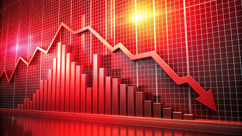
Free with trial Generative ai, The image is of a red bar graph and a red line graph. The line graph is going down, and the bar graph is going down. The image is set against a red background. The image is most likely representing a financial decline. It is a striki. Trend decrease illustrations A red bar graph and line graph displays a downward trend, with the bar graph decreasing in height and the line graph going down. generative ai, The image is of a red bar graph and a red line graph. The line graph is going down, and the bar graph is going down. The image is set against a red background. The image is most likely representing a financial decline. It is a striki
Free with trial Stacks of gold coins decrease in size as a red arrow points downwards over a stock market chart, indicating financial decline. Trend decrease illustrations Stacks of gold coins decreasing in size with a red downward arrow and stock market chart red arrow. Stacks of gold coins decrease in size as a red arrow points downwards over a stock market chart, indicating financial decline