Free with trial A person in a suit uses a stylus on a tablet displaying a quality cost checklist with upward and downward arrows. Chart financial growth decrease illustrations Businessman using stylus on tablet with quality cost checklist and award image. A person in a suit uses a stylus on a tablet displaying a quality cost checklist with upward and downward arrows
Free with trial Illustration of global stock market data. The graphic includes a world map background bar charts and a line graph. Represents finance investment and trading, trends across international. Chart financial growth decrease illustrations Illustration of global stock market data. The graphic includes a world map background bar charts and a line graph. Represents
Free with trial A 3D abstract representation of a falling graph with concrete texture and orange accents, with small orange particles floating around it on a white background. Chart financial growth decrease illustrations 3D abstract graph falling down with particles. A 3D abstract representation of a falling graph with concrete texture and orange accents, with small orange. A 3D abstract representation of a falling graph with concrete texture and orange accents, with small orange particles floating around it on a white background
Free with trial Sixteen simple yellow candlestick charts with black lines on a white background, arranged in a four by four grid. Chart financial growth decrease vectors Vector illustration of sixteen yellow candlestick charts. Sixteen simple yellow candlestick charts with black lines on a white background, arranged in a four by four grid
Free with trial A close-up of paper cutouts, showing a red background and a declining green arrow. Chart financial growth decrease illustrations Red paper with green arrow up. A close-up of paper cutouts, showing a red background and a declining green arrow
Free with trial A businessman in a suit analyzes a digital graph showing declining profits and costs, holding a smartphone and a stylus. Chart financial growth decrease illustrations Businessman Analyzing Declining Profits and Costs with Digital Graph. A businessman in a suit analyzes a digital graph showing declining profits and costs, holding a smartphone and a stylus
Free with trial Modern collection of business and finance elements. Contains data, charts,diagrams. Use it for presentation, report and infographic projects. Chart financial growth decrease vectors Set of Business and Finance Infographic Elements on Transparent Background Vectors. Modern collection of business and finance elements. Contains data, charts,diagrams. Use it for presentation, report and infographic projects
Free with trial A black graph showing an upward trend with a curved arrow indicating a reversal on a white background. Chart financial growth decrease illustrations Upward trending graph with a curved arrow indicating a reversal on white background. A black graph showing an upward trend with a curved arrow indicating a reversal on a white background
Free with trial Dollar Currency Up Down Icons. Redus and high costs line with dollar icons.. eps. Chart financial growth decrease vectors Circular dollar icons showing rising and falling currency values. Dollar Currency Up Down Icons. Redus and high costs line with dollar icons..eps
Free with trial Three green arrows pointing downwards, each displaying a white percentage symbol. Isolated on a transparent background. Chart financial growth decrease vectors Three Green Downward Arrows with Percent Symbol isolated on a transparent background. Three green arrows pointing downwards, each displaying a white percentage symbol. Isolated on a transparent background
Free with trial Business bar graph icon vector with upward and downward arrow. Trend analysis symbol with long shadow. Chart financial growth decrease vectors Business bar graph icon with upward and downward arrow. Trend analysis symbol with long shadow
Free with trial Woman's hands using a stylus on a tablet with a cost reduction graphic showing dollar coins descending. Chart financial growth decrease illustrations Person using tablet and laptop with cost reduction graphic business finance. Woman's hands using a stylus on a tablet with a cost reduction graphic showing dollar coins descending
Free with trial Colorful bar graph with downward trend, business concept illustration. Chart financial growth decrease vectors Colorful bar graph with downward trend, business concept illustration
Free with trial Several red, blue, and green arrows pointing in different directions are on a light yellow square grid. Some arrows point up, while others point down. This represents various economic trends. Chart financial growth decrease illustrations Colorful Painted Arrows Move up and Down on Graph Paper Background. Several red, blue, and green arrows pointing in different directions are on a light yellow square grid. Some arrows point up, while others point down. This represents various economic trends.
Free with trial Line graph with a green line and a red dot on top. The red dot is located at the top left corner of the graph. Chart financial growth decrease illustrations Graph with a green line and a red dot
Free with trial Four vibrant lines undulating on a dark dashboard, illustrating progress over time while emphasizing key data points with distinct circles for enhanced clarity and analysis. Chart financial growth decrease vectors Four vibrant lines undulating on a dark dashboard, illustrating progress over time while emphasizing key data points
Free with trial A set of nine minimalist vector icons depicting various types of charts and graphs including bar charts, progress bars, and trend lines for data visualization and analytics. Chart financial growth decrease vectors Collection of simple black glyph icons representing business charts graphs and data analysis. A set of nine minimalist vector icons depicting various types of charts and graphs including bar charts, progress bars, and trend lines for data visualization and analytics
Free with trial This conceptual image depicts an industrial factory with a declining graph, symbolizing economic downturn, industrial decline, or environmental impact. The paper cutout style adds a unique visual appeal. The image can be used to represent concepts related to business, finance, economics, manufacturing, environmental concerns, and the impact of industrial activity. It is suitable for presentations, reports, articles, and educational materials. Chart financial growth decrease illustrations Industrial Decline and Economic Downturn Concept. This conceptual image depicts an industrial factory with a declining graph, symbolizing economic downturn, industrial decline, or environmental impact. The paper cutout style adds a unique visual appeal. The image can be used to represent concepts related to business, finance, economics, manufacturing, environmental concerns, and the impact of industrial activity. It is suitable for presentations, reports, articles, and educational materials.
Free with trial Business bar graph with upward and downward arrow. Trend analysis icon vector. Chart financial growth decrease vectors Business bar graph with upward and downward arrow. Trend analysis icon
Free with trial This image showcases a collection of finance and government icons, generated by AI, perfect for use in presentations, reports, or websites related to business, economics, or politics. The stylized monochrome design provides a professional and consistent aesthetic. Chart financial growth decrease illustrations Finance and Government Icons
Free with trial A colorful graph with the words Net Income written below it. The graph is made up of many different colored lines and dots. Chart financial growth decrease illustrations A colorful graph with the words Net Income written below it
Free with trial Business bar graph icon with upward and downward arrow. Trend analysis symbol vector in circular outline. Chart financial growth decrease vectors Business bar graph icon with upward and downward arrow. Trend analysis symbol in circular outline
Free with trial Falling trend sketch of business finance graph with bar charts and arrow. Chart financial growth decrease illustrations Falling trend sketch of business finance graph with bar charts and arrow
Free with trial This image showcases vibrant 3D bar and line charts, generated by AI, offering a dynamic visual representation of business data. The colorful design effectively communicates trends and comparisons across multiple data sets, providing a clear and engaging overview of key performance indicators. Chart financial growth decrease illustrations AI-Generated 3D Business Charts. This image showcases vibrant 3D bar and line charts, generated by AI, offering a dynamic visual representation of business data. The colorful design effectively communicates trends and comparisons across multiple data sets, providing a clear and engaging overview of key performance indicators.
Free with trial Wooden toy houses illustrate real estate market trends. Created with the help of Generative AI tools. Chart financial growth decrease illustrations Wooden toy houses illustrate real estate market trends.
Free with trial Cost reduction icon price lower arrow. Vector low cost money crisis line icon. Chart financial growth decrease vectors Cost reduction icon price lower arrow. Vector low cost money crisis line icon
Free with trial Women in technology concept. Analyzing cryptocurrency trends and market data. Collaboration in digital finance research. Vector illustration. Chart financial growth decrease vectors Women In Technology. Flat Vector. Women in technology concept. Analyzing cryptocurrency trends and market data. Collaboration in digital finance research. Vector illustration.
Free with trial A visual depiction of decreasing financial returns with a pyramid of coins descending alongside a sloping graph illustrating a downward economic trend. Chart financial growth decrease illustrations Declining interest rates represented by stacked coins and downward trend graph. A visual depiction of decreasing financial returns with a pyramid of coins descending alongside a sloping graph illustrating a downward economic trend
Free with trial Simple vector graph illustration showing increasing and decreasing trend with bars. Chart financial growth decrease vectors Simple vector graph illustration showing increasing and decreasing trend with bars
Free with trial Viewing Progress Icon Line Design Style Finance and Business Symbol Vector Illustrations. Chart financial growth decrease vectors Viewing Progress Icon Line Design Style Finance and Business Symbol
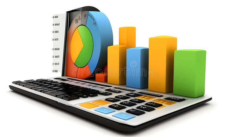
Free with trial Colorful Charts on a Calculator Keyboard. Chart financial growth decrease illustrations Colorful Charts on a Calculator Keyboard
Free with trial Graphs set with line charts, bar charts, and scatter plots illustrating upward and downward trends with arrows and data points. Chart financial growth decrease vectors Graphs set with line charts, bar charts, and scatter plots illustrating upward and
Free with trial Reciprocal tariffs and stock market crashes and economic decline or falling stock market prices Inflation and economic decline. Chart financial growth decrease illustrations Reciprocal tariffs and stock market crashes and economic decline or falling stock market prices Inflation and economic decline
Free with trial Reciprocal tariffs and stock market crashes and economic decline or falling stock market prices. Chart financial growth decrease illustrations Reciprocal tariffs and stock market crashes and economic decline or falling stock market prices
Free with trial This 3D rendered image shows a computer screen displaying various charts and graphs, including bar charts, pie charts, and line graphs. The data visualization is colorful and easy to understand, generated by AI for quick data interpretation. The design is simple and modern, ideal for presentations. Chart financial growth decrease illustrations AI-Generated Data Dashboard. This 3D rendered image shows a computer screen displaying various charts and graphs, including bar charts, pie charts, and line graphs. The data visualization is colorful and easy to understand, generated by AI for quick data interpretation. The design is simple and modern, ideal for presentations
Free with trial A woman analyzes stock market data using a magnifying glass, with a falling coin and downward trending charts indicating a potential loss. Chart financial growth decrease vectors Woman analyzing stock market data with magnifying glass tool. a woman analyzes stock market data using a magnifying glass, with a falling coin and downward trending charts indicating a potential loss.
Free with trial This image showcases a person using a tablet to interact with business analytics data, generated by AI. The visualization includes graphs and charts, providing real-time insights into key performance indicators. This technology streamlines business decision-making. Chart financial growth decrease illustrations AI-Powered Business Analytics. This image showcases a person using a tablet to interact with business analytics data, generated by AI. The visualization includes graphs and charts, providing real-time insights into key performance indicators. This technology streamlines business decision-making.
Free with trial This vibrant image depicts a stock market graph, generated by AI, showcasing a dramatic decline. The fiery red and orange hues emphasize the volatility and potential losses. The futuristic cityscape backdrop adds a layer of technological complexity, suggesting the interconnectedness of global fina. Chart financial growth decrease illustrations AI-Generated Stock Market Decline. This vibrant image depicts a stock market graph, generated by AI, showcasing a dramatic decline. The fiery red and orange hues emphasize the volatility and potential losses. The futuristic cityscape backdrop adds a layer of technological complexity, suggesting the interconnectedness of global fina
Free with trial This image shows a downward-trending red arrow graph, generated by AI, illustrating a significant decline. The visual representation is clear and effective in communicating a negative trend, potentially in stock prices, sales figures, or other quantifiable data. Chart financial growth decrease illustrations Downward Trending Graph. This image shows a downward-trending red arrow graph, generated by AI, illustrating a significant decline. The visual representation is clear and effective in communicating a negative trend, potentially in stock prices, sales figures, or other quantifiable data.
Free with trial This isometric illustration shows a delicious breakfast plate alongside a stock market graph, representing the connection between food trends and market data. The visual, generated by AI, is perfect for illustrating articles about food market analysis or investment opportunities in the food industr. Chart financial growth decrease illustrations Breakfast Market Trends. This isometric illustration shows a delicious breakfast plate alongside a stock market graph, representing the connection between food trends and market data. The visual, generated by AI, is perfect for illustrating articles about food market analysis or investment opportunities in the food industr
Free with trial Colorful blocks in decreasing order on a blue surface. Represents decline or recession in a vibrant, illustrative manner. Stock photo. Chart financial growth decrease illustrations Colorful blocks in decreasing order on a blue surface. Represents decline or recession in a vibrant, illustrative manner
Free with trial A person's hands gently cradle a vibrant, dynamic data visualization generated by AI. The image showcases interconnected nodes and lines, forming a complex yet aesthetically pleasing network. This represents the power of AI in data analysis and presentation. Chart financial growth decrease illustrations AI-Generated Data Visualization. A person's hands gently cradle a vibrant, dynamic data visualization generated by AI. The image showcases interconnected nodes and lines, forming a complex yet aesthetically pleasing network. This represents the power of AI in data analysis and presentation.
Free with trial A dynamic image of coins falling against a blurred stock market graph background, symbolizing finance, investment, and economic trends in today's market. Generative AI. Chart financial growth decrease illustrations Falling Coins with Stock Market Graph in Background Display. A dynamic image of coins falling against a blurred stock market graph background, symbolizing finance, investment, and economic trends in today's market. Generative AI
Free with trial Graph showing a line that is green and has a black background. The line is going up and to the right. Chart financial growth decrease illustrations Graph showing a line that is green and has a black background
Free with trial A dynamic display of market trends with charts and graphs in a cool blue color scheme. Chart financial growth decrease illustrations Financial market analysis with data charts and line graphs in blue tone. a dynamic display of market trends with charts and graphs in a cool blue color scheme
Free with trial This image showcases a dynamic graph, generated by AI, illustrating fluctuating data patterns. The abstract, wave-like design creates a visually engaging representation of complex information, perfect for presentations or reports needing a modern aesthetic. Its cool blue tones evoke a sense of calm. Chart financial growth decrease illustrations Abstract Data Visualization. This image showcases a dynamic graph, generated by AI, illustrating fluctuating data patterns. The abstract, wave-like design creates a visually engaging representation of complex information, perfect for presentations or reports needing a modern aesthetic. Its cool blue tones evoke a sense of calm
Free with trial Hand holding smartphone displaying stock market graph, Create with artificial intelligence. Chart financial growth decrease illustrations Hand holding smartphone displaying stock market graph
Free with trial A hand presents a glowing graph illustrating cost reduction. the downward arrow and shrinking bars emphasize decreasing expenses. a visual representation of financial efficiency and savings, ideal for business. Chart financial growth decrease illustrations Representation of cost reduction shown above a hand with a downward trending bar graph and arrow. a hand presents a glowing graph illustrating cost reduction. the downward arrow and shrinking bars emphasize decreasing expenses. a visual representation of financial efficiency and savings, ideal for business.
Free with trial Graph with a green arrow pointing upwards. The graph is labeled with numbers and the numbers are increasing. Chart financial growth decrease illustrations Graph with a green arrow pointing upwards
Free with trial An abstract image featuring four cylindrical shapes of varying heights, arranged in a descending order. The cylinders are dark, with the tops illuminated by a warm, golden light. The background gradients from a warm orange to a darker brown, creating a sense of depth and mystery. This image conveys concepts of decline, progress, or stages, and can be used to represent business trends, data visualization, or abstract concepts. Chart financial growth decrease illustrations Abstract Cylinders in Dim Light. An abstract image featuring four cylindrical shapes of varying heights, arranged in a descending order. The cylinders are dark, with the tops illuminated by a warm, golden light. The background gradients from a warm orange to a darker brown, creating a sense of depth and mystery. This image conveys concepts of decline, progress, or stages, and can be used to represent business trends, data visualization, or abstract concepts.
Free with trial Red Graph Line Under Magnifying Glass on White Paper. Chart financial growth decrease illustrations Red Graph Line Under Magnifying Glass on White Paper
Free with trial A digital artistic illustration depicting a bear and a bull facing off, symbolizing the stock market. The background features city skylines and stock market graphs in blue and red. Chart financial growth decrease illustrations Stylized artistic representation of the stock market. The image contrasts a bear and a bull against stock market graphs and a city. A digital artistic illustration depicting a bear and a bull facing off, symbolizing the stock market. The background features city skylines and stock market graphs in blue and red
Free with trial Colorful Charts and Graphs Data Visualization Infographic. Chart financial growth decrease illustrations Colorful Charts and Graphs Data Visualization Infographic
Free with trial A hand interacting with a graph showing quality increasing and cost decreasing. it represents business success, improvement, and strategic financial planning. Chart financial growth decrease illustrations Hand interacting with a quality and cost graph showing increasing quality and decreasing cost. a hand interacting with a graph showing quality increasing and cost decreasing. it represents business success, improvement, and strategic financial planning.
Free with trial 3D Illustration of Abstract Bar Graph finance. Chart financial growth decrease illustrations 3D Illustration of Abstract Bar Graph
Free with trial Simple vector illustration showing upward and downward trend arrows with smooth curves, perfect for financial or business presentations. Chart financial growth decrease illustrations Trend arrow showing positive and negative. Simple vector illustration showing upward and downward trend arrows with smooth curves, perfect for financial or business presentations
Free with trial Two different graphs with a downward trend. One is red and the other is white. Chart financial growth decrease illustrations Two different graphs with a downward trend
Free with trial A globe sits atop a descending bar graph, symbolizing economic downturn. The visual represents a global recession, market decline, or financial crisis. It is a concept for business and investment risks. Chart financial growth decrease illustrations Globe and declining bar graph isolated on white background. A globe sits atop a descending bar graph, symbolizing economic downturn. The visual represents a global recession, market decline, or financial crisis. It is a concept for business and investment risks
Free with trial This detailed graph presents the relationship between unemployment rates and gold demand, illustrating economic trends through visual data. Chart financial growth decrease illustrations Unemployment and Gold Demand Contrast Illustrated in Graph Format with Data Representation. This detailed graph presents the relationship between unemployment rates and gold demand, illustrating economic trends through visual data
Free with trial Set of twelve linear icons representing various business and financial concepts. These include documents, briefcase, graphs, charts, and more. Ideal for presentations, websites, or app design. Chart financial growth decrease vectors Collection of Business and Finance Line Icons. Set of twelve linear icons representing various business and financial concepts. These include documents, briefcase, graphs, charts, and more. Ideal for presentations, websites, or app design.
Free with trial Set of twenty different business and finance icons, perfect for presentations, websites, and applications. These simple yet effective line icons represent key concepts in the business world. Chart financial growth decrease vectors Collection of Business and Finance Line Icons. Set of twenty different business and finance icons, perfect for presentations, websites, and applications. These simple yet effective line icons represent key concepts in the business world.
Free with trial Finger Pressing Red Down Arrow Market Indicator. Chart financial growth decrease illustrations Finger Pressing Red Down Arrow Market Indicator
Free with trial A metallic downward trending graph arrow resting on a stack of silver coins against a white background. Chart financial growth decrease illustrations Stack of coins with downward trending graph arrow. A metallic downward trending graph arrow resting on a stack of silver coins against a white background
Free with trial Cost versus quality optimization concept with business professional analyzing charts by increasing quality while reducing cost representing efficiency, performance improvement, cost management. Chart financial growth decrease illustrations Cost versus quality optimization concept with business professional analyzing charts by increasing quality while reducing cost
Free with trial A clean, flat design illustration of a bar graph depicting a significant downward trend, highlighted by a bold blue arrow pointing downwards. Chart financial growth decrease illustrations A bar graph showing a downward trend with a blue arrow. A clean, flat design illustration of a bar graph depicting a significant downward trend, highlighted by a bold blue arrow pointing downwards
Free with trial A vibrant bar graph graphic with a gradient of colors, representing data visualization and statistical analysis. The bars vary in height, indicating different values or categories. The image is set against a clean white background, making it suitable for a variety of applications, including presentations, reports, and website design. The color palette adds visual interest and can be used to represent trends, comparisons, or performance metrics. Chart financial growth decrease illustrations Colorful Bar Graph Illustrating Data and Statistics. A vibrant bar graph graphic with a gradient of colors, representing data visualization and statistical analysis. The bars vary in height, indicating different values or categories. The image is set against a clean white background, making it suitable for a variety of applications, including presentations, reports, and website design. The color palette adds visual interest and can be used to represent trends, comparisons, or performance metrics.
Free with trial A three-dimensional gray percentage symbol rendered with a clean, modern aesthetic, casting a subtle shadow on a pure white background, perfect for financial or promotional content. Chart financial growth decrease illustrations A gray percentage symbol isolated on white background. A three-dimensional gray percentage symbol rendered with a clean, modern aesthetic, casting a subtle shadow on a pure white background, perfect for financial or promotional content
Free with trial A simple blue line graph with circular data points is displayed against a clean white background with subtle horizontal grid lines. The graph shows fluctuations and trends, making it suitable for representing data, analytics, or financial performance. Generated by AI. Chart financial growth decrease vectors Blue Line Graph with Data Points on White Background. A simple blue line graph with circular data points is displayed against a clean white background with subtle horizontal grid lines. The graph shows fluctuations and trends, making it suitable for representing data, analytics, or financial performance. Generated by AI
Free with trial A series of six stacks of shiny gold coins are arranged in a descending staircase formation against a white background. The stacks vary in height, with the tallest on the left and the shortest on the right, creating a visual representation of a downward trend or decrease. Each coin appears to be identical, featuring a laurel wreath design and a numeral. Chart financial growth decrease illustrations Staircase of Gold Coins Decreasing in Height on a White Background money finance. A series of six stacks of shiny gold coins are arranged in a descending staircase formation against a white background. The stacks vary in height, with the tallest on the left and the shortest on the right, creating a visual representation of a downward trend or decrease. Each coin appears to be identical, featuring a laurel wreath design and a numeral
Free with trial Global stock market fluctuations shown on a tablet in a business office, breathtaking wallpaper background Generative AI. Chart financial growth decrease illustrations Global stock market fluctuations shown on a tablet in a business office
Free with trial A graph with two lines, one red and one blue. The red line is higher than the blue line, indicating a positive trend. Chart financial growth decrease vectors A graph with a red line and a blue line. A graph with two lines, one red and one blue. The red line is higher than the blue line, indicating a positive trend
Free with trial Stacks of gold coins are arranged from tallest to shortest on a dark blue surface. Behind the coins, a white grid forms a graph. An orange line graph with an arrow at the end a sharp decline, starting from the left and moving downwards to the right. The background is a solid blue. Chart financial growth decrease illustrations Stacks of gold coins with downward trending orange graph. Stacks of gold coins are arranged from tallest to shortest on a dark blue surface. Behind the coins, a white grid forms a graph. An orange line graph with an arrow at the end a sharp decline, starting from the left and moving downwards to the right. The background is a solid blue
Free with trial Wooden blocks with the word "COST" beside decreasing stacks of gold coins on a wooden table with a blue backdrop. Chart financial growth decrease illustrations Wooden blocks with the word \'COST\' beside decreasing stacks of gold coins. Wooden blocks with the word "COST" beside decreasing stacks of gold coins on a wooden table with a blue backdrop
Free with trial A black and white icon depicting a decreasing percentage graph under a magnifying glass, representing sales drop, loss,. Chart financial growth decrease illustrations Decreasing Percentage Magnifier Icon Sales Drop, Loss Concept. A black and white icon depicting a decreasing percentage graph under a magnifying glass, representing sales drop, loss,.
Free with trial Two arrows, one pointing up and the other pointing down, indicating direction or movement. Ideal for navigation, decision-making, data trends, stock market, business strategies. Simple vector style. Chart financial growth decrease illustrations Two Light Blue Arrows Side by Side, Pointing Up and Down. Two arrows, one pointing up and the other pointing down, indicating direction or movement. Ideal for navigation, decision-making, data trends, stock market, business strategies. Simple vector style.
Free with trial A hand-drawn business graph showing a decreasing trend line. It represents a down market, financial loss, economic downturn, or a business crisis. This could be used to illustrate various business presentations or reports. Chart financial growth decrease illustrations Hand Drawn Business Graph with Decreasing Trend Line on White Background. A hand-drawn business graph showing a decreasing trend line. It represents a down market, financial loss, economic downturn, or a business crisis. This could be used to illustrate various business presentations or reports
Free with trial A 3D financial visualization showing a sharp economic decline. A red downward arrow crashes through green and red bar charts, representing market loss, recession, and the impact on workforce and societ. Chart financial growth decrease illustrations 3D Economic Crisis Graph with Falling Red Arrow and People Icons. A 3D financial visualization showing a sharp economic decline. A red downward arrow crashes through green and red bar charts, representing market loss, recession, and the impact on workforce and societ
Free with trial A 3D financial visualization showing a sharp economic decline. A red downward arrow crashes through green and red bar charts, representing market loss, recession, and the impact on workforce and societ. Chart financial growth decrease illustrations 3D Economic Crisis Graph with Falling Red Arrow and People Icons. A 3D financial visualization showing a sharp economic decline. A red downward arrow crashes through green and red bar charts, representing market loss, recession, and the impact on workforce and societ
Free with trial A 3D financial visualization showing a sharp economic decline. A red downward arrow crashes through green and red bar charts, representing market loss, recession, and the impact on workforce and societ. Chart financial growth decrease illustrations 3D Economic Crisis Graph with Falling Red Arrow and People Icons. A 3D financial visualization showing a sharp economic decline. A red downward arrow crashes through green and red bar charts, representing market loss, recession, and the impact on workforce and societ