Free with trial Collection of red infographic elements including charts, graphs, diagrams and icons. Perfect for presentations, reports, and data visualization. Clean, modern design. Data analysis decrease illustrations Red Infographic Elements
Free with trial Red graph falling down representing stock market crash with data and numbers on dark background. Data analysis decrease illustrations Stock market crashing down with red graph and numbers on dark background. Red graph falling down representing stock market crash with data and numbers on dark background
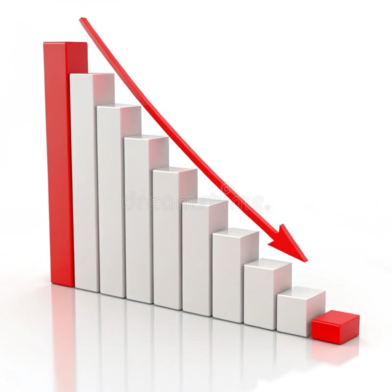
Free with trial This image shows a bar graph depicting a downward trend. A red arrow highlights the decrease in quarterly sales from Q1 to Q4, indicating negative growth and financial loss. Data analysis decrease illustrations Declining Bar Graph with Red Arrow Depicts Sales Performance. This image shows a bar graph depicting a downward trend. A red arrow highlights the decrease in quarterly sales from Q1 to Q4, indicating negative growth and financial loss.
Free with trial A close-up view of a laptop displaying a stock market chart with fluctuating trends, illustrating concepts of financial volatility and market analysis - generated AI. Data analysis decrease illustrations Stock market crash concept with graph on laptop screen. A close-up view of a laptop displaying a stock market chart with fluctuating trends, illustrating concepts of financial volatility and market analysis - generated AI
Free with trial A bar chart representing a sharp decline makes a dramatic splash in clear water. This conceptual image visualizes a financial crisis, liquidity problems, or the impactful consequences of negative data and market failure. Data analysis decrease illustrations Economic Downturn Graph Splashing Down. A bar chart representing a sharp decline makes a dramatic splash in clear water. This conceptual image visualizes a financial crisis, liquidity problems, or the impactful consequences of negative data and market failure
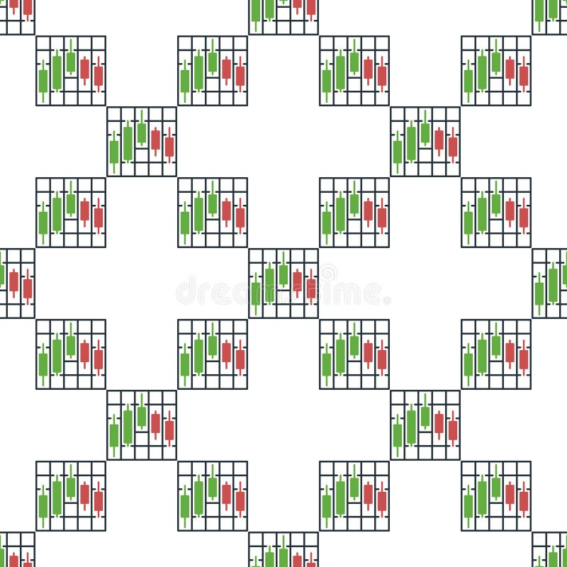
Free with trial Crypto Trading Data Visualization vector Candlestick Chart concept colored seamless pattern. Data analysis decrease vectors Crypto Trading Data Visualization vector Candlestick Chart colored seamless pattern
Free with trial A yellow downward trending line is depicted on a dark background, suggesting a negative trend or decline in data presentation. Data analysis decrease illustrations Downward Chart Line on Black Background. A yellow downward trending line is depicted on a dark background, suggesting a negative trend or decline in data presentation
Free with trial A candlestick chart showing a significant downward trend. The chart features black candlesticks indicating price fluctuations over time, with red, green, and orange lines tracing different moving averages. A bar graph at the bottom provides additional data. This image can be used to represent financial loss, market downturns, or economic recession. Data analysis decrease illustrations Downward Trend Candlestick Chart. A candlestick chart showing a significant downward trend. The chart features black candlesticks indicating price fluctuations over time, with red, green, and orange lines tracing different moving averages. A bar graph at the bottom provides additional data. This image can be used to represent financial loss, market downturns, or economic recession.
Free with trial A clean and modern vector illustration of a percentage sign, featuring two pale yellow circles with maroon outlines and a light blue diagonal bar also outlined in maroon. This simple graphic is set against a crisp white background, making it versatile for various design projects. It effectively conveys concepts of discounts, sales, financial rates, statistics, and promotions. Ideal for use in business presentations, marketing materials, educational content, websites, and mobile applications to highlight numerical data or special offers. Data analysis decrease vectors Percentage Sign Vector Icon Illustration. A clean and modern vector illustration of a percentage sign, featuring two pale yellow circles with maroon outlines and a light blue diagonal bar also outlined in maroon. This simple graphic is set against a crisp white background, making it versatile for various design projects. It effectively conveys concepts of discounts, sales, financial rates, statistics, and promotions. Ideal for use in business presentations, marketing materials, educational content, websites, and mobile applications to highlight numerical data or special offers.
Free with trial A conceptual image illustrating a decline in the cocoa market. In the foreground, a pile of raw cocoa beans sits on a white surface. Behind them, a 3D bar chart shows a steep downward trend, with tall green bars transitioning to shorter red bars, symbolizing falling prices, reduced production, or financial loss. This graphic is ideal for representing economic downturns, agricultural commodity trading, market analysis, business reports, and news related to the chocolate industry's performance, supply chain issues, or crop failure. Data analysis decrease illustrations Cocoa Market Decline with Beans and Graph. A conceptual image illustrating a decline in the cocoa market. In the foreground, a pile of raw cocoa beans sits on a white surface. Behind them, a 3D bar chart shows a steep downward trend, with tall green bars transitioning to shorter red bars, symbolizing falling prices, reduced production, or financial loss. This graphic is ideal for representing economic downturns, agricultural commodity trading, market analysis, business reports, and news related to the chocolate industry's performance, supply chain issues, or crop failure.
Free with trial Decreasing bar graph isolated on white background. Investment statistics. Economic data. Financial report. Interest rate. Business concept. Top view. 3d render. Data analysis decrease illustrations Decreasing bar graph isolated on white background
Free with trial This 3D model depicts an abstract molecular structure, generated by AI, showcasing vibrant colored spheres connected by rods, illustrating complex relationships and connections. The image is ideal for visualizing data, scientific concepts, or as an element of modern design. Data analysis decrease illustrations AI-Generated Abstract Molecular Structure. This 3D model depicts an abstract molecular structure, generated by AI, showcasing vibrant colored spheres connected by rods, illustrating complex relationships and connections. The image is ideal for visualizing data, scientific concepts, or as an element of modern design.
Free with trial A downward-trending red line graph overlays a dark screen displaying financial data with glowing red and green numbers. Image. Data analysis decrease illustrations Stock Market Ticker with Red Decline Line. A downward-trending red line graph overlays a dark screen displaying financial data with glowing red and green numbers. Image
Free with trial Decline flat style spiraling revenue chart illustration profit loss, trend data, visualization finance decline flat style spiraling revenue chart. Data analysis decrease illustrations Decline flat style spiraling revenue chart
Free with trial A stock chart shows a red arrow trending upwards with a sharp decline represented by a red bar, juxtaposed with green bars, illustrating market fluctuations for financial analysis. Data analysis decrease illustrations Stock Chart with Red Arrow and Green Bars. A stock chart shows a red arrow trending upwards with a sharp decline represented by a red bar, juxtaposed with green bars, illustrating market fluctuations for financial analysis
Free with trial Red decreasing bar graph on light gray background. Investment statistics. Economic data. Financial report. Interest rate. Business concept. Top view. 3d render. Data analysis decrease illustrations Red decreasing bar graph on light gray background
Free with trial Close-up of various financial charts and graphs displayed on a dark screen, with blue and orange color schemes. Image. Data analysis decrease illustrations Financial Data Charts and Graphs on Screen. Close-up of various financial charts and graphs displayed on a dark screen, with blue and orange color schemes. Image
Free with trial Red stock market graph plummets on a laptop keyboard, indicating financial loss and market decline, great for business and finance themes. Data analysis decrease illustrations Stock market crash data on laptop keyboard. Red stock market graph plummets on a laptop keyboard, indicating financial loss and market decline, great for business and finance themes
Free with trial Abstract digital illustration of a financial chart. A glowing white line graph rises and falls against a blue background with a grid pattern made of dots. The image conveys concepts of market trends, stock analysis, investment, and economic fluctuations. Suitable for illustrating financial reports, business presentations, and technology-related articles. Data analysis decrease illustrations Abstract Financial Chart with Glowing Line. Abstract digital illustration of a financial chart. A glowing white line graph rises and falls against a blue background with a grid pattern made of dots. The image conveys concepts of market trends, stock analysis, investment, and economic fluctuations. Suitable for illustrating financial reports, business presentations, and technology-related articles.
Free with trial The image shows a futuristic analytics display with a stock market graph. the graph, rendered in bright green, shows a sharp downward trend, culminating in a large arrow pointing downwards, indicating a significant crash. the graph is overlaid on a grid of orange lines. the background is dark, with several screens displaying data in the distance. the word "analytics" is visible in the upper right corner, suggesting the image represents a visualization of market data and analysis during a downturn. Data analysis decrease illustrations Stock market crash analytics display scene. the image shows a futuristic analytics display with a stock market graph. the graph, rendered in bright green, shows a sharp downward trend, culminating in a large arrow pointing downwards, indicating a significant crash. the graph is overlaid on a grid of orange lines. the background is dark, with several screens displaying data in the distance. the word "analytics" is visible in the upper right corner, suggesting the image represents a visualization of market data and analysis during a downturn.
Free with trial A vibrant, 3D bar graph with colorful blocks rises against a white background. This modern infographic uses geometric shapes to represent data trends, making it a perfect visual for presentations, rep. Data analysis decrease illustrations Colorful Bar Graph. A vibrant, 3D bar graph with colorful blocks rises against a white background. This modern infographic uses geometric shapes to represent data trends, making it a perfect visual for presentations, rep
Free with trial A vibrant, glossy red 3D percentage symbol stands prominently on a clean white background, casting a subtle shadow. This eye-catching graphic is perfect for conveying concepts of discounts, sales, interest rates, financial growth, or statistical data. Its bold, modern design makes it ideal for marketing campaigns, business presentations, retail promotions, economic reports, or any project requiring a clear and impactful representation of percentages, savings, or performance metrics. Data analysis decrease illustrations Red 3D Percentage Symbol on White Background. A vibrant, glossy red 3D percentage symbol stands prominently on a clean white background, casting a subtle shadow. This eye-catching graphic is perfect for conveying concepts of discounts, sales, interest rates, financial growth, or statistical data. Its bold, modern design makes it ideal for marketing campaigns, business presentations, retail promotions, economic reports, or any project requiring a clear and impactful representation of percentages, savings, or performance metrics.
Free with trial Stock Market Data Visualization vector Cryptocurrency Candlestick Chart concept seamless pattern. Data analysis decrease vectors Stock Market Data Visualization vector Cryptocurrency Candlestick Chart seamless pattern
Free with trial A minimalist line drawing of a bar chart, representing data, statistics and growth. Simple, bold and clean graphic icon. Data analysis decrease vectors Simple Line Chart Bar Statistic Graphic Icon. A minimalist line drawing of a bar chart, representing data, statistics and growth. Simple, bold and clean graphic icon.
Free with trial This 3D bar graph, generated by AI, visually represents a significant downward trend. The red bars show a decrease in value over time, culminating in a sharp drop indicated by the prominent red arrow. This image is ideal for illustrating economic downturns, market crashes, or any scenario depicting. Data analysis decrease illustrations Declining Bar Graph. This 3D bar graph, generated by AI, visually represents a significant downward trend. The red bars show a decrease in value over time, culminating in a sharp drop indicated by the prominent red arrow. This image is ideal for illustrating economic downturns, market crashes, or any scenario depicting
Free with trial A 3D illustration of a downwards statistic chart, isolated on white background, symbolizing decline, loss, or decrease in trends. Data analysis decrease illustrations Statistic down 3D illustration isolated on white background. A 3D illustration of a downwards statistic chart, isolated on white background, symbolizing decline, loss, or decrease in trends
Free with trial A 3D illustration of a downwards statistic chart, isolated on white background, symbolizing decline, loss, or decrease in trends. Data analysis decrease illustrations Statistic down 3D illustration isolated on white background. A 3D illustration of a downwards statistic chart, isolated on white background, symbolizing decline, loss, or decrease in trends
Free with trial A close-up view of a laptop screen showing a stock market crash with candlestick charts and financial data, highlighting market volatility and investment risks - generated AI. Data analysis decrease illustrations Stock market decline displayed on laptop with financial charts. A close-up view of a laptop screen showing a stock market crash with candlestick charts and financial data, highlighting market volatility and investment risks - generated AI
Free with trial A simple graphic depicting a downward trend with four circular data points and a prominent red arrow indicating the direction. Data analysis decrease illustrations Red downward trend line with circles and arrow. A simple graphic depicting a downward trend with four circular data points and a prominent red arrow indicating the direction
Free with trial A simple graphic showing a downward trend with a red line graph and several vertical bars of varying heights and colors. Data analysis decrease vectors Downward trending bar and line graph chart data. A simple graphic showing a downward trend with a red line graph and several vertical bars of varying heights and colors
Free with trial Digital graph showing significant drop in stock prices. Background includes various financial data and email icons, indicating a business or financial context. Data analysis decrease illustrations Digital graph showing significant drop in stock prices
Free with trial Stock Market Data Visualization vector Cryptocurrency Candlestick Chart concept icon or logo element. Data analysis decrease vectors Stock Market Data Visualization vector Cryptocurrency Candlestick Chart icon or logo element
Free with trial Close-up of a stock market crash highlighted on a digital screen displaying declining financial data and red trendlines, emphasizing volatility and economic downturn - generated AI. Data analysis decrease illustrations Stock market crash depicted on financial graph with red trendline. Close-up of a stock market crash highlighted on a digital screen displaying declining financial data and red trendlines, emphasizing volatility and economic downturn - generated AI
Free with trial A 3D white bar chart shows a significant downward trend indicated by a sharp, angled arrow pointing downwards. The bars decrease in height from left to right, illustrating a concept of decline or loss. The clean white background emphasizes the minimalist design and the stark visual representation of negative growth. Data analysis decrease illustrations 3D White Bar Chart with Downward Trending Arrow on White Background graph decline. A 3D white bar chart shows a significant downward trend indicated by a sharp, angled arrow pointing downwards. The bars decrease in height from left to right, illustrating a concept of decline or loss. The clean white background emphasizes the minimalist design and the stark visual representation of negative growth
Free with trial An infographic illustrates a sharp decline during the winter season. Data analysis decrease vectors Winter Temperature Decrease Chart with Thermometer. An infographic illustrates a sharp decline during the winter season
Free with trial Cheerful cartoon businessman reviewing positive financial data upward trending graph. Data analysis decrease illustrations Happy Businessman Analyzing Financial Growth Charts. Cheerful cartoon businessman reviewing positive financial data upward trending graph.
Free with trial A 3D rendered icon featuring a golden bar graph with a downward trend line and a red arrow indicating a decrease. The graph is set on a black circular background with a prominent gold rim. This symbol represents financial decline, loss, or negative performance. Data analysis decrease illustrations Golden Graph with Downward Trend Arrow on Black Circle with Gold Rim chart falling. A 3D rendered icon featuring a golden bar graph with a downward trend line and a red arrow indicating a decrease. The graph is set on a black circular background with a prominent gold rim. This symbol represents financial decline, loss, or negative performance
Free with trial Beige mailbox on wooden post with a declining bar graph, suggesting a decrease in mail volume or economic downturn. Image is digitally rendered. Data analysis decrease illustrations Beige Mailbox and Declining Bar Graph on Wooden Post. Beige mailbox on wooden post with a declining bar graph, suggesting a decrease in mail volume or economic downturn. Image is digitally rendered
Free with trial Angled downward arrow with jagged design suggests a declining trend in metallic tones against a clean background Great for illustrating concepts of decrease and downturn. Data analysis decrease illustrations Downward Arrow Graphic Showing Zigzag Trend on White. Angled downward arrow with jagged design suggests a declining trend in metallic tones against a clean background Great for illustrating concepts of decrease and downturn
Free with trial This abstract chart, generated by AI, displays a downward trend using a bold red line against a backdrop of scattered points and scribbles. The image suggests a decline or negative correlation, possibly representing economic data or a conceptual illustration. The style is reminiscent of a hand-draw. Data analysis decrease illustrations AI-Generated Abstract Chart. This abstract chart, generated by AI, displays a downward trend using a bold red line against a backdrop of scattered points and scribbles. The image suggests a decline or negative correlation, possibly representing economic data or a conceptual illustration. The style is reminiscent of a hand-draw
Free with trial A hand draws a downward-trending line graph on a chalkboard using chalk, illustrating a negative market trend or decline. This visual representation, generated by AI, is often used to symbolize economic recession, stock market crashes, or other forms of decrease. Data analysis decrease illustrations Downward Trend. A hand draws a downward-trending line graph on a chalkboard using chalk, illustrating a negative market trend or decline. This visual representation, generated by AI, is often used to symbolize economic recession, stock market crashes, or other forms of decrease.
Free with trial This simple bar graph is depicting market analysis with colorful bars. Data analysis decrease vectors Colorful bar graph showing market growth and success. This simple bar graph is depicting market analysis with colorful bars
Free with trial Chart showing downward trend with red nodes, sad face, recovery checkmark, warning alerts, and webpage visuals. Ideal for finance, business, analysis, recovery strategy monitoring evaluation. Data analysis decrease illustrations Negative Market Trends and Analytics with Recovery Progress Indicators. Chart showing downward trend with red nodes, sad face, recovery checkmark, warning alerts, and webpage visuals. Ideal for finance, business, analysis, recovery strategy monitoring evaluation
Free with trial A vibrant, modern icon depicting a financial growth chart, representing investment and market analysis. The design features ascending lines and bars, suggesting positive trends. This graphic was generated by AI for illustrative purposes. A representation of financial success. Data analysis decrease illustrations Financial Growth Chart Icon - Business Investment Concept. A vibrant, modern icon depicting a financial growth chart, representing investment and market analysis. The design features ascending lines and bars, suggesting positive trends. This graphic was generated by AI for illustrative purposes. A representation of financial success.
Free with trial A 3D rendering shows a red, downward-trending graph on a tablet screen, illustrating a market decline. The image, generated by AI, vividly represents financial loss and market instability. This visualization is ideal for illustrating economic trends and analysis. Data analysis decrease illustrations AI-Generated Market Decline Visualization. A 3D rendering shows a red, downward-trending graph on a tablet screen, illustrating a market decline. The image, generated by AI, vividly represents financial loss and market instability. This visualization is ideal for illustrating economic trends and analysis.
Free with trial A blackboard with a graph on it and a potted plant next to it. The graph shows a downward trend, which could represent a decrease in sales or a decline in a particular stock. Data analysis decrease illustrations A blackboard with a graph on it and a potted plant next to it
Free with trial A stylized digital graph depicts fluctuating market trends using bar columns and a connected line with bright orange data points. Data analysis decrease illustrations Abstract digital graph showing financial market trends. A stylized digital graph depicts fluctuating market trends using bar columns and a connected line with bright orange data points
Free with trial A collection of eight black and white, hand-drawn or doodle style icons. Each square icon features a different line graph, representing data, analytics, statistics, or financial trends. Data analysis decrease illustrations Set of hand drawn financial chart line graph icons isolated on white. A collection of eight black and white, hand-drawn or doodle style icons. Each square icon features a different line graph, representing data, analytics, statistics, or financial trends
Free with trial A collection of eight black and white, hand-drawn or doodle style icons. Each square icon features a different line graph, representing data, analytics, statistics, or financial trends. Data analysis decrease illustrations Set of hand drawn financial chart line graph icons isolated on white. A collection of eight black and white, hand-drawn or doodle style icons. Each square icon features a different line graph, representing data, analytics, statistics, or financial trends
Free with trial Visual representation of growth forecast and risk projection using colorful 3D bar graphs, emphasizing trends and metrics in business and finance analysis. Data analysis decrease illustrations Growth Forecast with Risk Projection Using Colorful 3D Bar Graph Visualization. Visual representation of growth forecast and risk projection using colorful 3D bar graphs, emphasizing trends and metrics in business and finance analysis
Free with trial A 3D rendered bar chart displaying a downward trend. The bars, colored black, blue, green, yellow, and orange, decrease in height from left to right. A bold red arrow points downwards, diagonally across the bars, indicating a decline or loss. The chart is presented on a white background. Data analysis decrease illustrations 3D Bar Chart with Red Downward Arrow on White Background. A 3D rendered bar chart displaying a downward trend. The bars, colored black, blue, green, yellow, and orange, decrease in height from left to right. A bold red arrow points downwards, diagonally across the bars, indicating a decline or loss. The chart is presented on a white background
Free with trial A detailed financial chart is presented with numerous vertical bars and multiple overlapping line graphs in blue, white, and orange. Red and green arrows indicate downward and upward movements, respectively, with specific numerical data points displayed. The overall trend shows fluctuations but a general upward trajectory towards the right. Data analysis decrease illustrations Detailed Financial Chart with Upward and Downward Trends. A detailed financial chart is presented with numerous vertical bars and multiple overlapping line graphs in blue, white, and orange. Red and green arrows indicate downward and upward movements, respectively, with specific numerical data points displayed. The overall trend shows fluctuations but a general upward trajectory towards the right
Free with trial A glowing red arrow depicting a downward trend rests on a blue digital data background illustrating market decline. Data analysis decrease illustrations Illuminated Red Downward Trend Graph Shows Market Decline. A glowing red arrow depicting a downward trend rests on a blue digital data background illustrating market decline
Free with trial This 3D rendered bar graph, generated by AI, visually represents a downward trend. The red bars progressively decrease in height, illustrating a clear decline. Perfect for illustrating concepts related to loss, decrease, or decline in presentations and reports. Data analysis decrease illustrations Declining Bar Graph. This 3D rendered bar graph, generated by AI, visually represents a downward trend. The red bars progressively decrease in height, illustrating a clear decline. Perfect for illustrating concepts related to loss, decrease, or decline in presentations and reports.
Free with trial Financial recission chart on papers 3d rendering image, Trade market failure prediction with data analysis background wallpaper colorful realistic. Commercial decrease concept idea. Data analysis decrease illustrations Financial recission chart on papers 3d rendering image, ai generated. Financial recission chart on papers 3d rendering image, Trade market failure prediction with data analysis background wallpaper colorful realistic. Commercial decrease concept idea
Free with trial A 3D render of a bar chart displaying a significant downward trend. Blue bars of varying heights represent data points, intersected by a sharp orange line that clearly illustrates a decline over time. The dark, reflective surface below the chart suggests a digital display or a futuristic interface. This image is ideal for representing financial losses, market crashes, performance decline, or negative trends in various industries. Data analysis decrease illustrations Downtrending Bar Chart with Orange Line on Dark Background. A 3D render of a bar chart displaying a significant downward trend. Blue bars of varying heights represent data points, intersected by a sharp orange line that clearly illustrates a decline over time. The dark, reflective surface below the chart suggests a digital display or a futuristic interface. This image is ideal for representing financial losses, market crashes, performance decline, or negative trends in various industries.
Free with trial A 3D figure sits on a platform reviewing financial data, using a laptop to analyze bar graphs, pie charts and line graphs representing business performance and growth. Data analysis decrease illustrations 3D Character Analyzing Business Charts and Graphs on Laptop. A 3D figure sits on a platform reviewing financial data, using a laptop to analyze bar graphs, pie charts and line graphs representing business performance and growth.
Free with trial A downward trending graph chart isolated on a white background, perfect for financial analysis. Data analysis decrease illustrations Downward graph chart. A downward trending graph chart isolated on a white background, perfect for financial analysis
Free with trial Open laptop showing line chart, bar chart, and trend analysis with arrow indicating sales decline. Ideal for analytics, e-commerce, business strategy, financial forecasting, market analysis, sales. Data analysis decrease vectors Laptop screen displaying charts, analytics, and sale trend with downward arrow. Open laptop showing line chart, bar chart, and trend analysis with arrow indicating sales decline. Ideal for analytics, e-commerce, business strategy, financial forecasting, market analysis, sales
Free with trial Downward trend graph with data points, sad face icon, and user profile silhouette. Ideal for business, economy, performance, analytics, customer satisfaction, decision-making simple flat metaphor. Data analysis decrease vectors Declining Business Performance Represented by Graph, Sad Face, and User Profile. Downward trend graph with data points, sad face icon, and user profile silhouette. Ideal for business, economy, performance, analytics, customer satisfaction, decision-making simple flat metaphor
Free with trial Down Downward Trend Chart Drop Line Bar Trending Data Statistic Graph Market Share Stock Line Outline Black White Vector Icon Sign Symbol Graphic Artwork. Data analysis decrease vectors Down Downward Trend Chart Drop Line Bar Trending Data Statistic Graph Market Share Stock Line Outline Black White Vector Icon
Free with trial A person holds a graph showing a sharp market downturn, illustrating a significant decrease in value. The red line highlights the negative trend, generated by AI for illustrative purposes. This image is perfect for representing financial losses or economic instability. Data analysis decrease illustrations Declining Market Trend. A person holds a graph showing a sharp market downturn, illustrating a significant decrease in value. The red line highlights the negative trend, generated by AI for illustrative purposes. This image is perfect for representing financial losses or economic instability.
Free with trial A 3D bar graph with a red line graph indicating a significant decrease, isolated on a clean white background. Data analysis decrease illustrations Bar graph showing downward trend isolated on white background. A 3D bar graph with a red line graph indicating a significant decrease, isolated on a clean white background
Free with trial A simple line style icon of a bar chart representing growth, data, or statistics. This graphic element is perfect for use in presentations, infographics, web design, and user interfaces. Data analysis decrease vectors Simple Line Style Bar Chart Graphic Outline Display Graph Icon. A simple line style icon of a bar chart representing growth, data, or statistics. This graphic element is perfect for use in presentations, infographics, web design, and user interfaces.
Free with trial A visual representation of negative financial performance, illustrating a declining trend in business or market data with a prominent red arrow indicating a downward movement. Data analysis decrease illustrations Bar chart showing a downward trend with a red arrow. A visual representation of negative financial performance, illustrating a declining trend in business or market data with a prominent red arrow indicating a downward movement
Free with trial A vibrant red arrow drawn with a dashed line and a solid tip, clearly indicating a downward trajectory or negative trend, perfect for financial or performance analysis. Data analysis decrease illustrations Red arrow symbol pointing downward indicating decline or trend. A vibrant red arrow drawn with a dashed line and a solid tip, clearly indicating a downward trajectory or negative trend, perfect for financial or performance analysis
Free with trial Nine simple black line illustrations of various charts and graphs. Data analysis decrease vectors Collection of Hand Drawn Charts and Graphs for Data Visualization. Nine simple black line illustrations of various charts and graphs
Free with trial This 3D illustration shows a colorful bar graph with pastel-colored cylinders on a white circular base, representing upward business growth trends. The chart includes a line graph illustrating various data points. Data analysis decrease illustrations 3D Colorful Cylindrical Bar Graph Chart Showing Business Growth. This 3D illustration shows a colorful bar graph with pastel-colored cylinders on a white circular base, representing upward business growth trends. The chart includes a line graph illustrating various data points.
Free with trial A clean and modern set of financial icons, perfect for illustrating business concepts. The image features icons representing profit growth, expense management, tax documents, and investment summaries. The illustrations use a simple, flat design with a limited color palette, making them versatile for various applications. Ideal for presentations, websites, infographics, and financial reports. The set highlights key financial aspects in an easily understandable visual format. Data analysis decrease illustrations Financial Icons Set: Profit, Expenses, Tax, and Investment Analysis. A clean and modern set of financial icons, perfect for illustrating business concepts. The image features icons representing profit growth, expense management, tax documents, and investment summaries. The illustrations use a simple, flat design with a limited color palette, making them versatile for various applications. Ideal for presentations, websites, infographics, and financial reports. The set highlights key financial aspects in an easily understandable visual format.
Free with trial Stock market showing closeup of stock market display with green and red percentage changes and arrows. resolution use. Clear details and vibrant colors enhance visual appeal. stock market, financial data, percentage changes. Data analysis decrease illustrations Closeup of stock market display with green and red percentage changes and arrows. Stock market showing closeup of stock market display with green and red. Stock market showing closeup of stock market display with green and red percentage changes and arrows. resolution use. Clear details and vibrant colors enhance visual appeal. stock market, financial data, percentage changes
Free with trial A hand draws a downward trending graph on a whiteboard, illustrating a market decline. This image, generated by AI, is perfect for illustrating concepts like economic downturn, market analysis, or financial forecasting. The simple yet effective visual communicates the message instantly. Data analysis decrease illustrations AI-Generated Market Trend. A hand draws a downward trending graph on a whiteboard, illustrating a market decline. This image, generated by AI, is perfect for illustrating concepts like economic downturn, market analysis, or financial forecasting. The simple yet effective visual communicates the message instantly.
Free with trial A 3D rendered icon depicting a downward trend, symbolizing financial decrease and economic challenges. Data analysis decrease illustrations Financial decline icon representing economic downturn and losses. A 3D rendered icon depicting a downward trend, symbolizing financial decrease and economic challenges
Free with trial Vibrant 3D render of a glowing neon blue gauge with up and down arrows on a bright green background. Symbolizing progress, change, data, or status measurement. Data analysis decrease illustrations Glowing Neon Blue Gauge with Up and Down Arrows on Vibrant Green. Vibrant 3D render of a glowing neon blue gauge with up and down arrows on a bright green background. Symbolizing progress, change, data, or status measurement
Free with trial A chrome metallic arrow points diagonally downward, indicating direction. The glossy arrow with a polished reflection represents a symbol for a decline on reports, charts, business or investment losses. The arrow sign is isolated on transparent background and shows a sign of navigation, targeting and analysis. Data analysis decrease vectors Metallic Downward Arrow Sign on transparent background AI Generated. A chrome metallic arrow points diagonally downward, indicating direction. The glossy arrow with a polished reflection represents a symbol for a decline on reports, charts, business or investment losses. The arrow sign is isolated on transparent background and shows a sign of navigation, targeting and analysis.
Free with trial A hand holding a pen points at a red, downward-trending line graph, symbolizing a financial market decline. The background features a digital display of stock market data, highlighting the negative trend. The lighting and composition emphasize the concept of financial loss. Data analysis decrease illustrations Stock Market Downturn: Hand with Pen Pointing at Red Declining Graph. A hand holding a pen points at a red, downward-trending line graph, symbolizing a financial market decline. The background features a digital display of stock market data, highlighting the negative trend. The lighting and composition emphasize the concept of financial loss
Free with trial A minimalist graphic depicting a bar chart with falling bars and a downward-pointing arrow, symbolizing a negative trend, economic downturn, or performance decline. Clean and clear representation of loss. Data analysis decrease illustrations Simple downward trend bar chart icon indicating decline or decrease. A minimalist graphic depicting a bar chart with falling bars and a downward-pointing arrow, symbolizing a negative trend, economic downturn, or performance decline. Clean and clear representation of loss
Free with trial Red financial chart with a sharp downward trend indicating a market crash or economic decline. The graph features jagged, descending lines with timestamps labeled on the x-axis as 06 231 and 08 231. The dark background enhances the focus on the bright red line, making the steep drop in value evident. Occasional data points are highlighted with small glowing dots, emphasizing key moments. The overall design conveys a sense of urgency and loss in financial markets. Data analysis decrease illustrations Dramatic downward trend financial chart illustrating market crash, economic decline, and losses. Red financial chart with a sharp downward trend indicating a market crash or economic decline. The graph features jagged, descending lines with timestamps labeled on the x-axis as 06 231 and 08 231. The dark background enhances the focus on the bright red line, making the steep drop in value evident. Occasional data points are highlighted with small glowing dots, emphasizing key moments. The overall design conveys a sense of urgency and loss in financial markets.
Free with trial A vibrant, 3D rendered bar chart displays ascending data, symbolizing progress and achievement. The pastel-colored bars are set against a clean white background, emphasizing their visual impact and providing a professional, modern feel. Perfect for presentations or business-related projects. Data analysis decrease illustrations Colorful 3D Bar Chart Showing Growth and Success on White Background. A vibrant, 3D rendered bar chart displays ascending data, symbolizing progress and achievement. The pastel-colored bars are set against a clean white background, emphasizing their visual impact and providing a professional, modern feel. Perfect for presentations or business-related projects.
Free with trial Woman seated while pointing upward beside a small house and upward-downward arrows. Ideal for real estate, trends, investment, housing market, decision-making, planning, simplified data, simple flat. Data analysis decrease illustrations Woman Pointing Upward with House and Directional Arrows Indicating Real Estate Trends. Woman seated while pointing upward beside a small house and upward-downward arrows. Ideal for real estate, trends, investment, housing market, decision-making, planning, simplified data, simple flat
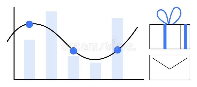
Free with trial Graph with decreasing bar chart and line graph noting key points beside a gift box and envelope. Ideal for business analysis, performance tracking, rewards programs, marketing, sales targets, client. Data analysis decrease vectors Bar Graph with Line Chart, Gift Box, and Envelope Representing Business Metrics and Rewards. Graph with decreasing bar chart and line graph noting key points beside a gift box and envelope. Ideal for business analysis, performance tracking, rewards programs, marketing, sales targets, client