Free with trial A person in a blue shirt is analyzing cost reduction strategies using a laptop computer A financial chart highlights decreasing costs symbolized by a downward trending red line and green bars indicating financial performance The image conveys themes of business success financial efficiency and strategic cost management in a digital age The focus on technology and financial analysis is evident. Data analysis decrease illustrations Analyzing Cost Reduction Strategy with Laptop and Financial Chart Showing Decreasing Costs for Business Success and Efficiency. A person in a blue shirt is analyzing cost reduction strategies using a laptop computer A financial chart highlights decreasing costs symbolized by a downward trending red line and green bars indicating financial performance The image conveys themes of business success financial efficiency and strategic cost management in a digital age The focus on technology and financial analysis is evident
Free with trial Burning candle with oil rigs seeing falling stock market data. Data analysis decrease illustrations Global energy crisis impacting oil prices financial markets. Burning candle with oil rigs seeing falling stock market data
Free with trial A downward graph chart showing a decrease, isolated on a white background, perfect for business and financial presentations. Data analysis decrease illustrations Downward graph chart isolated on white background. A downward graph chart showing a decrease, isolated on a white background, perfect for business and financial presentations
Free with trial A black bar chart with bars decreasing in height from left to right on a white background. Data analysis decrease illustrations Black bar chart showing decreasing values on white background graph data. A black bar chart with bars decreasing in height from left to right on a white background
Free with trial A bar chart displaying varying data points, with a prominent red bar signifying a downturn or negative outcome amidst generally positive trends, highlighting a specific area of concern. Data analysis decrease illustrations Bar chart with one red bar indicating a decline isolated on white background. A bar chart displaying varying data points, with a prominent red bar signifying a downturn or negative outcome amidst generally positive trends, highlighting a specific area of concern
Free with trial A graph showing a downward trend with a red arrow pointing downwards, indicating a decline or decrease in value over time, set against a blue gradient background. Data analysis decrease illustrations Downward trend indicated by red arrow on graph showing decline over time. A graph showing a downward trend with a red arrow pointing downwards, indicating a decline or decrease in value over time, set against a blue gradient background
Free with trial Two bar chart icons with descending trend arrows. The left chart features black and white bars, while the right chart includes red, green, and blue bars. Both charts depict a downward arrow starting from the peak of one bar to the base of the final bar, symbolizing a decrease or decline. The charts are presented on a white background and are used to represent data reduction or economic downturns graphically. Data analysis decrease vectors Two Silhouette of bar chart featuring vertical bars on a white background. Two bar chart icons with descending trend arrows. The left chart features black and white bars, while the right chart includes red, green, and blue bars. Both charts depict a downward arrow starting from the peak of one bar to the base of the final bar, symbolizing a decrease or decline. The charts are presented on a white background and are used to represent data reduction or economic downturns graphically.
Free with trial A graph with a grid background displaying a downward trend indicated by a red line and arrow, symbolizing a significant decrease or loss. Data analysis decrease illustrations Graph showing a sharp decline in trend with a red arrow pointing downwards. A graph with a grid background displaying a downward trend indicated by a red line and arrow, symbolizing a significant decrease or loss
Free with trial The image shows a canvas propped up on an easel displaying a bar chart with bars of varying heights that decrease from left to right. A red arrow points downward from the top right corner of the canvas, symbolizing a decline or downward trend. Data analysis decrease illustrations Declining bar chart illustration on an easel with a red downward arrow. The image shows a canvas propped up on an easel displaying a bar chart with bars of varying heights that decrease from left to right. A red arrow points downward from the top right corner of the canvas, symbolizing a decline or downward trend
Free with trial A minimalist 3D illustration shows red and blue cubes arranged on white tiered platforms, suggesting growth or data representation. Data analysis decrease illustrations Abstract 3D render of red and blue cubes on white tiered platforms blocks. A minimalist 3D illustration shows red and blue cubes arranged on white tiered platforms, suggesting growth or data representation
Free with trial The image depicts a bar graph with five bars of varying heights, each accompanied by an arrow indicating the direction of change. The bars are colored in shades of blue and green, with the arrows in black. The first bar is the tallest and has a downward arrow, the second bar is shorter with an upward arrow, the third bar is the shortest with a downward arrow, the fourth bar is taller than the. Data analysis decrease illustrations Visual representation of fluctuating data with upward and downward trends. The image depicts a bar graph with five bars of varying heights, each accompanied by an arrow indicating the direction of change. The bars are colored in shades of blue and green, with the arrows in black. The first bar is the tallest and has a downward arrow, the second bar is shorter with an upward arrow, the third bar is the shortest with a downward arrow, the fourth bar is taller than the
Free with trial Minimalist graphic depicting the Euro currency falling in value, ideal for financial news, business reports, and economic analysis on market trends. Data analysis decrease illustrations Euro currency symbol with downward red arrow indicating financial decline. Minimalist graphic depicting the Euro currency falling in value, ideal for financial news, business reports, and economic analysis on market trends
Free with trial A bright red arrow points upwards symbolizing growth and profit, while a vibrant green arrow points downwards signifying a decrease or loss. Ideal for finance and business concepts. Data analysis decrease illustrations Red up arrow and green down arrow symbols representing financial growth and decline. A bright red arrow points upwards symbolizing growth and profit, while a vibrant green arrow points downwards signifying a decrease or loss. Ideal for finance and business concepts
Free with trial A 3D bar graph with red bars decreasing in height from left to right, accompanied by a red arrow pointing downwards, indicating a decline or decrease in the represented values. Data analysis decrease illustrations A graph showing a decline in values over time with a red downward trend arrow. A 3D bar graph with red bars decreasing in height from left to right, accompanied by a red arrow pointing downwards, indicating a decline or decrease in the represented values
Free with trial The image shows a series of vertical bars in decreasing height from left to right, each bar colored differently (blue, green, yellow, orange). A bold red diagonal line with an arrow at the end overlays the bars, indicating a downward trend or decline in values. This visual representation is often used to depict a reduction in data metrics over time or categories. Data analysis decrease illustrations Declining bar chart with a downward trend line overlaying colorful bars. The image shows a series of vertical bars in decreasing height from left to right, each bar colored differently (blue, green, yellow, orange). A bold red diagonal line with an arrow at the end overlays the bars, indicating a downward trend or decline in values. This visual representation is often used to depict a reduction in data metrics over time or categories
Free with trial This is an detailed collection of line icons depicting market fluctuations, financial downturns, recovery patterns, and technical analysis indicators. Data analysis decrease vectors Market volatility and financial loss icons with bull and bear market cycle symbols. This is an detailed collection of line icons depicting market fluctuations, financial downturns, recovery patterns, and technical analysis indicators
Free with trial This vector file contains business chart icons including rising bar graphs, falling graphs, and pie chart symbols illustrating data trends in a simple style professional and clear mood. Generative AI. Data analysis decrease vectors Business chart icons set with rising and falling graphs pie chart symbols vector illustration. This vector file contains business chart icons including rising bar graphs, falling graphs, and pie chart symbols illustrating data trends in a simple style professional and clear mood. Generative AI
Free with trial A hand holds a magnifying glass over a red upward arrow, surrounded by black downward arrows. Symbolizes growth analysis, business trends, and investment opportunities. Data analysis decrease illustrations A hand holding a magnifying glass over a red upward arrow amidst downward black arrows on a light background. A hand holds a magnifying glass over a red upward arrow, surrounded by black downward arrows. Symbolizes growth analysis, business trends, and investment opportunities.
Free with trial This 3D rendered image presents a simple bar chart composed of four colored cubes: blue, yellow, red, and white. The cubes are arranged in ascending order of height from left to right, with the red cube being the tallest. They stand on a plain white surface, creating a clean and minimalist visual. The image is isolated on a white background. Data analysis decrease illustrations 3D Bar Chart with Blue Yellow Red and White Cubes on White Background graph data. This 3D rendered image presents a simple bar chart composed of four colored cubes: blue, yellow, red, and white. The cubes are arranged in ascending order of height from left to right, with the red cube being the tallest. They stand on a plain white surface, creating a clean and minimalist visual. The image is isolated on a white background
Free with trial Line chart with bars and a red arrow going downwards to signify a financial decrease. Data analysis decrease vectors Declining stock market chart with red arrow indicating loss, economy crisis. Line chart with bars and a red arrow going downwards to signify a financial decrease.
Free with trial This 3D illustration depicts a financial report represented by a document with a bar chart and a line graph. The bar chart shows alternating red and blue bars, while a blue line graph with an upward arrow indicates a positive trend. A yellow and purple magnifying glass is positioned over the chart, suggesting analysis and scrutiny. The artwork is set against a subtle light purple background. Data analysis decrease illustrations 3D illustration of a financial report with a magnifying glass and bar chart on a light purple background. This 3D illustration depicts a financial report represented by a document with a bar chart and a line graph. The bar chart shows alternating red and blue bars, while a blue line graph with an upward arrow indicates a positive trend. A yellow and purple magnifying glass is positioned over the chart, suggesting analysis and scrutiny. The artwork is set against a subtle light purple background
Free with trial This image depicts a candlestick chart, a type of financial chart used to describe price movements of securities, derivatives, or currencies. The chart shows a series of green and red vertical bars, with each bar representing a specific time period. The green bars indicate a price increase, while the red bars indicate a price decrease. Each bar has a rectangular body and thin lines, or wicks,. Data analysis decrease illustrations Candlestick chart showing the rise and fall of stock prices over time. This image depicts a candlestick chart, a type of financial chart used to describe price movements of securities, derivatives, or currencies. The chart shows a series of green and red vertical bars, with each bar representing a specific time period. The green bars indicate a price increase, while the red bars indicate a price decrease. Each bar has a rectangular body and thin lines, or wicks,
Free with trial A set of hand drawn black and white graphs and charts for business analysis. Data analysis decrease illustrations A collection of six hand drawn graphs and charts in black and white .ai generate. a set of hand drawn black and white graphs and charts for business analysis.
Free with trial An image of a wooden easel holding a whiteboard with a bar graph and a red arrow indicating a downward trend, symbolizing a decrease or decline. Data analysis decrease illustrations A graph on an easel showing a decline in values over time with a downward trend. An image of a wooden easel holding a whiteboard with a bar graph and a red arrow indicating a downward trend, symbolizing a decrease or decline
Free with trial Bar chart with downward trending arrow, representing loss, decrease, or recession. Data analysis decrease vectors Bar chart with downward trending arrow, representing loss, decrease, or recession
Free with trial Black silhouette of a jagged line graph showing a decrease over time on a white background. Data analysis decrease illustrations Black silhouette of a jagged line graph decreasing over time chart economics. Black silhouette of a jagged line graph showing a decrease over time on a white background
Free with trial The image depicts a stock chart with a blue background, displaying the fluctuations of a stock's value over a period. The chart includes various data points, such as the opening, closing, high, and low prices, represented by different candlestick patterns. The x-axis represents time, while the y-axis represents the stock price. The chart shows an overall upward trend with some periods of decline. Data analysis decrease illustrations A detailed stock chart showing the rise and fall of a stock\'s value over time. The image depicts a stock chart with a blue background, displaying the fluctuations of a stock's value over a period. The chart includes various data points, such as the opening, closing, high, and low prices, represented by different candlestick patterns. The x-axis represents time, while the y-axis represents the stock price. The chart shows an overall upward trend with some periods of decline
Free with trial Burning candle with oil rigs seeing falling stock market data. Data analysis decrease illustrations Global energy crisis impacting oil prices financial markets. Burning candle with oil rigs seeing falling stock market data
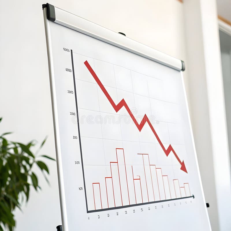
Free with trial The image shows a whiteboard with a red bar chart that initially rises and then sharply declines, accompanied by a downward-sloping red arrow. The chart is set against a white background and is placed on a wooden easel stand, indicating a visual representation of a downward trend or decline in data. Data analysis decrease illustrations Whiteboard displaying a declining trend with a red bar chart and downward arrow. The image shows a whiteboard with a red bar chart that initially rises and then sharply declines, accompanied by a downward-sloping red arrow. The chart is set against a white background and is placed on a wooden easel stand, indicating a visual representation of a downward trend or decline in data
Free with trial The image shows four separate bar charts, each with bars of different colors and heights. The first chart features a gradient from orange to red, showing an increasing trend. The second chart has blue bars that increase and then decrease slightly. The third chart uses green bars with a steady upward trend. The fourth chart combines purple and blue bars, showing a fluctuating pattern with an. Data analysis decrease illustrations Colorful bar charts displaying varying data trends across four distinct sets. The image shows four separate bar charts, each with bars of different colors and heights. The first chart features a gradient from orange to red, showing an increasing trend. The second chart has blue bars that increase and then decrease slightly. The third chart uses green bars with a steady upward trend. The fourth chart combines purple and blue bars, showing a fluctuating pattern with an
Free with trial This image depicts a bar chart with a symmetrical, bell-shaped distribution. The bars increase in height from the left, peak in the center with the highest bar, and then decrease symmetrically towards the right. This type of chart is often used to represent normal distributions or central tendencies in data sets. Data analysis decrease illustrations A bar chart displaying a distribution with a peak in the middle and tapering ends. This image depicts a bar chart with a symmetrical, bell-shaped distribution. The bars increase in height from the left, peak in the center with the highest bar, and then decrease symmetrically towards the right. This type of chart is often used to represent normal distributions or central tendencies in data sets
Free with trial Decreasing Bar Chart With Downward Arrow Line Icon. Financial Decline, Economic Downturn, And Business Loss Outline Symbol. Market Analysis. Editable Stroke. Isolated Vector Illustration. Data analysis decrease vectors Decreasing Bar Chart With Downward Arrow Line Icon. Financial Decline, Economic Downturn, And Business Loss Outline
Free with trial The image shows a central upward-pointing red arrow with a percent sign, indicating an increase, flanked by two downward-pointing red arrows on either side, symbolizing decreases or fluctuations in percentage values. This visual metaphor is often used to represent changes in metrics, financial trends, or statistical variations. Data analysis decrease illustrations Graphic illustrating percentage increase and decrease with directional arrows. The image shows a central upward-pointing red arrow with a percent sign, indicating an increase, flanked by two downward-pointing red arrows on either side, symbolizing decreases or fluctuations in percentage values. This visual metaphor is often used to represent changes in metrics, financial trends, or statistical variations
Free with trial The image shows a bar graph with three bars of decreasing height, representing a downward trend. A red arrow is pointing downwards, emphasizing the decline in values over time. Data analysis decrease illustrations A downward trend graph with a red arrow indicating a decrease in values over time. The image shows a bar graph with three bars of decreasing height, representing a downward trend. A red arrow is pointing downwards, emphasizing the decline in values over time
Free with trial Red arrow declining on bar graph, business finance chart, downward trend, recession, financial data, blue background. Data analysis decrease illustrations Red arrow graph showing decline, business finance chart, downward trend, recession. Red arrow declining on bar graph, business finance chart, downward trend, recession, financial data, blue background
Free with trial The image depicts a set of turquoise bars progressively decreasing in height from left to right, accompanied by a large red downward-pointing arrow, symbolizing a downward trend or decline in data. Data analysis decrease illustrations Declining trend represented by a series of descending bars and a downward arrow. The image depicts a set of turquoise bars progressively decreasing in height from left to right, accompanied by a large red downward-pointing arrow, symbolizing a downward trend or decline in data
Free with trial The image shows a whiteboard with a red bar chart that initially rises and then sharply declines, accompanied by a downward-sloping red arrow. The chart is set against a white background and is placed on a wooden easel stand, indicating a visual representation of a downward trend or decline in data. Data analysis decrease illustrations Whiteboard displaying a declining trend with a red bar chart and downward arrow. The image shows a whiteboard with a red bar chart that initially rises and then sharply declines, accompanied by a downward-sloping red arrow. The chart is set against a white background and is placed on a wooden easel stand, indicating a visual representation of a downward trend or decline in data
Free with trial This stylized bar graph shows a downward trending line, representing decrease or loss in a flat graphic style with blue and gray hues. Data analysis decrease vectors Downward trend graph indicating loss or decline in a modern simple style. This stylized bar graph shows a downward trending line, representing decrease or loss in a flat graphic style with blue and gray hues.
Free with trial A stylized black and white illustration shows a bar chart with bars of decreasing height, leading to a sharp downward-pointing arrow. Data analysis decrease vectors Decreasing bar chart with downward arrow decrease downward recession statistics negative. A stylized black and white illustration shows a bar chart with bars of. A stylized black and white illustration shows a bar chart with bars of decreasing height, leading to a sharp downward-pointing arrow
Free with trial A visual representation of a steep financial or performance decrease, indicated by a series of descending bars and directional arrows. Data analysis decrease illustrations 3D bar chart showing a significant decline from 100% to 10% with downward arrows. A visual representation of a steep financial or performance decrease, indicated by a series of descending bars and directional arrows
Free with trial A red graph with a downward trend, indicating a decline or decrease, set against a grid background with a prominent red arrow pointing downwards, symbolizing a significant drop or loss. Data analysis decrease illustrations Financial downturn indicated by red graph and downward arrow on grid background. A red graph with a downward trend, indicating a decline or decrease, set against a grid background with a prominent red arrow pointing downwards, symbolizing a significant drop or loss
Free with trial A close-up captures a digital tablet displaying vital progress in carbon emission reduction, visualized through dynamic graphs and charts. This image powerfully represents the critical journey toward achieving Net Zero goals. The data, likely analyzing CO2 emissions and the carbon footprint, emphasizes climate change mitigation through renewable energy sources like wind turbines and solar panels. Data analysis decrease illustrations Carbon emission reduction progress displayed on digital tablet illustrating net zero goals sustainability. A close-up captures a digital tablet displaying vital progress in carbon emission reduction, visualized through dynamic graphs and charts. This image powerfully represents the critical journey toward achieving Net Zero goals. The data, likely analyzing CO2 emissions and the carbon footprint, emphasizes climate change mitigation through renewable energy sources like wind turbines and solar panels.
Free with trial A 3D bar chart visually represents a financial or performance decline. The bars decrease in height from left to right, labeled with percentages indicating a downward trend. This graphic signifies loss or reduction. Data analysis decrease illustrations Declining blue bar chart showing percentage decrease from 100 percent downwards. A 3D bar chart visually represents a financial or performance decline. The bars decrease in height from left to right, labeled with percentages indicating a downward trend. This graphic signifies loss or reduction
Free with trial A computer screen shows a graph with red and blue lines. The graph is showing a downward trend, which could indicate a decrease in value or a negative outcome. Scene is somewhat ominous. Data analysis decrease illustrations A computer screen shows a graph with red and blue lines
Free with trial A simple line graph two colored lines, blue and green, with circular data points indicating trends against a white background. Data analysis decrease illustrations Two distinct colored lines with circular markers charting upward and downward trends on a white background. A simple line graph two colored lines, blue and green, with circular data points indicating trends against a white background
Free with trial The image shows a bar graph with a series of decreasing bars, each bar shorter than the previous one, indicating a downward trend. A red arrow extends diagonally from the top left to the bottom right, emphasizing the decline. The graph suggests a significant decrease in value or performance over time. Data analysis decrease illustrations A downward trending graph with a red arrow indicating a significant decline in value. The image shows a bar graph with a series of decreasing bars, each bar shorter than the previous one, indicating a downward trend. A red arrow extends diagonally from the top left to the bottom right, emphasizing the decline. The graph suggests a significant decrease in value or performance over time
Free with trial This image features four graphical elements that symbolize financial growth and decline. The top row displays two percentage signs with arrows indicating upward and downward trends. The bottom row shows two bar graphs, one with an upward trend and the other with a downward trend. These visuals are commonly used in finance to represent changes in data over time. Data analysis decrease illustrations Graphical representation of financial growth and decline. This image features four graphical elements that symbolize financial growth and decline. The top row displays two percentage signs with arrows indicating upward and downward trends. The bottom row shows two bar graphs, one with an upward trend and the other with a downward trend. These visuals are commonly used in finance to represent changes in data over time
Free with trial Financial chart shows falling market data with red and green candlesticks against a dark background, creating a dramatic effect suitable for investment and economic themed visuals. Data analysis decrease illustrations Dramatic Financial Chart with Green and Red Candlesticks on Black Background. Financial chart shows falling market data with red and green candlesticks against a dark background, creating a dramatic effect suitable for investment and economic themed visuals
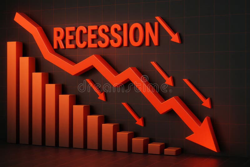
Free with trial This image visually represents an economic recession through downward trends and statistics. The vibrant red arrows emphasize the significant decline in growth, making it an impactful visual for financial analysis. Data analysis decrease illustrations Dramatic Decline in Economic Growth with Recession Indicator and Downward Arrows in Red. This image visually represents an economic recession through downward trends and statistics. The vibrant red arrows emphasize the significant decline in growth, making it an impactful visual for financial analysis
Free with trial The image depicts a graph with a downward trend, featuring a red arrow that points to a substantial decrease in value. The graph is set against a red gradient background, which adds to the overall sense of decline. Data analysis decrease illustrations A downward trending graph with a red arrow indicating a significant decline in value. The image depicts a graph with a downward trend, featuring a red arrow that points to a substantial decrease in value. The graph is set against a red gradient background, which adds to the overall sense of decline
Free with trial The image depicts five transparent cylindrical bars arranged in ascending order of height. The first four bars increase progressively in height, while the fifth bar, which is the tallest, has a red downward-pointing arrow indicating a decline or decrease. This visual often represents a concept of growth followed by a downturn or setback. Data analysis decrease illustrations A graphical illustration showing a declining trend in ascending cylindrical bars. The image depicts five transparent cylindrical bars arranged in ascending order of height. The first four bars increase progressively in height, while the fifth bar, which is the tallest, has a red downward-pointing arrow indicating a decline or decrease. This visual often represents a concept of growth followed by a downturn or setback
Free with trial The image depicts a stylized 3D bar chart with alternating red and blue bars representing fluctuations in data trends. The bars ascend and descend, symbolizing periods of growth and decline. The chart has a modern, gradient design with a clear upward trajectory at the end, suggesting recovery or improvement after a period of instability. The visual representation emphasizes the variability and. Data analysis decrease illustrations Dynamic 3d bar chart illustrating fluctuating growth and decline trends over time. The image depicts a stylized 3D bar chart with alternating red and blue bars representing fluctuations in data trends. The bars ascend and descend, symbolizing periods of growth and decline. The chart has a modern, gradient design with a clear upward trajectory at the end, suggesting recovery or improvement after a period of instability. The visual representation emphasizes the variability and
Free with trial The image shows a white easel holding a canvas with a red bar and line graph depicting a declining trend. The graph starts with high bars that gradually decrease in height, transitioning into a downward-sloping line. Beside the easel, there is a small golden trophy, possibly symbolizing achievement or competition. The overall scene suggests a representation of decreasing performance or results. Data analysis decrease illustrations A downward trend graph displayed on an easel with a small golden trophy beside it. The image shows a white easel holding a canvas with a red bar and line graph depicting a declining trend. The graph starts with high bars that gradually decrease in height, transitioning into a downward-sloping line. Beside the easel, there is a small golden trophy, possibly symbolizing achievement or competition. The overall scene suggests a representation of decreasing performance or results
Free with trial Cac cost acquisition is represented by wooden blocks and stacks of coins showing decreasing investment and financial return on marketing strategy business planning and customer acquisition for sales. Data analysis decrease illustrations Cac cost acquisition marketing business finance investment strategy return growth analysis budget advertising customer sales reven. Cac cost acquisition is represented by wooden blocks and stacks of coins showing decreasing investment and financial return on marketing strategy business planning and customer acquisition for sales
Free with trial A minimalist black line graph with circular data points and vertical bars is depicted on a white background. Data analysis decrease illustrations Simple black line graph with bars and circles on white background chart statistics. A minimalist black line graph with circular data points and vertical bars is depicted on a white background
Free with trial This 3D illustration depicts a purple calculator as the central element, set against a clean white background. Various colorful, stylized icons float around it, representing concepts related to business and finance. The icons include a percentage sign, an upward trend graph, a dollar sign, a notification bell, and a message bubble. The composition suggests themes of accounting, financial analysis. Data analysis decrease illustrations A purple calculator surrounded by business and financial icons in a 3d cartoon style. This 3D illustration depicts a purple calculator as the central element, set against a clean white background. Various colorful, stylized icons float around it, representing concepts related to business and finance. The icons include a percentage sign, an upward trend graph, a dollar sign, a notification bell, and a message bubble. The composition suggests themes of accounting, financial analysis
Free with trial A stark visual representation of fluctuating interest rates and housing market dynamics. A red arrow points downward, symbolizing a decrease, while a green house features a percentage symbol suggesting a change. Data analysis decrease illustrations Red down arrow and green house with percentage symbols indicating financial trends. A stark visual representation of fluctuating interest rates and housing market dynamics. A red arrow points downward, symbolizing a decrease, while a green house features a percentage symbol suggesting a change
Free with trial A 3D rendered bar chart illustrates a downward trend. Two tall green bars are followed by two shorter pink bars, representing a decrease in value. A bright yellow arrow sharply descends from right to left, crossing over the bars and emphasizing the decline. The composition is set against a solid light blue background. Data analysis decrease illustrations 3D Bar Chart with Falling Yellow Arrow Indicating Decline on Blue Background graph. A 3D rendered bar chart illustrates a downward trend. Two tall green bars are followed by two shorter pink bars, representing a decrease in value. A bright yellow arrow sharply descends from right to left, crossing over the bars and emphasizing the decline. The composition is set against a solid light blue background
Free with trial A downward graph chart showing a decrease, isolated on a white background, perfect for business and financial presentations. Data analysis decrease illustrations Downward graph chart isolated on white background. A downward graph chart showing a decrease, isolated on a white background, perfect for business and financial presentations
Free with trial A 3D bar chart made of red and blue cubes arranged in ascending and descending steps against a white background. Data analysis decrease illustrations 3D Red and Blue Cubes Arranged in Ascending Bar Chart Formation on White graph data. A 3D bar chart made of red and blue cubes arranged in ascending and descending steps against a white background
Free with trial This image displays a series of vertical bars arranged in a gradient color spectrum from green to red. Each bar varies in height, suggesting a comparison of different values or quantities. The bars start tall on the left in green, gradually decrease in height towards the center, and then increase again towards the right, ending with the tallest bar on the far right in red. The gradient color. Data analysis decrease illustrations Colorful bar chart showing varying heights in a gradient spectrum from green to red. This image displays a series of vertical bars arranged in a gradient color spectrum from green to red. Each bar varies in height, suggesting a comparison of different values or quantities. The bars start tall on the left in green, gradually decrease in height towards the center, and then increase again towards the right, ending with the tallest bar on the far right in red. The gradient color
Free with trial A 3D bar chart shows a significant downward trend with a prominent red arrow indicating a steep financial decline and market drop. Data analysis decrease illustrations Financial downturn declining bar chart with red arrow symbolizing loss and decrease. A 3D bar chart shows a significant downward trend with a prominent red arrow indicating a steep financial decline and market drop
Free with trial A 3D rendering shows a bar graph of five columns in pink, blue, and yellow hues illustrating decrease or loss, set against a transparent background. Data analysis decrease vectors Colorful bar graph illustration presenting downward trend on transparent background. A 3D rendering shows a bar graph of five columns in pink, blue, and yellow hues illustrating decrease or loss, set against a transparent background.
Free with trial A bar graph depicting a significant decrease in value or performance, highlighted by a prominent red arrow pointing downwards, indicating a negative trend. Data analysis decrease illustrations Bar graph illustrating a downward trend with a red arrow isolated on white background. A bar graph depicting a significant decrease in value or performance, highlighted by a prominent red arrow pointing downwards, indicating a negative trend
Free with trial The image shows a bar graph with green bars decreasing in height from left to right. A red arrow is superimposed over the bars, pointing downward, indicating a decline in value or performance. Data analysis decrease illustrations A downward trending bar graph with a red arrow indicating a decrease in value. The image shows a bar graph with green bars decreasing in height from left to right. A red arrow is superimposed over the bars, pointing downward, indicating a decline in value or performance
Free with trial The image is a combination of a bar and line graph. The blue bars represent individual data points, while the red line connects these points to show the overall trend. The graph demonstrates an upward trend with some fluctuations, indicating an overall increase in values over time. Data analysis decrease illustrations A bar and line graph showing a trend of increasing values over time with fluctuations. The image is a combination of a bar and line graph. The blue bars represent individual data points, while the red line connects these points to show the overall trend. The graph demonstrates an upward trend with some fluctuations, indicating an overall increase in values over time
Free with trial The image depicts a combination of bar and line charts. The bar chart shows three descending bars in orange, yellow, and a lighter shade, indicating a decline in values. Overlaid on this is a downward-sloping line chart, reinforcing the trend of decrease. The overall design suggests a visual representation of a downward market trend or decline in performance metrics over time. Data analysis decrease illustrations Graphic illustration of declining market trends with bar and line chart combination. The image depicts a combination of bar and line charts. The bar chart shows three descending bars in orange, yellow, and a lighter shade, indicating a decline in values. Overlaid on this is a downward-sloping line chart, reinforcing the trend of decrease. The overall design suggests a visual representation of a downward market trend or decline in performance metrics over time
Free with trial Declining Bar Graph With Cursor Solid Icon. Business Performance, Financial Loss, And Market Downturn Silhouette Symbol. Economic Analysis. Isolated Vector Illustration. Data analysis decrease vectors Declining Bar Graph With Cursor Solid Icon. Business Performance, Financial Loss, And Market Downturn Silhouette Symbol
Free with trial A white bar graph icon with bars of different heights is displayed within a black circle, representing data and analytics. Data analysis decrease illustrations White bar graph icon with varying height bars inside a black circle chart statistics. A white bar graph icon with bars of different heights is displayed within a black circle, representing data and analytics
Free with trial Line art bar graph icon set featuring upward and downward trend arrows for business analysis. Data analysis decrease vectors Line art bar graph icon set featuring upward and downward trend arrows for business analysis
Free with trial Isometric graph showing different trends with ups and downs, concept of trading and business analysis. Data analysis decrease illustrations Isometric graph showing different trends with ups and downs
Free with trial The image shows two contrasting line graphs: one with a green upward-sloping line indicating growth or positive performance, and another with a red downward-sloping line representing decline or negative performance. Both lines are jagged, suggesting volatility or fluctuating trends in data, commonly used in financial, business, or economic contexts to depict market movements or performance changes. Data analysis decrease illustrations Contrasting upward and downward trends in a financial or performance chart illustration. The image shows two contrasting line graphs: one with a green upward-sloping line indicating growth or positive performance, and another with a red downward-sloping line representing decline or negative performance. Both lines are jagged, suggesting volatility or fluctuating trends in data, commonly used in financial, business, or economic contexts to depict market movements or performance changes
Free with trial This image depicts a bar chart transitioning from green to red bars, representing a shift from positive growth to decline. Overlaid green and red line graphs emphasize the upward trend followed by a downward trend, symbolizing financial success turning into loss, often seen in market analysis or business performance evaluations. Data analysis decrease vectors Graphic illustration of financial growth and subsequent decline using bar and line charts. This image depicts a bar chart transitioning from green to red bars, representing a shift from positive growth to decline. Overlaid green and red line graphs emphasize the upward trend followed by a downward trend, symbolizing financial success turning into loss, often seen in market analysis or business performance evaluations
Free with trial The image features a small house model with a large percent sign on it, symbolizing interest rates or property values. Next to the house is a red bar graph with a downward trend, indicating a decrease in whatever the graph is measuring. Data analysis decrease illustrations A small house model with a percent sign on it next to a red bar graph showing a downward trend. The image features a small house model with a large percent sign on it, symbolizing interest rates or property values. Next to the house is a red bar graph with a downward trend, indicating a decrease in whatever the graph is measuring
Free with trial Man pointing at declining chart in office symbolizing loss and economic downturn in business strategy a man pointing at a declining chart ,Generative ai. Data analysis decrease illustrations Businessman Pointing at Declining Chart Showing Negative Growth in Financial Analysis Presentation Businessman. Man pointing at declining chart in office symbolizing loss and economic downturn in business strategy a man pointing at a declining chart ,Generative ai
Free with trial Negative growth graph with white 3d pillars on grid floor against blue background for market trend analysis. Data analysis decrease illustrations Business bar chart with declining red arrow showing financial loss and economic recession. Negative growth graph with white 3d pillars on grid floor against blue background for market trend analysis
Free with trial A hand displays a green bar graph illustrating a downward trend in CO2 levels, symbolizing environmental protection and carbon reduction. Data analysis decrease illustrations Hand holding a bar graph showing a decrease in CO2 emissions against a green leafy background. A hand displays a green bar graph illustrating a downward trend in CO2 levels, symbolizing environmental protection and carbon reduction
Free with trial A single yellow coin with the prominent Bitcoin symbol is centrally placed on a white background. To its left is a green circular icon with an upward-pointing arrow, signifying an increase or positive trend. To its right is a red circular icon with a downward-pointing arrow, representing a decrease or negative trend. The composition visually represents the fluctuating nature of cryptocurrency. Data analysis decrease illustrations Bitcoin symbol coin with green up arrow and red down arrow on a white background cryptocurrency. A single yellow coin with the prominent Bitcoin symbol is centrally placed on a white background. To its left is a green circular icon with an upward-pointing arrow, signifying an increase or positive trend. To its right is a red circular icon with a downward-pointing arrow, representing a decrease or negative trend. The composition visually represents the fluctuating nature of cryptocurrency
Free with trial The image depicts a red bar graph on a transparent background with a downward trend, indicating a decrease in values. The graph features a series of red bars of varying heights, with a red arrow pointing downwards to emphasize the decline. Data analysis decrease illustrations A red bar graph showing a significant decline in values over time with a downward trend arrow. The image depicts a red bar graph on a transparent background with a downward trend, indicating a decrease in values. The graph features a series of red bars of varying heights, with a red arrow pointing downwards to emphasize the decline