Free with trial A bold red arrow points downward, symbolizing a negative trend or decline, often associated with financial or performance metrics. This visual representation is commonly used in reports. Data analysis decrease vectors Red downward arrow indicating decline in trends or performance metrics across data visuals. A bold red arrow points downward, symbolizing a negative trend or decline, often associated with financial or performance metrics. This visual representation is commonly used in reports.
Free with trial Businessperson analyzes financial data on digital tablet. Growth chart, cost reduction strategies displayed on screen. Project management business strategy key concepts. Effective. Data analysis decrease illustrations Businessperson analyzes financial data on digital tablet. Growth chart, cost reduction strategies displayed on screen. Project
Free with trial Shiny metallic percentage sign centered on blue financial graph background. Selective focus highlights symbol over stock market data. Represents finance, business, price, discount sale. Data analysis decrease illustrations Shiny metallic percentage sign centered on blue financial graph background. Selective focus highlights symbol over stock market
Free with trial A pair of gleaming gold bars placed on digital financial graphs, symbolizing wealth and investment strategy. The background features abstract data points and fluctuating lines. Data analysis decrease illustrations Shiny Gold Bars Resting on Financial Charts Representing Wealth and Investment Opportunities. A pair of gleaming gold bars placed on digital financial graphs, symbolizing wealth and investment strategy. The background features abstract data points and fluctuating lines
Free with trial This graph chart depicts a significant downward trend in the stock market, indicating a period of market decline. The red arrows clearly show the loss in value across various investment instruments. This market downturn highlights the inherent volatility of financial markets and the need for careful financial analysis. Understanding the factors driving this decline, such as economic downturns,. Data analysis decrease illustrations Analyzing a Red Downward Trend Chart Stock Market Decline and Potential Investment Strategies. This graph chart depicts a significant downward trend in the stock market, indicating a period of market decline. The red arrows clearly show the loss in value across various investment instruments. This market downturn highlights the inherent volatility of financial markets and the need for careful financial analysis. Understanding the factors driving this decline, such as economic downturns,
Free with trial Concrete bar graph showing a decline with a downward arrow. Business loss and negative trend concept for financial downturn analysis. Data analysis decrease illustrations Concrete bar graph showing a decline with a downward arrow. Business loss and negative trend concept
Free with trial Three stacks of gold coins decrease in height from left to right, overlaid by a red arrow pointing downwards. Isolated on a transparent background. Data analysis decrease vectors Stacks of gold coins with red downward trending arrow isolated on a transparent background money. Three stacks of gold coins decrease in height from left to right, overlaid by a red arrow pointing downwards. Isolated on a transparent background
Free with trial A graph visually depicts two distinct lines, one showing a pronounced increase while the other reflects a steady decline, all presented in striking orange tones. Data analysis decrease illustrations Trends in Data Representation Illustrating Contrasting Growth and Decline Patterns in Vibrant Hues. A graph visually depicts two distinct lines, one showing a pronounced increase while the other reflects a steady decline, all presented in striking orange tones
Free with trial Vertical bar graph, bars decrease left to right, red arrow points down Vertical Mobile Wallpaper. Data analysis decrease illustrations Vertical bar graph, bars decrease left to right, red arrow points down
Free with trial Vertical bar graph, bars decrease left to right, red arrow points down For Social Media Post Size. Data analysis decrease illustrations Vertical bar graph, bars decrease left to right, red arrow points down
Free with trial Vertical bar graph, bars decrease left to right, red arrow points down Generative AI. Data analysis decrease illustrations Vertical bar graph, bars decrease left to right, red arrow points down
Free with trial Orange arrow pointing downward through clouds towards earth. Global economic downturn visualization for market analysis and business decline concept. Data analysis decrease illustrations Orange arrow pointing downward through clouds towards earth. Global economic downturn visualization
Free with trial A character stands alone, holding a large red arrow pointing downward, symbolizing a decline or decrease, set against a plain white backdrop. Data analysis decrease illustrations Character Holding a Large Red Downward Arrow Indicating Decline on a White Background. A character stands alone, holding a large red arrow pointing downward, symbolizing a decline or decrease, set against a plain white backdrop
Free with trial Modern Robot Hands Interacting with Digital Cost Reduction Concept on Futuristic Background Representing Business Strategy and Brand Analysis Quark. Data analysis decrease illustrations Modern Robot Hands Interacting with Digital Cost Reduction Concept on Futuristic Background Representing Business
Free with trial A 3D illustration depicts a large white dollar sign centered on a vibrant purple circle. Two smaller white circles are positioned on either side of the purple circle. A green upward-pointing arrow is in the top right circle, signifying growth or increase, while a red downward-pointing arrow is in the bottom left circle, indicating decline or decrease. The composition is set against a clean white. Data analysis decrease illustrations 3D Dollar Sign with Up and Down Arrows Indicating Financial Growth and Decline on White Background. A 3D illustration depicts a large white dollar sign centered on a vibrant purple circle. Two smaller white circles are positioned on either side of the purple circle. A green upward-pointing arrow is in the top right circle, signifying growth or increase, while a red downward-pointing arrow is in the bottom left circle, indicating decline or decrease. The composition is set against a clean white
Free with trial This image shows a vibrant 3D bar chart and pie chart, ideal for business presentations and reports to visualize data effectively. The colorful design is visually appealing and easy to understand. Data analysis decrease illustrations Colorful 3D Bar and Pie Charts for Business Presentation. This image shows a vibrant 3D bar chart and pie chart, ideal for business presentations and reports to visualize data effectively. The colorful design is visually appealing and easy to understand.
Free with trial A character stands isolated and holds a large red downward arrow, representing a decrease in values or metrics. Data analysis decrease illustrations Character Holding a Large Red Downward Arrow Symbolizing Decline on a White Background. A character stands isolated and holds a large red downward arrow, representing a decrease in values or metrics
Free with trial Concrete blocks form a downward arrow graph. Business concept of decline, crisis, or falling market trend. Financial data visualization. Data analysis decrease illustrations Concrete blocks form a downward arrow graph. Business concept of decline, crisis, or falling market trend
Free with trial Hand interacting with blue chart, analyzing growth, trends, and financial performance data ,Generative ai. Data analysis decrease illustrations Hand analyzing blue chart, deciphering growth trends and financial performance for business success. Hand interacting with blue chart, analyzing growth, trends, and financial performance data ,Generative ai
Free with trial Person holds smartphone displaying stock market charts. Person reviews financial data. Stock market trading in progress, on computer monitor. Person analyses market trends. Person. Data analysis decrease illustrations Person holds smartphone displaying stock market charts. Person reviews financial data. Stock market trading in progress on. Person holds smartphone displaying stock market charts. Person reviews financial data. Stock market trading in progress, on computer monitor. Person analyses market trends. Person.
Free with trial Reduction chart icon Black line art vector in black and white outline set collection sign. Data analysis decrease vectors Decline Chart Icon Illustrating Decrease in Performance, Economic Downturn, and Analytical Data. Reduction chart icon Black line art vector in black and white outline set collection sign
Free with trial Bar chart with illuminated bars showing an upward trend, depicted against a blurred cityscape at night. Bars increase in height from left to right, symbolizing growth. The glowing blue bars stand out against the dark background, visually representing a bullish financial trend. Various structures and faint lights in the defocused cityscape add context, highlighting the analytical and financial theme. Data analysis decrease illustrations Dynamic stock market chart showing bullish trend after downturn for financial analysis reports and presentations. Bar chart with illuminated bars showing an upward trend, depicted against a blurred cityscape at night. Bars increase in height from left to right, symbolizing growth. The glowing blue bars stand out against the dark background, visually representing a bullish financial trend. Various structures and faint lights in the defocused cityscape add context, highlighting the analytical and financial theme.
Free with trial Financial chart illustration. Declining graphic concept. Red arrow decrease Vector. Business diagram symbol. EPS 10. Data analysis decrease vectors Financial chart illustration. Declining graphic concept. Red arrow decrease Vector. Business diagram symbol.
Free with trial This comprehensive analysis explores the current downturn in the housing market, examining the factors driving falling house prices. We delve into the interconnectedness of real estate trends with broader economic indicators, including interest rates, inflation, and potential recessionary periods. The report visually depicts the negative trajectory of property values, highlighting the. Data analysis decrease illustrations Falling House Prices Analyzing Market Trends Impacts and Economic Forecasts for the Real Estate Sector. This comprehensive analysis explores the current downturn in the housing market, examining the factors driving falling house prices. We delve into the interconnectedness of real estate trends with broader economic indicators, including interest rates, inflation, and potential recessionary periods. The report visually depicts the negative trajectory of property values, highlighting the
Free with trial Bar Chart With Downward Arrow Solid Icon. Economic Decline, Financial Loss, And Market Downturn Silhouette Symbol. Business Analysis. Isolated Vector Illustration. Data analysis decrease vectors Bar Chart With Downward Arrow Solid Icon. Economic Decline, Financial Loss, And Market Downturn Silhouette Symbol
Free with trial Global inflation trends displayed on multiple digital screens. Macroeconomic research paper on screens shows worldwide inflation data. Charts graphs illustrate global economic. Data analysis decrease illustrations Global inflation trends displayed on multiple digital screens. Macroeconomic research paper on screens shows worldwide inflation
Free with trial The financial data graph is rendered using a 3D rendering of the world map as a background for the declining indexes. Data analysis decrease illustrations The financial data graph is rendered using a 3D rendering of the world map as a background for the declining indexes.
Free with trial Flaming red arrow pointing down on an earth globe. Global financial crisis, market crash, or economic downturn. World economy analysis. Data analysis decrease illustrations Flaming red arrow pointing down on an earth globe. Global financial crisis, market crash, or economic downturn
Free with trial Declining Bar Chart With Downward Arrow Icon. Economic Downturn, Financial Loss, And Market Decline Outline Symbol. Business Analysis And Risk Assessment. Editable Stroke. Isolated Vector Illustration. Data analysis decrease vectors Declining Bar Chart With Downward Arrow Icon. Economic Downturn, Financial Loss, And Market Decline Outline Symbol
Free with trial This image showcases vibrant 3D bar and pie charts, illustrating growth and statistical data. Perfect for presentations or reports on financial success. Data analysis decrease illustrations Colorful 3D Bar and Pie Charts Showing Business Growth and Statistics. This image showcases vibrant 3D bar and pie charts, illustrating growth and statistical data. Perfect for presentations or reports on financial success.
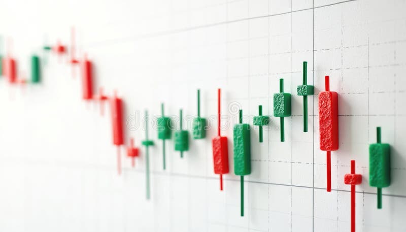
Free with trial Candlestick chart shows stock market fluctuations. Green candles show price increase, red candles pointing price decrease. Financial diagram of investment chart shows up down trends. Data analysis decrease illustrations Candlestick chart shows stock market fluctuations. Green candles show price increase, red candles pointing price decrease.
Free with trial A grid of 28 simple black line art icons on a white background depicting various financial charts graphs and business related symbols including bar charts pie charts computers and money. Data analysis decrease vectors Collection of 28 minimalist line art icons representing financial data charts and business concepts graph. A grid of 28 simple black line art icons on a white background depicting various financial charts graphs and business related symbols including bar charts pie charts computers and money
Free with trial The graphic illustrates stable bank withdrawals alongside a growing financial trend with upward movement, Bank withdrawals are currently stable and not showing any significant increase or decrease. Data analysis decrease vectors The graphic illustrates stable bank withdrawals alongside a growing financial trend with upward movement, Bank withdrawals are
Free with trial Cost reduction concept shows hands typing on a laptop keyboard with a glowing green icon representing financial savings budget management and efficiency optimization for business strategy planning an. Data analysis decrease illustrations Cost reduction savings finance economy budget management efficiency optimization strategy planning analysis. Cost reduction concept shows hands typing on a laptop keyboard with a glowing green icon representing financial savings budget management and efficiency optimization for business strategy planning an
Free with trial A stylized blue cloud graphic features a yellow percentage symbol and a blue downward-pointing arrow, suggesting a decrease in price or a sale. Data analysis decrease vectors Cloud icon with a percentage symbol and a downward arrow, isolated on transparent background cyber monday element. A stylized blue cloud graphic features a yellow percentage symbol and a blue downward-pointing arrow, suggesting a decrease in price or a sale
Free with trial Four stacks of Canadian coins, varying in height, are shown with red downward-pointing arrows on their sides. The isolated object on a white background symbolizes a decrease in currency value or economic downturn. created Ai. Data analysis decrease illustrations Canadian currency stacks with downward red arrows indicating financial decline isolated on white background. Four stacks of Canadian coins, varying in height, are shown with red downward-pointing arrows on their sides. The isolated object on a white background symbolizes a decrease in currency value or economic downturn. created Ai
Free with trial A 3D render of a business chart illustrating a financial decline with a visual representation of falling data, presented on an artist's easel. Concept for economic downturn. Data analysis decrease vectors 3d business graph showing a downward trend with bar chart and line on an easel stand transparent background. A 3D render of a business chart illustrating a financial decline with a visual representation of falling data, presented on an artist's easel. Concept for economic downturn
Free with trial Declining financial graph with downward arrow on rusty metal texture. Economic crisis concept and recession visual for business trend analysis. Data analysis decrease illustrations Declining financial graph with downward arrow on rusty metal texture. Economic crisis concept and recession visua
Free with trial Red arrow pointing downward on colorful vertical bars. Business financial crisis chart with decreasing trend line. Economic data visualization. Data analysis decrease illustrations Red arrow pointing downward on colorful vertical bars. Business financial crisis chart with decreasing trend line
Free with trial Eight circular icons with black backgrounds each feature a different chart or graph symbol. The frames are bordered by a sequence of colorful lines: red, green, blue, and yellow. The icons include bar graphs, line graphs, a pie chart, and scatter plots, all depicted in white. Each symbol includes axes and grid patterns, indicating statistical or financial data representation. The arrangement is in two rows of four, emphasizing symmetry and variety in chart types. A i Generated. Data analysis decrease vectors Collection of eight different chart and graph icons displayed in circular black frames with colorful borders. Eight circular icons with black backgrounds each feature a different chart or graph symbol. The frames are bordered by a sequence of colorful lines: red, green, blue, and yellow. The icons include bar graphs, line graphs, a pie chart, and scatter plots, all depicted in white. Each symbol includes axes and grid patterns, indicating statistical or financial data representation. The arrangement is in two rows of four, emphasizing symmetry and variety in chart types. A i Generated
Free with trial A dynamic stock market chart against a blurred city skyline, symbolizing financial growth and investment opportunities. it represents the intersection of urban finance and economic trends, showcasing potential. Data analysis decrease illustrations Stock market analysis chart with city skyline background for financial investment growth concept. a dynamic stock market chart against a blurred city skyline, symbolizing financial growth and investment opportunities. it represents the intersection of urban finance and economic trends, showcasing potential.
Free with trial Financial chart graphic with coins, blue bar graph, blurred orange line chart. Business profit, income growth, investment, financial analysis, marketing, economic saving money concept. Data analysis decrease illustrations Financial chart graphic with coins, blue bar graph, blurred orange line chart. Business profit, income growth, investment
Free with trial Bar Chart With Downward Arrow Line Icon. Business Decline, Financial Loss, And Market Downturn Outline Symbol. Economic Analysis And Trend Tracking. Editable Stroke. Isolated Vector Illustration. Data analysis decrease vectors Bar Chart With Downward Arrow Line Icon. Business Decline, Financial Loss, And Market Downturn Outline Symbol. Economic
Free with trial Financial Loss, Economic Downturn, And Business Decline Symbol Collection. Declining Bar Chart With Downward Arrow Line And Solid Icon Set. Market Analysis. Isolated Vector Illustration. Data analysis decrease vectors Financial Loss, Economic Downturn, And Business Decline Symbol Collection. Declining Bar Chart With Downward Arrow Line
Free with trial A laptop screen shows a graph with orange lines. The graph is showing a downward trend, which could indicate a decrease in stock prices or a decline in a particular market. Data analysis decrease illustrations A laptop screen shows a graph with orange lines. The graph is showing a downward trend, which could indicate a decrease in stock
Free with trial Red stock market chart decreasing. Financial trading background, investment risk concept. Economic crisis, market crash, index fall. Bear market trend with digital data volatility on. Data analysis decrease illustrations Red stock market chart decreasing. Financial trading background, investment risk concept. Economic crisis, market crash, index
Free with trial Set line Cloud computing lock Pie chart infographic Financial growth Search with folder Document and decrease icon. Vector. Data analysis decrease illustrations Set line Cloud computing lock, Pie chart infographic, Financial growth, Search with folder, Document and decrease icon
Free with trial White robot kneeling and examining a stack of plates forming a descending graph on a green background, representing economic decline or market analysis in a futuristic and conceptual way. Data analysis decrease illustrations Robotic figure analyzing stacked plates forming descending graph pattern, symbolizing economic downturn against green. White robot kneeling and examining a stack of plates forming a descending graph on a green background, representing economic decline or market analysis in a futuristic and conceptual way
Free with trial Bar Chart With Downward Arrow Solid Icon. Financial Decline, Economic Downturn, And Business Loss Silhouette Symbol. Market Analysis And Trend Observation. Isolated Vector Illustration. Data analysis decrease vectors Bar Chart With Downward Arrow Solid Icon. Financial Decline, Economic Downturn, And Business Loss Silhouette Symbol
Free with trial Bear represents falling stock market on red chart background. Financial graph shows investment loss, price decrease. Bearish concept symbolizes economic recession, downturn global. Data analysis decrease illustrations Bear represents falling stock market on red chart background. Financial graph shows investment loss, price decrease. Bearish
Free with trial This image shows a bar graph with a downward trending line and a dollar sign. It represents financial loss, economic downturn, or a decrease in market value. Data analysis decrease vectors Vector art of a bar graph with a downward trending line and a dollar sign, representing financial loss or economic downturn. This image shows a bar graph with a downward trending line and a dollar sign. It represents financial loss, economic downturn, or a decrease in market value
Free with trial Red arrow pointing downward on financial spreadsheet. Magnifying glass focuses on economic decline trend. No people. Business recession. Analyzing financial data. Spreadsheet with. Data analysis decrease illustrations Red arrow pointing downward on financial spreadsheet. Magnifying glass focuses on economic decline trend. No people. Business
Free with trial Bar Chart With Downward Arrow Solid Icon. Financial Decline, Economic Downturn, And Business Loss Silhouette Symbol. Market Analysis And Trend Evaluation. Isolated Vector Illustration. Data analysis decrease vectors Bar Chart With Downward Arrow Solid Icon. Financial Decline, Economic Downturn, And Business Loss Silhouette Symbol
Free with trial A person in a suit presents a bar chart indicating quality increase and cost decrease, illuminated by golden light. Data analysis decrease illustrations Person in Suit Presenting Bar Chart with Quality Up and Cost Down, Illuminated by Golden Light Modern technology business. A person in a suit presents a bar chart indicating quality increase and cost decrease, illuminated by golden light
Free with trial Red arrow graph indicates stock market decline, real estate downturn, financial loss. 3d illustration visualizes business concept of negative progress, sale reduction, profit decrease. Data analysis decrease illustrations Red arrow graph indicates stock market decline, real estate downturn, financial loss. 3d illustration visualizes business concept
Free with trial The graph of the growth and fall of valuable assets is black, three-dimensional, in a modern digital style. Exchange, trading, decrease, increase concept. Generative Ai. Data analysis decrease illustrations The graph of the growth and fall of valuable assets is black, three-dimensional, in a modern digital style. Exchange, trading
Free with trial A businessman in a suit holds a bar chart showing quality increasing and cost decreasing, with golden sparkles. Data analysis decrease illustrations Businessman Holding Upward Trending Bar Chart Showing Quality Increase and Cost Decrease with Golden Sparkles Modern technology. A businessman in a suit holds a bar chart showing quality increasing and cost decreasing, with golden sparkles
Free with trial A graph showing a downward trend of two values over time from 1990 to 2023 with a world map background. Data analysis decrease illustrations Global Trend Analysis Graph. A graph showing a downward trend of two values over time from 1990 to 2023 with a world map background. A graph showing a downward trend of two values over time from 1990 to 2023 with a world map background.
Free with trial Stock market or forex trading candlestick graph in graphic design for financial investment concept. Motion. Financial data and diagrams showing increase and decrease in profits. Data analysis decrease illustrations Stock market or forex trading candlestick graph in graphic design for financial investment concept. Motion. Financial
Free with trial Stock market or forex trading candlestick graph in graphic design for financial investment concept. Motion. Financial data and diagrams showing increase and decrease in profits. Data analysis decrease illustrations Stock market or forex trading candlestick graph in graphic design for financial investment concept. Motion. Financial
Free with trial Stock market or forex trading candlestick graph in graphic design for financial investment concept. Motion. Financial data and diagrams showing increase and decrease in profits. Data analysis decrease illustrations Stock market or forex trading candlestick graph in graphic design for financial investment concept. Motion. Financial
Free with trial This AI-generated image depicts a calculator displaying "TAX-2025" alongside a bar graph, illustrating potential tax revenue projections for the year. The graph, generated by AI, shows a projected decrease in tax revenue over time. This visualization is helpful for financial planning and forecastin. Data analysis decrease illustrations Tax Projections 2025. This AI-generated image depicts a calculator displaying "TAX-2025" alongside a bar graph, illustrating potential tax revenue projections for the year. The graph, generated by AI, shows a projected decrease in tax revenue over time. This visualization is helpful for financial planning and forecastin
Free with trial White robot kneeling and examining a stack of plates forming a descending graph on a green background, representing economic decline or market analysis in a futuristic and conceptual way. Data analysis decrease illustrations Robotic figure analyzing stacked plates forming descending graph pattern, symbolizing economic downturn against green. White robot kneeling and examining a stack of plates forming a descending graph on a green background, representing economic decline or market analysis in a futuristic and conceptual way
Free with trial The image displays a bar chart representing yearly data spanning from 2011 to 2021. The bars are colored in blue, with a notable decrease in bar height in 2020, followed by a large increase in 2021. The chart includes a Y-axis with numerical values, though specific labels are not clearly visible. The bars on the right side of the chart have color-coded sections in green, orange, and yellow,. Data analysis decrease illustrations Bar chart showing yearly data from 2011 to 2021 with a significant drop in 2020. The image displays a bar chart representing yearly data spanning from 2011 to 2021. The bars are colored in blue, with a notable decrease in bar height in 2020, followed by a large increase in 2021. The chart includes a Y-axis with numerical values, though specific labels are not clearly visible. The bars on the right side of the chart have color-coded sections in green, orange, and yellow,
Free with trial Charts and diagrams icon collection. Duotone color. Vector illustration. Containing graphic, infographic, graph, pie chart, graphs, bar chart, circular diagram, diagram, decrease, increase, with three design. Data analysis decrease vectors Economics strategy, analysis of sales, statistic, data statistic illustration set or collection for banner, landing web page. Charts and diagrams icon collection. Duotone color. Vector illustration. Containing graphic, infographic, graph, pie chart, graphs, bar chart, circular diagram, diagram, decrease, increase, with three design
Free with trial Charts and diagrams icon collection. Duotone color. Vector illustration. Containing graphic, infographic, graph, pie chart, graphs, bar chart, circular diagram, diagram, decrease, increase, with three design. Data analysis decrease vectors Economics strategy, analysis of sales, statistic, data statistic illustration set or collection for banner, landing web page. Charts and diagrams icon collection. Duotone color. Vector illustration. Containing graphic, infographic, graph, pie chart, graphs, bar chart, circular diagram, diagram, decrease, increase, with three design
Free with trial Charts and diagrams icon collection. Duotone color. Vector illustration. Containing graphic, infographic, graph, pie chart, graphs, bar chart, circular diagram, diagram, decrease, increase, with three design. Data analysis decrease vectors Economics strategy, analysis of sales, statistic, data statistic illustration set or collection for banner, landing web page. Charts and diagrams icon collection. Duotone color. Vector illustration. Containing graphic, infographic, graph, pie chart, graphs, bar chart, circular diagram, diagram, decrease, increase, with three design
Free with trial Charts and diagrams icon collection. Duotone color. Vector illustration. Containing graphic, infographic, graph, pie chart, graphs, bar chart, circular diagram, diagram, decrease, increase, with three design. Data analysis decrease vectors Economics strategy, analysis of sales, statistic, data statistic illustration set or collection for banner, landing web page. Charts and diagrams icon collection. Duotone color. Vector illustration. Containing graphic, infographic, graph, pie chart, graphs, bar chart, circular diagram, diagram, decrease, increase, with three design
Free with trial A business professional presents carbon emission reduction targets on a tablet screen, emphasizing environmental sustainability initiatives. The image showcases a detailed presentation with clear data visualizations, including graphs and charts, illustrating key strategies for achieving net-zero emissions. This modern illustration highlights the importance of corporate responsibility in combating. Data analysis decrease illustrations A businessperson presenting carbon emission reduction targets on a tablet screen with environmental sustainability icons. A business professional presents carbon emission reduction targets on a tablet screen, emphasizing environmental sustainability initiatives. The image showcases a detailed presentation with clear data visualizations, including graphs and charts, illustrating key strategies for achieving net-zero emissions. This modern illustration highlights the importance of corporate responsibility in combating
Free with trial The flag of UK with declining stock market graph and financial data overlay, symbolizing economic downturn, recession, or bearish market trends. Data analysis decrease illustrations The flag of UK with declining stock market graph and financial data overlay
Free with trial Job ID: fba8760d-e973-412d-9011-a0e8d72a93ed. Data analysis decrease illustrations Colorful Bar Graph with Flags: Abstract Representation of Data and Trends. Job ID: fba8760d-e973-412d-9011-a0e8d72a93ed
Free with trial The flag of UAE with declining stock market graph and financial data overlay, symbolizing economic downturn, recession, or bearish market trends. Data analysis decrease illustrations The flag of UAE with declining stock market graph and financial data overlay
Free with trial The flag of Yemen with declining stock market graph and financial data overlay, symbolizing economic downturn, recession, or bearish market trends. Data analysis decrease illustrations The flag of Yemen with declining stock market graph and financial data overlay
Free with trial The flag of Zambia with declining stock market graph and financial data overlay, symbolizing economic downturn, recession, or bearish market trends. Data analysis decrease illustrations The flag of Zambia with declining stock market graph and financial data overlay
Free with trial The flag of Turkey with declining stock market graph and financial data overlay, symbolizing economic downturn, recession, or bearish market trends. Data analysis decrease illustrations The flag of Turkey with declining stock market graph and financial data overlay