Free with trial Percent icon continuous one line drawing minimalist style isolate outline white background. Data analysis decrease vectors Continuous one line drawing minimalist style isolate outline percent icon. Percent icon continuous one line drawing minimalist style isolate outline white background
Free with trial The image displays a collection of editable vector assets featuring percentage symbols and arrows indicating upward and downward trends. The left side shows a red downward arrow with the text Business Rate next to it. The main section contains various combinations of black and red arrows pointing up or down paired with percentage signs all isolated on transparent background. Data analysis decrease vectors Business rate percentage up and down arrow icons isolated on transparent background. The image displays a collection of editable vector assets featuring percentage symbols and arrows indicating upward and downward trends. The left side shows a red downward arrow with the text Business Rate next to it. The main section contains various combinations of black and red arrows pointing up or down paired with percentage signs all isolated on transparent background
Free with trial Downward arrow graph on grid background symbolizing financial decline, loss, or negative performance. Ideal for business analytics and economic reports. Data analysis decrease vectors Red downward trend arrow on grid background representing financial loss and decline. Downward arrow graph on grid background symbolizing financial decline, loss. Downward arrow graph on grid background symbolizing financial decline, loss, or negative performance. Ideal for business analytics and economic reports
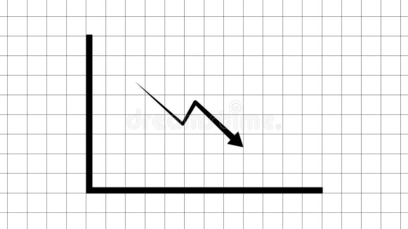
Free with trial A bold black line charts a significant downward trajectory, indicating a sharp decline, against a subtle grid. Data analysis decrease illustrations A jagged downward trend line illustrates a sharp decline on a grid background. A bold black line charts a significant downward trajectory, indicating a sharp decline, against a subtle grid
Free with trial Logo design graphic concept creative premium vector stock image top sell. Data analysis decrease vectors Dollar money arrow up down chart diagram inflation rate risk market business. Logo design graphic concept creative premium vector stock image top sell
Free with trial Building wooden bar graph with hand, representing growth and progress -. Data analysis decrease illustrations Building wooden bar graph with hand, representing growth and progress
Free with trial Arrows with dollar signs indicating financial trends and market directions. Data analysis decrease illustrations Arrows with dollar signs indicating financial trends and market directions
Free with trial Simple outline illustration of percent sign continuous single line drawing white background. Data analysis decrease vectors Simple outline illustration continuous single line drawing of percent sign. Simple outline illustration of percent sign continuous single line drawing white background
Free with trial 3d render of stand holding tablet showing bright red descending graph, isolated on a transparent background. Data analysis decrease vectors 3d render of stand holding tablet showing bright red descending graph
Free with trial Minimalist percent sign continuous line drawing icon symbol isolate element white background. Data analysis decrease vectors Minimalist percent sign continuous line drawing icon symbol isolate element
Free with trial Percentage symbol simple single line art drawing outline illustration minimal vector art. Data analysis decrease vectors Percentage symbol simple single line art drawing outline illustration minimal
Free with trial This image displays a 3D bar graph with five vertical bars of decreasing height, rendered in a vibrant pink color. A pink line graph with a sharp downward trajectory originates from the top of the tallest bar and descends across the bars, ending at the base of the shortest bar. The entire composition is isolated on a clean white background, clearly illustrating a negative trend or decline. Data analysis decrease illustrations A pink 3D bar graph with a descending line graph on a white background chart. This image displays a 3D bar graph with five vertical bars of decreasing height, rendered in a vibrant pink color. A pink line graph with a sharp downward trajectory originates from the top of the tallest bar and descends across the bars, ending at the base of the shortest bar. The entire composition is isolated on a clean white background, clearly illustrating a negative trend or decline
Free with trial A minimalist graphic featuring two opposing arrows, one pointing up and the other down, separated by a thick vertical line. The upward-pointing arrow is composed of a dark gray triangle atop a lighter gray rectangle, while the downward-pointing arrow consists of a dark blue triangle below a light blue rectangle. This clean design symbolizes concepts like comparison, contrast, growth, decline, progress, and regression, making it ideal for presentations, infographics, and digital interfaces. Data analysis decrease illustrations Up and Down Arrows with Vertical Divider. A minimalist graphic featuring two opposing arrows, one pointing up and the other down, separated by a thick vertical line. The upward-pointing arrow is composed of a dark gray triangle atop a lighter gray rectangle, while the downward-pointing arrow consists of a dark blue triangle below a light blue rectangle. This clean design symbolizes concepts like comparison, contrast, growth, decline, progress, and regression, making it ideal for presentations, infographics, and digital interfaces.
Free with trial Wooden blocks with the word "COST" beside decreasing stacks of coins, accompanied by a downward arrow symbolizing reduced expenses. Data analysis decrease illustrations Wooden blocks with the word \'COST\' beside decreasing stacks of coins. Wooden blocks with the word "COST" beside decreasing stacks of coins, accompanied by a downward arrow symbolizing reduced expenses
Free with trial A bar graph displaying a downward trend with a large arrow pointing downwards, indicating a decline in values. Data analysis decrease illustrations Decreasing bar graph with downward arrow. A bar graph displaying a downward trend with a large arrow pointing downwards, indicating a decline in values
Free with trial Rejection, negative feedback, failure, financial loss, poor performance, declining trends. Hand raised in stop gesture, sad face and declining bar graph. Rejection and negative feedback concept. Data analysis decrease illustrations Hand Gesture with Sad Face and Declining Bar Graph Rejection, Negative Trends, or Failure Concepts. Rejection, negative feedback, failure, financial loss, poor performance, declining trends. Hand raised in stop gesture, sad face and declining bar graph. Rejection and negative feedback concept
Free with trial This image depicts a sound wave spectrum with various colors representing different frequencies and amplitudes. The left side of the image shows a dense cluster of pink and purple waves, indicating high amplitude and frequency. The middle section transitions to blue, showing a decrease in amplitude and frequency. The right side features turquoise waves, indicating lower frequency and amplitude. Data analysis decrease illustrations Colorful sound wave spectrum. This image depicts a sound wave spectrum with various colors representing different frequencies and amplitudes. The left side of the image shows a dense cluster of pink and purple waves, indicating high amplitude and frequency. The middle section transitions to blue, showing a decrease in amplitude and frequency. The right side features turquoise waves, indicating lower frequency and amplitude
Free with trial Minimalist style percentage illustration continuous line drawing business graph vector art. Data analysis decrease vectors Minimalist style percentage illustration continuous line drawing business graph
Free with trial Decline chart icon. Falling bars symbol. Downward trend illustration. Vector image. EPS 10. Data analysis decrease vectors Decline chart icon. Falling bars symbol. Downward trend illustration. Vector image.
Free with trial Reduction chart icon Vector symbol or sign set collection in black and white outline. Data analysis decrease vectors Reduction chart icon Symbol mark in filled style. Reduction chart icon Vector symbol or sign set collection in black and white outline
Free with trial An illustrative bar chart depicts a clear financial decline, with five orange bars progressively decreasing in height from left to right. Each bar is topped with a black-outlined money bag containing a dollar sign, symbolizing diminishing wealth, income, or investment. This simple, flat design icon effectively conveys concepts of financial loss, economic downturn, decreasing profits, or budget cuts, suitable for business reports, presentations, and articles on market trends or investment risks. Data analysis decrease vectors Financial Decline Bar Chart with Money Bags. An illustrative bar chart depicts a clear financial decline, with five orange bars progressively decreasing in height from left to right. Each bar is topped with a black-outlined money bag containing a dollar sign, symbolizing diminishing wealth, income, or investment. This simple, flat design icon effectively conveys concepts of financial loss, economic downturn, decreasing profits, or budget cuts, suitable for business reports, presentations, and articles on market trends or investment risks.
Free with trial A 3D bar graph with bars of decreasing height, representing a downward trend. A prominent red arrow points downwards, signifying a decline or loss. The background is a subtle gradient. This visual effectively communicates concepts like financial crisis, economic recession, market crash, or business failure. Data analysis decrease illustrations Financial downturn illustrated by a declining bar graph and red arrow. A 3D bar graph with bars of decreasing height, representing a downward trend. A prominent red arrow points downwards, signifying a decline or loss. The background is a subtle gradient. This visual effectively communicates concepts like financial crisis, economic recession, market crash, or business failure
Free with trial Growth and decline chart icon in flat design. Business trend arrow symbol illustration. Profit and loss concept. Data analysis decrease vectors Growth and decline chart icon in flat design. Business trend arrow symbol. Profit and loss concept
Free with trial Chart decline icon. Business loss symbol. Vector trend design. Black background shape. EPS 10. Data analysis decrease vectors Chart decline icon. Business loss symbol. Vector trend design. Black background shape.
Free with trial A detailed red candlestick chart illustrating a consistent downward trend over time. Data analysis decrease illustrations Red candlestick chart showing downward trend. A detailed red candlestick chart illustrating a consistent downward trend over time
Free with trial A magnifying glass highlights glowing red business growth chart on dark background. Data analysis decrease illustrations Magnifying glass highlights glowing red business growth chart on dark background
Free with trial A stark red arrow plunges downwards across a gray bar graph, symbolizing a significant financial or economic downturn. Data analysis decrease illustrations Red arrow shows steep decline on gray bar graph. A stark red arrow plunges downwards across a gray bar graph, symbolizing a significant financial or economic downturn
Free with trial A 3D rendering of a bar graph with teal bars of decreasing height, indicating a downward trend. A bold red arrow overlays the graph, sharply descending and pointing towards the lowest bar, visually representing a significant loss or decline. The background is slightly blurred, suggesting a professional or office environment. Data analysis decrease illustrations Business graph showing a sharp decline with a red arrow pointing downwards. A 3D rendering of a bar graph with teal bars of decreasing height, indicating a downward trend. A bold red arrow overlays the graph, sharply descending and pointing towards the lowest bar, visually representing a significant loss or decline. The background is slightly blurred, suggesting a professional or office environment
Free with trial A prominent downward-pointing arrow is meticulously constructed from a dense arrangement of small, glossy black spheres. The spheres create a textured, three-dimensional effect against the stark white background, with a soft shadow beneath. Data analysis decrease illustrations Downward Arrow Formed by Black Spheres on White Background down arrow direction. A prominent downward-pointing arrow is meticulously constructed from a dense arrangement of small, glossy black spheres. The spheres create a textured, three-dimensional effect against the stark white background, with a soft shadow beneath
Free with trial Close-up of a man holding a tablet showing a stock market crash graph. The image represents financial loss, economic recession, and investment risks. Data analysis decrease illustrations Analyzing Stock Market Downturn on Tablet Device. Close-up of a man holding a tablet showing a stock market crash graph. The image represents financial loss, economic recession, and investment risks
Free with trial A 3D-rendered image depicts a red arrow pointing downwards, symbolizing a market decline or economic downturn. The arrow rests on a dark, textured surface, enhancing the visual representation of hardship. This image, generated by AI, is ideal for illustrating articles or presentations concerning fin. Data analysis decrease illustrations Downward Trend. A 3D-rendered image depicts a red arrow pointing downwards, symbolizing a market decline or economic downturn. The arrow rests on a dark, textured surface, enhancing the visual representation of hardship. This image, generated by AI, is ideal for illustrating articles or presentations concerning fin
Free with trial Illustration of stock market losses. Bankrupt financial information concept with arrows pointing down. Stock market correction concept. Descending trading graph. Data analysis decrease vectors Illustration of stock market losses. Bankrupt financial information concept with arrows pointing down. Stock market correction
Free with trial Downward-sloping chart with a sad face, green shoe, and question mark in speech bubble. Ideal for decline, confusion, business struggles, feedback, decision-making search or mystery. Simple flat. Data analysis decrease illustrations Declining Trend with Sad Face and a Shoe Mystery in Speech Bubble. Downward-sloping chart with a sad face, green shoe, and question mark in speech bubble. Ideal for decline, confusion, business struggles, feedback, decision-making search or mystery. Simple flat
Free with trial A stark white line graph depicts a significant downward trend with sharp fluctuations against a dark grid. Data analysis decrease illustrations Sharp downward trend illustrated by a jagged white line graph on a black grid background. A stark white line graph depicts a significant downward trend with sharp fluctuations against a dark grid
Free with trial Gear symbol illustrating a mechanical process with an arrow pointing down, representing decreasing output, declining performance, or a reduction in industrial operations. Data analysis decrease vectors Gear icon indicating declining production process. Gear symbol illustrating a mechanical process with an arrow pointing down, representing decreasing output, declining performance, or a reduction in industrial operations
Free with trial Red zigzag line graph with broken arrows pointing up and down. Business metaphor for market volatility and financial crisis. Handdrawn zig zag arrows. Data analysis decrease vectors Red zigzag line graph with broken arrows pointing up and down. Market volatility and financial crisis. Zig zag arrows. Red zigzag line graph with broken arrows pointing up and down. Business metaphor for market volatility and financial crisis. Handdrawn zig zag arrows
Free with trial Decline Chart simple icons set designed in filled, outline, line and stroke style. Data analysis decrease vectors Decline Chart simple icons set designed in filled and stroke style. Decline Chart simple icons set designed in filled, outline, line and stroke style
Free with trial A 3D render depicts a series of translucent blue glass bars arranged in ascending order, representing a bar chart. A large, sharp blue glass arrow points downwards, diagonally crossing the bars and indicating a sharp decline or negative trend. The composition is set against a light gray, subtly textured background, emphasizing the abstract and conceptual nature of the graphic. Data analysis decrease illustrations Blue Glass Bar Chart with Downward Arrow Symbolizing Financial Decline graph. A 3D render depicts a series of translucent blue glass bars arranged in ascending order, representing a bar chart. A large, sharp blue glass arrow points downwards, diagonally crossing the bars and indicating a sharp decline or negative trend. The composition is set against a light gray, subtly textured background, emphasizing the abstract and conceptual nature of the graphic
Free with trial A 3D rendered image features two bold, orange arrows on a white background. One arrow points directly upwards, and the other points directly downwards, positioned side-by-side. The arrows have a smooth, glossy finish and cast subtle shadows, creating a sense of depth. The composition is clean and graphic, representing opposing directions or concepts. Data analysis decrease illustrations 3D Rendered Orange Up and Down Arrows on White Background direction movement. A 3D rendered image features two bold, orange arrows on a white background. One arrow points directly upwards, and the other points directly downwards, positioned side-by-side. The arrows have a smooth, glossy finish and cast subtle shadows, creating a sense of depth. The composition is clean and graphic, representing opposing directions or concepts
Free with trial This vector graphic depicts a magnifying glass focused on a female figure and a declining bar graph, symbolizing the. Data analysis decrease illustrations Women\'s Job Loss Magnifying Glass on Female Employment Decline. This vector graphic depicts a magnifying glass focused on a female figure and a declining bar graph, symbolizing the.
Free with trial A simple illustration depicting flat business growth. A horizontal arrow points to the right, indicating stagnation or no significant increase. The chart is clean and minimalist, suitable for presentations, reports, and articles discussing economic challenges or business performance. The image can be used to represent a lack of progress, a plateau in growth, or a need for strategic change. Data analysis decrease illustrations Flat Business Growth Chart. A simple illustration depicting flat business growth. A horizontal arrow points to the right, indicating stagnation or no significant increase. The chart is clean and minimalist, suitable for presentations, reports, and articles discussing economic challenges or business performance. The image can be used to represent a lack of progress, a plateau in growth, or a need for strategic change.
Free with trial A detailed financial chart showing a downward trend in stock prices, represented by red candlesticks and a downward arrow. Data analysis decrease illustrations Downward stock market trend with red candlesticks. A detailed financial chart showing a downward trend in stock prices, represented by red candlesticks and a downward arrow
Free with trial A bar graph illustrating growth trends with notable peaks and valleys, highlighting significant increases and decreases over time. Data analysis decrease illustrations Graph showing steady growth with peaks and valleys. A bar graph illustrating growth trends with notable peaks and valleys, highlighting significant increases and decreases over time
Free with trial A close-up view of a red stock market chart displaying a strong downward trend. Candlestick bars and a fluctuating line graph indicate a significant decline in stock prices. Red arrows point downwards, emphasizing the negative movement. The background is dark with a subtle grid pattern and a bright light source on the left. Data analysis decrease illustrations Red Stock Market Chart Showing Downward Trend graph. A close-up view of a red stock market chart displaying a strong downward trend. Candlestick bars and a fluctuating line graph indicate a significant decline in stock prices. Red arrows point downwards, emphasizing the negative movement. The background is dark with a subtle grid pattern and a bright light source on the left
Free with trial Three black arrows pointing downwards against a clean, bright white background. Generative AI. Data analysis decrease illustrations Three DownwardPointing Arrows on a White Background. Three black arrows pointing downwards against a clean, bright white background. Generative AI