Free with trial Two distinct lines converge in an engaging graph, illustrating contrasting trends. The sharp gradient colors enhance the visual impact, emphasizing change and growth. Data analysis decrease illustrations Dynamic Trends Revealed Through Shifting Data in Vibrant Gradient Hues. Two distinct lines converge in an engaging graph, illustrating contrasting trends. The sharp gradient colors enhance the visual impact, emphasizing change and growth
Free with trial Financial chart with red candlesticks showing a downtrend, glowing on a dark background. Represents stock market downturn, financial crisis. 3D Rendering. Data analysis decrease illustrations Financial chart with falling red candlesticks and data on a dark interface backdrop, representing market decline and economic loss. Financial chart with red candlesticks showing a downtrend, glowing on a dark background. Represents stock market downturn, financial crisis. 3D Rendering
Free with trial Line chart with red and yellow bars on a black grid background, illustrating a steep decline. The graph features jagged peaks and troughs, indicating significant volatility. The use of bright colors against the dark grid enhances the dramatic effect, commonly associated with financial market downturns. Gridlines and numerical axes suggest precise data metrics. Data analysis decrease illustrations Stock Market Chart With Downturn. A Dramatic Finance Graph Depicts Economic Recession. Line chart with red and yellow bars on a black grid background, illustrating a steep decline. The graph features jagged peaks and troughs, indicating significant volatility. The use of bright colors against the dark grid enhances the dramatic effect, commonly associated with financial market downturns. Gridlines and numerical axes suggest precise data metrics.
Free with trial Two distinct lines illustrate a decrease and an increase, creating a dynamic contrast in shades of orange that captures attention and represents change. Data analysis decrease illustrations Visual Representation of Contrasting Trends With Realistic Orange Hues. Two distinct lines illustrate a decrease and an increase, creating a dynamic contrast in shades of orange that captures attention and represents change
Free with trial A crisp vector illustration of an orange downward trending line graph, signifying a fall, loss, or negative economic movement. This versatile icon is perfect for financial dashboards, business analysis, or reporting on declining statistics. Its clear visual representation quickly conveys a reduction in values, making it highly effective, vector design Generative AI. Data analysis decrease vectors Orange Downward Trending Financial Graph, vector design Generative AI. A crisp vector illustration of an orange downward trending line graph, signifying a fall, loss, or negative economic movement. This versatile icon is perfect for financial dashboards, business analysis, or reporting on declining statistics. Its clear visual representation quickly conveys a reduction in values, making it highly effective, vector design Generative AI
Free with trial Falling down charts against downtown silhouette background image, Economy decrease 3d illustration wallpaper picture backdrop. Depression concept for business presentation corporate. Data analysis decrease illustrations Falling down charts against downtown silhouette background image, ai generated. Falling down charts against downtown silhouette background image, Economy decrease 3d illustration wallpaper picture backdrop. Depression concept for business presentation corporate
Free with trial Visualize impactful data with this dynamic water intensity graph, showcasing a strong downward trend over time. Perfect for illustrating progress in conservation and efficiency. Data analysis decrease vectors Dramatic water graph visually represents declining water intensity over time, showing efficiency gains. Visualize impactful data with this dynamic water intensity graph, showcasing a strong downward trend over time. Perfect for illustrating progress in conservation and efficiency
Free with trial A financial market graph on a blue background illustrating investment trends, this is a visual representation of market fluctuations and volume, reflecting economic movements, investment strategies and business performance analysis. Generative AI. Data analysis decrease illustrations Financial markets graph on a blue background showing investment trends. A financial market graph on a blue background illustrating investment trends, this is a visual representation of market fluctuations and volume, reflecting economic movements, investment strategies and business performance analysis. Generative AI
Free with trial Percentage sign set hand drawn. math calculation, finance statistics, increase decrease percentage sign vector sketch. isolated black illustration. Data analysis decrease illustrations Percentage sign set sketch hand drawn vector. percentage sign set hand drawn. math calculation, finance statistics, increase decrease percentage sign vector sketch. isolated black illustration
Free with trial Dollar coin next to declining bar graph and directional arrow illustrating financial downturn. Ideal for finance, economics, investment, stock market, loss, budget analysis, simple flat metaphor. Data analysis decrease illustrations Dollar Sign Coin and Declining Bar Chart with Arrow Indicating Financial Downward Trend. Dollar coin next to declining bar graph and directional arrow illustrating financial downturn. Ideal for finance, economics, investment, stock market, loss, budget analysis, simple flat metaphor
Free with trial Math percentage sign hand drawn. calculation finance, statistics increase, decrease ratio math percentage sign vector sketch. isolated black illustration. Data analysis decrease vectors Math percentage sign sketch hand drawn vector. math percentage sign hand drawn. calculation finance, statistics increase, decrease ratio math percentage sign vector sketch. isolated black illustration
Free with trial Math percentage sign hand drawn. calculation finance, statistics increase, decrease ratio math percentage sign vector sketch. isolated black illustration. Data analysis decrease illustrations Math percentage sign sketch hand drawn vector. math percentage sign hand drawn. calculation finance, statistics increase, decrease ratio math percentage sign vector sketch. isolated black illustration
Free with trial Math percentage sign hand drawn. calculation finance, statistics increase, decrease ratio math percentage sign vector sketch. isolated color illustration. Data analysis decrease illustrations Math percentage sign sketch hand drawn vector. math percentage sign hand drawn. calculation finance, statistics increase, decrease ratio math percentage sign vector sketch. isolated color illustration
Free with trial A 3D render displays a white rectangular surface with a grid pattern, representing a chart. A wavy blue line traverses the grid, with two red circular markers indicating specific points on the line. The graph is presented against a soft purple background. Data analysis decrease illustrations 3D Render of a Line Graph with Red Markers on a Grid Background chart data. A 3D render displays a white rectangular surface with a grid pattern, representing a chart. A wavy blue line traverses the grid, with two red circular markers indicating specific points on the line. The graph is presented against a soft purple background
Free with trial Gold coins stacked in increasing columns with decreasing stock market graph in background representing the inverse relationship between gold and stocks. image. Data analysis decrease illustrations Stacks of gold coins growing with stock market data declining in background. Gold coins stacked in increasing columns with decreasing stock market graph in background representing the inverse relationship between gold and stocks. image
Free with trial Woman dressed in gray and red points at a downward red line graph symbolizing loss or decline, conveying concern and analysis mood. Generative AI. Data analysis decrease vectors Woman pointing at declining red line graph showing financial loss vector illustration. Woman dressed in gray and red points at a downward red line graph symbolizing loss or decline, conveying concern and analysis mood. Generative AI
Free with trial This image captures a conceptual business planning session, suggesting a focus on market trend analysis, charting of progress and addressing potential declines. Data analysis decrease illustrations Conceptual business strategy session with downward trend and coffee break. This image captures a conceptual business planning session, suggesting a focus on market trend analysis, charting of progress and addressing potential declines
Free with trial Symbol percentage sign hand drawn. math calculation, finance statistics, increase decrease symbol percentage sign vector sketch. isolated black illustration. Data analysis decrease illustrations Symbol percentage sign sketch hand drawn vector. symbol percentage sign hand drawn. math calculation, finance statistics, increase decrease symbol percentage sign vector sketch. isolated black illustration
Free with trial Symbol percentage sign hand drawn. math calculation, finance statistics, increase decrease symbol percentage sign vector sketch. isolated color illustration. Data analysis decrease illustrations Symbol percentage sign sketch hand drawn vector. symbol percentage sign hand drawn. math calculation, finance statistics, increase decrease symbol percentage sign vector sketch. isolated color illustration
Free with trial Symbol percentage sign hand drawn. math calculation, finance statistics, increase decrease symbol percentage sign vector sketch. isolated color illustration. Data analysis decrease vectors Symbol percentage sign sketch hand drawn vector. symbol percentage sign hand drawn. math calculation, finance statistics, increase decrease symbol percentage sign vector sketch. isolated color illustration
Free with trial Symbol percentage sign hand drawn. math calculation, finance statistics, increase decrease symbol percentage sign vector sketch. isolated black illustration. Data analysis decrease illustrations Symbol percentage sign sketch hand drawn vector. symbol percentage sign hand drawn. math calculation, finance statistics, increase decrease symbol percentage sign vector sketch. isolated black illustration
Free with trial Woman holding glasses and a tablet while examining large upward and downward arrows. Ideal for business analysis, decision-making, growth, statistics, market trends, planning, and presentations in. Data analysis decrease illustrations Professional woman analyzing upward and downward trends alongside graphical arrows and metrics. Woman holding glasses and a tablet while examining large upward and downward arrows. Ideal for business analysis, decision-making, growth, statistics, market trends, planning, and presentations in
Free with trial Planet earth with stock exchange data showing falling prices, indicating a global financial crisis. Data analysis decrease illustrations Stock market crash affecting global economy, showing falling prices and financial crisis. Planet earth with stock exchange data showing falling prices, indicating a global financial crisis
Free with trial A bright red arrow points upwards symbolizing growth and profit, while a vibrant green arrow points downwards signifying a decrease or loss. Ideal for finance and business concepts. Data analysis decrease vectors Red up arrow and green down arrow symbols representing financial growth and decline. A bright red arrow points upwards symbolizing growth and profit, while a vibrant green arrow points downwards signifying a decrease or loss. Ideal for finance and business concepts
Free with trial Line chart illustrating an upward trend, featuring candlestick patterns and glowing dots against a dark background. The arrangement indicates a positive movement in data, reflecting investment and financial growth. Blue and orange tones highlight data points and lines, providing a visual contrast that enhances readability. The abstract style conveys a modern financial theme, emphasizing success and progress in stock markets. Data analysis decrease illustrations Dynamic stock market chart showing upward trend for investment and financial growth success concept. Line chart illustrating an upward trend, featuring. Line chart illustrating an upward trend, featuring candlestick patterns and glowing dots against a dark background. The arrangement indicates a positive movement in data, reflecting investment and financial growth. Blue and orange tones highlight data points and lines, providing a visual contrast that enhances readability. The abstract style conveys a modern financial theme, emphasizing success and progress in stock markets.
Free with trial A hand uses a stylus to draw a glowing bar graph. The graph illustrates increasing income and decreasing expenses, symbolizing financial management and growth. Data analysis decrease illustrations Hand drawing a financial graph showing income growth and expense decrease. A hand uses a stylus to draw a glowing bar graph. The graph illustrates increasing income and decreasing expenses, symbolizing financial management and growth
Free with trial Finance percentage sign hand drawn. statistics increase, decrease ratio, proportion interest finance percentage sign vector sketch. isolated color illustration. Data analysis decrease vectors Finance percentage sign sketch hand drawn vector. finance percentage sign hand drawn. statistics increase, decrease ratio, proportion interest finance percentage sign vector sketch. isolated color illustration
Free with trial Finance percentage sign hand drawn. statistics increase, decrease ratio, proportion interest finance percentage sign vector sketch. isolated black illustration. Data analysis decrease vectors Finance percentage sign sketch hand drawn vector. finance percentage sign hand drawn. statistics increase, decrease ratio, proportion interest finance percentage sign vector sketch. isolated black illustration
Free with trial Finance percentage sign hand drawn. statistics increase, decrease ratio, proportion interest finance percentage sign vector sketch. isolated black illustration. Data analysis decrease illustrations Finance percentage sign sketch hand drawn vector. finance percentage sign hand drawn. statistics increase, decrease ratio, proportion interest finance percentage sign vector sketch. isolated black illustration
Free with trial A person's open palm supports a glowing blue graph illustrating a downward trend for cost and an upward trend for quality against a dark background. Data analysis decrease illustrations Hand holding graph showing decreasing cost and increasing quality decrease. A person's open palm supports a glowing blue graph illustrating a downward trend for cost and an upward trend for quality against a dark background
Free with trial A three-dimensional line graph depicts a significant decrease in market value over a period of four months, indicated by a sharp downward trend. Data analysis decrease illustrations Sharp market value decline over time illustrated by a downward trend graph. A three-dimensional line graph depicts a significant decrease in market value over a period of four months, indicated by a sharp downward trend
Free with trial Colorful isometric bar chart showing business data and growth with bars of different height, colored blue, yellow and green. Isolated on a transparent background, perfect for business presentations or infographics. Data analysis decrease vectors Colorful business chart illustration on transparent background AI Generated. Colorful isometric bar chart showing business data and growth with bars of different height, colored blue, yellow and green. Isolated on a transparent background, perfect for business presentations or infographics.
Free with trial A stark visual representation of a financial downturn with a bold red arrow pointing downwards. This graphic captures market decline and economic recession trends, ideal for financial analysis and reporting. Data analysis decrease illustrations Financial downturn visualized red arrow chart showing decline candlestick graph indicating market drop economic recession trend. A stark visual representation of a financial downturn with a bold red arrow pointing downwards. This graphic captures market decline and economic recession trends, ideal for financial analysis and reporting
Free with trial This visually striking graph displays two contrasting trends one line shows a sharp decrease while the other illustrates a significant increase in an engaging orange palette. Data analysis decrease illustrations Dynamic Trends of Change Illustrated Through Contrasting Lines in Orange Hues. This visually striking graph displays two contrasting trends one line shows a sharp decrease while the other illustrates a significant increase in an engaging orange palette
Free with trial A pair of hands holds a sheet of paper displaying a red line graph on a grid pattern the graph illustrates a downward trend, indicating a decline in business, finance or economy the image represents loss, failure, or a recession, generated by AI. Data analysis decrease illustrations Hands holding paper showing a declining red business graph data. a pair of hands holds a sheet of paper displaying a red line graph on a grid pattern the graph illustrates a downward trend, indicating a decline in business, finance or economy the image represents loss, failure, or a recession, generated by AI.
Free with trial Two distinct lines illustrate contrasting trends, one rising and the other falling. The gradient colors blend harmoniously, enhancing the visual impact. Data analysis decrease illustrations Analysis of Fluctuating Trends in a Colorful Gradient Landscape Representation. Two distinct lines illustrate contrasting trends, one rising and the other falling. The gradient colors blend harmoniously, enhancing the visual impact
Free with trial A whiteboard easel displays a bar graph with a downward trend and a red arrow indicating a decrease, isolated on a white background. Data analysis decrease illustrations Business bar chart showing decline isolated on white background. A whiteboard easel displays a bar graph with a downward trend and a red arrow indicating a decrease, isolated on a white background
Free with trial A 3D rendering features a bar graph with three vertical bars in blue and yellow. Above the graph, a molecular structure is depicted with a central yellow sphere connected to three blue spheres by white rods. The entire graphic is isolated on a clean white background. Data analysis decrease illustrations 3D bar graph with molecular structure above on a white background chart data. A 3D rendering features a bar graph with three vertical bars in blue and yellow. Above the graph, a molecular structure is depicted with a central yellow sphere connected to three blue spheres by white rods. The entire graphic is isolated on a clean white background
Free with trial Elevate your everyday style with Abu Taher's collection of Typography T-Shirt Designs, where words meet artistry. Data analysis decrease vectors Collection of 32 icons representing increase and decrease in business and finance. Elevate your everyday style with Abu Taher's collection of Typography T-Shirt Designs, where words meet artistry
Free with trial Statistics percentage sign hand drawn. increase decrease, ratio proportion, interest profit statistics percentage sign vector sketch. isolated color illustration. Data analysis decrease illustrations Statistics percentage sign sketch hand drawn vector. statistics percentage sign hand drawn. increase decrease, ratio proportion, interest profit statistics percentage sign vector sketch. isolated color illustration
Free with trial Statistics percentage sign hand drawn. increase decrease, ratio proportion, interest profit statistics percentage sign vector sketch. isolated color illustration. Data analysis decrease illustrations Statistics percentage sign sketch hand drawn vector. statistics percentage sign hand drawn. increase decrease, ratio proportion, interest profit statistics percentage sign vector sketch. isolated color illustration
Free with trial Globe outline with five stars arranged in an arc and a black downward arrow with a cloud above. Ideal for global ranking, review system, feedback, decision-making, quality metrics, trend analysis. Data analysis decrease vectors Global rating concept with stars, globe, and downward arrow indicating feedback or ranking shift. Globe outline with five stars arranged in an arc and a black downward arrow with a cloud above. Ideal for global ranking, review system, feedback, decision-making, quality metrics, trend analysis
Free with trial Signed document with a frown face and declining bar chart symbolizing failure, loss, rejection, or performance drop. Ideal for business, finance, loss, analysis, feedback strategy simple landing. Data analysis decrease vectors Document with Signature, Sad Face, and Bar Graph Highlighting Decline in Performance or Approval. Signed document with a frown face and declining bar chart symbolizing failure, loss, rejection, or performance drop. Ideal for business, finance, loss, analysis, feedback strategy simple landing
Free with trial A 3D render illustrates a downward trending bar chart. Five light blue vertical bars of decreasing height are arranged from left to right. A bright yellow line with an arrow at its end descends across the bars, indicating a negative trend. The background is a solid, soft pink. Data analysis decrease illustrations Downward Trending Bar Chart with Yellow Arrow on a Pink Background graph data. A 3D render illustrates a downward trending bar chart. Five light blue vertical bars of decreasing height are arranged from left to right. A bright yellow line with an arrow at its end descends across the bars, indicating a negative trend. The background is a solid, soft pink
Free with trial Calculation percentage sign hand drawn. finance statistics, increase decrease, ratio proportion calculation percentage sign vector sketch. isolated black illustration. Data analysis decrease vectors Calculation percentage sign sketch hand drawn vector. calculation percentage sign hand drawn. finance statistics, increase decrease, ratio proportion calculation percentage sign vector sketch. isolated black illustration
Free with trial Calculation percentage sign hand drawn. finance statistics, increase decrease, ratio proportion calculation percentage sign vector sketch. isolated black illustration. Data analysis decrease illustrations Calculation percentage sign sketch hand drawn vector. calculation percentage sign hand drawn. finance statistics, increase decrease, ratio proportion calculation percentage sign vector sketch. isolated black illustration
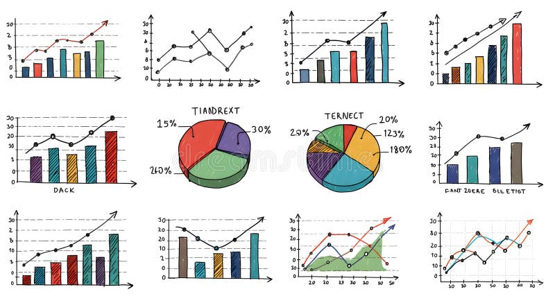
Free with trial A collection of hand-drawn style charts and diagrams that can be used to display data and analyze progress, ideal for business presentations, reports, or data visualizations. Data analysis decrease illustrations Hand-Drawn Collection of Statistical Charts and Diagrams for Business Analytics. A collection of hand-drawn style charts and diagrams that can be used to display data and analyze progress, ideal for business presentations, reports, or data visualizations
Free with trial A character stands alone holding a big red arrow pointing downwards, symbolizing a decrease or decline, against a plain white backdrop. Data analysis decrease illustrations Character Holds Large Red Downward Arrow Representing Decline on White Background. A character stands alone holding a big red arrow pointing downwards, symbolizing a decrease or decline, against a plain white backdrop
Free with trial 3D red zigzag arrow trending downward across white studio backdrop, casting subtle shadow. Graph, finance, analysis, growth, decline, investment, strategy. Data analysis decrease illustrations 3D red zigzag arrow trending downward across white studio backdrop, casting subtle shadow
Free with trial Financial chart with red and yellow candlesticks and a downward yellow arrow, on a dark background, concept of market crash and recession. 3D Rendering. Data analysis decrease illustrations Abstract financial chart with red and yellow candlesticks showing a downward trend and falling market data on dark background. 3D. Financial chart with red and yellow candlesticks and a downward yellow arrow, on a dark background, concept of market crash and recession. 3D Rendering
Free with trial Illustration shows a man facing a thick downward arrow indicating decline or loss in business or finance, creating a serious and contemplative mood. Generative AI. Data analysis decrease vectors Man standing near downward arrow symbolizing decline or decrease in business or finance concepts. Illustration shows a man facing a thick downward arrow indicating decline or loss in business or finance, creating a serious and contemplative mood. Generative AI
Free with trial A woman contemplates a declining bar graph, symbolizing business challenges and financial analysis. Data analysis decrease vectors Woman Analyzing Declining Bar Graph - Business and Finance Visualization Illustration. A woman contemplates a declining bar graph, symbolizing business challenges and financial analysis.
Free with trial Person holding checklist and tablet with a clock icon, next to a dollar sign and downward arrow. Ideal for financial management, time efficiency, budget planning, productivity, cost reduction. Data analysis decrease illustrations Businessperson Analyzing Checklist and Tablet as Costs Decrease Indicated by Downward Dollar Arrow. Person holding checklist and tablet with a clock icon, next to a dollar sign and downward arrow. Ideal for financial management, time efficiency, budget planning, productivity, cost reduction
Free with trial A 3D rendered graph displays a downward trend. Two tall green bars are followed by two shorter pink bars, indicating a decrease in value. A thick yellow arrow with a sharp point descends diagonally across the bars, emphasizing the decline. The background is a solid, light blue color. Data analysis decrease illustrations Falling graph with green and pink bars and a yellow arrow pointing down chart decline. A 3D rendered graph displays a downward trend. Two tall green bars are followed by two shorter pink bars, indicating a decrease in value. A thick yellow arrow with a sharp point descends diagonally across the bars, emphasizing the decline. The background is a solid, light blue color
Free with trial Downward trending graph with red and black bars on a whiteboard mounted on an easel. Data analysis decrease illustrations Whiteboard displaying a downward trending graph with red and black bars chart data. Downward trending graph with red and black bars on a whiteboard mounted on an easel
Free with trial Steep downward trending red line graph with an arrow on a whiteboard mounted on an easel. Data analysis decrease illustrations Whiteboard showing a steep downward trending red line graph on an easel chart data. Steep downward trending red line graph with an arrow on a whiteboard mounted on an easel
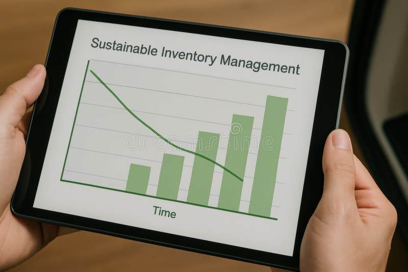
Free with trial A detailed graph displaying sustainable inventory management trends on a tablet device. This image highlights data analytics for business strategy and efficiency. Data analysis decrease illustrations Sustainable Inventory Management Graph on Tablet Device for Business Analytics and Strategy. A detailed graph displaying sustainable inventory management trends on a tablet device. This image highlights data analytics for business strategy and efficiency
Free with trial A person's open palm supports a glowing digital graph illustrating a decrease in cost and an increase in quality, set against a dark background. Data analysis decrease illustrations Hand holding glowing graph showing cost decreasing and quality increasing palm open. A person's open palm supports a glowing digital graph illustrating a decrease in cost and an increase in quality, set against a dark background
Free with trial A stark pink line graph shows a dramatic downward trend against a dark green grid, symbolizing a significant loss or decrease. Data analysis decrease illustrations Sharp decline illustrated by a jagged pink line graph on a dark green grid background. A stark pink line graph shows a dramatic downward trend against a dark green grid, symbolizing a significant loss or decrease
Free with trial Displaying 3D bar columns on analytics dashboard, with overlaid line graph and numeric labels. Data, visualization, dashboard, analytics, infographic, 3d, abstract. Data analysis decrease illustrations Displaying 3D bar columns on analytics dashboard, with overlaid line graph and numeric labels
Free with trial A minimalist 3D white bar chart displays a clear downward trend. Four bars of decreasing height are shown, with a sharp white arrow pointing downwards from the top of the second bar, indicating a significant decline. The chart is presented in isolation against a clean white background, emphasizing the concept of financial or economic downturn. Data analysis decrease illustrations 3D White Bar Chart with a Downward Trending Arrow Symbolizing Decline graph decrease. A minimalist 3D white bar chart displays a clear downward trend. Four bars of decreasing height are shown, with a sharp white arrow pointing downwards from the top of the second bar, indicating a significant decline. The chart is presented in isolation against a clean white background, emphasizing the concept of financial or economic downturn
Free with trial A 3D illustration depicting financial concepts. A purple rectangular bar shows a sharp red downward trending arrow. Below it, another purple bar displays a candlestick chart with red and blue bars. To the right, a magnifying glass with an orange handle and turquoise lens hovers, suggesting analysis. A small, colorful pie chart with red, yellow, and blue segments is positioned to the left. The. Data analysis decrease illustrations 3D Financial Downward Trend Chart with Magnifying Glass and Pie Chart finance stock market. A 3D illustration depicting financial concepts. A purple rectangular bar shows a sharp red downward trending arrow. Below it, another purple bar displays a candlestick chart with red and blue bars. To the right, a magnifying glass with an orange handle and turquoise lens hovers, suggesting analysis. A small, colorful pie chart with red, yellow, and blue segments is positioned to the left. The
Free with trial A handwritten chart depicting a downward trend, possibly representing financial loss or a decrease in value, alongside a red light. Data analysis decrease illustrations A downtrend chart drawn on a notebook with a red warning light, symbolizing financial loss. A handwritten chart depicting a downward trend, possibly representing financial loss or a decrease in value, alongside a red light
Free with trial Rising thick red arrow filling grid lines in design studio, with blue pink charts, dotted bars. Financial, analytics, data, visualization, digital, technology, infographic. Data analysis decrease illustrations Rising thick red arrow filling grid lines in design studio, with blue pink charts, dotted bars
Free with trial A simple 3D bar chart composed of three colored cubes stands on a white background. The cubes are arranged in ascending order of height from left to right: a small blue cube, a medium yellow cube, and a tall red cube. This arrangement visually represents increasing data or progress. Data analysis decrease illustrations Colorful Bar Chart with Red, Yellow, and Blue Cubes on White Background graph statistics. A simple 3D bar chart composed of three colored cubes stands on a white background. The cubes are arranged in ascending order of height from left to right: a small blue cube, a medium yellow cube, and a tall red cube. This arrangement visually represents increasing data or progress
Free with trial A 3D illustration depicting financial growth. A line graph with blue and red data points ascends across a light blue background. Interspersed are green and red candlestick bars, representing market fluctuations. Stacks of gold coins and individual coins with dollar signs are arranged at the base of the chart, symbolizing wealth and investment. Data analysis decrease illustrations 3D Financial Growth Chart with Stacks of Gold Coins and Candlestick Bars finance graph. A 3D illustration depicting financial growth. A line graph with blue and red data points ascends across a light blue background. Interspersed are green and red candlestick bars, representing market fluctuations. Stacks of gold coins and individual coins with dollar signs are arranged at the base of the chart, symbolizing wealth and investment
Free with trial Colorful growth chart with red and teal bars showing upward and downward arrows on a light background representing data trends progress decline business performance and financial analytics visual. Data analysis decrease illustrations Colorful growth chart with red and teal bars and upward and downward arrows on light background. colorful growth chart with red and teal bars showing upward and downward arrows on a light background representing data trends progress decline business performance and financial analytics visual
Free with trial This illustration depicts upward and downward trending arrows on a grid, symbolizing market fluctuations, business trends, and financial performance analysis. Data analysis decrease vectors Illustration of upward and downward trending arrows on a grid isolated on white background. This illustration depicts upward and downward trending arrows on a grid, symbolizing market fluctuations, business trends, and financial performance analysis
Free with trial A minimalist 3D render displays three rounded rectangular bars representing a bar graph. The tallest bar is a soft blue, followed by a medium green bar, and the shortest is a light pink bar. They are arranged in descending order of height and stand on a plain white background, suggesting data visualization or progress. Data analysis decrease illustrations Three colorful 3D bar graph elements in blue green and pink on a white background chart. A minimalist 3D render displays three rounded rectangular bars representing a bar graph. The tallest bar is a soft blue, followed by a medium green bar, and the shortest is a light pink bar. They are arranged in descending order of height and stand on a plain white background, suggesting data visualization or progress
Free with trial A 3D rendered bar chart with yellow, pink, and teal bars stands against a light purple background. A purple magnifying glass with a yellow handle is positioned over the chart, suggesting analysis. A thin line with pink dots connects the tops of the bars, indicating a trend. Data analysis decrease illustrations 3D Bar Chart with Magnifying Glass and Trend Line on Purple Background graph statistics. A 3D rendered bar chart with yellow, pink, and teal bars stands against a light purple background. A purple magnifying glass with a yellow handle is positioned over the chart, suggesting analysis. A thin line with pink dots connects the tops of the bars, indicating a trend
Free with trial Stacks of gold coins decrease in size as a red arrow points downwards over a stock market chart, indicating financial decline. Data analysis decrease illustrations Stacks of gold coins decreasing in size with a red downward arrow and stock market chart red arrow. Stacks of gold coins decrease in size as a red arrow points downwards over a stock market chart, indicating financial decline
Free with trial This graphic illustrates various colorful bars and shapes representing data trends and statistics in a bold, abstract style. Data analysis decrease illustrations Colorful abstract data visualization with bars, lines, and circles depicting trends and statistics. This graphic illustrates various colorful bars and shapes representing data trends and statistics in a bold, abstract style.
Free with trial A 3D rendered image of a businessman presenting financial data on a large screen, showing various charts and graphs. Data analysis decrease illustrations Businessman Presenting Financial Charts and Graphs. A 3D rendered image of a businessman presenting financial data on a large screen, showing various charts and graphs.
Free with trial Red background with a downward arrow and grid pattern, with vertical bars at the bottom, suggesting a decline or decrease in a metric Vertical Mobile Wallpaper. Data analysis decrease illustrations Red background, downward arrow with grid pattern, vertical bars suggest decline. red background with a downward arrow and grid pattern, with vertical bars at the bottom, suggesting a decline or decrease in a metric Vertical Mobile Wallpaper
Free with trial Red background with a downward arrow and grid pattern, with vertical bars at the bottom, suggesting a decline or decrease in a metric. Data analysis decrease illustrations Red background, downward arrow with grid pattern, vertical bars suggest decline. red background with a downward arrow and grid pattern, with vertical bars at the bottom, suggesting a decline or decrease in a metric
Free with trial Red textured arrows depict market fluctuations and business trends against a textured background symbolizes economic ups and downs, financial analysis, and investment opportunities with market statistics. Data analysis decrease illustrations Red arrows symbolizing fluctuations representing business trends on a textured background. red textured arrows depict market fluctuations and business trends against a textured background symbolizes economic ups and downs, financial analysis, and investment opportunities with market statistics
Free with trial Three stacks of gold coins decrease in height from left to right, with a red arrow pointing downwards across them. Isolated on a transparent background. Data analysis decrease vectors Stacks of gold coins with red downward trend arrow isolated on a transparent background money. Three stacks of gold coins decrease in height from left to right, with a red arrow pointing downwards across them. Isolated on a transparent background
Free with trial Colorful growth chart featuring orange and teal bars with upward and downward arrows on a clean white background representing progress decline business data trends and financial performance metrics. Data analysis decrease illustrations Colorful growth chart with orange and teal bars and upward and downward arrows on white background. colorful growth chart featuring orange and teal bars with upward and downward arrows on a clean white background representing progress decline business data trends and financial performance metrics
Free with trial A dramatic downward trending graph illustrates the global economic downturn and financial crisis. Red arrows emphasize the sharp decline in the global market, signifying instability, risk, and uncertainty for businesses and investors. Data visualization of a critical economic prediction, generated by AI. Data analysis decrease illustrations Global economic downturn recession financial crisis. A dramatic downward trending graph illustrates the global economic downturn and financial crisis. Red arrows emphasize the sharp decline in the global market, signifying instability, risk, and uncertainty for businesses and investors. Data visualization of a critical economic prediction, generated by AI.
Free with trial Hand-drawn line chart doodle is showing grid backdrop and axis over gradient background, copy space. Data visualization, infographics, analytics, diagram, business, educational, minimalistic. Data analysis decrease illustrations Hand-drawn line chart doodle is showing grid backdrop and axis over gradient background, copy space