Free with trial San Francisco skyline with a financial chart overlay showing red downward trends, glowing data, and buildings in the background, symbolizing market crisis. Data decrease illustrations Double exposure of San Francisco skyline and financial stock market chart with red downward trend, glowing data points, and. San Francisco skyline with a financial chart overlay showing red downward trends, glowing data, and buildings in the background, symbolizing market crisis
Free with trial Set line Arrow, Infographic element, and Financial growth decrease. Glowing neon icon on brick wall. Vector. Data decrease illustrations Set line Arrow, Infographic element, and Financial growth decrease. Glowing neon icon on brick wall. Vector
Free with trial This image displays a grid of nine red percentage symbols, each paired with a directional arrow. The arrows point either upward, downward, or are neutral, indicating trends of increase, decrease, or no change respectively. The symbols are arranged in three rows and three columns, with each symbol and arrow combination repeated in different positions. Data decrease illustrations Collection of red percentage symbols with directional arrows indicating increase or decrease. This image displays a grid of nine red percentage symbols, each paired with a directional arrow. The arrows point either upward, downward, or are neutral, indicating trends of increase, decrease, or no change respectively. The symbols are arranged in three rows and three columns, with each symbol and arrow combination repeated in different positions
Free with trial This is an detailed set of clean line icons for infographic design, corporate data analysis, and finance. Data decrease vectors Clean infographic symbols for corporate data analysis and financial tracking applications. This is an detailed set of clean line icons for infographic design, corporate data analysis, and finance
Free with trial This is an detailed series of analytical icons for data visualization and statistical reporting in a clean line style. Data decrease vectors Comprehensive analytical data and statistics symbols for corporate business presentations. This is an detailed series of analytical icons for data visualization and statistical reporting in a clean line style
Free with trial Abstract financial trading graph with candlestick charts and data analysis on a dark background. Data decrease illustrations Abstract financial trading graph with candlestick charts and data analysis on a dark background
Free with trial The image shows two arrows, one red with a downward direction and a percentage symbol indicating a decrease, and another green with an upward direction and a percentage symbol indicating an increase. These visuals are commonly used to represent opposing trends, such as declines and rises in data like stock prices, economic indicators, or performance metrics. Data decrease illustrations Opposing trends represented by percentage change indicators with upward and downward arrows. The image shows two arrows, one red with a downward direction and a percentage symbol indicating a decrease, and another green with an upward direction and a percentage symbol indicating an increase. These visuals are commonly used to represent opposing trends, such as declines and rises in data like stock prices, economic indicators, or performance metrics
Free with trial A set of nine minimalist vector icons depicting various types of charts and graphs including bar charts, progress bars, and trend lines for data visualization and analytics. Data decrease vectors Collection of simple black glyph icons representing business charts graphs and data analysis. A set of nine minimalist vector icons depicting various types of charts and graphs including bar charts, progress bars, and trend lines for data visualization and analytics
Free with trial Set line Financial growth decrease, Graph, chart, diagram and Clock icon. Vector. Data decrease illustrations Set line Financial growth decrease, Graph, chart, diagram and Clock icon. Vector
Free with trial Decrease bar chart icon set on black circle. Market crash illustration concept. Data decrease vectors Decrease bar chart icon set on black circle. Market crash concept. Decrease bar chart icon set on black circle. Market crash illustration concept
Free with trial Computer Screen Showing Downward Trend Graph in Red. Stock Market Decrease and Economic Problems. Data decrease vectors Computer Screen Showing Downward Trend Graph in Red. Stock Market Decrease and Economic Problems
Free with trial Polished chrome pyramid chart composed of layered tiers, each glowing with illuminated data readouts. Layers decrease in size towards the top, forming a stacked, futuristic appearance. The reflective chrome surface adds a sleek, technology-focused aesthetic, contrasting with the dark background to emphasize the illuminated patterns. Data decrease illustrations A captivating pyramid chart elegantly composed of polished chrome layers, each layer featuring a. Polished chrome pyramid chart composed of layered tiers, each glowing with illuminated data readouts. Layers decrease in size towards the top, forming a stacked, futuristic appearance. The reflective chrome surface adds a sleek, technology-focused aesthetic, contrasting with the dark background to emphasize the illuminated patterns.
Free with trial The image displays a three-dimensional, purple percentage symbol against a plain white background. The symbol appears glossy and modern, likely intended for use in presentations, financial reports, or data visualizations. Data decrease illustrations A sleek purple percentage symbol floating in a white space for financial or data representation. The image displays a three-dimensional, purple percentage symbol against a plain white background. The symbol appears glossy and modern, likely intended for use in presentations, financial reports, or data visualizations
Free with trial Set of icons featuring different types of charts and graphs used for data analysis and business growth isolated on transparent background. Data decrease vectors Collection of various icons representing data analysis and business growth with charts and graphs. Set of icons featuring different types of charts and graphs used for data analysis and business growth isolated on transparent background
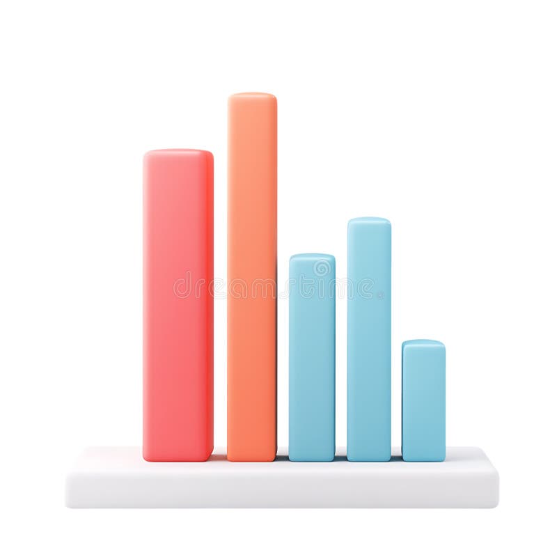
Free with trial Colorful bar chart on a blue background showing data analysis and statistical growth. Generative AI. Data decrease illustrations Colorful bar chart on a blue background showing data analysis and statistical growth
Free with trial Flat design illustration showing colorful bar graph combined with a line chart, both displaying data trends against a simple black background. Data decrease vectors Colorful Bar Graph and Line Chart on Black Background Illustrating Data Analysis and Trends. Flat design illustration showing colorful bar graph combined with a line chart, both displaying data trends against a simple black background.
Free with trial Financial Data Chart Analysis with Glowing Stock Market Uptrend Graph in Blue and Orange Colors, Generated by AI. Data decrease illustrations Financial Data Chart Analysis with Glowing Stock Market Uptrend Graph in Blue and Orange Colors
Free with trial Close Up of L. E. D. Stock Ticker Showing Market Data Prices and Numbers at Night With Blurred Crowd, Generated by AI. Data decrease illustrations Close Up of L.E.D. Stock Ticker Showing Market Data Prices and Numbers at Night With Blurred Crowd
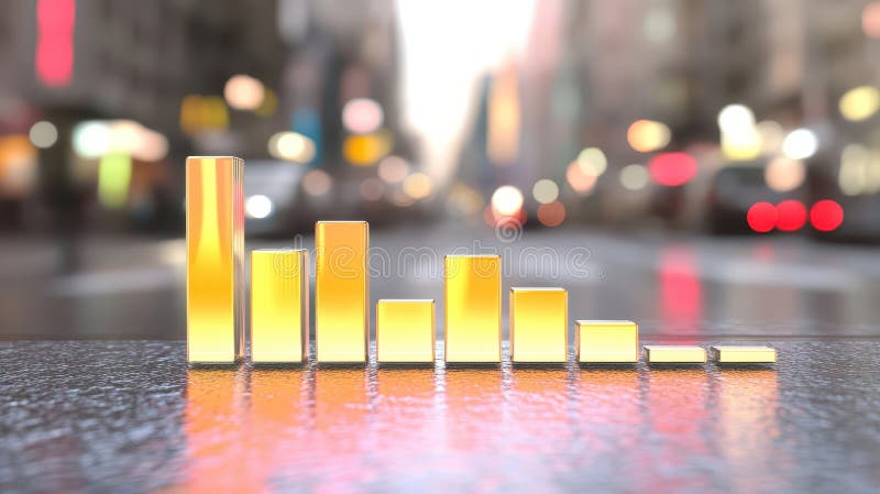
Free with trial Futuristic 3D bar graph displaying quarterly sales data with falling trend. Economic loss concept market crisis analysis illustration. Business finance investment report. Declining. Data decrease illustrations Futuristic 3D bar graph displaying quarterly sales data with falling trend. Economic loss concept, market crisis analysis. Futuristic 3D bar graph displaying quarterly sales data with falling trend. Economic loss concept market crisis analysis illustration. Business finance investment report. Declining.
Free with trial Performance showing colorful graph with magnifying glass and pie chart on white background keywords: graph, chart, data, analytics, statistics. Data decrease illustrations Colorful graph with magnifying glass and pie chart on white background Keywords: graph, chart, data, analytics
Free with trial The image shows a 3D bar graph with blue bars of varying heights. Two large red arrows cross over the graph: one pointing upward to the right, symbolizing growth or increase, and the other pointing downward to the right, symbolizing decline or decrease. This visual metaphor emphasizes conflicting trends or mixed signals in data. Data decrease illustrations Contradictory growth and decline indicators represented by a bar graph with crossed arrows. The image shows a 3D bar graph with blue bars of varying heights. Two large red arrows cross over the graph: one pointing upward to the right, symbolizing growth or increase, and the other pointing downward to the right, symbolizing decline or decrease. This visual metaphor emphasizes conflicting trends or mixed signals in data
Free with trial Financial Market Data, Red Stock Chart Lines over a Cityscape at Night, Business and Finance Concept, Generated by AI. Data decrease illustrations Financial Market Data, Red Stock Chart Lines over a Cityscape at Night, Business and Finance Concept
Free with trial Blue digital network with glowing lights and bokeh effects creates an abstract representation of data flow and connectivity. The image features a central cluster of bright points, surrounded by blurred circles that decrease in clarity as they move outward, suggesting motion and dynamic interaction. The combination of various shades of blue and white enhances the sense of digital activity and energy. The overall design invokes a futuristic and technological aesthetic, symbolizing connectivity and information exchange in a digital landscape. Data decrease illustrations Abstract blue digital network glowing with glowing lights and bokeh, representing data flow and connectivity. Blue digital network with glowing lights and bokeh effects creates an abstract representation of data flow and connectivity. The image features a central cluster of bright points, surrounded by blurred circles that decrease in clarity as they move outward, suggesting motion and dynamic interaction. The combination of various shades of blue and white enhances the sense of digital activity and energy. The overall design invokes a futuristic and technological aesthetic, symbolizing connectivity and information exchange in a digital landscape.
Free with trial Colorful data charts, graphs, and infographics on white background, illustrating business analytics, breathtaking wallpaper background Generative AI. Data decrease illustrations Colorful data charts, graphs, and infographics on white background, illustrating business analytics
Free with trial Close-up view of city street with bar chart overlay, visualizing urban data analysis ,Generative AI. Data decrease illustrations Urban data analysis, closeup view of city street with bar chart visualization closeup. Close-up view of city street with bar chart overlay, visualizing urban data analysis ,Generative AI
Free with trial Blue bar graph with a downward trending arrow and a red heart above, representing a decrease in love or affection. Data decrease vectors Blue bar graph showing decrease in love and affection. Blue bar graph with a downward trending arrow and a red heart above, representing a decrease in love or affection
Free with trial Red arrow pointing downwards declining market, financial downturn, investment loss, business crisis. Economic concepts decrease, failure, debt, bankruptcy, recession. Represents. Data decrease illustrations Red arrow pointing downwards, declining market, financial downturn, investment loss, business crisis. Economic concepts decrease. Red arrow pointing downwards declining market, financial downturn, investment loss, business crisis. Economic concepts decrease, failure, debt, bankruptcy, recession. Represents.
Free with trial Four distinct graphs and charts illustrating various data trends and patterns, each with unique colors and styles. Data decrease illustrations Collection of colorful graphs and charts displaying data trends isolated on transparent background. Four distinct graphs and charts illustrating various data trends and patterns, each with unique colors and styles
Free with trial This image depicts a circular gauge showing a sixty percent reduction, indicated by the minus sixty percent symbol. Such visuals are often used in data analytics, financial reports, or performance tracking to illustrate declines in metrics like sales, resources, or efficiency. The gauge design emphasizes the negative change, making it clear and visually impactful for quick interpretation by. Data decrease illustrations Understanding the representation of a sixty percent decrease in a visual gauge or progress indicator. This image depicts a circular gauge showing a sixty percent reduction, indicated by the minus sixty percent symbol. Such visuals are often used in data analytics, financial reports, or performance tracking to illustrate declines in metrics like sales, resources, or efficiency. The gauge design emphasizes the negative change, making it clear and visually impactful for quick interpretation by
Free with trial PNG 3D Bar Chart Data Visualization Business Analytics Performance Metrics Colorful Graph against transparent Background. Data decrease illustrations PNG 3D Bar Chart Data Visualization Business Analytics Performance Metrics Colorful Graph against transparent Background
Free with trial Comprehensive Financial Business Stock Data Indicator Charts for Analyzing Market Trends Effectively, Generated by AI. Data decrease illustrations Comprehensive Financial Business Stock Data Indicator Charts for Analyzing Market Trends Effectively
Free with trial A neon bar chart with downward arrow showing decline in data, glowing pink and blue on black background. Generative AI. Data decrease illustrations Neon bar chart with downward arrow showing decline in data glowing pink and blue on black background. A neon bar chart with downward arrow showing decline in data, glowing pink and blue on black background. Generative AI
Free with trial A clean vector illustration of a bar chart graph featuring pink striped bars and a yellow highlighted section against a white background. The chart is flat design style, ideal for data visualization, business presentations, or infographics. The bars decrease in height from left to right, with the yellow section emphasizing the bottom area. Data decrease illustrations Striped bar chart graph with yellow highlight and pink bars on white background vector illustration. A clean vector illustration of a bar chart graph featuring pink striped bars and a yellow highlighted section against a white background. The chart is flat design style, ideal for data visualization, business presentations, or infographics. The bars decrease in height from left to right, with the yellow section emphasizing the bottom area
Free with trial A 3D bar graph with a jagged trend line shows rising data followed by a sudden drop, set against a bright blue background. Data decrease illustrations A 3D bar graph with a jagged trend line shows rising data followed by a sudden drop, set against a bright blue background
Free with trial Futuristic data visualization dashboards with various charts and graphs in purple hues. Data decrease illustrations Futuristic data visualization dashboards
Free with trial A financial chart stock market downtrend red line trading graph investment loss crisis volatility data financial chart stock market downtrend. Data decrease illustrations Financial chart stock market downtrend red line trading graph investment loss crisis volatility data financial chart stock market
Free with trial A collection of colorful isometric bar charts and line graphs are displayed on a white background, representing data visualization and analysis. Data decrease illustrations Isometric colorful bar charts and line graphs displayed on a white background for data visualization. a collection of colorful isometric bar charts and line graphs are displayed on a white background, representing data visualization and analysis
Free with trial Line art business trend icons set featuring growth and decline bar charts for financial data visualization. Data decrease vectors Line art business trend icons set featuring growth and decline bar charts for financial data visualization
Free with trial Yellow business trend line graph shows financial decline, revenue decrease with white arrow pointing downward, market fall concept. Data decrease illustrations Yellow business trend line graph shows financial decline, revenue decrease with white arrow pointing downward
Free with trial A high-tech visualization of financial data, showing a glowing blue bar chart and line graphs representing stock market trends, business analytics, and economic growth. Data decrease illustrations Futuristic digital stock market chart with glowing blue graphs and data analysis on a dark background. A high-tech visualization of financial data, showing a. A high-tech visualization of financial data, showing a glowing blue bar chart and line graphs representing stock market trends, business analytics, and economic growth
Free with trial Business Concept of Quality and Cost Management with Graphs Showing Increase and Decrease Percentages in Professional Setting. Qubit. Data decrease illustrations Business Concept of Quality and Cost Management with Graphs Showing Increase and Decrease Percentages in Professional
Free with trial Close-up view of computer screen with colorful graphs, charts, representing financial, economic data visualization. Stock market analysis, business statistics investment data displayed. Data decrease illustrations Close-up view of computer screen with colorful graphs, charts, representing financial, economic data visualization. Stock market
Free with trial Neobrutalism infographic design for presenting marketing and business data percentages. Minimalistic graphics with decorative elements creates an engaging and informative layout. Data decrease vectors Neobrutalism infographic design for presenting marketing and business data percentages. Minimalistic graphics with
Free with trial A man is presenting business data on a whiteboard, using a laptop. He is explaining the chart and graph to his colleagues. The scene is set in an office. Data decrease illustrations Man presenting business data on a whiteboard with laptop isolated on white background. A man is presenting business data on a whiteboard, using a laptop. He is explaining the chart and graph to his colleagues. The scene is set in an office
Free with trial Sleek minimalist 3D rendered silver downward arrow nestled within a polished glass circular button. Versatile as a UI icon, financial decrease indicator, or directional navigation asset for apps, websites, and marketing design projects, isolated for seamless creative integration , futuristic concept. Data decrease vectors Silver Arrow Points Down in Glass Circle, A Symbol of Decrease or Direction, Minimalist Design Concept. Sleek minimalist 3D rendered silver downward arrow nestled within a polished glass circular button. Versatile as a UI icon, financial decrease indicator, or directional navigation asset for apps, websites, and marketing design projects, isolated for seamless creative integration , futuristic concept
Free with trial Set of icons illustrating data analysis and business analytics with various charts graphs and tools isolated on transparent background. Data decrease vectors Collection of icons representing data analysis and business analytics with various charts graphs and tools. Set of icons illustrating data analysis and business analytics with various charts graphs and tools isolated on transparent background
Free with trial A comprehensive data analysis icon set, ideal for illustrating data processing, teamwork dynamics, chart analysis, and various analytical tools, all on a white backdrop. Data decrease vectors Vector art of data analysis icon set, featuring data processing, teamwork, charts, and various analytical tools and. A comprehensive data analysis icon set, ideal for illustrating data processing, teamwork dynamics, chart analysis, and various analytical tools, all on a white backdrop
Free with trial This abstract image represents detailed data visualization of financial market trends featuring line graphs and bar charts on a dark backdrop. Data decrease illustrations Abstract Data Visualization of Financial Market Trends with Line Graph and Bar Chart on Dark Background. This abstract image represents detailed data visualization of financial market trends featuring line graphs and bar charts on a dark backdrop
Free with trial Golden arrow symbol pointing downwards and to the left representing direction. Shiny metallic object conveys movement, navigation, and location. Ideal for indicating decrease, download, or reverse action. Solid gold rendering with reflections highlights its polished surface. Design element for user interfaces or data visualization projects. Data decrease vectors Gold Arrow Pointing Down Left Angled View Golden Directional Sign Icon Indicating Movement Navigation. Golden arrow symbol pointing downwards and to the left representing direction. Shiny metallic object conveys movement, navigation, and location. Ideal for indicating decrease, download, or reverse action. Solid gold rendering with reflections highlights its polished surface. Design element for user interfaces or data visualization projects
Free with trial Collection of black vector icons featuring downward trending charts, magnifying glass over bar graph, document reports, and computer screen data analysis symbols representing financial decline and analytics. Generative AI. Data decrease vectors Black icons set showing downward trending graphs analysis with document reports magnifying glass and data visualization. Collection of black vector icons featuring downward trending charts, magnifying glass over bar graph, document reports, and computer screen data analysis symbols representing financial decline and analytics. Generative AI
Free with trial Four distinct 3D graphs illustrating different data trends and representations, featuring upward and downward movements. Data decrease illustrations Collection of 3d graphs showing various trends and data representations isolated on transparent background. Four distinct 3D graphs illustrating different data trends and representations, featuring upward and downward movements
Free with trial OKR Objectives and Key Results infographic template with round box container decrease gradually with dark background style with 3 point for slide presentation vector. Data decrease illustrations OKR Objectives and Key Results infographic template with round box container decrease gradually with dark background style with 3
Free with trial A hopeful medical technology science displays weight loss and glucose level data charts showing healthcare progress with syringe. Data decrease illustrations Hopeful medical technology science displays weight loss and glucose level data charts showing healthcare progress with syringe
Free with trial Financial Capability Month Colorful graphs and charts representing financial data analysis on desk. Data decrease illustrations Financial Capability Month Colorful graphs and charts representing financial data analysis on desk
Free with trial Comprehensive data visualization, graphs and charts on a computer monitor for trend analysis reporting ,Generative AI. Data decrease illustrations Comprehensive data visualization, graphs and charts on a computer monitor for trend analysis reporting
Free with trial A visually stunning digital depiction of stock market analysis featuring colorful graphs and bars that represent current finance trends and data insights. Data decrease illustrations Stock market analysis with colorful graphs and bars indicating data trends in a futuristic digital space. A visually stunning digital depiction of stock market analysis featuring colorful graphs and bars that represent current finance trends and data insights
Free with trial A set of business and data analysis icons, perfect for presentations, reports, and dashboards. These icons cover various aspects of data management and reporting. Data decrease vectors Vector art of collection of business and data analysis icons, representing various aspects of data management and reporting. A set of business and data analysis icons, perfect for presentations, reports, and dashboards. These icons cover various aspects of data management and reporting
Free with trial Vibrant data visualization featuring bar and line graphs, sun icon, and descending trend lines against a stark black background in a flat style. Data decrease vectors Colorful data visualization with bar graphs, line graph, sun icon, and descending trends on a black background. Vibrant data visualization featuring bar and line graphs, sun icon, and descending trend lines against a stark black background in a flat style.
Free with trial Visualizing india's economic downturn with a stock market crash chart. the red graph highlights financial recession, data analysis, and downward trends on the map, indicating a crisis situation. Data decrease illustrations India economic crisis stock market crash concept financial recession chart graph down trend analysis data map. visualizing india's economic downturn with a stock market crash chart. the red graph highlights financial recession, data analysis, and downward trends on the map, indicating a crisis situation.
Free with trial Dynamic grid of fluctuating stock prices and financial data with columns and rows showing the volatile market changes in green and red creating a high-tech abstract visualization. Data decrease illustrations Abstract data visualization of stock market prices and financial data in rows and columns with price changes in green and red. Dynamic grid of fluctuating stock prices and financial data with columns and rows showing the volatile market changes in green and red creating a high-tech abstract visualization
Free with trial Decrease vector icon on the white background. EPS 10. Data decrease vectors Decrease thin line vector icon set. Decrease vector icon on the white background. EPS 10
Free with trial Decrease vector icon on the white background. EPS 10. Data decrease vectors Decrease thin line vector icon set. Decrease vector icon on the white background. EPS 10
Free with trial Decrease vector icon on the white background. EPS 10. Data decrease vectors Decrease thin line vector icon set. Decrease vector icon on the white background. EPS 10
Free with trial Decrease vector icon on the white background. EPS 10. Data decrease vectors Decrease thin line vector icon set. Decrease vector icon on the white background. EPS 10
Free with trial This image showcases data analysis and cloud computing icons, including graphs, security, funnel, magnifying glass, error, and data processing, all in one visual. Data decrease vectors Vector art of data analysis and cloud computing icons, featuring graphs, security, funnel, magnifying glass, error, and data. This image showcases data analysis and cloud computing icons, including graphs, security, funnel, magnifying glass, error, and data processing, all in one visual
Free with trial Decrease vector icon on the white background. EPS 10. Data decrease vectors Decrease thin line vector icon set. Decrease vector icon on the white background. EPS 10
Free with trial Decrease vector icon on the white background. EPS 10. Data decrease vectors Decrease thin line vector icon set. Decrease vector icon on the white background. EPS 10
Free with trial Decrease vector icon on the white background. EPS 10. Data decrease vectors Decrease thin line vector icon set. Decrease vector icon on the white background. EPS 10
Free with trial Decrease vector icon on the white background. EPS 10. Data decrease vectors Decrease thin line vector icon set. Decrease vector icon on the white background. EPS 10
Free with trial Vr headset showing data visualization with decreasing graph and data grid. Data decrease vectors Vr headset with display showing decreasing graph and data grid. Vr headset showing data visualization with decreasing graph and data grid
Free with trial Line art arrow icon set featuring percentage symbols with upward, downward, and bidirectional movement for financial data. Data decrease vectors Line art arrow icon set featuring percentage symbols with upward, downward, and bidirectional movement for financial data
Free with trial Performance gauge dropping with an arrow indicating a decrease, reduction, or decline. Meter going down showing change or fluctuation. Data decrease vectors Performance gauge dropping with an arrow indicating a decrease, reduction, or decline. Meter going down showing change or
Free with trial Data analysis highlighted with a graph showing key findings. Line charts, reports, research, and scientific documents point to insights and results. Data decrease illustrations Analyzing Data Finger points to a graph showing the data, line, chart, analysis, information, report, science, document, results. Data analysis highlighted with a graph showing key findings. Line charts, reports, research, and scientific documents point to insights and results
Free with trial A professional set of icons depicting various data chart types, including exponential growth, volatility, and linear trends for business analytics and reporting. Data decrease illustrations Collection of professional data graph icons illustrating different growth patterns and financial statistics trends. a professional set of icons depicting various data chart types, including exponential growth, volatility, and linear trends for business analytics and reporting
Free with trial Business analytics icon depicting price fluctuations in economic market data, financial growth concept. Data decrease vectors Financial candlestick chart illustrating market trend for investment, stock trading data analysis. Isolated digital graphic. Business analytics icon depicting price fluctuations in economic market data, financial growth concept.
Free with trial A document with bar and line graphs is being examined with a magnifying glass. This suggests a detailed analysis of data, trends, and insights. It is isolated on white background. Data decrease vectors Vector art of analyzing data with a magnifying glass on a report it shows bar graphs and a line graph indicating trends and. A document with bar and line graphs is being examined with a magnifying glass. This suggests a detailed analysis of data, trends, and insights. It is isolated on white background
Free with trial Hand Drawn Pink Bar Chart Illustration Showing Rise and Fall of Data Trends with Arrows Symbolizing Up and Down Fluctuations. Data decrease vectors Hand Drawn Pink Bar Chart Illustration Showing Rise and Fall of Data Trends with Arrows Symbolizing Up and Down Fluctuations
Free with trial Simplified icon-style illustration of a business professional with financial reports and data on a black backdrop in a modern flat vector style. Data decrease vectors Business professional and financial data presented with a simplified stylized illustration on a black background. Simplified icon-style illustration of a business professional with financial reports and data on a black backdrop in a modern flat vector style.
Free with trial A close-up shot shows a businessman in a suit using a marker to draw a sharp downward trend line over a bar graph, symbolizing significant cost reduction and a decrease in percentage. Data decrease illustrations Businessman drawing a downward trend graph indicating cost reduction and percentage decrease with a marker background image. A close-up shot shows a businessman in a suit using a marker to draw a sharp downward trend line over a bar graph, symbolizing significant cost reduction and a decrease in percentage