Free with trial Business growth and decline icon in circular outline. Up and down trend chart symbol illustration. Increase and decrease bar graph concept. Decrease bar vectors Business growth and decline icon in circular outline. Up and down trend chart symbol. Increase and decrease bar graph concept
Free with trial This image shows a colorful 3D bar graph representing growth or progress. The bars increase in height, then decrease slightly before another sharp increase, indicating fluctuations in data. The wooden background adds a rustic and visually appealing contrast. Decrease bar illustrations Colorful Bar Graph on Wooden Background. This image shows a colorful 3D bar graph representing growth or progress. The bars increase in height, then decrease slightly before another sharp increase, indicating fluctuations in data. The wooden background adds a rustic and visually appealing contrast.
Free with trial Circular bar chart with red upward arrow and dark gray downward arrow icon for growth and analytics featuring improvement, decrease, trend with. Decrease bar vectors Circular bar chart with red upward arrow and dark gray downward arrow icon for growth
Free with trial Red bar graph shows decline with downward arrow, representing financial loss. Business failure reduced performance or decrease of value. Negative trend report. Decrease bar illustrations Red bar graph shows decline with downward arrow, representing financial loss. Business failure, reduced performance or decrease. Red bar graph shows decline with downward arrow, representing financial loss. Business failure reduced performance or decrease of value. Negative trend report.
Free with trial Tree illustration with bar graph displaying decrease in carbon emissions from wood pellets, Generated by AI. Decrease bar illustrations Tree illustration with bar graph displaying decrease in carbon emissions from wood pellets
Free with trial Tree illustration with bar graph displaying decrease in carbon emissions from wood pellets, Generated by AI. Decrease bar illustrations Tree illustration with bar graph displaying decrease in carbon emissions from wood pellets
Free with trial Tree illustration with bar graph displaying decrease in carbon emissions through wood pellets, Generated by AI. Decrease bar illustrations Tree illustration with bar graph displaying decrease in carbon emissions through wood pellets
Free with trial The image depicts a bar graph with a downward trend. The bars decrease in height from left to right, indicating a decline. A prominent red downward arrow further emphasizes the downward trend. Decrease bar vectors Decreasing bar graph with downward arrow. The image depicts a bar graph with a downward trend. The bars decrease in height from left to right, indicating a decline. A prominent red downward arrow further emphasizes the downward trend
Free with trial A cartoon woman with brown hair in a ponytail, wearing a blue shirt and red pants, stands confidently between two bar graphs. The green graph on the left shows an increase, while the purple graph on the right shows a decrease. The image is a simple, illustrative representation of data analysis or business concepts. Decrease bar vectors Woman Standing Between Two Bar Graphs. A cartoon woman with brown hair in a ponytail, wearing a blue shirt and red pants, stands confidently between two bar graphs. The green graph on the left shows an increase, while the purple graph on the right shows a decrease. The image is a simple, illustrative representation of data analysis or business concepts.
Free with trial A black bar chart graph with a falling arrow on a white background, indicating decline and decrease in data or business performance. Scalable format print and digital media. and projects. Decrease bar vectors Black bar chart graph with falling arrow decline. A black bar chart graph with a falling arrow on a white background, indicating decline and decrease in data or business performance. Scalable format print and digital media. and projects
Free with trial Woman working on laptop atop bar graph, large downward arrow symbolizing decrease, airplane highlighting travel or aviation. Ideal for business trends, travel industry, finance, productivity. Decrease bar vectors Woman with Laptop Sitting on Bar Graph with Downward Arrow and Airplane in Blue Circle. Woman working on laptop atop bar graph, large downward arrow symbolizing decrease, airplane highlighting travel or aviation. Ideal for business trends, travel industry, finance, productivity
Free with trial A blue bar chart with four bars of decreasing height and a large blue downward arrow on the left side, indicating a decline or decrease in value. Scalable format print and digital media. Decrease bar vectors Decreasing bar chart with downward arrow blue graph. A blue bar chart with four bars of decreasing height and a large blue downward arrow on the left side, indicating a decline or decrease in value. Scalable format print and digital media
Free with trial A modern flat design graphic set featuring two icons: opposing arrows indicating increase decrease and a bar chart showing financial growth or decline, perfect for business concepts. Decrease bar vectors Increase and decrease arrows with bar chart icon. A modern flat design graphic set featuring two icons: opposing arrows indicating increase decrease and a bar chart showing financial growth or decline, perfect for business concepts
Free with trial Bar chart with descending bars and dashed arrow illustrating decline in value or trend analysis. Ideal for business, finance, economy, performance, forecasting, data, and growth planning. Simple flat. Decrease bar illustrations Declining Bar Chart with Dashed Arrow Representing Decrease and Trend Analysis. Bar chart with descending bars and dashed arrow illustrating decline in value or trend analysis. Ideal for business, finance, economy, performance, forecasting, data, and growth planning. Simple flat
Free with trial Illustration of a descending bar graph with an arrow signifying decline. Percentage symbol indicates decrease. Minimalist flat style, on black background. Decrease bar vectors Declining bar graph with percentage drop indicator icon. Illustration of a descending bar graph with an arrow signifying decline. Percentage symbol indicates decrease. Minimalist flat style, on black background.
Free with trial The image depicts a bar graph with a downward trend. The bars, which are blue, progressively decrease in height from left to right. A red downward-pointing arrow overlays the graph, emphasizing the decline. This visual representation typically indicates a decrease in values over time or across a series of measurements. Decrease bar illustrations Declining bar graph. The image depicts a bar graph with a downward trend. The bars, which are blue, progressively decrease in height from left to right. A red downward-pointing arrow overlays the graph, emphasizing the decline. This visual representation typically indicates a decrease in values over time or across a series of measurements
Free with trial A dark blue bar chart with four bars and a large blue downward arrow crossing through it, indicating a downward trend or decrease in value. Scalable format print and digital media. Decrease bar vectors Bar chart with downward trend line blue arrow graph statistics. A dark blue bar chart with four bars and a large blue downward arrow crossing through it, indicating a downward trend or decrease in value. Scalable format print and digital media
Free with trial The image depicts a bar graph with a downward trend. The bars, colored in turquoise, start at a higher value and gradually decrease in height, indicating a decline. A large red arrow, pointing downwards, further emphasizes the downward trend. Decrease bar illustrations Decreasing bar graph. The image depicts a bar graph with a downward trend. The bars, colored in turquoise, start at a higher value and gradually decrease in height, indicating a decline. A large red arrow, pointing downwards, further emphasizes the downward trend
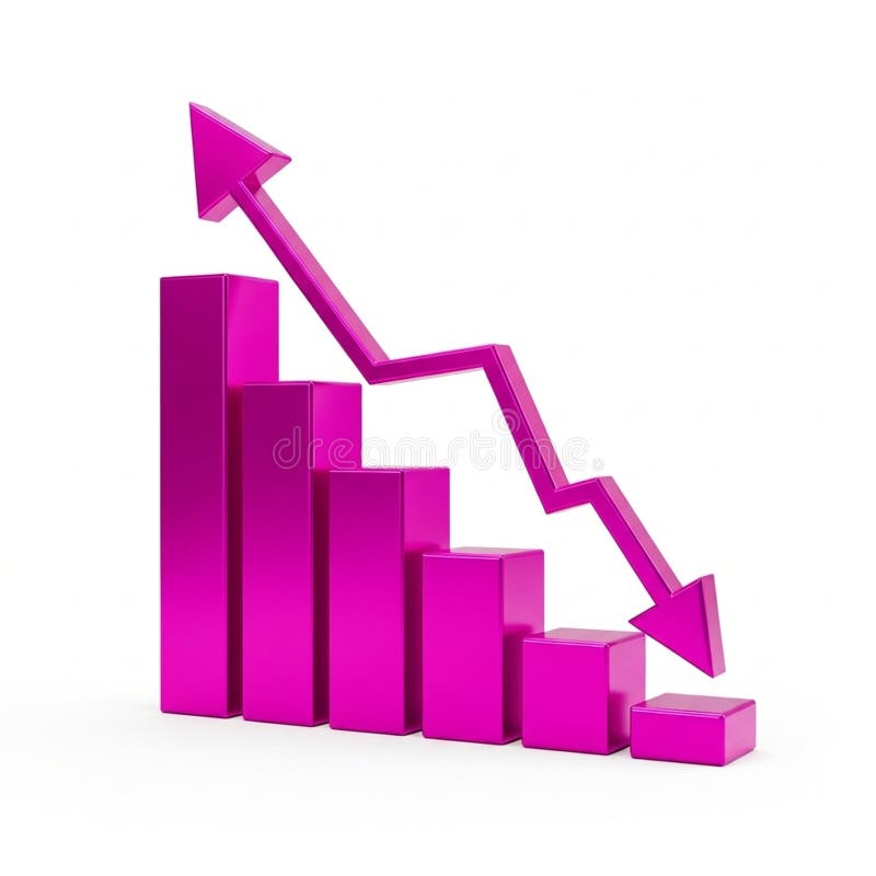
Free with trial A vibrant pink 3D bar chart illustrates financial data with a prominent downward-trending arrow superimposed. The bars decrease in height from left to right, signifying a decline. An upward-pointing arrow is positioned at the top left, indicating a contrasting upward trend. The graphic is isolated on a white background, making it suitable for presentations on financial performance, market trends,. Decrease bar illustrations 3D Pink Bar Chart with Downward Trend Arrow and Upward Trend Arrow graph statistics. A vibrant pink 3D bar chart illustrates financial data with a prominent downward-trending arrow superimposed. The bars decrease in height from left to right, signifying a decline. An upward-pointing arrow is positioned at the top left, indicating a contrasting upward trend. The graphic is isolated on a white background, making it suitable for presentations on financial performance, market trends,
Free with trial A simple illustration of a declining blue bar graph against a black background. Represents loss or decrease. Decrease bar vectors Declining bar graph demonstrating financial loss and recession illustration. A simple illustration of a declining blue bar graph against a black background. Represents loss or decrease.
Free with trial A 3D rendered bar chart illustrating a significant downward trend. Three blue, rounded bars are displayed on a clean white background with subtle grid lines. A prominent, bold red arrow sharply descends across the bars, clearly indicating a decline, decrease, or negative progression. This graphic is ideal for representing financial losses, market downturns, business challenges, economic recession, or any statistical data showing a negative trend. It conveys concepts of risk, failure, and reduction in a clear, impactful visual manner for presentations, reports, and analytical content. Decrease bar vectors Downward Trend Bar Chart with Red Arrow. A 3D rendered bar chart illustrating a significant downward trend. Three blue, rounded bars are displayed on a clean white background with subtle grid lines. A prominent, bold red arrow sharply descends across the bars, clearly indicating a decline, decrease, or negative progression. This graphic is ideal for representing financial losses, market downturns, business challenges, economic recession, or any statistical data showing a negative trend. It conveys concepts of risk, failure, and reduction in a clear, impactful visual manner for presentations, reports, and analytical content.
Free with trial An illustrative bar graph on a dark purple background depicts a clear downward trend using yellow bars and a prominent descending arrow. The text "Debt Reduction" is displayed below the chart. This visual metaphor effectively represents the successful management and decrease of financial obligations, highlighting progress in financial health. It is ideal for use in financial planning, economic reports, personal finance articles, business presentations, or any content related to improving financial stability and reducing liabilities. The clean, flat design makes it versatile for various digital and print media. Decrease bar vectors Debt Reduction Bar Graph with Downward Trend. An illustrative bar graph on a dark purple background depicts a clear downward trend using yellow bars and a prominent descending arrow. The text "Debt Reduction" is displayed below the chart. This visual metaphor effectively represents the successful management and decrease of financial obligations, highlighting progress in financial health. It is ideal for use in financial planning, economic reports, personal finance articles, business presentations, or any content related to improving financial stability and reducing liabilities. The clean, flat design makes it versatile for various digital and print media.
Free with trial A 3D bar chart rendered in a vibrant pink color illustrates a significant downward trend. The bars decrease in height from left to right, culminating in a very short bar. A bold pink arrow, also in 3D, starts high on the left and sharply descends to the right, mirroring the decline shown by the bars. The entire graphic is isolated on a clean white background. Decrease bar illustrations Pink 3D Bar Chart Showing a Downward Trend with an Arrow graph decline. A 3D bar chart rendered in a vibrant pink color illustrates a significant downward trend. The bars decrease in height from left to right, culminating in a very short bar. A bold pink arrow, also in 3D, starts high on the left and sharply descends to the right, mirroring the decline shown by the bars. The entire graphic is isolated on a clean white background
Free with trial A 3D rendering of a bar chart featuring three colorful columns: blue, orange, and green, increasing in height from left to right. Two prominent red downward arrows are positioned above the tallest green bar, clearly indicating a decline, decrease, or negative trend. The minimalist design on a clean white background makes it ideal for illustrating business performance, financial reports, economic downturns, sales drops, or any data visualization requiring a clear representation of a negative change or warning. Perfect for presentations, infographics, and analytical content. Decrease bar vectors 3D Bar Chart with Red Downward Arrows Showing Decline. A 3D rendering of a bar chart featuring three colorful columns: blue, orange, and green, increasing in height from left to right. Two prominent red downward arrows are positioned above the tallest green bar, clearly indicating a decline, decrease, or negative trend. The minimalist design on a clean white background makes it ideal for illustrating business performance, financial reports, economic downturns, sales drops, or any data visualization requiring a clear representation of a negative change or warning. Perfect for presentations, infographics, and analytical content.
Free with trial A 3D bar chart rendered in a vibrant pink color illustrates a downward trend. The bars decrease in height from left to right, representing a decline in data or performance. A thick pink arrow with a sharp point follows the descending path of the bars, reinforcing the concept of a decrease. The chart is presented in isolation against a clean white background, making the visual elements stand out. Decrease bar illustrations Pink Bar Chart with a Downward Trending Arrow Symbolizing Decline graph magenta. A 3D bar chart rendered in a vibrant pink color illustrates a downward trend. The bars decrease in height from left to right, representing a decline in data or performance. A thick pink arrow with a sharp point follows the descending path of the bars, reinforcing the concept of a decrease. The chart is presented in isolation against a clean white background, making the visual elements stand out
Free with trial This image features a bar graph with a downward trend, indicated by a red arrow. The bars are colored in various shades of blue and decrease in height from left to right. The image has a transparent background, making it suitable for various design applications. Keywords: bar graph, downward trend, blue bars, red arrow, white background, transparent background. Decrease bar illustrations Decreasing bar graph icon isolated on white background. This image features a bar graph with a downward trend, indicated by a red arrow. The bars are colored in various shades of blue and decrease in height from left to right. The image has a transparent background, making it suitable for various design applications. Keywords: bar graph, downward trend, blue bars, red arrow, white background, transparent background
Free with trial A three-dimensional bar graph composed of translucent blue bars illustrates a significant downward trend. The bars decrease in height from left to right, and a large, transparent blue arrow points downwards, reinforcing the concept of decline. The graph is set against a gradient blue background, creating a sense of depth and focus on the data visualization. Decrease bar illustrations A3D Rendered Blue Bar Graph Showing a Downward Trend with a Falling Arrow chart data. A three-dimensional bar graph composed of translucent blue bars illustrates a significant downward trend. The bars decrease in height from left to right, and a large, transparent blue arrow points downwards, reinforcing the concept of decline. The graph is set against a gradient blue background, creating a sense of depth and focus on the data visualization
Free with trial A stylized, flat design illustration of a bar chart depicting a downward trend. The bars are colored red, yellow, and blue, arranged in decreasing height from left to right. A prominent red arrow points downwards across the chart, emphasizing the decline. The graphic is set against a clean white background, making it ideal for presentations, reports, and financial concepts related to loss, decrease, or negative performance. Decrease bar illustrations Declining Bar Chart with Downward Arrow. A stylized, flat design illustration of a bar chart depicting a downward trend. The bars are colored red, yellow, and blue, arranged in decreasing height from left to right. A prominent red arrow points downwards across the chart, emphasizing the decline. The graphic is set against a clean white background, making it ideal for presentations, reports, and financial concepts related to loss, decrease, or negative performance.
Free with trial A series of golden, metallic bars are arranged in a descending order, forming a bar chart that clearly illustrates a downward trend. The bars decrease in height from left to right, with the leftmost bar being the tallest and the rightmost bar being the shortest and widest. The reflective golden surface of the bars catches the light, highlighting their three-dimensional form. The chart is presented. Decrease bar illustrations Golden Bar Chart Showing A Downward Trend On A White Background graph financial. A series of golden, metallic bars are arranged in a descending order, forming a bar chart that clearly illustrates a downward trend. The bars decrease in height from left to right, with the leftmost bar being the tallest and the rightmost bar being the shortest and widest. The reflective golden surface of the bars catches the light, highlighting their three-dimensional form. The chart is presented
Free with trial A 3D bar chart illustrates a downward trend against a white background. The bars, colored red, yellow, green, and blue, decrease in height from left to right. A thick black arrow curves downwards, pointing towards the shortest bar, visually reinforcing the concept of decline or loss. Decrease bar illustrations Downward Trend Bar Chart with Red Yellow Green Blue Bars and Black Arrow on White Background. A 3D bar chart illustrates a downward trend against a white background. The bars, colored red, yellow, green, and blue, decrease in height from left to right. A thick black arrow curves downwards, pointing towards the shortest bar, visually reinforcing the concept of decline or loss
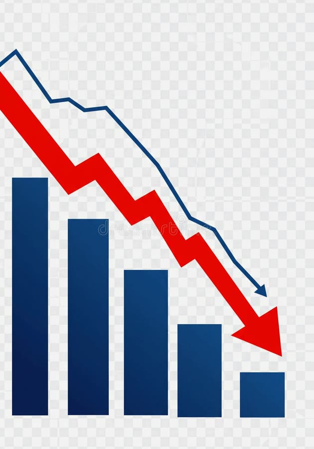
Free with trial This image depicts a bar graph with a clear downward trend. Blue bars decrease in height from left to right, representing a decline in value. A bold red arrow overlays the bars, visually emphasizing the negative trend. A blue line also shows a downward trend. The image conveys a sense of loss, recession, or negative performance and is suitable for illustrating financial or economic concepts. Decrease bar illustrations Declining Bar Graph with Downward Trend Lines. This image depicts a bar graph with a clear downward trend. Blue bars decrease in height from left to right, representing a decline in value. A bold red arrow overlays the bars, visually emphasizing the negative trend. A blue line also shows a downward trend. The image conveys a sense of loss, recession, or negative performance and is suitable for illustrating financial or economic concepts.
Free with trial A 3D golden bar chart illustrates a declining trend, with a sharp downward arrow indicating a significant decrease in performance or value. Isolated on a white background. Decrease bar illustrations Golden downward trending bar chart with arrow. A 3D golden bar chart illustrates a declining trend, with a sharp downward arrow indicating a significant decrease in performance or value. Isolated on a white background
Free with trial A visual representation of a declining trend, depicted by a blue bar chart with a prominent downward-pointing arrow, indicating a decrease in performance or value. Decrease bar illustrations Blue bar chart with a downward trending arrow. A visual representation of a declining trend, depicted by a blue bar chart with a prominent downward-pointing arrow, indicating a decrease in performance or value
Free with trial This image depicts a visual representation of financial or business growth and decline using a series of ascending and descending three-dimensional bar charts, where the left side shows smaller bars gradually increasing in height, transitioning through a central flat bar, and shifting to taller bars on the right side that progressively decrease, all set against a plain white background to. Decrease bar illustrations Growth and progress concept with ascending and descending bar charts illustrating business success and financial improvement over. This image depicts a visual representation of financial or business growth and decline using a series of ascending and descending three-dimensional bar charts, where the left side shows smaller bars gradually increasing in height, transitioning through a central flat bar, and shifting to taller bars on the right side that progressively decrease, all set against a plain white background to
Free with trial An isometric 3D bar graph with three descending steps, made of a glossy, reflective material with a blue and purple gradient. This illustrates a decrease or decline. Concept of financial loss or reduced metrics. Decrease bar vectors Blue and Purple Isometric Bar Graph Showing a Downtrend. An isometric 3D bar graph with three descending steps, made of a glossy, reflective material with a blue and purple gradient. This illustrates a decrease or decline. Concept of financial loss or reduced metrics
Free with trial Financial crisis, economic downturn, bankruptcy concept. 3D blue glass bar chart icon with arrow down, recession graph. Falling price, decline profit or asset value, decrease in sales. 3D illustration. Decrease bar illustrations Financial crisis, economic downturn, bankruptcy concept. 3D blue glass bar chart icon with arrow down, recession graph. Falling
Free with trial Black and white icon of a bar graph with short bars and a downward pointing arrow. Decrease bar illustrations Bar graph with short bars and a downward pointing arrow bar chart decrease. Black and white icon of a bar graph with short bars and a downward pointing arrow
Free with trial A colorful bar chart illustrates a downward trend, with a prominent red arrow indicating a significant decrease in data. Decrease bar illustrations Bar chart showing declining trend with red arrow. A colorful bar chart illustrates a downward trend, with a prominent red arrow indicating a significant decrease in data
Free with trial A 3D red bar chart shows a declining trend against a white grid background. The bars decrease in height from left to right, with a red line graph following the downward trajectory. Decrease bar illustrations Red 3 D bar chart with downward trend line on white grid background graph line graph. A 3D red bar chart shows a declining trend against a white grid background. The bars decrease in height from left to right, with a red line graph following the downward trajectory
Free with trial Black and white icon of a bar graph showing a downward trend with an arrow pointing down. Decrease bar illustrations Downward trending bar graph with arrow indicating decrease bar chart decline. Black and white icon of a bar graph showing a downward trend with an arrow pointing down
Free with trial The image depicts a bar graph with a downward trend. The bars, colored in blue, start at a higher value and gradually decrease in height, indicating a decline. A red downward-pointing arrow further emphasizes the downward trend. Decrease bar vectors Decline in bar graph. The image depicts a bar graph with a downward trend. The bars, colored in blue, start at a higher value and gradually decrease in height, indicating a decline. A red downward-pointing arrow further emphasizes the downward trend
Free with trial A red downward arrow and a red bar chart showing a decline are presented on a white background. Decrease bar illustrations Red Downward Arrow and Bar Chart Symbolizing Decrease and Decline Keywords: decrease, decline, down, arrow, bar. A red downward arrow and a red bar chart showing a decline are presented on a white background
Free with trial A visual representation of a financial or business trend showing a steady decrease over time. The bar chart illustrates negative performance with a prominent downward arrow. Decrease bar illustrations Declining bar chart showing downward trend with arrow. A visual representation of a financial or business trend showing a steady decrease over time. The bar chart illustrates negative performance with a prominent downward arrow
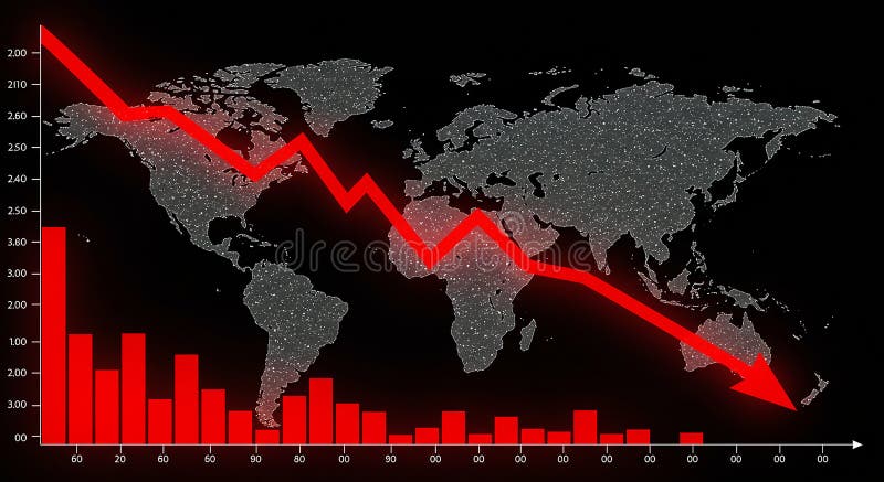
Free with trial World map backdrop with a downward-trending red line graph and red bar graph, set against a black background. The bar graph features various heights, indicating statistical data points, while the line graph suggests a decrease. The map includes continents like Africa, Europe, Asia, and the Americas, with numerous small white dots representing data or illumination. The dramatic red color emphasizes the negative trend, possibly symbolizing economic or market decline on a global scale. Decrease bar illustrations World map backdrop with a downward-trending red line graph and red bar graph
Free with trial The image depicts a bar graph with a downward trend. The bars start high on the left and progressively decrease in height towards the right. A large red downward arrow further emphasizes the declining trend. Decrease bar vectors Decreasing trend in bar graph. The image depicts a bar graph with a downward trend. The bars start high on the left and progressively decrease in height towards the right. A large red downward arrow further emphasizes the declining trend
Free with trial Red 3D bar graph against a black background, featuring an upward-sloping horizontal line that sharply declines, ending in a downward-pointing arrow. The bars decrease in height from left to right, visually representing a decline or loss. The red color contrasts with the dark background, emphasizing the downward trend. The composition suggests financial or business decline, often used in economic or market analysis. Decrease bar illustrations Red 3D bar graph against a black background, featuring an upward-sloping
Free with trial Two flat design icons with color. One depicts an upward bar chart with a blue arrow and percentage, the other a downward bar chart with a grey arrow and percentage. Decrease bar vectors Color Bar Chart Icons for Increase and Decrease graph Ai-Generated. Two flat design icons with color. One depicts an upward bar chart with a blue arrow and percentage, the other a downward bar chart with a grey arrow and percentage
Free with trial A vibrant, flat-design illustration depicts a bar graph with a downward-trending arrow, suggesting a decline in data. The graph features bars in red, yellow, green, and blue, set against a clean white background. The composition is simple, yet conveys a clear message of financial or performance decrease. Decrease bar illustrations Colorful Bar Graph with Declining Trend and Arrows, Business Concept. A vibrant, flat-design illustration depicts a bar graph with a downward-trending arrow, suggesting a decline in data. The graph features bars in red, yellow, green, and blue, set against a clean white background. The composition is simple, yet conveys a clear message of financial or performance decrease
Free with trial Downward blue arrow, hand gesture, and declining bar graph. Ideal for business loss, negative trends, economy, failure, recession setback performance. Simple flat metaphor. Decrease bar illustrations Downward Arrow with Hand and Declining Bar Graph Representing Business Loss or Decrease. Downward blue arrow, hand gesture, and declining bar graph. Ideal for business loss, negative trends, economy, failure, recession setback performance. Simple flat metaphor
Free with trial Colorful bar chart illustrating a gradual decrease against a transparent background, highlighting a decline in data and signaling a negative financial trend or recession. Decrease bar vectors Bar chart gradually decreasing with transparent background. Colorful bar chart illustrating a gradual decrease against a transparent background, highlighting a decline in data and signaling a negative financial trend or recession
Free with trial This infographic displays a bar graph illustrating a sharp negative trend. The red line clearly depicts a significant decrease, showcasing concepts like downturn, recession, and loss within a business or financial context. Ideal for presentations, reports, and analyses highlighting negative market trends or economic decline, generated by AI. Decrease bar illustrations Decreasing bar graph showing negative trend decline. This infographic displays a bar graph illustrating a sharp negative trend. The red line clearly depicts a significant decrease, showcasing concepts like downturn, recession, and loss within a business or financial context. Ideal for presentations, reports, and analyses highlighting negative market trends or economic decline, generated by AI.
Free with trial 3D render showcasing descending statistical bar graph. The bars are colored differently: purple, blue, and yellow. This graphic represents statistical data trend decreasing. Decrease bar vectors Colorful statistical bar graph rendering showing decrease on transparent background. 3D render showcasing descending statistical bar graph. The bars are colored differently: purple, blue, and yellow. This graphic represents statistical data trend decreasing.
Free with trial This image depicts a bar graph with a downward trend. The bars decrease in height from left to right, indicating a decline in the measured values. A red arrow at the top further emphasizes the downward direction. Decrease bar illustrations Decreasing bar graph. This image depicts a bar graph with a downward trend. The bars decrease in height from left to right, indicating a decline in the measured values. A red arrow at the top further emphasizes the downward direction
Free with trial The image depicts a bar graph with three bars of varying heights. The first bar is the tallest, followed by a shorter blue bar, and the third bar is the shortest. A large red downward arrow is pointing from the top of the tallest bar to the shortest bar, indicating a downward trend or decrease. Decrease bar illustrations Decreasing bar graph. The image depicts a bar graph with three bars of varying heights. The first bar is the tallest, followed by a shorter blue bar, and the third bar is the shortest. A large red downward arrow is pointing from the top of the tallest bar to the shortest bar, indicating a downward trend or decrease
Free with trial Business graph data in a bar chart showing increase and decrease with blue line illustration on plain background. Decrease bar vectors Business graph data in a bar chart showing increase and decrease with blue line illustration on plain background
Free with trial This image displays a bar graph visualizing a clear downward trend. Nine vertical blue bars gradually decrease in height from left to right, signifying a consistent decline in values. A white arrowed line diagonally descends across the graph, reinforcing the negative trend. Blue horizontal and vertical grid lines aid in alignment. The background is green screen, allowing for chroma key use. This chart effectively communicates decline in areas like business, finance, or performance. Decrease bar illustrations Downward Bar Graph Showing Financial Decline on Green Screen. This image displays a bar graph visualizing a clear downward trend. Nine vertical blue bars gradually decrease in height from left to right, signifying a consistent decline in values. A white arrowed line diagonally descends across the graph, reinforcing the negative trend. Blue horizontal and vertical grid lines aid in alignment. The background is green screen, allowing for chroma key use. This chart effectively communicates decline in areas like business, finance, or performance.
Free with trial The image depicts a flip chart with a combination of a bar graph and a line graph, both showing a downward trend. The bar graph starts with taller bars that gradually decrease in height, indicating a decline over time. The line graph above it also trends downward, reinforcing the concept of a negative trajectory or economic downturn. The visual is likely used to represent financial loss, market. Decrease bar illustrations Economic decline illustrated by a combination of bar and line graphs on a flip chart. The image depicts a flip chart with a combination of a bar graph and a line graph, both showing a downward trend. The bar graph starts with taller bars that gradually decrease in height, indicating a decline over time. The line graph above it also trends downward, reinforcing the concept of a negative trajectory or economic downturn. The visual is likely used to represent financial loss, market
Free with trial A striking 3D rendering showcases a red bar chart dramatically illustrating an economic downturn and financial decline. The downward trending bar chart, emphasized by a prominent red color and a downward-pointing arrow, conveys a sense of decrease and loss within business, finance, and the global economy. This graphic effectively represents concepts such as recession, a bearish market, and. Decrease bar illustrations Red bar chart depicting economic downturn or financial decline business and investment concerns. A striking 3D rendering showcases a red bar chart dramatically illustrating an economic downturn and financial decline. The downward trending bar chart, emphasized by a prominent red color and a downward-pointing arrow, conveys a sense of decrease and loss within business, finance, and the global economy. This graphic effectively represents concepts such as recession, a bearish market, and
Free with trial The image features a red arrow pointing downward towards a bar graph. The bar graph consists of six bars of varying heights, indicating different data points. The arrow suggests a downward trend or decrease in the data represented by the bars. Decrease bar illustrations Arrow pointing down to bar graph. The image features a red arrow pointing downward towards a bar graph. The bar graph consists of six bars of varying heights, indicating different data points. The arrow suggests a downward trend or decrease in the data represented by the bars
Free with trial The image depicts a bar graph with two distinct sections. The left section of the graph shows an upward trend with green bars and a green arrow pointing upwards, indicating an increase. The right section of the graph shows a downward trend with red bars and a red arrow pointing downwards, indicating a decrease. The graph visually represents contrasting trends in data. Decrease bar illustrations Bar graph with up and down trends. The image depicts a bar graph with two distinct sections. The left section of the graph shows an upward trend with green bars and a green arrow pointing upwards, indicating an increase. The right section of the graph shows a downward trend with red bars and a red arrow pointing downwards, indicating a decrease. The graph visually represents contrasting trends in data
Free with trial The image depicts a bar graph with two distinct sections. The left section of the graph shows an upward trend with green bars and a green arrow pointing upwards, indicating an increase. The right section of the graph shows a downward trend with red bars and a red arrow pointing downwards, indicating a decrease. The graph visually represents contrasting trends in data. Decrease bar illustrations Bar graph with up and down trends. The image depicts a bar graph with two distinct sections. The left section of the graph shows an upward trend with green bars and a green arrow pointing upwards, indicating an increase. The right section of the graph shows a downward trend with red bars and a red arrow pointing downwards, indicating a decrease. The graph visually represents contrasting trends in data
Free with trial 3d render of clean air compliance showing carbon emission decrease with bar chart, gauge, recycle button, and carbon coin, on transparent background. Decrease bar illustrations Clean air compliance showing carbon emission decrease with transparent background. 3d render of clean air compliance showing carbon emission decrease with bar chart, gauge, recycle button, and carbon coin, on transparent background
Free with trial The image depicts a bar graph with two distinct sections. The left section of the graph shows an upward trend with green bars and a green arrow pointing upwards, indicating an increase. The right section of the graph shows a downward trend with red bars and a red arrow pointing downwards, indicating a decrease. The graph visually represents contrasting trends in data. Decrease bar illustrations Bar graph with up and down trends. The image depicts a bar graph with two distinct sections. The left section of the graph shows an upward trend with green bars and a green arrow pointing upwards, indicating an increase. The right section of the graph shows a downward trend with red bars and a red arrow pointing downwards, indicating a decrease. The graph visually represents contrasting trends in data
Free with trial A red bar chart illustrates a steep downward trend with a red arrow indicating a significant decrease in value. Decrease bar illustrations Red bar chart showing sharp decline. A red bar chart illustrates a steep downward trend with a red arrow indicating a significant decrease in value
Free with trial The image depicts a bar graph with a series of red bars that progressively decrease in height from left to right. An arrow pointing downward is positioned above the bars, indicating a downward trend or decrease in values. Decrease bar illustrations Decreasing bar graph with down arrow. The image depicts a bar graph with a series of red bars that progressively decrease in height from left to right. An arrow pointing downward is positioned above the bars, indicating a downward trend or decrease in values
Free with trial A flat design illustration of a bar chart showing a declining trend, with a red arrow pointing downwards, symbolizing a decrease in performance or value. Decrease bar illustrations Bar chart with a downward trend isolated on white background. A flat design illustration of a bar chart showing a declining trend, with a red arrow pointing downwards, symbolizing a decrease in performance or value
Free with trial Red bar chart depicting a downward trend on a white background. The bars progressively decrease in height from left to right. An upward-pointing arrow emerges from the first bar, indicating initial growth. A curved, downward-pointing arrow overlays the bars, emphasizing the overall decline. The clear design conveys concepts of financial loss, decreasing statistics, or declining data points. Decrease bar vectors Red bar chart showing a downward trend with an upward arrow and a falling arrow isolated on white background. Red bar chart depicting a downward trend on a white background. The bars progressively decrease in height from left to right. An upward-pointing arrow emerges from the first bar, indicating initial growth. A curved, downward-pointing arrow overlays the bars, emphasizing the overall decline. The clear design conveys concepts of financial loss, decreasing statistics, or declining data points.
Free with trial A colorful bar graph with a downward trend, showing a decrease in values from left to right, with a large orange arrow pointing downwards. Decrease bar illustrations A colorful bar graph with a downward trend
Free with trial A bar chart displayed on an easel, illustrating a negative trend. The bars, a mix of blue and grey, show a progressive decrease in value. A prominent red arrow curves downwards across the chart, signifying a decline or loss. The presentation suggests a financial report or business analysis with unfavorable results. Decrease bar illustrations Bar chart showing a downward trend with a red arrow indicating decline. A bar chart displayed on an easel, illustrating a negative trend. The bars, a mix of blue and grey, show a progressive decrease in value. A prominent red arrow curves downwards across the chart, signifying a decline or loss. The presentation suggests a financial report or business analysis with unfavorable results
Free with trial The image depicts a bar graph with three red bars of varying heights, representing data values. A large red arrow points downward from the top left to the bottom right, indicating a decline or decrease in the values. Following the arrow, there are two yellow bars, which are shorter than the red bars, further emphasizing the downward trend. Decrease bar illustrations Decreasing bar graph with downward arrow. The image depicts a bar graph with three red bars of varying heights, representing data values. A large red arrow points downward from the top left to the bottom right, indicating a decline or decrease in the values. Following the arrow, there are two yellow bars, which are shorter than the red bars, further emphasizing the downward trend
Free with trial A three-dimensional bar graph is depicted against a white background, illustrating a clear downward trend. The bars, transitioning from blue at the highest point to red at the lowest, decrease in height from left to right, visually representing a decline or loss. Decrease bar illustrations 3D bar graph showing a downward trend with red and blue bars chart data. A three-dimensional bar graph is depicted against a white background, illustrating a clear downward trend. The bars, transitioning from blue at the highest point to red at the lowest, decrease in height from left to right, visually representing a decline or loss
Free with trial Modern vector icon showing a downward arrow over a bar chart with progressively smaller bars indicating decline or decrease. Decrease bar illustrations Downward arrow with decreasing bar chart graphic. Modern vector icon showing a downward arrow over a bar chart with progressively smaller bars indicating decline. Modern vector icon showing a downward arrow over a bar chart with progressively smaller bars indicating decline or decrease
Free with trial A black icon depicting a bar graph with three bars of decreasing height, representing a downward trend. A black arrow points diagonally downwards from the top right, indicating a decline. The icon is enclosed within a black circle and set against a white background. Decrease bar illustrations Black Downward Trend Bar Graph Icon with Arrow Inside Circle chart decrease. A black icon depicting a bar graph with three bars of decreasing height, representing a downward trend. A black arrow points diagonally downwards from the top right, indicating a decline. The icon is enclosed within a black circle and set against a white background
Free with trial A three-dimensional bar chart constructed from shiny golden bars depicts a clear downward trend. The bars decrease in height from left to right, creating a visual representation of decline or loss. The metallic gold material reflects light, giving the chart a polished and impactful appearance. The entire graphic is isolated on a clean white background, making the data visualization the sole focus. Decrease bar illustrations Golden 3D bar chart showing a downward trend on a white background graph data. A three-dimensional bar chart constructed from shiny golden bars depicts a clear downward trend. The bars decrease in height from left to right, creating a visual representation of decline or loss. The metallic gold material reflects light, giving the chart a polished and impactful appearance. The entire graphic is isolated on a clean white background, making the data visualization the sole focus
Free with trial The image depicts three blue bar charts of varying heights, symbolizing different levels of data or growth. Two large orange arrows are shown pointing in opposite directions, one upward and one downward, indicating trends of increase and decrease respectively. The upward arrow is positioned behind the tallest bar, while the downward arrow is behind the shortest bar. Decrease bar illustrations Growth and decline represented by arrows and bar charts. The image depicts three blue bar charts of varying heights, symbolizing different levels of data or growth. Two large orange arrows are shown pointing in opposite directions, one upward and one downward, indicating trends of increase and decrease respectively. The upward arrow is positioned behind the tallest bar, while the downward arrow is behind the shortest bar
Free with trial A black and white circular icon depicting a bar chart with three bars of decreasing height. A diagonal arrow points downwards from the tallest bar to the shortest, indicating a downward trend or decline. The icon is set against a white background. Decrease bar illustrations Black and White Icon of a Downward Trending Bar Chart in a Circle graph decrease. A black and white circular icon depicting a bar chart with three bars of decreasing height. A diagonal arrow points downwards from the tallest bar to the shortest, indicating a downward trend or decline. The icon is set against a white background
Free with trial Gray bar chart with red line graph and downward arrow, illustrating decline, decrease, loss, and negative trend. Decrease bar vectors Bar chart with downward red arrow, symbolizing decline. Gray bar chart with red line graph and downward arrow, illustrating decline, decrease, loss, and negative trend