Free with trial Bar graph showing a downward trend, business decline, economic decrease, market analysis, financial chart. Decrease bar vectors Bar chart with downward trend arrow business decline graph. Bar graph showing a downward trend, business decline, economic decrease, market analysis, financial chart
Free with trial This image displays a series of vertical bars arranged in a gradient color spectrum from green to red. Each bar varies in height, suggesting a comparison of different values or quantities. The bars start tall on the left in green, gradually decrease in height towards the center, and then increase again towards the right, ending with the tallest bar on the far right in red. The gradient color. Decrease bar illustrations Colorful bar chart showing varying heights in a gradient spectrum from green to red. This image displays a series of vertical bars arranged in a gradient color spectrum from green to red. Each bar varies in height, suggesting a comparison of different values or quantities. The bars start tall on the left in green, gradually decrease in height towards the center, and then increase again towards the right, ending with the tallest bar on the far right in red. The gradient color
Free with trial The image depicts a combination of bar and line charts. The bar chart shows three descending bars in orange, yellow, and a lighter shade, indicating a decline in values. Overlaid on this is a downward-sloping line chart, reinforcing the trend of decrease. The overall design suggests a visual representation of a downward market trend or decline in performance metrics over time. Decrease bar illustrations Graphic illustration of declining market trends with bar and line chart combination. The image depicts a combination of bar and line charts. The bar chart shows three descending bars in orange, yellow, and a lighter shade, indicating a decline in values. Overlaid on this is a downward-sloping line chart, reinforcing the trend of decrease. The overall design suggests a visual representation of a downward market trend or decline in performance metrics over time
Free with trial A clean, minimalist 3D rendering of a declining bar chart in a monochromatic pastel pink color scheme. The bars are arranged in descending order, clearly illustrating a concept of decrease, loss, or a downward trend. This abstract and modern graphic is perfect for business and financial presentations, reports, or infographics about recession, economic downturn, sales reduction, or negative growth. The soft lighting and ample copy space make it a versatile background for various data visualization and corporate concepts. Decrease bar illustrations Minimalist Pink 3D Bar Chart Showing a Downward Trend. A clean, minimalist 3D rendering of a declining bar chart in a monochromatic pastel pink color scheme. The bars are arranged in descending order, clearly illustrating a concept of decrease, loss, or a downward trend. This abstract and modern graphic is perfect for business and financial presentations, reports, or infographics about recession, economic downturn, sales reduction, or negative growth. The soft lighting and ample copy space make it a versatile background for various data visualization and corporate concepts.
Free with trial A 3D bar graph with blue bars of decreasing height from left to right, accompanied by a large red arrow pointing downwards, indicating a decline or decrease. Decrease bar illustrations A downward trend is illustrated in a bar graph with a red arrow. A 3D bar graph with blue bars of decreasing height from left to right, accompanied by a large red arrow pointing downwards, indicating a decline or decrease
Free with trial A 3D rendered bar chart illustrating a downward trend. The bars, colored black, green, orange, red, and a lighter red, decrease in height from left to right. A vibrant purple arrow points downwards, diagonally across the bars, signifying a decrease or negative movement. The object is isolated on a white background. Decrease bar illustrations 3D Bar Chart with Purple Downward Arrow on White Background. A 3D rendered bar chart illustrating a downward trend. The bars, colored black, green, orange, red, and a lighter red, decrease in height from left to right. A vibrant purple arrow points downwards, diagonally across the bars, signifying a decrease or negative movement. The object is isolated on a white background
Free with trial The image contains six different charts depicting various data trends. The top row features a bar chart with a downward arrow indicating a decrease, a bar chart with an upward arrow indicating growth, and a line chart showing a steady increase. The bottom row includes a bar chart with a gradual increase, a line chart with a sharp upward trend, and another line chart with a fluctuating but overall. Decrease bar illustrations Diverse bar and line charts illustrating various data trends. The image contains six different charts depicting various data trends. The top row features a bar. The image contains six different charts depicting various data trends. The top row features a bar chart with a downward arrow indicating a decrease, a bar chart with an upward arrow indicating growth, and a line chart showing a steady increase. The bottom row includes a bar chart with a gradual increase, a line chart with a sharp upward trend, and another line chart with a fluctuating but overall
Free with trial The image depicts a bar chart showing a significant decline in values across five categories, accompanied by a bold downward red arrow emphasizing the sharp decrease. The bars progressively shorten from left to right, indicating a continuous drop in whatever metric is being measured. Decrease bar illustrations Declining trend illustrated with bar chart and downward arrow. The image depicts a bar chart showing a significant decline in values across five categories, accompanied by a bold downward red arrow emphasizing the sharp decrease. The bars progressively shorten from left to right, indicating a continuous drop in whatever metric is being measured
Free with trial The image shows an easel holding a canvas with a bar chart. The bar chart displays a series of green vertical bars that initially increase in height but then decrease, illustrating a downward trend. A red line with an arrowhead at the end emphasizes the declining trend. Decrease bar illustrations Illustration of a bar chart on an easel showing a downward trend. The image shows an easel holding a canvas with a bar chart. The bar chart displays a series of green vertical bars that initially increase in height but then decrease, illustrating a downward trend. A red line with an arrowhead at the end emphasizes the declining trend
Free with trial 3D silver column chart depicting a decreasing sequence of bars from left to right. Each bar is rectangular and has a metallic finish, giving a sleek and reflective appearance. The chart suggests a downward trend, possibly illustrating declining values or losses. The bars are evenly spaced on a flat surface with no additional labels or axes visible. Suitable for representing financial data or general decrease in values. Decrease bar vectors Silver 3D column chart or bar chart showing decreasing financial values and losses. 3D silver column chart depicting a decreasing sequence of bars from left to right. Each bar is rectangular and has a metallic finish, giving a sleek and reflective appearance. The chart suggests a downward trend, possibly illustrating declining values or losses. The bars are evenly spaced on a flat surface with no additional labels or axes visible. Suitable for representing financial data or general decrease in values.
Free with trial The image shows a bar chart with green bars that progressively decrease in height from left to right, illustrating a downward trend. A bold red diagonal arrow points downward, emphasizing the decline in values or performance over time. Decrease bar illustrations Decline in bar chart growth represented by a downward red arrow. The image shows a bar chart with green bars that progressively decrease in height from left to right, illustrating a downward trend. A bold red diagonal arrow points downward, emphasizing the decline in values or performance over time
Free with trial The image depicts a small yellow character standing on a green circular platform with a series of bar graphs behind it. The bars are colored in shades of pink and red, showing a descending trend. A large red downward arrow is superimposed over the bars, indicating a decline or decrease in values or performance over time. Decrease bar illustrations Falling bar chart with a small figure standing on a green platform. The image depicts a small yellow character standing on a green circular platform with a series of bar graphs behind it. The bars are colored in shades of pink and red, showing a descending trend. A large red downward arrow is superimposed over the bars, indicating a decline or decrease in values or performance over time
Free with trial An image showing a bar graph with tax rates represented on blue blocks with coins on top. The middle block has a red arrow pointing down, indicating a decrease, while the right block is the tallest, indicating an increase. Decrease bar illustrations Tax rates decreasing then increasing on bar graph with coins on top. An image showing a bar graph with tax rates represented on blue blocks with coins on top. The middle block has a red arrow pointing down, indicating a decrease, while the right block is the tallest, indicating an increase
Free with trial A red bar graph showing a decline with a downward pointing arrow above it. Clear details and vibr. Decrease bar illustrations Red Bar Graph Showing Decline With Downward Arrow chart decrease. A red bar graph showing a decline with a downward pointing arrow above it. Clear details and vibr
Free with trial This conceptual scientific illustration features a dramatic black hole on the left, rendered with a deep blue cosmic background and radiant rays of light emanating from its center, visually paired with a clean, modern bar graph on the right that charts a significant decrease in mass drop events over time, directly comparing a 10x mass decrease against a 100x mass drop with clear white data labels. Decrease bar illustrations An illustration of a black hole with a tenfold mass decrease and hundredfold mass drop alongside a comparative bar graph showing. This conceptual scientific illustration features a dramatic black hole on the left, rendered with a deep blue cosmic background and radiant rays of light emanating from its center, visually paired with a clean, modern bar graph on the right that charts a significant decrease in mass drop events over time, directly comparing a 10x mass decrease against a 100x mass drop with clear white data labels
Free with trial The image depicts a descending bar graph with yellow bars progressively decreasing in height from left to right. A red diagonal arrow overlays the bars, emphasizing the downward trend. This visual representation effectively communicates a consistent decline over a series of intervals or time periods, often used to illustrate reduction, decrease, or negative growth in data sets. Decrease bar illustrations Declining trend illustrated through descending bar graph and arrow. The image depicts a descending bar graph with yellow bars progressively decreasing in height from left to right. A red diagonal arrow overlays the bars, emphasizing the downward trend. This visual representation effectively communicates a consistent decline over a series of intervals or time periods, often used to illustrate reduction, decrease, or negative growth in data sets
Free with trial A hand-drawn illustration showing a bar chart with a downward arrow, symbolizing a decline in values, recession, decrease, or negative trends. The minimalistic sketch represents loss, degradation, or economic downturn. Decrease bar illustrations Hand-Drawn Declining Bar Chart with Arrow Illustrating Negative Growth Trend. A hand-drawn illustration showing a bar chart with a downward arrow, symbolizing a decline in values, recession, decrease, or negative trends. The minimalistic sketch represents loss, degradation, or economic downturn
Free with trial Abstract data reduction concept showing declining metrics in a bar chart sequence, perfect for finance analysts and business presentations. This compelling AI-generated visual provides a clear metaphor for optimization, cost-cutting, or efficiency improvements in corporate reporting and digital design projects. Decrease bar illustrations Visual decrease in bar chart values indicated by a directional arrow. Abstract data reduction concept showing declining metrics in a bar chart sequence, perfect for finance analysts and business presentations. This compelling AI-generated visual provides a clear metaphor for optimization, cost-cutting, or efficiency improvements in corporate reporting and digital design projects.
Free with trial The image displays a bar chart with eight vertical bars of varying heights. Each bar is colored in teal, and there are red arrows pointing downward on top of each bar, suggesting a decrease in the values they represent. The bars are arranged in a slightly irregular pattern, with the tallest bar positioned in the center of the chart. Decrease bar illustrations A bar chart with red arrows indicating a downward trend in data values. The image displays a bar chart with eight vertical bars of varying heights. Each bar is colored in teal, and there are red arrows pointing downward on top of each bar, suggesting a decrease in the values they represent. The bars are arranged in a slightly irregular pattern, with the tallest bar positioned in the center of the chart
Free with trial Black bar graph and downward arrow icon illustrating a financial decline or negative trend. Decrease bar illustrations Black Bar Graph and Downward Arrow Icon Showing Decline fall decrease. Black bar graph and downward arrow icon illustrating a financial decline or negative trend
Free with trial The image features a visual representation of a declining trend using a bar chart on an easel. The bars decrease in height from left to right, transitioning from blue to green, and are topped with a bold red downward arrow, symbolizing a downward trend or decline. Decrease bar illustrations Declining bar chart illustrated on an easel with a red downward arrow. The image features a visual representation of a declining trend using a bar chart on an easel. The bars decrease in height from left to right, transitioning from blue to green, and are topped with a bold red downward arrow, symbolizing a downward trend or decline
Free with trial A bar graph showing a decrease in CO2 emissions with a green cloud and downward trend arrow. Decrease bar illustrations Reducing carbon dioxide emissions over time as shown in the bar graph. A bar graph showing a decrease in CO2 emissions with a green cloud and downward trend arrow
Free with trial A vibrant 3D rendered bar graph showing a downward trend. Pink, teal, blue, and yellow columns illustrate decrease, ideal for presentations. Decrease bar vectors Colorful bar graph with growth illustration on transparent background. A vibrant 3D rendered bar graph showing a downward trend. Pink, teal, blue, and yellow columns illustrate decrease, ideal for presentations.
Free with trial A vertical bar graph displays monthly service reach statistics with six colored sections representing different months, showing service growth from approximately $20,000 to $30,000 in the first quarter, fluctuations between 1,500 and 2,500 in the second quarter, a decrease followed by slight recovery in service requests during the third quarter, and a significant increase from around 3,500 to 4,. Decrease bar illustrations Business growth bar chart showing monthly service reach statistics with colorful data visualization and performance metrics. A vertical bar graph displays monthly service reach statistics with six colored sections representing different months, showing service growth from approximately $20,000 to $30,000 in the first quarter, fluctuations between 1,500 and 2,500 in the second quarter, a decrease followed by slight recovery in service requests during the third quarter, and a significant increase from around 3,500 to 4,
Free with trial A bar graph showing a decrease in CO2 emissions with a green cloud and downward trend arrow. Decrease bar illustrations Reducing carbon dioxide emissions over time as shown in the bar graph. A bar graph showing a decrease in CO2 emissions with a green cloud and downward trend arrow
Free with trial This image features a bar chart with four bars. The first bar is the tallest, and the subsequent bars decrease in height. The third bar has an arrow pointing downwards, and the fourth bar has an arrow pointing upwards, indicating a slight increase. Decrease bar illustrations Bar chart showing a downward trend with a slight upward shift at the end. This image features a bar chart with four bars. The first bar is the tallest, and the subsequent bars decrease in height. The third bar has an arrow pointing downwards, and the fourth bar has an arrow pointing upwards, indicating a slight increase
Free with trial The image shows a whiteboard with a bar chart illustrating a series of bars that decrease in height. A red downward arrow is drawn over the bars, indicating a decline or negative trend. The whiteboard is set on a simple wooden easel with a small wooden figure on top, emphasizing the visual message of a downward trajectory in data or performance metrics. Decrease bar illustrations Declining growth represented by a bar chart with a downward trend arrow. The image shows a whiteboard with a bar chart illustrating a series of bars that decrease in height. A red downward arrow is drawn over the bars, indicating a decline or negative trend. The whiteboard is set on a simple wooden easel with a small wooden figure on top, emphasizing the visual message of a downward trajectory in data or performance metrics
Free with trial The image features various financial data visualizations, including declining bar charts, pie charts, and downward trend graphs, which collectively illustrate a decrease in financial performance metrics. These elements serve as effective tools for analyzing business statistics and presenting reports. The visuals are designed to convey a clear message about trends and losses in the economy. This composition is made with AI. Decrease bar vectors Declining Bar Charts Pie Chart and Downward Trend Graphs for Financial Data Analysis and Business Reports. The image features various financial data visualizations, including declining bar charts, pie charts, and downward trend graphs, which collectively illustrate a decrease in financial performance metrics. These elements serve as effective tools for analyzing business statistics and presenting reports. The visuals are designed to convey a clear message about trends and losses in the economy. This composition is made with AI.
Free with trial The image shows a bar chart with five bars of varying heights, arranged from left to right. The bars are in shades of blue, with the leftmost bar being the tallest and the rightmost bar being the shortest. The bars gradually decrease in height from left to right. Decrease bar illustrations A bar chart with five bars of varying heights in shades of blue. The image shows a bar chart with five bars of varying heights, arranged from left to right. The bars are in shades of blue, with the leftmost bar being the tallest and the rightmost bar being the shortest. The bars gradually decrease in height from left to right
Free with trial A black bar chart icon with bars of decreasing height and a downward arrow indicating a decline. Decrease bar illustrations Black Bar Chart Icon Showing Decline With Downward Arrow graph decrease. A black bar chart icon with bars of decreasing height and a downward arrow indicating a decline
Free with trial The image depicts a series of vertical bars in teal color, showing a gradual decrease in height from left to right. A large red downward-pointing arrow overlays the bars, emphasizing the trend of decline in the data represented. This visual is commonly used to illustrate decreasing performance, sales, or other metrics over time. Decrease bar illustrations Declining bar chart with a downward arrow indicating a decrease in values. The image depicts a series of vertical bars in teal color, showing a gradual decrease in height from left to right. A large red downward-pointing arrow overlays the bars, emphasizing the trend of decline in the data represented. This visual is commonly used to illustrate decreasing performance, sales, or other metrics over time
Free with trial The image shows a bar chart with five red bars of decreasing height. Each bar has a downward-pointing arrow above it, indicating a downward trend or decrease in the data represented by the bars. Decrease bar illustrations A bar chart with arrows pointing downwards indicating a decreasing trend. The image shows a bar chart with five red bars of decreasing height. Each bar has a downward-pointing arrow above it, indicating a downward trend or decrease in the data represented by the bars
Free with trial The image shows a canvas propped up on an easel displaying a bar chart with bars of varying heights that decrease from left to right. A red arrow points downward from the top right corner of the canvas, symbolizing a decline or downward trend. Decrease bar illustrations Declining bar chart illustration on an easel with a red downward arrow. The image shows a canvas propped up on an easel displaying a bar chart with bars of varying heights that decrease from left to right. A red arrow points downward from the top right corner of the canvas, symbolizing a decline or downward trend
Free with trial A minimalist vertical bar graph on a gray background visually represents the alarming eighty percent decline in Arctic ice volume, with labeled x-axis stating '80% Decline' and y-axis titled 'Arctic Ice Volume', where bars decrease from bottom to top to illustrate dramatic reduction over time for environmental reports, scientific presentations, climate change articles, educational materials, and. Decrease bar illustrations Vertical bar graph showing an eighty percent decline in Arctic ice volume with minimalist design on gray background for climate. A minimalist vertical bar graph on a gray background visually represents the alarming eighty percent decline in Arctic ice volume, with labeled x-axis stating '80% Decline' and y-axis titled 'Arctic Ice Volume', where bars decrease from bottom to top to illustrate dramatic reduction over time for environmental reports, scientific presentations, climate change articles, educational materials, and
Free with trial The image displays a simple bar chart composed of five red bars of varying heights. Each bar has arrows pointing upward or downward, indicating an increase or decrease in values. The chart visually represents fluctuations in data, with the tallest bar in the center and the shortest bars on the far left and right. Decrease bar illustrations Red bar chart with upward and downward directional arrows indicating trends. The image displays a simple bar chart composed of five red bars of varying heights. Each bar has arrows pointing upward or downward, indicating an increase or decrease in values. The chart visually represents fluctuations in data, with the tallest bar in the center and the shortest bars on the far left and right
Free with trial Bar chart with downward trending arrow, representing loss, decrease, or recession. Decrease bar vectors Bar chart with downward trending arrow, representing loss, decrease, or recession
Free with trial A 3D rendered bar graph displays a series of six distinct bars, arranged in descending order of height from left to right. The bars are colored in a gradient from blue to orange, resting on a white, slightly angled platform. A subtle shadow is cast to the left, emphasizing the three-dimensional nature of the graphic. The visual represents a downward trend or decrease in data. Decrease bar illustrations 3D rendered bar graph showing a downward trend with colorful bars on a white platform chart statistics. A 3D rendered bar graph displays a series of six distinct bars, arranged in descending order of height from left to right. The bars are colored in a gradient from blue to orange, resting on a white, slightly angled platform. A subtle shadow is cast to the left, emphasizing the three-dimensional nature of the graphic. The visual represents a downward trend or decrease in data
Free with trial The image shows a bar graph with a red line indicating a downward trend. The bars decrease in height from left to right, suggesting a significant decline in the measured data over time. Decrease bar illustrations A downward trend graph illustrating a significant decrease in data over time. The image shows a bar graph with a red line indicating a downward trend. The bars decrease in height from left to right, suggesting a significant decline in the measured data over time
Free with trial The image shows a framed bar chart with red and green bars. The bars represent data trends over time, with the green bars showing an increase and the red bars showing a decrease. The chart is displayed on a white background with a wooden frame. Decrease bar illustrations A framed bar chart with red and green bars representing data trends over time. The image shows a framed bar chart with red and green bars. The bars represent data trends over time, with the green bars showing an increase and the red bars showing a decrease. The chart is displayed on a white background with a wooden frame
Free with trial The image shows a bar chart with a red downward-sloping line overlay, illustrating a clear decline in values over a series of intervals. The bars progressively decrease in height from left to right, emphasizing a consistent downward trend in the data represented. Decrease bar illustrations Decline in performance or value represented by a downward trending bar chart. The image shows a bar chart with a red downward-sloping line overlay, illustrating a clear decline in values over a series of intervals. The bars progressively decrease in height from left to right, emphasizing a consistent downward trend in the data represented
Free with trial The image shows a series of vertical bars in descending order of height, colored from dark blue to light purple. A bold red diagonal arrow overlays the bars, pointing downward, symbolizing a decline or reduction in values over time. This visual is often used to represent a decrease in metrics such as sales, performance, or other quantifiable data trends. Decrease bar illustrations Declining bar chart with downward trend arrow indicating a decrease in values. The image shows a series of vertical bars in descending order of height, colored from dark blue to light purple. A bold red diagonal arrow overlays the bars, pointing downward, symbolizing a decline or reduction in values over time. This visual is often used to represent a decrease in metrics such as sales, performance, or other quantifiable data trends
Free with trial The image shows an easel holding a white poster with a blue bar and line chart. The chart depicts a series of vertical bars that gradually decrease in height, accompanied by a line graph that rises initially and then declines. The easel is positioned on a plain, light-colored background, emphasizing the visual data presentation on the poster. Decrease bar illustrations Easel displaying a bar and line chart illustrating financial or data trends. The image shows an easel holding a white poster with a blue bar and line chart. The chart depicts a series of vertical bars that gradually decrease in height, accompanied by a line graph that rises initially and then declines. The easel is positioned on a plain, light-colored background, emphasizing the visual data presentation on the poster
Free with trial A stylized black and white illustration shows a bar chart with bars of decreasing height, leading to a sharp downward-pointing arrow. Decrease bar vectors Decreasing bar chart with downward arrow decrease downward recession statistics negative. A stylized black and white illustration shows a bar chart with bars of decreasing height, leading to a sharp downward-pointing arrow
Free with trial A 3D bar chart visually represents a financial or performance decline. The bars decrease in height from left to right, labeled with percentages indicating a downward trend. This graphic signifies loss or reduction. Decrease bar illustrations Declining blue bar chart showing percentage decrease from 100 percent downwards. A 3D bar chart visually represents a financial or performance decline. The bars decrease in height from left to right, labeled with percentages indicating a downward trend. This graphic signifies loss or reduction
Free with trial Line art illustration of a bar chart depicting financial decrease for business analysis. Decrease bar vectors Line art illustration of a bar chart depicting financial decrease for business analysis
Free with trial A 3D bar graph with red bars of decreasing height from left to right, accompanied by a red arrow that trends downward, indicating a decline or decrease in the represented data over a certain period. Decrease bar illustrations A bar graph showing a decline in values over time with a red arrow trending downward. A 3D bar graph with red bars of decreasing height from left to right, accompanied by a red arrow that trends downward, indicating a decline or decrease in the represented data over a certain period
Free with trial This image depicts a 3D bar chart with red and gray bars arranged in a pyramid shape. The bars gradually decrease in height from the center to the edges, creating a symmetrical and visually appealing data distribution. The red bars represent one data set, while the gray bars represent another, providing a clear comparison between the two. Decrease bar illustrations A 3d bar chart with red and gray bars showing data distribution in a pyramid shape. This image depicts a 3D bar chart with red and gray bars arranged in a pyramid shape. The bars gradually decrease in height from the center to the edges, creating a symmetrical and visually appealing data distribution. The red bars represent one data set, while the gray bars represent another, providing a clear comparison between the two
Free with trial Bar chart graphic showing a downward trend with an orange arrow indicating decrease. Decrease bar vectors Bar chart graphic showing a downward trend with an orange arrow indicating decrease
Free with trial The image shows a gold coin with a dollar sign on it placed in front of a bar chart with a downward trend. The bars are gray and the trend line is red, indicating a decrease in value or performance over time. Decrease bar illustrations A gold coin with a dollar sign on it sits in front of a bar chart with a downward trend. The image shows a gold coin with a dollar sign on it placed in front of a bar chart with a downward trend. The bars are gray and the trend line is red, indicating a decrease in value or performance over time
Free with trial A 3D rendered bar chart illustrates a downward trend. Two tall green bars are followed by two shorter pink bars, representing a decrease in value. A bright yellow arrow sharply descends from right to left, crossing over the bars and emphasizing the decline. The composition is set against a solid light blue background. Decrease bar illustrations 3D Bar Chart with Falling Yellow Arrow Indicating Decline on Blue Background graph. A 3D rendered bar chart illustrates a downward trend. Two tall green bars are followed by two shorter pink bars, representing a decrease in value. A bright yellow arrow sharply descends from right to left, crossing over the bars and emphasizing the decline. The composition is set against a solid light blue background
Free with trial A small house model is placed next to a red percentage symbol and a bar graph showing a downward trend, indicating a decrease in value or growth. Decrease bar illustrations A small house model with a red percentage symbol and bar graph showing a downward trend. A small house model is placed next to a red percentage symbol and a bar graph showing a downward trend, indicating a decrease in value or growth
Free with trial The image depicts a bar chart with a superimposed red line showing a clear downward trend. Each bar represents a progressively smaller value, indicating a consistent decrease in data over time. The chart uses a gradient from taller to shorter bars, suggesting a significant drop in the measured quantity, which is reinforced by the downward-sloping line connecting the tops of the bars. Decrease bar illustrations Declining bar chart graph illustrating a downward trend in data values over time. The image depicts a bar chart with a superimposed red line showing a clear downward trend. Each bar represents a progressively smaller value, indicating a consistent decrease in data over time. The chart uses a gradient from taller to shorter bars, suggesting a significant drop in the measured quantity, which is reinforced by the downward-sloping line connecting the tops of the bars
Free with trial A 3D bar chart shows a significant downward trend with a prominent red arrow indicating a steep financial decline and market drop. Decrease bar illustrations Financial downturn declining bar chart with red arrow symbolizing loss and decrease. A 3D bar chart shows a significant downward trend with a prominent red arrow indicating a steep financial decline and market drop
Free with trial A 3D rendering shows a bar graph of five columns in pink, blue, and yellow hues illustrating decrease or loss, set against a transparent background. Decrease bar vectors Colorful bar graph illustration presenting downward trend on transparent background. A 3D rendering shows a bar graph of five columns in pink, blue, and yellow hues illustrating decrease or loss, set against a transparent background.
Free with trial A bar graph depicting a significant decrease in value or performance, highlighted by a prominent red arrow pointing downwards, indicating a negative trend. Decrease bar illustrations Bar graph illustrating a downward trend with a red arrow isolated on white background. A bar graph depicting a significant decrease in value or performance, highlighted by a prominent red arrow pointing downwards, indicating a negative trend
Free with trial The image shows a bar graph with green bars decreasing in height from left to right. A red arrow is superimposed over the bars, pointing downward, indicating a decline in value or performance. Decrease bar illustrations A downward trending bar graph with a red arrow indicating a decrease in value. The image shows a bar graph with green bars decreasing in height from left to right. A red arrow is superimposed over the bars, pointing downward, indicating a decline in value or performance
Free with trial The image shows a 3D-rendered easel holding a canvas with a bar and line chart. The bar chart illustrates a declining trend in growth, with the first bar being the tallest and each subsequent bar progressively shorter. Overlaid on the bars is a red downward-sloping line, emphasizing the decrease. The scene is set against a plain white background, highlighting the chart's elements clearly. Decrease bar illustrations Easing economic growth depicted through a declining bar and line chart on an easel. The image shows a 3D-rendered easel holding a canvas with a bar and line chart. The bar chart illustrates a declining trend in growth, with the first bar being the tallest and each subsequent bar progressively shorter. Overlaid on the bars is a red downward-sloping line, emphasizing the decrease. The scene is set against a plain white background, highlighting the chart's elements clearly
Free with trial The image depicts a 3D bar graph with red bars, showing a clear downward trend. The bars decrease in height from left to right, indicating a significant decline in the measured data. An arrow points downwards, emphasizing the negative trend. Decrease bar illustrations A downward trending graph illustrating a significant decrease in data points over time. The image depicts a 3D bar graph with red bars, showing a clear downward trend. The bars decrease in height from left to right, indicating a significant decline in the measured data. An arrow points downwards, emphasizing the negative trend
Free with trial The image features a small house model with a large percent sign on it, symbolizing interest rates or property values. Next to the house is a red bar graph with a downward trend, indicating a decrease in whatever the graph is measuring. Decrease bar illustrations A small house model with a percent sign on it next to a red bar graph showing a downward trend. The image features a small house model with a large percent sign on it, symbolizing interest rates or property values. Next to the house is a red bar graph with a downward trend, indicating a decrease in whatever the graph is measuring
Free with trial A hand displays a green bar graph illustrating a downward trend in CO2 levels, symbolizing environmental protection and carbon reduction. Decrease bar illustrations Hand holding a bar graph showing a decrease in CO2 emissions against a green leafy background. A hand displays a green bar graph illustrating a downward trend in CO2 levels, symbolizing environmental protection and carbon reduction
Free with trial The image depicts a red bar graph on a transparent background with a downward trend, indicating a decrease in values. The graph features a series of red bars of varying heights, with a red arrow pointing downwards to emphasize the decline. Decrease bar illustrations A red bar graph showing a significant decline in values over time with a downward trend arrow. The image depicts a red bar graph on a transparent background with a downward trend, indicating a decrease in values. The graph features a series of red bars of varying heights, with a red arrow pointing downwards to emphasize the decline
Free with trial A 3D illustration depicts a bar chart with bars of varying colors (blue, grey, yellow) showing a downward trend. Above the chart, a red triangular warning sign with a white exclamation mark signifies an alert or danger. The composition is set against a soft pink background, conveying a message of financial or business decline and risk. Decrease bar illustrations 3D Bar Chart Showing Decline with a Red Exclamation Mark Warning Sign Above graph decrease. A 3D illustration depicts a bar chart with bars of varying colors (blue, grey, yellow) showing a downward trend. Above the chart, a red triangular warning sign with a white exclamation mark signifies an alert or danger. The composition is set against a soft pink background, conveying a message of financial or business decline and risk
Free with trial This image features a bar chart with orange bars representing performance metrics that steadily decrease over time, accompanied by a downward-sloping line graph that tracks the same trend against a blurred office background. Decrease bar illustrations A bar chart showing a steady decline in performance metrics over a series of sequential periods. This image features a bar chart with orange bars representing performance metrics that steadily decrease over time, accompanied by a downward-sloping line graph that tracks the same trend against a blurred office background
Free with trial The image depicts a bar graph with blue bars that increase in height initially, then gradually decrease, symbolizing growth followed by decline. An upward-pointing arrow overlays the graph, indicating an overall upward trend or potential future growth despite the current decline in the bars' heights. This visual is often used in business, finance, and analytics to illustrate performance trends. Decrease bar illustrations Growth trend represented by increasing and then decreasing blue bar graph with upward arrow. The image depicts a bar graph with blue bars that increase in height initially, then gradually decrease, symbolizing growth followed by decline. An upward-pointing arrow overlays the graph, indicating an overall upward trend or potential future growth despite the current decline in the bars' heights. This visual is often used in business, finance, and analytics to illustrate performance trends
Free with trial The image shows a 3D bar graph with blue bars of varying heights. Two large red arrows cross over the graph: one pointing upward to the right, symbolizing growth or increase, and the other pointing downward to the right, symbolizing decline or decrease. This visual metaphor emphasizes conflicting trends or mixed signals in data. Decrease bar illustrations Contradictory growth and decline indicators represented by a bar graph with crossed arrows. The image shows a 3D bar graph with blue bars of varying heights. Two large red arrows cross over the graph: one pointing upward to the right, symbolizing growth or increase, and the other pointing downward to the right, symbolizing decline or decrease. This visual metaphor emphasizes conflicting trends or mixed signals in data
Free with trial Iconographic display of economic downturn and business challenges. A black bar graph accompanied by a descending arrow, representing loss, decrease, and negative market trends. Useful for financial reports and risk analysis. Decrease bar illustrations Black bar chart with downward arrow signifying financial decline and negative market performance. Iconographic display of economic downturn and business challenges. A black bar graph accompanied by a descending arrow, representing loss, decrease, and negative market trends. Useful for financial reports and risk analysis
Free with trial The image depicts a downward trend using a combination of bar and line chart elements. The yellow bars gradually decrease in height from left to right, indicating a consistent decline. A red line overlays the bars, further emphasizing the downward trajectory, ending with a large red arrow pointing downwards to signify a significant drop. This visual representation is often used to show reductions. Decrease bar illustrations Declining trend illustrated through bar and line chart visualization isolated on white background. The image depicts a downward trend using a combination of bar and line chart elements. The yellow bars gradually decrease in height from left to right, indicating a consistent decline. A red line overlays the bars, further emphasizing the downward trajectory, ending with a large red arrow pointing downwards to signify a significant drop. This visual representation is often used to show reductions
Free with trial A line graph shows a steady increase in sales over the past five years while a corresponding bar graph demonstrates the decrease in operating expenses during the same period.. Vector. Decrease bar illustrations A line graph shows a steady increase in sales over the past five years while a corresponding bar graph demonstrates the
Free with trial A clean vector illustration of a bar chart graph featuring pink striped bars and a yellow highlighted section against a white background. The chart is flat design style, ideal for data visualization, business presentations, or infographics. The bars decrease in height from left to right, with the yellow section emphasizing the bottom area. Decrease bar illustrations Striped bar chart graph with yellow highlight and pink bars on white background vector illustration. A clean vector illustration of a bar chart graph featuring pink striped bars and a yellow highlighted section against a white background. The chart is flat design style, ideal for data visualization, business presentations, or infographics. The bars decrease in height from left to right, with the yellow section emphasizing the bottom area
Free with trial Graphic representation of declining business. Bar chart shows falling trend. Arrow points downwards. Silhouettes of people signify workforce reduction. Concept for economic downturn, negative growth, or company challenges. Decrease bar illustrations Declining bar chart with downward arrow and silhouettes of people representing decrease in workforce or business performance loss. Graphic representation of declining business. Bar chart shows falling trend. Arrow points downwards. Silhouettes of people signify workforce reduction. Concept for economic downturn, negative growth, or company challenges
Free with trial Declining bar graph with trend line symbolizing financial loss or business decrease. Decrease bar illustrations Declining Bar Chart with Downward Trend Line Illustration. Declining bar graph with trend line symbolizing financial loss or business decrease.
Free with trial This icon represents a decrease in profit, depicted with a downward-pointing arrow and a bar or line graph. The design is simple and clean, often using red or orange colors to signify a negative change. The icon symbolizes financial loss, declining revenue, or a downturn in business performance, making it a clear visual representation of economic challenges. Decrease bar vectors Profit decrease icon. This icon represents a decrease in profit, depicted with a downward-pointing arrow and a bar or line graph. The design is simple and clean, often using red or orange colors to signify a negative change. The icon symbolizes financial loss, declining revenue, or a downturn in business performance, making it a clear visual representation of economic challenges.
Free with trial Square icon with rounded edges featuring a red downward-trending bar graph on a white background. The graph has five bars of varying heights, each decreasing from left to right, with a red arrow descending across the tops of the bars. The icon is set against a plain gray background, highlighting the contrast between the red graph and the white square. The design suggests a decrease or decline in data or statistics, commonly used in business or financial contexts. Decrease bar illustrations Square icon with rounded edges featuring a red downward-trending bar graph on a
Free with trial Flat design vector of a dollar coin and a falling bar chart. Perfect for finance, business, and loss themes. Isolated on white. Decrease bar vectors Dollar Decrease Bar Chart Icon. Flat design vector of a dollar coin and a falling bar chart. Perfect for finance, business, and loss themes. Isolated on white
Free with trial 3D illustration of a bar graph showing a declining trend. Red bars of decreasing height are set against a backdrop of a light gray frame. The image is perfect for presentations, reports, or any visual representation of negative growth, decline, or decrease in data. Suitable for use in business, finance, and educational contexts. Decrease bar vectors Declining Trend Bar Graph. 3D illustration of a bar graph showing a declining trend. Red bars of decreasing height are set against a backdrop of a light gray frame. The image is perfect for presentations, reports, or any visual representation of negative growth, decline, or decrease in data. Suitable for use in business, finance, and educational contexts.
Free with trial Red 3D bar chart with descending trend line and arrow, set against a dark gradient background. The tallest bar on the left progressively declines toward the right, illustrating a decrease. The entire structure has a glossy finish, emphasizing the downward movement indicated by the arrowhead at the end of the line. The chart appears suspended centrally, providing a clear visual representation of a downward trend, often used in financial or analytical contexts to denote loss or decline. Decrease bar illustrations Red 3D bar chart with descending trend line and arrow, set against a dark gradient
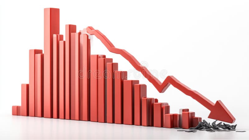
Free with trial A 3D rendering of a bar graph depicting a sharp decline in values. The red bars decrease in size, culminating in a large downward red arrow, symbolizing a significant economic downturn or market crash. The broken pieces at the bottom represent the loss or damage incurred. Decrease bar illustrations Red Bar Graph Showing Decline. A 3D rendering of a bar graph depicting a sharp decline in values. The red bars decrease in size, culminating in a large downward red arrow, symbolizing a significant economic downturn or market crash. The broken pieces at the bottom represent the loss or damage incurred.
Free with trial A minimalist white 3D bar graph illustrates a significant downward trend. The bars decrease in height from left to right, connected by a dashed line that forms a descending path, culminating in an arrow pointing downwards. The graphic is rendered in an isometric perspective on a white background, representing decline, loss, or negative performance. Decrease bar illustrations White 3D Bar Graph Showing a Downward Trend chart decline. A minimalist white 3D bar graph illustrates a significant downward trend. The bars decrease in height from left to right, connected by a dashed line that forms a descending path, culminating in an arrow pointing downwards. The graphic is rendered in an isometric perspective on a white background, representing decline, loss, or negative performance