Free with trial Metallic percentage symbol resting atop financial charts. Evokes concepts of interest, discounts, growth, or decline. Great for business, finance, or sales themes. Increase decrease graph illustrations Metallic percentage symbol resting atop financial charts. Evokes concepts of interest, discounts, growth, or decline. Great for
Free with trial Lower price. Text effect design with modern colors and 3D font look. Increase decrease graph vectors Lower price. Text effect with modern colors and 3D font look
Free with trial Up and down arrow icon on circle line. Upward and downward sign symbol vector. Increase decrease graph vectors Up and down arrow icon on circle line. Upward and downward sign symbol
Free with trial Visualize complex market trends and strategy using this metallic, AI-generated bar chart illustration. Perfect for financial reports, planning presentations, and investor materials that require a sophisticated, high-impact visual representation of business growth, decline, and future success. Increase decrease graph illustrations Conceptual 3D business bar chart illustrating market performance, showing initial decline followed by upward growth. Visualize complex market trends and strategy using this metallic, AI-generated bar chart illustration. Perfect for financial reports, planning presentations, and investor materials that require a sophisticated, high-impact visual representation of business growth, decline, and future success.
Free with trial Business analytics icon depicting price fluctuations in economic market data, financial growth concept. Increase decrease graph vectors Financial candlestick chart illustrating market trend for investment, stock trading data analysis. Isolated digital graphic. Business analytics icon depicting price fluctuations in economic market data, financial growth concept.
Free with trial This image showcases a 3D bar chart with four distinct vertical bars. The bars vary in height, forming a pattern that. Increase decrease graph illustrations A 3D bar chart displays a downward trend on a smooth light surface suggesting diminishing returns or financial decline. This image showcases a 3D bar chart with four distinct vertical bars. The bars vary in height, forming a pattern that.
Free with trial This image illustrates market trends with arrows and graphs. It represents economic instability, showing both growth and decline, crucial for financial analysis. Increase decrease graph vectors Vector art of illustration depicting fluctuating market trends with upward and downward arrows and bar graphs, , conveying. This image illustrates market trends with arrows and graphs. It represents economic instability, showing both growth and decline, crucial for financial analysis
Free with trial A close up view of golden digital currency coins on a financial candlestick chart. this image represents the volatility and trading patterns of the modern cryptocurrency market and global economy. Increase decrease graph vectors Golden digital currency coins placed over a financial candlestick chart showing market volatility and trading trends. a close up view of golden digital currency coins on a financial candlestick chart. this image represents the volatility and trading patterns of the modern cryptocurrency market and global economy
Free with trial Uptrend and downtrend arrow line icon on black circle. Rising and falling arrows illustration concept. Increase decrease graph vectors Uptrend and downtrend arrow line icon on black circle. Rising and falling arrows concept
Free with trial Hand Drawn Pink Bar Chart Illustration Showing Rise and Fall of Data Trends with Arrows Symbolizing Up and Down Fluctuations. Increase decrease graph vectors Hand Drawn Pink Bar Chart Illustration Showing Rise and Fall of Data Trends with Arrows Symbolizing Up and Down Fluctuations
Free with trial Simplified icon-style illustration of a business professional with financial reports and data on a black backdrop in a modern flat vector style. Increase decrease graph vectors Business professional and financial data presented with a simplified stylized illustration on a black background. Simplified icon-style illustration of a business professional with financial reports and data on a black backdrop in a modern flat vector style.
Free with trial Photo of handwritten charts illustrating inflation and potential recession. Graphs show rising prices and economic downturn concerns. Financial crisis concept depicted with, business. Increase decrease graph illustrations Photo of handwritten charts illustrating inflation and potential recession. Graphs show rising prices and economic downturn
Free with trial Colorful bar chart displayed on a polished wooden table, representing data analysis and visualization ,Generative ai. Increase decrease graph illustrations Colorful bar chart on wooden table, visualizing data analysis, trends, and performance metrics for business insights. Colorful bar chart displayed on a polished wooden table, representing data analysis and visualization ,Generative ai
Free with trial Simple graphic illustration of a dollar coin and financial arrows depicting market fluctuations for business and finance concepts. Increase decrease graph vectors Simple graphic illustration of a dollar coin and financial arrows depicting market fluctuations for business and finance concepts
Free with trial Line art icon of a whiteboard with graphs and charts being used for a business presentation. Increase decrease graph vectors Businessman analyzing statistics on whiteboard with graphs and charts. Line art icon of a whiteboard with graphs and charts being used for a business presentation
Free with trial Deflation line icon. Economic crisis sign. Vector illustration. Increase decrease graph vectors Deflation line icon. Economic crisis sign
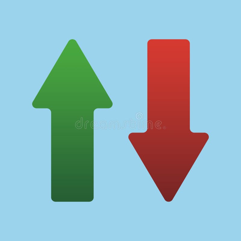
Free with trial Up and Down sign with green and red arrows isolated on a blue background vector illustration. Concept of sales bar chart symbol icon with arrow moving down and sales bar chart with arrow moving up. Increase decrease graph vectors Up and Down sign with green and red arrows vector illustration. Concept of sales bar chart symbol icon with arrows. Up and Down sign with green and red arrows isolated on a blue background vector illustration. Concept of sales bar chart symbol icon with arrow moving down and sales bar chart with arrow moving up.
Free with trial Up and Down sign with green and red arrows vector illustration. Concept of sales bar chart symbol icon with arrow moving down and sales bar chart with arrow moving up. Increase decrease graph vectors Up and Down sign with green and red arrows vector illustration. Concept of sales bar chart symbol icon with arrows. Up and Down sign with green and red arrows vector illustration. Concept of sales bar chart symbol icon with arrow moving down and sales bar chart with arrow moving up.
Free with trial Up and Down sign with green and red arrows vector illustration. Concept of sales bar chart symbol icon with arrow moving down and sales bar chart with arrow moving up. Increase decrease graph vectors Up and Down sign with green and red arrows vector illustration. Concept of sales bar chart symbol icon with arrows. Up and Down sign with green and red arrows vector illustration. Concept of sales bar chart symbol icon with arrow moving down and sales bar chart with arrow moving up.
Free with trial Green arrows pointing up and down. Illustrative design shows direction choice. Concept for website user interface button, or for business graphic. Increase decrease graph illustrations Green arrows pointing up and down. Illustrative design shows direction choice. Concept for website user interface button or for
Free with trial This image features financial analysis and cryptocurrency icons, including money, calculator, bear market, graphs, bitcoin, and a digital display, all in one place. Increase decrease graph vectors Vector art of financial analysis and cryptocurrency icons, featuring money, calculator, bear market, graphs, bitcoin, and digital. This image features financial analysis and cryptocurrency icons, including money, calculator, bear market, graphs, bitcoin, and a digital display, all in one place
Free with trial Colorful pie chart is showing positive statistics and business growth, target and financial analysis and marketing report, data with copy space. Increase decrease graph illustrations Colorful pie chart is showing positive statistics and business growth, target and financial analysis and marketing
Free with trial A graphic illustration depicting the fluctuating value of digital currency, shown with a price performance chart and coins. this visual represents market ups and downs and financial trends. Increase decrease graph vectors Stylized illustration showing digital currency market volatility and virtual coin price trends on financial growth chart. a graphic illustration depicting the fluctuating value of digital currency, shown with a price performance chart and coins. this visual represents market ups and downs and financial trends
Free with trial This image showcases a businessman illustrating the concept of cost reduction and profit growth holding graphic elements that represent financial data analysis market performance and strategic planning The composition suggests a focus on improving business outcomes through careful financial management and investment decisions leading to increased profitability and overall success in competitive. Increase decrease graph illustrations Cost reduction and profit growth strategy depicted by businessman with graphic elements indicating financial performance and. This image showcases a businessman illustrating the concept of cost reduction and profit growth holding graphic elements that represent financial data analysis market performance and strategic planning The composition suggests a focus on improving business outcomes through careful financial management and investment decisions leading to increased profitability and overall success in competitive
Free with trial Percentage sign icon, related to accounting, ideal for financial, tax, or business-related designs. Increase decrease graph vectors Professional Percentage Sign Icon for Accounting Purposes. Percentage sign icon, related to accounting, ideal for financial, tax, or business-related designs.
Free with trial Percentage sign icon, related to accounting, ideal for financial, tax, or business-related designs. Increase decrease graph vectors Professional Percentage Sign Icon for Accounting Purposes. Percentage sign icon, related to accounting, ideal for financial, tax, or business-related designs.
Free with trial Red arrow 3D down shows decreasing sales. Conceptual vector illustration. Increase decrease graph vectors Red arrow down increasing sales vector. Red arrow 3D down shows decreasing sales. Conceptual vector illustration
Free with trial Collection of black and white cryptocurrency and finance icons on a white background. Increase decrease graph vectors Cryptocurrency and finance icons set including Bitcoin Ethereum Litecoin symbols and various business graphs and charts financial. Collection of black and white. Collection of black and white cryptocurrency and finance icons on a white background
Free with trial A detailed data visualization illustrating market trends over time. The infographic combines a line chart, which shows fluctuating values and percentages, with a bar chart representing data for specific time intervals. The line chart highlights key data points, such as peaks annotated with values like '1. 24%' and '500K'. The x-axis represents a timeline from January to March, while the y-axis. Increase decrease graph illustrations A modern market trend analysis visualization combining a bar and line chart for financial data isolated on white background. A detailed data visualization illustrating market trends over time. The infographic combines a line chart, which shows fluctuating values and percentages, with a bar chart representing data for specific time intervals. The line chart highlights key data points, such as peaks annotated with values like '1.24%' and '500K'. The x-axis represents a timeline from January to March, while the y-axis
Free with trial Up, down, left, and right arrow icon in rounded corner. Upward, downward, leftward, and rightward sign symbol vector. Increase decrease graph vectors Up, down, left, and right arrow icon in rounded corner. Upward, downward, leftward, and rightward sign symbol
Free with trial Sine waves analysis outline icon in white and black colors. sine waves analysis flat vector icon from business and analytics collection for web, mobile apps and ui. Increase decrease graph vectors Sine waves analysis outline icon in white and black colors. sine waves analysis flat vector icon from business and analytics
Free with trial Blue stacked arrows illustrate financial growth, market trends. Graphic displays upward, downward movement, signifying progress, decline in business economy. Represents strategy,. Increase decrease graph illustrations Blue stacked arrows illustrate financial growth, market trends. Graphic displays upward, downward movement, signifying progress
Free with trial A colorful bar chart overlays blueprint showcasing data visualization for business analysis colorful on top of blueprinted paper ,Generative ai. Increase decrease graph illustrations A vibrant and informative colorful bar chart displayed on top of detailed blueprinted paper for comprehensive data analysis. A colorful bar chart overlays blueprint showcasing data visualization for business analysis colorful on top of blueprinted paper ,Generative ai
Free with trial A businessman in suit pushing a percent sign for your needs. Concept for online bank or your finance company. Special offer, sale, gift. Vector illustration. Increase decrease graph vectors A businessman in suit pushing a percent sign for your needs. Concept for online bank or your finance company. Special
Free with trial Up down arrow icon on black circle. Upward downward sign symbol vector. Increase decrease graph vectors Up down arrow icon on black circle. Upward downward sign symbol
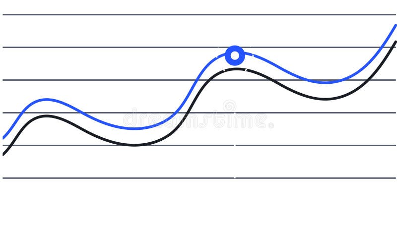
Free with trial Two lines are representing data progression over time, one blue and one black, creating a visual representation of trends and a key intersection point is marked with a blue circle. Increase decrease graph illustrations Two lines are representing data progression over time, one blue and one black, creating a visual representation of
Free with trial Two lines are representing data progression over time, one blue and one black, creating a visual representation of trends and a key intersection point is marked with a blue circle. Increase decrease graph vectors Two lines are representing data progression over time, one blue and one black, creating a visual representation of
Free with trial Up, down, left, and right arrow icon set on black square. Upward, downward, leftward, and rightward sign symbol vector. Increase decrease graph vectors Up, down, left, and right arrow icon set on black square. Upward, downward, leftward, and rightward sign symbol
Free with trial An abstract image depicting stylized blue mountains and orange data points suggesting growth or a dynamic process. Increase decrease graph illustrations Abstract Blue Mountainscape With Orange Data Points. An abstract image depicting stylized blue mountains and orange data points suggesting growth or a dynamic process
Free with trial Two lines are representing increasing and declining trends over a grid background, symbolizing market analysis, financial performance, or business progress. Increase decrease graph illustrations Two lines are representing increasing and declining trends over a grid background, symbolizing market analysis
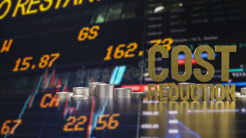
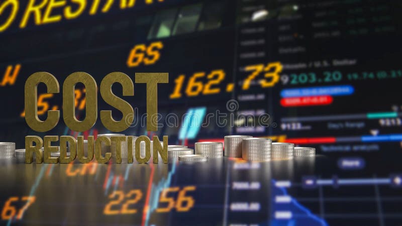
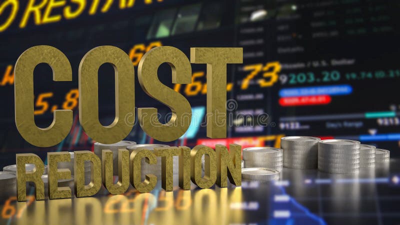
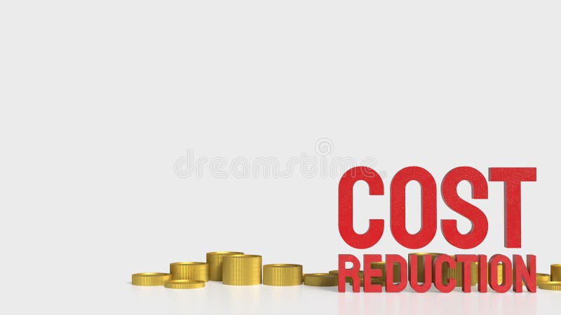
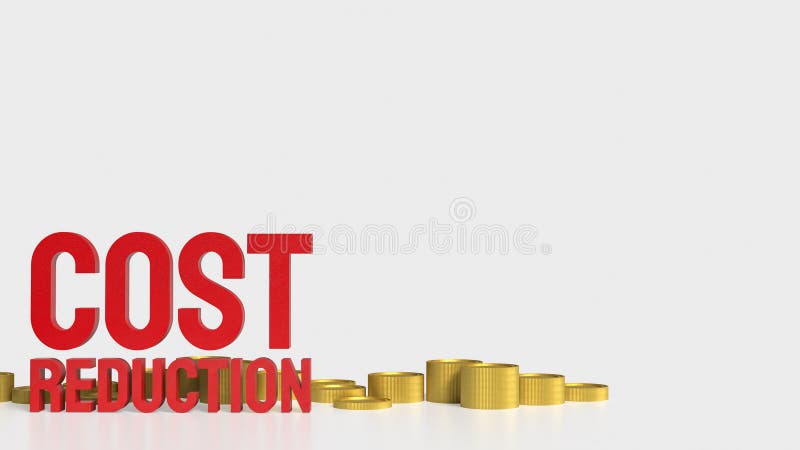
Free with trial The Cost reduction and coins for Business concept 3d rendering. Increase decrease graph illustrations The Cost reduction and coins for Business concept 3d rendering
Free with trial The Cost reduction and coins for Business concept 3d rendering. Increase decrease graph illustrations The Cost reduction and coins for Business concept 3d rendering
Free with trial The Cost reduction and coins for Business concept 3d rendering. Increase decrease graph illustrations The Cost reduction and coins for Business concept 3d rendering
Free with trial The Cost reduction and coins for Business concept 3d rendering. Increase decrease graph illustrations The Cost reduction and coins for Business concept 3d rendering
Free with trial The Cost reduction and coins for Business concept 3d rendering. Increase decrease graph illustrations The Cost reduction and coins for Business concept 3d rendering
Free with trial The Cost reduction and coins for Business concept 3d rendering. Increase decrease graph illustrations The Cost reduction and coins for Business concept 3d rendering
Free with trial This image depicts two contrasting scenarios of the housing market, one showing a positive upward trend and the other a negative downward trend. Increase decrease graph illustrations Visual representation of real estate market trends showing both upward and downward fluctuations in housing prices and investment. This image depicts two contrasting scenarios of the housing market, one showing a positive upward trend and the other a negative downward trend
Free with trial The Cost reduction and coins for Business concept 3d rendering. Increase decrease graph illustrations The Cost reduction and coins for Business concept 3d rendering
Free with trial The Cost reduction and coins for Business concept 3d rendering. Increase decrease graph illustrations The Cost reduction and coins for Business concept 3d rendering
Free with trial The Cost reduction and coins for Business concept 3d rendering. Increase decrease graph illustrations The Cost reduction and coins for Business concept 3d rendering
Free with trial The Cost reduction and coins for Business concept 3d rendering. Increase decrease graph illustrations The Cost reduction and coins for Business concept 3d rendering
Free with trial The Cost reduction and coins for Business concept 3d rendering. Increase decrease graph illustrations The Cost reduction and coins for Business concept 3d rendering
Free with trial The Cost reduction and coins for Business concept 3d rendering. Increase decrease graph illustrations The Cost reduction and coins for Business concept 3d rendering
Free with trial Lower price. Text effect design with modern colors and 3D font look. Increase decrease graph vectors Lower price. Text effect with modern colors and 3D font look
Free with trial Lower price. Text effect design with modern colors and 3D font look. Increase decrease graph vectors Lower price. Text effect with modern colors and 3D font look
Free with trial Seamless pattern featuring colorful financial arrows pointing up and down representing market trends isolated on a bright white. Generative AI Illustration. Increase decrease graph illustrations Seamless pattern featuring colorful financial arrows pointing up and down representing market trends isolated on a bright white
Free with trial Seamless pattern featuring colorful financial arrows pointing up and down representing market trends isolated on a bright white. Generative AI Illustration. Increase decrease graph illustrations Seamless pattern featuring colorful financial arrows pointing up and down representing market trends isolated on a bright white
Free with trial Seamless pattern featuring colorful financial arrows pointing up and down representing market trends isolated on a bright white. Generative AI Illustrations. Increase decrease graph illustrations Seamless pattern featuring colorful financial arrows pointing up and down representing market trends isolated on a bright white
Free with trial Seamless pattern featuring colorful financial arrows pointing up and down representing market trends isolated on a bright white. Generative AI Illustration. Increase decrease graph illustrations Seamless pattern featuring colorful financial arrows pointing up and down representing market trends isolated on a bright white
Free with trial Decline Curve A Visual Representation of Increasing Trends Curving Downward and Overcoming Previous Bars Against a Dark Blue Background by SD. Increase decrease graph illustrations Decline Curve A Visual Representation of Increasing Trends Curving Downward and Overcoming Previous Bars Against a Dark Blue Backg
Free with trial Up and down arrow icon on black circle. Upward and downward sign symbol vector. Increase decrease graph vectors Up and down arrow icon on black circle. Upward and downward sign symbol
Free with trial This illustration features two colorful bar graphs on a white background, showcasing data comparison with distinct color palettes for engaging visual analysis and presentations. Increase decrease graph illustrations Colorful Bar Graphs on White Background Representing Data Comparison and Growth with Different Color Schemes for Visual Analysis. This illustration features two colorful bar graphs on a white background, showcasing data comparison with distinct color palettes for engaging visual analysis and presentations
Free with trial This illustration portrays money circulation with arrows around a dollar coin, symbolizing financial flow and economic activity in a dynamic system. Increase decrease graph vectors Vector art of illustration depicting money circulation with arrows around a dollar coin, representing financial flow and economic. This illustration portrays money circulation with arrows around a dollar coin, symbolizing financial flow and economic activity in a dynamic system
Free with trial Modern abstract zigzag-shaped chart depicting fluctuations in data analysis representing concept. Increase decrease graph illustrations Modern abstract zigzag-shaped line chart representing fluctuations in data analysis concept. Modern abstract zigzag-shaped chart depicting fluctuations in data analysis representing concept
Free with trial Lower price. Text effect design with modern colors and 3D font look. Increase decrease graph illustrations Lower price. Text effect with modern colors and 3D font look
Free with trial Curved red down arrow and green up arrow icons for visualizing growth, decline, trends, performance metrics, charts, and financial data. Increase decrease graph vectors Curved red down and green up arrows for growth and decline indicators. Curved red down arrow and green up arrow icons for visualizing growth, decline, trends, performance metrics, charts, and financial data
Free with trial Growth chart icon. Decline line symbol. Vector business graphic. Profit and loss shape. EPS 10. Increase decrease graph vectors Growth chart icon. Decline line symbol. Vector business graphic. Profit and loss shape.
Free with trial This vibrant line chart illustrates growth and decline trends with colored circles, making it suitable for business presentations, reports, and educational material. Increase decrease graph illustrations Colorful Line Chart Showing Growth and Decline Trends with Green, Yellow, and Red Circles Representing Data Points over Time. This vibrant line chart illustrates growth and decline trends with colored circles, making it suitable for business presentations, reports, and educational material
Free with trial Percent growth and decline arrow icon vector isolated on white background. Percentage up and down sign symbol. Increase decrease graph vectors Percent growth and decline arrow icon isolated on white background. Percentage up and down sign symbol
Free with trial Colorful bar charts illustrating positive and negative business trends from january to may provide a clear visual representation of performance. Increase decrease graph vectors Colorful bar charts illustrating positive and negative business trends from january to may provide a clear visual
Free with trial Colorful bar charts are presenting statistical trends and business performance data across different time periods. Possibly days of the week. Using a vibrant color scheme of blue. Purple. And orange. Increase decrease graph illustrations Colorful bar charts are presenting statistical trends and business performance data across different time periods
Free with trial Elevate your financial presentations and data visualizations with these captivating vintage-style arrow graphics. Perfect for illustrating price fluctuations, interest rate movements, and market trends, these retro-inspired up and down arrow designs are a visually engaging way to convey complex information. The sepia tone and textured background add a touch of vintage charm, bringing a classic. Increase decrease graph illustrations Vintage-Inspired Arrow Graphics for Illustrating Price & Interest Rate Trends: A Retro Style Design Element. Elevate your financial presentations and data visualizations with these captivating vintage-style arrow graphics. Perfect for illustrating price fluctuations, interest rate movements, and market trends, these retro-inspired up and down arrow designs are a visually engaging way to convey complex information. The sepia tone and textured background add a touch of vintage charm, bringing a classic
Free with trial This illustration features two colorful bar graphs on a white background, showcasing data comparison with distinct color palettes for engaging visual analysis and presentations. Increase decrease graph illustrations Colorful Bar Graphs on White Background Representing Data Comparison and Growth with Different Color Schemes for Visual Analysis. This illustration features two colorful bar graphs on a white background, showcasing data comparison with distinct color palettes for engaging visual analysis and presentations
Free with trial This image features colorful 3D bar graphs representing both growth and decline trends, ideal for business analytics and financial performance visualizations. Increase decrease graph illustrations Colorful 3D Bar Graphs Displaying Growth and Decline Trends in Business Analytics and Financial Performance on a Clean White. This image features colorful 3D bar graphs representing both growth and decline trends, ideal for business analytics and financial performance visualizations
Free with trial This abstract data visualization features smooth blue waves representing trends and fluctuations, ideal for business reports, finance presentations, and analytical insights. Increase decrease graph illustrations Abstract Blue Data Visualization Depicting Trends and Fluctuations in Graphical Format for Business and Finance Presentations. This abstract data visualization features smooth blue waves representing trends and fluctuations, ideal for business reports, finance presentations, and analytical insights
Free with trial Vibrant and colorful bar chart illustrating various data metrics, perfect for business or marketing use, highlighting trends and insights visually engaging for audiences. Increase decrease graph illustrations Colorful Bar Chart Showing Data Variations in a Bright and Engaging Style Suitable for Business Presentations or Marketing. Vibrant and colorful bar chart illustrating various data metrics, perfect for business or marketing use, highlighting trends and insights visually engaging for audiences
Free with trial This vibrant illustration features colorful bar graphs that visualize business growth and performance metrics, ideal for presentations, reports, and analysis. Increase decrease graph illustrations Colorful Bar Graphs Representing Business Growth and Performance Metrics in Vibrant Tones of Red, Orange, Yellow, White, and Green. This vibrant illustration features colorful bar graphs that visualize business growth and performance metrics, ideal for presentations, reports, and analysis
Free with trial Colorful bar charts illustrating positive and negative business trends from january to may provide a clear visual representation of performance. Increase decrease graph illustrations Colorful bar charts illustrating positive and negative business trends from january to may provide a clear visual
Free with trial Reduce energy usage, in line design, green. Reduce, energy, usage, conservation, efficiency, sustainable, power on white background vector. Reduce energy usage editable stroke icon. Increase decrease graph vectors Reduce energy usage, in line design, green. Reduce, energy, usage, conservation, efficiency, sustainable, power on white
Free with trial Featuring four vibrant business charts illustrating increasing, decreasing, fluctuating, and peaking trends, perfect for enhancing presentations and reports with clear visual data analysis. Increase decrease graph vectors Featuring four vibrant business charts illustrating increasing, decreasing, fluctuating, and peaking trends, perfect for