Free with trial This image displays a graph with fluctuating data points over a period of time. The y-axis represents the magnitude of the data, while the x-axis denotes the time period. Initially, there is a sharp peak followed by a series of oscillations that gradually decrease in amplitude. Time decrease illustrations Graph showing fluctuating data over time. This image displays a graph with fluctuating data points over a period of time. The y-axis represents the magnitude of the data, while the x-axis denotes the time period. Initially, there is a sharp peak followed by a series of oscillations that gradually decrease in amplitude
Free with trial A line graph illustrates a steady decline in values, featuring a blue line dropping toward a bright red arrow indicating a significant downward trend over time. Time decrease illustrations Declining trend in data representation shows significant decrease over time. A line graph illustrates a steady decline in values, featuring a blue line dropping toward a bright red arrow indicating a significant downward trend over time.
Free with trial A green line graph illustrating data points over time, with the y-axis labeled 'Value' and the x-axis labeled 'Time', showcasing significant ups and downs in the data. Time decrease illustrations Line graph showing fluctuating values over time. A green line graph illustrating data points over time, with the y-axis labeled 'Value' and the x-axis labeled 'Time', showcasing significant ups and downs in the data
Free with trial This image depicts a bar and line graph that illustrates fluctuating values over a period of time. The x-axis represents time, while the y-axis represents the value. The graph shows an overall upward trend with several peaks and troughs, indicating periods of increase and decrease in value. The bars provide a visual representation of the value at specific intervals, while the line connects these. Time decrease illustrations Graph showing fluctuating values over time. This image depicts a bar and line graph that illustrates fluctuating values over a period of time. The x-axis represents time, while the y-axis represents the value. The graph shows an overall upward trend with several peaks and troughs, indicating periods of increase and decrease in value. The bars provide a visual representation of the value at specific intervals, while the line connects these
Free with trial A line graph displaying two lines, one red and one blue, both trending downward over time. The red line is consistently above the blue line and both show a significant decrease, with the red line ending in a sharp drop highlighted by a red arrow. Time decrease illustrations Graph showing a decline in values over time with a notable drop. A line graph displaying two lines, one red and one blue, both trending downward over time. The red line is consistently above the blue line and both show a significant decrease, with the red line ending in a sharp drop highlighted by a red arrow
Free with trial This conceptual scientific illustration features a dramatic black hole on the left, rendered with a deep blue cosmic background and radiant rays of light emanating from its center, visually paired with a clean, modern bar graph on the right that charts a significant decrease in mass drop events over time, directly comparing a 10x mass decrease against a 100x mass drop with clear white data labels. Time decrease illustrations An illustration of a black hole with a tenfold mass decrease and hundredfold mass drop alongside a comparative bar graph showing. This conceptual scientific illustration features a dramatic black hole on the left, rendered with a deep blue cosmic background and radiant rays of light emanating from its center, visually paired with a clean, modern bar graph on the right that charts a significant decrease in mass drop events over time, directly comparing a 10x mass decrease against a 100x mass drop with clear white data labels
Free with trial The image displays a line graph with two lines, one blue and one red, trending downward over time. The y-axis is labeled 'Monthly searches' and the x-axis is unlabeled but marked 'Time (months years)'. Both lines start at a high point and decrease, with the red line generally following the average of the blue line's fluctuations. Time decrease illustrations A graph showing a decline in monthly searches over time with two lines. The image displays a line graph with two lines, one blue and one red, trending downward over time. The y-axis is labeled 'Monthly searches' and the x-axis is unlabeled but marked 'Time (months years)'. Both lines start at a high point and decrease, with the red line generally following the average of the blue line's fluctuations
Free with trial A red graph with a downward trend, indicating a decline or decrease in a particular metric or value over time, with a prominent red arrow pointing downwards. Time decrease illustrations Downward trend indicated by red graph with declining values over time. A red graph with a downward trend, indicating a decline or decrease in a particular metric or value over time, with a prominent red arrow pointing downwards
Free with trial The image depicts a bar and line graph illustrating a steady decline in values over a period of time. The bars represent the values at specific intervals, while the red line connects the data points, emphasizing the downward trend. Time decrease illustrations A downward trend graph showing a significant decrease in values over time. The image depicts a bar and line graph illustrating a steady decline in values over a period of time. The bars represent the values at specific intervals, while the red line connects the data points, emphasizing the downward trend
Free with trial The image depicts a series of vertical bars in teal color, showing a gradual decrease in height from left to right. A large red downward-pointing arrow overlays the bars, emphasizing the trend of decline in the data represented. This visual is commonly used to illustrate decreasing performance, sales, or other metrics over time. Time decrease illustrations Declining bar chart with a downward arrow indicating a decrease in values. The image depicts a series of vertical bars in teal color, showing a gradual decrease in height from left to right. A large red downward-pointing arrow overlays the bars, emphasizing the trend of decline in the data represented. This visual is commonly used to illustrate decreasing performance, sales, or other metrics over time
Free with trial The image displays a graph with a red line trending downward, suggesting a decrease or decline in the represented data over a period of time. The background of the graph is gray with a grid pattern, and the red line has fluctuations but overall points downwards, ending with a red arrowhead at the bottom right. Time decrease illustrations A graph showing a downward trend with a red line indicating decline over time. The image displays a graph with a red line trending downward, suggesting a decrease or decline in the represented data over a period of time. The background of the graph is gray with a grid pattern, and the red line has fluctuations but overall points downwards, ending with a red arrowhead at the bottom right
Free with trial A graph showing a downward trend with a red arrow pointing downwards, indicating a decline or decrease in value or quantity over time. Time decrease illustrations Declining trend indicated by red arrow on graph showing decrease over time. A graph showing a downward trend with a red arrow pointing downwards, indicating a decline or decrease in value or quantity over time
Free with trial Black silhouette of a jagged line graph showing a decrease over time on a white background. Time decrease illustrations Black silhouette of a jagged line graph decreasing over time chart economics. Black silhouette of a jagged line graph showing a decrease over time on a white background
Free with trial The image shows a bar graph with a red line indicating a downward trend. The bars decrease in height from left to right, suggesting a significant decline in the measured data over time. Time decrease illustrations A downward trend graph illustrating a significant decrease in data over time. The image shows a bar graph with a red line indicating a downward trend. The bars decrease in height from left to right, suggesting a significant decline in the measured data over time
Free with trial The image shows a framed bar chart with red and green bars. The bars represent data trends over time, with the green bars showing an increase and the red bars showing a decrease. The chart is displayed on a white background with a wooden frame. Time decrease illustrations A framed bar chart with red and green bars representing data trends over time. The image shows a framed bar chart with red and green bars. The bars represent data trends over time, with the green bars showing an increase and the red bars showing a decrease. The chart is displayed on a white background with a wooden frame
Free with trial The image shows a bar graph with three bars of decreasing height, representing a downward trend. A red arrow is pointing downwards, emphasizing the decline in values over time. Time decrease illustrations A downward trend graph with a red arrow indicating a decrease in values over time. The image shows a bar graph with three bars of decreasing height, representing a downward trend. A red arrow is pointing downwards, emphasizing the decline in values over time
Free with trial This candlestick chart displays the price movements of a stock over a period. The green and red bars represent price changes, with green indicating an increase and red indicating a decrease. The chart shows a clear upward trend, suggesting a bullish market sentiment. The x-axis represents time, while the y-axis represents the stock price. Time decrease illustrations Candlestick chart showing a significant upward trend in stock prices over time. This candlestick chart displays the price movements of a stock over a period. The green and red bars represent price changes, with green indicating an increase and red indicating a decrease. The chart shows a clear upward trend, suggesting a bullish market sentiment. The x-axis represents time, while the y-axis represents the stock price
Free with trial The image shows a bar graph with a red line trending downward, indicating a significant decline in data points over time. The bars start tall on the left and gradually decrease in height towards the right, with the red line sharply descending, emphasizing the negative trend. Time decrease illustrations A downward trend graph illustrating a significant decline in data points over time. The image shows a bar graph with a red line trending downward, indicating a significant decline in data points over time. The bars start tall on the left and gradually decrease in height towards the right, with the red line sharply descending, emphasizing the negative trend
Free with trial The image depicts a bar chart with a superimposed red line showing a clear downward trend. Each bar represents a progressively smaller value, indicating a consistent decrease in data over time. The chart uses a gradient from taller to shorter bars, suggesting a significant drop in the measured quantity, which is reinforced by the downward-sloping line connecting the tops of the bars. Time decrease illustrations Declining bar chart graph illustrating a downward trend in data values over time. The image depicts a bar chart with a superimposed red line showing a clear. The image depicts a bar chart with a superimposed red line showing a clear downward trend. Each bar represents a progressively smaller value, indicating a consistent decrease in data over time. The chart uses a gradient from taller to shorter bars, suggesting a significant drop in the measured quantity, which is reinforced by the downward-sloping line connecting the tops of the bars
Free with trial The image depicts a 3D bar graph with red bars, showing a clear downward trend. The bars decrease in height from left to right, indicating a significant decline in the measured data. An arrow points downwards, emphasizing the negative trend. Time decrease illustrations A downward trending graph illustrating a significant decrease in data points over time. The image depicts a 3D bar graph with red bars, showing a clear downward trend. The bars decrease in height from left to right, indicating a significant decline in the measured data. An arrow points downwards, emphasizing the negative trend
Free with trial An AI image illustration of an era where Bitcoin will experiencing a significant decrease in a short up to medium term, or so called a bearish time. Time decrease illustrations Bitcoin bearish time. an AI image illustration of an era where Bitcoin will experiencing a significant decrease in a short up to medium term, or so called a bearish time
Free with trial Clock With Arrows Line And Solid Icon Set. Time Management, Efficiency, And Productivity Symbol Collection. Directional Arrows Indicating Increase And Decrease. Isolated Vector Illustration. Time decrease vectors Clock With Arrows Line And Solid Icon Set. Time Management, Efficiency, And Productivity Symbol Collection. Directional
Free with trial Downward trend, schematic chart. Declining red line graph depicting a downward trend with fluctuations, indicating decrease over time. Greatly simplified symbol of downturn, falling, and loss. Vector. Time decrease vectors Downward trend, schematic chart, symbol of loss. Downward trend, schematic chart. Declining red line graph depicting a downward trend with fluctuations, indicating decrease over time. Greatly simplified symbol of downturn, falling, and loss. Vector
Free with trial Decrease: Decrease represents a reduction in value, amount, or performance over time. Time decrease illustrations Illustration of Decrease. Decrease: Decrease represents a reduction in value, amount, or performance over time.
Free with trial Downward arrow, clock face, and cloud symbolizing time tracking, efficiency, focus, digital minimalism, productivity, data flow, and workflow optimization as a simple flat metaphor. Time decrease illustrations Downward Arrow, Clock, and Cloud Representing Time Management and Efficiency. Downward arrow, clock face, and cloud symbolizing time tracking, efficiency, focus, digital minimalism, productivity, data flow, and workflow optimization as a simple flat metaphor
Free with trial Two opposing arrows, a clock, and a growth chart with an upward trend. Ideal for business, productivity, time management, performance, progress efficiency and decision-making. A simple flat. Time decrease illustrations Upward and Downward Arrows with Clock and Growth Chart Representing Time and Progress. Two opposing arrows, a clock, and a growth chart with an upward trend. Ideal for business, productivity, time management, performance, progress efficiency and decision-making. A simple flat
Free with trial The image depicts a bar graph with a downward trend. The graph shows a series of bars representing value over time. The value starts high and gradually decreases, indicating a decline over the period measured. The x-axis is labeled 'Time' and the y-axis is labeled 'Value'. The bars are red, and a red arrow at the end of the line graph emphasizes the downward trend. Time decrease illustrations Decreasing value over time. The image depicts a bar graph with a downward trend. The graph shows a series of bars representing value over time. The value starts high and gradually decreases, indicating a decline over the period measured. The x-axis is labeled 'Time' and the y-axis is labeled 'Value'. The bars are red, and a red arrow at the end of the line graph emphasizes the downward trend
Free with trial Set of six flat design icons related to time measurement and performance trends isolated on transparent background. Time decrease vectors Collection of flat design time and performance measurement icons. Set of six flat design icons related to time measurement and performance trends isolated on transparent background
Free with trial The image depicts a bar graph with a downward trend. The bars, which start at a higher value on the left, progressively decrease in height towards the right. A large red arrow, pointing downwards, emphasizes the declining trend. This visual representation suggests a continuous decrease in performance, sales, or another measured metric over a specified period. Time decrease illustrations Decline in performance over time. The image depicts a bar graph with a downward trend. The bars, which start at a higher value on the left, progressively decrease in height towards the right. A large red arrow, pointing downwards, emphasizes the declining trend. This visual representation suggests a continuous decrease in performance, sales, or another measured metric over a specified period
Free with trial A 3D financial chart depicting a stock market downturn. The chart features blue and pink bar graphs with numerical values like 45,971 and 37,020. A red downward-curving line with arrows illustrates the declining trend. The background is dark, emphasizing the vibrant colors of the bars and line. Small numbers indicate data points along the bottom, highlighting the decrease in value over time. The visual representation effectively conveys a negative financial trend. Time decrease illustrations Declining Stock Market Performance Financial Charts Showing Downturn Trend. A 3D financial chart depicting a stock market downturn. The chart features blue and pink bar graphs with numerical values like 45,971 and 37,020. A red downward-curving line with arrows illustrates the declining trend. The background is dark, emphasizing the vibrant colors of the bars and line. Small numbers indicate data points along the bottom, highlighting the decrease in value over time. The visual representation effectively conveys a negative financial trend.
Free with trial This image depicts a 3D stock market chart with green and red candlesticks. The chart shows fluctuations in stock prices over a period of time. Green candlesticks indicate an increase in stock prices, while red candlesticks indicate a decrease. The chart is set on a grid background, providing a clear visualization of the price movements. Time decrease illustrations Stock market chart with green and red candles
Free with trial A line graph displaying fluctuating data points over time with a distinct pattern of peaks and troughs. Time decrease illustrations Graph showing fluctuating data points over time. A line graph displaying fluctuating data points over time with a distinct pattern of peaks and troughs
Free with trial Candlestick chart displaying financial data trends with red and green bars on a white background. Each candlestick represents price movement over a specific time period, reflecting opening, closing, high, and low prices. Green candles indicate a price increase, while red ones signify a decrease. Vertical lines, or wicks, extend above and below the body of the candle, showing price extremes. This visualization is commonly used in financial markets to analyze stock prices and trends. Time decrease illustrations Candlestick chart displaying financial data trends with red and green bars on a
Free with trial Real time carbon emission data monitoring and CO2 tracking outline concept. Smart city feature for air quality management to avoid carbon dioxide gas pollution vector illustration. Green urban scene. Time decrease vectors Real time carbon emission data monitoring and CO2 tracking outline concept
Free with trial The image depicts a series of green bars representing data points, with a prominent red downward arrow indicating a decline in performance or values over time. The bars decrease in height from left to right, emphasizing a downward trend. Time decrease illustrations Decline in performance indicated by downward trend. The image depicts a series of green bars representing data points, with a prominent red downward arrow indicating a decline in performance or values over time. The bars decrease in height from left to right, emphasizing a downward trend
Free with trial Set line Location, Financial growth decrease, Old hourglass with sand and increase icon. Vector. Time decrease illustrations Set line Location, Financial growth decrease, Old hourglass with sand and increase icon. Vector
Free with trial This image depicts a combination of line and bar graphs showing comparative data analysis over a period of time. Time decrease illustrations Comparative data analysis over time with line and bar graphs. This image depicts a combination of line and bar graphs showing comparative data analysis over a period of time
Free with trial The image shows a red candlestick chart against a white background. the chart displays price movements over time, with each candlestick representing a specific period. the red color indicates a price decrease during that period. two horizontal black lines are drawn across the chart, potentially indicating support or resistance levels. the chart shows an overall upward trend, with periods of both gains and losses. the candlesticks vary in size, reflecting the magnitude of price fluctuations. the background is plain white, providing a clean and uncluttered view of the chart. Time decrease illustrations Red candlestick chart on white background. the image shows a red candlestick chart against a white background. the chart displays price movements over time, with each candlestick representing a specific period. the red color indicates a price decrease during that period. two horizontal black lines are drawn across the chart, potentially indicating support or resistance levels. the chart shows an overall upward trend, with periods of both gains and losses. the candlesticks vary in size, reflecting the magnitude of price fluctuations. the background is plain white, providing a clean and uncluttered view of the chart.
Free with trial Black and white line graph comparing nominal and real return over time with axes labeled. Time decrease illustrations Black and white line graph showing nominal and real return over time chart nominal return. Black and white line graph comparing nominal and real return over time with axes labeled
Free with trial A simple yet effective downward sloping arrow indicating a declining trend or negative progress. This infographic element is ideal for business reports, financial charts, educational materials, or presentations needing to visualize a decrease in value or performance over time. vector design Generative AI. Time decrease vectors Downward Sloping Graph Arrow for Declining Trends, vector design Generative AI. A simple yet effective downward sloping arrow indicating a declining trend or negative progress. This infographic element is ideal for business reports, financial charts, educational materials, or presentations needing to visualize a decrease in value or performance over time. vector design Generative AI
Free with trial Set line Financial growth decrease Playing card with clubs symbol Casino chips Wine glass Slot machine Online poker table game and Calendar icon. Vector. Time decrease illustrations Set line Financial growth decrease, Playing card with clubs symbol, Casino chips, Wine glass, Slot machine, Online poker. Set line Financial growth decrease Playing card with clubs symbol Casino chips Wine glass Slot machine Online poker table game and Calendar icon. Vector.
Free with trial The chart displays a candlestick pattern where the prices fluctuate over time. Different colors represent price movements and trading activity during sessions. Time decrease vectors The chart displays a candlestick pattern where the prices fluctuate over time. Different colors represent price movements and
Free with trial The image shows a line graph illustrating the decline of carbon emissions. there are two lines on the graph, a green line and a grey line, both trending downwards. the green line, representing "carbon inteetiual emissions," shows a steeper decline compared to the grey line. the graph is set against a grid background, providing a visual reference for the rate of decrease in emissions over time. the downward trend suggests a positive change in reducing carbon output. Time decrease illustrations Carbon emissions decline graph illustration. the image shows a line graph illustrating the decline of carbon emissions. there are two lines on the graph, a green line and a grey line, both trending downwards. the green line, representing "carbon inteetiual emissions," shows a steeper decline compared to the grey line. the graph is set against a grid background, providing a visual reference for the rate of decrease in emissions over time. the downward trend suggests a positive change in reducing carbon output.
Free with trial Downward arrow, segmented pie chart, and analog clock suggest concepts of time management, data analysis, and decline. Ideal for productivity, efficiency, business, strategy evaluation finance. Time decrease vectors Downward Arrow, Pie Chart, and Clock Representing Time, Decline, and Data Analysis Concept. Downward arrow, segmented pie chart, and analog clock suggest concepts of time management, data analysis, and decline. Ideal for productivity, efficiency, business, strategy evaluation finance
Free with trial This vector icon shows a minus sign enclosed in a rectangle with a clock symbol inside. It typically represents actions like zoom out, remove item, decrease quantity, or a time related subtraction. A common UI element for various applications. vector design Generative AI. Time decrease vectors Minus Sign in Rectangle Icon Zoom Out Remove Vector, vector design Generative AI. This vector icon shows a minus sign enclosed in a rectangle with a clock symbol inside. It typically represents actions like zoom out, remove item, decrease quantity, or a time related subtraction. A common UI element for various applications. vector design Generative AI
Free with trial A red line graph with data points illustrating a downward trend over time, suggesting a decrease in measured values. Time decrease illustrations Declining Trend in Data Analysis Representation. a red line graph with data points illustrating a downward trend over time, suggesting a decrease in measured values
Free with trial Colorful line graph illustrating growth and decline over time, with variously colored data points on a dark background, visualizing financial performance and trends. Time decrease vectors Colorful line graph illustrating growth and decline over time, with variously colored data points on a dark background
Free with trial Cloaked figures travel toward a vanishing point. Above, a procession of clocks and hourglasses decrease in size, visually illustrating the swift passage of time. Time decrease illustrations On paths of time, cloaked figures journey as clocks and hourglasses tick, whispering tempus fugit. Cloaked figures travel toward a vanishing point. Above, a procession of clocks and hourglasses decrease in size, visually illustrating the swift passage of time.
Free with trial Downward arrow, spiral calendar, and bar graph signifying trend analysis, scheduling, and metrics. Ideal for time management, progress tracking, productivity, data analytics planning forecasting. Time decrease vectors Calendar, Downward Arrow, and Bar Graph Representing Time Management and Performance Analysis. Downward arrow, spiral calendar, and bar graph signifying trend analysis, scheduling, and metrics. Ideal for time management, progress tracking, productivity, data analytics planning forecasting
Free with trial The image depicts a financial chart, specifically a downward trending line graph, suggesting a stock market crash or economic downturn. the line is orange and jagged, indicating volatility and a significant decrease in value. the background features a dark blue grid with vertical lines, possibly representing data points or time intervals. the overall aesthetic is modern and digital, reinforcing the theme of financial technology and market analysis. the color scheme is dominated by blues and oranges, creating a sense of urgency and concern. Time decrease illustrations Stock market crash illustration with downward trend. the image depicts a financial chart, specifically a downward trending line graph, suggesting a stock market crash or economic downturn. the line is orange and jagged, indicating volatility and a significant decrease in value. the background features a dark blue grid with vertical lines, possibly representing data points or time intervals. the overall aesthetic is modern and digital, reinforcing the theme of financial technology and market analysis. the color scheme is dominated by blues and oranges, creating a sense of urgency and concern.
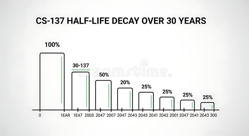
Free with trial A line graph illustrating the decrease in half-life over 30 years with bars representing percentage decay at different years, demonstrating long-term decline suitable for scientific, educational, or research presentations. Time decrease illustrations Half-life Decay Over 30 Years Chart Showing Decrease in Value or Effectiveness. A line graph illustrating the decrease in half-life over 30 years with bars representing percentage decay at different years, demonstrating long-term decline suitable for scientific, educational, or research presentations
Free with trial A gold alarm clock with a dollar sign sits on a table in front of a pink financial chart showing a downward trend This illustrates the concept of time and its value in financial matters Coins are scattered nearby adding to the money theme. Time decrease illustrations Time is Money Alarm Clock Coins Financial Chart. A gold alarm clock with a dollar sign sits on a table in front of a pink financial chart showing a downward trend This illustrates the concept of time and its value in financial matters Coins are scattered nearby adding to the money theme
Free with trial Graph reduction with arrow down, line chart icon. Financial fall, decrease, fail. Statistics and analytics. Vector flat illustration. Time decrease vectors Graph reduction with arrow down, line chart icon. Financial fall, decrease, fail. Statistics and analytics. Vector illustration
Free with trial A digital illustration of a black rectangular device with a dark blue background features a blue line graph on its screen, where an orange arrow points downward to indicate a decrease in frequency, with the x-axis representing time and the y-axis showing frequency, creating a visually striking and modern design for technology and data analysis concepts. Time decrease illustrations Digital device displaying a blue line graph with orange arrow on dark background. A digital illustration of a black rectangular device with a dark blue background features a blue line graph on its screen, where an orange arrow points downward to indicate a decrease in frequency, with the x-axis representing time and the y-axis showing frequency, creating a visually striking and modern design for technology and data analysis concepts
Free with trial This image depicts a financial market stock chart with green and red candlesticks. The candlesticks represent price movements over specific time intervals, with green indicating an increase in value and red indicating a decrease. The chart is set against a dark background, highlighting the candlesticks clearly. This type of chart is commonly used by traders and investors to analyze market trends. Time decrease illustrations Financial market stock chart
Free with trial The image depicts a bar graph with a downward trend. The graph has blue bars representing data values that decrease from left to right. A large red arrow further emphasizes the downward trend, indicating a significant decline in the data over time. The graph is displayed on an easel with wooden legs. Time decrease illustrations Graph showing decline in data. The image depicts a bar graph with a downward trend. The graph has blue bars representing data values that decrease from left to right. A large red arrow further emphasizes the downward trend, indicating a significant decline in the data over time. The graph is displayed on an easel with wooden legs
Free with trial How depreciation affects asset values in business over time explained simply. Time decrease illustrations The effect of depreciation on business assets and financial health over time. How depreciation affects asset values in business over time explained simply
Free with trial The image depicts a graph with a downward trend. The line on the graph slopes downwards from left to right, indicating a decrease in the measured values over time. The graph is rendered in red, with various markers and lines connecting the data points, suggesting a continuous decline. Time decrease illustrations Graph showing downward trend. The image depicts a graph with a downward trend. The line on the graph slopes downwards from left to right, indicating a decrease in the measured values over time. The graph is rendered in red, with various markers and lines connecting the data points, suggesting a continuous decline
Free with trial This image depicts a bar and line chart illustrating a significant decline in values. The bars represent discrete data points that decrease progressively, while the line chart overlays the bars, emphasizing the downward trend. The chart uses a blue color scheme for both the bars and the line, with a clear visual representation of a negative progression. The overall design is minimalistic and. Time decrease vectors Downward trend chart showing a decline in values over time. This image depicts a bar and line chart illustrating a significant decline in values. The bars represent discrete data points that decrease progressively, while the line chart overlays the bars, emphasizing the downward trend. The chart uses a blue color scheme for both the bars and the line, with a clear visual representation of a negative progression. The overall design is minimalistic and
Free with trial This image depicts a financial market trend analysis using a candlestick chart. The chart shows the fluctuations in stock prices over a period of time. Each candlestick represents the price movement of a stock within a specific time frame, with green candlesticks indicating an increase in price and red candlesticks indicating a decrease. The vertical lines extending from each candlestick represent. Time decrease illustrations Financial market trend analysis
Free with trial Four hourglasses are aligned in a row, each showcasing different levels of golden sand falling through their narrow necks. The hourglasses feature transparent glass bodies and gold-colored bases and tops. The sand levels decrease progressively from left to right, indicating different stages of time passage. These classic time-measuring instruments are set against a plain gray background, emphasizing their elegant and functional design. Time decrease vectors Four hourglasses are aligned in a row, each showcasing different levels of golden sand falling through their narrow necks.
Free with trial Stock market bullish point analysis. This image depicts a stock market chart highlighting a bullish point. The chart shows a trend line indicating an upward trajectory in stock prices over time. Green and red bars represent price movements, with green bars indicating an increase and red bars indicating a decrease. The bullish point is marked with an arrow, suggesting a significant upward movement. Time decrease illustrations Stock market bullish point analysis
Free with trial Decrease and increase temperature of air on thermometer thin black and red symbols vector illustration. Four seasons, hot and cold weather of winter, summer and spring, autumn time line icon set. Time decrease vectors Four seasons, hot and cold weather of winter, summer and spring, autumn line icon set. Decrease and increase temperature of air on thermometer thin black and red symbols vector illustration. Four seasons, hot and cold weather of winter, summer and spring, autumn time line icon set
Free with trial A line graph illustrating a fluctuating trend over a period of time. The graph shows an overall upward trend with several peaks and troughs. Time decrease illustrations Graph showing fluctuating trend over time. A line graph illustrating a fluctuating trend over a period of time. The graph shows an overall upward trend with several peaks and troughs
Free with trial The image features four bar graphs displaying data trends over time, with varying scales and patterns on each graph. Time decrease illustrations Four graphs showing data trends over time. The image features four bar graphs displaying data trends over time, with varying scales and patterns on each graph
Free with trial This graph depicts the oscillatory behavior of a variable over a period of time. The y-axis represents the amplitude of the oscillations, while the x-axis represents the time. Initially, the amplitude is high and gradually decreases, stabilizing into a smaller amplitude oscillation as time progresses. Time decrease illustrations Graph showing oscillatory behavior over time. This graph depicts the oscillatory behavior of a variable over a period of time. The y-axis represents the amplitude of the oscillations, while the x-axis represents the time. Initially, the amplitude is high and gradually decreases, stabilizing into a smaller amplitude oscillation as time progresses