Free with trial Light showing neon orange downward trend arrow with arrowhead on dark reflective surface. Trend decrease illustrations Neon Orange Downward Trend Arrow with Arrowhead on Dark Reflective Surface
Free with trial Stacked money gold coins with green up arrow and red down arrow, stock market trend icon, finance symbol, investment, profit, and loss, perfect for design and communication illustration. Trend decrease vectors Stacked money gold coins with green up arrow and red down arrow, stock market trend icon, finance symbol, investment, profit, and
Free with trial A simple line art icon of a decreasing bar chart with a trend arrow, representing negative growth or loss in business. Trend decrease vectors Line Art Outline Decreasing Bar Chart Trend Arrow Business Icon. A simple line art icon of a decreasing bar chart with a trend arrow, representing negative growth or loss in business.
Free with trial A stark white line graph depicts a significant downward trend with sharp fluctuations against a dark grid. Trend decrease illustrations Sharp downward trend illustrated by a jagged white line graph on a black grid background. A stark white line graph depicts a significant downward trend with sharp fluctuations against a dark grid
Free with trial Red arrow points down on dark background. Shows downward trend. Business concept. Negative market concept for background. Crisis symbol. Trend decrease illustrations Red arrow shows downward trend on dark background. Red arrow points down on dark background. Shows downward trend. Business concept. Negative market concept for background. Crisis symbol
Free with trial A sharp, faceted blue crystal arrow is depicted pointing diagonally downwards on a clean white background. The arrow exhibits reflective surfaces and sharp edges, giving it a modern and sleek appearance. This graphic element symbolizes decline, decrease, or a downward trend. Trend decrease illustrations Blue Crystal Arrow Pointing Downward on a White Background direction decline. A sharp, faceted blue crystal arrow is depicted pointing diagonally downwards on a clean white background. The arrow exhibits reflective surfaces and sharp edges, giving it a modern and sleek appearance. This graphic element symbolizes decline, decrease, or a downward trend
Free with trial A sharp, blue glass arrow is depicted pointing directly downwards against a stark white background. The arrow is rendered in 3D, showcasing its glossy, reflective surface and faceted edges. The bright blue color and the downward direction suggest concepts of decrease, loss, or a negative trend. The object is isolated, highlighting its form and material. Trend decrease illustrations 3D Rendered Blue Glass Arrow Pointing Downward on White Background direction. A sharp, blue glass arrow is depicted pointing directly downwards against a stark white background. The arrow is rendered in 3D, showcasing its glossy, reflective surface and faceted edges. The bright blue color and the downward direction suggest concepts of decrease, loss, or a negative trend. The object is isolated, highlighting its form and material
Free with trial A detailed financial chart showing a downward trend in stock prices, represented by red candlesticks and a downward arrow. Trend decrease illustrations Downward stock market trend with red candlesticks. A detailed financial chart showing a downward trend in stock prices, represented by red candlesticks and a downward arrow
Free with trial A simple and effective line graph illustrating the concept of debt reduction. The chart, on a clean white background, shows a green line trending downwards, representing a successful decrease in liabilities over time. A final red arrow emphasizes a significant or accelerated drop, symbolizing a successful financial strategy, cost-cutting, or achieving financial freedom. This vector illustration is perfect for presentations, articles, and infographics on personal or business finance, money management, and economic stability. Trend decrease vectors Debt Reduction Concept Graph Showing Downward Trend. A simple and effective line graph illustrating the concept of debt reduction. The chart, on a clean white background, shows a green line trending downwards, representing a successful decrease in liabilities over time. A final red arrow emphasizes a significant or accelerated drop, symbolizing a successful financial strategy, cost-cutting, or achieving financial freedom. This vector illustration is perfect for presentations, articles, and infographics on personal or business finance, money management, and economic stability.
Free with trial A close-up view of a red stock market chart displaying a strong downward trend. Candlestick bars and a fluctuating line graph indicate a significant decline in stock prices. Red arrows point downwards, emphasizing the negative movement. The background is dark with a subtle grid pattern and a bright light source on the left. Trend decrease illustrations Red Stock Market Chart Showing Downward Trend graph. A close-up view of a red stock market chart displaying a strong downward trend. Candlestick bars and a fluctuating line graph indicate a significant decline in stock prices. Red arrows point downwards, emphasizing the negative movement. The background is dark with a subtle grid pattern and a bright light source on the left
Free with trial Temperature melting line graph illustration data trend, analysis visualization, ice decrease temperature melting line graph. Trend decrease illustrations Temperature melting line graph
Free with trial A striking red 3D arrow is constructed from a series of connected cubes that gradually decrease in size as they form the arrow's shaft. The arrow points downwards and to the right, suggesting a trend or decline. The entire object is rendered in sharp detail against a clean white background. Trend decrease illustrations Red 3D Arrow Composed of Cubes Progressing Downward on White Background blocks. A striking red 3D arrow is constructed from a series of connected cubes that gradually decrease in size as they form the arrow's shaft. The arrow points downwards and to the right, suggesting a trend or decline. The entire object is rendered in sharp detail against a clean white background
Free with trial A 3D rendering of a bar chart featuring three colorful columns: blue, orange, and green, increasing in height from left to right. Two prominent red downward arrows are positioned above the tallest green bar, clearly indicating a decline, decrease, or negative trend. The minimalist design on a clean white background makes it ideal for illustrating business performance, financial reports, economic downturns, sales drops, or any data visualization requiring a clear representation of a negative change or warning. Perfect for presentations, infographics, and analytical content. Trend decrease vectors 3D Bar Chart with Red Downward Arrows Showing Decline. A 3D rendering of a bar chart featuring three colorful columns: blue, orange, and green, increasing in height from left to right. Two prominent red downward arrows are positioned above the tallest green bar, clearly indicating a decline, decrease, or negative trend. The minimalist design on a clean white background makes it ideal for illustrating business performance, financial reports, economic downturns, sales drops, or any data visualization requiring a clear representation of a negative change or warning. Perfect for presentations, infographics, and analytical content.
Free with trial A 3D bar chart rendered in a vibrant pink color illustrates a downward trend. The bars decrease in height from left to right, representing a decline in data or performance. A thick pink arrow with a sharp point follows the descending path of the bars, reinforcing the concept of a decrease. The chart is presented in isolation against a clean white background, making the visual elements stand out. Trend decrease illustrations Pink Bar Chart with a Downward Trending Arrow Symbolizing Decline graph magenta. A 3D bar chart rendered in a vibrant pink color illustrates a downward trend. The bars decrease in height from left to right, representing a decline in data or performance. A thick pink arrow with a sharp point follows the descending path of the bars, reinforcing the concept of a decrease. The chart is presented in isolation against a clean white background, making the visual elements stand out
Free with trial This abstract financial graph visually represents a significant economic downturn or market decline. A prominent, bold red arrow sharply points downwards across a blue grid background, symbolizing loss, recession, or a negative trend. A lighter blue fluctuating line also shows a general downward trajectory, indicating market volatility or a secondary metric. This impactful illustration is ideal for conveying concepts of financial crisis, business failure, falling stock prices, or any situation involving a sharp decrease and poor performance. Trend decrease vectors Economic Downturn Graph with Red Arrow Showing Decline. This abstract financial graph visually represents a significant economic downturn or market decline. A prominent, bold red arrow sharply points downwards across a blue grid background, symbolizing loss, recession, or a negative trend. A lighter blue fluctuating line also shows a general downward trajectory, indicating market volatility or a secondary metric. This impactful illustration is ideal for conveying concepts of financial crisis, business failure, falling stock prices, or any situation involving a sharp decrease and poor performance.
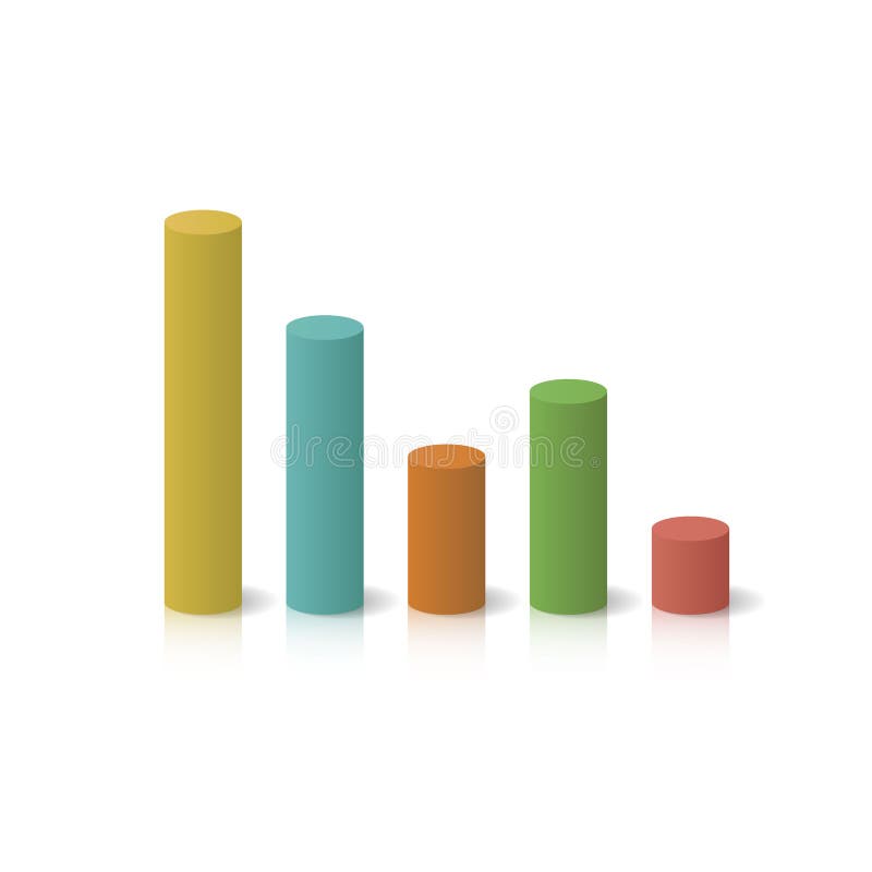
Free with trial Isometric colorful cylinder bar graph showing a financial decline. 3D chart representing loss, decrease, and business drop symbol. Trend decrease vectors Isometric colorful cylinder bar graph showing a financial decline. 3D chart representing loss, decrease, and business drop
Free with trial This image features a bar graph with a downward trend, indicated by a red arrow. The bars are colored in various shades of blue and decrease in height from left to right. The image has a transparent background, making it suitable for various design applications. Keywords: bar graph, downward trend, blue bars, red arrow, white background, transparent background. Trend decrease illustrations Decreasing bar graph icon isolated on white background. This image features a bar graph with a downward trend, indicated by a red arrow. The bars are colored in various shades of blue and decrease in height from left to right. The image has a transparent background, making it suitable for various design applications. Keywords: bar graph, downward trend, blue bars, red arrow, white background, transparent background
Free with trial Line Graph Chart Line And Solid Icon Set. Data Analysis, Trend Visualization, And Business Growth Symbol Collection. Statistical Representation And Performance Tracking. Isolated Vector Illustration. Trend decrease vectors Line Graph Chart Line And Solid Icon Set. Data Analysis, Trend Visualization, And Business Growth Symbol Collection
Free with trial A bold, three-dimensional red arrow depicted in a downward curve, signifying a negative trend, decline, or decrease, isolated against a clean white background for clear visual emphasis. Trend decrease illustrations Red arrow curving downwards isolated on white background. A bold, three-dimensional red arrow depicted in a downward curve, signifying a negative trend, decline, or decrease, isolated against a clean white background for clear visual emphasis
Free with trial An illustration featuring two contrasting arrows against a plain white background. The red arrow shows a wavy upward trend, symbolizing growth, increase, or positive performance with fluctuation. The black arrow shows a wavy downward trend, symbolizing decline, decrease, or negative performance with fluctuation. This visual concept is often used to represent financial market volatility, business. Trend decrease vectors Dynamic business trends illustrated by contrasting red upward and black downward arrows Vector. An illustration featuring two contrasting arrows against a plain white background. The red arrow shows a wavy upward trend, symbolizing growth, increase, or positive performance with fluctuation. The black arrow shows a wavy downward trend, symbolizing decline, decrease, or negative performance with fluctuation. This visual concept is often used to represent financial market volatility, business
Free with trial A digital representation of a blue line graph showing a significant downward trend with fluctuations against a dark grid. Trend decrease illustrations Abstract blue line graph depicting a sharp decline and volatile trend on a black grid background. A digital representation of a blue line graph showing a significant downward trend with fluctuations against a dark grid
Free with trial A green arrow graph displaying a sharp decline, indicating a downward trend. Trend decrease vectors Green arrow decline graph showing downward trend. A green arrow graph displaying a sharp decline, indicating a downward trend.
Free with trial Black icon of a jagged downward trend line within a circle on a white background. Clear details and vibrant co. Trend decrease illustrations Circular Icon With Downward Jagged Trend Line graph chart. Black icon of a jagged downward trend line within a circle on a white background. Clear details and vibrant co
Free with trial A bold, red arrow with a zig-zag pattern points downwards, symbolizing a decline or negative trend. The arrow is rendered in a 3D style with subtle shading, giving it depth. It is isolated on a transparent background, making it versatile for various design applications. This graphic is ideal for representing financial losses, market downturns, declining performance, or any concept associated with a downward trajectory. Trend decrease illustrations Red Downward Trend Arrow. A bold, red arrow with a zig-zag pattern points downwards, symbolizing a decline or negative trend. The arrow is rendered in a 3D style with subtle shading, giving it depth. It is isolated on a transparent background, making it versatile for various design applications. This graphic is ideal for representing financial losses, market downturns, declining performance, or any concept associated with a downward trajectory.
Free with trial A bold, three-dimensional red arrow forms a jagged downward trend, symbolizing decline, loss, or negative performance. The arrow's sharp angles and bright red color convey urgency and a significant downturn. Isolated on a clean white background, this graphic is versatile for illustrating financial losses, market crashes, declining statistics, or any concept related to a negative trajectory. Its minimalist design makes it suitable for presentations, reports, and digital media. Trend decrease illustrations Red Downward Trend Arrow. A bold, three-dimensional red arrow forms a jagged downward trend, symbolizing decline, loss, or negative performance. The arrow's sharp angles and bright red color convey urgency and a significant downturn. Isolated on a clean white background, this graphic is versatile for illustrating financial losses, market crashes, declining statistics, or any concept related to a negative trajectory. Its minimalist design makes it suitable for presentations, reports, and digital media.
Free with trial A red and yellow financial chart depicts a steep downward trend. Red candlestick bars form the base, with yellow lines showing price fluctuations. A large yellow arrow clearly indicates a sharp decline, suggesting a significant market drop. Trend decrease illustrations Red and Yellow Stock Market Chart with Steep Downward Trend. A red and yellow financial chart depicts a steep downward trend. Red candlestick bars form the base, with yellow lines showing price fluctuations. A large yellow arrow clearly indicates a sharp decline, suggesting a significant market drop
Free with trial A hand-drawn bar chart shows a downward trend with a line graph indicating a significant decrease in value over time. Trend decrease vectors Downturn graph illustrating declining trends and financial loss. A hand-drawn bar chart shows a downward trend with a line graph indicating a significant decrease in value over time
Free with trial A 3D render of a golden bar chart with bars decreasing in height from left to right, indicating a downward trend. The bars are metallic and shiny, casting subtle shadows on the white background. This visual represents financial decline, economic downturn, or negative performance. Trend decrease illustrations Golden Bar Chart Showing Downward Trend on White Background graph decline. A 3D render of a golden bar chart with bars decreasing in height from left to right, indicating a downward trend. The bars are metallic and shiny, casting subtle shadows on the white background. This visual represents financial decline, economic downturn, or negative performance
Free with trial Interest rate going down decrease cost of fund and inflation money market percentage vector. Trend decrease illustrations Interest rate going down decrease cost of fund and inflation money market percentage
Free with trial A clean, minimalist icon representing the stock market. The image features a bull and a bear, symbolizing market trends, with a rising green arrow indicating an upward trend. The design is enclosed in a circular frame, suitable for financial reports, investment presentations, or business infographics. The simple line art style makes it versatile for various applications. Trend decrease illustrations Stock Market Bull and Bear Trend Icon. A clean, minimalist icon representing the stock market. The image features a bull and a bear, symbolizing market trends, with a rising green arrow indicating an upward trend. The design is enclosed in a circular frame, suitable for financial reports, investment presentations, or business infographics. The simple line art style makes it versatile for various applications.
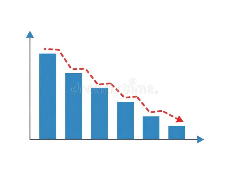
Free with trial This image features a bar chart with a decreasing trend isolated on a white background. The chart displays blue bars that progressively decrease in height from left to right, with a red dashed line indicating the downward trend. The horizontal axis represents different categories, while the vertical axis shows the corresponding values. The image is clear and SEO-friendly, highlighting data. Trend decrease illustrations Bar chart with decreasing trend isolated on white background. This image features a bar chart with a decreasing trend isolated on a white background. The chart displays blue bars that progressively decrease in height from left to right, with a red dashed line indicating the downward trend. The horizontal axis represents different categories, while the vertical axis shows the corresponding values. The image is clear and SEO-friendly, highlighting data
Free with trial 3D yellow arrow graph descending sharply on a teal blue background, representing financial loss or negative trend. Trend decrease illustrations 3D yellow arrow graph descending sharply on a teal blue background, representing financial loss or negative trend
Free with trial A 3D golden bar chart is arranged in a descending sequence, illustrating a downward trend. The bars are polished and reflective, casting subtle shadows on the pure white background. This visual represents a decline in data or financial performance. Trend decrease illustrations Golden Bar Chart Showing Downward Trend on White Background graph metallic. A 3D golden bar chart is arranged in a descending sequence, illustrating a downward trend. The bars are polished and reflective, casting subtle shadows on the pure white background. This visual represents a decline in data or financial performance
Free with trial This illustration depicts a financial concept with a bar graph showing a downward trend, alternating between green (profit) and red (loss) bars. A red line graph with an arrow indicates a significant decline. To the right, a stack of documents represents a profit and loss statement, with 'Profit' and 'Loss' clearly labeled. This visual is ideal for representing financial performance, business challenges, economic downturns, or the need for strategic adjustments. Trend decrease vectors Declining Profit and Loss Statement with Downward Trend Graph. This illustration depicts a financial concept with a bar graph showing a downward trend, alternating between green (profit) and red (loss) bars. A red line graph with an arrow indicates a significant decline. To the right, a stack of documents represents a profit and loss statement, with 'Profit' and 'Loss' clearly labeled. This visual is ideal for representing financial performance, business challenges, economic downturns, or the need for strategic adjustments.
Free with trial This image features a 3D bar graph with a downward trend isolated on a white background. The graph consists of green bars that decrease in height from left to right, with a red arrow pointing downward to emphasize the declining trend. The image is clean and visually appealing, suitable for business and financial contexts. Trend decrease illustrations 3d bar graph with downward trend isolated on white background. This image features a 3D bar graph with a downward trend isolated on a white background. The graph consists of green bars that decrease in height from left to right, with a red arrow pointing downward to emphasize the declining trend. The image is clean and visually appealing, suitable for business and financial contexts
Free with trial Frozen icicle bar chart showing a downward trend and frosty arrow. Concept of economic recession or financial crisis. Trend decrease illustrations Frozen icicle bar chart showing a downward trend and frosty arrow
Free with trial A stylized, flat design illustration of a bar chart depicting a downward trend. The bars are colored red, yellow, and blue, arranged in decreasing height from left to right. A prominent red arrow points downwards across the chart, emphasizing the decline. The graphic is set against a clean white background, making it ideal for presentations, reports, and financial concepts related to loss, decrease, or negative performance. Trend decrease illustrations Declining Bar Chart with Downward Arrow. A stylized, flat design illustration of a bar chart depicting a downward trend. The bars are colored red, yellow, and blue, arranged in decreasing height from left to right. A prominent red arrow points downwards across the chart, emphasizing the decline. The graphic is set against a clean white background, making it ideal for presentations, reports, and financial concepts related to loss, decrease, or negative performance.
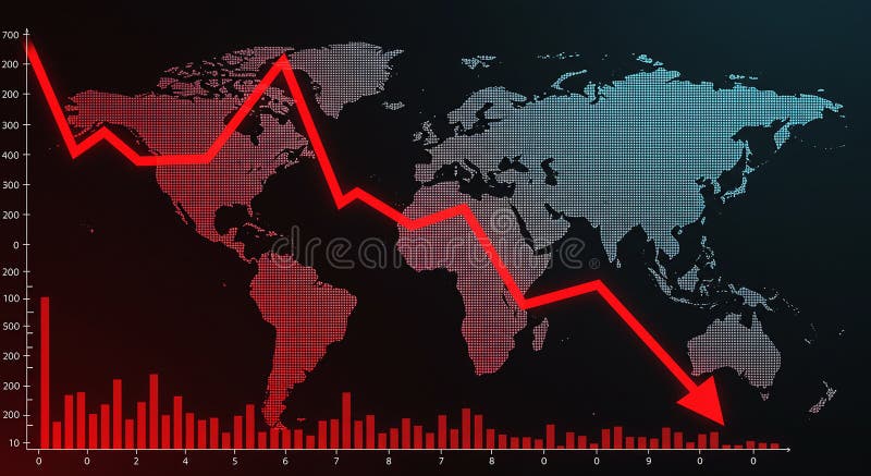
Free with trial World map with a red declining line graph overlay, illustrating a decrease or economic downturn. The graph features sharp declines across various data points, reflecting a downward trend. Red bar chart at the bottom represents additional numerical data against a black background. The map uses a dotted pattern for continents, highlighting regions globally. The image conveys financial analysis, market trends, or economic statistics. Trend decrease illustrations World map with a red declining line graph overlay
Free with trial A vibrant, pixelated pink arrow points downwards, set against a dark, textured background with subtle horizontal grey lines. This retro 8-bit style graphic symbolizes decrease, decline, download, or a negative trend. Ideal for illustrating financial data, market downturns, digital alerts, gaming interfaces, or any concept requiring a clear downward direction indicator. Its bold color and distinct pixel art aesthetic make it a versatile design element for technology, business, or creative projects. Trend decrease illustrations Pixel Art Down Arrow on Dark Background. A vibrant, pixelated pink arrow points downwards, set against a dark, textured background with subtle horizontal grey lines. This retro 8-bit style graphic symbolizes decrease, decline, download, or a negative trend. Ideal for illustrating financial data, market downturns, digital alerts, gaming interfaces, or any concept requiring a clear downward direction indicator. Its bold color and distinct pixel art aesthetic make it a versatile design element for technology, business, or creative projects.
Free with trial A red line graph showing a significant downward trend, indicating a decline or loss, set against a subtle white background with small, scattered grid points. Trend decrease illustrations Red downward trend line on a white background with grid points. A red line graph showing a significant downward trend, indicating a decline or loss, set against a subtle white background with small, scattered grid points
Free with trial Professional business man holding pie chart showing negative trend with loss. Economic crisis, recession, market crash, financial planning. Trend decrease illustrations Business man holding pie chart showing negative trend with loss
Free with trial Three red arrows, each featuring a white percentage sign, are depicted pointing downwards against a neutral grey background. The arrows are arranged in a staggered formation, suggesting a trend or movement. This visual metaphor strongly represents concepts such as financial loss, economic downturn, price reduction, or a decrease in value. The stark contrast between the red arrows and the white. Trend decrease illustrations Red arrows pointing down with percentage signs symbolizing financial decline. Three red arrows, each featuring a white percentage sign, are depicted pointing downwards against a neutral grey background. The arrows are arranged in a staggered formation, suggesting a trend or movement. This visual metaphor strongly represents concepts such as financial loss, economic downturn, price reduction, or a decrease in value. The stark contrast between the red arrows and the white
Free with trial A striking 3D rendering illustrates a significant decline in consumer spending or retail sales. The image features a large green shopping bag followed by three progressively smaller white shopping bags, visually representing a reduction. A prominent red arrow, shaped like a downward trend graph, effectively symbolizes a market downturn, economic recession, or decrease in purchasing power. Set against a clean white background, this conceptual image is ideal for financial reports, business presentations, and articles discussing economic challenges, retail struggles, or market analysis. Trend decrease illustrations Retail Sales Decline and Economic Downturn. A striking 3D rendering illustrates a significant decline in consumer spending or retail sales. The image features a large green shopping bag followed by three progressively smaller white shopping bags, visually representing a reduction. A prominent red arrow, shaped like a downward trend graph, effectively symbolizes a market downturn, economic recession, or decrease in purchasing power. Set against a clean white background, this conceptual image is ideal for financial reports, business presentations, and articles discussing economic challenges, retail struggles, or market analysis.
Free with trial Line graph with downward trend alongside sad face. Ideal for performance loss, business challenges, failure, analysis, recession, disappointment, frustration. Simple flat metaphor. Trend decrease vectors Declining Line Graph with Sad Face Representing Negative Trend and Disappointment. Line graph with downward trend alongside sad face. Ideal for performance loss, business challenges, failure, analysis, recession, disappointment, frustration. Simple flat metaphor
Free with trial A 3D rendered image of a bar chart with a downward trend, set against a bright yellow background. The chart features grey frame and orange bars, with a prominent red arrow indicating a decline. This image is suitable for illustrating concepts related to financial loss, market downturn, economic recession, or negative performance in business and investment contexts. Trend decrease illustrations Downward Trend Chart on Yellow Background. A 3D rendered image of a bar chart with a downward trend, set against a bright yellow background. The chart features grey frame and orange bars, with a prominent red arrow indicating a decline. This image is suitable for illustrating concepts related to financial loss, market downturn, economic recession, or negative performance in business and investment contexts.
Free with trial A businessman interacts with a digital graph showcasing cost reduction through a declining trend. It symbolizes modern financial strategies and data-driven decision-making. XDMCP. Trend decrease illustrations Businessman Presenting Digital Graph with Cost Reduction Concept, Showing Declining Trend in Expenses with Iconic. A businessman interacts with a digital graph. A businessman interacts with a digital graph showcasing cost reduction through a declining trend. It symbolizes modern financial strategies and data-driven decision-making. XDMCP
Free with trial The image shows a red candlestick chart against a white background. the chart displays price movements over time, with each candlestick representing a specific period. the red color indicates a price decrease during that period. two horizontal black lines are drawn across the chart, potentially indicating support or resistance levels. the chart shows an overall upward trend, with periods of both gains and losses. the candlesticks vary in size, reflecting the magnitude of price fluctuations. the background is plain white, providing a clean and uncluttered view of the chart. Trend decrease illustrations Red candlestick chart on white background. the image shows a red candlestick chart against a white background. the chart displays price movements over time, with each candlestick representing a specific period. the red color indicates a price decrease during that period. two horizontal black lines are drawn across the chart, potentially indicating support or resistance levels. the chart shows an overall upward trend, with periods of both gains and losses. the candlesticks vary in size, reflecting the magnitude of price fluctuations. the background is plain white, providing a clean and uncluttered view of the chart.
Free with trial Graph and diagram from planes with decrease. Finance and business concepts. Vector Illustration isolated. Trend decrease vectors Graph and diagram from planes with decrease. Finance and business concepts. Vector Illustration
Free with trial A 3D render illustrating a concept of financial decline and economic recession. The image features a red bar chart with progressively shorter bars, indicating a downward trend. A bold, red arrow follows this negative trajectory, pointing sharply downwards. Set against a clean, neutral gray background, this graphic powerfully symbolizes concepts like business failure, stock market crash, investment loss, sales decrease, and economic crisis. It's a perfect visual for presentations, reports, and articles discussing financial downturns, poor performance, and negative growth. Trend decrease illustrations Financial Decline Graph with Red Arrow Down. A 3D render illustrating a concept of financial decline and economic recession. The image features a red bar chart with progressively shorter bars, indicating a downward trend. A bold, red arrow follows this negative trajectory, pointing sharply downwards. Set against a clean, neutral gray background, this graphic powerfully symbolizes concepts like business failure, stock market crash, investment loss, sales decrease, and economic crisis. It's a perfect visual for presentations, reports, and articles discussing financial downturns, poor performance, and negative growth.
Free with trial A 3D golden bar chart illustrates a declining trend, with a sharp downward arrow indicating a significant decrease in performance or value. Isolated on a white background. Trend decrease illustrations Golden downward trending bar chart with arrow. A 3D golden bar chart illustrates a declining trend, with a sharp downward arrow indicating a significant decrease in performance or value. Isolated on a white background
Free with trial A visual representation of a declining trend, depicted by a blue bar chart with a prominent downward-pointing arrow, indicating a decrease in performance or value. Trend decrease illustrations Blue bar chart with a downward trending arrow. A visual representation of a declining trend, depicted by a blue bar chart with a prominent downward-pointing arrow, indicating a decrease in performance or value
Free with trial Percent Arrow Icons Set: Growth, Increase, Decrease Filled Up and Down Arrows. Trend decrease vectors Percent Arrow Icons Set: Growth, Increase, Decrease Filled Up and Down Arrows
Free with trial This image features a collection of stacked coins with a downward trend arrow above them, set against a transparent background. The coins are arranged in varying heights, and the arrow indicates a decline in value or quantity. Trend decrease illustrations Stacked coins with downward trend arrow isolated on white background. This image features a collection of stacked coins with a downward trend arrow above them, set against a transparent background. The coins are arranged in varying heights, and the arrow indicates a decline in value or quantity
Free with trial Four colorful 3D arrows in red, orange, cyan, and green are pointing down, representing a decline, loss, or downward trend in a business or financial chart. Trend decrease vectors Set of Four Glossy 3D Arrows Showing a Downward Trend. Four colorful 3D arrows in red, orange, cyan, and green are pointing down, representing a decline, loss, or downward trend in a business or financial chart
Free with trial Several dark, pointed arrow shapes are patterned diagonally across a light background. The arrows point downwards, suggesting a trend or direction. Trend decrease illustrations Downward Trend Shown With Repeating Arrow Shapes on a Plain Background. Several dark, pointed arrow shapes are patterned diagonally across a light background. The arrows point downwards, suggesting a trend or direction.
Free with trial A vibrant red arrow curves downwards, symbolizing a decrease, loss, or negative trajectory in a business or financial context. Trend decrease illustrations Red arrow indicating downward trend and decline. A vibrant red arrow curves downwards, symbolizing a decrease, loss, or negative trajectory in a business or financial context
Free with trial Platinum bars with downward trend arrow. 3D rendering isolated on white background. Trend decrease illustrations Platinum bars with downward trend arrow. 3D rendering
Free with trial A black line graph icon showing a downward trend with an arrow pointing down on a white background. Trend decrease illustrations Downward Trend Graph Icon with Arrow on White Background chart decline. A black line graph icon showing a downward trend with an arrow pointing down on a white background
Free with trial Black icon of a fluctuating graph with a downward trend arrow on a white background. Trend decrease illustrations Black icon of a fluctuating graph with downward trend arrow chart data. Black icon of a fluctuating graph with a downward trend arrow on a white background
Free with trial A 3D rendered bar chart with bars in red, yellow, green, and blue, arranged in descending order of height. A thick black arrow curves downwards from the top left, crossing over the bars and pointing towards the bottom right, indicating a downward trend or decline. The image is set against a clean, white background. Trend decrease illustrations Colorful Bar Chart Showing Downward Trend with Black Arrow on White Background graph. A 3D rendered bar chart with bars in red, yellow, green, and blue, arranged in descending order of height. A thick black arrow curves downwards from the top left, crossing over the bars and pointing towards the bottom right, indicating a downward trend or decline. The image is set against a clean, white background
Free with trial The image depicts a series of stacked gold coins with a prominent red downward arrow overlaid on them. The arrow indicates a downward trend, suggesting a decrease or decline. Trend decrease illustrations Economic decline symbolized by stacking gold coins with downward arrow. The image depicts a series of stacked gold coins with a prominent red downward arrow overlaid on them. The arrow indicates a downward trend, suggesting a decrease or decline
Free with trial A clear vector illustration of a line graph showing a downward trend. Represents financial decline, negative performance, market downturns, or decreasing metrics. Ideal for business reports, financial analysis, economic indicators, or risk assessment. It visually communicates a decrease or a challenging period, vector design Generative AI. Trend decrease vectors Downtrend Line Graph Financial Market Decline, vector design Generative AI. A clear vector illustration of a line graph showing a downward trend. Represents financial decline, negative performance, market downturns, or decreasing metrics. Ideal for business reports, financial analysis, economic indicators, or risk assessment. It visually communicates a decrease or a challenging period, vector design Generative AI
Free with trial A vibrant, bold red arrow points directly downwards, presented in a clean, modern flat design style with a subtle shadow effect giving it a slight three-dimensional appearance. The arrow features a rectangular shaft and a triangular head, making it a clear and universally recognizable symbol. Isolated on a crisp white background, this versatile graphic element is ideal for conveying concepts such as download, scroll down, decrease, navigation, or indicating a downward trend. Perfect for web design, mobile applications, presentations, infographics, and any project requiring a clear directional or action-oriented icon. Trend decrease illustrations Red Down Arrow Icon Isolated on White Background. A vibrant, bold red arrow points directly downwards, presented in a clean, modern flat design style with a subtle shadow effect giving it a slight three-dimensional appearance. The arrow features a rectangular shaft and a triangular head, making it a clear and universally recognizable symbol. Isolated on a crisp white background, this versatile graphic element is ideal for conveying concepts such as download, scroll down, decrease, navigation, or indicating a downward trend. Perfect for web design, mobile applications, presentations, infographics, and any project requiring a clear directional or action-oriented icon.
Free with trial Graph with decrease report. Business and finance vector illustration. Diagram with recession and bankruptcy progress. Trend decrease vectors Graph with decrease report. Business and finance vector illustration. Diagram with recession and bankruptcy
Free with trial A visual representation of financial decline, economic downturn, or falling percentages. Three green arrows, shaped like a ribbon, are shown descending, each marked with a percentage symbol. The background is a clean, neutral gray, emphasizing the downward trend. Trend decrease illustrations Green arrows with percentage signs pointing downwards symbolizing a decrease in value. A visual representation of financial decline, economic downturn, or falling percentages. Three green arrows, shaped like a ribbon, are shown descending, each marked with a percentage symbol. The background is a clean, neutral gray, emphasizing the downward trend