Free with trial Isometric gear wheel with a downward pointing arrow and falling droplets symbolizes a system or process of reduction, decrease, or falling metrics within a mechanical or digital context. Trend decrease vectors Gear mechanism indicating metric data decrease process. Isometric gear wheel with a downward pointing arrow and falling droplets symbolizes a system or process of reduction, decrease, or falling metrics within a mechanical or digital context
Free with trial A visual representation of a downward trend, where colorful stacks of translucent tokens decrease in height. Trend decrease illustrations Financial Decline Chart with Colored Tokens. A visual representation of a downward trend, where colorful stacks of translucent tokens decrease in height
Free with trial Arrow icon with percent symbol, economic growth, increase, decrease arrow, up and down arrow icon. Trend decrease vectors Arrow icon with percent symbol, economic growth, increase, decrease arrow, up and down arrow icon.
Free with trial Bar chart showing stock market increase and decrease. Trend decrease vectors Bar chart showing stock market increase and decrease.
Free with trial A set of money growth and decrease icons featuring coins and directional arrows, indicating financial increase and decline. These images represent concepts of economic growth, loss, and currency fluctuation, suitable for various financial and business design projects. Trend decrease vectors Set of Money Growth and Decrease Icons with Arrows and Coins. A set of money growth and decrease icons featuring coins and directional arrows, indicating financial increase and decline. These images represent concepts of economic growth, loss, and currency fluctuation, suitable for various financial and business design projects
Free with trial A simple flat design graphic features a red arrow pointing down and a green arrow pointing up, symbolizing increase and decrease. Ideal for business and finance concepts. Trend decrease vectors Directional arrows indicating increase and decrease. A simple flat design graphic features a red arrow pointing down and a green arrow pointing up, symbolizing increase and decrease. Ideal for business and finance concepts
Free with trial This graphic displays two circular icons, one depicting a downward-pointing arrow with a dollar sign, symbolizing a decrease in value, and the other an upward arrow with a dollar sign, representing an increase. Trend decrease vectors Cost decrease or increase icon. Downward vs upward dollar signs. This graphic displays two circular icons, one depicting a downward-pointing arrow with a dollar sign, symbolizing a decrease in value, and the other an upward arrow with a dollar sign, representing an increase.
Free with trial The image depicts a bar graph with a downward trend. The bars, which are blue, progressively decrease in height from left to right. A red downward-pointing arrow overlays the graph, emphasizing the decline. This visual representation typically indicates a decrease in values over time or across a series of measurements. Trend decrease illustrations Declining bar graph. The image depicts a bar graph with a downward trend. The bars, which are blue, progressively decrease in height from left to right. A red downward-pointing arrow overlays the graph, emphasizing the decline. This visual representation typically indicates a decrease in values over time or across a series of measurements
Free with trial Flat design illustration showing downward trend with graph, coins and descending arrow. Demonstrates financial loss and market decline. Trend decrease vectors Declining financial graph with downward trend and currency. Flat design illustration showing downward trend with graph, coins and descending arrow. Demonstrates financial loss and market decline.
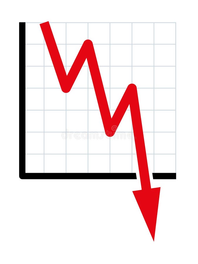
Free with trial The image features a red zigzag line that descends to the right, ending in a downward-pointing arrow. The design is simple and bold, with the red color standing out against a white background. This symbol is often used to represent a downward trend or decrease. Trend decrease illustrations Red zigzag down arrow. The image features a red zigzag line that descends to the right, ending in a downward-pointing arrow. The design is simple and bold, with the red color standing out against a white background. This symbol is often used to represent a downward trend or decrease
Free with trial Up and down graph chart icon. Growth increase and decrease sign. Graph or diagram with arrow going up and down. Vector illustration. Trend decrease illustrations Up and down graph chart icon. Growth increase and decrease sign. Graph or diagram with arrow going up and down. Vector
Free with trial Downward trend line on grid chart with sad face and progress icon signaling mediocre results or declining metrics. Ideal for failure, analytics, market loss, strategy, performance, results, simple. Trend decrease illustrations Declining Trend on Graph with Sad Face Symbolizing Negative Results or Performance. Downward trend line on grid chart with sad face and progress icon signaling mediocre results or declining metrics. Ideal for failure, analytics, market loss, strategy, performance, results, simple
Free with trial Up and down graph chart icon. Growth increase and decrease sign. Graph or diagram with arrow going up and down. Vector illustration. Trend decrease vectors Up and down graph chart icon. Growth increase and decrease sign. Graph or diagram with arrow going up and down. Vector
Free with trial 3D rendering of the red arrow and stack of coins, downward financial trend or economic decline. Metaphor for financial loss, market crashes, or decreasing value. Trend decrease illustrations 3D rendering of the red arrow and stack of coins, downward financial trend. 3D rendering of the red arrow and stack of coins, downward financial trend or economic decline. Metaphor for financial loss, market crashes, or decreasing value.
Free with trial 3D rendering of the red arrow and stack of coins, downward financial trend or economic decline. Metaphor for financial loss, market crashes, or decreasing value. Trend decrease illustrations 3D rendering of the red arrow and stack of coins, downward financial trend. 3D rendering of the red arrow and stack of coins, downward financial trend or economic decline. Metaphor for financial loss, market crashes, or decreasing value.
Free with trial 3D rendering of the red arrow and stack of coins, downward financial trend or economic decline. Metaphor for financial loss, market crashes, or decreasing value. Trend decrease illustrations 3D rendering of the red arrow and stack of coins, downward financial trend. 3D rendering of the red arrow and stack of coins, downward financial trend or economic decline. Metaphor for financial loss, market crashes, or decreasing value.
Free with trial Financial Loss Report Document Icon Set with Downward Trend vol 11427. Trend decrease vectors Financial Loss Report Document Icon Set with Downward Trend
Free with trial Business decline chart or bar graph icon. Decrease, loss, and financial crisis sign symbol vector. Trend decrease vectors Business decline chart or bar graph icon. Decrease, loss, and financial crisis sign symbol
Free with trial A flat style graph depicting a downward trend with declining bars and arrow. Strong use of contrasting colors. Trend decrease vectors Declining bar graph showing negative trend with falling arrow. A flat style graph depicting a downward trend with declining bars and arrow. Strong use of contrasting colors.
Free with trial Minimalist style gradient blue diagram showing downward trend line graph on black background representing economic decline or loss. Trend decrease vectors Downward trend line graph on black background for infographic. Minimalist style gradient blue diagram showing downward trend line graph on black background representing economic decline or loss.
Free with trial Downward trend, symbolic chart for falling prices. Decreasing red line of a diagram falls with fluctuations into the bottomless, indicating sudden heavy losses, bursting bubbles and downward movement. Trend decrease vectors Downward trend, symbolic chart for falling prices
Free with trial A line graph showing a downward trend with two colored lines on a grid background. The graph represents data analysis and statistics. Trend decrease illustrations Downward Trend Line Graph. A line graph showing a downward trend with two colored lines on a grid background. The graph represents data analysis and statistics.
Free with trial Bar graph with an upward trend, blue downward arrow, and percentage sign. Ideal for business analysis, finance, growth, decline trends, statistics economics comparison. Flat simple metaphor. Trend decrease vectors Financial chart with growth trend, declining arrow, and percentage symbol representing data analysis. Bar graph with an upward trend, blue downward arrow, and percentage sign. Ideal for business analysis, finance, growth, decline trends, statistics economics comparison. Flat simple metaphor
Free with trial Vertical arrow pointing downward next to bar graph with decreasing metrics. Ideal for business analysis, data visualization, financial downturn, market decline, trend report, economics, simple flat. Trend decrease illustrations Declining Bar Graph with Arrow Indicating Downward Trend in Performance or Statistics. Vertical arrow pointing downward next to bar graph with decreasing metrics. Ideal for business analysis, data visualization, financial downturn, market decline, trend report, economics, simple flat
Free with trial A minimalist line graph depicts a significant downward trend with a sharp, jagged line indicating a decline. Trend decrease illustrations Simple line graph illustrating a sharp downward trend and decline. A minimalist line graph depicts a significant downward trend with a sharp, jagged line indicating a decline
Free with trial Statistic Bar Chart Outline Sign Data Stats Business Performance Market Analysis Economic Trend Line Icon Presentation Display Board Symbol. Trend decrease vectors Statistic Bar Chart Outline Sign Data Stats Business Performance Market Analysis Economic Trend Line Icon Presentation Display
Free with trial Multiple Downward Arrows Showing Declining Trend, Business Loss Concept with Gradient Arrows on White Background. Trend decrease vectors Multiple Downward Arrows Showing Declining Trend, Business Loss Concept
Free with trial The image depicts a bar graph with a downward trend. The bars, which start at a higher value on the left, progressively decrease in height towards the right. A large red arrow, pointing downwards, emphasizes the declining trend. This visual representation suggests a continuous decrease in performance, sales, or another measured metric over a specified period. Trend decrease illustrations Decline in performance over time. The image depicts a bar graph with a downward trend. The bars, which start at a higher value on the left, progressively decrease in height towards the right. A large red arrow, pointing downwards, emphasizes the declining trend. This visual representation suggests a continuous decrease in performance, sales, or another measured metric over a specified period
Free with trial This bar and line graph illustrates a declining trend in data values over a period of months. The x-axis represents time in months from January to December, while the y-axis shows the values ranging from 0 to 800. The red bars indicate the monthly data values, and the red line represents the overall trend. The trend shows a consistent decrease in values from January to December. Trend decrease illustrations Decline in monthly data over time. This bar and line graph illustrates a declining trend in data values over a period of months. The x-axis represents time in months from January to December, while the y-axis shows the values ranging from 0 to 800. The red bars indicate the monthly data values, and the red line represents the overall trend. The trend shows a consistent decrease in values from January to December
Free with trial The image depicts a bar graph with a downward trend. The bars, colored in turquoise, start at a higher value and gradually decrease in height, indicating a decline. A large red arrow, pointing downwards, further emphasizes the downward trend. Trend decrease illustrations Decreasing bar graph. The image depicts a bar graph with a downward trend. The bars, colored in turquoise, start at a higher value and gradually decrease in height, indicating a decline. A large red arrow, pointing downwards, further emphasizes the downward trend
Free with trial Arrow icon with percent symbol, economic growth, increase, decrease arrow, up and down arrow icon. Trend decrease vectors Arrow icon with percent symbol, economic growth, increase, decrease arrow, up and down arrow icon
Free with trial Percentage Decrease Bar Chart Icons for Financial Reports and Analytics vol 34492. Trend decrease vectors Percentage Decrease Bar Chart Icons for Financial Reports and Analytics
Free with trial Red downward zigzag line represents financial decline, stock market crash, or negative business performance trend isolated on white. Trend decrease vectors Red downward zigzag arrow graphic indicating market crash or negative trend. Red downward zigzag line represents financial decline, stock market crash, or negative business performance trend isolated on white
Free with trial The image features a large, red downward-pointing arrow with the symbol '%' and the number '0' inside it. The arrow is set against a plain white background, creating a stark contrast. The design is simple and minimalistic, emphasizing the downward trend or decrease. Trend decrease illustrations Downward arrow with zero percent symbol. The image features a large, red downward-pointing arrow with the symbol '%' and the number '0' inside it. The arrow is set against a plain white background, creating a stark contrast. The design is simple and minimalistic, emphasizing the downward trend or decrease
Free with trial The image depicts a bar graph with a downward trend. The bars are colored in red, blue, and dark red, showing a decline from left to right. The red line on top of the bars indicates a continuous decrease in values. The graph is displayed on a dark background with a metallic base. Trend decrease illustrations Decreasing bar graph with downward trend. The image depicts a bar graph with a downward trend. The bars are colored in red, blue, and dark red, showing a decline from left to right. The red line on top of the bars indicates a continuous decrease in values. The graph is displayed on a dark background with a metallic base
Free with trial A 3D bar graph showing a downward trend with a red arrow indicating a decline. Trend decrease illustrations Decreasing bar graph with downward trend. A 3D bar graph showing a downward trend with a red arrow indicating a decline
Free with trial Diagonal down left arrow symbol set in outline and solid styles suitable for navigation controls, trend decrease indicators, return actions, directional guidance, and interface elements. Trend decrease vectors Arrow Diagonal Down Left Icon Collection in Line and Solid Style for Direction. Diagonal down left arrow symbol set in outline and solid styles suitable for navigation controls, trend decrease indicators, return actions, directional guidance, and interface elements
Free with trial A 3D rendered image depicting a financial graph with a prominent red arrow indicating a downward trend. The graph features a bar chart with several red bars, showing a decline in value. The background is a dark grid, emphasizing the data visualization. This image is ideal for representing financial losses, economic downturns, market crashes, or negative performance in business and investment contexts. Trend decrease illustrations Red Arrow Downward Trend Graph with Bar Chart. A 3D rendered image depicting a financial graph with a prominent red arrow indicating a downward trend. The graph features a bar chart with several red bars, showing a decline in value. The background is a dark grid, emphasizing the data visualization. This image is ideal for representing financial losses, economic downturns, market crashes, or negative performance in business and investment contexts.
Free with trial Decline chart icon. Falling bars symbol. Downward trend illustration. Vector image. EPS 10. Trend decrease vectors Decline chart icon. Falling bars symbol. Downward trend illustration. Vector image.
Free with trial A bright red, three-dimensional arrow is depicted pointing directly downwards. The arrow has a glossy, reflective surface and is presented in isolation against a stark white background. This visual element commonly represents a downward trend, decrease, or negative movement. Trend decrease illustrations Shiny Red 3D Arrow Pointing Downwards on a White Background direction. A bright red, three-dimensional arrow is depicted pointing directly downwards. The arrow has a glossy, reflective surface and is presented in isolation against a stark white background. This visual element commonly represents a downward trend, decrease, or negative movement
Free with trial This abstract illustration depicts the dynamic nature of financial markets, showcasing both significant volatility and an overall upward growth trend. A prominent red line graph indicates positive development, while underlying grey jagged lines and vertical bars represent frequent fluctuations and market uncertainty. To the right, orange up and down arrows symbolize the opposing forces and constant changes within the market. This visual is ideal for conveying concepts related to stock market performance, economic indicators, investment risks, and business analysis. Trend decrease vectors Financial Market Volatility and Growth Trend. This abstract illustration depicts the dynamic nature of financial markets, showcasing both significant volatility and an overall upward growth trend. A prominent red line graph indicates positive development, while underlying grey jagged lines and vertical bars represent frequent fluctuations and market uncertainty. To the right, orange up and down arrows symbolize the opposing forces and constant changes within the market. This visual is ideal for conveying concepts related to stock market performance, economic indicators, investment risks, and business analysis.
Free with trial Growth and decline chart icon in flat design. Business trend arrow symbol illustration. Profit and loss concept. Trend decrease vectors Growth and decline chart icon in flat design. Business trend arrow symbol. Profit and loss concept
Free with trial Data melting line graph illustration trend analysis, visualization ice, decrease plot data melting line graph. Trend decrease illustrations Data melting line graph
Free with trial Chart decline icon. Business loss symbol. Vector trend design. Black background shape. EPS 10. Trend decrease vectors Chart decline icon. Business loss symbol. Vector trend design. Black background shape.
Free with trial Declining graph trend with sad face, security lock symbol, and coding element. Ideal for failure analysis, cybersecurity, data breach awareness, risk management, technology flaws, business loss. Trend decrease vectors Declining Data Trend on Graph with Security and Sad Expression. Declining graph trend with sad face, security lock symbol, and coding element. Ideal for failure analysis, cybersecurity, data breach awareness, risk management, technology flaws, business loss
Free with trial A detailed red candlestick chart illustrating a consistent downward trend over time. Trend decrease illustrations Red candlestick chart showing downward trend. A detailed red candlestick chart illustrating a consistent downward trend over time
Free with trial Sugar cubes with downward arrow. Sugar price falling or blood sugar decrease concept. 3D rendering isolated on white background. Trend decrease illustrations Sugar cubes with downward arrow. Sugar price falling or blood sugar decrease concept. 3D rendering
Free with trial Three gold bars with a black downward arrow, symbolizing a decrease in the value of gold or financial market decline. Trend decrease illustrations Three gold bars with a downward arrow indicating a decrease in value or a market decline. Three gold bars with a black downward arrow, symbolizing a decrease in the value of gold or financial market decline
Free with trial A minimalist vector icon illustrating market volatility and financial trends. The graphic features two distinct line graphs on a coordinate system: a jagged, highly fluctuating upper line representing high volatility, and a smoother lower line with marked points indicating a general trend. Up-down arrows and separate up down indicators further emphasize market movement and unpredictable changes. Ideal for financial reports, business presentations, data visualization, and economic analysis. Trend decrease vectors Market Volatility and Financial Trend Graph Icon. A minimalist vector icon illustrating market volatility and financial trends. The graphic features two distinct line graphs on a coordinate system: a jagged, highly fluctuating upper line representing high volatility, and a smoother lower line with marked points indicating a general trend. Up-down arrows and separate up down indicators further emphasize market movement and unpredictable changes. Ideal for financial reports, business presentations, data visualization, and economic analysis.
Free with trial A bright red arrow points diagonally downwards against a clean white background. The arrow is rendered with a slight 3D effect, casting a soft shadow beneath it, suggesting depth and movement. This universally recognized symbol represents decline, decrease, or a negative trend, making it ideal for financial, business, or data-related concepts. Trend decrease illustrations Red Downward Arrow Symbol. A bright red arrow points diagonally downwards against a clean white background. The arrow is rendered with a slight 3D effect, casting a soft shadow beneath it, suggesting depth and movement. This universally recognized symbol represents decline, decrease, or a negative trend, making it ideal for financial, business, or data-related concepts.
Free with trial This 3D render depicts a stark red downward trend line superimposed over a grid background, with a bar chart showing declining values. The composition visually represents financial loss, economic downturn, market crash, or negative performance. The bold red color and sharp angles convey urgency and a sense of crisis, making it ideal for illustrating concepts related to business failure, stock market decline, or any situation involving a significant negative trajectory. Trend decrease illustrations Red Downward Trend Graph with Bar Chart. This 3D render depicts a stark red downward trend line superimposed over a grid background, with a bar chart showing declining values. The composition visually represents financial loss, economic downturn, market crash, or negative performance. The bold red color and sharp angles convey urgency and a sense of crisis, making it ideal for illustrating concepts related to business failure, stock market decline, or any situation involving a significant negative trajectory.
Free with trial A single, large, shiny green arrow curves downwards on a white background. The arrow has a smooth, glossy surface that reflects light, giving it a three-dimensional appearance. The arrowhead points directly downwards, indicating a direction of descent or decrease. The vibrant green color and polished finish make the arrow stand out prominently. Trend decrease illustrations Shiny Green Downward Curved Arrow on a White Background direction decrease. A single, large, shiny green arrow curves downwards on a white background. The arrow has a smooth, glossy surface that reflects light, giving it a three-dimensional appearance. The arrowhead points directly downwards, indicating a direction of descent or decrease. The vibrant green color and polished finish make the arrow stand out prominently