Free with trial A 3D financial chart depicting a stock market downturn. The chart features blue and pink bar graphs with numerical values like 45,971 and 37,020. A red downward-curving line with arrows illustrates the declining trend. The background is dark, emphasizing the vibrant colors of the bars and line. Small numbers indicate data points along the bottom, highlighting the decrease in value over time. The visual representation effectively conveys a negative financial trend. Trend decrease illustrations Declining Stock Market Performance Financial Charts Showing Downturn Trend. A 3D financial chart depicting a stock market downturn. The chart features blue and pink bar graphs with numerical values like 45,971 and 37,020. A red downward-curving line with arrows illustrates the declining trend. The background is dark, emphasizing the vibrant colors of the bars and line. Small numbers indicate data points along the bottom, highlighting the decrease in value over time. The visual representation effectively conveys a negative financial trend.
Free with trial Trend melting line graph illustration analysis visualization, ice decrease, plot statistics trend melting line graph. Trend decrease illustrations Trend melting line graph
Free with trial This image depicts a financial market trend analysis using a candlestick chart. The chart shows the fluctuations in stock prices over a period of time. Each candlestick represents the price movement of a stock within a specific time frame, with green candlesticks indicating an increase in price and red candlesticks indicating a decrease. The vertical lines extending from each candlestick represent. Trend decrease illustrations Financial market trend analysis
Free with trial Diagonal arrow pointing down left symbol representing downward trend, reduction movement and directional navigation indicator used in data visualization and interface tools. Trend decrease vectors Arrow Diagonal Down Left Direction Symbol For Decrease Trend Navigation Color Icon. Diagonal arrow pointing down left symbol representing downward trend, reduction movement and directional navigation indicator used in data visualization and interface tools
Free with trial A simple and clear illustration depicting a downward trend. The image features a bar graph with decreasing values, indicated by bars of different heights. A prominent red arrow points downwards, visually emphasizing the negative trend. This graphic is suitable for representing financial losses, declining sales, economic downturns, or any concept of decrease. The clean design and use of color make it easily understandable and versatile for various applications. Trend decrease vectors Downward Trend Chart with Red Arrow. A simple and clear illustration depicting a downward trend. The image features a bar graph with decreasing values, indicated by bars of different heights. A prominent red arrow points downwards, visually emphasizing the negative trend. This graphic is suitable for representing financial losses, declining sales, economic downturns, or any concept of decrease. The clean design and use of color make it easily understandable and versatile for various applications.
Free with trial A stack of gold coins and bars sit on top of a chart with a downward trend. The chart shows a decrease in value, while the gold coins and bars remain valuable. Trend decrease illustrations A stack of gold coins and bars sit on top of a chart with a downward trend
Free with trial A colorful bar chart displays a significant downward trend. The bars, colored red, yellow, green, and blue, decrease in height from left to right. A bold black arrow points downwards, emphasizing the decline. The chart is presented on a plain white background. Trend decrease illustrations Colorful Bar Chart Showing a Steep Decline with a Downward Arrow graph decrease. A colorful bar chart displays a significant downward trend. The bars, colored red, yellow, green, and blue, decrease in height from left to right. A bold black arrow points downwards, emphasizing the decline. The chart is presented on a plain white background
Free with trial The image depicts a series of green bars representing data points, with a prominent red downward arrow indicating a decline in performance or values over time. The bars decrease in height from left to right, emphasizing a downward trend. Trend decrease illustrations Decline in performance indicated by downward trend. The image depicts a series of green bars representing data points, with a prominent red downward arrow indicating a decline in performance or values over time. The bars decrease in height from left to right, emphasizing a downward trend
Free with trial A conceptual vector illustration depicting the currency exchange rate between the US Dollar (USD) and the Euro (EUR). The green dollar sign is shown with an upward-pointing arrow and a rising trend line, symbolizing an increase in its value. Conversely, the red Euro sign is accompanied by a downward-pointing arrow and a falling trend line, indicating a decrease in its value. A red checkmark sits between them, emphasizing the shift. This graphic effectively visualizes market fluctuations, forex trading, economic trends, and international finance, suitable for financial news, reports, and presentations. Trend decrease vectors USD EUR Currency Exchange Rate Trend and Fluctuation. A conceptual vector illustration depicting the currency exchange rate between the US Dollar (USD) and the Euro (EUR). The green dollar sign is shown with an upward-pointing arrow and a rising trend line, symbolizing an increase in its value. Conversely, the red Euro sign is accompanied by a downward-pointing arrow and a falling trend line, indicating a decrease in its value. A red checkmark sits between them, emphasizing the shift. This graphic effectively visualizes market fluctuations, forex trading, economic trends, and international finance, suitable for financial news, reports, and presentations.
Free with trial A bold red arrow pointing downward, symbolizing a decrease, loss, or negative trend. Trend decrease vectors Red downward arrow showing decrease or loss. A bold red arrow pointing downward, symbolizing a decrease, loss, or negative trend.
Free with trial Trend disintegrating line graph illustration dec decrease, fall analysis, visualization statistics trend disintegrating line graph. Trend decrease illustrations Trend disintegrating line graph
Free with trial A stark black 3D arrow is shown pointing downwards and to the right, isolated on a white background. The arrow has a sharp, angular design, with a vertical shaft that bends into a diagonal descent. This visual representation clearly conveys concepts of decline, decrease, or a negative trend, commonly used in business, finance, or statistical contexts. Trend decrease illustrations Black 3D Arrow Pointing Downward on White Background Symbolizing Decline decrease. A stark black 3D arrow is shown pointing downwards and to the right, isolated on a white background. The arrow has a sharp, angular design, with a vertical shaft that bends into a diagonal descent. This visual representation clearly conveys concepts of decline, decrease, or a negative trend, commonly used in business, finance, or statistical contexts
Free with trial A three-dimensional bar graph composed of translucent blue bars illustrates a significant downward trend. The bars decrease in height from left to right, and a large, transparent blue arrow points downwards, reinforcing the concept of decline. The graph is set against a gradient blue background, creating a sense of depth and focus on the data visualization. Trend decrease illustrations A3D Rendered Blue Bar Graph Showing a Downward Trend with a Falling Arrow chart data. A three-dimensional bar graph composed of translucent blue bars illustrates a significant downward trend. The bars decrease in height from left to right, and a large, transparent blue arrow points downwards, reinforcing the concept of decline. The graph is set against a gradient blue background, creating a sense of depth and focus on the data visualization
Free with trial The image depicts a graph with a prominent downward trend. The graph features a thick black line sloping downwards from left to right, indicating a decline. Alongside this line, there are several vertical bars representing data points. The bars vary in height, with some being taller and others shorter, suggesting fluctuations in the data. The overall visual representation suggests a decrease in. Trend decrease vectors Graph displaying downward trend with multiple data points. The image depicts a graph with a prominent downward trend. The graph features a thick black line sloping downwards from left to right, indicating a decline. Alongside this line, there are several vertical bars representing data points. The bars vary in height, with some being taller and others shorter, suggesting fluctuations in the data. The overall visual representation suggests a decrease in
Free with trial Trend melting line graph illustration analysis visualization, ice decrease, plot statistics trend melting line graph. Trend decrease illustrations Trend melting line graph
Free with trial A simple yet impactful vector icon of a downward-pointing arrow, symbolizing a negative trend, decline, or decrease. This design is ideal for financial reports, economic indicators, market analysis, or any data visualization requiring a clear representation of reduction or downturns, vector design Generative AI. Trend decrease vectors Downward Trend Arrow, Market Decline, vector design Generative AI. A simple yet impactful vector icon of a downward-pointing arrow, symbolizing a negative trend, decline, or decrease. This design is ideal for financial reports, economic indicators, market analysis, or any data visualization requiring a clear representation of reduction or downturns, vector design Generative AI
Free with trial Trend artwork poster sketch collage of crude oil bankruptcy loss budget business reduction decrease young businesswoman sit work laptop. Trend decrease illustrations Trend artwork poster sketch collage of crude oil bankruptcy loss budget business reduction decrease young businesswoman
Free with trial A series of golden, metallic bars are arranged in a descending order, forming a bar chart that clearly illustrates a downward trend. The bars decrease in height from left to right, with the leftmost bar being the tallest and the rightmost bar being the shortest and widest. The reflective golden surface of the bars catches the light, highlighting their three-dimensional form. The chart is presented. Trend decrease illustrations Golden Bar Chart Showing A Downward Trend On A White Background graph financial. A series of golden, metallic bars are arranged in a descending order, forming a bar chart that clearly illustrates a downward trend. The bars decrease in height from left to right, with the leftmost bar being the tallest and the rightmost bar being the shortest and widest. The reflective golden surface of the bars catches the light, highlighting their three-dimensional form. The chart is presented
Free with trial A 3D bar chart illustrates a downward trend against a white background. The bars, colored red, yellow, green, and blue, decrease in height from left to right. A thick black arrow curves downwards, pointing towards the shortest bar, visually reinforcing the concept of decline or loss. Trend decrease illustrations Downward Trend Bar Chart with Red Yellow Green Blue Bars and Black Arrow on White Background. A 3D bar chart illustrates a downward trend against a white background. The bars, colored red, yellow, green, and blue, decrease in height from left to right. A thick black arrow curves downwards, pointing towards the shortest bar, visually reinforcing the concept of decline or loss
Free with trial A graphic illustration featuring three prominent red arrows, each adorned with a white percentage sign. The arrows are positioned to point downwards, creating a strong visual representation of a decline, reduction, or decrease in value, price, or rate. This imagery is commonly used in financial contexts, marketing, and data visualization to convey a downward trend or a sale. Trend decrease illustrations Three red arrows pointing down with percentage signs symbolizing a decrease in value or price. A graphic illustration featuring three prominent red arrows, each adorned with a white percentage sign. The arrows are positioned to point downwards, creating a strong visual representation of a decline, reduction, or decrease in value, price, or rate. This imagery is commonly used in financial contexts, marketing, and data visualization to convey a downward trend or a sale
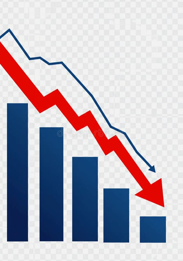
Free with trial This image depicts a bar graph with a clear downward trend. Blue bars decrease in height from left to right, representing a decline in value. A bold red arrow overlays the bars, visually emphasizing the negative trend. A blue line also shows a downward trend. The image conveys a sense of loss, recession, or negative performance and is suitable for illustrating financial or economic concepts. Trend decrease illustrations Declining Bar Graph with Downward Trend Lines. This image depicts a bar graph with a clear downward trend. Blue bars decrease in height from left to right, representing a decline in value. A bold red arrow overlays the bars, visually emphasizing the negative trend. A blue line also shows a downward trend. The image conveys a sense of loss, recession, or negative performance and is suitable for illustrating financial or economic concepts.
Free with trial A colorful bar chart illustrates a downward trend, with a prominent red arrow indicating a significant decrease in data. Trend decrease illustrations Bar chart showing declining trend with red arrow. A colorful bar chart illustrates a downward trend, with a prominent red arrow indicating a significant decrease in data
Free with trial A 3D red bar chart shows a declining trend against a white grid background. The bars decrease in height from left to right, with a red line graph following the downward trajectory. Trend decrease illustrations Red 3 D bar chart with downward trend line on white grid background graph line graph. A 3D red bar chart shows a declining trend against a white grid background. The bars decrease in height from left to right, with a red line graph following the downward trajectory
Free with trial A minimalist 3D icon rendered in white depicts a downward arrow pointing into a square frame containing a percentage symbol. The icon is presented on a reflective white surface, with a subtle blurred background. This graphic represents concepts such as price decrease, discount, or a downward trend. Trend decrease illustrations 3D White Icon Symbolizing Percentage Decrease or Discount with Downward Arrow on Reflective Surface. A minimalist 3D icon rendered in white depicts a downward arrow pointing into a square frame containing a percentage symbol. The icon is presented on a reflective white surface, with a subtle blurred background. This graphic represents concepts such as price decrease, discount, or a downward trend
Free with trial This vector illustration features a set of two minimalist graphs depicting a significant decline. Each graph includes a downward-sloping line chart with an accompanying filled area, clearly indicating a negative trend. One version is presented in black on a white background, while the other is white on a black background, offering versatile usage. This icon is ideal for illustrating concepts of business loss, economic recession, market downturns, financial crisis, poor performance, or any data showing a decrease. Perfect for presentations, reports, infographics, and web design. Trend decrease vectors Declining Business Graph Icon Set - Negative Trend Chart. This vector illustration features a set of two minimalist graphs depicting a significant decline. Each graph includes a downward-sloping line chart with an accompanying filled area, clearly indicating a negative trend. One version is presented in black on a white background, while the other is white on a black background, offering versatile usage. This icon is ideal for illustrating concepts of business loss, economic recession, market downturns, financial crisis, poor performance, or any data showing a decrease. Perfect for presentations, reports, infographics, and web design.
Free with trial A visual representation of a financial or business trend showing a steady decrease over time. The bar chart illustrates negative performance with a prominent downward arrow. Trend decrease illustrations Declining bar chart showing downward trend with arrow. A visual representation of a financial or business trend showing a steady decrease over time. The bar chart illustrates negative performance with a prominent downward arrow
Free with trial The image depicts a bar graph with a downward trend. The bars start high on the left and progressively decrease in height towards the right. A large red downward arrow further emphasizes the declining trend. Trend decrease vectors Decreasing trend in bar graph. The image depicts a bar graph with a downward trend. The bars start high on the left and progressively decrease in height towards the right. A large red downward arrow further emphasizes the declining trend
Free with trial A pair of minimalist line graphs illustrating a downward trend, presented in a high-contrast black on white and white on black design. The arrow at the end clearly indicates a decline, representing concepts like loss, decrease, negative growth, or recession. Ideal for financial reports, business presentations, economic news, data visualization, or any content requiring a clear symbol for falling statistics or poor performance. Trend decrease vectors Downward Trend Graph Icon Set - Black and White Decline Chart. A pair of minimalist line graphs illustrating a downward trend, presented in a high-contrast black on white and white on black design. The arrow at the end clearly indicates a decline, representing concepts like loss, decrease, negative growth, or recession. Ideal for financial reports, business presentations, economic news, data visualization, or any content requiring a clear symbol for falling statistics or poor performance.
Free with trial A bold red arrow pointing downwards along a slope, indicating a negative trend, decrease, or decline. This clear visual indicator is perfect for financial reports, data visualizations, educational presentations, or any graphic where a reduction in value or progress needs to be highlighted. vector design Generative AI. Trend decrease vectors Red Downward Slope Arrow for Negative Trend Indicator, vector design Generative AI. A bold red arrow pointing downwards along a slope, indicating a negative trend, decrease, or decline. This clear visual indicator is perfect for financial reports, data visualizations, educational presentations, or any graphic where a reduction in value or progress needs to be highlighted. vector design Generative AI
Free with trial A clean, minimalist 3D icon rendered in white against a neutral gray background. The icon features a square border with rounded corners, containing a downward-pointing arrow and a percentage sign. This graphic represents concepts such as a price decrease, discount, or negative financial trend. Trend decrease illustrations White 3D Icon Symbolizing Percentage Decrease or Discount with Downward Arrow down arrow. A clean, minimalist 3D icon rendered in white against a neutral gray background. The icon features a square border with rounded corners, containing a downward-pointing arrow and a percentage sign. This graphic represents concepts such as a price decrease, discount, or negative financial trend
Free with trial A bold red arrow with a zigzag pattern points downwards, symbolizing a negative trend, loss, or decrease. Trend decrease vectors Red arrow indicating downward trend or decline. A bold red arrow with a zigzag pattern points downwards, symbolizing a negative trend, loss, or decrease
Free with trial A pink piggy bank sits below a sharp red arrow indicating a downward trend, representing financial decline or savings decrease. Trend decrease illustrations Piggy bank with downward trend arrow symbolizing financial loss. A pink piggy bank sits below a sharp red arrow indicating a downward trend, representing financial decline or savings decrease
Free with trial A Bitcoin coin rests on a chart depicting a falling trend line symbolizing a decrease in value. Stacked coins are in the background highlighting the instability of the crypto market. Trend decrease illustrations Bitcoin and Crypto Market Volatility Visualized With a Falling Trend Line and. A Bitcoin coin rests on a chart depicting a falling trend line symbolizing a decrease in value. Stacked coins are in the background highlighting the instability of the crypto market
Free with trial A bright yellow arrow curves downwards indicating a downward trend, decrease, or decline. Ideal for presentations on finance, market analysis, or performance changes. Trend decrease illustrations Yellow arrow pointing downward showing a decline or falling trend. A bright yellow arrow curves downwards indicating a downward trend, decrease, or decline. Ideal for presentations on finance, market analysis, or performance changes
Free with trial Isolated showing simple line graph showing downward trend on white background keywords: graph, chart, line graph, downward trend, decline, decrease. Trend decrease illustrations Simple Line Graph Showing Downward Trend on White Background Keywords: graph, chart, line graph, downward trend
Free with trial Black arrow with jagged lines indicating a sharp downward trend on white background. Trend decrease illustrations Black arrow with jagged lines indicating a sharp downward trend on white decline decrease. Black arrow with jagged lines indicating a sharp downward trend on white background
Free with trial Downward pointing black arrow diagonally crossing a clean white background, representing direction, descent, or a trend indicating decrease and decline in various contexts. Trend decrease vectors Downward pointing black arrow diagonally crossing a clean white background, representing direction, descent, or a trend
Free with trial A bright glossy red arrow curves downwards indicating a fall or decline. This symbol represents negative trends, decrease, or a downward movement in data or performance. Trend decrease illustrations Glossy red downward curve arrow showing decline fall decrease trend. A bright glossy red arrow curves downwards indicating a fall or decline. This symbol represents negative trends, decrease, or a downward movement in data or performance
Free with trial A red line graph with data points illustrating a downward trend over time, suggesting a decrease in measured values. Trend decrease illustrations Declining Trend in Data Analysis Representation. a red line graph with data points illustrating a downward trend over time, suggesting a decrease in measured values
Free with trial A vector icon of a descending line graph on a green base, illustrating a downward trend, decrease, or decline in data. Represents financial loss, reduced performance, or negative growth. Suitable for business reports, statistical analysis, and economic presentations, vector design Generative AI. Trend decrease vectors Descending Line Graph Decline Trend Chart Icon, vector design Generative AI. A vector icon of a descending line graph on a green base, illustrating a downward trend, decrease, or decline in data. Represents financial loss, reduced performance, or negative growth. Suitable for business reports, statistical analysis, and economic presentations, vector design Generative AI
Free with trial A glossy, vibrant red arrow makes a sharp downward curve. This dynamic visual represents a negative trend, decrease, or a directional shift towards a lower point. Trend decrease illustrations Shiny red arrow curves downward symbolizing decline or negative trend. A glossy, vibrant red arrow makes a sharp downward curve. This dynamic visual represents a negative trend, decrease, or a directional shift towards a lower point
Free with trial A vector graphic of a line graph showing a downward trend. Represents decrease, decline, loss, or negative performance. In automotive context, could symbolize falling sales, decreasing fuel efficiency, or a system performance drop. A clear visual for illustrating negative trends, vector design Generative AI. Trend decrease vectors Downtrend graph icon, decrease decline loss symbol, vector design Generative AI. A vector graphic of a line graph showing a downward trend. Represents decrease, decline, loss, or negative performance. In automotive context, could symbolize falling sales, decreasing fuel efficiency, or a system performance drop. A clear visual for illustrating negative trends, vector design Generative AI
Free with trial This infographic displays a bar graph illustrating a sharp negative trend. The red line clearly depicts a significant decrease, showcasing concepts like downturn, recession, and loss within a business or financial context. Ideal for presentations, reports, and analyses highlighting negative market trends or economic decline, generated by AI. Trend decrease illustrations Decreasing bar graph showing negative trend decline. This infographic displays a bar graph illustrating a sharp negative trend. The red line clearly depicts a significant decrease, showcasing concepts like downturn, recession, and loss within a business or financial context. Ideal for presentations, reports, and analyses highlighting negative market trends or economic decline, generated by AI.
Free with trial A vector graphic of a line graph showing a downward trend with an arrow. Represents decline, loss, decrease, negative progress, or recession. Useful graphic for financial reports, statistics, or negative outcomes. Illustrating a drop in value, vector design Generative AI. Trend decrease vectors Downward Trend Arrow Vector Graphic, Decline and Loss Icon, vector design Generative AI. A vector graphic of a line graph showing a downward trend with an arrow. Represents decline, loss, decrease, negative progress, or recession. Useful graphic for financial reports, statistics, or negative outcomes. Illustrating a drop in value, vector design Generative AI
Free with trial A line graph illustrates a steady decline in values, featuring a blue line dropping toward a bright red arrow indicating a significant downward trend over time. Trend decrease illustrations Declining trend in data representation shows significant decrease over time. A line graph illustrates a steady decline in values, featuring a blue line dropping toward a bright red arrow indicating a significant downward trend over time.
Free with trial A simple line graph icon showing a downward trend, representing statistics, data, or a decline in performance. Useful for financial reports, market analysis, or educational materials. Its clear visual direction conveys negative momentum or a decrease, vector design Generative AI. Trend decrease vectors Downward Trend Line Graph Icon for Statistics and Data, vector design Generative AI. A simple line graph icon showing a downward trend, representing statistics, data, or a decline in performance. Useful for financial reports, market analysis, or educational materials. Its clear visual direction conveys negative momentum or a decrease, vector design Generative AI
Free with trial A flat vector icon showing a line graph with a distinct downward trend. Represents decline, decrease, negative growth, or falling performance. Suitable for business analysis, financial reports, or graphics illustrating negative progress or statistics, vector design Generative AI. Trend decrease vectors Downward line graph icon representing negative trend decline, vector design Generative AI. A flat vector icon showing a line graph with a distinct downward trend. Represents decline, decrease, negative growth, or falling performance. Suitable for business analysis, financial reports, or graphics illustrating negative progress or statistics, vector design Generative AI
Free with trial Outline vector icon of a line graph showing a downward trend. Represents decline, loss, decrease, failure, or negative performance in line art. Suitable for financial reports, data analysis, business presentations, and illustrating negative change, vector design Generative AI. Trend decrease vectors Downward Trend Graph Icon Outline, Decline Loss Failure Symbol, vector design Generative AI. Outline vector icon of a line graph showing a downward trend. Represents decline, loss, decrease, failure, or negative performance in line art. Suitable for financial reports, data analysis, business presentations, and illustrating negative change, vector design Generative AI
Free with trial Abstract illustration of a downward trending arrow chart. The arrows are depicted in varying shades of blue and green, suggesting a gradual decline. This image can be used to represent concepts such as loss, decrease, negative growth, or a downward trend in various fields like finance, sales, or performance metrics. The clean background and simple design make it versatile for presentations, reports, and infographics. Trend decrease illustrations Decreasing Trend Arrow Chart. Abstract illustration of a downward trending arrow chart. The arrows are depicted in varying shades of blue and green, suggesting a gradual decline. This image can be used to represent concepts such as loss, decrease, negative growth, or a downward trend in various fields like finance, sales, or performance metrics. The clean background and simple design make it versatile for presentations, reports, and infographics.
Free with trial The image displays a red line graph with a downward trend, indicating a decline or decrease. The graph starts high on the left and slopes downward to the right, with minor fluctuations but an overall downward trajectory. Trend decrease illustrations Graph showing downward trend. The image displays a red line graph with a downward trend, indicating a decline or decrease. The graph starts high on the left and slopes downward to the right, with minor fluctuations but an overall downward trajectory
Free with trial The image depicts a graph with a downward trend. The line on the graph slopes downwards from left to right, indicating a decrease in the measured values over time. The graph is rendered in red, with various markers and lines connecting the data points, suggesting a continuous decline. Trend decrease illustrations Graph showing downward trend. The image depicts a graph with a downward trend. The line on the graph slopes downwards from left to right, indicating a decrease in the measured values over time. The graph is rendered in red, with various markers and lines connecting the data points, suggesting a continuous decline
Free with trial This image depicts a bar and line chart illustrating a significant decline in values. The bars represent discrete data points that decrease progressively, while the line chart overlays the bars, emphasizing the downward trend. The chart uses a blue color scheme for both the bars and the line, with a clear visual representation of a negative progression. The overall design is minimalistic and. Trend decrease vectors Downward trend chart showing a decline in values over time. This image depicts a bar and line chart illustrating a significant decline in values. The bars represent discrete data points that decrease progressively, while the line chart overlays the bars, emphasizing the downward trend. The chart uses a blue color scheme for both the bars and the line, with a clear visual representation of a negative progression. The overall design is minimalistic and
Free with trial Trend disintegrating revenue chart illustration decrease loss, downturn metrics, performance data trend disintegrating revenue chart. Trend decrease illustrations Trend disintegrating revenue chart
Free with trial The image depicts a bar chart with yellow bars of decreasing height from left to right, indicating a downward trend. A red line with an arrowhead follows the tops of the bars, reinforcing the declining pattern. The arrowhead at the end of the line points downward to the right, symbolizing a reduction or decrease over time. Trend decrease illustrations Graph showing a downward trend with a red arrow and yellow bars. The image depicts a bar chart with yellow bars of decreasing height from left to right, indicating a downward trend. A red line with an arrowhead follows the tops of the bars, reinforcing the declining pattern. The arrowhead at the end of the line points downward to the right, symbolizing a reduction or decrease over time
Free with trial A minimalist black line graph icon on a clean white background, clearly illustrating a downward trend. The zigzagging line culminates in a sharp arrow pointing downwards, symbolizing decline, decrease, or negative performance. This versatile vector illustration is ideal for representing financial losses, economic downturns, sales drops, market crashes, or any data indicating a negative trajectory. Perfect for business reports, presentations, websites, apps, and infographics requiring a clear visual indicator of reduction or poor results. Trend decrease vectors Downward Trend Graph with Arrow Icon. A minimalist black line graph icon on a clean white background, clearly illustrating a downward trend. The zigzagging line culminates in a sharp arrow pointing downwards, symbolizing decline, decrease, or negative performance. This versatile vector illustration is ideal for representing financial losses, economic downturns, sales drops, market crashes, or any data indicating a negative trajectory. Perfect for business reports, presentations, websites, apps, and infographics requiring a clear visual indicator of reduction or poor results.
Free with trial This minimalist vector illustration depicts a retail store icon integrated into a shopping cart, positioned against a declining line graph. The visual metaphor highlights a negative economic trend or a decrease in consumer activity. The color palette uses muted tones with a bold red accent to emphasize the downward trajectory of the market performance. Trend decrease vectors A line graph showing a downward trend for a retail business concept. This minimalist vector illustration depicts a retail store icon integrated into a shopping. This minimalist vector illustration depicts a retail store icon integrated into a shopping cart, positioned against a declining line graph. The visual metaphor highlights a negative economic trend or a decrease in consumer activity. The color palette uses muted tones with a bold red accent to emphasize the downward trajectory of the market performance
Free with trial A red arrow pointing downwards with a jagged line indicating a decline or decrease in something, possibly related to finance or statistics. the arrow is pointing downwards to indicate a negative trend. Trend decrease illustrations A red downward trend line with a jagged line. a red arrow pointing downwards with a jagged line indicating a decline or decrease in something, possibly related to finance or statistics. the arrow is pointing downwards to indicate a negative trend
Free with trial A flat design illustration of a bar chart showing a declining trend, with a red arrow pointing downwards, symbolizing a decrease in performance or value. Trend decrease illustrations Bar chart with a downward trend isolated on white background. A flat design illustration of a bar chart showing a declining trend, with a red arrow pointing downwards, symbolizing a decrease in performance or value
Free with trial A 3D red arrow pointing downward, indicating a decrease or negative trend, on a gray background with a subtle shadow effect. Trend decrease illustrations A red arrow pointing downward in a downward trend. a 3D red arrow pointing downward, indicating a decrease or negative trend, on a gray background with a subtle shadow effect
Free with trial Red bar chart depicting a downward trend on a white background. The bars progressively decrease in height from left to right. An upward-pointing arrow emerges from the first bar, indicating initial growth. A curved, downward-pointing arrow overlays the bars, emphasizing the overall decline. The clear design conveys concepts of financial loss, decreasing statistics, or declining data points. Trend decrease vectors Red bar chart showing a downward trend with an upward arrow and a falling arrow isolated on white background. Red bar chart depicting a downward trend on a white background. The bars progressively decrease in height from left to right. An upward-pointing arrow emerges from the first bar, indicating initial growth. A curved, downward-pointing arrow overlays the bars, emphasizing the overall decline. The clear design conveys concepts of financial loss, decreasing statistics, or declining data points.
Free with trial A colorful bar graph with a downward trend, showing a decrease in values from left to right, with a large orange arrow pointing downwards. Trend decrease illustrations A colorful bar graph with a downward trend
Free with trial A bar chart with descending bars, representing decline, decrease, and negative data trends in a clear, informative style vector design Generative AI. Trend decrease vectors Bar chart descending, decline decrease negative trend data vector design Generative AI. A bar chart with descending bars, representing decline, decrease, and negative data trends in a clear, informative style vector design Generative AI
Free with trial A bar chart displayed on an easel, illustrating a negative trend. The bars, a mix of blue and grey, show a progressive decrease in value. A prominent red arrow curves downwards across the chart, signifying a decline or loss. The presentation suggests a financial report or business analysis with unfavorable results. Trend decrease illustrations Bar chart showing a downward trend with a red arrow indicating decline. A bar chart displayed on an easel, illustrating a negative trend. The bars, a mix of blue and grey, show a progressive decrease in value. A prominent red arrow curves downwards across the chart, signifying a decline or loss. The presentation suggests a financial report or business analysis with unfavorable results
Free with trial The image depicts a red zigzag line that starts at the top left and ends with an arrow pointing downward at the bottom right. This line illustrates a downward trend or a decrease over time. The zigzag pattern indicates fluctuations or periodic drops in the data being represented. The simplicity of the image highlights the concept of decline or reduction clearly and effectively. Trend decrease illustrations Graphical representation of decreasing trend. The image depicts a red zigzag line that starts at the top left and ends with an arrow pointing downward at the bottom right. This line illustrates a downward trend or a decrease over time. The zigzag pattern indicates fluctuations or periodic drops in the data being represented. The simplicity of the image highlights the concept of decline or reduction clearly and effectively
Free with trial An illustration of a bar graph on an easel with a downward trend line, indicating a decrease in values over time or categories. The graph is displayed on a white canvas, supported by a wooden easel, set against a plain white background. Trend decrease illustrations A graph on an easel showing a downward trend. An illustration of a bar graph on an easel with a downward trend line, indicating a decrease in values over time or categories. The graph is displayed on a white canvas, supported by a wooden easel, set against a plain white background
Free with trial A 3D rendered blue arrow symbol, depicted as a zig-zag line with an arrowhead pointing downwards, signifies a negative trend or decline. The object is isolated on a clean white background, making it suitable for representing financial data, economic downturns, or performance metrics. Trend decrease illustrations 3D Blue Arrow Graph Showing Downward Trend on White Background decrease. A 3D rendered blue arrow symbol, depicted as a zig-zag line with an arrowhead pointing downwards, signifies a negative trend or decline. The object is isolated on a clean white background, making it suitable for representing financial data, economic downturns, or performance metrics
Free with trial A three-dimensional bar graph is depicted against a white background, illustrating a clear downward trend. The bars, transitioning from blue at the highest point to red at the lowest, decrease in height from left to right, visually representing a decline or loss. Trend decrease illustrations 3D bar graph showing a downward trend with red and blue bars chart data. A three-dimensional bar graph is depicted against a white background, illustrating a clear downward trend. The bars, transitioning from blue at the highest point to red at the lowest, decrease in height from left to right, visually representing a decline or loss
Free with trial A black icon depicting a bar graph with three bars of decreasing height, representing a downward trend. A black arrow points diagonally downwards from the top right, indicating a decline. The icon is enclosed within a black circle and set against a white background. Trend decrease illustrations Black Downward Trend Bar Graph Icon with Arrow Inside Circle chart decrease. A black icon depicting a bar graph with three bars of decreasing height, representing a downward trend. A black arrow points diagonally downwards from the top right, indicating a decline. The icon is enclosed within a black circle and set against a white background
Free with trial The image depicts a dollar sign in the center with a red downward arrow on the left and a green upward arrow on the right. This visual metaphor represents financial trends, specifically a decrease and an increase in monetary value or economic indicators. Trend decrease illustrations Financial trend illustration showing increase and decrease with dollar sign. The image depicts a dollar sign in the center with a red downward arrow on the left and a green upward arrow on the right. This visual metaphor represents financial trends, specifically a decrease and an increase in monetary value or economic indicators
Free with trial A 3D graphic of a bar graph with blue and yellow bars and a large blue arrow pointing downward indicating a decline or decrease in the trend shown by the graph. Trend decrease illustrations A blue and yellow graph with a downward trend arrow. a 3D graphic of a bar graph with blue and yellow bars and a large blue arrow pointing downward indicating a decline or decrease in the trend shown by the graph
Free with trial A three-dimensional bar chart constructed from shiny golden bars depicts a clear downward trend. The bars decrease in height from left to right, creating a visual representation of decline or loss. The metallic gold material reflects light, giving the chart a polished and impactful appearance. The entire graphic is isolated on a clean white background, making the data visualization the sole focus. Trend decrease illustrations Golden 3D bar chart showing a downward trend on a white background graph data. A three-dimensional bar chart constructed from shiny golden bars depicts a clear downward trend. The bars decrease in height from left to right, creating a visual representation of decline or loss. The metallic gold material reflects light, giving the chart a polished and impactful appearance. The entire graphic is isolated on a clean white background, making the data visualization the sole focus
Free with trial This graphic depicts a bar chart showing a progressive decline in values. Four vertical bars, rendered in shades of blue, decrease in height from left to right, symbolizing a reduction. Each bar is accompanied by a dark grey downward-pointing arrow, reinforcing the concept of a negative trend or decrease. The clean, minimalist composition on a white background provides a clear and easily. Trend decrease vectors A bar chart illustrates a clear downward trend with multiple decreasing values. This graphic depicts a bar chart showing a progressive decline in values. Four vertical bars, rendered in shades of blue, decrease in height from left to right, symbolizing a reduction. Each bar is accompanied by a dark grey downward-pointing arrow, reinforcing the concept of a negative trend or decrease. The clean, minimalist composition on a white background provides a clear and easily