Free with trial Financial chart with golden downward arrow, statistical data, numbers in focus, white background. Concept of economic decline. 3D Rendering. Data analysis decrease illustrations Financial chart with downward trend and arrow on light background. 3D Rendering. Financial chart with golden downward arrow, statistical data, numbers in focus, white background. Concept of economic decline. 3D Rendering
Free with trial A black jagged line graph with sharp peaks that descends sharply to a horizontal line. Data analysis decrease illustrations Black Jagged Line Graph Descending Sharply chart data. A black jagged line graph with sharp peaks that descends sharply to a horizontal line
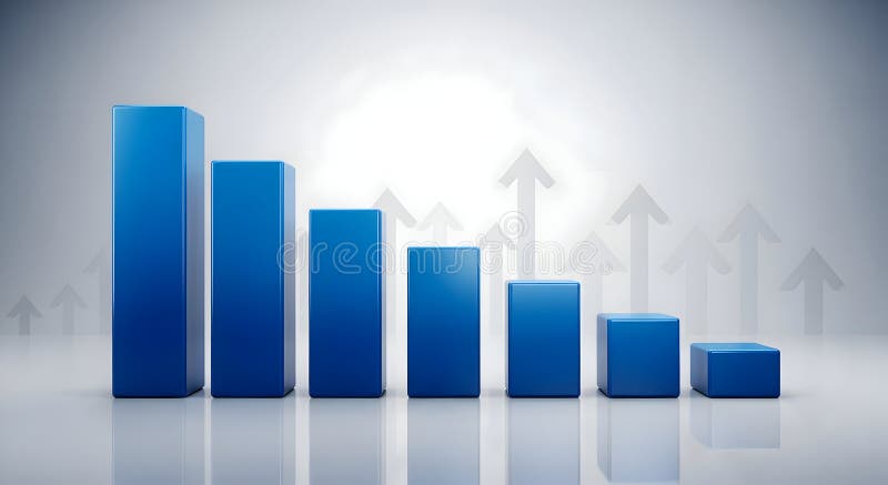
Free with trial A 3D render of a blue bar chart displaying a downward trend, with bars decreasing in height from left to right. The background features a subtle pattern of translucent upward-pointing arrows, suggesting growth or recovery despite the current decline. The scene is set against a clean, gradient gray backdrop with reflections, creating a modern and professional aesthetic. This image is ideal for representing financial downturns, market analysis, economic challenges, or the concept of overcoming obstacles. Data analysis decrease illustrations Declining Blue Bar Chart with Upward Arrows Background. A 3D render of a blue bar chart displaying a downward trend, with bars decreasing in height from left to right. The background features a subtle pattern of translucent upward-pointing arrows, suggesting growth or recovery despite the current decline. The scene is set against a clean, gradient gray backdrop with reflections, creating a modern and professional aesthetic. This image is ideal for representing financial downturns, market analysis, economic challenges, or the concept of overcoming obstacles.
Free with trial This minimalist vector illustration depicts a retail store icon integrated into a shopping cart, positioned against a declining line graph. The visual metaphor highlights a negative economic trend or a decrease in consumer activity. The color palette uses muted tones with a bold red accent to emphasize the downward trajectory of the market performance. Data analysis decrease vectors A line graph showing a downward trend for a retail business concept. This minimalist vector illustration depicts a retail store icon integrated into a shopping cart, positioned against a declining line graph. The visual metaphor highlights a negative economic trend or a decrease in consumer activity. The color palette uses muted tones with a bold red accent to emphasize the downward trajectory of the market performance
Free with trial A modern digital tablet is placed on a sleek marble desk, displaying a prominent graph illustrating a rising inflation rate. The graph features a jagged, upward trend in red and orange hues, indicating economic volatility. Beside the tablet, a stack of white cards, a pen, and a pair of reading glasses suggest a business or analytical setting. A small green potted plant adds a touch of life to the scene. This image is ideal for representing economic analysis, financial planning, market trends, and the challenges of managing inflation. Data analysis decrease illustrations Digital Tablet Displaying Inflation Rate Graph on a Marble Desk. A modern digital tablet is placed on a sleek marble desk, displaying a prominent graph illustrating a rising inflation rate. The graph features a jagged, upward trend in red and orange hues, indicating economic volatility. Beside the tablet, a stack of white cards, a pen, and a pair of reading glasses suggest a business or analytical setting. A small green potted plant adds a touch of life to the scene. This image is ideal for representing economic analysis, financial planning, market trends, and the challenges of managing inflation.
Free with trial A minimalist, flat design illustration of a bar chart featuring three vertical bars of varying heights. The bars are colored teal, orange, and beige, with dark blue outlines. They stand on a light yellow base and are arranged from tallest to shortest, indicating a declining trend. This graphic is ideal for representing data, statistics, financial reports, or progress over time in a clean and modern visual style. Data analysis decrease illustrations Colorful Bar Chart with Declining Trend. A minimalist, flat design illustration of a bar chart featuring three vertical bars of varying heights. The bars are colored teal, orange, and beige, with dark blue outlines. They stand on a light yellow base and are arranged from tallest to shortest, indicating a declining trend. This graphic is ideal for representing data, statistics, financial reports, or progress over time in a clean and modern visual style.
Free with trial An illustrative icon representing the exchange of digital information. Data analysis decrease vectors Digital Dialogue and Data Download Icon. An illustrative icon representing the exchange of digital information
Free with trial A minimalist line icon representing a detailed review or audit. Data analysis decrease vectors Clipboard Review and Analysis Line Icon. A minimalist line icon representing a detailed review or audit
Free with trial Simple 3D bar graph with colored bars on a white background, representing data comparison. Data analysis decrease illustrations Colorful Bar Graph Illustration on White. Simple 3D bar graph with colored bars on a white background, representing data comparison
Free with trial Hand holding holographic financial graph. Data analysis decrease illustrations Hand Holding Evolving Green Financial Data Graph and Cityscape - Investment Growth Concept. Hand holding holographic financial graph
Free with trial A downward trending graph chart isolated on a white background, perfect for financial analysis. Data analysis decrease illustrations Downward graph chart. A downward trending graph chart isolated on a white background, perfect for financial analysis
Free with trial A close-up view of a digital screen displaying a red stock market graph in a financial district, capturing a sense of economic downturn. The red-lit screen contrasts with the city buildings and people in the background. Data analysis decrease illustrations Red Stock Market Data Displayed on Screen in City Financial District at Twilight. A close-up view of a digital screen displaying a red stock market graph in a financial district, capturing a sense of economic downturn. The red-lit screen contrasts with the city buildings and people in the background
Free with trial A computer screen displaying stock market notifications for three stocks: Stock A with a 5% increase, Stock B with a 3% decrease, and Stock C that has reached its target. The image features a dark grey computer screen with a light blue background and colorful notification bubbles. Data analysis decrease illustrations Stock market notifications on a computer screen. A computer screen displaying stock market notifications for three stocks: Stock A with a 5% increase, Stock B with a 3% decrease, and Stock C that has reached its target. The image features a dark grey computer screen with a light blue background and colorful notification bubbles.
Free with trial A clean and minimalist vector icon featuring a black zigzag line, universally recognized as a heartbeat or pulse graph. Set against a stark white background and framed by a black border, this graphic effectively symbolizes vital signs, medical monitoring, data fluctuation, or energy signals. Its simple, high-contrast design makes it versatile for healthcare applications, financial charts, technology interfaces, infographics, and any project requiring a clear representation of rhythm, change, or status. Data analysis decrease vectors Minimalist Heartbeat Pulse Line Icon Vector. A clean and minimalist vector icon featuring a black zigzag line, universally recognized as a heartbeat or pulse graph. Set against a stark white background and framed by a black border, this graphic effectively symbolizes vital signs, medical monitoring, data fluctuation, or energy signals. Its simple, high-contrast design makes it versatile for healthcare applications, financial charts, technology interfaces, infographics, and any project requiring a clear representation of rhythm, change, or status.
Free with trial A stick figure businessman in a suit and tie looks worried and confused while holding a tablet displaying a downward-trending graph. The man has a question mark above his head, indicating confusion or concern about the negative financial data. This image can be used to illustrate financial loss, business failure, economic downturn, or market crash. Data analysis decrease vectors Stick Figure Businessman with Falling Graph. A stick figure businessman in a suit and tie looks worried and confused while holding a tablet displaying a downward-trending graph. The man has a question mark above his head, indicating confusion or concern about the negative financial data. This image can be used to illustrate financial loss, business failure, economic downturn, or market crash.
Free with trial A hand-drawn illustration featuring a large percentage symbol at the center, surrounded by various financial and business-related doodles. Icons include bar charts, pie charts, stacks of coins, a calculator, dollar signs, and numerous arrows indicating direction, flow, or change. The style is simple, black and white line art, suitable for representing concepts like finance, economics, growth, discounts, and business analysis. Data analysis decrease illustrations Doodle Financial Icons and Percentage Symbol. A hand-drawn illustration featuring a large percentage symbol at the center, surrounded by various financial and business-related doodles. Icons include bar charts, pie charts, stacks of coins, a calculator, dollar signs, and numerous arrows indicating direction, flow, or change. The style is simple, black and white line art, suitable for representing concepts like finance, economics, growth, discounts, and business analysis.
Free with trial A simple black and white icon depicting a graph with a downward trend, indicating a decrease or decline in something, possibly related to business or finance. Data analysis decrease vectors A black and white graph icon showing a decline. a simple black and white icon depicting a graph with a downward trend, indicating a decrease or decline in something, possibly related to business or finance
Free with trial A minimalist abstract design featuring four stacked, solid black hexagonal shapes. Each subsequent shape is slightly larger and positioned below the one above it, creating a sense of depth and progression. The clean lines and geometric form make this graphic versatile for use in presentations, infographics, web design, and branding, symbolizing growth, structure, or data layering. Data analysis decrease vectors Layered Hexagonal Shapes Abstract Background. A minimalist abstract design featuring four stacked, solid black hexagonal shapes. Each subsequent shape is slightly larger and positioned below the one above it, creating a sense of depth and progression. The clean lines and geometric form make this graphic versatile for use in presentations, infographics, web design, and branding, symbolizing growth, structure, or data layering.
Free with trial A 3D rendered image of a tall cylindrical structure composed of stainless steel vertical bars arranged in descending order from tallest at the top to shortest at the bottom, creating a minimalist bar chart visualization that rests on a rectangular base of the same metallic material, evoking a modern and sleek aesthetic suitable for presentations about data analysis, financial growth, business. Data analysis decrease illustrations Modern stainless steel 3D bar graph rendering with minimalist design and sleek vertical structure. A 3D rendered image of a tall cylindrical structure composed of stainless steel vertical bars arranged in descending order from tallest at the top to shortest at the bottom, creating a minimalist bar chart visualization that rests on a rectangular base of the same metallic material, evoking a modern and sleek aesthetic suitable for presentations about data analysis, financial growth, business
Free with trial A creative, hand-drawn bar chart illustrates a downward trend in data. Data analysis decrease vectors HandDrawn Business Bar Chart Showing Decline. A creative, hand-drawn bar chart illustrates a downward trend in data
Free with trial A clean and contemporary vector illustration of a downward-pointing arrow, rendered in varying shades of blue to create a subtle gradient effect. The arrow features a smooth, rounded top and a distinct, angular bottom, clearly indicating a downward direction. Isolated on a pure white background, this versatile graphic is ideal for conveying concepts such as download, navigation, decrease, or general directional cues in web design, mobile applications, presentations, and infographics. Its minimalist style ensures broad applicability across digital and print media. Data analysis decrease vectors Modern Blue Downward Arrow Icon with Gradient. A clean and contemporary vector illustration of a downward-pointing arrow, rendered in varying shades of blue to create a subtle gradient effect. The arrow features a smooth, rounded top and a distinct, angular bottom, clearly indicating a downward direction. Isolated on a pure white background, this versatile graphic is ideal for conveying concepts such as download, navigation, decrease, or general directional cues in web design, mobile applications, presentations, and infographics. Its minimalist style ensures broad applicability across digital and print media.
Free with trial This vibrant vector illustration showcases a collection of red and orange gradient arrows, all pointing downwards. The set includes both straight and dynamically curved arrows, effectively symbolizing various forms of decline, decrease, or negative trends. Perfect for use in business presentations, financial reports, infographics, or any design requiring a clear visual representation of falling statistics, market drops, recession, loss, or a general downward movement. The clean, modern flat design ensures versatility and impact. Data analysis decrease vectors Downward Trend Red Gradient Arrows Vector Set. This vibrant vector illustration showcases a collection of red and orange gradient arrows, all pointing downwards. The set includes both straight and dynamically curved arrows, effectively symbolizing various forms of decline, decrease, or negative trends. Perfect for use in business presentations, financial reports, infographics, or any design requiring a clear visual representation of falling statistics, market drops, recession, loss, or a general downward movement. The clean, modern flat design ensures versatility and impact.
Free with trial Detailed stock chart displays fluctuating trends represented in pink and teal lines showcasing market volatility, and is suitable for financial analysis. Data analysis decrease illustrations Analyzing Stock Market Chart with Fluctuating Trends in Pink and Teal. Detailed stock chart displays fluctuating trends represented in pink and teal lines showcasing market volatility, and is suitable for financial analysis
Free with trial A dynamic financial chart illustrating market fluctuations with percentage changes and various currency coins. Ideal for illustrating economic trends, investment analysis, or financial reports. Data analysis decrease illustrations Financial Growth Chart with Currency Symbols. A dynamic financial chart illustrating market fluctuations with percentage changes and various currency coins. Ideal for illustrating economic trends, investment analysis, or financial reports
Free with trial A visually appealing abstract bar chart illustration featuring pastel color bars on a dark teal background. The design is clean, modern, and versatile, suitable for presentations, reports, websites, or any project requiring data visualization. The simple style allows for easy customization and integration into various design projects. Data analysis decrease vectors Abstract Bar Chart Infographic Design. A visually appealing abstract bar chart illustration featuring pastel color bars on a dark teal background. The design is clean, modern, and versatile, suitable for presentations, reports, websites, or any project requiring data visualization. The simple style allows for easy customization and integration into various design projects.
Free with trial Woman courier near rising and falling graph symbolizing changing trends in logistics business. Courier girl falls after onset of crisis and decrease in flow of customers from online stores. Data analysis decrease vectors Woman courier near rising and falling graph symbolizing changing trends in logistics business
Free with trial A 3D rendered image displays a collection of business charts on a document. A colorful pie chart with six segments sits to the left of a bar graph with five vertical bars of varying heights and colors. A line graph with multiple colored lines is visible on the document below. The composition is set against a white background. Data analysis decrease illustrations 3D Rendered Pie Chart Bar Graph and Line Graph on a Document data statistics. A 3D rendered image displays a collection of business charts on a document. A colorful pie chart with six segments sits to the left of a bar graph with five vertical bars of varying heights and colors. A line graph with multiple colored lines is visible on the document below. The composition is set against a white background
Free with trial The image depicts a magnifying glass closely inspecting a graph that shows a rising trend. The graph is set against a blue circular background with white radial lines extending outward. A yellow upward-pointing arrow signifies growth, while a downward-pointing yellow arrow indicates a decline. The magnifying glass emphasizes the importance of detailed analysis in monitoring market trends. Data analysis decrease illustrations Examining market growth with magnifying glass. The image depicts a magnifying glass closely inspecting a graph that shows a rising trend. The graph is set against a blue circular background with white radial lines extending outward. A yellow upward-pointing arrow signifies growth, while a downward-pointing yellow arrow indicates a decline. The magnifying glass emphasizes the importance of detailed analysis in monitoring market trends
Free with trial A close-up shot of a stock market display board, showcasing real-time financial data. The image features rows of red and green numbers, representing stock prices, with upward and downward arrows indicating market trends. The dark background emphasizes the bright, glowing numbers and symbols, creating a sense of urgency and activity. This image is ideal for illustrating financial news, investment strategies, trading concepts, and economic reports. Data analysis decrease illustrations Stock Market Display: Rising and Falling Trends. A close-up shot of a stock market display board, showcasing real-time financial data. The image features rows of red and green numbers, representing stock prices, with upward and downward arrows indicating market trends. The dark background emphasizes the bright, glowing numbers and symbols, creating a sense of urgency and activity. This image is ideal for illustrating financial news, investment strategies, trading concepts, and economic reports.
Free with trial A hand in a suit jacket uses a needle to pop a soap bubble containing binary code against a blurred stock market background. AI-generated. Data analysis decrease illustrations Hand popping a digital data bubble with needle. A hand in a suit jacket uses a needle to pop a soap bubble containing binary code against a blurred stock market background. AI-generated
Free with trial A flat-style illustration depicting a falling bar graph, combined with a sad face emoji and recovery arrow for financial analysis. Data analysis decrease vectors Decreasing bar graph with sad face emoji and upwards arrow showing potential recovery. A flat-style illustration depicting a falling bar graph, combined with a sad face emoji and recovery arrow for financial analysis.
Free with trial A person is pointing at a graph with the word buy on it. The graph is showing a downward trend, which could indicate a decrease in stock prices or a decline in the market. Data analysis decrease illustrations A person is pointing at a graph with the word buy on it
Free with trial Hand points toward a descending bar graph with bars in warm colors from yellow to red, symbolizing decline or decrease. Data analysis decrease illustrations The hand points to the bar graph showing a downtrend. Hand points toward a descending bar graph with bars in warm colors from yellow to red, symbolizing decline. hand points toward a descending bar graph with bars in warm colors from yellow to red, symbolizing decline or decrease.
Free with trial This abstract image features a silhouette of a bar graph against a clean white background. The bars vary in height and width, creating a dynamic, wave-like pattern that rises towards the center and then gradually descends. The overall impression is one of growth, progress, or data visualization. This versatile graphic can be used for concepts related to business, finance, technology, statistics, or any subject requiring a visual representation of change and trends. Data analysis decrease vectors Abstract Silhouette Bar Graph with Rising Trend. This abstract image features a silhouette of a bar graph against a clean white background. The bars vary in height and width, creating a dynamic, wave-like pattern that rises towards the center and then gradually descends. The overall impression is one of growth, progress, or data visualization. This versatile graphic can be used for concepts related to business, finance, technology, statistics, or any subject requiring a visual representation of change and trends.
Free with trial A visually striking representation of financial decline, featuring a red arrow pointing downward on a sleek graph. Ideal for illustrating market trends and economic analysis. Data analysis decrease illustrations Red Arrow Graph Depicting Financial Decline and Market Trends. A visually striking representation of financial decline, featuring a red arrow pointing downward on a sleek graph. Ideal for illustrating market trends and economic analysis
Free with trial An illustration of a bar graph on an easel with a downward trend line, indicating a decrease in values over time or categories. The graph is displayed on a white canvas, supported by a wooden easel, set against a plain white background. Data analysis decrease illustrations A graph on an easel showing a downward trend. An illustration of a bar graph on an easel with a downward trend line, indicating a decrease in values over time or categories. The graph is displayed on a white canvas, supported by a wooden easel, set against a plain white background
Free with trial A stylized, flat design illustration of a magnifying glass. The lens is a vibrant teal color, framed by a bold orange border. Inside the lens, a prominent white horizontal bar with an orange line in the center represents a minus symbol, indicating a zoom-out or reduce function. The handle is a light beige color, completing the clean, modern aesthetic. This graphic is perfect for representing concepts related to search, analysis, reduction, or digital interface controls. Data analysis decrease vectors Magnifying Glass with Minus Symbol - Zoom Out Icon. A stylized, flat design illustration of a magnifying glass. The lens is a vibrant teal color, framed by a bold orange border. Inside the lens, a prominent white horizontal bar with an orange line in the center represents a minus symbol, indicating a zoom-out or reduce function. The handle is a light beige color, completing the clean, modern aesthetic. This graphic is perfect for representing concepts related to search, analysis, reduction, or digital interface controls.
Free with trial A smartphone screen showcases a modern fintech application featuring a blue and white interface with a declining stock market chart in the top left corner, accompanied by various performance graphs and analytical tools including a portfolio dashboard with spending insights, pie charts, and bar graphs illustrating investment distributions, all designed for comprehensive financial data analysis and. Data analysis decrease illustrations Mobile phone screen displaying fintech app with stock market charts and financial dashboard analytics. A smartphone screen showcases a modern fintech application featuring a blue and white interface with a declining stock market chart in the top left corner, accompanied by various performance graphs and analytical tools including a portfolio dashboard with spending insights, pie charts, and bar graphs illustrating investment distributions, all designed for comprehensive financial data analysis and
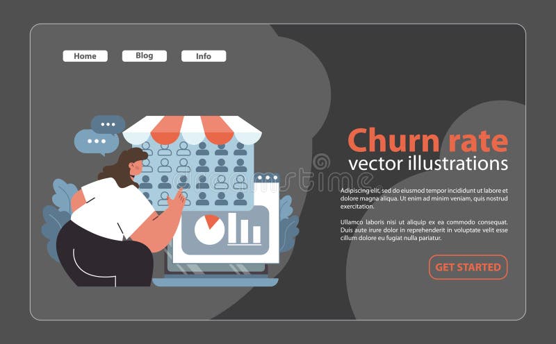
Free with trial Churn rate analytics concept. Woman studying customer retention metrics on a computer screen. Business analysis, graph visualization, and feedback tracking. Flat vector illustration. Data analysis decrease vectors Churn rate analytics concept. Flat. Churn rate analytics concept. Woman studying customer retention metrics on a computer screen. Business analysis, graph visualization, and feedback tracking. Flat vector illustration
Free with trial A vertical bar graph on a solid blue background displays a declining trend with the tallest bar representing 80% at the bottom and progressively shorter bars ascending to the top, visually representing a decrease in the percentage of people diagnosed with cancer for use in medical reports, health presentations, statistical analysis, and educational materials about disease prevalence and public. Data analysis decrease illustrations A vertical bar graph with decreasing blue bars showing a decline in cancer diagnosis rates on a blue background. A vertical bar graph on a solid blue background displays a declining trend with the tallest bar representing 80% at the bottom and progressively shorter bars ascending to the top, visually representing a decrease in the percentage of people diagnosed with cancer for use in medical reports, health presentations, statistical analysis, and educational materials about disease prevalence and public
Free with trial A crisp, minimalist vector icon featuring a bold white percentage symbol centrally placed on a solid black circular background. This high-contrast graphic is ideal for conveying concepts of discount, sale, rate, proportion, or statistical data. Its clean, flat design makes it versatile for various applications, including web interfaces, mobile apps, marketing materials, financial reports, and educational content. The isolated element offers clear readability and a modern aesthetic for any project requiring a clear representation of percentages. Data analysis decrease vectors Minimalist Black and White Percentage Symbol Icon. A crisp, minimalist vector icon featuring a bold white percentage symbol centrally placed on a solid black circular background. This high-contrast graphic is ideal for conveying concepts of discount, sale, rate, proportion, or statistical data. Its clean, flat design makes it versatile for various applications, including web interfaces, mobile apps, marketing materials, financial reports, and educational content. The isolated element offers clear readability and a modern aesthetic for any project requiring a clear representation of percentages.
Free with trial An illustrative icon depicting a strong blue shield encompassing a red segment of a pie chart and a prominent white downward-pointing arrow. This visual metaphor represents financial protection, risk management, and safeguarding against economic decline or market downturns. It symbolizes strategies to mitigate losses, secure investments, and manage negative trends in business or finance. Ideal for conveying concepts of security, crisis management, and data analysis related to falling statistics or decreasing performance in corporate presentations, reports, and financial articles. Data analysis decrease vectors Financial Protection Against Economic Decline Icon. An illustrative icon depicting a strong blue shield encompassing a red segment of a pie chart and a prominent white downward-pointing arrow. This visual metaphor represents financial protection, risk management, and safeguarding against economic decline or market downturns. It symbolizes strategies to mitigate losses, secure investments, and manage negative trends in business or finance. Ideal for conveying concepts of security, crisis management, and data analysis related to falling statistics or decreasing performance in corporate presentations, reports, and financial articles.
Free with trial A 3D graphic of a bar graph with blue and yellow bars and a large blue arrow pointing downward indicating a decline or decrease in the trend shown by the graph. Data analysis decrease illustrations A blue and yellow graph with a downward trend arrow. a 3D graphic of a bar graph with blue and yellow bars and a large blue arrow pointing downward indicating a decline or decrease in the trend shown by the graph
Free with trial Dramatic red arrow pointing down symbolizes financial loss, market downturn, or economic recession. Perfect for illustrating concepts of decline, risk, and negative trends in business or finance. Ideal for presentations on economics, investments, and market analysis. Data analysis decrease vectors Red downward arrow indicating financial decline or economic downturn concept. Dramatic red arrow pointing down symbolizes financial loss, market downturn, or economic recession. Perfect for illustrating concepts of decline, risk, and negative trends in business or finance. Ideal for presentations on economics, investments, and market analysis
Free with trial A modern computer monitor displays a detailed stock market candlestick chart on its screen, showing a downward trend with red and green candles and moving averages. The chart is set against a softly lit office or home office background, with a potted snake plant and pens in a holder adding a touch of life and organization to the scene. This image evokes themes of financial analysis, trading, investment, market volatility, and economic downturns, suitable for business, finance, and technology-related content. Data analysis decrease illustrations Computer Screen Displaying Stock Market Candlestick Chart with Falling Trend. A modern computer monitor displays a detailed stock market candlestick chart on its screen, showing a downward trend with red and green candles and moving averages. The chart is set against a softly lit office or home office background, with a potted snake plant and pens in a holder adding a touch of life and organization to the scene. This image evokes themes of financial analysis, trading, investment, market volatility, and economic downturns, suitable for business, finance, and technology-related content.
Free with trial A calculator displaying the word INFLATION with upward arrows, surrounded by stacks of coins, loose change, a pen, and financial charts on a desk, symbolizing economic growth and financial analysis. Data analysis decrease illustrations Inflation Calculator with Coins and Charts on Desk. A calculator displaying the word INFLATION with upward arrows, surrounded by stacks of coins, loose change, a pen, and financial charts on a desk, symbolizing economic growth and financial analysis
Free with trial A clean, minimalist 3D rendering of a descending bar graph composed of sleek, white rectangular prisms. The graph is set against a bright, neutral background, creating a modern and versatile image ideal for presentations, reports, or website design related to business, finance, or data visualization. The image offers a clean, uncluttered aesthetic. Data analysis decrease illustrations Abstract White Bar Graph: Minimalist 3D Render. A clean, minimalist 3D rendering of a descending bar graph composed of sleek, white rectangular prisms. The graph is set against a bright, neutral background, creating a modern and versatile image ideal for presentations, reports, or website design related to business, finance, or data visualization. The image offers a clean, uncluttered aesthetic.
Free with trial A graph displays a downward trend line colored in red, indicating a significant decline in data over a period of time. The background is dark, emphasizing the red color of the line. Data analysis decrease illustrations Graph shows sharp decline in performance over time. A graph displays a downward trend line colored in red, indicating a significant decline in data over a period of time. The background is dark, emphasizing the red color of the line
Free with trial Visual representation of a hand reaching out over a laptop displaying quality and cost indicators, symbolizing business analysis and performance metrics in a modern setting. Qubit. Data analysis decrease illustrations Hand Reaching Out Over Laptop Displaying Quality and Cost Percentage Indicators in a Dark Background for Business. Visual representation of a hand reaching out over a laptop displaying quality and cost indicators, symbolizing business analysis and performance metrics in a modern setting. Qubit
Free with trial A black and white circular icon depicting a bar chart with three bars of decreasing height. A diagonal arrow points downwards from the tallest bar to the shortest, indicating a downward trend or decline. The icon is set against a white background. Data analysis decrease illustrations Black and White Icon of a Downward Trending Bar Chart in a Circle graph decrease. A black and white circular icon depicting a bar chart with three bars of decreasing height. A diagonal arrow points downwards from the tallest bar to the shortest, indicating a downward trend or decline. The icon is set against a white background
Free with trial A simple line icon of a computer screen displaying a jagged downward arrow, symbolizing financial loss, economic downturn, business failure, or a decrease in performance. Data analysis decrease vectors Downward trend arrow on computer monitor screen icon. A simple line icon of a computer screen displaying a jagged downward arrow, symbolizing financial loss, economic downturn, business failure, or a decrease in performance
Free with trial A simple icon showing a line graph with a zigzag pattern trending upwards to the right, indicating positive growth or increase. Below the graph, a straight-lined arrow points upward, reinforcing the sense of rising trend. The entire illustration is enclosed within a circle, suggesting focus on graphs or analytics. The design uses clean, black lines on a white background for a clear, minimalist appearance. Data analysis decrease vectors Market Loss Analysis and Negative Trend Graph Icon. A simple icon showing a line graph with a zigzag pattern trending upwards to the right, indicating positive growth or increase. Below the graph, a straight-lined arrow points upward, reinforcing the sense of rising trend. The entire illustration is enclosed within a circle, suggesting focus on graphs or analytics. The design uses clean, black lines on a white background for a clear, minimalist appearance.
Free with trial This image displays two distinct charts illustrating annual revenue performance over quarters. The left chart features a line graph with shaded areas, showing trends and cumulative revenue. The right chart presents a bar graph with stacked segments, offering a clear comparison of revenue contributions across different quarters. Both charts use a clean, modern design with blue, green, and gray color palettes, suitable for business presentations, financial reports, and data visualization. Data analysis decrease illustrations Annual Revenue Performance Charts: Line and Bar Graphs. This image displays two distinct charts illustrating annual revenue performance over quarters. The left chart features a line graph with shaded areas, showing trends and cumulative revenue. The right chart presents a bar graph with stacked segments, offering a clear comparison of revenue contributions across different quarters. Both charts use a clean, modern design with blue, green, and gray color palettes, suitable for business presentations, financial reports, and data visualization.
Free with trial This image depicts a hand-drawn or sketched line graph illustrating a general upward trend with significant fluctuations and sharp peaks. The graph shows a series of rapid increases and decreases, indicating volatility in the data, but overall points to a positive growth trajectory. The peaks are pronounced, suggesting periods of high activity or spikes in whatever variable is being measured. Data analysis decrease illustrations Spiking upward trend line graph with volatility peaks. This image depicts a hand-drawn or sketched line graph illustrating a general upward trend with significant fluctuations and sharp peaks. The graph shows a series of rapid increases and decreases, indicating volatility in the data, but overall points to a positive growth trajectory. The peaks are pronounced, suggesting periods of high activity or spikes in whatever variable is being measured
Free with trial A 3D bar chart illustrates a significant downward trend in data, emphasized by a bold red arrow pointing downwards. Data analysis decrease illustrations Bar chart showing declining trend with downward arrow. A 3D bar chart illustrates a significant downward trend in data, emphasized by a bold red arrow pointing downwards
Free with trial A stylized image depicts a magnifying glass focusing on a declining bar graph being passed from one hand to another. Data analysis decrease illustrations Declining Market Analysis Magnifying Glass, Graph, Hands. A stylized image depicts a magnifying glass focusing on a declining bar graph being passed from one hand to another.
Free with trial A visual representation of a stock market crash, showing falling arrows and declining charts. Illustrates financial crisis, economic downturn, and investment loss. A symbolic depiction of recession. Data analysis decrease illustrations Stock market crash financial crisis recession investment loss downward trend economic downturn chart analysis. A visual representation of a stock market crash, showing falling arrows and declining charts. Illustrates financial crisis, economic downturn, and investment loss. A symbolic depiction of recession.
Free with trial The image depicts a candlestick chart, commonly used in financial trading to represent price movements. The chart includes various colored candlesticks: green, red, orange, and gray. Green candlesticks typically indicate a price increase, while red candlesticks indicate a price decrease. The chart shows a series of these candlesticks over a period, providing insights into market trends and. Data analysis decrease illustrations Detailed candlestick chart illustrating market trends. The image depicts a candlestick chart, commonly used in financial trading to represent price movements. The chart includes various colored candlesticks: green, red, orange, and gray. Green candlesticks typically indicate a price increase, while red candlesticks indicate a price decrease. The chart shows a series of these candlesticks over a period, providing insights into market trends and
Free with trial A colorful, hand-drawn illustration depicting a large percentage symbol surrounded by various financial and statistical icons. This doodle-style artwork includes bar graphs, pie charts, stacks of coins, dollar signs, and arrows indicating growth and decline. The sketch effectively visualizes concepts like interest rates, economic trends, business analytics, investment returns, and market data. Isolated on a white background, this versatile image is perfect for presentations, infographics, financial reports, and educational materials related to business, finance, and statistics. Data analysis decrease illustrations Hand Drawn Finance and Percentage Concept Illustration. A colorful, hand-drawn illustration depicting a large percentage symbol surrounded by various financial and statistical icons. This doodle-style artwork includes bar graphs, pie charts, stacks of coins, dollar signs, and arrows indicating growth and decline. The sketch effectively visualizes concepts like interest rates, economic trends, business analytics, investment returns, and market data. Isolated on a white background, this versatile image is perfect for presentations, infographics, financial reports, and educational materials related to business, finance, and statistics.
Free with trial A digital bar chart displayed on a dark blue screen with a grid overlay. The bars are predominantly blue, with some white bars indicating significant spikes. The chart fluctuating data with reflections on the glossy surface below. Numbers and percentages are visible on the grid lines. Data analysis decrease illustrations Blue digital bar chart with grid and reflections graph. A digital bar chart displayed on a dark blue screen with a grid overlay. The bars are predominantly blue, with some white bars indicating significant spikes. The chart fluctuating data with reflections on the glossy surface below. Numbers and percentages are visible on the grid lines
Free with trial A dynamic black and white background pattern featuring a collection of hand-drawn financial and economic elements. The design includes various currency symbols like the Dollar, Euro, and Yen, alongside upward and downward arrows, zig-zag lines representing market volatility, and simple bar charts indicating growth or decline. Scattered ink splatters add a grunge, artistic touch to the overall composition. This versatile illustration is ideal for conveying concepts related to global finance, business trends, investment, stock market fluctuations, economic data, and wealth management in a creative and engaging way. Data analysis decrease vectors Hand Drawn Financial Market Elements Background Pattern. A dynamic black and white background pattern featuring a collection of hand-drawn financial and economic elements. The design includes various currency symbols like the Dollar, Euro, and Yen, alongside upward and downward arrows, zig-zag lines representing market volatility, and simple bar charts indicating growth or decline. Scattered ink splatters add a grunge, artistic touch to the overall composition. This versatile illustration is ideal for conveying concepts related to global finance, business trends, investment, stock market fluctuations, economic data, and wealth management in a creative and engaging way.
Free with trial Red arrows indicate business growth and decline, along with percentage symbols for financial data and market trends. Data analysis decrease vectors Up and down arrows with percentage symbol business icon. Red arrows indicate business growth and decline, along with percentage symbols for financial data and market trends
Free with trial This 3D rendering illustrates the dynamic journey of financial markets. It depicts a series of bar graphs on a dark, reflective surface, showcasing different stages of economic activity. From steady growth and fluctuating upward trends, the visualization culminates in a dramatic market collapse, where a tall bar graph shatters into pieces. This powerful image represents concepts of business success, market volatility, economic downturns, and financial crises, making it ideal for reports, presentations, and articles on investment risks and market analysis. Data analysis decrease illustrations Financial Market Dynamics: Growth, Volatility, and Collapse. This 3D rendering illustrates the dynamic journey of financial markets. It depicts a series of bar graphs on a dark, reflective surface, showcasing different stages of economic activity. From steady growth and fluctuating upward trends, the visualization culminates in a dramatic market collapse, where a tall bar graph shatters into pieces. This powerful image represents concepts of business success, market volatility, economic downturns, and financial crises, making it ideal for reports, presentations, and articles on investment risks and market analysis.
Free with trial The image depicts a professional trading setup with multiple computer monitors displaying candlestick charts, which are commonly used in technical analysis for stocks, forex, or cryptocurrencies. The primary screen shows detailed price movements with green and red bars indicating price increases and decreases. The trader appears focused, suggesting active engagement in market analysis or trading. Data analysis decrease illustrations Trader analyzing stock market trends on multiple screens. The image depicts a professional trading setup with multiple computer monitors displaying candlestick charts, which are commonly used in technical analysis for stocks, forex, or cryptocurrencies. The primary screen shows detailed price movements with green and red bars indicating price increases and decreases. The trader appears focused, suggesting active engagement in market analysis or trading
Free with trial A repeating pattern of red down arrows in an isometric view. This image represents concepts such as business decline, negative trends, or decreasing statistics. Suitable for illustrating financial reports, market analysis, or economic downturns. Data analysis decrease illustrations Red Down Arrows Pattern, Isometric View, Business Decline. A repeating pattern of red down arrows in an isometric view. This image represents concepts such as business decline, negative trends, or decreasing statistics. Suitable for illustrating financial reports, market analysis, or economic downturns
Free with trial A close-up of torn paper showing a downward trend graph symbolizing market decline. This image reflects financial uncertainty and critical loss analysis. Data analysis decrease illustrations Torn Paper with Red Graph Decline on Financial Background. A close-up of torn paper showing a downward trend graph symbolizing market decline. This image reflects financial uncertainty and critical loss analysis
Free with trial Abstract 3D bar chart with a downward trending arrow, representing financial data and market decline, set against a neutral background. Data analysis decrease illustrations 3D bar chart showing financial decline with downward trend. Abstract 3D bar chart with a downward trending arrow, representing financial data and market decline, set against a neutral background
Free with trial A simple outline graphic showing a magnifying glass over a chart with a pie chart and bar graph, with a downward. Data analysis decrease illustrations Declining Sales Analysis Magnifying Glass, Chart, Arrow Down. A simple outline graphic showing a magnifying glass over a chart with a pie chart and bar graph, with a downward.
Free with trial A minimalist line drawing depicts a person walking with a declining sales graph under a magnifying glass. Data analysis decrease illustrations Declining Sales Analysis Magnifying Glass on Falling Graph. A minimalist line drawing depicts a person walking with a declining sales graph under a magnifying glass.
Free with trial A graphic illustration of a declining graph chart with prominent red arrows, symbolizing financial downturn, loss, or negative trends. Suitable for illustrating economic reports, business analysis, or market performance. Data analysis decrease illustrations Declining Graph Chart with Red Arrows, Financial Downturn. A graphic illustration of a declining graph chart with prominent red arrows, symbolizing financial downturn, loss, or negative trends. Suitable for illustrating economic reports, business analysis, or market performance
Free with trial A 3D rendered bar chart is displayed on a purple easel against a white background. The chart features a white board with a purple horizontal axis and three vertical purple bars of varying heights, indicating data or growth. The easel has three purple legs supporting the board. The overall aesthetic is clean and minimalist, suitable for business or educational contexts. Data analysis decrease illustrations A Purple 3D Rendered Bar Chart on an Easel Against a White Background graph statistics. A 3D rendered bar chart is displayed on a purple easel against a white background. The chart features a white board with a purple horizontal axis and three vertical purple bars of varying heights, indicating data or growth. The easel has three purple legs supporting the board. The overall aesthetic is clean and minimalist, suitable for business or educational contexts
Free with trial A laptop screen displays a prominent line graph labeled Credit Accumulation showing a downward trend, topped with a blue graduation cap and surrounded by colorful confetti, academic books, and scattered yellow stars against a light blue background, creating a conceptual visual about educational progress, financial analysis, student achievement metrics, and academic performance tracking with. Data analysis decrease illustrations Laptop displaying credit accumulation graph with downward trend surrounded by confetti books and graduation cap. A laptop screen displays a prominent line graph labeled Credit Accumulation showing a downward trend, topped with a blue graduation cap and surrounded by colorful confetti, academic books, and scattered yellow stars against a light blue background, creating a conceptual visual about educational progress, financial analysis, student achievement metrics, and academic performance tracking with
Free with trial A neon blue line graph with a jagged, downward trend is displayed against a dark, grid-like background. The graph's line is composed of small, glowing dots, creating a digital and futuristic aesthetic. The overall mood is serious and analytical, suggesting a decline in data or performance. Data analysis decrease illustrations Neon blue line graph showing a downward trend on a dark grid. A neon blue line graph with a jagged, downward trend is displayed against a dark, grid-like background. The graph's line is composed of small, glowing dots, creating a digital and futuristic aesthetic. The overall mood is serious and analytical, suggesting a decline in data or performance
Free with trial A dynamic collection of hand-drawn financial and trend-related symbols rendered in a grunge, brush-stroke style. This illustration features various dollar signs, upward and downward arrows, a zig-zag chart line, checkmarks, and crosses. The black-on-white design conveys concepts of business growth, economic trends, profit, loss, success, and decision-making. Ideal for presentations, reports, infographics, or any design project requiring a raw, energetic visual representation of financial data and market fluctuations. Data analysis decrease vectors Grunge Hand Drawn Financial Growth and Decline Symbols Set. A dynamic collection of hand-drawn financial and trend-related symbols rendered in a grunge, brush-stroke style. This illustration features various dollar signs, upward and downward arrows, a zig-zag chart line, checkmarks, and crosses. The black-on-white design conveys concepts of business growth, economic trends, profit, loss, success, and decision-making. Ideal for presentations, reports, infographics, or any design project requiring a raw, energetic visual representation of financial data and market fluctuations.
Free with trial A simple line drawing depicts a person presenting a declining bar chart on a whiteboard, viewed through a magnifying. Data analysis decrease illustrations Decline Analysis Magnifying Glass on Falling Chart, Business. A simple line drawing depicts a person presenting a declining bar chart on a whiteboard, viewed through a magnifying.
Free with trial A 3D bar graph with blue bars of decreasing height from left to right, accompanied by a large red arrow pointing downwards, indicating a decline or decrease. Data analysis decrease illustrations A downward trend is illustrated in a bar graph with a red arrow. A 3D bar graph with blue bars of decreasing height from left to right, accompanied by a large red arrow pointing downwards, indicating a decline or decrease
Free with trial A 3D rendered bar chart illustrating a downward trend. The bars, colored black, green, orange, red, and a lighter red, decrease in height from left to right. A vibrant purple arrow points downwards, diagonally across the bars, signifying a decrease or negative movement. The object is isolated on a white background. Data analysis decrease illustrations 3D Bar Chart with Purple Downward Arrow on White Background. A 3D rendered bar chart illustrating a downward trend. The bars, colored black, green, orange, red, and a lighter red, decrease in height from left to right. A vibrant purple arrow points downwards, diagonally across the bars, signifying a decrease or negative movement. The object is isolated on a white background
Free with trial Charts and Pen A magnifying glass rests atop financial charts with a pen, displaying analysis and review. Data analysis decrease illustrations Magnifying Glass Over Financial Reports and Charts. Charts and Pen A magnifying glass rests atop financial charts with a pen, displaying analysis and review
Free with trial A person holding a smartphone displaying a glowing house with a percentage sign and red downward arrows, indicating a decrease in rates. Data analysis decrease illustrations Person using a smartphone with a glowing house and percentage sign with red down generated using ai. A person holding a smartphone displaying a glowing house with a percentage sign and red downward arrows, indicating a decrease in rates
Free with trial A businessman is shown from a high angle, typing on a silver laptop. The screen displays a green downward-pointing arrow above the word COST, symbolizing cost reduction or decrease. The setting appears to be a professional office environment. Data analysis decrease illustrations Businessman using laptop with cost reduction arrow on screen. A businessman is shown from a high angle, typing on a silver laptop. The screen displays a green downward-pointing arrow above the word COST, symbolizing cost reduction or decrease. The setting appears to be a professional office environment