Free with trial The chart shows falling oil prices with an oil rig visible in the background. Data highlights market changes. Data analysis decrease illustrations Oil price trends show decline near oil extraction site in industry setting Generative AI. The chart shows falling oil prices with an oil rig visible in the background. Data highlights market changes
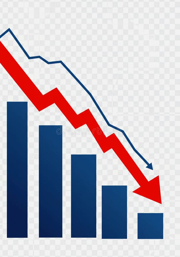
Free with trial A 3D blue bar chart and a dark blue line graph illustrate a significant downward trend, indicating a decline in data over time. Data analysis decrease illustrations Blue bar chart and line graph showing downward trend. A 3D blue bar chart and a dark blue line graph illustrate a significant downward trend, indicating a decline in data over time.
Free with trial Man examines with magnifying glass, coins signifying finance, gear and downward arrow symbolizing process decline. Ideal for business, analysis, economy, process, research, strategy simple flat. Data analysis decrease vectors Businessman Holding Magnifying Glass, Coins, and Gear with Downward Arrow. Man examines with magnifying glass, coins signifying finance, gear and downward arrow symbolizing process decline. Ideal for business, analysis, economy, process, research, strategy simple flat
Free with trial A 3D golden bar chart is arranged in a descending sequence, illustrating a downward trend. The bars are polished and reflective, casting subtle shadows on the pure white background. This visual represents a decline in data or financial performance. Data analysis decrease illustrations Golden Bar Chart Showing Downward Trend on White Background graph metallic. A 3D golden bar chart is arranged in a descending sequence, illustrating a downward trend. The bars are polished and reflective, casting subtle shadows on the pure white background. This visual represents a decline in data or financial performance
Free with trial A visual representation of a stock market candlestick chart is depicted with a downward trend. The chart features alternating red and green candlesticks, indicating price fluctuations. A subtle shadow is cast on the white background, adding depth to the financial data visualization. Data analysis decrease illustrations Downward Trending Stock Market Candlestick Chart with Red and Green Bars and Shadow finance. A visual representation of a stock market candlestick chart is depicted with a downward trend. The chart features alternating red and green candlesticks, indicating price fluctuations. A subtle shadow is cast on the white background, adding depth to the financial data visualization
Free with trial An abstract representation of a stock market decline is illustrated through a sharply descending red line graph against a dark, grid-like background. The red hues emphasize the severity of the drop, suggesting financial loss. Numerical data points faintly accompany the visual. This image was generat. Data analysis decrease illustrations Red Stock Decline. An abstract representation of a stock market decline is illustrated through a sharply descending red line graph against a dark, grid-like background. The red hues emphasize the severity of the drop, suggesting financial loss. Numerical data points faintly accompany the visual. This image was generat
Free with trial A stylized, flat design illustration of a bar chart depicting a downward trend. The bars are colored red, yellow, and blue, arranged in decreasing height from left to right. A prominent red arrow points downwards across the chart, emphasizing the decline. The graphic is set against a clean white background, making it ideal for presentations, reports, and financial concepts related to loss, decrease, or negative performance. Data analysis decrease illustrations Declining Bar Chart with Downward Arrow. A stylized, flat design illustration of a bar chart depicting a downward trend. The bars are colored red, yellow, and blue, arranged in decreasing height from left to right. A prominent red arrow points downwards across the chart, emphasizing the decline. The graphic is set against a clean white background, making it ideal for presentations, reports, and financial concepts related to loss, decrease, or negative performance.
Free with trial A pair of three-dimensional arrows, rendered in shades of gray, are presented against a white background. One arrow points upwards, signifying growth or progress, while the other points downwards, indicating decline or a decrease. The arrows are constructed from layered chevron shapes, creating a textured and modern appearance. Data analysis decrease illustrations 3D rendering of an upward and downward pointing chevron arrow pair on a white background. A pair of three-dimensional arrows, rendered in shades of gray, are presented against a white background. One arrow points upwards, signifying growth or progress, while the other points downwards, indicating decline or a decrease. The arrows are constructed from layered chevron shapes, creating a textured and modern appearance
Free with trial This visually striking image depicts a futuristic financial concept. Scattered coins on a dark surface are illuminated by glowing neon percentages (1%, 10%, 20%, 30%, 50%, 100%). A subtle network of lines and lights in the background suggests a digital or abstract representation of data and growth. The composition evokes themes of investment, progress, and financial targets, suitable for business, finance, and technology-related content. Data analysis decrease illustrations Digital Growth and Financial Percentages. This visually striking image depicts a futuristic financial concept. Scattered coins on a dark surface are illuminated by glowing neon percentages (1%, 10%, 20%, 30%, 50%, 100%). A subtle network of lines and lights in the background suggests a digital or abstract representation of data and growth. The composition evokes themes of investment, progress, and financial targets, suitable for business, finance, and technology-related content.
Free with trial A series of golden, metallic bars are arranged in a descending order, forming a bar chart that clearly illustrates a downward trend. The bars decrease in height from left to right, with the leftmost bar being the tallest and the rightmost bar being the shortest and widest. The reflective golden surface of the bars catches the light, highlighting their three-dimensional form. The chart is presented. Data analysis decrease illustrations Golden Bar Chart Showing A Downward Trend On A White Background graph financial. A series of golden, metallic bars are arranged in a descending order, forming a bar chart that clearly illustrates a downward trend. The bars decrease in height from left to right, with the leftmost bar being the tallest and the rightmost bar being the shortest and widest. The reflective golden surface of the bars catches the light, highlighting their three-dimensional form. The chart is presented
Free with trial Line graph with downward trend alongside sad face. Ideal for performance loss, business challenges, failure, analysis, recession, disappointment, frustration. Simple flat metaphor. Data analysis decrease vectors Declining Line Graph with Sad Face Representing Negative Trend and Disappointment. Line graph with downward trend alongside sad face. Ideal for performance loss, business challenges, failure, analysis, recession, disappointment, frustration. Simple flat metaphor
Free with trial A businessman interacts with a digital graph showcasing cost reduction through a declining trend. It symbolizes modern financial strategies and data-driven decision-making. XDMCP. Data analysis decrease illustrations Businessman Presenting Digital Graph with Cost Reduction Concept, Showing Declining Trend in Expenses with Iconic. A businessman interacts with a digital graph showcasing cost reduction through a declining trend. It symbolizes modern financial strategies and data-driven decision-making. XDMCP
Free with trial Sad face alongside a line graph showing downward trends, small airport icon, and flight imagery. Ideal for travel analysis, business performance, economy, transportation, tourism, crisis impact. Data analysis decrease illustrations Declining Travel Trends Represented by Graph and Sad Face. Sad face alongside a line graph showing downward trends, small airport icon, and flight imagery. Ideal for travel analysis, business performance, economy, transportation, tourism, crisis impact
Free with trial Clean magnifying glass icon featuring minus symbol representing zoom out function, search reduction, content minimization, scaling down view, and simplified data visualization. Data analysis decrease vectors Magnifying Glass Icon with Minus Symbol for Zoom Out Search Reduction and Content Minimization Concept. Clean magnifying glass icon featuring minus symbol representing zoom out function, search reduction, content minimization, scaling down view, and simplified data visualization
Free with trial A 3D rendered image features two glossy, red arrows in a dynamic, circular arrangement. One arrow points upwards, signifying growth or increase, while the other points downwards, representing decline or decrease. The arrows are highly reflective and are presented against a clean white background, emphasizing their form and the concept of opposing directions or change. Data analysis decrease illustrations Glossy Red Arrows Pointing Up and Down in a Circular Motion on a White Background image photo. A 3D rendered image features two glossy, red arrows in a dynamic, circular arrangement. One arrow points upwards, signifying growth or increase, while the other points downwards, representing decline or decrease. The arrows are highly reflective and are presented against a clean white background, emphasizing their form and the concept of opposing directions or change
Free with trial A dramatic visual representation of a stock market crash, featuring a downward trending red candlestick chart against a dark, grid-like background. Numbers and financial data are subtly visible, emphasizing the financial context. This image evokes feelings of loss, recession, and economic downturn, making it ideal for illustrating financial crises, market volatility, and investment risks. Data analysis decrease illustrations Red Stock Market Crash Chart. A dramatic visual representation of a stock market crash, featuring a downward trending red candlestick chart against a dark, grid-like background. Numbers and financial data are subtly visible, emphasizing the financial context. This image evokes feelings of loss, recession, and economic downturn, making it ideal for illustrating financial crises, market volatility, and investment risks.
Free with trial A 3D render illustrating a concept of financial decline and economic recession. The image features a red bar chart with progressively shorter bars, indicating a downward trend. A bold, red arrow follows this negative trajectory, pointing sharply downwards. Set against a clean, neutral gray background, this graphic powerfully symbolizes concepts like business failure, stock market crash, investment loss, sales decrease, and economic crisis. It's a perfect visual for presentations, reports, and articles discussing financial downturns, poor performance, and negative growth. Data analysis decrease illustrations Financial Decline Graph with Red Arrow Down. A 3D render illustrating a concept of financial decline and economic recession. The image features a red bar chart with progressively shorter bars, indicating a downward trend. A bold, red arrow follows this negative trajectory, pointing sharply downwards. Set against a clean, neutral gray background, this graphic powerfully symbolizes concepts like business failure, stock market crash, investment loss, sales decrease, and economic crisis. It's a perfect visual for presentations, reports, and articles discussing financial downturns, poor performance, and negative growth.
Free with trial Blue bar chart with a black arrow bouncing backward vector illustration. Economic recession, financial loss, market crash, business failure, negative growth, setback. Data graph with falling pointer. Data analysis decrease vectors Financial bar chart with a bouncing arrow pointing down economic recession and market loss vector illustration. Blue bar chart with a black arrow bouncing. Blue bar chart with a black arrow bouncing backward vector illustration. Economic recession, financial loss, market crash, business failure, negative growth, setback. Data graph with falling pointer
Free with trial A 3D bar chart illustrates a downward trend against a white background. The bars, colored red, yellow, green, and blue, decrease in height from left to right. A thick black arrow curves downwards, pointing towards the shortest bar, visually reinforcing the concept of decline or loss. Data analysis decrease illustrations Downward Trend Bar Chart with Red Yellow Green Blue Bars and Black Arrow on White Background. A 3D bar chart illustrates a downward trend against a white background. The bars, colored red, yellow, green, and blue, decrease in height from left to right. A thick black arrow curves downwards, pointing towards the shortest bar, visually reinforcing the concept of decline or loss
Free with trial Businessman with downward graph indicating financial decline, recession, and negative growth. Ideal for economic analysis, loss reporting, and business downturn visuals. Data analysis decrease vectors Business decline graph with downward arrow showing financial loss recession and negative growth concept. Businessman with downward graph indicating financial decline, recession, and negative growth. Ideal for economic analysis, loss reporting, and business downturn visuals
Free with trial Digital Transformation in Real Estate Market with Laptop and House Icon Illustrating Decrease in Property Value Represented by Percent Symbol Sigmoid. Data analysis decrease illustrations A modern workspace with a laptop and digital house icon, showcasing the decline in property value with a percent symbol. Digital Transformation in Real Estate Market with Laptop and House Icon Illustrating Decrease in Property Value Represented by Percent Symbol Sigmoid
Free with trial This image depicts a bar graph on an easel showing a clear downward trend. The bars are blue, and a large red arrow points downward, indicating a decline. Data analysis decrease illustrations Decline in data represented by a descending bar graph on an easel. This image depicts a bar graph on an easel showing a clear downward trend. The bars are blue, and a large red arrow points downward, indicating a decline
Free with trial Black line graph showing upward and downward trends with arrows on a white background. Data analysis decrease illustrations Black line graph with upward and downward trends and arrows chart data. Black line graph showing upward and downward trends with arrows on a white background
Free with trial This image features an abstract illustration of a bar graph against a dark gray background. The graph consists of three vertical bars of varying heights, each with horizontal rectangles inside. The bars are shades of white and gray, creating a minimalist and modern design. This image can be used to represent data, growth, statistics, or business performance in a visually appealing manner. Data analysis decrease vectors Abstract Bar Graph Illustration. This image features an abstract illustration of a bar graph against a dark gray background. The graph consists of three vertical bars of varying heights, each with horizontal rectangles inside. The bars are shades of white and gray, creating a minimalist and modern design. This image can be used to represent data, growth, statistics, or business performance in a visually appealing manner.
Free with trial A striking 3D rendering depicts a significant financial market decline, symbolized by a bold red arrow sharply pointing downwards across a dark grey background. The scene includes a subtle line graph and bar charts in shades of red and grey, illustrating a negative trend in data. This image effectively conveys concepts of economic recession, stock market crash, business losses, and financial crisis. Ideal for articles, presentations, and reports discussing market downturns, investment risks, or economic challenges. Data analysis decrease illustrations Financial Market Decline with Red Arrow Chart. A striking 3D rendering depicts a significant financial market decline, symbolized by a bold red arrow sharply pointing downwards across a dark grey background. The scene includes a subtle line graph and bar charts in shades of red and grey, illustrating a negative trend in data. This image effectively conveys concepts of economic recession, stock market crash, business losses, and financial crisis. Ideal for articles, presentations, and reports discussing market downturns, investment risks, or economic challenges.
Free with trial This image depicts a bar graph with a clear downward trend. Blue bars decrease in height from left to right, representing a decline in value. A bold red arrow overlays the bars, visually emphasizing the negative trend. A blue line also shows a downward trend. The image conveys a sense of loss, recession, or negative performance and is suitable for illustrating financial or economic concepts. Data analysis decrease illustrations Declining Bar Graph with Downward Trend Lines. This image depicts a bar graph with a clear downward trend. Blue bars decrease in height from left to right, representing a decline in value. A bold red arrow overlays the bars, visually emphasizing the negative trend. A blue line also shows a downward trend. The image conveys a sense of loss, recession, or negative performance and is suitable for illustrating financial or economic concepts.
Free with trial A 3D golden bar chart illustrates a declining trend, with a sharp downward arrow indicating a significant decrease in performance or value. Isolated on a white background. Data analysis decrease illustrations Golden downward trending bar chart with arrow. A 3D golden bar chart illustrates a declining trend, with a sharp downward arrow indicating a significant decrease in performance or value. Isolated on a white background
Free with trial A visual representation of a declining trend, depicted by a blue bar chart with a prominent downward-pointing arrow, indicating a decrease in performance or value. Data analysis decrease illustrations Blue bar chart with a downward trending arrow. A visual representation of a declining trend, depicted by a blue bar chart with a prominent downward-pointing arrow, indicating a decrease in performance or value
Free with trial Line art depicting a magnifying glass focused on a declining sales graph and a thumbs-down gesture. Data analysis decrease illustrations Declining Sales Analysis Magnifying Glass, Downward Trend, Thumbs Down. Line art depicting a magnifying glass focused on a declining sales graph and a thumbs-down gesture.
Free with trial An illustration of a simple line graph showing a decline or decrease, accompanied by an exclamation mark inside a triangle, indicating a warning, danger or risk. Suitable for topics like financial loss, market crash, or economic downturn. Data analysis decrease vectors Simple Line Decline Graph with Exclamation Mark Attention Icon Design. An illustration of a simple line graph showing a decline or decrease, accompanied by an exclamation mark inside a triangle, indicating a warning, danger or risk. Suitable for topics like financial loss, market crash, or economic downturn.
Free with trial This image depicts a visual representation of financial or business growth and decline using a series of ascending and descending three-dimensional bar charts, where the left side shows smaller bars gradually increasing in height, transitioning through a central flat bar, and shifting to taller bars on the right side that progressively decrease, all set against a plain white background to. Data analysis decrease illustrations Growth and progress concept with ascending and descending bar charts illustrating business success and financial improvement over. This image depicts a visual representation of financial or business growth and decline using a series of ascending and descending three-dimensional bar charts, where the left side shows smaller bars gradually increasing in height, transitioning through a central flat bar, and shifting to taller bars on the right side that progressively decrease, all set against a plain white background to
Free with trial Vibrant candlestick patterns and descending trend lines illustrate a market downturn, highlighting analysis tools amid a somber financial atmosphere. Data analysis decrease illustrations Stock market decline with colorful candlestick charts and trend lines. Vibrant candlestick patterns and descending trend lines illustrate a market downturn, highlighting analysis tools amid a somber financial atmosphere
Free with trial Businessman presenting falling chart indicating financial decline and loss. Ideal for analytics, reporting, and economic downturn presentations. Data analysis decrease vectors Business decline presentation with downward chart representing financial loss analysis and negative growth. Businessman presenting falling chart indicating financial decline and loss. Ideal for analytics, reporting, and economic downturn presentations
Free with trial Two sets of simple flat design charts showing bar graphs with line graphs and three-segment pie charts in red, green, and blue. Data analysis decrease vectors Two bar charts with line graphs and two pie charts data visualization statistics. Two sets of simple flat design charts showing bar graphs with line graphs and three-segment pie charts in red, green, and blue
Free with trial An isometric 3D bar graph with three descending steps, made of a glossy, reflective material with a blue and purple gradient. This illustrates a decrease or decline. Concept of financial loss or reduced metrics. Data analysis decrease vectors Blue and Purple Isometric Bar Graph Showing a Downtrend. An isometric 3D bar graph with three descending steps, made of a glossy, reflective material with a blue and purple gradient. This illustrates a decrease or decline. Concept of financial loss or reduced metrics
Free with trial A collection of nine simple, solid black icons on a white background, illustrating concepts of decline, loss, and negative trends using various charts like bar graphs, line graphs, and pie charts with downward pointing arrows. Data analysis decrease vectors Set of black icons representing financial decrease and downward trends. A collection of nine simple, solid black icons on a white background, illustrating concepts of decline, loss, and negative trends using various charts like bar graphs, line graphs, and pie charts with downward pointing arrows
Free with trial Line art icon featuring a magnifying glass positioned over a vertical bar chart. The design is simple and minimalistic, using grey lines. The bar chart consists of three bars of varying heights, and the magnifying glass is centered over the middle bar, suggesting examination or analysis of data. This icon is likely used to symbolize data analysis, inspection, or detailed observation in a graphical representation. Data analysis decrease vectors Line art icon of magnifying glass over bar chart. Line art icon featuring a magnifying glass positioned over a vertical bar chart. The design is simple and minimalistic, using grey lines. The bar chart consists of three bars of varying heights, and the magnifying glass is centered over the middle bar, suggesting examination or analysis of data. This icon is likely used to symbolize data analysis, inspection, or detailed observation in a graphical representation.
Free with trial A green line graph illustrating data points over time, with the y-axis labeled 'Value' and the x-axis labeled 'Time', showcasing significant ups and downs in the data. Data analysis decrease illustrations Line graph showing fluctuating values over time. A green line graph illustrating data points over time, with the y-axis labeled 'Value' and the x-axis labeled 'Time', showcasing significant ups and downs in the data
Free with trial A comprehensive collection of hand-drawn business and data visualization icons. This doodle-style set features a variety of essential elements, including different types of arrows, bar graphs, line charts, and pie charts. The sketchy, black and white illustrations are perfect for infographics, presentations, financial reports, and marketing materials. Each icon is isolated on a white background, representing concepts like growth, statistics, process flow, and direction. This versatile vector set is ideal for adding a creative, hand-made touch to any project related to analytics, finance, or strategy. Data analysis decrease illustrations Hand Drawn Business and Finance Doodle Icon Set. A comprehensive collection of hand-drawn business and data visualization icons. This doodle-style set features a variety of essential elements, including different types of arrows, bar graphs, line charts, and pie charts. The sketchy, black and white illustrations are perfect for infographics, presentations, financial reports, and marketing materials. Each icon is isolated on a white background, representing concepts like growth, statistics, process flow, and direction. This versatile vector set is ideal for adding a creative, hand-made touch to any project related to analytics, finance, or strategy.
Free with trial A striking 3D rendered image featuring a bar chart with decreasing red bars and a prominent red downward-pointing arrow, set against a vibrant yellow background. This minimalist visual powerfully symbolizes financial decline, economic recession, business loss, or a negative trend in performance. The clean design effectively conveys concepts of decreasing profits, market downturns, or poor investment outcomes. Ideal for presentations, financial reports, economic analysis, infographics, and articles discussing challenges, risks, or market volatility in business and finance. Data analysis decrease illustrations Economic Downturn Bar Chart with Downward Arrow. A striking 3D rendered image featuring a bar chart with decreasing red bars and a prominent red downward-pointing arrow, set against a vibrant yellow background. This minimalist visual powerfully symbolizes financial decline, economic recession, business loss, or a negative trend in performance. The clean design effectively conveys concepts of decreasing profits, market downturns, or poor investment outcomes. Ideal for presentations, financial reports, economic analysis, infographics, and articles discussing challenges, risks, or market volatility in business and finance.
Free with trial An isometric 3D bar chart with four descending bars, made of a clear glass with a modern, holographic, and iridescent finish in pink and blue. Concept of financial decline or decreasing data trends. Data analysis decrease vectors Isometric Bar Chart Showing Decline with Iridescent Bars. An isometric 3D bar chart with four descending bars, made of a clear glass with a modern, holographic, and iridescent finish in pink and blue. Concept of financial decline or decreasing data trends
Free with trial Black and white icon of a bar graph with short bars and a downward pointing arrow. Data analysis decrease illustrations Bar graph with short bars and a downward pointing arrow bar chart decrease. Black and white icon of a bar graph with short bars and a downward pointing arrow
Free with trial Black icon of a fluctuating graph with a downward trend arrow on a white background. Data analysis decrease illustrations Black icon of a fluctuating graph with downward trend arrow chart data. Black icon of a fluctuating graph with a downward trend arrow on a white background
Free with trial Black and red arrow pointing downward on financial graph showing a decline. Business growth chart with falling trend line for investment analysis. Data analysis decrease illustrations Black and red arrow pointing downward on financial graph showing a decline
Free with trial Team Collaboration on Real Estate Strategy with Finance Charts and House Icon, Representing Property Investment Opportunities and Market Analysis Sigmoid. Data analysis decrease illustrations Professional team working together on real estate strategies with finance insights and graphics, focusing on investment. Team Collaboration on Real Estate Strategy with Finance Charts and House Icon, Representing Property Investment Opportunities and Market Analysis Sigmoid
Free with trial A 3D red bar chart shows a declining trend against a white grid background. The bars decrease in height from left to right, with a red line graph following the downward trajectory. Data analysis decrease illustrations Red 3 D bar chart with downward trend line on white grid background graph line graph. A 3D red bar chart shows a declining trend against a white grid background. The bars decrease in height from left to right, with a red line graph following the downward trajectory
Free with trial Black and white icon of a bar graph showing a downward trend with an arrow pointing down. Data analysis decrease illustrations Downward trending bar graph with arrow indicating decrease bar chart decline. Black and white icon of a bar graph showing a downward trend with an arrow pointing down
Free with trial Displaying dashboard grid showing fluctuating blue and red line graphs with metallic green sphere. Analytics, investment, data visualization, technology, finance, bar chart, dashboard. Data analysis decrease illustrations Displaying dashboard grid showing fluctuating blue and red line graphs with metallic green sphere
Free with trial This image showcases colorful 3D charts and graphs, representing financial data, generated by AI. It includes bar graphs, pie charts, and other visual representations of financial performance, displayed on a tablet and printed reports. The image suggests growth and positive financial trends. Data analysis decrease illustrations AI-Generated Financial Charts. This image showcases colorful 3D charts and graphs, representing financial data, generated by AI. It includes bar graphs, pie charts, and other visual representations of financial performance, displayed on a tablet and printed reports. The image suggests growth and positive financial trends.
Free with trial Smartphone screen with password protection icon, downward sale arrow, and a chart depicting analytics. Ideal for cybersecurity, digital sales, ecommerce metrics, data protection, online safety. Data analysis decrease vectors Mobile Security Features and Analytics Highlighting Sales Performance with Trend Insights. Smartphone screen with password protection icon, downward sale arrow, and a chart depicting analytics. Ideal for cybersecurity, digital sales, ecommerce metrics, data protection, online safety
Free with trial A person in a suit analyzes a financial chart with a pen. The chart displays a red zigzag arrow pointing downward, indicating a decline. Various colorful pie charts and graphs are scattered on the table. The focus is on the financial documents and analysis tools, suggesting an office or business setting. The overall tone conveys economic downturn or negative financial trends. a i generated. Data analysis decrease illustrations A hand analyzes a declining financial chart with a red arrow pointing downward. A person in a suit analyzes a financial chart with a pen. The chart displays a red zigzag arrow pointing downward, indicating a decline. Various colorful pie charts and graphs are scattered on the table. The focus is on the financial documents and analysis tools, suggesting an office or business setting. The overall tone conveys economic downturn or negative financial trends. a i generated
Free with trial This image presents a compelling visual representation of a global economic downturn. A prominent, three-dimensional white arrow dramatically plunges downward, superimposed on a world map rendered in dark, somber tones. The map serves as a backdrop to several red bar graphs, illustrating a decline in various economic indicators across different regions of the globe. The overall color scheme reinforces a sense of crisis and uncertainty. The arrow's sharp descent visually emphasizes the severity of the economic drop. Numerical data and graphical representations are included, further supporting the downward economic trend. Data analysis decrease illustrations Global Economic Downturn Visualized with 3D Arrow and Charts. This image presents a compelling visual representation of a global economic downturn. A prominent, three-dimensional white arrow dramatically plunges downward, superimposed on a world map rendered in dark, somber tones. The map serves as a backdrop to several red bar graphs, illustrating a decline in various economic indicators across different regions of the globe. The overall color scheme reinforces a sense of crisis and uncertainty. The arrow's sharp descent visually emphasizes the severity of the economic drop. Numerical data and graphical representations are included, further supporting the downward economic trend.
Free with trial Blue sad face next to a declining line graph in a calendar frame under a cloud. Ideal for business loss, economic crisis, emotional impact, failure, disappointment, analytics, trends. Simple flat. Data analysis decrease vectors Sad face and declining data chart representing failure, downturn, or negative outcome concept. Blue sad face next to a declining line graph in a calendar frame under a cloud. Ideal for business loss, economic crisis, emotional impact, failure, disappointment, analytics, trends. Simple flat
Free with trial Financial stock market chart with falling red arrow and rising green arrow. Business growth and decline concept for economic analysis success failure and investment. Data analysis decrease vectors Red decreasing and green increasing arrows representing market trend analytics. Financial stock market chart with falling red arrow and rising green arrow. Business growth and decline concept for economic analysis success failure and investment
Free with trial Two distinct 3D arrows are presented against a white background. One arrow points directly upwards, while the other points directly downwards, symbolizing opposing directions or concepts such as progress and decline, or growth and decrease. Both arrows feature a layered, chevron-like design, giving them a modern and geometric appearance. Data analysis decrease illustrations Two 3D Arrows, One Pointing Up and One Pointing Down, with Layered Design on White Background. Two distinct 3D arrows are presented against a white background. One arrow points directly upwards, while the other points directly downwards, symbolizing opposing directions or concepts such as progress and decline, or growth and decrease. Both arrows feature a layered, chevron-like design, giving them a modern and geometric appearance
Free with trial Data Stats Board Display Line Icon Downward Down Trend Statistic Performance Market Decline Economy Downturn Bar Graph Progress Outline Presentation. Data analysis decrease vectors Data Stats Board Display Line Icon Downward Down Trend Statistic Performance Market Decline Economy Downturn Bar Graph
Free with trial The image depicts a bar graph with a downward trend. The bars start high on the left and progressively decrease in height towards the right. A large red downward arrow further emphasizes the declining trend. Data analysis decrease vectors Decreasing trend in bar graph. The image depicts a bar graph with a downward trend. The bars start high on the left and progressively decrease in height towards the right. A large red downward arrow further emphasizes the declining trend
Free with trial This vector illustration shows a set of black graph icons with rising and falling charts indicated by arrows showing trends in data with clear simple design and sharp edges calm. Generative AI. Data analysis decrease vectors Black graph icons set rising and falling charts with arrows vector illustration simple design. This vector illustration shows a set of black graph icons with rising and falling charts indicated by arrows showing trends in data with clear simple design and sharp edges calm. Generative AI
Free with trial Magnifying glass highlights poor analytics on chart, signed document, and sad emotion. Ideal for business, analytics, decline, review, research productivity failure. Simple flat metaphor. Data analysis decrease illustrations Analysis of Declining Trends with Signed Document and Performance Chart. Magnifying glass highlights poor analytics on chart, signed document, and sad emotion. Ideal for business, analytics, decline, review, research productivity failure. Simple flat metaphor
Free with trial A downward trending chart line with an arrow shows negative movement against a dark background and can be used to represent concepts like loss or decrease. Data analysis decrease illustrations Decreasing Chart with Downward Arrow. A downward trending chart line with an arrow shows negative movement against a dark background and can be used to represent concepts like loss or decrease
Free with trial A black bar graph icon with a downward arrow and trend line indicates a decline. Clear details and vibrant col. Data analysis decrease illustrations Black Bar Graph Icon with Downward Arrow and Trend Line on White Background data. A black bar graph icon with a downward arrow and trend line indicates a decline. Clear details and vibrant col
Free with trial Trading chart showing numbers increase and decrease on different globe areas. Financial market, investment, economy analyzing concept. Data analysis decrease illustrations Trading chart showing numbers increase and decrease on globe areas. Trading chart showing numbers increase and decrease on different globe areas. Financial market, investment, economy analyzing concept
Free with trial This set contains business chart, magnifying glass. Good for market research and investment data collection concept design. Data analysis decrease vectors Set of business chart statistic icon vector illustration on transparent background. This set contains business chart, magnifying glass. Good for market research and investment data collection concept design
Free with trial Modern collection of business and finance elements. Contains data, charts,diagrams. Use it for presentation, report and infographic projects. Data analysis decrease vectors Set of Business and Finance Infographic Elements on Transparent Background Vectors. Modern collection of business and finance elements. Contains data, charts,diagrams. Use it for presentation, report and infographic projects
Free with trial A visual representation of data trends, highlighting both positive progress and areas of concern with distinct markers for clarity and decision-making. Data analysis decrease illustrations Bar chart showing growth with red crosses indicating issues. A visual representation of data trends, highlighting both positive progress and areas of concern with distinct markers for clarity and decision-making
Free with trial Economics, healthcare, pharmaceutical industry, quality certification, cost analysis, success indicators. Blue arrow pointing down, reward ribbon and vials. Economic trends and healthcare industry. Data analysis decrease vectors Graph Downward Arrow, Reward Ribbon, and Medical Vials Concept for Decreasing Medical Costs and Quality Assurance. Economics, healthcare, pharmaceutical industry, quality certification, cost analysis, success indicators. Blue arrow pointing down, reward ribbon and vials. Economic trends and healthcare industry
Free with trial Data Stats Board Display Icon Downward Down Trend Statistic Performance Market Decline Economy Downturn Bar Graph Progress Sign Symbol Presentation. Data analysis decrease vectors Data Stats Board Display Icon Downward Down Trend Statistic Performance Market Decline Economy Downturn Bar Graph Progress
Free with trial This futuristic dashboard, generated by AI, displays a comprehensive set of dynamic graphs and charts, ideal for visualizing complex datasets. The vibrant color scheme enhances readability, while the sleek design emphasizes efficiency and modern aesthetics. This is a perfect example of how AI can. Data analysis decrease illustrations AI-Generated Data Visualization Dashboard. This futuristic dashboard, generated by AI, displays a comprehensive set of dynamic graphs and charts, ideal for visualizing complex datasets. The vibrant color scheme enhances readability, while the sleek design emphasizes efficiency and modern aesthetics. This is a perfect example of how AI can
Free with trial Financial analysis scene showing colorful graphs and charts with a wooden block displaying a house icon and the year 2026, conveying real estate market growth and investment trends, ideal for finance and real estate marketing materials. Data analysis decrease illustrations Financial Growth Charts with Wooden House Block and Year 2026. Financial analysis scene showing colorful graphs and charts with a wooden block displaying a house icon and the year 2026, conveying real estate market growth and investment trends, ideal for finance and real estate marketing materials
Free with trial Simple black bar graph icon with bars of varying heights on a white background Clear details and vibrant color. Data analysis decrease illustrations Simple black bar graph icon showing varying heights on a white background chart data. Simple black bar graph icon with bars of varying heights on a white background Clear details and vibrant color
Free with trial A simple bar chart illustrating data trends with predominantly green bars indicating positive performance and one red bar suggesting a negative outcome, isolated on white. Data analysis decrease illustrations Bar chart with green and red bars isolated on white background. A simple bar chart illustrating data trends with predominantly green bars indicating positive performance and one red bar suggesting a negative outcome, isolated on white
Free with trial A vibrant purple arrow points downwards, landing in a glowing circle on a landscape with fiery lava, suggesting a market downturn or decline for investment analysis. Data analysis decrease illustrations Market Dip Arrow Down with Glowing Circle. A vibrant purple arrow points downwards, landing in a glowing circle on a landscape with fiery lava, suggesting a market downturn or decline for investment analysis
Free with trial A 3D rendered bar chart illustrates a decreasing trend. The bars, colored in a gradient from yellow to purple, represent data points that are diminishing in value. Placed on a simple gray base, the chart is isolated against a white background. This image is suitable for illustrating concepts related to business, finance, statistics, and economic downturns. Data analysis decrease illustrations 3D Bar Chart Decreasing Trend. A 3D rendered bar chart illustrates a decreasing trend. The bars, colored in a gradient from yellow to purple, represent data points that are diminishing in value. Placed on a simple gray base, the chart is isolated against a white background. This image is suitable for illustrating concepts related to business, finance, statistics, and economic downturns.
Free with trial A clean and modern digital illustration of a financial candlestick chart, displaying market trends and stock performance. The graph features blue candlesticks indicating price movements over time, accompanied by a solid blue line graph and subtle dashed trend lines. Set against a crisp white background with a clear grid, this visualization is ideal for illustrating concepts related to finance, investment, business analytics, economic forecasts, and data reporting. It conveys growth, volatility, and strategic decision-making in the stock market. Data analysis decrease illustrations Financial Candlestick Chart with Trend Line on White Background. A clean and modern digital illustration of a financial candlestick chart, displaying market trends and stock performance. The graph features blue candlesticks indicating price movements over time, accompanied by a solid blue line graph and subtle dashed trend lines. Set against a crisp white background with a clear grid, this visualization is ideal for illustrating concepts related to finance, investment, business analytics, economic forecasts, and data reporting. It conveys growth, volatility, and strategic decision-making in the stock market.
Free with trial Displaying chart showing downward trend on gray hexagon grid, with gradient bars and red arrow. Data analytics, infographics, minimalist, technology, finance, business intelligence, dashboard. Data analysis decrease illustrations Displaying chart showing downward trend on gray hexagon grid, with gradient bars and red arrow
Free with trial The image shows a line graph illustrating the decline of carbon emissions. there are two lines on the graph, a green line and a grey line, both trending downwards. the green line, representing "carbon inteetiual emissions," shows a steeper decline compared to the grey line. the graph is set against a grid background, providing a visual reference for the rate of decrease in emissions over time. the downward trend suggests a positive change in reducing carbon output. Data analysis decrease illustrations Carbon emissions decline graph illustration. the image shows a line graph illustrating the decline of carbon emissions. there are two lines on the graph, a green line and a grey line, both trending downwards. the green line, representing "carbon inteetiual emissions," shows a steeper decline compared to the grey line. the graph is set against a grid background, providing a visual reference for the rate of decrease in emissions over time. the downward trend suggests a positive change in reducing carbon output.
Free with trial A 3D icon features a blue pound sterling symbol within a white circle, which is bordered by a light blue ring. To the right of the circle, a small orange circle contains a white downward-pointing triangle, indicating a decrease or fall. The icon is presented on a clean white background with a subtle shadow. Data analysis decrease illustrations 3D Icon with Pound Sterling Symbol and Downward Arrow on White Background currency money. A 3D icon features a blue pound sterling symbol within a white circle, which is bordered by a light blue ring. To the right of the circle, a small orange circle contains a white downward-pointing triangle, indicating a decrease or fall. The icon is presented on a clean white background with a subtle shadow
Free with trial Vibrant financial decisions shown through floating digital market charts --chaos 55 --ar 16:9 --profile 8vfa4lb --v 7 Job ID: 73c43520-d3ac-4d75-940e-9fab8db6f1ed. Generative AI. Data analysis decrease illustrations Red Arrow Decrease on Stock Market Graph Showing Economic Downturn and Financial Decline. Vibrant financial decisions shown through floating digital market charts --chaos 55 --ar 16:9 --profile 8vfa4lb --v 7 Job ID: 73c43520-d3ac-4d75-940e-9fab8db6f1ed. Generative AI