Free with trial A businessman in a suit holds a glowing digital interface showing a growth bar chart and the words COST Focusing, representing financial strategy and cost management analysis. Data analysis decrease illustrations A businessman in a suit holds a glowing digital interface showing a growth bar chart and the words COST Focusing, representing
Free with trial A close-up view of a digital financial candlestick chart, prominently featuring numerous red candlesticks against a dark, grid-lined background. The overwhelming presence of red signifies a strong bearish trend, indicating significant price drops and market decline. This visual effectively represents a stock market crash, economic recession, or a period of substantial losses in investments. Ideal for illustrating financial news, economic reports, trading analysis, and concepts of risk and volatility. Data analysis decrease illustrations Financial Market Decline: Red Candlestick Chart. A close-up view of a digital financial candlestick chart, prominently featuring numerous red candlesticks against a dark, grid-lined background. The overwhelming presence of red signifies a strong bearish trend, indicating significant price drops and market decline. This visual effectively represents a stock market crash, economic recession, or a period of substantial losses in investments. Ideal for illustrating financial news, economic reports, trading analysis, and concepts of risk and volatility.
Free with trial A 3D bar chart displays four vertical bars in red, yellow, green, and blue, arranged in descending order of height. A thick black arrow curves downwards from the top right, pointing towards the shortest bar, indicating a negative trend or decline. The chart is presented on a plain white background. Data analysis decrease illustrations Downward Trending Bar Chart with Black Arrow on White Background graph data. A 3D bar chart displays four vertical bars in red, yellow, green, and blue, arranged in descending order of height. A thick black arrow curves downwards from the top right, pointing towards the shortest bar, indicating a negative trend or decline. The chart is presented on a plain white background
Free with trial Microphone symbol for voice input, bar graph indicating decline, and sad face reaction. Ideal for communication, feedback, analysis, customer service, dissatisfaction, technology simple flat. Data analysis decrease vectors Voice Input with Declining Graph and Blue Sad Face Suggesting Negative Feedback. Microphone symbol for voice input, bar graph indicating decline, and sad face reaction. Ideal for communication, feedback, analysis, customer service, dissatisfaction, technology simple flat
Free with trial Woman working on laptop atop bar graph, large downward arrow symbolizing decrease, airplane highlighting travel or aviation. Ideal for business trends, travel industry, finance, productivity. Data analysis decrease vectors Woman with Laptop Sitting on Bar Graph with Downward Arrow and Airplane in Blue Circle. Woman working on laptop atop bar graph, large downward arrow symbolizing decrease, airplane highlighting travel or aviation. Ideal for business trends, travel industry, finance, productivity
Free with trial Line graph showing downward trend, large sad face, smaller happy face, and individual figure. Ideal for performance analysis, emotions tracking, business trends, psychology, market research feedback. Data analysis decrease vectors Declining Performance Graph with Emotions and Individual Representation. Line graph showing downward trend, large sad face, smaller happy face, and individual figure. Ideal for performance analysis, emotions tracking, business trends, psychology, market research feedback
Free with trial Minimalistic human head profile alongside descending bar chart, showcasing analysis, statistics, and progress trends. Ideal for business, evaluation, decision-making, trends, growth performance. Data analysis decrease illustrations Human Profile Beside Downward Bar Chart Representing Analytics and Performance Trends. Minimalistic human head profile alongside descending bar chart, showcasing analysis, statistics, and progress trends. Ideal for business, evaluation, decision-making, trends, growth performance
Free with trial Sad face beside a chart showing a downward curve, circular target design, and finger tap icon. Ideal for business losses, failure, feedback, analytics, disappointment usability data trends. Simple. Data analysis decrease vectors Declining Trend Displayed with Sad Face, Downward Graph Line, and Finger Tap Icon. Sad face beside a chart showing a downward curve, circular target design, and finger tap icon. Ideal for business losses, failure, feedback, analytics, disappointment usability data trends. Simple
Free with trial Magnifying glass highlighting a minus symbol, illustrating the concept of zooming out, reducing size, or decreasing a value within interfaces and digital applications. Data analysis decrease illustrations Magnifying glass showing zoom out or decrease concept. Magnifying glass highlighting a minus symbol, illustrating the concept of zooming out, reducing size, or decreasing a value within interfaces and digital applications
Free with trial A flat illustration of business graphs and charts showing analysis results. Featuring clean design and vibrant color scheme. Data analysis decrease vectors Colorful business graph and chart flat style design. A flat illustration of business graphs and charts showing analysis results. Featuring clean design and vibrant color scheme.
Free with trial Business decline. Bar chart falling growth levels, paired with a sad face icon negative outcomes. Ideal for business reports, marketing, finance, corporate strategy, data visualization. Data analysis decrease illustrations Declining Business Growth Concept with Negative Emotional Impact Icon. Business decline. Bar chart falling growth levels, paired with a sad face icon negative outcomes. Ideal for business reports, marketing, finance, corporate strategy, data visualization
Free with trial Abstract bull and bear market graph. Data analysis decrease illustrations Bull and Bear Neon Silhouettes on Stock Market Data Chart Background. Abstract bull and bear market graph
Free with trial Illustration of a descending bar graph with an arrow signifying decline. Percentage symbol indicates decrease. Minimalist flat style, on black background. Data analysis decrease vectors Declining bar graph with percentage drop indicator icon. Illustration of a descending bar graph with an arrow signifying decline. Percentage symbol indicates decrease. Minimalist flat style, on black background.
Free with trial A financial chart illustrating a significant downward trend. The chart features two lines, one black and one bold red, both indicating a decline over time. The red line emphasizes the sharp decrease, culminating in a prominent arrow pointing downwards. The background is a simple grid, providing a clear visual representation of the data's movement. This image is suitable for illustrating concepts like market crash, economic recession, or business failure. Data analysis decrease vectors Downward Trend Chart. A financial chart illustrating a significant downward trend. The chart features two lines, one black and one bold red, both indicating a decline over time. The red line emphasizes the sharp decrease, culminating in a prominent arrow pointing downwards. The background is a simple grid, providing a clear visual representation of the data's movement. This image is suitable for illustrating concepts like market crash, economic recession, or business failure.
Free with trial Two black bar chart graphs with a rising arrow and a falling arrow on a white background, indicating growth and decline in data or business performance. Scalable format print and digital media. Data analysis decrease vectors Black bar chart graphs with rising and falling arrows rising arrow. Two black bar chart graphs with a rising arrow and a falling arrow on a white background, indicating growth and decline in data or business performance. Scalable format print and digital media
Free with trial Line graph with downward trend and red markers, sad face symbolizing disappointment, outlined clouds indicating challenges. Ideal for analysis, business, growth, crisis, finance, performance or. Data analysis decrease vectors Declining Graph with Sad Face and Clouds Representing Negative Trends and Challenges. Line graph with downward trend and red markers, sad face symbolizing disappointment, outlined clouds indicating challenges. Ideal for analysis, business, growth, crisis, finance, performance or
Free with trial A professional businessman analyzes private equity portfolio management data on a large screen, evaluating ebitda growth, revenue increase, and cost optimization charts while taking notes. Data analysis decrease vectors Man Analyzing Financial Charts for Private Equity Portfolio. A professional businessman analyzes private equity portfolio management data on a large screen, evaluating ebitda growth, revenue increase, and cost optimization charts while taking notes
Free with trial Medicine bottle surrounded by upward and downward arrows with bar chart illustrating statistics and growth. Ideal for health, medicine, pharmaceutical industry, research, statistics, marketing, data. Data analysis decrease vectors Medicine Bottle with Rising Arrow and Bar Chart Representing Growth and Decline Trends. Medicine bottle surrounded by upward and downward arrows with bar chart illustrating statistics and growth. Ideal for health, medicine, pharmaceutical industry, research, statistics, marketing, data
Free with trial Flat style image displaying a decreasing blue bar chart with a percentage icon, isolated on black. Data analysis decrease vectors Blue bar chart showing decrease with percentage symbol icon. Flat style image displaying a decreasing blue bar chart with a percentage icon, isolated on black.
Free with trial A clean, minimalist illustration of a blue bar chart on a black backdrop, simple and effective visual for data presentation. Data analysis decrease vectors Minimalist blue bar chart illustration on a black background. A clean, minimalist illustration of a blue bar chart on a black backdrop, simple and effective visual for data presentation.
Free with trial Sad face beside a descending line graph with plotted points, accompanied by a robot holding a data file. Ideal for technology, analytics, business insights, AI impact, performance review. Data analysis decrease vectors Declining Trends Analyzed by AI Robot with Sad Face Indicating Negative Performance. Sad face beside a descending line graph with plotted points, accompanied by a robot holding a data file. Ideal for technology, analytics, business insights, AI impact, performance review
Free with trial Data displays price changes for various stocks. Data analysis decrease illustrations Market trends show price movements for stocks and investments over time. Data displays price changes for various stocks
Free with trial Cost reduction graph displaying financial decrease with an interactive digital pen. High-resolution image featuring a laptop, smartphone, and ample copy space on a modern wooden desk. Perfect for business presentations, financial reports, and marketing campaigns. Data analysis decrease illustrations Financial Cost Reduction Digital Graph, Business Laptop, Modern Office Workspace. Cost reduction graph displaying financial decrease with an interactive digital pen. High-resolution image featuring a laptop, smartphone, and ample copy space on a modern wooden desk. Perfect for business presentations, financial reports, and marketing campaigns.
Free with trial Large percentage sign within a speech bubble and a person holding a pointer, pointing at an arrow. Ideal for finance, business, education, statistics, analysis, presentations strategy. Simple flat. Data analysis decrease vectors Financial Presentation With Percentage Sign and Person Explaining Using a Pointer. Large percentage sign within a speech bubble and a person holding a pointer, pointing at an arrow. Ideal for finance, business, education, statistics, analysis, presentations strategy. Simple flat
Free with trial Large location marker, CO2 footprint, clipboard graph report, and downward arrow conveying emission reduction. Ideal for sustainability, green initiatives, data, environmental impact, efficiency. Data analysis decrease vectors Carbon Footprint Reduction Concept with Location, CO2 Footprint, Report, and Dropping Emissions Indicator. Large location marker, CO2 footprint, clipboard graph report, and downward arrow conveying emission reduction. Ideal for sustainability, green initiatives, data, environmental impact, efficiency
Free with trial A simple line art icon illustration showing a decreasing bar chart with an arrow pointing downward. This minimalist design is suitable for presentations, websites, and other visuals related to financial loss, economic downturn, or market decline. Data analysis decrease vectors Simple Line Art Decrease Chart Icon Illustration for Financial Report. A simple line art icon illustration showing a decreasing bar chart with an arrow pointing downward. This minimalist design is suitable for presentations, websites, and other visuals related to financial loss, economic downturn, or market decline.
Free with trial Financial graph with green and red pointers, Business strategy, Business concept, Price increase, Price decrease. Data analysis decrease vectors Financial graph with green and red pointers, Business strategy, Business concept
Free with trial Financial graph with green and red pointers, Business strategy, Business concept, Price increase, Price decrease. Data analysis decrease vectors Financial graph with green and red pointers, Business strategy, Business concept
Free with trial Financial graph with green and red pointers, Business strategy, Business concept, Price increase, Price decrease. Data analysis decrease vectors Financial graph with green and red pointers, Business strategy, Business concept
Free with trial Zigzag downward arrow representing financial loss, market decline, and negative business performance. Ideal for economic reports and risk analysis. Data analysis decrease vectors Zigzag Down Arrow Business Decline Financial Loss Concept Illustration. Zigzag downward arrow representing financial loss, market decline, and negative business performance. Ideal for economic reports and risk analysis.
Free with trial Business strategy, performance analysis, goal setting, success tracking, financial growth, decision-making. Visual includes bar chart, target with an arrow and directional arrows. Business strategy. Data analysis decrease vectors Business Growth, Performance Metrics, and Success Concept with Charts, Arrows, and Target Symbol. Business strategy, performance analysis, goal setting, success. Business strategy, performance analysis, goal setting, success tracking, financial growth, decision-making. Visual includes bar chart, target with an arrow and directional arrows. Business strategy
Free with trial Financial market chart with burning sun. Data analysis decrease illustrations Global stock market trading chart with financial data and candles, dark theme, red orange. Financial market chart with burning sun
Free with trial This image showcases a large collection of minimalist, line-style icons representing various charts and graphs. These icons depict data visualization elements commonly used in business, analytics, and reporting. high-quality professional. Data analysis decrease vectors Collection of diverse line style charts and graphs icons displayed neatly. This image showcases a large collection of minimalist, line-style icons representing various charts and graphs. These icons depict data visualization elements commonly used in business, analytics, and reporting. high-quality professional
Free with trial Zigzag downward arrow representing financial loss, business decline, and negative market trends. Perfect for risk analysis, crisis reports, and economic downturn visuals. Data analysis decrease vectors Downward Zigzag Arrow Business Decline Concept Financial Loss Illustration. Zigzag downward arrow representing financial loss, business decline, and negative market trends. Perfect for risk analysis, crisis reports, and economic downturn visuals.
Free with trial Monochrome Graphic Illustrating a Financial Decline or Discount. Data analysis decrease vectors Percentage Rate Decrease Symbolized by a Downward Arrow Icon. Monochrome Graphic Illustrating a Financial Decline or Discount.
Free with trial A simple illustration of a declining blue bar graph against a black background. Represents loss or decrease. Data analysis decrease vectors Declining bar graph demonstrating financial loss and recession illustration. A simple illustration of a declining blue bar graph against a black background. Represents loss or decrease.
Free with trial Downward arrow, dollar-sign money bag, and folder graphic emphasizing financial decline, cost reduction, or document management. Ideal for financial planning, economy, budgeting, data storage. Data analysis decrease vectors Downward Arrow, Money Bag, and Folder Icons Representing Financial Loss or Document Organization. Downward arrow, dollar-sign money bag, and folder graphic emphasizing financial decline, cost reduction, or document management. Ideal for financial planning, economy, budgeting, data storage
Free with trial A bold, three-dimensional red percentage symbol (%) is depicted against a clean white background. The symbol is stylized with a downward-pointing arrow integrated into its design, suggesting a decrease or reduction. This graphic is ideal for illustrating concepts related to discounts, sales, negative growth, financial losses, or declining trends in various business and economic contexts. Data analysis decrease vectors Red Percentage Symbol with Downward Arrow. A bold, three-dimensional red percentage symbol (%) is depicted against a clean white background. The symbol is stylized with a downward-pointing arrow integrated into its design, suggesting a decrease or reduction. This graphic is ideal for illustrating concepts related to discounts, sales, negative growth, financial losses, or declining trends in various business and economic contexts.
Free with trial Red glowing line graph with scattered particles illustrating financial decline, economic crisis, recession, or stock market crash. Data analysis decrease illustrations Falling red data line showing market crash. Red glowing line graph with scattered particles illustrating financial decline, economic crisis, recession, or stock market crash
Free with trial A 3D rendered image depicting a financial graph with a prominent red arrow indicating a downward trend. The graph features a bar chart with several red bars, showing a decline in value. The background is a dark grid, emphasizing the data visualization. This image is ideal for representing financial losses, economic downturns, market crashes, or negative performance in business and investment contexts. Data analysis decrease illustrations Red Arrow Downward Trend Graph with Bar Chart. A 3D rendered image depicting a financial graph with a prominent red arrow indicating a downward trend. The graph features a bar chart with several red bars, showing a decline in value. The background is a dark grid, emphasizing the data visualization. This image is ideal for representing financial losses, economic downturns, market crashes, or negative performance in business and investment contexts.
Free with trial A visual representation of a downward trend, where colorful stacks of translucent tokens decrease in height. Data analysis decrease illustrations Financial Decline Chart with Colored Tokens. A visual representation of a downward trend, where colorful stacks of translucent tokens decrease in height
Free with trial A close-up shot of a tablet screen displaying a critical alert from a Maintenance Decision Support System (MDSS). The alert indicates a rapid temperature drop detected in Sector Alpha-7, with a deviation of -15�C. A graph shows the temperature decrease over time. The screen also displays options to acknowledge the alert and view the data log. This image represents industrial monitoring, safety protocols, and automated alert systems. Data analysis decrease illustrations Tablet Displaying Critical Temperature Alert. A close-up shot of a tablet screen displaying a critical alert from a Maintenance Decision Support System (MDSS). The alert indicates a rapid temperature drop detected in Sector Alpha-7, with a deviation of -15�C. A graph shows the temperature decrease over time. The screen also displays options to acknowledge the alert and view the data log. This image represents industrial monitoring, safety protocols, and automated alert systems.
Free with trial A vibrant collection of flat design charts, including a bar graph and two pie charts, presented together to visualize data and trends effectively on a clean white background. Data analysis decrease vectors Illustration of colorful bar and pie charts isolated on white background. A vibrant collection of flat design charts, including a bar graph and two pie charts, presented together to visualize data and trends effectively on a clean white background
Free with trial This abstract illustration depicts the dynamic nature of financial markets, showcasing both significant volatility and an overall upward growth trend. A prominent red line graph indicates positive development, while underlying grey jagged lines and vertical bars represent frequent fluctuations and market uncertainty. To the right, orange up and down arrows symbolize the opposing forces and constant changes within the market. This visual is ideal for conveying concepts related to stock market performance, economic indicators, investment risks, and business analysis. Data analysis decrease vectors Financial Market Volatility and Growth Trend. This abstract illustration depicts the dynamic nature of financial markets, showcasing both significant volatility and an overall upward growth trend. A prominent red line graph indicates positive development, while underlying grey jagged lines and vertical bars represent frequent fluctuations and market uncertainty. To the right, orange up and down arrows symbolize the opposing forces and constant changes within the market. This visual is ideal for conveying concepts related to stock market performance, economic indicators, investment risks, and business analysis.
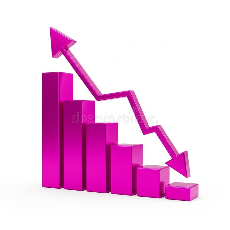
Free with trial A 3D bar chart rendered in a vibrant pink color illustrates a significant downward trend. The bars decrease in height from left to right, culminating in a very short bar. A bold pink arrow, also in 3D, starts high on the left and sharply descends to the right, mirroring the decline shown by the bars. The entire graphic is isolated on a clean white background. Data analysis decrease illustrations Pink 3D Bar Chart Showing a Downward Trend with an Arrow graph decline. A 3D bar chart rendered in a vibrant pink color illustrates a significant downward trend. The bars decrease in height from left to right, culminating in a very short bar. A bold pink arrow, also in 3D, starts high on the left and sharply descends to the right, mirroring the decline shown by the bars. The entire graphic is isolated on a clean white background
Free with trial A person in a suit uses a pen and tablet with a holographic house overlayed with graph data. The blue hue gives a futuristic look. The data suggests the person is analyzing real estate trends and making financial decisions or predictions. The image was generated by AI. Data analysis decrease illustrations Real Estate Analytics. A person in a suit uses a pen and tablet with a holographic house overlayed with graph data. The blue hue gives a futuristic look. The data suggests the person is analyzing real estate trends and making financial decisions or predictions. The image was generated by AI.
Free with trial Set of circular dollar currency icons with up and down arrows representing profit, loss, exchange and rate changes flat and glyph styles in black, red and green for business and finance use. Data analysis decrease vectors Money Currency Icons With Up And Down Arrows Showing Increase And Decrease Financial Trends. Set of circular dollar currency icons with up and down arrows representing profit, loss, exchange and rate changes flat and glyph styles in black, red and green for business and finance use.
Free with trial A bold, black 3D rendered number "1" stands next to a percentage symbol "%" on a clean white background. The "1" is solid and glossy, with sharp edges, and the percentage sign is proportionally sized. This graphic represents one percent, often used in contexts of finance, discounts, interest rates, or statistical data. Data analysis decrease illustrations Black 3D Rendered One Percent Symbol on a White Background 1 percent percentage. A bold, black 3D rendered number "1" stands next to a percentage symbol "%" on a clean white background. The "1" is solid and glossy, with sharp edges, and the percentage sign is proportionally sized. This graphic represents one percent, often used in contexts of finance, discounts, interest rates, or statistical data
Free with trial Climate change, sustainability, carbon tracking, CO2 emissions reduction, environmental impact, data visualization. Line graph tracking data. Climate change and sustainability concepts. Data analysis decrease vectors Carbon Footprint Reduction Concept with Line Graph, CO2 Symbol, and Decreasing Temperature Indicator. Climate change, sustainability, carbon tracking, CO2 emissions reduction, environmental impact, data visualization. Line graph tracking data. Climate change and sustainability concepts
Free with trial A clean, minimalist 3D bar chart made of translucent blue blocks illustrates a steady decline. This powerful visual represents concepts like economic downturn, financial recession, reduced sales, or negative performance data, making it ideal for business reports and presentations. Data analysis decrease illustrations Economic Downturn Concept with Blue Bar Graph. A clean, minimalist 3D bar chart made of translucent blue blocks illustrates a steady decline. This powerful visual represents concepts like economic downturn, financial recession, reduced sales, or negative performance data, making it ideal for business reports and presentations
Free with trial An illustrative financial graph depicting a significant downward trend. A prominent red arrow emphasizes the decline, cutting through a black line chart with a shaded area, set against a backdrop of subtle candlestick patterns and a grid. This image effectively conveys concepts of economic recession, market loss, falling stock prices, and business challenges. Ideal for financial news, reports, and presentations on market analysis or investment risks. Data analysis decrease vectors Financial Market Downturn Graph with Red Arrow. An illustrative financial graph depicting a significant downward trend. A prominent red arrow emphasizes the decline, cutting through a black line chart with a shaded area, set against a backdrop of subtle candlestick patterns and a grid. This image effectively conveys concepts of economic recession, market loss, falling stock prices, and business challenges. Ideal for financial news, reports, and presentations on market analysis or investment risks.
Free with trial This image depicts a 3D stock market chart with green and red candlesticks. The chart shows fluctuations in stock prices over a period of time. Green candlesticks indicate an increase in stock prices, while red candlesticks indicate a decrease. The chart is set on a grid background, providing a clear visualization of the price movements. Data analysis decrease illustrations Stock market chart with green and red candles
Free with trial A bar graph with a red downward arrow illustrates a decline in data over time. Data analysis decrease illustrations Decline in bar graph indicates downward trend. A bar graph with a red downward arrow illustrates a decline in data over time
Free with trial A 3D rendered image of a simple bar chart featuring two rounded vertical columns, one red and one blue, standing on a dark gray oval base. The blue column is taller than the red one, suggesting a comparison or growth. The objects are set against a clean, light gray background with subtle shadows, highlighting their form and isolation. Data analysis decrease illustrations 3D Rendered Bar Chart with Red and Blue Columns on a Gray Base graph data. A 3D rendered image of a simple bar chart featuring two rounded vertical columns, one red and one blue, standing on a dark gray oval base. The blue column is taller than the red one, suggesting a comparison or growth. The objects are set against a clean, light gray background with subtle shadows, highlighting their form and isolation
Free with trial A simple and clear illustration depicting a downward trend. The image features a bar graph with decreasing values, indicated by bars of different heights. A prominent red arrow points downwards, visually emphasizing the negative trend. This graphic is suitable for representing financial losses, declining sales, economic downturns, or any concept of decrease. The clean design and use of color make it easily understandable and versatile for various applications. Data analysis decrease vectors Downward Trend Chart with Red Arrow. A simple and clear illustration depicting a downward trend. The image features a bar graph with decreasing values, indicated by bars of different heights. A prominent red arrow points downwards, visually emphasizing the negative trend. This graphic is suitable for representing financial losses, declining sales, economic downturns, or any concept of decrease. The clean design and use of color make it easily understandable and versatile for various applications.
Free with trial A vibrant bar chart displays a spectrum of colors, showing a decrease then increase in data points against a soft blue background. Data analysis decrease illustrations Colorful bar chart illustrating growth and decline with a gradient of hues. A vibrant bar chart displays a spectrum of colors, showing a decrease then increase in data points against a soft blue background
Free with trial Concept of red arrow 8k digital technology against blurry background. Illustration for business decrease, loss, and failure with electronic circuit motherboard design. Data analysis decrease illustrations Abstract red arrow 8k digital technology concept. Concept of red arrow 8k digital technology against blurry background. Illustration for business decrease, loss, and failure with electronic circuit motherboard design
Free with trial A hand interacts with a tablet displaying a graph showing quality increasing and cost decreasing, symbolizing business improvement and efficiency. Data analysis decrease illustrations Quality Up, Cost Down: Business Analysis on Tablet. A hand interacts with a tablet displaying a graph showing quality increasing and cost decreasing, symbolizing business improvement and efficiency
Free with trial Revenue flowing sales graph illustration growth metrics, visualization forecast, increase decrease revenue flowing sales graph. Data analysis decrease illustrations Revenue flowing sales graph
Free with trial Chmetrics flowing loss graph illustration training accuracy, performance trend, analysis epoch chmetrics flowing loss graph. Data analysis decrease illustrations Chmetrics flowing loss graph
Free with trial A simple and effective line graph illustrating the concept of debt reduction. The chart, on a clean white background, shows a green line trending downwards, representing a successful decrease in liabilities over time. A final red arrow emphasizes a significant or accelerated drop, symbolizing a successful financial strategy, cost-cutting, or achieving financial freedom. This vector illustration is perfect for presentations, articles, and infographics on personal or business finance, money management, and economic stability. Data analysis decrease vectors Debt Reduction Concept Graph Showing Downward Trend. A simple and effective line graph illustrating the concept of debt reduction. The chart, on a clean white background, shows a green line trending downwards, representing a successful decrease in liabilities over time. A final red arrow emphasizes a significant or accelerated drop, symbolizing a successful financial strategy, cost-cutting, or achieving financial freedom. This vector illustration is perfect for presentations, articles, and infographics on personal or business finance, money management, and economic stability.
Free with trial Gear mechanism with people icons falling beneath a large down arrow, illustrating decrease in metrics, performance decline, workflow reduction and lowered efficiency in business or system settings. Data analysis decrease vectors Gear mechanism indicating reducing downward process. Gear mechanism with people icons falling beneath a large down arrow, illustrating decrease in metrics, performance decline, workflow reduction and lowered efficiency in business or system settings
Free with trial Decline scanning revenue chart illustration forecast data, performance metrics, visualization comparison decline scanning revenue chart. Data analysis decrease illustrations Decline scanning revenue chart
Free with trial Growth pulsating revenue chart illustration trends analysis, forecast metrics, insights performance growth pulsating revenue chart. Data analysis decrease illustrations Growth pulsating revenue chart
Free with trial Gear mechanism showing a large downward arrow surrounded by smaller blue figures, illustrating a concept of decline, decrease, or negative trend within a system or process. Data analysis decrease vectors Economic downfall concept with downward arrow in gear. Gear mechanism showing a large downward arrow surrounded by smaller blue figures, illustrating a concept of decline, decrease, or negative trend within a system or process
Free with trial A professional 3D rendering of a bar chart representing a negative trend or financial loss. The illustration features three textured blue metallic columns with a prominent, jagged red arrow pointing downwards across them. This graphic symbolizes economic recession, market crashes, or decreasing sales figures. It is mounted on a sleek grey base and isolated on a white background, making it perfect for business presentations, investment risk analysis, and economic reports. Data analysis decrease vectors 3D Downward Bar Chart with Red Arrow - Financial Loss & Recession Concept. A professional 3D rendering of a bar chart representing a negative trend or financial loss. The illustration features three textured blue metallic columns with a prominent, jagged red arrow pointing downwards across them. This graphic symbolizes economic recession, market crashes, or decreasing sales figures. It is mounted on a sleek grey base and isolated on a white background, making it perfect for business presentations, investment risk analysis, and economic reports.
Free with trial This abstract financial graph visually represents a significant economic downturn or market decline. A prominent, bold red arrow sharply points downwards across a blue grid background, symbolizing loss, recession, or a negative trend. A lighter blue fluctuating line also shows a general downward trajectory, indicating market volatility or a secondary metric. This impactful illustration is ideal for conveying concepts of financial crisis, business failure, falling stock prices, or any situation involving a sharp decrease and poor performance. Data analysis decrease vectors Economic Downturn Graph with Red Arrow Showing Decline. This abstract financial graph visually represents a significant economic downturn or market decline. A prominent, bold red arrow sharply points downwards across a blue grid background, symbolizing loss, recession, or a negative trend. A lighter blue fluctuating line also shows a general downward trajectory, indicating market volatility or a secondary metric. This impactful illustration is ideal for conveying concepts of financial crisis, business failure, falling stock prices, or any situation involving a sharp decrease and poor performance.
Free with trial Visualization flowing loss graph illustration data plot, chmetrics training, accuracy performance visualization flowing loss graph. Data analysis decrease illustrations Visualization flowing loss graph
Free with trial A bright red 3d arrow pointing downwards, symbolizing a decrease or decline, often used in financial contexts. Data analysis decrease vectors Red downward arrow indicates economic decline. A bright red 3d arrow pointing downwards, symbolizing a decrease or decline, often used in financial contexts.
Free with trial 3D rendering of a business infographic chart showing a progressive decline over four periods. Red color on the 3D bar graph chart with an arrow on it. Data analysis decrease illustrations 3D render of a business data in decline. 3D rendering of a business infographic chart showing a progressive decline over four periods. Red color on the 3D bar graph chart with an arrow on it.
Free with trial A clean line drawing showcases a magnifying glass focusing on a hand holding a declining bar graph with a downward. Data analysis decrease illustrations Declining Market Analysis Magnifying Glass on Loss Trend. A clean line drawing showcases a magnifying glass focusing on a hand holding a declining bar graph with a downward.
Free with trial Bitcoin icon within circular outline, large downward arrow, and stack of blue documents. Ideal for cryptocurrency, finance, blockchain, decreasing trends, data transfer, document management simple. Data analysis decrease vectors Bitcoin Logo with Downward Arrow and Document Stack in Minimalistic Style. Bitcoin icon within circular outline, large downward arrow, and stack of blue documents. Ideal for cryptocurrency, finance, blockchain, decreasing trends, data transfer, document management simple
Free with trial A black and white line drawing depicts a magnifying glass focusing on a gear, a descending bar graph, and a. Data analysis decrease illustrations Decline Analysis Magnifying Glass, Gear, and Downward Graph. A black and white line drawing depicts a magnifying glass focusing on a gear, a descending bar graph, and a.
Free with trial An illustration featuring two contrasting arrows against a plain white background. The red arrow shows a wavy upward trend, symbolizing growth, increase, or positive performance with fluctuation. The black arrow shows a wavy downward trend, symbolizing decline, decrease, or negative performance with fluctuation. This visual concept is often used to represent financial market volatility, business. Data analysis decrease vectors Dynamic business trends illustrated by contrasting red upward and black downward arrows Vector. An illustration featuring two contrasting arrows against a plain white background. The red arrow shows a wavy upward trend, symbolizing growth, increase, or positive performance with fluctuation. The black arrow shows a wavy downward trend, symbolizing decline, decrease, or negative performance with fluctuation. This visual concept is often used to represent financial market volatility, business
Free with trial A 3D illustration of a red arrow pointing downward on a graph, indicating a decline or negative trend in business, finance, or economy. The image represents a decrease or loss in value, and can be used to symbolize a crisis, recession, or failure. Data analysis decrease illustrations A red arrow pointing downward on a graph indicating a decline. A 3D illustration of a red arrow pointing downward on a graph, indicating a decline or negative trend in business, finance, or economy. The image represents a decrease or loss in value, and can be used to symbolize a crisis, recession, or failure.
Free with trial A hand-drawn bar chart shows a downward trend with a line graph indicating a significant decrease in value over time. Data analysis decrease vectors Downturn graph illustrating declining trends and financial loss. A hand-drawn bar chart shows a downward trend with a line graph indicating a significant decrease in value over time
Free with trial Economic decline, financial loss, market trends, business analysis, payment reminder, schedule planning. Downward trend graph with sad face icon. Economic decline and financial loss. Data analysis decrease vectors Economic Decline and Financial Trends with Calendar Reminder and Graph Symbols. Economic decline, financial loss, market trends, business analysis, payment reminder, schedule planning. Downward trend graph with sad face icon. Economic decline and financial loss
Free with trial The word 'TRENDS' is displayed prominently in blue, overlaid by a sharp, downward-pointing red arrow, visually communicating a negative trend or decline in data or performance. Data analysis decrease illustrations Word trends with a downward red arrow. The word 'TRENDS' is displayed prominently in blue, overlaid by a sharp, downward-pointing red arrow, visually communicating a negative trend or decline in data or performance
Free with trial A 3D rendered graphic depicts a simplified bar chart with pastel colored bars in pink, yellow, and blue. A line graph with white lines and orange and yellow nodes crosses diagonally above the bars. The elements are set against a light blue background with a light tan border, all isolated on a white background. Data analysis decrease vectors 3 D cartoon bar chart with line graph on blue background data. A 3D rendered graphic depicts a simplified bar chart with pastel colored bars in pink, yellow, and blue. A line graph with white lines and orange and yellow nodes crosses diagonally above the bars. The elements are set against a light blue background with a light tan border, all isolated on a white background