Free with trial Graph line icon. Neumorphic, Flat shadow, 3d buttons. Column chart sign. Growth diagram symbol. Line graph chart icon. Social media icons. Vector. Decrease line graph vectors Graph line icon. Column chart sign. Neumorphic buttons. Vector. Graph line icon. Neumorphic, Flat shadow, 3d buttons. Column chart sign. Growth diagram symbol. Line graph chart icon. Social media icons. Vector
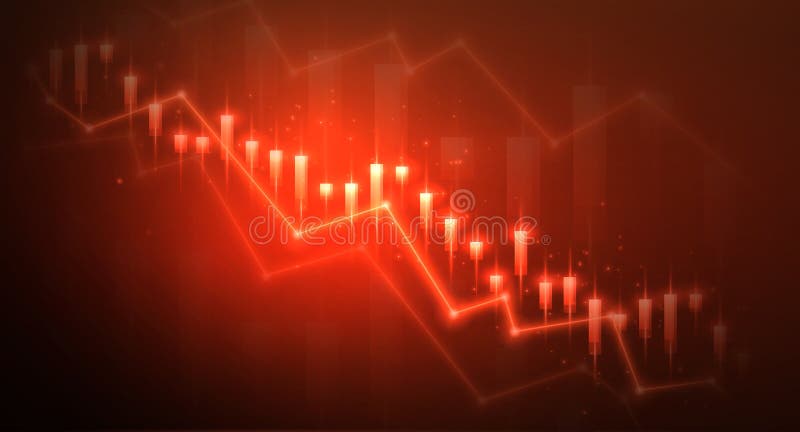
Free with trial The image depicts a bar and line graph illustrating a steady decline in values over a period of time. The bars represent the values at specific intervals, while the red line connects the data points, emphasizing the downward trend. Decrease line graph illustrations A downward trend graph showing a significant decrease in values over time. The image depicts a bar and line graph illustrating a steady decline in values over a period of time. The bars represent the values at specific intervals, while the red line connects the data points, emphasizing the downward trend
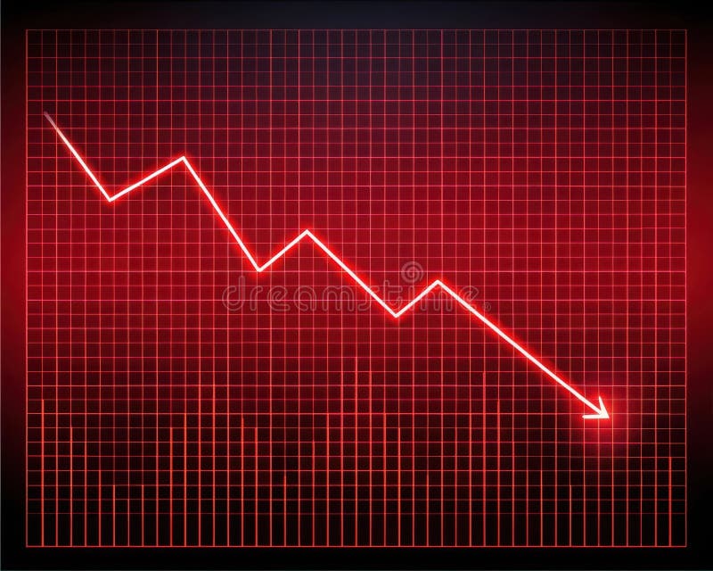
Free with trial A graph with a grid background displaying a downward trend indicated by a red line and arrow, symbolizing a significant decrease or loss. Decrease line graph illustrations Graph showing a sharp decline in trend with a red arrow pointing downwards. A graph with a grid background displaying a downward trend indicated by a red line and arrow, symbolizing a significant decrease or loss
Free with trial This image features a minimalist line graph with a red arrow pointing downwards, symbolizing a decline or loss. Below this, a detailed candlestick chart displays market volatility with fluctuating data points and numerical values on a dark background. The composition contrasts simple graphic design with intricate data visualization to represent economic downturns or negative performance metrics. Decrease line graph vectors A simple line graph showing a downward trend alongside a complex financial chart. This image features a minimalist line graph with a red arrow pointing downwards. This image features a minimalist line graph with a red arrow pointing downwards, symbolizing a decline or loss. Below this, a detailed candlestick chart displays market volatility with fluctuating data points and numerical values on a dark background. The composition contrasts simple graphic design with intricate data visualization to represent economic downturns or negative performance metrics
Free with trial This 3D illustration features a series of vertical bars arranged in a descending sequence, representing a decline in data. A smooth, continuous line graph follows the top of the bars, emphasizing the negative trajectory. The color palette uses shades of blue and light gray against a clean white background, creating a professional and minimalist aesthetic suitable for financial or analytical. Decrease line graph vectors A three dimensional bar chart showing a downward trend with a line graph overlay. This 3D illustration features a series of vertical bars arranged in a descending sequence, representing a decline in data. A smooth, continuous line graph follows the top of the bars, emphasizing the negative trajectory. The color palette uses shades of blue and light gray against a clean white background, creating a professional and minimalist aesthetic suitable for financial or analytical
Free with trial A line art illustration isolated on white background displays business performance indicators: a speedometer, arrows, a bar graph, and a line graph, all in a minimalist style. Decrease line graph vectors Vector art of line art illustration of business performance indicators featuring a speedometer, arrows, bar graph, and line graph. A line art illustration isolated on white background displays business performance indicators: a speedometer, arrows, a bar graph, and a line graph, all in a minimalist style
Free with trial This minimalist vector illustration depicts a downward trending line graph alongside a bar chart that appears to be shattering or breaking apart. The color palette utilizes high-contrast red and dark gray tones to emphasize a sense of urgency and economic instability. The clean lines and geometric shapes create a professional yet dramatic visual representation of loss, failure, or market. Decrease line graph vectors A red line graph shows a sharp decline in performance and financial market value. This minimalist vector illustration depicts a downward trending line graph alongside a bar chart that appears to be shattering or breaking apart. The color palette utilizes high-contrast red and dark gray tones to emphasize a sense of urgency and economic instability. The clean lines and geometric shapes create a professional yet dramatic visual representation of loss, failure, or market
Free with trial A black jagged line graph with sharp peaks that descends sharply to a horizontal line. Decrease line graph illustrations Black Jagged Line Graph Descending Sharply chart data. A black jagged line graph with sharp peaks that descends sharply to a horizontal line
Free with trial This image depicts a hand-drawn or sketched line graph illustrating a general upward trend with significant fluctuations and sharp peaks. The graph shows a series of rapid increases and decreases, indicating volatility in the data, but overall points to a positive growth trajectory. The peaks are pronounced, suggesting periods of high activity or spikes in whatever variable is being measured. Decrease line graph illustrations Spiking upward trend line graph with volatility peaks. This image depicts a hand-drawn or sketched line graph illustrating a general upward trend with significant fluctuations and sharp peaks. The graph shows a series of rapid increases and decreases, indicating volatility in the data, but overall points to a positive growth trajectory. The peaks are pronounced, suggesting periods of high activity or spikes in whatever variable is being measured
Free with trial A simple blue line graph with circular data points is displayed against a clean white background with subtle horizontal grid lines. The graph shows fluctuations and trends, making it suitable for representing data, analytics, or financial performance. Generated by AI. Decrease line graph vectors Blue Line Graph with Data Points on White Background. A simple blue line graph with circular data points is displayed against a clean white background with subtle horizontal grid lines. The graph shows fluctuations and trends, making it suitable for representing data, analytics, or financial performance. Generated by AI
Free with trial A line graph depicting a downward trend, symbolizing a decline in performance, sales, or economic activity, often used in business and financial contexts. Decrease line graph vectors Vector art of a line graph showing a downward trend, , indicating a decline in performance, sales, or economic activity in a. A line graph depicting a downward trend, symbolizing a decline in performance, sales, or economic activity, often used in business and financial contexts
Free with trial Decline graph chart icon. Descending market stock scheme vector illustration. Decrease statistics symbol. Failing finance data sign. Arrow down economic analysis. Business loss trend. Report diagram. Decrease line graph vectors Decline graph chart icon. Descending market stock scheme vector illustration. Decrease statistics symbol. Failing finance data
Free with trial Stock and economic crisis graph background. Trade exchange, financial decrease, bed business strategy, digital asset, loss investment fund, online broker, stock collapse and crisis concept. Decrease line graph illustrations Stock and economic crisis graph background. Trade exchange, financial decrease
Free with trial A striking visual representation of economic decline or market volatility. A bold red line graph plunges downwards against a textured, abstract background, suggesting a financial crisis or loss. The image evokes a sense of urgency and concern, suitable for illustrating concepts related to finance, economics, business, and market trends. The abstract background adds a modern and dynamic feel. Decrease line graph illustrations Economic Downturn: Red Line Graph on Abstract Background. A striking visual representation of economic decline or market volatility. A bold red line graph plunges downwards against a textured, abstract background, suggesting a financial crisis or loss. The image evokes a sense of urgency and concern, suitable for illustrating concepts related to finance, economics, business, and market trends. The abstract background adds a modern and dynamic feel.
Free with trial A graph with two lines, one red and one blue. The red line is higher than the blue line, indicating a positive trend. Decrease line graph vectors A graph with a red line and a blue line. A graph with two lines, one red and one blue. The red line is higher than the blue line, indicating a positive trend
Free with trial Economic crisis line icon of freight traffic decrease and commercial economy downturn, vector symbol. Logistics business recession icon of freight truck, parcels and arrow down for financial crisis. Decrease line graph vectors Economic crisis line icon freight traffic decrease. Economic crisis line icon of freight traffic decrease and commercial economy downturn, vector symbol. Logistics business recession icon of freight truck, parcels and arrow down for financial crisis
Free with trial Bar chart and line graph showing financial data and trends. Generative AI. Decrease line graph illustrations Bar chart and line graph showing financial data and trends
Free with trial This is an isometric 3D illustration depicting a dynamic data visualization. It features a combination of bar charts and a line graph, showcasing rising trends and fluctuating data points. The color palette includes shades of blue, teal, and coral, creating a modern and professional aesthetic. This graphic is ideal for representing financial reports, business analytics, market trends, growth, and performance metrics in a visually engaging and easy-to-understand format. Decrease line graph illustrations Isometric 3D Bar and Line Graph with Data Visualization. This is an isometric 3D illustration depicting a dynamic data visualization. It features a combination of bar charts and a line graph, showcasing rising trends and fluctuating data points. The color palette includes shades of blue, teal, and coral, creating a modern and professional aesthetic. This graphic is ideal for representing financial reports, business analytics, market trends, growth, and performance metrics in a visually engaging and easy-to-understand format.
Free with trial Graph line icon. Halftone dotted pattern. Gradient icon with grain shadow. Column chart sign. Growth diagram symbol. Line graph chart icon. Various designs. Vector. Decrease line graph vectors Graph line icon. Column chart sign. Halftone dotted pattern. Vector. Graph line icon. Halftone dotted pattern. Gradient icon with grain shadow. Column chart sign. Growth diagram symbol. Line graph chart icon. Various designs. Vector
Free with trial Chart icon and graph for statistic line or bar diagram with growth pie and graphic data. Use for analysis trend and pictogram by profit algorithm report. Business infographic title. Vector. Decrease line graph vectors Chart icon and graph for statistic line or bar diagram with growth pie and graphic data. Use for analysis trend and
Free with trial Decline bar chart with downward trend arrow outline icon vector. Decrease, loss, and financial drop symbol in circular line. Decrease line graph vectors Decline bar chart with downward trend arrow outline icon. Decrease, loss, and financial drop symbol in circular line
Free with trial The image depicts a line graph with a clear downward trend. The graph includes multiple data points connected by lines, with some lines being smoother and others more jagged. The overall direction of the lines is from the upper left to the lower right, indicating a decrease over time. There are also several distinct markers along the lines, possibly indicating significant data points or changes. Decrease line graph illustrations Graph illustrating a clear downward trend in data points. The image depicts a line graph with a clear downward trend. The graph includes multiple data points connected by lines, with some lines being smoother and others more jagged. The overall direction of the lines is from the upper left to the lower right, indicating a decrease over time. There are also several distinct markers along the lines, possibly indicating significant data points or changes
Free with trial A neon blue line graph with a jagged, downward trend is displayed against a dark, grid-like background. The graph's line is composed of small, glowing dots, creating a digital and futuristic aesthetic. The overall mood is serious and analytical, suggesting a decline in data or performance. Decrease line graph illustrations Neon blue line graph showing a downward trend on a dark grid. A neon blue line graph with a jagged, downward trend is displayed against a dark, grid-like background. The graph's line is composed of small, glowing dots, creating a digital and futuristic aesthetic. The overall mood is serious and analytical, suggesting a decline in data or performance
Free with trial Set of black and white vector icons showing falling bar charts, descending line graph, report with chart, presentation board, magnifying glass analyzing chart, and analytics dashboard with downward arrow. Generative AI. Decrease line graph vectors Black and white falling bar chart line graph report and analytics icons. Set of black and white vector icons showing falling bar charts, descending line graph, report with chart, presentation board, magnifying glass analyzing chart, and analytics dashboard with downward arrow. Generative AI
Free with trial Bar chart with line graph overlay showing annual data trends over time. Decrease line graph vectors Bar chart showing annual data trends with line graph overlay. Bar chart with line graph overlay showing annual data trends over time
Free with trial Graph laptop line icon. Halftone dotted pattern. Gradient icon with grain shadow. Column chart sign. Growth diagram symbol. Line graph laptop icon. Various designs. Vector. Decrease line graph illustrations Graph laptop line icon. Column chart sign. Halftone dotted pattern. Vector. Graph laptop line icon. Halftone dotted pattern. Gradient icon with grain shadow. Column chart sign. Growth diagram symbol. Line graph laptop icon. Various designs. Vector
Free with trial This minimalist vector illustration depicts a downward-trending line graph representing economic decline. Two distinct lines in red and green descend sharply, accompanied by floating currency symbols and percentage indicators. The clean, flat design uses a simple color palette against a white background to communicate concepts of financial loss, market volatility and economic instability. Decrease line graph vectors A line graph showing a downward trend in financial market performance and currency value. This minimalist vector illustration depicts a downward-trending line graph representing economic decline. Two distinct lines in red and green descend sharply, accompanied by floating currency symbols and percentage indicators. The clean, flat design uses a simple color palette against a white background to communicate concepts of financial loss, market volatility and economic instability
Free with trial Three electronic devices are arranged on a sleek black surface, featuring a central tablet with a vibrant blue screen displaying a detailed line graph where green, pink, and other colored data points track decreasing metrics over time against a dark background illuminated by blue and white lights, creating a futuristic technological atmosphere perfect for concepts involving data analysis, business. Decrease line graph illustrations Futuristic data analytics dashboard displayed on blue glowing tablet screen with colorful line graph visualization. Three electronic devices are arranged on a sleek black surface, featuring a central tablet with a vibrant blue screen displaying a detailed line graph where green, pink, and other colored data points track decreasing metrics over time against a dark background illuminated by blue and white lights, creating a futuristic technological atmosphere perfect for concepts involving data analysis, business
Free with trial A line graph displaying two lines, one red and one blue, both trending downward over time. The red line is consistently above the blue line and both show a significant decrease, with the red line ending in a sharp drop highlighted by a red arrow. Decrease line graph illustrations Graph showing a decline in values over time with a notable drop. A line graph displaying two lines, one red and one blue, both trending downward over time. The red line is consistently above the blue line and both show a significant decrease, with the red line ending in a sharp drop highlighted by a red arrow
Free with trial Decrease bar chart icon set on circle line. Statistic sign symbol. Decrease line graph vectors Decrease bar chart icon set on circle line
Free with trial A data visualization graph displays the average digs per game metric over a time period from 0 to 100 on the x-axis with the number of digs quantified on the y-axis, featuring an orange line that starts high and gradually decreases to indicate declining performance while remaining slightly above a comparative blue line to show relative improvement, enhanced by a red upward-pointing arrow. Decrease line graph illustrations Statistical graph showing average digs per game with orange line trending downward over time period, sports analytics. A data visualization graph displays the average digs per game metric over a time period from 0 to 100 on the x-axis with the number of digs quantified on the y-axis, featuring an orange line that starts high and gradually decreases to indicate declining performance while remaining slightly above a comparative blue line to show relative improvement, enhanced by a red upward-pointing arrow
Free with trial A line graph illustrating the gradual decrease in energy consumption over several months, with lightning bolt icons transitioning to leaf icons, symbolizing a shift from high energy usage to sustainable, cost-effective practices. The x-axis represents time in months, and the y-axis shows energy consumption in kWh, clearly indicating a downward trend in energy use and associated costs. Decrease line graph illustrations Energy Consumption Decrease Over Time Leading to Cost Reduction. A line graph illustrating the gradual decrease in energy consumption over several months, with lightning bolt icons transitioning to leaf icons, symbolizing a shift from high energy usage to sustainable, cost-effective practices. The x-axis represents time in months, and the y-axis shows energy consumption in kWh, clearly indicating a downward trend in energy use and associated costs
Free with trial The image presents a colorful bar graph with a downward trending line, symbolizing a decline in performance or an economic downturn on a white background. Decrease line graph vectors Vector art of colorful bar graph with a downward trending line, indicating a decline in performance or economic downturn. The image presents a colorful bar graph with a downward trending line, symbolizing a decline in performance or an economic downturn on a white background
Free with trial An exponential decay function graph displayed on a black background features a prominent orange curved line that starts at the top left and gradually decreases toward the bottom right, with the x-axis labeled X and y-axis labeled 10X indicating logarithmic scaling, while four distinct numerical values 3, 2, 0, and 1 are displayed in crisp white text along the left side corresponding to different. Decrease line graph illustrations Exponential decay curve graph on black background showing mathematical function with orange line and numerical values. An exponential decay function graph displayed on a black background features a prominent orange curved line that starts at the top left and gradually decreases toward the bottom right, with the x-axis labeled X and y-axis labeled 10X indicating logarithmic scaling, while four distinct numerical values 3, 2, 0, and 1 are displayed in crisp white text along the left side corresponding to different
Free with trial A digital line graph displays a sharp decline in interest rates, highlighting sudden market shifts and economic downturn trends. Decrease line graph illustrations A digital line graph displays a sharp decline in interest rates, highlighting sudden market shifts and economic downturn trends
Free with trial A bright red line graph with a steep downward trend is displayed on a glowing red grid against a dark background. Decrease line graph illustrations Bright Red Digital Line Graph Showing Steep Decline on Grid image. A bright red line graph with a steep downward trend is displayed on a glowing red grid against a dark background
Free with trial Economic crisis line icon of graph going down, economy downturn and bankruptcy vector symbol. Stock exchange or economical index decrease linear icon of financial crisis and global economy recession. Decrease line graph vectors Economic crisis icon of economy graph going down. Economic crisis line icon of graph going down, economy downturn and bankruptcy vector symbol. Stock exchange or economical index decrease linear icon of financial crisis and global economy recession
Free with trial The image depicts a line graph with a purple line illustrating a fluctuating trend. The area under the line is shaded in light purple, indicating the cumulative value over time. The graph has a steady upward trend with several peaks and troughs, suggesting variability in the data. Decrease line graph illustrations A graph showing a fluctuating trend with a purple line and shaded area. The image depicts a line graph with a purple line illustrating a fluctuating trend. The area under the line is shaded in light purple, indicating the cumulative value over time. The graph has a steady upward trend with several peaks and troughs, suggesting variability in the data
Free with trial Hand holds a vibrant yellow line graph showing a decrease in value with bokeh. Soft lighting accentuates the chart line. Dark backdrop. Decrease line graph illustrations Glowing Stock Chart in Hand, Dark Background, Yellow Light, Loss, Graph, Fingers. Hand holds a vibrant yellow line graph showing a decrease in value with bokeh. Soft lighting accentuates the chart line. Dark backdrop
Free with trial Two wooden baseball bats with brown barrels and green handles are crossed in an X formation against a dark black background featuring a subtle grid pattern, with a vibrant pink line graph positioned centrally between them displaying a clear downward trend labeled RUNS PER GAME and accompanied by a bold black downward-pointing arrow, creating a conceptual sports analytics visual about declining. Decrease line graph illustrations Two crossed brown baseball bats with green handles over black grid background with pink line graph showing decreasing runs per. Two wooden baseball bats with brown barrels and green handles are crossed in an X formation against a dark black background featuring a subtle grid pattern, with a vibrant pink line graph positioned centrally between them displaying a clear downward trend labeled RUNS PER GAME and accompanied by a bold black downward-pointing arrow, creating a conceptual sports analytics visual about declining
Free with trial A stark black and white photograph features deeply cracked, uneven ground as its textured backdrop, with a prominent red line graph positioned centrally that displays a clear downward trend symbolizing decreasing cancer diagnosis rates, accompanied by a small but vivid red blood splatter in the top right corner acting as a potent symbol, all set against a solid black background to create a somber. Decrease line graph illustrations Black and white photograph of cracked ground with red declining line graph representing decreasing cancer diagnosis rates with. A stark black and white photograph features deeply cracked, uneven ground as its textured backdrop, with a prominent red line graph positioned centrally that displays a clear downward trend symbolizing decreasing cancer diagnosis rates, accompanied by a small but vivid red blood splatter in the top right corner acting as a potent symbol, all set against a solid black background to create a somber
Free with trial The image displays a line graph with two lines, one blue and one red, trending downward over time. The y-axis is labeled 'Monthly searches' and the x-axis is unlabeled but marked 'Time (months years)'. Both lines start at a high point and decrease, with the red line generally following the average of the blue line's fluctuations. Decrease line graph illustrations A graph showing a decline in monthly searches over time with two lines. The image displays a line graph with two lines, one blue and one red, trending downward over time. The y-axis is labeled 'Monthly searches' and the x-axis is unlabeled but marked 'Time (months years)'. Both lines start at a high point and decrease, with the red line generally following the average of the blue line's fluctuations
Free with trial The visual features a black line graph illustration showing a downward trend. Positioned on a light blue backdrop, the minimalist design may represent decline, loss or negative progression. The image suits presentations, reports, or articles related to finance, statistics, business, or economic subjects, for editorial or commercial use. Decrease line graph illustrations Decreasing trend line graph on blue background finance visual concept. The visual features a black line graph illustration showing a downward trend. Positioned on a light blue backdrop, the minimalist design may represent decline, loss or negative progression. The image suits presentations, reports, or articles related to finance, statistics, business, or economic subjects, for editorial or commercial use
Free with trial A 3D illustration of a magnifying glass over a bar chart and line graph on a white background. Decrease line graph vectors Magnifying glass over bar chart and line graph transparent background. A 3D illustration of a magnifying glass over a bar chart and line graph on a white background
Free with trial Pencil draws diagram with line going down on checkered paper. Falling graph, business decline concept. Investment risk. Market crash, financial loss. Crisis analysis, business strategy. Decrease line graph illustrations Pencil draws diagram with line going down on checkered paper. Falling graph, business decline concept. Investment risk. Market
Free with trial A red graph with arrows illustrating decrease and increase, representing data analysis and performance evaluation in business. Suitable for reports and presentations. Decrease line graph vectors Vector art of red graph with arrow, illustrating decrease and increase, representing data analysis and performance evaluation in. A red graph with arrows illustrating decrease and increase, representing data analysis and performance evaluation in business. Suitable for reports and presentations
Free with trial Blue arrow pointing downward on a grid. Business graph with falling trend line. Digital stock market data visualization for investment analysis. Decrease line graph illustrations Blue arrow pointing downward on a grid. Business graph with falling trend line
Free with trial Simple and clean blue gradient line graph is going up and down showing growth and decline over a period of time. Decrease line graph vectors Blue gradient line graph showing growth and decline over time. Simple and clean blue gradient line graph is going up and down showing growth and decline over a period of time
Free with trial Metallic silver 3D graph line arrow pointing downwards on a gradient blue background with reflection, symbolizing financial decline or negative trend. Decrease line graph illustrations Metallic silver 3D graph line arrow pointing downwards on a gradient blue background with reflection, symbolizing financial
Free with trial A neat stack of US dollar bills arranged on a black desk surface features the prominent text URNIFICATION printed across the currency, with each bill topped by a gold coin positioned at the upper right corner and displaying a multicolored line graph in blue, green, and pink that illustrates a downward trend in dollar value, captured from a direct top-down perspective with a softly blurred. Decrease line graph illustrations Stack of US dollar bills with urnification text and gold coins on top, showing declining value line graph in blue green pink. A neat stack of US dollar bills arranged on a black desk surface features the prominent text URNIFICATION printed across the currency, with each bill topped by a gold coin positioned at the upper right corner and displaying a multicolored line graph in blue, green, and pink that illustrates a downward trend in dollar value, captured from a direct top-down perspective with a softly blurred
Free with trial The image depicts a stylized representation of financial imbalance, featuring a purple scale with two gold coins, each bearing a dollar sign, placed on either side. Above the scale, a red line graph shows a downward trend, indicating a decline. The graph consists of connected lines with circles at each data point, and an arrow at the end points downward, reinforcing the notion of a decrease. The. Decrease line graph illustrations Financial imbalance concept with coins on a scale and a declining graph. The image depicts a stylized representation of financial imbalance, featuring a purple scale with two gold coins, each bearing a dollar sign, placed on either side. Above the scale, a red line graph shows a downward trend, indicating a decline. The graph consists of connected lines with circles at each data point, and an arrow at the end points downward, reinforcing the notion of a decrease. The
Free with trial A close up of a red line graph with peaks and valleys on a textured light background. Generative AI. Decrease line graph illustrations A close up of a red line graph with peaks and valleys on a textured light background
Free with trial Stylized graphic shows two graphs trending downwards against a yellow background. A line graph shows minor fluctuations while another heavier, bolder line with an arrow accentuates the downward trend. Image may illustrate loss, decline, or decrease in reports and presentations. Vector illustration. Decrease line graph illustrations Declining trend graphic falling line chart with downward arrow indicator. Stylized graphic shows two graphs trending downwards against a yellow background. A line graph shows minor fluctuations while another heavier, bolder line with an arrow accentuates the downward trend. Image may illustrate loss, decline, or decrease in reports and presentations. Vector illustration
Free with trial A black jagged line graph with a downward arrow on a white background. Clear details and vibrant colors enhanc. Decrease line graph illustrations Black jagged line graph with down arrow on white background chart zigzag. A black jagged line graph with a downward arrow on a white background. Clear details and vibrant colors enhanc
Free with trial A black jagged line graph depicts a significant downward trend on a white background. Decrease line graph illustrations Black jagged line graph showing a downward trend on white Keywords: graph, chart, line, trend. A black jagged line graph depicts a significant downward trend on a white background
Free with trial A white line graph icon with three data points is displayed on a dark circular button against a white background. Decrease line graph illustrations Line Graph Icon on Dark Circular Button with White Background chart data. A white line graph icon with three data points is displayed on a dark circular button against a white background
Free with trial A vibrant and detailed bar chart with a line graph overlay, showcasing financial data trends over time. The chart features a variety of colors, including shades of green, purple, and blue, with data points marked by small diamond shapes. The background is a dark blue grid, providing a stark contrast to the colorful data visualization. Decrease line graph illustrations Colorful bar chart and line graph representing financial data trends. A vibrant and detailed bar chart with a line graph overlay, showcasing financial data trends over time. The chart features a variety of colors, including shades of green, purple, and blue, with data points marked by small diamond shapes. The background is a dark blue grid, providing a stark contrast to the colorful data visualization
Free with trial A blue zig zag line represents a stock market graph that rises and falls. It is placed upon a financial square grid of many small blocks with color changing from red to blue. Decrease line graph illustrations Stock Market Graph Showing Trending Line on Financial Grid During Daytime. A blue zig zag line represents a stock market graph that rises and falls. It is placed upon a financial square grid of many small blocks with color changing from red to blue.
Free with trial Abstract line graph with four distinct data points connected by red line, indicating trend analysis and progress. Simple design. Decrease line graph vectors Line graph with colored points showing data points and trend on white background. Abstract line graph with four distinct data points connected by red line, indicating trend analysis and progress. Simple design
Free with trial The image shows a white easel holding a presentation board with a combination of a red bar and line graph. The graph illustrates a downward trend, starting with high values that progressively decrease over time. The bars are tall initially and shorten as they move rightward, while the line graph follows a similar declining pattern, emphasizing a significant drop in values. Decrease line graph illustrations Declining trend represented by a bar and line graph on an easel display. The image shows a white easel holding a presentation board with a combination of a red bar and line graph. The graph illustrates a downward trend, starting with high values that progressively decrease over time. The bars are tall initially and shorten as they move rightward, while the line graph follows a similar declining pattern, emphasizing a significant drop in values
Free with trial Statistic icon in generic style. Decrease graph symbol illustration. Decrease line graph vectors Statistic icon in generic style. Decrease graph symbol
Free with trial Illustration of financial line graph showing growth. Upward trending arrow, chart, bar chart, income, finance, business, statistics development. Visual representation of success. Decrease line graph illustrations Illustration of financial line graph showing growth. Upward trending arrow, chart, bar chart, income, finance, business
Free with trial A red line graph showing a downward trend on a gray grid background with white lines. Generative AI. Decrease line graph illustrations A red line graph showing a downward trend on a gray grid background with white lines
Free with trial Illustration of a line graph connecting points above bar graph on black. Flat design with blue outlines, orange points, and blue and green bars. Decrease line graph vectors Line graph and bar graph showing growth and trends, isolated on black background. Illustration of a line graph connecting points above bar graph on black. Flat design with blue outlines, orange points, and blue and green bars.
Free with trial Diagram chart line icon. Neumorphic, Green gradient, 3d pin buttons. Analytics graph sign. Market analytics symbol. Line icons. Neumorphic buttons with outline signs. Vector. Decrease line graph vectors Diagram chart line icon. Analytics graph sign. Line icons. Vector. Diagram chart line icon. Neumorphic, Green gradient, 3d pin buttons. Analytics graph sign. Market analytics symbol. Line icons. Neumorphic buttons with outline signs. Vector
Free with trial The image shows a bar graph with a red line indicating a downward trend. The bars decrease in height from left to right, suggesting a significant decline in the measured data over time. Decrease line graph illustrations A downward trend graph illustrating a significant decrease in data over time. The image shows a bar graph with a red line indicating a downward trend. The bars decrease in height from left to right, suggesting a significant decline in the measured data over time
Free with trial A vibrant red glowing line graph cuts through abstract concrete blocks, leaving a trail of shattered debris and dust. Conceptual image for financial crisis, market downturns, and economic. Decrease line graph illustrations Gleaming red graph line breaking concrete blocks symbolizing financial crisis. A vibrant red glowing line graph cuts through abstract concrete blocks, leaving a trail of shattered debris and dust. Conceptual image for financial crisis, market downturns, and economic.
Free with trial A white world map with a red line graph showing a downward trend across the continents. Generative AI. Decrease line graph illustrations A white world map with a red line graph showing a downward trend across the continents
Free with trial A 3D rendered graphic displays a colorful bar chart with bars in orange, green, yellow, and pink. A yellow line with white dots connects points above the bars, forming a trend graph. A blue rectangular background with a white strip containing green, orange, and blue dots sits at the top. The object is isolated on a white background. Decrease line graph vectors 3 D colorful bar chart graph with line and dots on blue background statistics. A 3D rendered graphic displays a colorful bar chart with bars in orange, green, yellow, and pink. A yellow line with white dots connects points above the bars, forming a trend graph. A blue rectangular background with a white strip containing green, orange, and blue dots sits at the top. The object is isolated on a white background
Free with trial The image shows a red line graph with data points connected by lines, creating a zigzag pattern that overall trends upwards from the bottom left to the top right of the image. Decrease line graph illustrations A red line graph depicting fluctuating data points with a general upward trend. The image shows a red line graph with data points connected by lines, creating a zigzag pattern that overall trends upwards from the bottom left to the top right of the image
Free with trial A stark white 3D representation of a jagged line graph is depicted against a clean white background. The graph's peaks and valleys form a distinct downward trend, suggesting a decline or loss. The sharp angles and minimalist design emphasize the concept of a negative trajectory. The object casts a subtle shadow, adding depth and dimension to the isolated graphic. Decrease line graph illustrations White 3D Jagged Line Graph Showing Downward Trend on White Background chart decline. A stark white 3D representation of a jagged line graph is depicted against a clean white background. The graph's peaks and valleys form a distinct downward trend, suggesting a decline or loss. The sharp angles and minimalist design emphasize the concept of a negative trajectory. The object casts a subtle shadow, adding depth and dimension to the isolated graphic
Free with trial The image shows an easel holding a white poster with a blue bar and line chart. The chart depicts a series of vertical bars that gradually decrease in height, accompanied by a line graph that rises initially and then declines. The easel is positioned on a plain, light-colored background, emphasizing the visual data presentation on the poster. Decrease line graph illustrations Easel displaying a bar and line chart illustrating financial or data trends. The image shows an easel holding a white poster with a blue bar and line chart. The chart depicts a series of vertical bars that gradually decrease in height, accompanied by a line graph that rises initially and then declines. The easel is positioned on a plain, light-colored background, emphasizing the visual data presentation on the poster
Free with trial The image depicts a line graph with a light blue line representing the changes in stock price over time. The graph shows various peaks and troughs, indicating the volatility of the stock. The background is a light, gradient blue color, providing a clear contrast to the line graph. Decrease line graph illustrations A detailed line graph showing the fluctuations of a stock price over a period of time. The image depicts a line graph with a light blue line representing the changes in stock price over time. The graph shows various peaks and troughs, indicating the volatility of the stock. The background is a light, gradient blue color, providing a clear contrast to the line graph
Free with trial This stylized bar graph shows a downward trending line, representing decrease or loss in a flat graphic style with blue and gray hues. Decrease line graph vectors Downward trend graph indicating loss or decline in a modern simple style. This stylized bar graph shows a downward trending line, representing decrease or loss in a flat graphic style with blue and gray hues.
Free with trial A black line graph with a zigzag pattern trending downwards with an arrow. Clear details and vibrant colors en. Decrease line graph illustrations Black downward trending line graph with arrow on white background chart decline. A black line graph with a zigzag pattern trending downwards with an arrow. Clear details and vibrant colors en
Free with trial Diagram chart line icon. Neumorphic, Flat shadow, 3d buttons. Presentation graph sign. Market analytics symbol. Line diagram chart icon. Social media icons. Vector. Decrease line graph vectors Diagram chart line icon. Presentation graph sign. Neumorphic buttons. Vector. Diagram chart line icon. Neumorphic, Flat shadow, 3d buttons. Presentation graph sign. Market analytics symbol. Line diagram chart icon. Social media icons. Vector
Free with trial Diagram chart line icon. Neumorphic, Flat shadow, 3d buttons. Presentation graph sign. Market analytics symbol. Line diagram chart icon. Social media icons. Vector. Decrease line graph illustrations Diagram chart line icon. Presentation graph sign. Neumorphic buttons. Vector. Diagram chart line icon. Neumorphic, Flat shadow, 3d buttons. Presentation graph sign. Market analytics symbol. Line diagram chart icon. Social media icons. Vector