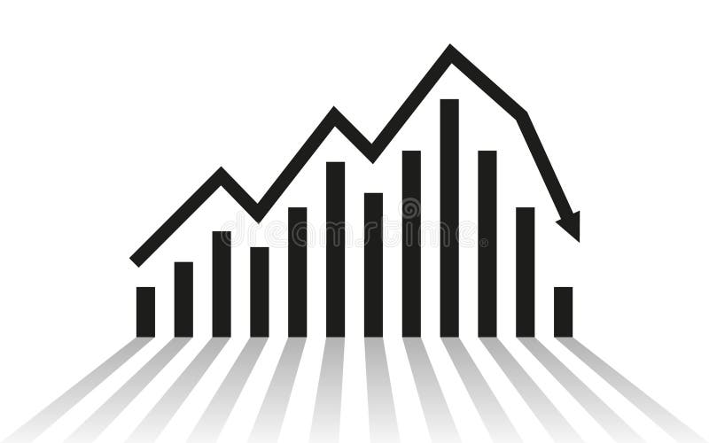
Free with trial Red 3D bar graph against a black background, featuring an upward-sloping horizontal line that sharply declines, ending in a downward-pointing arrow. The bars decrease in height from left to right, visually representing a decline or loss. The red color contrasts with the dark background, emphasizing the downward trend. The composition suggests financial or business decline, often used in economic or market analysis. Decrease line graph illustrations Red 3D bar graph against a black background, featuring an upward-sloping
Free with trial Line Graph Trend Analysis Line And Solid Icon Set. Data Visualization, Business Growth, Statistical Analysis Symbol Collection. Financial And Market Insights. Isolated Vector Illustration. Decrease line graph vectors Line Graph Trend Analysis Line And Solid Icon Set. Data Visualization, Business Growth, Statistical Analysis Symbol
Free with trial The image depicts a graph with a downward trend. The line on the graph slopes downwards from left to right, indicating a decrease in the measured values over time. The graph is rendered in red, with various markers and lines connecting the data points, suggesting a continuous decline. Decrease line graph illustrations Graph showing downward trend. The image depicts a graph with a downward trend. The line on the graph slopes downwards from left to right, indicating a decrease in the measured values over time. The graph is rendered in red, with various markers and lines connecting the data points, suggesting a continuous decline
Free with trial Set line Casino chips, Financial growth increase, Hand holding casino and decrease icon. Vector. Decrease line graph vectors Set line Casino chips, Financial growth increase, Hand holding casino and decrease icon. Vector
Free with trial Graph line icon. Neumorphic, Flat shadow, 3d buttons. Column chart sign. Growth diagram symbol. Line graph chart icon. Social media icons. Vector. Decrease line graph vectors Graph line icon. Column chart sign. Neumorphic buttons. Vector. Graph line icon. Neumorphic, Flat shadow, 3d buttons. Column chart sign. Growth diagram symbol. Line graph chart icon. Social media icons. Vector
Free with trial Horizontal chart line icon. Halftone dotted pattern. Gradient icon with grain shadow. Column graph sign. Market analytics symbol. Line horizontal chart icon. Various designs. Vector. Decrease line graph vectors Horizontal chart line icon. Column graph sign. Halftone dotted pattern. Vector. Horizontal chart line icon. Halftone dotted pattern. Gradient icon with grain shadow. Column graph sign. Market analytics symbol. Line horizontal chart icon. Various designs. Vector
Free with trial The image shows a line graph illustrating the decline of carbon emissions. there are two lines on the graph, a green line and a grey line, both trending downwards. the green line, representing "carbon inteetiual emissions," shows a steeper decline compared to the grey line. the graph is set against a grid background, providing a visual reference for the rate of decrease in emissions over time. the downward trend suggests a positive change in reducing carbon output. Decrease line graph illustrations Carbon emissions decline graph illustration. the image shows a line graph illustrating the decline of carbon emissions. there are two lines on the graph, a green line and a grey line, both trending downwards. the green line, representing "carbon inteetiual emissions," shows a steeper decline compared to the grey line. the graph is set against a grid background, providing a visual reference for the rate of decrease in emissions over time. the downward trend suggests a positive change in reducing carbon output.
Free with trial Graph line icon. Halftone dotted pattern. Gradient icon with grain shadow. Column chart sign. Ab test diagram symbol. Line graph chart icon. Various designs. Vector. Decrease line graph vectors Graph line icon. Column chart sign. Halftone dotted pattern. Vector. Graph line icon. Halftone dotted pattern. Gradient icon with grain shadow. Column chart sign. Ab test diagram symbol. Line graph chart icon. Various designs. Vector
Free with trial The image shows a conference room with a long wooden table and black leather chairs. a silver line graph depicting a downward trend is placed on the table. the graph starts high on the left and gradually declines towards the right, indicating a loss or decrease. the room is well-lit with ceiling lights. the background is blurred, focusing attention on the graph and the table. a painting is visible on the wall. Decrease line graph illustrations Decreasing graph on conference room table view. the image shows a conference room with a long wooden table and black leather chairs. a silver line graph depicting a downward trend is placed on the table. the graph starts high on the left and gradually declines towards the right, indicating a loss or decrease. the room is well-lit with ceiling lights. the background is blurred, focusing attention on the graph and the table. a painting is visible on the wall.
Free with trial Line graph with a green line and a red dot on top. The red dot is located at the top left corner of the graph. Decrease line graph illustrations Graph with a green line and a red dot
Free with trial A digital illustration of a declining line graph with a large downward arrow and a coin at the bottom, representing financial decline or market loss, suitable for economic and business contexts. Decrease line graph illustrations Downward Trending Graph with Falling Line Chart and Coin Illustration. A digital illustration of a declining line graph with a large downward arrow and a coin at the bottom, representing financial decline or market loss, suitable for economic and business contexts
Free with trial A simple red line graph showing a sharp downward trend with an arrow indicating a significant decrease, symbolizing loss or decline in performance. Decrease line graph illustrations Red downward trending graph isolated on white background. A simple red line graph showing a sharp downward trend with an arrow indicating a significant decrease, symbolizing loss or decline in performance
Free with trial A clear vector icon showing a downward arrow on a line graph, symbolizing downturn, decline, or negative statistics. Ideal for financial reports, economic trends, and business analysis. This graphic effectively visualizes a decrease or setback, vector design Generative AI. Decrease line graph vectors Downturn Decline Graph Arrow Statistic Icon, vector design Generative AI. A clear vector icon showing a downward arrow on a line graph, symbolizing downturn, decline, or negative statistics. Ideal for financial reports, economic trends, and business analysis. This graphic effectively visualizes a decrease or setback, vector design Generative AI
Free with trial A simple black and white illustration of a bar chart and a line graph showing business growth trends, isolated on a white background. Decrease line graph vectors Business growth bar chart and line graph isolated on white background. A simple black and white illustration of a bar chart and a line graph showing business growth trends, isolated on a white background
Free with trial Colorful line graph illustrating growth and decline over time, with variously colored data points on a dark background, visualizing financial performance and trends. Decrease line graph vectors Colorful line graph illustrating growth and decline over time, with variously colored data points on a dark background
Free with trial This infographic displays a bar graph illustrating a sharp negative trend. The red line clearly depicts a significant decrease, showcasing concepts like downturn, recession, and loss within a business or financial context. Ideal for presentations, reports, and analyses highlighting negative market trends or economic decline, generated by AI. Decrease line graph illustrations Decreasing bar graph showing negative trend decline. This infographic displays a bar graph illustrating a sharp negative trend. The red line clearly depicts a significant decrease, showcasing concepts like downturn, recession, and loss within a business or financial context. Ideal for presentations, reports, and analyses highlighting negative market trends or economic decline, generated by AI.
Free with trial Simple line graph illustrating data points and trends. Ideal for presentations, reports, and infographics related to business analysis, market research, or financial reporting. Decrease line graph vectors Simple Line Graph, Data Visualization, Business Chart. Simple line graph illustrating data points and trends. Ideal for presentations, reports, and infographics related to business analysis, market research, or financial reporting.
Free with trial Report line icon. Continuous line with share plane. Column graph, pie chart sign. Market analytics symbol. 3d heart in speech bubble. Report single line ribbon. Loop curve pattern. Vector. Decrease line graph vectors Report line icon. Column graph, pie chart sign. Continuous line with plane. Vector. Report line icon. Continuous line with share plane. Column graph, pie chart sign. Market analytics symbol. 3d heart in speech bubble. Report single line ribbon. Loop curve pattern. Vector
Free with trial Diagram with recession and bankruptcy. Graph with decrease report. Business and finance vector illustration. Decrease line graph vectors Diagram with recession and bankruptcy. Graph with decrease report. Business and finance vector
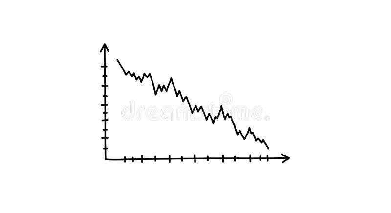
Free with trial A simple, hand-drawn line graph displayed on a plain white background illustrates a notable downward trend. The black line demonstrates decreasing values over time along the defined axes. Decrease line graph vectors Descending line graph displays a downward trend, isolated on white background. A simple, hand-drawn line graph displayed on a plain white background illustrates a notable downward trend. The black line demonstrates decreasing values over time along the defined axes.
Free with trial Diagram with recession and bankruptcy progress. Graph with decrease report. Business and finance vector. Decrease line graph vectors Diagram with recession and bankruptcy progress. Graph with decrease report. Business and finance
Free with trial Analytics graph line icon. Neumorphic, Flat shadow, 3d buttons. Column chart sign. Growth diagram symbol. Line analytics graph icon. Social media icons. Vector. Decrease line graph vectors Analytics graph line icon. Column chart sign. Neumorphic buttons. Vector. Analytics graph line icon. Neumorphic, Flat shadow, 3d buttons. Column chart sign. Growth diagram symbol. Line analytics graph icon. Social media icons. Vector
Free with trial A colorful bar graph with a line graph overlayed on a blue background. it shows data trends and market analysis in a simple visual format. Decrease line graph vectors Colorful bar graph with a line graph on a blue background. a colorful bar graph with a line graph overlayed on a blue background. it shows data trends and market analysis in a simple visual format
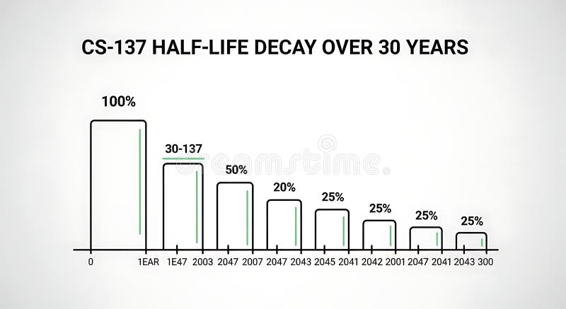
Free with trial A line graph illustrating the decrease in half-life over 30 years with bars representing percentage decay at different years, demonstrating long-term decline suitable for scientific, educational, or research presentations. Decrease line graph illustrations Half-life Decay Over 30 Years Chart Showing Decrease in Value or Effectiveness. A line graph illustrating the decrease in half-life over 30 years with bars representing percentage decay at different years, demonstrating long-term decline suitable for scientific, educational, or research presentations
Free with trial Horizontal chart line icon. Neumorphic, Flat shadow, 3d buttons. Column graph sign. Market analytics symbol. Line horizontal chart icon. Social media icons. Vector. Decrease line graph illustrations Horizontal chart line icon. Column graph sign. Neumorphic buttons. Vector. Horizontal chart line icon. Neumorphic, Flat shadow, 3d buttons. Column graph sign. Market analytics symbol. Line horizontal chart icon. Social media icons. Vector
Free with trial Pyramid chart line icon. Neumorphic, Flat shadow, 3d buttons. Analytics graph sign. Market analytics symbol. Line pyramid chart icon. Social media icons. Vector. Decrease line graph vectors Pyramid chart line icon. Analytics graph sign. Neumorphic buttons. Vector. Pyramid chart line icon. Neumorphic, Flat shadow, 3d buttons. Analytics graph sign. Market analytics symbol. Line pyramid chart icon. Social media icons. Vector
Free with trial Diagram chart line icon. Neumorphic, Flat shadow, 3d buttons. Column 3d graph sign. Market analytics symbol. Line 3d chart icon. Social media icons. Vector. Decrease line graph vectors Diagram chart line icon. Column 3d graph sign. Neumorphic buttons. Vector. Diagram chart line icon. Neumorphic, Flat shadow, 3d buttons. Column 3d graph sign. Market analytics symbol. Line 3d chart icon. Social media icons. Vector
Free with trial This image features two minimalist icons representing financial or data trends. The left icon is a white line graph with circular data points and directional arrows, set against a solid black shield shape. The right icon presents the same line graph and data points within a black outline of a shield, on a white background. Both icons depict fluctuating data, with one showing a downward trend and the other an upward trend, symbolizing market volatility, analysis, and security. Decrease line graph illustrations Line Graph Icon with Shield Symbol - Upward and Downward Trends. This image features two minimalist icons representing financial or data trends. The left icon is a white line graph with circular data points and directional arrows, set against a solid black shield shape. The right icon presents the same line graph and data points within a black outline of a shield, on a white background. Both icons depict fluctuating data, with one showing a downward trend and the other an upward trend, symbolizing market volatility, analysis, and security.
Free with trial Set line Mobile stock trading, Burning dollar bill, Dollar rate decrease and Debt ball chained coin icon. Vector. Decrease line graph vectors Set line Mobile stock trading, Burning dollar bill, Dollar rate decrease and Debt ball chained coin icon. Vector
Free with trial Decreasing graph line icon. Continuous line big heart. Column chart sign. Market analytics symbol. 3d hearts in heart shaped loop. Decreasing graph single line ribbon. Loop curve pattern. Vector. Decrease line graph vectors Decreasing graph line icon. Column chart sign. Continuous line big heart. Vector. Decreasing graph line icon. Continuous line big heart. Column chart sign. Market analytics symbol. 3d hearts in heart shaped loop. Decreasing graph single line ribbon. Loop curve pattern. Vector
Free with trial Pie chart line icon. Neumorphic, Flat shadow, 3d buttons. Presentation 3d graph sign. Market analytics symbol. Line pie chart icon. Social media icons. Vector. Decrease line graph vectors Pie chart line icon. Presentation 3d graph sign. Neumorphic buttons. Vector. Pie chart line icon. Neumorphic, Flat shadow, 3d buttons. Presentation 3d graph sign. Market analytics symbol. Line pie chart icon. Social media icons. Vector
Free with trial A simple bar chart and line graph with a downward arrow illustrates a negative trend like recession or business failure ideal for financial reports about crisis or loss. Decrease line graph illustrations Declining Blue Bar Chart and Line Graph Showing Financial Loss on Gray Background. A simple bar chart and line graph with a downward arrow illustrates a negative trend like recession or business failure ideal for financial reports about crisis or loss
Free with trial Set line Dollar rate decrease, Contract money and pen, Global economic crisis and Mobile stock trading. Business infographic template. Vector. Decrease line graph illustrations Set line Dollar rate decrease, Contract money and pen, Global economic crisis and Mobile stock trading. Business
Free with trial Calendar graph line icon. Halftone dotted pattern. Gradient icon with grain shadow. Column chart sign. Growth diagram symbol. Line calendar graph icon. Various designs. Vector. Decrease line graph vectors Calendar graph line icon. Column chart sign. Halftone dotted pattern. Vector. Calendar graph line icon. Halftone dotted pattern. Gradient icon with grain shadow. Column chart sign. Growth diagram symbol. Line calendar graph icon. Various designs. Vector
Free with trial Outline vector icon of a line graph showing a downward trend. Represents decline, loss, decrease, failure, or negative performance in line art. Suitable for financial reports, data analysis, business presentations, and illustrating negative change, vector design Generative AI. Decrease line graph vectors Downward Trend Graph Icon Outline, Decline Loss Failure Symbol, vector design Generative AI. Outline vector icon of a line graph showing a downward trend. Represents decline, loss, decrease, failure, or negative performance in line art. Suitable for financial reports, data analysis, business presentations, and illustrating negative change, vector design Generative AI
Free with trial A simple black line graph depicts a downward trend with sharp fluctuations on white. Decrease line graph illustrations Black line graph showing a downward trend on a white background chart. A simple black line graph depicts a downward trend with sharp fluctuations on white
Free with trial Decreasing graph line icon. Halftone dotted pattern. Gradient icon with grain shadow. Column chart sign. Crisis diagram symbol. Line decreasing graph icon. Various designs. Vector. Decrease line graph vectors Decreasing graph line icon. Crisis chart sign. Halftone dotted pattern. Vector. Decreasing graph line icon. Halftone dotted pattern. Gradient icon with grain shadow. Column chart sign. Crisis diagram symbol. Line decreasing graph icon. Various designs. Vector
Free with trial Graph line icon. Neumorphic, Flat shadow, 3d buttons. Column chart sign. Growth diagram symbol. Line graph chart icon. Social media icons. Vector. Decrease line graph vectors Graph line icon. Column chart sign. Neumorphic buttons. Vector. Graph line icon. Neumorphic, Flat shadow, 3d buttons. Column chart sign. Growth diagram symbol. Line graph chart icon. Social media icons. Vector
Free with trial Percentage increase decrease arrow up down icon simple line stroke outline icon graphic set, money price cost loss growth sign symbol pictogram label, fund interest revenue rate results image. Decrease line graph vectors Percentage increase decrease arrow up down icon simple line stroke outline icon graphic set, money price cost loss growth sign
Free with trial Percentage increase decrease arrow up down icon simple line stroke outline icon graphic set, money price cost loss growth sign symbol pictogram label, fund interest revenue rate results image. Decrease line graph illustrations Percentage increase decrease arrow up down icon simple line stroke outline icon graphic set, money price cost loss growth sign
Free with trial A close-up shot of a printed financial report showing market fluctuations indicated by a red line graph. Decrease line graph illustrations A financial document showing a fluctuating red line graph displayed. A close-up shot of a printed financial report showing market fluctuations indicated by a red line graph
Free with trial Dec fading line graph illustration data analysis, statistics visualization, slope axis dec fading line graph. Decrease line graph illustrations Dec fading line graph
Free with trial Graph line icon. Continuous line with share plane. Column chart sign. Growth diagram symbol. 3d heart in speech bubble. Graph chart single line ribbon. Loop curve pattern. Vector. Decrease line graph vectors Graph line icon. Column chart sign. Continuous line with plane. Vector. Graph line icon. Continuous line with share plane. Column chart sign. Growth diagram symbol. 3d heart in speech bubble. Graph chart single line ribbon. Loop curve pattern. Vector
Free with trial Set line Dollar rate decrease, Global economic crisis, news and icon. Vector. Decrease line graph vectors Set line Dollar rate decrease, Global economic crisis, news and icon. Vector
Free with trial Displaying green fluctuating data line moving across dashboard grid overlay, with red area graph. Financial, analytics, dashboard, data, technology, investment, digital. Decrease line graph illustrations Displaying green fluctuating data line moving across dashboard grid overlay, with red area graph
Free with trial A bold line graph icon displays business data with trend analysis, featuring circles marking data points and horizontal lines indicating value levels. Decrease line graph vectors Bold Line Graph Icon: Business Data Visualization with Trend Analysis. A bold line graph icon displays business data with trend analysis, featuring circles marking data points and horizontal lines indicating value levels
Free with trial Growth and reduction arrow, up and down, line icon set. Rise and fall, increase and decrease. Graphic signs. Vector flat illustration. Decrease line graph vectors Growth and reduction arrow, up and down, line icon set. Rise and fall, increase and decrease. Graphic signs. Vector illustration
Free with trial A digital line graph displays a sharp decline in interest rates, highlighting sudden market shifts and economic downturn trends. Decrease line graph illustrations A digital line graph displays a sharp decline in interest rates, highlighting sudden market shifts and economic downturn trends
Free with trial Graph showing a line that is green and has a black background. The line is going up and to the right. Decrease line graph illustrations Graph showing a line that is green and has a black background
Free with trial The image displays a red line graph with a downward trend, indicating a decline or decrease. The graph starts high on the left and slopes downward to the right, with minor fluctuations but an overall downward trajectory. Decrease line graph illustrations Graph showing downward trend. The image displays a red line graph with a downward trend, indicating a decline or decrease. The graph starts high on the left and slopes downward to the right, with minor fluctuations but an overall downward trajectory
Free with trial A clean and modern vector illustration of a line graph, isolated on a white background. This flat design icon features two distinct lines, one blue and one brown, plotting various data points to show trends and comparisons over time. It's a versatile graphic representing concepts like data analysis, business analytics, financial statistics, market research, and performance tracking. Ideal for use in presentations, infographics, websites, business reports, and marketing materials to visualize progress, growth, or economic fluctuations. Decrease line graph vectors Data Analysis Line Graph Icon. A clean and modern vector illustration of a line graph, isolated on a white background. This flat design icon features two distinct lines, one blue and one brown, plotting various data points to show trends and comparisons over time. It's a versatile graphic representing concepts like data analysis, business analytics, financial statistics, market research, and performance tracking. Ideal for use in presentations, infographics, websites, business reports, and marketing materials to visualize progress, growth, or economic fluctuations.
Free with trial The image depicts a flip chart with a combination of a bar graph and a line graph, both showing a downward trend. The bar graph starts with taller bars that gradually decrease in height, indicating a decline over time. The line graph above it also trends downward, reinforcing the concept of a negative trajectory or economic downturn. The visual is likely used to represent financial loss, market. Decrease line graph illustrations Economic decline illustrated by a combination of bar and line graphs on a flip chart. The image depicts a flip chart with a combination of a bar graph and a line graph, both showing a downward trend. The bar graph starts with taller bars that gradually decrease in height, indicating a decline over time. The line graph above it also trends downward, reinforcing the concept of a negative trajectory or economic downturn. The visual is likely used to represent financial loss, market
Free with trial Graph phone line icon. Neumorphic, Flat shadow, 3d buttons. Column chart sign. Growth diagram symbol. Line graph phone icon. Social media icons. Vector. Decrease line graph vectors Graph phone line icon. Column chart sign. Neumorphic buttons. Vector. Graph phone line icon. Neumorphic, Flat shadow, 3d buttons. Column chart sign. Growth diagram symbol. Line graph phone icon. Social media icons. Vector
Free with trial Red Graph Line Under Magnifying Glass on White Paper. Decrease line graph illustrations Red Graph Line Under Magnifying Glass on White Paper
Free with trial Web report line icon. Continuous line with share plane. Column graph sign. Growth diagram symbol. 3d star in speech bubble. Web report single line ribbon. Loop curve pattern. Vector. Decrease line graph vectors Web report line icon. Column graph sign. Continuous line with plane. Vector. Web report line icon. Continuous line with share plane. Column graph sign. Growth diagram symbol. 3d star in speech bubble. Web report single line ribbon. Loop curve pattern. Vector
Free with trial Graph laptop line icon. Continuous line with share plane. Column chart sign. Growth diagram symbol. 3d heart in speech bubble. Graph laptop single line ribbon. Loop curve pattern. Vector. Decrease line graph vectors Graph laptop line icon. Column chart sign. Continuous line with plane. Vector. Graph laptop line icon. Continuous line with share plane. Column chart sign. Growth diagram symbol. 3d heart in speech bubble. Graph laptop single line ribbon. Loop curve pattern. Vector
Free with trial Digital screen displays vibrant red downward trend line graph. Finance chart signals significant earning loss, economic crisis. Business performance decreased. Stock market faces. Decrease line graph illustrations Digital screen displays vibrant red downward trend line graph. Finance chart signals significant earning loss, economic crisis.
Free with trial Set line Falling property prices, Dollar rate decrease, Global economic crisis and Safe icon. Vector. Decrease line graph vectors Set line Falling property prices, Dollar rate decrease, Global economic crisis and Safe icon. Vector
Free with trial Diagram chart line icon. Neumorphic, Flat shadow, 3d buttons. Column graph sign. Market analytics symbol. Line diagram chart icon. Social media icons. Vector. Decrease line graph vectors Diagram chart line icon. Column graph sign. Neumorphic buttons. Vector. Diagram chart line icon. Neumorphic, Flat shadow, 3d buttons. Column graph sign. Market analytics symbol. Line diagram chart icon. Social media icons. Vector
Free with trial A simple black line drawing of a heart with an electrocardiogram line through it and a downward pointing arrow, symbolizing a decrease in heart rate or health. Decrease line graph vectors Heart Rate Line Graph with Downward Arrow. A simple black line drawing of a heart with an electrocardiogram line through it and a downward pointing arrow, symbolizing a decrease in heart rate or health
Free with trial This image depicts a bar and line graph that illustrates fluctuating values over a period of time. The x-axis represents time, while the y-axis represents the value. The graph shows an overall upward trend with several peaks and troughs, indicating periods of increase and decrease in value. The bars provide a visual representation of the value at specific intervals, while the line connects these. Decrease line graph illustrations Graph showing fluctuating values over time. This image depicts a bar and line graph that illustrates fluctuating values over a period of time. The x-axis represents time, while the y-axis represents the value. The graph shows an overall upward trend with several peaks and troughs, indicating periods of increase and decrease in value. The bars provide a visual representation of the value at specific intervals, while the line connects these
Free with trial Dollar arrow up and down icon on circle line. USD currency increase and decrease concept vector. Decrease line graph vectors Dollar arrow up and down icon on circle line. USD currency increase and decrease concept
Free with trial Stock quotes icons set in outline stroke design for web. Pack line pictograms with increase, decrease, exchange currency, investment portfolio, bear, bull, watch list, other. Vector illustration. Decrease line graph vectors Stock quotes icons set in outline stroke design for web. Pack line pictograms with increase, decrease, exchange currency
Free with trial Economic crisis line icon of graph going down, economy downturn and bankruptcy vector symbol. Stock exchange or economical index decrease linear icon of financial crisis and global economy recession. Decrease line graph vectors Economic crisis icon of economy graph going down. Economic crisis line icon of graph going down, economy downturn and bankruptcy vector symbol. Stock exchange or economical index decrease linear icon of financial crisis and global economy recession
Free with trial Declining Graph With Cursor Line And Solid Icon Set. Economic Downturn, Market Analysis, And Financial Decline Symbol Collection. Business Performance Tracking. Isolated Vector Illustration. Decrease line graph vectors Declining Graph With Cursor Line And Solid Icon Set. Economic Downturn, Market Analysis, And Financial Decline Symbol
Free with trial A 3D rendered image displays a collection of business charts on a document. A colorful pie chart with six segments sits to the left of a bar graph with five vertical bars of varying heights and colors. A line graph with multiple colored lines is visible on the document below. The composition is set against a white background. Decrease line graph illustrations 3D Rendered Pie Chart Bar Graph and Line Graph on a Document data statistics. A 3D rendered image displays a collection of business charts on a document. A colorful pie chart with six segments sits to the left of a bar graph with five vertical bars of varying heights and colors. A line graph with multiple colored lines is visible on the document below. The composition is set against a white background
Free with trial Pie chart line icon. Continuous line with share plane. Presentation 3d graph sign. Market analytics symbol. 3d star in speech bubble. Pie chart single line ribbon. Loop curve pattern. Vector. Decrease line graph vectors Pie chart line icon. Presentation 3d graph sign. Continuous line with plane. Vector. Pie chart line icon. Continuous line with share plane. Presentation 3d graph sign. Market analytics symbol. 3d star in speech bubble. Pie chart single line ribbon. Loop curve pattern. Vector
Free with trial Diagram chart line icon. Halftone dotted pattern. Gradient icon with grain shadow. Column 3d graph sign. Market analytics symbol. Line 3d chart icon. Various designs. Vector. Decrease line graph vectors Diagram chart line icon. Column 3d graph sign. Halftone dotted pattern. Vector. Diagram chart line icon. Halftone dotted pattern. Gradient icon with grain shadow. Column 3d graph sign. Market analytics symbol. Line 3d chart icon. Various designs. Vector
Free with trial This illustration features a minimalist hand-drawn line graph depicting a clear downward trajectory. The blue line connects several circular data points, ending in a distinct red circle that highlights a final decline. The background is clean and white, emphasizing the simple sketch style used to represent financial or statistical loss. Decrease line graph vectors A simple hand drawn line graph showing a downward trend on a white background. This illustration features a minimalist hand-drawn line graph depicting a clear. This illustration features a minimalist hand-drawn line graph depicting a clear downward trajectory. The blue line connects several circular data points, ending in a distinct red circle that highlights a final decline. The background is clean and white, emphasizing the simple sketch style used to represent financial or statistical loss
Free with trial Set line Financial growth decrease Sales funnel with chart Pie infographic and Binary code with long shadow. Red square button. Vector. Decrease line graph illustrations Set line Financial growth decrease, Sales funnel with chart, Pie infographic and Binary code with long shadow. Red. Set line Financial growth decrease Sales funnel with chart Pie infographic and Binary code with long shadow. Red square button. Vector.
Free with trial Red percentage symbol and downward arrow with graph line, minimalist style, white background, concept of decline or economic drop. 3D Rendering. Decrease line graph illustrations Red percentage symbol with downward arrow and graph line on white background. 3D Rendering. Red percentage symbol and downward arrow with graph line, minimalist style, white background, concept of decline or economic drop. 3D Rendering
Free with trial A graph crash hologram financial loss stock market digital chart red line technology dramatic crisis business. Decrease line graph illustrations Graph crash hologram financial loss stock market digital chart red line technology dramatic crisis business
Free with trial Down real estate value color line icon, housing market and economic crisis. House price decline graph vector outline symbol with down arrow and buildings. Economy, finance and business recession. Decrease line graph vectors Down real estate value line icon, houses and graph. Down real estate value color line icon, housing market and economic crisis. House price decline graph vector outline symbol with down arrow and buildings. Economy, finance and business recession