Free with trial This image shows a colorful 3D bar graph representing growth or progress. The bars increase in height, then decrease slightly before another sharp increase, indicating fluctuations in data. The wooden background adds a rustic and visually appealing contrast. Bar chart decrease illustrations Colorful Bar Graph on Wooden Background. This image shows a colorful 3D bar graph representing growth or progress. The bars increase in height, then decrease slightly before another sharp increase, indicating fluctuations in data. The wooden background adds a rustic and visually appealing contrast.
Free with trial A simple line drawing depicts a magnifying glass focusing on a declining bar chart with a downward arrow and zig-zag. Bar chart decrease illustrations Declining Market Analysis Magnifying Glass, Downward Trend Chart. A simple line drawing depicts a magnifying glass focusing on a declining bar chart with a downward arrow and zig-zag.
Free with trial The image displays four distinct data visualizations. The top left and bottom left show bar charts with varying heights, indicating different data values. The top right presents a stacked bar chart, where each bar is divided into segments. The bottom right illustrates a line chart, showing data points connected by lines to depict trends over time. Bar chart decrease illustrations Various types of data visualizations including bar and line charts. The image displays four distinct data visualizations. The top left and bottom left show bar charts with varying heights, indicating different data values. The top right presents a stacked bar chart, where each bar is divided into segments. The bottom right illustrates a line chart, showing data points connected by lines to depict trends over time
Free with trial Blue upward bar graph with arrow and falling coin near a sad face. Ideal for finance, economy, investment risks, financial loss, market analysis, emotional impact, business strategies. Simple flat. Bar chart decrease vectors Financial growth with unhappy outcome reflected by increasing bar chart, falling coin, and sad face. Blue upward bar graph with arrow and falling coin near a sad face. Ideal for finance, economy, investment risks, financial loss, market analysis, emotional impact, business strategies. Simple flat
Free with trial 3D render showcasing descending statistical bar graph. The bars are colored differently: purple, blue, and yellow. This graphic represents statistical data trend decreasing. Bar chart decrease vectors Colorful statistical bar graph rendering showing decrease on transparent background. 3D render showcasing descending statistical bar graph. The bars are colored differently: purple, blue, and yellow. This graphic represents statistical data trend decreasing.
Free with trial A 3D rendered image showing a decreasing purple bar graph with an orange arrow pointing downwards. Stacks of coins are placed near the graph, suggesting financial loss or economic downturn. The graph is displayed on a white surface with lines indicating a chart. Bar chart decrease illustrations 3d purple bar graph with orange downward arrow. A 3D rendered image showing a decreasing purple bar graph with an orange arrow pointing downwards. Stacks of coins are placed near the graph, suggesting financial loss or economic downturn. The graph is displayed on a white surface with lines indicating a chart
Free with trial This image depicts a bar graph with a downward trend. The bars decrease in height from left to right, indicating a decline in the measured values. A red arrow at the top further emphasizes the downward direction. Bar chart decrease illustrations Decreasing bar graph. This image depicts a bar graph with a downward trend. The bars decrease in height from left to right, indicating a decline in the measured values. A red arrow at the top further emphasizes the downward direction
Free with trial Hand drawing a down arrow over a decreasing bar chart on a green chalkboard. Bar chart decrease illustrations Hand drawing declining bar graph on blackboard. Hand drawing a down arrow over a decreasing bar chart on a green chalkboard
Free with trial Hand holding smartphone displaying bar chart with CO2 and downward arrows. Represents reducing carbon emissions or environmental analytics. Part of series. Bar chart decrease vectors Hand holding smartphone displaying bar chart with CO2 and downward arrows. Represents reducing carbon emissions or environmental
Free with trial Hand drawing a decreasing bar graph with chalk on a dark chalkboard. Bar chart decrease illustrations Hand drawing declining bar chart on blackboard. Hand drawing a decreasing bar graph with chalk on a dark chalkboard
Free with trial This hand-drawn bar chart, generated by AI, visually represents growth over time. The chart shows an initial decline followed by a significant upward trend, highlighting potential recovery or resurgence after a setback. The artistic style adds a unique touch. Bar chart decrease illustrations AI-Generated Growth Chart. This hand-drawn bar chart, generated by AI, visually represents growth over time. The chart shows an initial decline followed by a significant upward trend, highlighting potential recovery or resurgence after a setback. The artistic style adds a unique touch.
Free with trial The image depicts a bar graph with two distinct sections. The left section of the graph shows an upward trend with green bars and a green arrow pointing upwards, indicating an increase. The right section of the graph shows a downward trend with red bars and a red arrow pointing downwards, indicating a decrease. The graph visually represents contrasting trends in data. Bar chart decrease illustrations Bar graph with up and down trends. The image depicts a bar graph with two distinct sections. The left section of the graph shows an upward trend with green bars and a green arrow pointing upwards, indicating an increase. The right section of the graph shows a downward trend with red bars and a red arrow pointing downwards, indicating a decrease. The graph visually represents contrasting trends in data
Free with trial The image depicts a bar graph with two distinct sections. The left section of the graph shows an upward trend with green bars and a green arrow pointing upwards, indicating an increase. The right section of the graph shows a downward trend with red bars and a red arrow pointing downwards, indicating a decrease. The graph visually represents contrasting trends in data. Bar chart decrease illustrations Bar graph with up and down trends. The image depicts a bar graph with two distinct sections. The left section of the graph shows an upward trend with green bars and a green arrow pointing upwards, indicating an increase. The right section of the graph shows a downward trend with red bars and a red arrow pointing downwards, indicating a decrease. The graph visually represents contrasting trends in data
Free with trial The image depicts a bar graph with two distinct sections. The left section of the graph shows an upward trend with green bars and a green arrow pointing upwards, indicating an increase. The right section of the graph shows a downward trend with red bars and a red arrow pointing downwards, indicating a decrease. The graph visually represents contrasting trends in data. Bar chart decrease illustrations Bar graph with up and down trends. The image depicts a bar graph with two distinct sections. The left section of the graph shows an upward trend with green bars and a green arrow pointing upwards, indicating an increase. The right section of the graph shows a downward trend with red bars and a red arrow pointing downwards, indicating a decrease. The graph visually represents contrasting trends in data
Free with trial Business decline bar chart icon vector. Decrease, loss, and financial collapse symbol inside circular outline. Bar chart decrease vectors Business decline bar chart icon. Decrease, loss, and financial collapse symbol inside circular outline
Free with trial A 3D rendered bar chart encased in clear glass, displaying year-end business performance. The chart features three vertical bars in blue, pink, and yellow, representing 61%, 24%, and 35% respectively. The clean, modern design and transparent material create a sophisticated visual suitable for presentations, reports, and data visualization concepts related to business growth, financial analysis, and success metrics. Bar chart decrease illustrations Year End Business Performance Chart. A 3D rendered bar chart encased in clear glass, displaying year-end business performance. The chart features three vertical bars in blue, pink, and yellow, representing 61%, 24%, and 35% respectively. The clean, modern design and transparent material create a sophisticated visual suitable for presentations, reports, and data visualization concepts related to business growth, financial analysis, and success metrics.
Free with trial This minimalist vector illustration depicts a human hand holding a pen, actively drawing a downward-trending bar graph. The composition features a clean, flat design style with a neutral white background, emphasizing the red and grey bars. The visual mood is professional and analytical, representing concepts of financial loss, market decline, or negative performance metrics. Bar chart decrease vectors A hand uses a pen to draw a declining bar chart on a white background. This minimalist vector illustration depicts a human hand holding a pen, actively drawing a downward-trending bar graph. The composition features a clean, flat design style with a neutral white background, emphasizing the red and grey bars. The visual mood is professional and analytical, representing concepts of financial loss, market decline, or negative performance metrics
Free with trial This graphic illustration depicts a declining financial trend using a bar chart and a line graph. The visual features red bars decreasing in height alongside a red line pointing downward, symbolizing economic loss or market contraction. Various currency symbols are positioned near arrows to emphasize the negative movement against a dark background. Bar chart decrease vectors A financial chart showing a downward trend with red bars and arrows. This graphic illustration depicts a declining financial trend using a bar chart and a line graph. The visual features red bars decreasing in height alongside a red line pointing downward, symbolizing economic loss or market contraction. Various currency symbols are positioned near arrows to emphasize the negative movement against a dark background
Free with trial A colorful bar graph with a downward trend, showing a decrease in values from left to right, with a large orange arrow pointing downwards. Bar chart decrease illustrations A colorful bar graph with a downward trend
Free with trial This image presents a clean, minimalist graphic illustrating economic trends. It features two distinct charts: a line graph on the left showing fluctuating data points over time, and a bar chart on the right comparing values across categories. The charts use a simple black and white color scheme with grayscale elements, making them versatile for various business and financial contexts. Labels like 'ECONOMIC', 'PARCTIRUM', and 'PLACTIRUM' suggest analysis of economic performance and market data. The overall design emphasizes clarity and data visualization. Bar chart decrease vectors Economic Growth Trends: Line and Bar Charts. This image presents a clean, minimalist graphic illustrating economic trends. It features two distinct charts: a line graph on the left showing fluctuating data points over time, and a bar chart on the right comparing values across categories. The charts use a simple black and white color scheme with grayscale elements, making them versatile for various business and financial contexts. Labels like 'ECONOMIC', 'PARCTIRUM', and 'PLACTIRUM' suggest analysis of economic performance and market data. The overall design emphasizes clarity and data visualization.
Free with trial Various colored cylinder objects of different heights arranged against striped background resembling falling chart Ideal for presenting business data or financial analysis. Bar chart decrease illustrations Analyzing Colorful Cylinders Arranged Like a Falling Bar Chart on Blue Background. Various colored cylinder objects of different heights arranged against striped background resembling falling chart Ideal for presenting business data or financial analysis
Free with trial A professional bar chart visualization featuring multiple colorful vertical bars of varying heights, representing statistical data, growth, or financial analysis in a clean minimalist style. Created AI. Bar chart decrease illustrations A colorful bar graph showing financial data trends on white background. A professional bar chart visualization featuring multiple colorful vertical bars of varying heights, representing statistical data, growth, or financial analysis in a clean minimalist style.Created AI
Free with trial A minimalist black icon depicting a business data chart. It features a bar graph with multiple vertical bars, overlaid by two distinct line graphs. One line graph shows an upward trend with data points, symbolizing growth and success, while the other illustrates a downward trend, representing decline or loss. This versatile vector illustration is ideal for conveying concepts related to financial analysis, market trends, business performance, statistics, and economic fluctuations. Perfect for web interfaces, presentations, reports, and infographics. Bar chart decrease vectors Business Data Analysis Chart Icon with Trends. A minimalist black icon depicting a business data chart. It features a bar graph with multiple vertical bars, overlaid by two distinct line graphs. One line graph shows an upward trend with data points, symbolizing growth and success, while the other illustrates a downward trend, representing decline or loss. This versatile vector illustration is ideal for conveying concepts related to financial analysis, market trends, business performance, statistics, and economic fluctuations. Perfect for web interfaces, presentations, reports, and infographics.
Free with trial A clean vector illustration of a descending bar graph, symbolizing a period of financial decline, economic recession, or poor business performance. Bar chart decrease vectors Descending Bar Chart Showing Financial Decline. A clean vector illustration of a descending bar graph, symbolizing a period of financial decline, economic recession, or poor business performance
Free with trial Hand is pointing towards a descending bar chart with bars in shades of red, orange, and yellow on a white background. Bar chart decrease illustrations The hand points to the bar chart showing a downtrend. hand is pointing towards a descending bar chart with bars in shades of red, orange, and yellow on a white background.
Free with trial Hand points toward a descending bar graph with bars in warm colors from yellow to red, symbolizing decline or decrease. Bar chart decrease illustrations The hand points to the bar graph showing a downtrend. hand points toward a descending bar graph with bars in warm colors from yellow to red, symbolizing decline or decrease.
Free with trial This icon features a simple black and white representation of a bar graph with bars decreasing in height from left to right. A bold black arrow points downwards, indicating a decline or negative trend. The entire graphic is enclosed within a black circle and presented on a white background, making it a clear and concise symbol for financial or economic downturn. Bar chart decrease illustrations Icon of a Falling Bar Graph with Downward Arrow Symbolizing Decline chart. This icon features a simple black and white representation of a bar graph with bars decreasing in height from left to right. A bold black arrow points downwards, indicating a decline or negative trend. The entire graphic is enclosed within a black circle and presented on a white background, making it a clear and concise symbol for financial or economic downturn
Free with trial This graphic depicts a bar chart showing a progressive decline in values. Four vertical bars, rendered in shades of blue, decrease in height from left to right, symbolizing a reduction. Each bar is accompanied by a dark grey downward-pointing arrow, reinforcing the concept of a negative trend or decrease. The clean, minimalist composition on a white background provides a clear and easily. Bar chart decrease vectors A bar chart illustrates a clear downward trend with multiple decreasing values. This graphic depicts a bar chart showing a progressive decline in values. Four vertical bars, rendered in shades of blue, decrease in height from left to right, symbolizing a reduction. Each bar is accompanied by a dark grey downward-pointing arrow, reinforcing the concept of a negative trend or decrease. The clean, minimalist composition on a white background provides a clear and easily
Free with trial Depreciation color line icon with decline bar graph and percent vector symbol. Inflation, economic crisis, business and finance recession, money loss and bankruptcy outline sign with decrease chart. Bar chart decrease vectors Depreciation color line icon with decline graph. Depreciation color line icon with decline bar graph and percent vector symbol. Inflation, economic crisis, business and finance recession, money loss and bankruptcy outline sign with decrease chart
Free with trial A collection of six black depicting various business analytics charts and graphs, including bar charts, a pie chart, and line graphs on presentation boards. Bar chart decrease vectors Black analytics chart and graph on white background. A collection of six black depicting various business analytics charts and graphs, including bar charts, a pie chart, and line graphs on presentation boards
Free with trial A 3D render shows a financial bar graph with grey concrete bars decreasing in height from left to right. A thick white arrow points downwards across the graph, intersecting a thin red line that follows the downward trend. The background is a blurred cityscape at dusk with soft lighting. Bar chart decrease illustrations White arrow pointing down over grey bar graph chart. A 3D render shows a financial bar graph with grey concrete bars decreasing in height from left to right. A thick white arrow points downwards across the graph, intersecting a thin red line that follows the downward trend. The background is a blurred cityscape at dusk with soft lighting
Free with trial Set of black icons showing a digital clock, triangular shape within a square, bar chart with line graph overlay, atomic model, upward arrows, and a ruler with a downward arrow. Generative AI. Bar chart decrease vectors Black digital clock triangle chart atom arrows and ruler icons. Set of black icons showing a digital clock, triangular shape within a square, bar chart with line graph overlay, atomic model, upward arrows, and a ruler with a downward arrow. Generative AI
Free with trial A teal bar graph visually represents a significant downward trend, with a red arrow pointing sharply lower, all isolated on a white background. Bar chart decrease illustrations Teal bar chart showing a sharp decline with a red arrow indicating downward trend isolated on white background. A teal bar graph visually represents a significant downward trend, with a red arrow pointing sharply lower, all isolated on a white background
Free with trial Business strategy concept showing quality improvement and cost reduction with rising bar chart and target icon represent performance optimization, efficiency, KPI achievement and smart decision making. Bar chart decrease illustrations Business strategy concept showing quality improvement and cost reduction with rising bar chart and target icon represent
Free with trial A 3D rendered bar graph composed of six vertical bars arranged in a descending sequence. The bars transition in color from a deep blue at the tallest end to a bright orange at the shortest end, showcasing a gradient of blues, purples, and reds. The graph is set against a clean white background with subtle shading, emphasizing the visual representation of a declining trend. Bar chart decrease illustrations Decreasing Bar Graph with Gradient Colors on White Background chart statistics. A 3D rendered bar graph composed of six vertical bars arranged in a descending sequence. The bars transition in color from a deep blue at the tallest end to a bright orange at the shortest end, showcasing a gradient of blues, purples, and reds. The graph is set against a clean white background with subtle shading, emphasizing the visual representation of a declining trend
Free with trial A 3D rendered image depicts a golden downward-sloping arrow positioned over a series of golden bars representing a declining bar chart. A golden coin with a dollar symbol and the inscription "ONE COONIT ES OF BERIC 1909" is shown above the chart, further emphasizing a financial downturn. The image is set against a white background. Bar chart decrease illustrations Golden Downward Trend Arrow Over Declining Bar Chart with Coin finance economy. A 3D rendered image depicts a golden downward-sloping arrow positioned over a series of golden bars representing a declining bar chart. A golden coin with a dollar symbol and the inscription "ONE COONIT ES OF BERIC 1909" is shown above the chart, further emphasizing a financial downturn. The image is set against a white background
Free with trial This image displays two distinct charts illustrating annual revenue performance over quarters. The left chart features a line graph with shaded areas, showing trends and cumulative revenue. The right chart presents a bar graph with stacked segments, offering a clear comparison of revenue contributions across different quarters. Both charts use a clean, modern design with blue, green, and gray color palettes, suitable for business presentations, financial reports, and data visualization. Bar chart decrease illustrations Annual Revenue Performance Charts: Line and Bar Graphs. This image displays two distinct charts illustrating annual revenue performance over quarters. The left chart features a line graph with shaded areas, showing trends and cumulative revenue. The right chart presents a bar graph with stacked segments, offering a clear comparison of revenue contributions across different quarters. Both charts use a clean, modern design with blue, green, and gray color palettes, suitable for business presentations, financial reports, and data visualization.
Free with trial A simple graphic representing a downward trend in business or finance. Shows a bar chart with decreasing heights and a clear arrow indicating a fall. Perfect for representing loss or decline. Bar chart decrease vectors Down trend bar chart arrow icon business finance drop. A simple graphic representing a downward trend in business or finance. Shows a bar chart with decreasing heights and a clear arrow indicating a fall. Perfect for representing loss or decline.
Free with trial Laptop displaying a bar chart indicating growth and analysis ,Generative ai. Bar chart decrease illustrations Laptop with bar chart, visualizing growth, analysis, and business trends. Laptop displaying a bar chart indicating growth and analysis ,Generative ai
Free with trial A dynamic 3D visualization of financial data, featuring an upward trending blue arrow graph, a series of white and blue bar graphs, and two pie charts. The composition is set against a dark blue, grid-like background, symbolizing data analysis, business growth, and financial success. This image is ideal for presentations, reports, and websites related to finance, economics, and market trends. Bar chart decrease illustrations 3D Financial Growth Chart with Pie Charts and Bar Graph. A dynamic 3D visualization of financial data, featuring an upward trending blue arrow graph, a series of white and blue bar graphs, and two pie charts. The composition is set against a dark blue, grid-like background, symbolizing data analysis, business growth, and financial success. This image is ideal for presentations, reports, and websites related to finance, economics, and market trends.
Free with trial Abstract pastel color blocks forming a bar graph on a pink base. Ideal for presentations and reports illustrating business growth or statistical data. Bar chart decrease illustrations Colorful 3D Bar Chart Graph on Pink Base, Business Data Visualization. Abstract pastel color blocks forming a bar graph on a pink base. Ideal for presentations and reports illustrating business growth or statistical data.
Free with trial Illustration of a bar chart showing a downward trend with a red arrow pointing to a star. The bars decrease in height from left to right, transitioning through various colors. The chart visually represents a decline in value or performance. Bar chart decrease illustrations Declining bar chart with star isolated on white background. Illustration of a bar chart showing a downward trend with a red arrow pointing to a star. The bars decrease in height from left to right, transitioning through various colors. The chart visually represents a decline in value or performance
Free with trial A 3d bar graph showing a downward trend with a red arrow indicating decline, representing business loss. Bar chart decrease vectors Bar chart with red arrow pointing down on white background. A 3d bar graph showing a downward trend with a red arrow indicating decline, representing business loss
Free with trial A simple line drawing depicts a person presenting a declining bar chart on a whiteboard, viewed through a magnifying. Bar chart decrease illustrations Decline Analysis Magnifying Glass on Falling Chart, Business. A simple line drawing depicts a person presenting a declining bar chart on a whiteboard, viewed through a magnifying.
Free with trial A 3D rendered image depicts a colorful bar graph with bars in red, yellow, green, and blue. A thick black arrow curves downwards from the top left, pointing towards the right and indicating a negative trend or decline. The bars are arranged in descending order of height from left to right, further emphasizing the downward trajectory. The image is set against a clean white background, making the. Bar chart decrease illustrations Colorful Bar Graph Showing Downward Trend with Black Arrow on White Background chart. A 3D rendered image depicts a colorful bar graph with bars in red, yellow, green, and blue. A thick black arrow curves downwards from the top left, pointing towards the right and indicating a negative trend or decline. The bars are arranged in descending order of height from left to right, further emphasizing the downward trajectory. The image is set against a clean white background, making the
Free with trial A 3D bar graph with blue bars of decreasing height from left to right, accompanied by a large red arrow pointing downwards, indicating a decline or decrease. Bar chart decrease illustrations A downward trend is illustrated in a bar graph with a red arrow. A 3D bar graph with blue bars of decreasing height from left to right, accompanied by a large red arrow pointing downwards, indicating a decline or decrease
Free with trial 3d tax illustration with decreasing bar chart and gold coins. Creative 3D tax concept showing financial decrease with coins and bar graph. Bar chart decrease illustrations 3d tax illustration with decreasing bar chart and gold coins. Creative 3D tax concept showing financial decrease with coins and bar graph
Free with trial Bar graph showing decreasing values, financial downturn, negative trend, data analysis, loss, economic decline, risk. Bar chart decrease illustrations Blue bar chart indicates decline and negative trend over time. Bar graph showing decreasing values, financial downturn, negative trend, data analysis, loss, economic decline, risk
Free with trial A businessman's hands interact with a futuristic virtual interface displaying a declining bar chart, symbolizing cost reduction or performance decrease. This central icon is encircled by various business process icons, representing data analysis, management, and strategy. The concept illustrates managing a business downturn, financial crisis, or economic recession through technology and data-driven decisions. It's an ideal visual for topics like risk management, cost optimization, efficiency improvement, and corporate strategy in a challenging economic environment, set against a modern, dark background. Bar chart decrease illustrations Business Cost Reduction and Performance Decline Analysis Concept. A businessman's hands interact with a futuristic virtual interface displaying a declining bar chart, symbolizing cost reduction or performance decrease. This central icon is encircled by various business process icons, representing data analysis, management, and strategy. The concept illustrates managing a business downturn, financial crisis, or economic recession through technology and data-driven decisions. It's an ideal visual for topics like risk management, cost optimization, efficiency improvement, and corporate strategy in a challenging economic environment, set against a modern, dark background.
Free with trial An image showing a bar graph with tax rates represented on blue blocks with coins on top. The middle block has a red arrow pointing down, indicating a decrease, while the right block is the tallest, indicating an increase. Bar chart decrease illustrations Tax rates decreasing then increasing on bar graph with coins on top. An image showing a bar graph with tax rates represented on blue blocks with coins on top. The middle block has a red arrow pointing down, indicating a decrease, while the right block is the tallest, indicating an increase
Free with trial Bar chart with a downward trending orange arrow indicating decline. Bar chart decrease vectors Bar chart with a downward trending orange arrow indicating decline
Free with trial Hand Drawn Bar Chart Demonstrating Negative Trend with Downward Arrow. Bar chart decrease vectors Hand Drawn Bar Chart Demonstrating Negative Trend with Downward Arrow
Free with trial Hand drawn bar chart illustrating a downward trend with a large arrow. Bar chart decrease vectors Hand drawn bar chart illustrating a downward trend with a large arrow
Free with trial The image depicts a descending bar graph with yellow bars progressively decreasing in height from left to right. A red diagonal arrow overlays the bars, emphasizing the downward trend. This visual representation effectively communicates a consistent decline over a series of intervals or time periods, often used to illustrate reduction, decrease, or negative growth in data sets. Bar chart decrease illustrations Declining trend illustrated through descending bar graph and arrow. The image depicts a descending bar graph with yellow bars progressively decreasing in height from left to right. A red diagonal arrow overlays the bars, emphasizing the downward trend. This visual representation effectively communicates a consistent decline over a series of intervals or time periods, often used to illustrate reduction, decrease, or negative growth in data sets
Free with trial A blue line drop-down with red bar chart on a white background. Businese concept. Bar chart decrease vectors A blue line drop-down with red bar chart on white background. Business concept
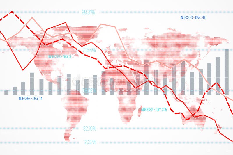
Free with trial Financial data chart featuring declining indexes and bar graphs overlaid on a world map background. Concept of global economic downturn. 3D Rendering. Bar chart decrease illustrations Financial data chart with declining indexes on a world map background. 3D Rendering. Financial data chart featuring declining indexes and bar graphs overlaid on a world map background. Concept of global economic downturn. 3D Rendering
Free with trial A black magnifying glass is placed over a bar graph on a white background. Clear details and vibrant colors en. Bar chart decrease illustrations Magnifying Glass Over Bar Graph Icon on White Background chart data. A black magnifying glass is placed over a bar graph on a white background. Clear details and vibrant colors en
Free with trial A 3D bar chart with white bars and red bases shows a downward trend. A thick red arrow points downwards across the grid background. Isolated on white. Bar chart decrease illustrations 3 D red arrow graph chart showing decline on white background image. A 3D bar chart with white bars and red bases shows a downward trend. A thick red arrow points downwards across the grid background. Isolated on white
Free with trial This image shows a simple bar graph with a downward trend, featuring four bars in bright blue, red, yellow, and green, on a transparent background. Bar chart decrease vectors Colorful Bar Chart Showing Downward Trend on Transparent Background. This image shows a simple bar graph with a downward trend, featuring four bars in bright blue, red, yellow, and green, on a transparent background.
Free with trial The image features a collection of colorful chart icons, including bar graphs, line graphs, and pie charts, symbolizing data analysis, business growth, and financial performance. Bar chart decrease illustrations Colorful chart icons representing data analysis and business growth. The image features a collection of colorful chart icons, including bar graphs, line graphs, and pie charts, symbolizing data analysis, business growth, and financial performance
Free with trial A visually appealing bar chart composed of colorful blocks arranged to represent fluctuating data and growth patterns. Bar chart decrease illustrations Colorful bar graph showing upward and downward trends on a clean white surface. A visually appealing bar chart composed of colorful blocks arranged to represent fluctuating data and growth patterns
Free with trial Colorful bar graph chart depicted with crayons. Set against a rustic wooden background, implying decline or financial loss. Perfect for business, economics, and data visualization concepts. Bar chart decrease illustrations Falling Bar Graph with Crayons Good Resolution Stock Photo. Colorful bar graph chart depicted with crayons. Set against a rustic wooden background, implying decline or financial loss. Perfect for business, economics, and data visualization concepts.
Free with trial 3D bar chart illustrating decline, financial loss, or negative growth. Purple bars and arrow on white. Bar chart decrease illustrations Purple bar graph showing downward trend with arrow, financial concept. 3D bar chart illustrating decline, financial loss, or negative growth. Purple bars and arrow on white
Free with trial The image depicts a 3D bar chart with bars in varying heights. The bars are colored in shades of green and blue, with the green bars being shorter and the blue bars being taller. The chart is set against a plain white background, which highlights the colors of the bars. Bar chart decrease illustrations Colorful 3d bar chart with green and blue bars on a white background. The image depicts a 3D bar chart with bars in varying heights. The bars are colored in shades of green and blue, with the green bars being shorter and the blue bars being taller. The chart is set against a plain white background, which highlights the colors of the bars
Free with trial An open notebook displays two pages of business data visualization with a vertical bar graph on the left page featuring green, red, and blue bars alongside a central pie chart divided into red, blue, and green segments showing 70% in red with upward and downward arrows indicating percentage changes, all set against a clean white background ideal for concepts of analytics, financial reporting,. Bar chart decrease illustrations Business data analysis shown in an open notebook with colorful bar graph and pie chart illustrating statistics and percentages. An open notebook displays two pages of business data visualization with a vertical bar graph on the left page featuring green, red, and blue bars alongside a central pie chart divided into red, blue, and green segments showing 70% in red with upward and downward arrows indicating percentage changes, all set against a clean white background ideal for concepts of analytics, financial reporting,
Free with trial Black bar graph and downward arrow icon illustrating a financial decline or negative trend. Bar chart decrease illustrations Black Bar Graph and Downward Arrow Icon Showing Decline fall decrease. Black bar graph and downward arrow icon illustrating a financial decline or negative trend
Free with trial A bar graph showing a decrease in CO2 emissions with a green cloud and downward trend arrow. Bar chart decrease illustrations Reducing carbon dioxide emissions over time as shown in the bar graph. A bar graph showing a decrease in CO2 emissions with a green cloud and downward trend arrow
Free with trial A vibrant 3D rendered bar graph showing a downward trend. Pink, teal, blue, and yellow columns illustrate decrease, ideal for presentations. Bar chart decrease vectors Colorful bar graph with growth illustration on transparent background. A vibrant 3D rendered bar graph showing a downward trend. Pink, teal, blue, and yellow columns illustrate decrease, ideal for presentations.
Free with trial Grayscale Illustration of a Decreasing Bar Chart with a Downward Trend Arrow. Bar chart decrease vectors Grayscale Illustration of a Decreasing Bar Chart with a Downward Trend Arrow
Free with trial A bar graph showing a decrease in CO2 emissions with a green cloud and downward trend arrow. Bar chart decrease illustrations Reducing carbon dioxide emissions over time as shown in the bar graph. A bar graph showing a decrease in CO2 emissions with a green cloud and downward trend arrow
Free with trial This image shows two sets of 3D bar charts, one with green bars indicating a consistent upward trend and growth, while the other with red bars depicts a downward trend and decline. The green chart has arrows pointing upwards, symbolizing positive growth, while the red chart has arrows pointing downwards, indicating a negative trend. Bar chart decrease illustrations Contrasting upward and downward trends in a 3d bar chart visualization. This image shows two sets of 3D bar charts, one with green bars indicating a consistent upward trend and growth, while the other with red bars depicts a downward trend and decline. The green chart has arrows pointing upwards, symbolizing positive growth, while the red chart has arrows pointing downwards, indicating a negative trend
Free with trial Red bars drop steadily, showing sharp decrease in values.. Ends with money pouch symbol, hinting at spending cuts or loss.. Clean, bold design emphasizes downward financial trend. Bar chart decrease vectors Declining bar chart with money bag icon illustrating financial downturn or budget reduction concept. Red bars drop steadily, showing sharp decrease in values.. Ends with money pouch symbol, hinting at spending cuts or loss.. Clean, bold design emphasizes downward financial trend
Free with trial The image shows a series of vertical bars in decreasing height from left to right, each bar colored differently (blue, green, yellow, orange). A bold red diagonal line with an arrow at the end overlays the bars, indicating a downward trend or decline in values. This visual representation is often used to depict a reduction in data metrics over time or categories. Bar chart decrease illustrations Declining bar chart with a downward trend line overlaying colorful bars. The image shows a series of vertical bars in decreasing height from left to right, each bar colored differently (blue, green, yellow, orange). A bold red diagonal line with an arrow at the end overlays the bars, indicating a downward trend or decline in values. This visual representation is often used to depict a reduction in data metrics over time or categories